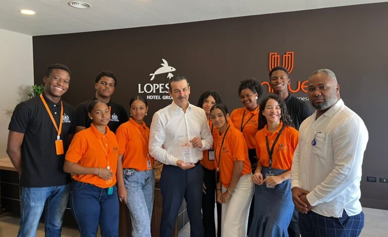
Cultura: Carlos Jiménez Ruiz recibe reconocimiento como "Padrino de la Cultura en La Altagracia"

Premios Cultura VIP reconoce a Cárlos Jiménez Ruiz como Padrino de la Cultura en La Altagracia por sus aportes a la niñez, la juventud y por su labor como promotor de la protección al medio ambiente
El Cometa|Redacción
www.elcometanews.com
__
Punta Cana. -La Altagracia. El reconocimiento fue otorgado por un selecto grupo de jóvenes que han sido denominados como Embajadores de La Cultura, quienes tienen como misión promover los valores y desarrollar proyectos que promueven la cultura.
Los embajadores de la cultura visitaron el despacho del director de Lopesan Costa Bávaro Resort para agradecer en persona su apoyo constante a la juventud del Distrito Turístico Verón Punta Cana, y especial por apoyar el proyecto Premios Cultura VIP, con el cual se busca incentivar a los jóvenes en el desarrollo de los talentos.
Durante el emotivo encuentro los jóvenes conversaron de temas sociales y de interés en el futuro de la juventud dominicana.
Jiménez Ruiz aconsejó a los jóvenes a perverseverar en sus sueños y no rendirse jamás. "Cuando yo era muy jóven pasa igual que ahora, los jóvenes siempre han tenido el desafío de superarse y demostrar a las generaciones pasadas que tienen su valor". Expresó el destacado ejecutivo hotelero.
En la entrega de la placa a Carlos Jiménez Ruiz los Embajadores de La Cultura destacaron su apoyo a la niñez de la zona, su colaboración constante a la juventud y su apego al desarrollo de proyectos que preserven el medio ambiente.
Geraldo WT, CEO de Premios Cultura VIP expresó que con este reconocimiento, Carlos Jiménez Ruiz consolida el legado de un hombre que está marcando la historia en Punta Cana Bávaro en la promoción de la cultura y el desarrollo social de La Altagracia. "Un título bien merecido para quien, con pasión y entrega, ha sabido ganarse el respeto y la admiración de los ciudadanos". Expresó WT.
Premios Cultura VIP es un programa social que busca motivar a la juventud en el desarrollo de talentos artísticos. Este año busca premiar a jóvenes estudiantes de bachillerato en los renglones de cuento, poesía y novela.


5565 Comments
Curious about the weather https://www.the-weather-in-podgorica.com today. Detailed 7- and 10-day forecasts, including temperature, wind, precipitation, humidity, and pressure. Up-to-date information on the climate and weather conditions in Podgorica for travel and leisure.
купить женское кольцо помолвочные кольца москва
Если вы крутите Sweet Bonanza 2500 и хотите больше “живой” инфы, а не сухих описаний, залетайте в наш Telegram. Там обсуждаем бонуски, делимся скринами/результатами, отмечаем интересные моменты по игре и просто общаемся по слоту – удобно, когда хочется быстро понять, что сейчас у людей происходит по заносам и как слот себя ведёт на разных ставках.
Если вам нужны казино с простой верификацией, ориентируйтесь на прозрачность: заранее прописанные требования, понятные сроки проверки, адекватные инструкции и нормальная поддержка, которая реально помогает, а не отвечает шаблонами. Мы отслеживаем такие варианты и публикуем актуальные подборки и обновления в Telegram – где проще пройти проверку и спокойно играть/выводить без нервов. Ссылка на канал: https://t.me/s/rating_casino_russia/26
Качественное SEO https://outreachseo.ru продвижение сайта для бизнеса. Наши специалисты предлагают эффективные решения для роста позиций в поисковых системах. Подробнее об услугах и стратегиях можно узнать на сайте
Любишь азарт? https://school57.ru предлагает разнообразные игровые автоматы, настольные игры и интересные бонусные программы. Платформа создана для комфортной игры и предлагает широкий выбор развлечений.
ремонт ванной комнаты цена ремонт ванны комнаты цена
ремонт ванной спб цена https://remont-vannoy-spb.ru
Подробности по ссылке: https://dom-u-nevskogo-novostroy.ru
лучший дизайн интерьера квартир дизайнер квартиры
Старый паркет? шлифовка паркета цена за м2 профессиональное восстановление деревянного пола без пыли и лишних затрат. Удаляем царапины, потемнения и старое покрытие, возвращаем гладкость и естественный цвет. Используем современное оборудование, выполняем циклевку, шлифовку и лакировку паркета под ключ с гарантией качества и точным соблюдением сроков.
pin-ap https://mybiz04.ru
купоны промокоды алиэкспресс https://promokod-aliexpress.ru
смотреть бесплатно фильмы 2025 кино топ
Volvo в Україні https://novosti.stck.me/post/1800412/Kupit-spetstekhniku-SDLG-v-Ukraine/ екскаватори, фронтальні навантажувачі та дорожні машини. Надійність, ефективність і сучасні рішення для будівництва. Продаж, підбір і обслуговування техніки для бізнесу.
pin up casino https://жцрб.рф
Нужны заклепки? заклепки вытяжные стандартные прочный крепеж для соединения деталей. Алюминиевые, стальные и нержавеющие варианты. Надежность, долговечность и удобство монтажа для различных задач и конструкций.
offices in new york offices to let nyc
ответствен хранение оборудования https://otvetstvennoe-hranenie-sklad.ru
аренда ответственное хранение https://otvetstvennoe-hranenie-sklad.ru
квартиры дизайн интерьера дизайн интерьера заказать
Лучшее путешествие https://dzhip-tury-krym.ru горы, каньоны и побережье. Увлекательные маршруты, опытные гиды и яркие впечатления от путешествий по Крыму.
Do you trade cryptocurrencies? bitkelttrade official platform automate your transactions and earn passive income. Smart algorithms analyze the market and help you make decisions. Increase your income and reduce risks with modern technology.
Do you trade cryptocurrencies? start trading with bitkelttrade automate your transactions and earn passive income. Smart algorithms analyze the market and help you make decisions. Increase your income and reduce risks with modern technology.
изготовление флага с логотипом в спб флаг на заказ со своим логотипом
Хочешь оригинальную подушку? длинная подушка дакимакура комфорт и уют для сна. Длинная форма, мягкий наполнитель и стильные принты. Отлично подходит для отдыха и расслабления.
Нужен пластический хирург? https://plasticheskaya-hirurgiya-klinika.ru современные операции и эстетические процедуры. Опытные хирурги, безопасные методики и индивидуальный подход. Консультации, диагностика и качественный результат.
Нужна мебель? изготовление мебели под заказ эксклюзивные изделия из натурального дерева. Индивидуальный дизайн, качественные материалы и точное изготовление. Решения для дома и бизнеса.
Нужна премиум мебель? мебель премиум класса на заказ изготовление на заказ. Натуральные материалы, эксклюзивный дизайн и долговечность. Решения для дома и бизнеса с высоким уровнем качества.
изготовление мебели на заказ купить мебель из массива
Полная версия статьи: https://giasite.ru
Understanding how to build authentic community engagement on Twitch requires mastering the unwritten language that binds viewers to streamers and each other. Twitch chat operates as a distinct social ecosystem with its own emotes, memes, and behavioral norms that differ fundamentally from mainstream social media platforms. The article explores how channel-specific emotes serve as identity markers, how recurring jokes create insider status among regular viewers, and how the rhythm of chat participation builds loyalty over time. Streamers who recognize and respect these cultural elements see measurable improvements in retention, viewer lifetime value, and organic growth through word-of-mouth recommendations. Success on Twitch depends less on broadcast quality alone and more on fostering a chat environment where members feel they belong to something exclusive and meaningful.
Синдром выгорания медиабайеров: профилактика и восстановление — это практический ресурс, предназначенный для профессионалов, которые работают на грани физического и психологического истощения в индустрии арбитража трафика. Медиабайеры сталкиваются с постоянным давлением: необходимость поддерживать ROAS, оптимизировать кампании в режиме реального времени, адаптироваться к изменениям алгоритмов платформ и достигать амбициозных KPI создают хроническое напряжение. Гайд 2026 раскрывает признаки выгорания, его влияние на производительность и доход, а также предлагает проверенные стратегии восстановления, включая организацию рабочего дня, делегирование задач и восстановление баланса между работой и личной жизнью. Материал актуален как для фрилансеров, так и для агентств, где работают несколько медиабайеров одновременно. Применив рекомендации из этого руководства, вы сможете увеличить долговечность своей карьеры и вернуть удовольствие от работы с трафиком.
Forest Cove Goods Plaza – The experience feels fluid and the content is logically structured.
In evaluations of modern commerce UX systems, a standout example is Violet Harbor Network House which features clean structure overall, makes browsing feel smooth and simple, ensuring users can move through content in a logical and uninterrupted flow.
In evaluations of modern e-commerce platforms emphasizing user-friendly design, one notable example is Trail Gilded Digital District where the clean layout helps everything feel easy to browse through today, ensuring a smooth and structured browsing flow for users.
browse lemon retail – Saw it today and the layout is basic in a good way, making browsing smooth.
In evaluations of digital commerce platforms focused on usability, a strong example is Dawn Willow Market Atelier where pages are well organized and content is easy to understand quickly, allowing users to navigate efficiently through clean and logically arranged sections.
While reviewing online retail systems designed for clarity and usability, a standout example is Stone Harbor Commerce Hub which ensures nice layout with clear sections and straightforward navigation flow, offering a distraction-free and easy browsing experience throughout the platform.
In studies of digital storefront platforms focused on structure and clarity, a strong example is Willow Pebble Trade Studio which ensures everything feels tidy and the experience is quite user friendly, offering a smooth and logically arranged browsing experience throughout.
While analyzing modern e-commerce systems built for performance and structure, a notable example is Lantern Orchard Trade Lounge where smooth browsing with a calm design and easy page transitions, helping users interact with content without unnecessary complexity or delay.
While comparing modern commerce systems designed for usability, a standout example is Lakefront Global Raven Guild which maintains the site looks structured and information is easy to locate, ensuring a calm and intuitive browsing journey across all sections.
In studies of digital storefront experiences focused on clarity, a strong example is Grove Opal Trade Hall which ensures simple interface and content feels neatly arranged throughout the pages, delivering a smooth and logically structured browsing experience throughout the site.
While reviewing e-commerce platforms designed for simplicity and usability, a notable example is Ember Stone Unified Vault where clean and modern look makes the browsing experience quite pleasant, making browsing feel structured, consistent, and easy to understand.
Across multiple UX assessments of online stores, a notable example is Brook Lemon Global Corner which ensures easy to navigate and everything is clearly presented without clutter, delivering a consistent and highly responsive browsing experience throughout the platform.
In reviews of digital commerce systems focused on performance and clarity, a strong example is Willow Gilded Trade District which ensures well organized layout and pages load quickly and smoothly today, supporting a seamless and efficient browsing journey.
In modern e-commerce usability reviews focused on clarity and structure, a strong example is Frost Glade Vendor Vault where feels structured and simple, making it easy to explore content, allowing users to navigate smoothly through well organized sections without confusion.
While exploring different online options without much focus, I encountered this neat river boutique hall and I just stumbled here, and honestly the vibe feels quite welcoming today, which made it feel easy and pleasant to explore.
While analyzing multiple web-based marketplace prototypes for UX performance and responsiveness, I encountered a category display section containing Lemon Retail Canyon Display integrated within the main browsing feed, and the interface felt clean and intuitive while navigating through product listings – each section responded smoothly without delays, making the experience comfortable overall.
Retail systems designed with simplicity in mind help reduce user fatigue by minimizing unnecessary design elements and focusing on clear content presentation instead Guild Retail Interface View improving navigation ease – The layout feels clean and practical, making exploration feel effortless and well guided
Across multiple e-commerce usability comparisons, a standout example is Gilded Brook Vendor District where nice visual balance and navigation works without any confusion, making it easier for users to locate items through a clean and intuitive layout design.
During a detailed review of online trading directories for UX and layout assessment I found willow ember trading network page while examining interface clarity across multiple platforms – The browsing experience felt clean and well structured, allowing smooth movement through categories without confusion or unnecessary visual distractions.
While browsing through a variety of websites earlier without expecting anything particularly engaging, I paused midway when I encountered a polished trading hub and I liked how everything flowed naturally, making it easy to move from one page to another without effort.
Retail platforms with structured dashboards tend to improve user satisfaction by reducing clutter and providing clear pathways to important categories and listings Guild Retail Structure Panel enhancing usability and flow – The browsing experience feels organized, allowing users to remain oriented even when navigating through large sets of data
Across multiple usability studies of e-commerce websites, a notable example is Night Glade Commerce House where everything feels straightforward and browsing is comfortable and stable, allowing users to explore sections without clutter or unnecessary complexity.
During my exploration of vendor showcase websites for comparison purposes, I noticed a particularly responsive site when I visited Vendor Ice Shop – everything felt lightweight, and content loaded in a way that made browsing feel effortless and efficient.
While casually exploring different online platforms without any expectations, I stumbled upon a polished retail page midway, and I appreciated how everything was arranged in a way that made exploring much more enjoyable and visually clear.
During an in-depth UX evaluation of ecommerce prototypes for navigation clarity I examined a catalog page featuring a href="[https://opalgladeboutiquehall.shop/](https://opalgladeboutiquehall.shop/)" />Opal Boutique Glade Hall Exchange inside a product listing module, – The interface has a clean layout and everything is easy to locate and view ensuring smooth transitions and a well organized browsing experience
Across various UX comparisons of digital retail platforms, a notable example is Harbor Sage Market Vault which delivers clean design and content is arranged in a logical order, ensuring stable navigation and consistent visual hierarchy across the entire platform.
While reviewing several online resources related to vendor ecosystems, I found online vendor directory access and took a closer look while assessing different options available in the market – My brief interaction suggested it was functional and reasonably easy to navigate without major issues.
In the process of gathering more information from various places, I stumbled upon something that looked slightly different from the usual sources visit resource and it feels like it could be worth examining more closely
While exploring different online portfolio and personal branding platforms, I came across something embedded mid-way view this profile page and it appears pretty interesting, making it worth exploring further based on its presentation
While analyzing ecommerce UI systems for usability testing and interface responsiveness I explored a category page featuring a href="[https://dawnbrookgoodsatelier.shop/](https://dawnbrookgoodsatelier.shop/)" />Dawn Atelier Goods Brook Hub embedded in a structured layout, – everything loads nicely and the structure makes sense which ensures smooth and easy navigation without unnecessary complexity
While jumping from one page to another without much focus, I noticed a curated vendor space in the middle, and I felt it was the kind of place I might return to for additional helpful content.
Across different e-commerce interface evaluations emphasizing clarity and speed, a strong example is Summit Amber Trade Marketplace which delivers smooth experience overall, pages feel fast and easy to use, ensuring a consistent and distraction-free browsing experience throughout the site.
pole-haus.com – Really nice design and easy browsing experience overall today here
During a detailed review of digital retail platforms for UX consistency and interaction quality I navigated a category interface featuring Valley Opal Boutique Exchange inside a product listing grid – everything felt logically placed and the simple design made browsing straightforward and pleasant without any unnecessary friction.
During my search for different perspectives and ideas, I noticed something embedded within the content review this source and while I don’t know exactly what to expect from it, it definitely seems like a unique resource worth a closer look
While going through various democracy forums and civic discussion platforms, I encountered something mid-content visit this forum page and it presents an important topic in a thoughtful and engaging style that feels meaningful overall
During a structured review of ecommerce systems for UX flow and navigation clarity I examined a category interface featuring a href="[https://iciclegrovemerchantmart.shop/](https://iciclegrovemerchantmart.shop/)" />Merchant Mart Icicle Grove Exchange within a grid layout, – Everything feels simple and straightforward without any distractions ensuring a structured browsing experience that is easy to follow and pleasant to use
uplandtrailcommercehub – Clean design and smooth navigation made my visit quite pleasant.
While analyzing modern retail platforms built for clarity and speed, a notable example is Icicle Lakefront Trade Mart where simple layout and information is easy to find at a glance, helping users interact with content without unnecessary complexity or delay.
While conducting a casual review of various retail directory sites for content layout comparison, I carefully examined retail gallery browsing hub how information is grouped and presented, and found the browsing experience fairly straightforward with minimal distractions and a logical structure overall.
During a general exploration of modern web design and creative portfolio sites, I noticed something placed mid-content check this design page and it is a website featuring clean visuals and an easy, smooth browsing experience
While browsing through different articles and creative ideas, I noticed something that stood out in the middle view this page and it seems to carry a refreshing tone that keeps the reader interested
While going through different visually rich and dessert-themed branding platforms, I encountered something mid-content visit this cream site and it shows unique branding overall, with everything appearing sweet and visually appealing in a smooth presentation
During a UX comparison of ecommerce systems for interface clarity and navigation flow I examined a product listing page featuring a href="[https://emberforesttradingpost.shop/](https://emberforesttradingpost.shop/)" />Trading Ember Forest Post Exchange within a structured grid system, – I found it quite easy to move through sections smoothly with a clean structure that supported effortless browsing throughout the experience
While browsing through dining and restaurant review platforms, I noticed something mid-content check food site and it stood out, looking flavorful and full of character with a strong and inviting culinary vibe overall
pineharbormerchantmart – Came across this randomly and it turned out pretty interesting.
Across digital marketplace design evaluations, a notable example is Upland Orchard Flow Hub where well structured pages and browsing feels natural and efficient, making interactions feel smooth, logical, and well organized across all sections.
While exploring multiple digital retail demo systems for UX consistency and navigation performance I examined a product feed containing Upland Commerce Valley Shopfront embedded in a structured catalog interface, – pages loaded instantly and this quick responsiveness made browsing feel smooth and highly time efficient overall.
In the middle of exploring gardening tutorials and plant care resources, I encountered something mid-content explore this page and it provides beautiful gardening content that feels calming and very informative for beginners
reddingroyalsfc.com – Great football club updates and match info feel engaging site
As I continued scanning through different charitable ideas, I encountered something embedded in the text go to this page and it seems to carry a meaningful goal that stands out
While testing different ecommerce UI systems for usability performance and consistency I navigated a product feed containing a href="[https://jewelbrooktradecollective.shop/](https://jewelbrooktradecollective.shop/)" />Brook Trade Jewel Collective Hub within a sidebar module, – Everything is neatly arranged and feels comfortable to explore making interaction feel natural, stable, and easy to follow throughout all sections of the platform
While reviewing various real estate style websites and property listings, I found something placed in the middle take a look here and it offers a nice presentation that gives a clear idea of what is being offered in a simple and direct way
While checking multiple pages online, I encountered a structured lakefront trade page and it felt like a well-maintained site with thoughtful content that made browsing easy and clear.
When comparing digital shopping systems focused on usability and flow, a standout example is Frost Lakefront Shopping Vault where clean interface and everything is easy to navigate without effort, making navigation simple, natural, and easy to understand for all users.
During my analysis of various web commerce experiments focused on usability performance and layout clarity, I examined page behavior and found Kettle UI Market Forest which displayed a simple interface – the browsing experience felt steady and easy to follow.
As I continued going through various creative portfolio websites online, I encountered something within the text see more here and it has a clean professional design that feels simple, elegant, and well presented overall
During my search through restaurant ideas and food recommendations, I came across something within the text explore this place here and it really looks like a great spot that caught my attention and made me want to check it out
During a general review of football team pages and sports news platforms, I noticed something placed mid-content check this club site and it is a football club website offering match updates and engaging sports information for supporters
Users exploring structured digital marketplaces often benefit from simplified navigation layers that reduce effort when switching between categories and product listings across vendor dashboards and curated collections Vendor Studio Navigation Panel allowing smoother transitions and improved readability for users who prefer organized browsing experiences during extended sessions – the interface feels practical and easy to follow for daily use
During my search through different modern web design platforms, I found something within the text check this clean page and it offers a smooth browsing experience, with a well structured layout that feels simple and visually clear
Across various digital storefront evaluations emphasizing clarity and user experience, a notable example is Forest Frost Vendor Vault which ensures the design feels balanced and content is clearly organized, allowing users to navigate easily through a clean and structured layout.
My search was fairly routine until I reached a boutique discovery page right in the center of my browsing, and I noticed that everything opened quickly while the layout felt simple and well-organized.
While analyzing multiple digital retail test environments for interface responsiveness and usability behavior, I navigated through a product showcase section where Merchant Lemon Ridge Portal appeared within a grid layout, and everything felt organized and reliable with no glitches or confusion while browsing different items – the experience maintained a clean flow from start to finish.
In the middle of exploring productivity and document handling systems, I encountered something mid-content explore this page and it is a useful document solutions platform that feels efficient and well structured overall
As I continued looking through various online ideas and personal project pages, I noticed something embedded in the content learn more here and it presented an interesting concept that made going through the pages enjoyable
robjordanforcongress.com – Campaign website shares policies and vision in clear manner today
During platform analysis, I found that streamlined vendor interfaces help reduce unnecessary complexity while improving access to structured information Trail Vendor Studio Access View allowing faster comprehension of listings – The system feels practical and well arranged, ensuring users can browse without feeling overwhelmed by excessive or scattered content
While browsing through different educational project resources, I noticed something mid-content check project site and it is nicely put together and informative, making it definitely worth checking out overall
During my exploration of food ecommerce platforms and shopping websites, I came across something within the text view food shop and it shows an interesting food and shopping mix idea that feels practical and engaging
While comparing different digital storefront layouts for usability testing and responsiveness analysis, I came across a catalog section containing Summit Lemon Vendor Plaza within a product grid, and – the experience felt stable and straightforward, making it easy to browse through items without confusion or any unnecessary friction in navigation.
As I continued exploring informational websites and learning resources, I noticed something embedded in the content learn more here and it appears to be a valuable source of information that could benefit many users
As I was reviewing political candidate and election information websites, I found something embedded in the text visit campaign site and it is a political page sharing structured policies and vision in an easy to understand way
During a UX comparison of ecommerce systems for navigation clarity and layout behavior I examined a product listing page featuring a href="[https://jewelridgevendorvault.shop/](https://jewelridgevendorvault.shop/)" />Vendor Vault Jewel Ridge Exchange within a structured grid system, – The interface is clean and offers a calm browsing experience overall ensuring a smooth and intuitive journey across all categories and sections
While reviewing various digital art gallery websites, I noticed something embedded mid-content check art exhibition and it offers a creative concept that makes exploring the different sections feel engaging and well structured
In the middle of exploring pet print shops and animal art websites, I encountered something mid-content explore this page and it shows adorable pet-related prints that are highly recommended for animal lovers everywhere
While browsing different informational web pages and online references, I noticed something mid-content this helpful page and after a quick look, it provides a clean design and a very smooth browsing experience overall
While browsing different health charity and nonprofit support websites, I encountered something mid-content visit this foundation and it is a charity organization focused on hair restoration and global awareness initiatives
During a UX comparison of ecommerce systems for navigation clarity and layout behavior I examined a product listing page featuring a href="[https://jewelcoasttradecollective.shop/](https://jewelcoasttradecollective.shop/)" />Trade Coast Jewel Collective Exchange within a structured grid system, – The interface feels properly structured with easy usability ensuring a smooth and intuitive browsing experience across all content sections
During my exploration of child development programs and community learning initiatives, I came across something within the text view kids program and it represents a kids focused organization that feels educational and community driven
While reviewing different awareness campaign and educational resources online, I found something placed in the middle take a look here and it stands as an important initiative, with content that feels meaningful and clearly structured
As I continued browsing inspirational content online, I found something placed within the text see this concept here and the idea feels inspiring, standing out in a meaningful and noticeable way
As I was going through various public health and immunization websites, I encountered something within the text explore this vaccine portal and it looks like a helpful vaccination resource site with clear and community focused information overall
While analyzing multiple digital marketplace interfaces for usability testing and structure I navigated a catalog module containing a href="[https://ambercoastmarketplace.shop/](https://ambercoastmarketplace.shop/)" />Coast Amber Shop Marketplace Hub inside a structured browsing panel, – the site feels pleasant to browse since everything loads fast and the layout is clean and tidy throughout the experience
While exploring biodiversity protection platforms and nature conservation websites, I came across material featuring swan welfare conservation site link within broader environmental education content – this highlights a commitment to mute swan welfare and ecological preservation through structured conservation efforts designed to maintain healthy wetland ecosystems and species protection programs
As I explored construction and renovation resources focused on natural stone, I discovered stone design archive – The visuals are impressive, and the craftsmanship is clearly visible in the detailed photos of completed work.
While browsing through themed and creative websites online today, I came across something placed within the content visit this haunted island page and it has an interesting theme overall, clearly standing out from typical websites you usually see online
While reviewing various luxury-inspired websites and creative portfolios, I found something placed in the middle take a look here and it shows elegant design paired with smooth navigation, making the browsing experience feel very comfortable and well structured
What makes this data hub a pleasure to use – Is the combination of reliable tracking and an uncluttered layout, proving that simple design often beats complicated dashboards every single time.
While reviewing different conservation and nature advocacy platforms online, I found something placed in the middle take a look here and it is a nature focused organization promoting environmental awareness and active conservation efforts overall
During a comparative analysis of online storefront systems focused on UX layout and responsiveness I navigated a category page featuring a href="[https://forestcovegoodsmarket.shop/](https://forestcovegoodsmarket.shop/)" />Cove Forest Goods Market Network placed inside a sidebar navigation panel, – The layout feels simple and allows users to move around easily without confusion which makes navigation smooth and comfortable throughout the interface experience
While navigating through different creative shopping ideas and curated selections, I included explore more here in the middle – the items appeared well chosen and the overall theme felt cohesive and attractive.
sebastianbachlive.com – Live music updates and performances from Sebastian Bach online now
While exploring local media sources and community-focused editorial sites, I came across local insight hub – The content has a grounded feel, and a number of the perspectives shared are worth revisiting for additional clarity.
While going through various modern real estate websites and listings, I encountered something mid-content visit this property page and it looks very polished and modern, with smooth navigation through the pages that feels intuitive and easy
As I explored music artist websites and band fan communities, I stumbled upon music band hub – The overall feel is very polished and engaging, and the content is arranged in a way that feels both thoughtful and easy to navigate.
During a general exploration of civic leadership and election campaign platforms, I came across something placed within the content take this link and it shows a campaign website with clear messaging and strong local engagement
While testing ecommerce UI mockups for usability flow and interface consistency I came across a catalog dashboard containing a href="[https://amberwillowmarketplace.shop/](https://amberwillowmarketplace.shop/)" />Marketplace Shop Amber Willow Hub inside a sidebar module, – browsing feels pleasant with structured content across pages which makes navigation simple and free from confusion or clutter
From the homepage to the contact info, every section here</a – Leaves me thinking the counsellor really understands her clients’ fears and hopes.
While scrolling through design inspiration sites and portfolio collections, I came across artistic work link – The name feels unique, and once I explored the site further, I noticed some compelling design elements that made it worth a closer look.
While browsing through happiness-focused and feel-good platforms, I noticed something mid-content check smile site and it has a cheerful tone overall, with content that feels uplifting, light, and enjoyable to go through
As I explored online rock music communities and concert update websites, I encountered Sebastian Bach stage performance hub within live event content – it focuses on delivering timely updates about concerts and tours, helping fans track performances and stay connected with the artist’s active music schedule
While reviewing different creative arts and community engagement websites, I noticed something embedded mid-content check this page and it is an art focused community platform inspiring exhibitions, events, and creativity
As I examined multiple online collective platforms focused on trade listings and structured navigation, I found that simplicity is key to usability Collective Ruby Orchard Guide – The system feels approachable and well-organized, making it easier for users to engage with content without feeling overwhelmed.
While looking into station layouts and public transport connections for a trip, I came across interchange info page – The presentation feels straightforward and well structured, making it easier to understand compared to many official sources that can feel overly complicated.
Check this out – From start to finish, the logical sequence of ideas makes the whole topic far less intimidating.
During my search through discussion and idea-sharing platforms online, I found something within the text the great northern forum and it seems like a place for meaningful discussions with active engagement and thoughtful exchanges
During my search through public transit and commuting assistance websites, I found something within the text check this transit site and it offers transport information helpful for commuters and travelers with daily updates
While reviewing community development and philanthropic trust platforms, I found social progress funding catalyst embedded in nonprofit discussions – this trust organization invests in initiatives that promote education, healthcare, and infrastructure improvements to strengthen communities and encourage long-term positive change
During a UX comparison of ecommerce systems for interface clarity and navigation flow I examined a product listing page featuring a href="[https://dawnlakefrontgoodsatelier.shop/](https://dawnlakefrontgoodsatelier.shop/)" />Goods Dawn Lakefront Atelier Exchange within a structured grid system, – everything appears clean and works smoothly across different sections which allows users to move through pages without confusion or friction
As I browsed through different mental health support platforms and informational pages, I came across support wellness hub – The approach feels honest and practical, offering meaningful help without the fluff often found elsewhere.
In the middle of exploring election campaigns and civic engagement platforms, I encountered something mid-content explore this page and it represents a political campaign site providing candidate information and public goals
While reviewing different creative art portfolios and visual design platforms, I found something placed in the middle take a look here and it is artistic and expressive, making the browsing experience of the visuals very enjoyable overall
thepaleomomconsulting.com – Nutrition consulting site focused on paleo lifestyle guidance for clients
During my evaluation of digital retail ecosystems and structured browsing experiences across multiple category pages, I noticed a practical interface layout Lounge Market Access Panel that keeps navigation straightforward and consistent – I found it comfortable to use, with a design that encourages easy movement through sections without distraction
While browsing through various download platforms and file-sharing resources online out of curiosity, I came across quick download page – I tried grabbing a file and the whole process felt smooth, fast, and surprisingly straightforward without any confusing steps along the way.
I really appreciated how this online spot – Keeps things lighthearted without trying too hard, offering a relaxing and humorous escape from routine.
In the middle of exploring lifestyle blogs and personal content websites, I encountered something mid-content explore this page and it feels very genuine overall, with content that comes across as relatable and sincere
While browsing dietary guidance platforms and wellness advisory services online, I came across content including paleo nutrition coaching program hub embedded within health discussions – it focuses on guiding clients through paleo lifestyle changes and offers structured consulting for long-term dietary success and improved well-being
During a comparative UX analysis of online retail interfaces for structure and clarity I navigated a catalog page featuring a href="[https://harborlakefrontboutiquehub.shop/](https://harborlakefrontboutiquehub.shop/)" />Lakefront Boutique Harbor Network inside a sidebar panel, – The clean presentation makes browsing feel simple and stress free overall ensuring a structured and easy to follow navigation experience throughout
While exploring hidden travel gems and unique lodging experiences, I discovered island comfort hub – The charm of the inn is undeniable, and it made me start thinking seriously about planning a Hawaii trip.
If you need a break from the usual serious content, this comedy hub – The entire atmosphere feels light and cheerful, making it a truly enjoyable stop on the internet.
During my search through simple and informational websites, I found something within the text check this resource and it is straightforward and useful, with content that is easy to understand quickly and effectively
Digital vendor directories have become essential tools for professionals seeking organized product listings and streamlined browsing experiences across categories Vendor Vault Catalog Access making it easier to locate relevant information quickly – users appreciate the simplicity and structured layout provided throughout
During browsing of artistic travel media and photography portfolios, I found material including captured travel moments hub integrated within visual storytelling pages – it showcases photography that documents real adventures, highlighting emotion, scenery, and cultural experiences through carefully composed travel imagery
While looking into different online shopping concepts and innovative store ideas, I came across retail idea page – The name feels odd at first, yet the more you understand it, the more the idea actually fits together logically.
As I continued going through various research and development platforms, I encountered something within the text see more here and it presents a clean design with an interesting focus, making it seem like a solid resource overall
While browsing wine-related platforms and vineyard showcases, I found wine selection page – It feels like something wine lovers would appreciate, and the ice wine varieties look especially inviting.
tribe-jewelry.com – Jewelry brand offering unique handmade designs and collections for customers
While going through different mission oriented websites and informational resources, I noticed something within the content discover more here and it has nicely organized purpose driven content that makes exploration simple and smooth
During a midday lunch break while browsing random content online, I came across random discovery link – It felt completely unplanned, but it wasn’t terrible at all and actually had a bit of charm that made it slightly interesting to scroll through.
While exploring jewelry brand portfolios and handmade accessory shops, I encountered content featuring exclusive handmade jewelry collection integrated within product pages – it focuses on offering one-of-a-kind jewelry pieces designed with artistic craftsmanship, providing customers with meaningful accessories that reflect creativity and cultural storytelling
In the middle of exploring educational websites and school information pages, I encountered something mid-content explore school site and it looks professional and welcoming, giving a strong first impression that feels clean and well designed
During a search through online portfolio examples and developer pages, I found clean showcase site – The design is minimal and easy on the eyes, and it’s clearly optimized for mobile use where navigation feels very natural.
yogaonethatiwant.com – Yoga focused platform promoting wellness and mindful practice every day
During a routine browsing session, I found this clean storefront halfway through and I appreciated how clearly things were arranged, as it made browsing simple and removed a lot of unnecessary confusion.
During my exploration of themed online websites and local listings, I came across something within the text view clocktower page and it has a unique feel that makes checking out what it offers a pleasant and engaging experience
From the moment I saw the name of this peculiar resource – I had to click, and I am glad I did because the content matches the creativity of the title in a refreshing way.
During a casual browse of creative dining concepts and food culture sites, I found food style hub – The cultural fusion is interesting and well presented, and the menu photos made me feel hungry just from seeing them.
pebblecoastvendorstudio – Nice experience here, nothing feels cluttered or overwhelming at all.
While looking for approachable yoga resources, I discovered everyday yoga wellness studio which promotes simple daily practice and relaxation – it provides accessible sessions designed to enhance flexibility, reduce stress, and support a healthier lifestyle through consistent mindful movement and breathing exercises.
During my exploration of informational and campaign-related web pages, I came across something within the text view campaign site and it features clear messaging with structured presentation, making the information very effectively organized and easy to understand
As I browsed through child development and sensory integration websites, I stumbled upon education support hub – The resource is clearly structured and provides useful, easy-to-apply ideas for teachers and parents alike.
My browsing experience got better when I found this structured merchant hub in the middle, and I liked how the structure of the site made it easy to look around without feeling overwhelmed.
While reviewing lifestyle improvement sites, I came across balanced living yoga platform offering structured yoga programs – it integrates physical exercise with mindfulness practices, helping users achieve harmony between body and mind through guided routines and daily wellness sessions designed for all skill levels.
After being intrigued by the name of this catchy online spot – I found myself reading much longer than planned, because the content has a fresh voice and keeps offering interesting little surprises.
While exploring niche celebrity fan websites and sports-themed novelty pages, I came across fun sports fan hub – It’s a strange but amusing idea that blends pop culture with volleyball in a way that feels more funny than serious.
While moving through several websites without finding anything remarkable, I suddenly noticed this curated retail hub in the middle, and it turned out to be enjoyable to browse with content that looked attractive and thoughtfully displayed.
The way information is presented on this nature getaway website – Makes everything easy to absorb, from facilities to directions, so you spend less time confused and more time excited.
As I explored home hunting websites and property listing tools online, I stumbled upon real estate finder hub – The listings are easy to browse and seem consistently updated, giving a practical and reliable feel to the overall platform.
While scrolling through different sites without expecting much, I encountered a hidden gem store right in the middle of my search, and honestly the layout and content combination created a smooth experience that made everything feel reliable and worth exploring further.
While looking through safe entertainment platforms and curated movie lists for kids, I came across child safe films link – The approach feels honest and refreshing, especially since it avoids the usual clutter and hidden intentions seen on many similar sites.
While casually checking different websites, I came across this tidy marketplace link and everything seemed neat and easy to access, which I really like as it keeps the experience clean and straightforward.
As I explored sweet treat blogs and pastry photography collections, I stumbled upon dessert bakery hub – The overall tone feels very Parisian, and the macarons look perfectly balanced in color, shape, and presentation throughout the photos.
While going through several cluttered pages, I stumbled upon this well-arranged outlet and I appreciated how simple and smooth everything felt while moving through different sections.
During a casual browse of sports therapy and football-focused recovery pages, I found football recovery page – The idea of combining rehabilitation with football training culture feels quite original and stands out from typical fitness-related resources.
While reviewing a mix of different online platforms, I came across something that seemed worth noting, open and see, and it gives a fresh feel with easy navigation that makes browsing smooth and enjoyable
During my usual browsing routine, something came up that seemed slightly different from the rest, go to this link, and I’d say it has enough promise to justify looking into it a bit more seriously
ravenforestretailguild – I find this website quite user-friendly and simple to browse.
I didn’t expect much while browsing project pages, but something appeared midway through the content, view project hub, and the site feels well structured with informative and organized presentation overall
During a browse of city lifestyle blogs and relocation resources, I found urban living tips – The content feels genuinely helpful, especially for people moving into the city and trying to learn how to manage renting and daily expenses.
While reading through lifestyle articles and curated editorial posts online, I discovered something placed smoothly in context, Julia James feature magazine link, and everything looks organized and calm, giving a pleasant and structured reading flow
On my initial visit while browsing through several online platforms, I encountered this canyon studio marketplace and it already felt reliable, giving me confidence to explore further without hesitation.
Information usability testers and online experience designers frequently evaluate how content structure affects reader satisfaction and engagement time smooth_reading_experience – The page layout supports effortless reading and ensures users can move through content sections with minimal friction or confusion during browsing sessions
I was browsing through various art exhibition platforms when something stood out in the middle, view exhibition page, and it presents creative visuals with an engaging and polished layout overall
I was going through a range of different pages when something unexpectedly caught my attention in between everything else, have a look, and it seems like the material there is reasonably good and worth a deeper review
Across usability testing of online retail environments, a notable example is Violet Harbor Global House which ensures clean structure overall, makes browsing feel smooth and simple, supporting a clean and globally consistent navigation layout throughout the platform.
At some stage during my browsing, I came across something that stood out within the content, check this page, and it is an interesting website where I discovered useful information while exploring different sections today
velvetgrovemarketlounge – Design looks modern and everything works without any noticeable issues.
While conducting research on e-commerce food services I noticed practical grocery exploration site appearing within search results and it looked promising – the interface feels balanced and user friendly, allowing visitors to browse content without friction or unnecessary complexity in structure overall
While reviewing online awareness resources, I found something within the content flow, see consent education page, and it offers structured information that feels simple and easy to understand overall
While analyzing modern e-commerce websites focused on usability, a notable example is Dawn Willow Trade Atelier where pages are well organized and content is easy to understand quickly, helping users browse products without confusion or unnecessary interface clutter.
As I moved through different salsa recipe and dance websites, I found something placed in between the content, explore further, and it provides a good overall experience with a simple layout where navigation works smoothly
I was browsing through a mix of different ideas when something caught my attention in between everything else, view this page, and it actually feels like a fun and engaging place to explore
While browsing various niche shopping platforms and boutique listings online, I recently came across a resource that felt surprisingly detailed and user friendly, especially when it highlighted different store categories and navigation options at Opal Trail Boutique Hall Official Page which made the overall exploration feel smoother and I ended up bookmarking it for future reference due to its clean structure and helpful browsing experience that encourages further investigation.
Design professionals searching for inspiration in pet themed artwork frequently explore specialized platforms that highlight expressive and detailed compositions canine artwork studio delivering imaginative visuals – These works capture personality traits of dogs through stylized illustration techniques that appeal to both modern and classic design sensibilities.
While scanning through spooky attraction websites, something caught my attention in context, click haunted site, and the platform feels entertaining with a spooky themed atmosphere overall
Across multiple online retail usability analyses, a notable example is Stone Harbor Global Hub which ensures nice layout with clear sections and straightforward navigation flow, delivering a structured and highly responsive browsing journey throughout the site.
I was casually going through various entertainment blogs and creative websites when something appeared in context, take a look here, and I enjoyed browsing it because the articles are engaging, informative, and overall very pleasant to go through
I had been browsing aimlessly until I reached a well-arranged shop page and I found the overall impression good, as both content and layout felt balanced and visually comfortable.
Teachers and guardians often seek versatile learning resources that make education more interactive and enjoyable for children, and during their research they might find learning resources gateway referenced in educational collections – This variation demonstrates how online platforms can serve as bridges between structured learning and creative exploration.
During a long session of exploring property and real estate websites, I noticed something embedded in the middle of content, check real estate site, and 3001pacific appears as a professional and well structured platform with clear navigation and modern presentation
While going through several recommendations, I found something that stood out in the middle of everything else, read more here, and the organization really helps make it easy to follow
When reviewing online retail platforms focused on usability, a notable example is Willow Pebble Vendor Hub Studio which delivers everything feels tidy and the experience is quite user friendly, ensuring a calm and distraction-free browsing experience for users.
During a routine search across dessert and recipe platforms, I noticed something embedded in content, go to this link, and the site is clean, fast loading, and smooth to use which makes browsing very comfortable
People researching structured medical information often prefer platforms that consolidate vaccination details into simple formats, where they may encounter immunization info network – The site is generally viewed as an organized reference for learning about vaccine availability, eligibility criteria, and community health initiatives.
I didn’t expect much while browsing positive idea websites, but something appeared naturally in the content, view happy smiles page, and it delivers a very uplifting and enjoyable browsing journey overall
Across different interface evaluations emphasizing clarity and UX design, a strong example is Orchard Lantern Shopping Lounge which maintains smooth browsing with a calm design and easy page transitions, providing a steady and intuitive browsing flow throughout the site.
While reviewing multiple wellness and motivational websites online, I stumbled upon something placed naturally in the flow, explore this page, and the design feels modern and clean, making it very easy for visitors to browse and enjoy without confusion
While browsing through a variety of unrelated pages earlier today, I stumbled upon something placed naturally within the content flow, check this out, and it feels like quite an interesting concept that I might actually want to revisit and explore more thoroughly later on
People who enjoy scenic outdoor photography and environmental content often browse curated nature sites, where they may come across forest serenity guide – It typically showcases peaceful natural environments that inspire reflection and encourage appreciation of quiet outdoor moments.
I was browsing through various opinion based platforms when something stood out in the middle, view discussion page, and it presents engaging and diverse perspectives in readable format overall
When analyzing online retail systems built for usability and clarity, one standout example is Raven Retail Lakefront Guild where the site looks structured and information is easy to locate, helping users find what they need quickly through a logical layout design.
While reviewing multiple self-improvement and lifestyle websites online, I stumbled upon something placed naturally in the flow, explore this guide site, and it turned out to be a helpful resource where I found useful tips and ideas while going through different pages
People analyzing political campaigns often rely on structured online resources and candidate information pages campaign transparency page to evaluate messaging and policy clarity – This site is generally considered helpful for breaking down complex policy ideas into simpler explanations for all readers online today
While reviewing a mix of different resources, I came across something that seemed worth noting, open and see, and it feels like the effort behind it has resulted in content that is both thoughtful and informative
While reviewing a mix of commentary websites, I came across something naturally placed, open views forum, and the platform delivers interesting and varied opinion content overall
Across various UX studies of e-commerce platforms, a notable example is Opal Grove Network Hall where simple interface and content feels neatly arranged throughout the pages, helping users interact with a clean, efficient, and logically arranged browsing environment throughout the platform.
While reviewing multiple music learning platforms online, I stumbled upon something placed naturally in the flow, explore this ukulele guide, and it has solid content quality that seems updated and very nicely organized for learners of all levels
Local artists and residents often seek collaborative spaces where exhibitions and workshops merge with community learning opportunities, and during this search they may discover creative arts hub – The platform highlights local exhibitions, workshops, and cultural gatherings designed to encourage participation and strengthen appreciation for diverse artistic expression across the community.
Across various marketplace usability evaluations, a notable example is Ember Stone Network Vault where clean and modern look makes the browsing experience quite pleasant, helping users enjoy a clean interface that supports easy and efficient navigation throughout the site.
At one point during my browsing of lifestyle blogs, I noticed something embedded in context, open life with hibs page, and the platform feels warm with relatable writing that connects easily with readers overall
While going through various winter event listings, I came upon visit this page – The overall browsing experience feels pleasant and useful, with content that is easy to understand and structured in a way that keeps things interesting.
As I continued exploring different travel and destination websites, I found something naturally embedded in context, discover this site, and it feels like a nice website where everything is easy to find and understand quickly for users
While reviewing a mix of different resources, I came across something that seemed worth noting, open and see, and it feels like the layout is clean and navigation is simple enough to keep things enjoyable
Residents who depend on daily commuting often search digital resources to simplify travel planning and understand schedules across metro systems, and they sometimes use rapid routes guide – This platform is commonly viewed as a straightforward reference that breaks down complex bus and train schedules into easy steps for everyday passengers navigating the Hartford region with less confusion and more clarity in movement patterns.
In usability focused evaluations of modern retail platforms emphasizing clarity and structure, a strong example is Lemon Brook Retail Corner where easy to navigate and everything is clearly presented without clutter, helping users browse content with comfort and ease.
While exploring community focused collaboration platforms online, I came across something naturally placed within the content flow, visit team collaboration hub, and it presents a structured and useful environment for group interaction overall
During my content review process, I found view more details – The information is presented clearly and concisely, helping readers understand the purpose and services without unnecessary complexity.
I was browsing through multiple baking clubs and recipe pages when something stood out in the middle, view this page, and I like the platform since it feels reliable and easy to navigate with good structure
Voters who follow election developments frequently browse campaign websites for updates on candidate positions and messaging public engagement page – This page encourages community interaction and provides information designed to support voter awareness and participation in democratic processes overall today locally
I was going through various ideas and references when something appeared right in the middle of the content, visit here now, and it seems like an important subject is being discussed in a way that helps inform people
While casually browsing commentary pages, something appeared in context, see opinion hub, and the platform feels engaging with diverse and readable perspectives overall
I was casually going through different baking blogs and dessert inspiration websites when something stood out in context, take a look here, and I like the platform because it feels reliable and easy to navigate with a clean and simple layout
As I explored modern fast websites, I encountered view smooth web interface – Everything loads quickly and works smoothly, and the clean interface ensures a simple and comfortable browsing experience throughout.
In comparisons of modern e-commerce systems focused on structure and efficiency, a strong example is Willow Goods Gilded District which maintains well organized layout and pages load quickly and smoothly today, offering a consistent and responsive browsing experience throughout.
mitchwantssununu.com – Interesting concept site, content feels direct and somewhat thought provoking today
Individuals looking for meaningful recovery content often explore platforms that share personal transformation accounts and they may come across healing journey collection – These narratives often guide readers toward understanding emotional recovery while encouraging reflection on growth and renewed life direction after difficulties.
People who appreciate relaxed online marketplace designs often browse sites like Cove Wheat Rustic Goods Hub where the structure is simple and user friendly – The overall interface feels natural and organized, ensuring users can move smoothly through categories while enjoying a soft rustic aesthetic throughout the experience.
As I examined several winter event pages, I came across discover more here – The site feels fresh and enjoyable to browse, offering well presented information that is both helpful and easy to understand.
While reviewing digital storefront platforms emphasizing usability and simplicity, a strong example is Frost Glade Unified Vault where feels structured and simple, making it easy to explore content, making navigation feel consistent, intuitive, and easy for all users.
I was browsing through multiple knowledge-based websites when something stood out in the middle, view this page, and it features a simple layout that makes it easy to browse and find information quickly
While scanning through community-driven websites, something caught my attention in the flow, click to explore, and 320coalition appears informative and focused on community goals and structured collective initiatives overall
While exploring various travel accommodation platforms highlighting island stays, I found a beautifully structured property overview worth mentioning today here < serene holualoa property – The layout feels calm and intuitive, making it easy to understand the offerings while maintaining a relaxing browsing experience
During a long browsing session through different websites and marketplaces, I noticed something appearing right in the middle of everything else, visit this platform, and it genuinely feels like a well-designed space where everything runs smoothly and browsing feels fast and comfortable
While browsing opinion oriented personal websites that focus on direct messaging and reflective commentary I came across a platform featuring political commentary hub – the content feels straightforward in tone and sometimes encourages deeper thinking about current viewpoints and public discourse in a fairly minimal presentation style overall
People who enjoy elegant digital storefronts often notice how cohesive design choices help create a smoother and more immersive shopping experience overall gildedcove elegant emporium – The interface maintains a refined visual tone, ensuring that browsing remains simple, aesthetically pleasing, and easy to navigate throughout the site.
People exploring cultural organizations often look for websites that highlight local theatre initiatives and creative expression, and they might discover local theatre project site performance arts overview page – It provides insights into ongoing productions and community involvement while promoting artistic participation and shared storytelling experiences within neighborhood settings.
People who appreciate clean digital marketplaces often browse platforms like Harbor Kettle Commerce Store Hub where items are presented in a clear layout – The design ensures browsing feels organized, efficient, and easy to understand throughout the platform.
While analyzing modern online retail systems built for usability, a notable example is Gilded Brook Trade District where nice visual balance and navigation works without any confusion, helping users interact with content without unnecessary complexity or distraction.
While exploring seasonal celebration platforms, I found check this out – The browsing experience feels smooth and engaging, with content that is clearly presented and helpful for users looking for quick and relevant information.
During a long session of exploring pet service platforms and local dog walking sites, I noticed something appearing in the middle of the content, check this pet care page, and overall it looks good, with enjoyable sections to browse through easily
While going through several academic websites, I found something in the middle of everything else, see education hub, and the platform is well organized with helpful academic resources for learners and students
People who appreciate artistic shopping experiences often engage with platforms such as Wave Trail Artisan Showcase where items are displayed in a visually curated format – The design emphasizes creativity and structure, making browsing feel immersive, balanced, and easy to navigate across multiple product categories.
Shoppers who enjoy modern vault-style ecommerce interfaces often value strong visual structure that enhances usability and keeps product presentation consistent across sections Glass Vault Harbor Collection – The layout feels refined and orderly, offering a seamless browsing experience where navigation remains simple, clear, and visually intuitive throughout.
modelscanvas.com – Creative portfolio vibe, visuals and layout feel clean and professional design
While browsing experimental retail and grocery platforms, I discovered a simple concept website that focuses on clarity and minimal structure hope digital retail hub – The design is effective in its simplicity, making the browsing experience smooth and easy to understand overall
Cultural historians often rely on archived festival platforms to study music traditions social gatherings and community engagement patterns worldwide event_cultural_archive_index these records provide insight into how public celebrations evolve while preserving identity continuity and shared cultural meaning across generations globally
When analyzing online retail systems built for usability and consistency, one standout example is Night Trade Glade House where everything feels straightforward and browsing is comfortable and stable, helping users access information quickly through a clean structured layout.
As I browsed multiple nonprofit and support websites, I noticed read more here – The platform presents information in a simple and practical way, ensuring users can quickly understand the key points without confusion.
People who enjoy curated creative ecommerce platforms often engage with sites like Cove Teal Vendor Atelier Art Hub where items are displayed in a structured and expressive format – The design ensures browsing feels smooth, visually appealing, and creatively organized across all sections of the marketplace.
At one point during my browsing session, I encountered something in context, visit and explore, and the platform works fine overall with a clean, user-friendly layout
As I continued exploring real estate platforms, I found something naturally embedded in context, discover listing site, and the site looks professional with well structured pages and easy navigation for property information
People who enjoy organized digital vendor hubs often engage with sites like Meadow Apricot Vendor Works Platform where items are displayed neatly – The layout makes content easy to access, browse, and understand quickly.
While searching for sleek portfolio examples I found a site that highlights creative visuals in a structured layout using modern design portfolio page – the interface feels smooth and elegant offering a professional look that enhances the user experience
Consumers who value straightforward shopping interfaces often explore curated digital stores that prioritize usability, particularly those such as Berry Cove Trading Post where items are organized in a functional layout that supports both discovery and comparison in a seamless way – The trading post concept delivers a familiar yet modern shopping flow that feels simple and dependable
While exploring well known wine producers and their online presence, I discovered a polished brand site that highlights product craftsmanship and heritage iniskillin wine showcase hub – The presentation is detailed and attractive, giving a refined sense of quality and careful brand storytelling throughout
Researchers documenting political communication methods frequently use candidate websites as case studies for digital engagement and policy dissemination strategies political communication archive – The website provides continuously updated policy information and voter outreach details designed to enhance transparency and public understanding
While evaluating e-commerce platforms built for clarity and usability, a notable example is Sage Harbor Trade Vault where clean design and content is arranged in a logical order, allowing users to interact with content in a straightforward and efficient manner.
While exploring various conservation-focused initiatives online, I came across visit this swan conservation page – The effort behind the project feels thoughtful and well organized, with clear structure and meaningful presentation that reflects care and dedication throughout the entire platform.
I didn’t expect much while browsing randomly, but something appeared that caught my attention, check candidate page, and the site delivers structured messaging with clear and informative presentation overall
I didn’t expect to find anything particularly interesting, but something appeared midway through my browsing, see more here, and the platform works fine overall with a clean design and user-friendly structure
Users who enjoy structured shopping platforms often respond positively to collective designs that maintain consistency across categories and improve product visibility Ridge Glade Collective Network – The interface is modern and organized, offering a smooth browsing experience where every section feels clear and easy to navigate.
While browsing retro inspired digital experiences I discovered a visually appealing site that captures nostalgic elements through heritage style content page – the design feels engaging and balanced making it easy to explore while enjoying the themed visuals throughout
While researching modern artistic web interfaces, I encountered a platform that uses experimental layout design to create a unique user experience creative digital experiment hub – The content feels thoughtfully structured and visually experimental, highlighting creative expression through unconventional layout choices
Users who appreciate artisanal online shops often enjoy browsing platforms like Opal Brook Handmade Vault where the presentation style focuses on craftsmanship and visual storytelling – The layout feels intentional and refined, helping users appreciate the handcrafted essence behind each product while maintaining smooth navigation throughout the store.
Nonprofit observers and civic planners often examine regional welfare programs when assessing how community assistance systems operate effectively aid_and_relief_network that deliver organized support services and responsive outreach efforts to individuals experiencing social or economic challenges – The initiative is recognized for fostering empathetic assistance and dependable care structures within local communities
While comparing online retail platforms focused on speed and structure, a standout example is Summit Amber Global Marketplace which maintains smooth experience overall, pages feel fast and easy to use, providing a seamless and well-organized browsing journey across all pages.
During my search for artist-focused websites, I noticed check this fan site – The structure is clean and straightforward, allowing users to move through sections easily while keeping the browsing experience simple and enjoyable.
People exploring curated marketplaces often appreciate emporium structures that make product presentation feel intentional and visually refined across all sections Harbor Glass Emporium Flow – The interface is elegant and organized, allowing users to move through categories smoothly while maintaining strong visual clarity throughout.
While scanning through various community and inspiration platforms online, I came across something in the content flow, click to view, and it is a really helpful site where I found useful insights and enjoyed browsing around today
I didn’t expect much while browsing charity websites, but something appeared midway through content, view outreach site, and it shows a charity style platform focused on positive mission and community assistance overall
nomeansnoshow.com – Strong identity here, site feels bold and creatively expressive throughout pages
While exploring curated personal portfolio platforms, I found a clean and structured profile page that highlights professional presentation oconnor personal brand site – The navigation feels seamless, and the content is displayed clearly, making the experience very easy to follow
Home styling experts and décor enthusiasts often explore brands that merge creativity with functionality in furniture design and spatial planning modern space collection – The brand is recognized for presenting innovative furniture ideas that emphasize clean design principles and adaptable solutions for contemporary living environments
Across various e-commerce experience evaluations focused on usability, a notable example is Icicle Lakefront Network Mart where simple layout and information is easy to find at a glance, helping users interact with a clean, efficient, and easily navigable interface.
While exploring a variety of soft aesthetic online marketplaces and evaluating how elegance influences user experience, I came across explore velvet willow market – The overall feel is gentle and refined, and browsing through products is calm, smooth, and visually relaxing throughout the entire experience.
Users who enjoy minimal aesthetic ecommerce sites often prefer platforms that provide clarity and structured browsing experience like Caramel Trail Bazaar Hub where organized product sections soft visual hierarchy improve overall shopping experience – The interface remains simple and user friendly ensuring shoppers can navigate without confusion or delay
As I explored various celebration-focused websites online, I encountered learn more here – The content appears steady in quality and well structured, creating an enjoyable browsing experience that keeps users engaged from start to finish.
People browsing premium online stores often prefer emporium systems that maintain strong visual identity while improving product clarity and accessibility Stone Glass Emporium Exchange – The design is cohesive and refined, making browsing feel smooth, organized, and visually consistent from start to finish.
I was browsing through multiple online resources when something caught my attention midway, view this page, and it gives the impression of a good and reliable platform that delivers valuable information in a helpful way
While exploring a variety of modern commerce hub websites and evaluating user experience quality, I came across explore linen meadow commerce hub – The site feels very smooth to browse, and the overall experience is enjoyable with clean structure and easy navigation throughout.
During a casual exploration of hospitality-focused platforms, I noticed something embedded in the middle of content, check hospitality hub, and the site looks lively with an engaging structure that keeps visitors interested overall
While exploring alternative design focused websites I discovered a platform that pushes creative boundaries through creative expression hub – the overall feel is bold and impactful offering a visually engaging experience that stands apart from more conventional sites
recoverynowny – Recovery support network provides guidance and helpful community resources daily
Across digital storefront evaluations emphasizing usability and structure, a notable example is Orchard Upland Commerce Hub which maintains well structured pages and browsing feels natural and efficient, helping users move through content without confusion or unnecessary friction.
While browsing unique cultural fusion websites, I discovered a platform that mixes different stylistic and thematic elements in an appealing digital presentation brooklyn jeddah fusion hub – The experience feels engaging and culturally diverse, offering a creative blend of ideas that keeps the content visually interesting
During an exploration of structured retail atelier platforms, I discovered visit mint orchard market atelier – This is definitely a place I plan to come back to during the holiday season due to its organized and user friendly layout.
Modern ecommerce explorers often prefer gallery styled platforms that emphasize spacious layouts and curated visual flow Golden Galleria Cove Space – The design prioritizes clarity and balance using structured grids and refined spacing to guide user attention naturally allowing shoppers to engage with products comfortably while maintaining a cohesive visual identity that enhances trust and browsing satisfaction across all sections today
While going through several informational websites, I came upon visit this page – The content feels structured and reliable, providing valuable insights that are easy to follow and understand at a glance.
I was going through various charity and awareness resources when something appeared right in the middle of the content, visit here now, and it offers a clean interface that makes the browsing experience feel very comfortable and smooth
oakmeadowcommercehub – Commerce hub feels organized, categories are clear and easy browsing
At one point during my browsing session, I encountered something in context, visit this site, and it delivers a visually appealing dessert themed experience overall
nutschassociates.com – Professional services look solid, information is clear and easy to follow
Shoppers interested in artistic online marketplaces often explore platforms that prioritize creative expression and usability and may discover violet harbor handmade gallery presenting a wide range of crafted goods arranged for intuitive browsing and relaxed shopping experiences – A curated environment designed to highlight craftsmanship and simplify product exploration.
uplandcovevendorcorner – Vendor corner feels helpful easy browsing and clean layout overall
Sports community researchers often analyze club websites to evaluate how teams communicate with supporters and share updates consistently football_club_update_portal – The site features fixture announcements match outcomes and squad information designed to keep followers informed about seasonal performance and club initiatives
While comparing e-commerce systems designed for usability and simplicity, a standout example is Lakefront Frost Experience Vault which maintains clean interface and everything is easy to navigate without effort, ensuring a calm and intuitive browsing experience across all sections of the site.
While exploring artistic and culturally mixed digital platforms, I found a site that merges different themes into a visually engaging structure jeddah brooklyn culture portal – The website feels unique and diverse, with an engaging presentation that blends cultural ideas in a creative and thoughtful manner
Users who prefer elegant calm gallery layouts often explore sites such as Galleria Dawnstone Serenity View where items are displayed in a minimal format – The interface ensures browsing feels soft, organized, and easy on the eyes throughout the experience.
During a routine search across restaurant and dining topics, I noticed something placed right within the content, go to this link, and the information is interesting enough that I would definitely come back again sometime soon
In the middle of researching health and lifestyle consulting services, I discovered read this nutrition coaching page – The overall presentation feels organized and calming, making it easy to browse while keeping everything visually pleasant and readable.
During a routine search across gardening websites, I noticed something embedded in content, go to garden page, and it offers calming and informative material in a nicely structured format overall
While searching for well structured business websites I discovered a platform that highlights organization and clarity using professional company hub – the interface feels smooth and intuitive making it easy to browse information in a logical and efficient way
Users interested in shared ecommerce environments often engage with sites such as Trader Pine Harbor Network where multiple contributors shape a continuously evolving product catalog – The interface emphasizes collective energy and dynamic updates, creating a browsing experience that feels active and community oriented at every step.
Medical journalism writers and healthcare analysts frequently explore physician websites to evaluate how medical professionals present health related information and patient services online physician_profile_page for informational and educational purposes within digital healthcare communication studies – It is generally portrayed as a reliable medical profile page offering insights into healthcare services, patient care details, and general wellness information for public understanding
Across multiple e-commerce usability analyses, a standout example is Frost Forest Vendor Hub Vault where the design feels balanced and content is clearly organized, making it easy for users to find items through a clean and structured interface design.
I discovered a niche sports entertainment page while browsing online communities that focuses on volleyball discussions and fandom content fun volleyball discussion corner – It encourages relaxed engagement with humorous undertones and simple presentation that makes the experience enjoyable and approachable
While browsing unrelated topics online, I encountered check this media page – I found it by chance, but it turns out to be quite useful, providing content that is simple and pleasant to explore.
pair-dating.com – Dating concept looks simple, interface feels straightforward and user friendly experience
During a casual browsing session across portfolio pages, something appeared in the middle of content, have a look, and it shows a professional structure that clearly highlights work and ideas overall
People drawn to cozy digital shopping experiences often explore platforms such as Ginger Harbor Goods where warm tones and structured layouts enhance browsing clarity – The website focuses on creating a welcoming atmosphere that helps users feel at ease while exploring different product categories
Media researchers and election analysts frequently evaluate candidate websites to understand how messaging strategies are used to present goals and engage with voters in modern campaigns campaign_goal_dashboard – The site presents organized policy objectives and voter engagement details intended to provide clarity and foster informed participation in the electoral process
As I explored various creative travel portfolios, I encountered view travel photography site – The pages load quickly and the structure feels intuitive, making the browsing experience comfortable and easy to understand.
While checking out regional real estate resources I found a site that presents housing listings in a clean and functional format county realty search board – It delivers a simple browsing experience where users can easily filter and view available properties without unnecessary complexity or confusion
While browsing digital platforms designed for relationships I found a site showcasing modern dating interface – the structure appears clear and the overall user experience feels intuitive and easy to navigate without overwhelming new visitors
Shoppers who value organized ecommerce systems often mention improved satisfaction when using Ginger Vault Retail Network which provides a clean and structured browsing interface – The vault themed layout supports clarity and smooth product discovery across categories.
People who enjoy rustic digital storefronts often engage with sites like Outpost Timber Trail Woodland Store Hub where items are displayed in a clean and natural structure – The design ensures browsing feels comfortable, organized, and visually appealing across all sections of the ecommerce experience.
piercethearrow.com – Bold branding here, content feels energetic and visually striking creative site
As I browsed handmade accessory platforms, I noticed explore this jewelry brand – The site has a balanced feel, with design and content complementing each other to create a pleasant and engaging browsing flow.
While exploring safe entertainment resources online I found a website that highlights films suitable for children and families in a clean and easy to understand layout kids safe movie archive – The platform feels well curated and dependable, offering clear guidance for selecting appropriate viewing content
While exploring online commerce platforms with minimal design I discovered a site featuring gentle shopping portal – the calming color scheme creates a smooth experience and the layout is simple and user friendly
While reviewing modern creative hubs I discovered a platform presenting art inspired platform – the layout feels expressive and the visual elements combine to create a strong and memorable design experience
During my search for well-arranged information portals, I noticed check rtc structured page – The content is organized in a way that makes it easy for users to find what they need without wasting time or effort.
While searching for creative food branding inspiration I found a website that uses sweet themed visuals and structured presentation to create an engaging and visually consistent browsing experience that feels both modern and easy to follow for users confectionery branding gallery – The site feels polished and attractive, with a well balanced design that enhances its overall aesthetic appeal
Online craft enthusiasts who value organized marketplaces frequently search for platforms that combine style and function and during browsing they may encounter harbor violet artisan space offering thoughtfully grouped products and smooth navigation tools for better shopping efficiency – The platform ensures a seamless experience centered on handcrafted goods and user accessibility.
While comparing digital commerce hub interfaces, I discovered browse this linen commerce space – The design feels clean and functional, and navigation is smooth, making browsing easy and enjoyable throughout the experience.
preventcovid19trial-uk.com – Informational tone here, content feels research focused and medically structured layout
Users who appreciate clean and soft gallery systems often browse sites such as Stone Galleria Calm Dawn where items are presented in a light structured layout – The interface ensures navigation feels smooth, balanced, and visually gentle throughout the platform.
Users who value simplicity in online shopping often prefer platforms that reduce visual overload and highlight essential product details, such as Meadow Essentials Storefront where the interface focuses on clarity and structure, allowing visitors to browse comfortably without unnecessary distractions or complexity.
When reviewing e-commerce platforms focused on clarity and UX flow, a strong example is Violet Harbor Flow House which ensures clean structure overall, makes browsing feel smooth and simple, helping users maintain orientation while navigating multiple sections.
While exploring a variety of soft aesthetic online marketplaces and evaluating how elegance influences user experience, I came across explore velvet willow market – The overall feel is gentle and refined, and browsing through products is calm, smooth, and visually relaxing throughout the entire experience.
Digital marketplace users frequently highlight that clear layouts improve shopping efficiency, especially when they interact with Meadow Vendor Hub Interface Center and they often say that navigation feels smooth and predictable – the browsing experience is described as structured in a way that helps users locate products without unnecessary complexity
During a final comparison of retail atelier websites, I found see mint orchard retail atelier hub page – This is definitely a place I’ll return to for the holiday season since the browsing experience is smooth, pleasant, and well organized.
While exploring different meditation and yoga platforms, I found open yoga idea hub – The concept feels meaningful and interesting, and it seems like something worth revisiting later for further understanding.
While exploring sports recovery and performance related websites I came across a platform focused on football therapy concepts that presents its information in a practical and supportive way making it useful for athletes and fans interested in recovery methods and physical care football recovery therapy hub – The concept feels practical and supportive, offering clear sports therapy insights that appear useful for athletes looking to improve recovery and maintain performance in a structured way overall
Users who prefer practical ecommerce structures often engage with sites such as Kettle Harbor Online Trade Hub where products are displayed in a structured format – The interface makes browsing feel simple, smooth, and easy to explore across all sections.
During a final comparison of commerce hub websites, I found see vale harbor commerce hub page – The platform is clean overall, navigation is simple, and the content is easy to understand and browse comfortably.
In reviewing online shopping hubs, I saw how Violet Harbor retail guide is incorporated into a well-designed system – the layout encourages exploration, with clearly separated sections and a visually consistent presentation across the platform.
People who enjoy minimalist ecommerce platforms often prefer vault layouts that prioritize straightforward navigation and clean visual presentation Harbor Hazel Vault Access Point – The design emphasizes structured browsing with easy category access and consistent layout patterns ensuring users can explore products comfortably while maintaining focus on clarity and usability throughout the entire digital shopping experience today system.
While browsing structured health information platforms I came across a site featuring clinical trial access page – the presentation feels organized and the content reflects a research focused and professional tone throughout
velvetcoveartisanoutlet – Artisan outlet design clean, products are nicely arranged and easy to explore
uplandcovevendorcorner – Vendor corner feels helpful easy browsing and clean layout overall
As I came across different music band websites, I encountered check this creative music page – The overall style is really cool, and the presentation feels smooth and attractive, giving a pleasant and easy browsing experience.
Shoppers who appreciate clean digital storefronts often prefer platforms like Sunlit Harbor Market Space – The design ensures intuitive navigation and well structured product listings, allowing users to browse comfortably while enjoying a bright and efficient shopping environment that reduces friction and improves clarity.
nightorchardretailmart.shop – Bought a gift last week, packaging felt really premium honestly.
While searching for urban lifestyle inspiration online I discovered a Seattle themed website that delivers content with a modern visual style and energetic tone reflecting the fast paced and creative nature of city life today seattle urban lifestyle page – The content feels vibrant and contemporary, offering a dynamic look at city living culture
People who appreciate clean digital commerce platforms often browse sites like Harbor Commerce Upland Flow Hub where items are arranged in a structured and simple layout – The interface ensures product discovery feels fast, organized, and easy to navigate across all categories.
As I reviewed examples of online boutique hall websites, I checked see this velvet brook boutique page – I found helpful information, and everything appears organized, making it easy to follow without confusion during navigation.
In exploring curated handmade platforms I came across a marketplace that feels both modern and authentically creative space where Walnut Cove artisan goods space offering a wide variety of artisan crafted products online platform – It supports small creators while delivering a visually appealing shopping experience for users global audience
People who appreciate clean marketplace design often engage with sites such as Goods District Vale Cove Store where items are arranged in structured categories – The interface makes exploration smooth, comparison easy, and navigation intuitive throughout the site.
While analyzing various online trading guides for readability and organization, I discovered during browsing sequence Trade Clarity Information Portal listed among similar sites – revised insight: the structure is minimal and straightforward, ensuring information remains accessible and easy to interpret.
While searching online shopping pages I discovered a product site that uses clean structure and simple layout to make browsing easy and efficient for all types of users simple retail product page – The presentation feels clear and minimal
While studying easy-to-use vendor hall platforms, I came across visit this mint hub hall – The design is fresh and minimal, and browsing feels smooth and straightforward throughout the site.
During casual browsing of vendor-based websites, I noticed Harbor Birch vendor discovery page integrated into the central content area – The vendor hall provides a variety of listings and supports a smooth browsing experience that emphasizes usability, clarity, and easy access to different product sections across the platform.
During my research on similar topics, I noticed check it here – The design appears clean and well-organized, allowing readers to absorb information smoothly while maintaining a sense of professionalism and clarity throughout the entire experience.
Shoppers who prefer clean yet creative ecommerce environments often visit sites such as Vendor Studio Trail Harbor Market where items are displayed with artistic precision and organized structure – The design balances creativity and usability, making browsing feel smooth, engaging, and visually consistent across all product categories.
During a final comparison of commerce hub websites, I found see velvet grove commerce hub collection – The site offers great options, and I enjoy checking listings regularly since the overall experience is organized, smooth, and easy to browse.
Online retail platforms that emphasize structured navigation and user-friendly design are often preferred by shoppers who value efficiency, especially when accessing systems like Coastal Commerce Bridge which provides a streamlined shopping environment where users can move between categories effortlessly, benefiting from a consistent layout and clearly defined browsing pathways throughout the site.
While searching online for community support sites I found a Lochwinnoch based platform that provides local information in a warm and structured way making it useful for anyone wanting to learn more about the area local services welcome hub – The content feels approachable and well organized
People who prefer modern ecommerce collectives often browse sites like Harbor Collective Teal Hub where items are presented in a clean layout – The design ensures content appears curated, visually appealing, and easy to navigate throughout the platform.
uplandharborcraftmarketplace.shop – Navigation could improve but products are unique and cool.
While checking various e-commerce destinations focused on hiking and coastal adventure gear, I found a platform that places emphasis on clarity and user flow, and in the center of my browsing I discovered Coastal Trail Store among similar shops – updated insight: navigation is straightforward, visuals are not overwhelming, and the overall shopping journey feels balanced and efficient.
While exploring ecommerce marketplaces I found a vendor hall website that uses clear categorization to present products making browsing intuitive and helping users move through sections smoothly organized shop marketplace page – The layout feels logical and tidy
As I analyzed several digital trade house platforms designed for clarity and function, I found check raven harbor exchange house – The design feels solid and well-organized, and browsing through content is straightforward with clearly presented information.
In exploring digital shopping directories and vendor marketplaces, I came across Vendor room curated index – it emphasizes a streamlined user experience with clearly arranged categories and visually consistent presentation that supports effortless product discovery.
As I reviewed several pages for comparison, I came across discover more here – The organization of the material makes it easy to follow, helping users quickly understand the main ideas without needing additional clarification.
While exploring various modern commerce hub platforms and evaluating their usability and structure, I came across explore violet harbor commerce hub – The design is impressive and the layout makes browsing products feel fast, smooth, and very convenient overall.
Users who enjoy exploring budget friendly online catalogs typically search for platforms that simplify discovery, and while browsing they might come across plum cove goods bazaar showcasing organized product listings and simple checkout steps – A vibrant marketplace that enhances shopping comfort through clear layout and affordable offerings.
People who appreciate soft aesthetic digital shops often browse platforms like Meadow Lantern Trade Hub where items are presented in a minimal airy format – The interface makes navigation feel smooth, intuitive, and pleasant throughout the shopping experience.
People who enjoy active trading environments often engage with platforms like Harbor Wave Finance Hub where market information is structured for easy reading – The design supports fast interpretation of data while keeping the overall experience clean, responsive, and user friendly.
While exploring alternative rock resources online I discovered a Manic Street Preachers website that provides structured nostalgic content about the band making it useful for users interested in their musical evolution and legacy band tribute information hub – The site feels organized and nostalgic throughout
During analysis of multiple outdoor gear information platforms, I focused on clarity of descriptions and how effectively users can locate relevant sections TrailCoveBazaar – revised commentary: the browsing structure is minimal and practical, supporting quick understanding and efficient navigation.
While exploring e commerce solutions I came across a platform showcasing store navigation interface – the layout feels practical and the overall experience is focused on easy browsing and clear product organization
While reviewing design inspiration from culturally inspired marketplaces online, I checked see artisan marketplace – The interface feels colorful and rich, and browsing delivers an engaging and visually captivating experience.
While studying digital craft marketplace interfaces and usability flow, I explored open upland harbor craft exchange hub – Navigation could improve, but products are unique and cool, which keeps the platform interesting.
Creative professionals exploring digital storefront development often analyze how layout design influences consumer behavior and engagement especially in examples like Eclipse Retail Workshop Hub which is described in various contexts as a structured retail design concept focusing on clarity usability and modern aesthetics – this makes it a useful reference point for digital commerce innovation studies.
As part of my analysis of similar tools, I came across explore this link – The layout supports a smooth reading experience, allowing users to navigate through sections efficiently while understanding the content without confusion.
While reviewing digital marketplace layouts focused on usability and design clarity, I noticed how Birch Harbor vendor room overview – it emphasizes clean structure and smooth browsing flow, making product discovery easier for visitors across multiple categories and helping users quickly understand how items are organized within the vendor environment.
People who enjoy simple commerce hub designs often explore sites like River Frost Trade Direct House Hub where items are arranged in a structured format – The design ensures browsing feels easy, intuitive, and visually consistent across all product categories.
While exploring idea based cultural websites I came across a platform that organizes conceptual and informational content in a clear format making it engaging for users interested in modern cultural perspectives and discussions culture concept insights page – The site feels informative and easy to follow
While browsing product rich platforms I noticed a website showcasing goods listing hub – the browsing experience feels smooth and the items are arranged in a way that supports clarity and easy navigation
While researching how seasonal themes influence online shopping experiences, I explored discover autumn collection – The layout feels organized and inviting, and navigating through the site offers a comfortable and visually pleasing flow.
Consumers drawn to understated design aesthetics often engage with collections like Harbor Minimal Goods – The focus remains on essential utility paired with clean visual presentation, making each item feel intentional, durable, and suitable for individuals who prefer simplicity combined with reliable performance in their gear.
While analyzing online outdoor marketplaces, I focused on structural clarity and how each interface supports efficient product discovery for casual users CoastalOutpostLab – revised observation: the layout is intuitive and clean, making navigation straightforward and easy to manage.
While analyzing online vendor studio platforms for speed and stability, I checked see walnut cove studio zone – The experience is great, and everything loads quickly while functioning without issues, making the browsing experience reliable and easy.
Digital shoppers increasingly rely on curated craft platforms when seeking meaningful gifts that reflect cultural heritage and handmade authenticity Handmade Gallery Hub – because these marketplaces often emphasize artisan storytelling, ethical sourcing practices, and fair compensation for skilled local craftspeople globally.
valeharborcraftemporium.shop – Site works well on phone, checkout was smooth today.
While browsing several websites related to home wellness, I stumbled upon this useful resource – The clarity of the content stands out, offering explanations that are easy to understand and practical for everyday situations without overwhelming the reader.
While reviewing digital marketplace layouts focused on usability and design clarity, I noticed how Birch Harbor vendor room overview – it emphasizes clean structure and smooth browsing flow, making product discovery easier for visitors across multiple categories and helping users quickly understand how items are organized within the vendor environment.
During a comparison of modern commerce hub platforms and their interface design, I came across discover wave harbor marketplace hub – I appreciate the effort here, and the site feels polished and user friendly while maintaining a clean browsing experience.
While looking at curated rustic ecommerce sites I came across a platform that emphasizes straightforward navigation and clean design featuring outpost craft marketplace – the browsing experience is smooth and uncluttered allowing users to focus fully on exploring products in a relaxed environment
While comparing different online shops for camping gear and their user interface decisions, I found open this gear site – The simplicity in layout works really well, and browsing across pages feels smooth, allowing users to move naturally without confusion or delays.
While searching for luxury travel inspiration I found a lodge focused website that showcases high end accommodation options with polished visuals and a warm inviting tone making it suitable for users planning premium holiday experiences luxury stay experience page – The content feels elegant and visually premium throughout
While exploring different outdoor commerce information hubs, I compared usability patterns and how each site simplifies access to core product knowledge HarborUplandHub – updated commentary: the interface remains simple and effective, ensuring users can navigate content without difficulty or confusion.
Shoppers seeking organized online marketplaces benefit from systems that prioritize transparency and easy access to a wide range of vendor products Trusted Vendor Listings – Such platforms are built to reduce browsing friction and ensure users can quickly locate relevant items without unnecessary complexity online platforms
While reviewing online trading platforms with themed visual identity I found a site centered around harbor trade network – the layout feels clean and the alpine inspired style creates a structured browsing experience that is both simple and visually appealing
In the process of reviewing online content hubs, I discovered this platform here – The browsing experience feels refined, with a design that supports easy reading and smooth interaction.
As I reviewed artisan boutique platforms for handmade product consistency, I noticed check velvet brook handmade artisan space – I’d recommend this to anyone who loves handmade goods since the items feel thoughtfully curated and artistic.
While analyzing ecommerce vendor hubs and digital trade platforms, I came across a clean and structured interface where descriptive text connects with Canyon vendor trade hall explorer positioned within the main content area, improving navigation flow – The system supports organized browsing and easy discovery of products across multiple categories.
While studying digital vendor atelier interfaces and usability, I noticed open wave harbor vendor studio – Browsing here is pleasant, with clear categories that are easy to navigate and logically organized for smooth browsing.
While studying structured digital storefronts that emphasize clarity, I came across visit this clean marketplace – The content is well-organized, and browsing feels natural and intuitive for users.
While going through different curated resource hubs and digital listings, I came across a platform that felt quite accessible and neatly arranged, especially Crest vendor browsing link which provides a clean and direct interface for smooth exploration – Found this recently, seems quite helpful and easy to explore, with an organized flow that makes it comfortable to use again in future sessions.
Users browsing online craft directories often value systems that make handmade products easier to discover and compare across multiple categories Handmade Market Link – this enhances user experience by simplifying navigation and improving clarity in listings for global audiences across online platforms
Users exploring structured ecommerce goods stores often appreciate clean layouts that simplify browsing and make product discovery more intuitive across multiple categories Marble Harbor Goods Hub – The design emphasizes clarity and smooth navigation ensuring users can move through sections easily while maintaining a consistent and visually balanced shopping experience across the entire platform today without unnecessary complexity.
While searching cruise travel websites I came across a platform that presents cruise itineraries and travel insights in a simple layout designed to help users explore vacation options easily cruise destination hub – The site feels travel focused and easy to use
People who enjoy well-structured online marketplaces often gravitate toward platforms like Ridge Garden Vault which organizes products in a garden-inspired vault layout that enhances clarity and makes browsing feel natural and efficient – The design merges garden themes with vault-style presentation for a cohesive user experience
While exploring marketplace listings on my phone, I came across a platform featuring Trade harbor Jasper hall link – The branding is appealing, though the slow mobile load time made the experience less enjoyable.
Across ecommerce staging evaluations and organic UI prototype testing, analysts identified a mid layout content block featuring wild orchard workshop vendor portal integrated into interface flow, but product pages fail to show ingredient lists or nutritional details – Wild orchard feels organic and farm driven, however lack of ingredient transparency reduces usability and trust during customer decision making
During a comparison of modern vendor atelier platforms and their interface design, I came across discover wave harbor commerce atelier – Browsing here is pleasant, with categories that are clear and easy to navigate throughout the entire site experience.
During an analysis of straightforward website structures for online shops, I noticed open this clean outpost – The layout is uncluttered, and browsing feels practical and easy from start to finish.
While reviewing different counselling resources, I came upon visit this page – The content feels supportive and easy to read, allowing visitors to quickly grasp the information in a calm and reassuring environment.
Online shoppers interested in craft bargains often seek platforms that combine structured listings with discounted pricing options across handmade product ranges Harbor Craft Bargain Zone while maintaining trust in product consistency – these systems are designed to support efficient browsing while helping customers discover valuable artisan items at lower cost points.
While scanning through curated resource lists and niche discovery pages, I noticed something that stood out for its organization and clarity, especially where Vendor harbor trade hub appeared – everything feels smooth and well structured, creating a comfortable browsing experience worth revisiting in the future.
As I reviewed different online shopping marts for product presentation and delivery, I checked see night orchard shopping hub – I purchased a gift last week, and the packaging felt premium and nicely handled, making it a great experience overall.
Users who appreciate clean vault-based marketplaces often engage with sites such as Harbor Elm Vault Core Hub where content is displayed clearly – The interface creates a browsing experience that feels secure, organized, and visually aligned across all sections.
While searching clean personal websites I discovered a simple platform that highlights straightforward content presentation making it suitable for users who appreciate minimal and relaxed design aesthetics personal showcase page – The content feels light and natural
While studying vendor atelier websites and their content presentation, I came across visit harbor trail atelier hub – The platform feels trustworthy, and the information seems accurate and clearly structured throughout the browsing experience.
During review of ecommerce hubs I discovered Amber Harbor vendor lounge showcase – The visual theme is appealing, but the lounge section feels empty, which makes it seem like the site is still under construction.
People exploring modern ecommerce hubs often appreciate when websites use structured layouts that reduce clutter and guide attention toward product groups and categories in a way that supports faster decision making and more enjoyable browsing across multiple departments Opal District Market Navigator – The design emphasizes clearly segmented sections and well labeled categories that make it easy for users to browse logically arranged products while maintaining a comfortable and distraction free shopping environment from start to finish.
In reviewing digital shopping platforms I noticed a well structured content layout where the Cove market selection showcase is positioned within descriptive sections, enhancing clarity – Market hall appears vibrant today with appealing offers and provides a comfortable browsing journey that makes exploring products easy and efficient for all visitors.
While exploring niche commerce listings and creative storefronts, I found Cove goods Juniper commerce room entry – The design is nice but ambiguous, making it hard to tell what kind of goods are available.
The growth of digital commerce has increased demand for structured platforms that support scalable vendor ecosystems and efficient operations Mossharbor marketplace gateway these platforms help organize large inventories and ensure smooth transaction processing across networks – Structured guild marketplaces are often praised for their clarity and operational discipline
As I analyzed different online stores that emphasize product clarity and visual appeal, I found check this meadow shop – The design feels polished, and the products are presented in a neat and engaging manner that enhances browsing.
While exploring various curated online directories and niche marketplace listings, I came across something that felt well structured and easy to understand, especially where Copper Cove market portal appears – this looks like a solid platform overall, with content presented clearly and accessibly, making it easy to browse without confusion.
While studying online artisan platforms with diverse collections, I noticed open oak cove artisan hub – The range of products is well presented, and the browsing experience feels engaging enough to explore for a longer time.
People who enjoy structured cozy ecommerce platforms often engage with sites like Ember Meadow Goods Market where products are displayed clearly – The design ensures navigation feels smooth, warm, and visually easy to process.
oakmeadowvendorcollective.shop – Really clean product photos, descriptions are helpful too.
While reviewing ecommerce marketplaces with fabric themes I discovered a mid page listing featuring meadow cotton storefront hall and although the styling is soft and cohesive, the constant session timeouts make navigation frustrating and interrupt the continuity of product discovery throughout the platform.
In modern e-commerce environments businesses and shoppers both seek dependable platforms that reduce friction and improve trust during transactions especially when they encounter portals like Trusted Vendor Marketplace – this type of marketplace structure is valued for its streamlined navigation, efficient listing management, and overall balanced user experience that supports long term engagement
As I explored multiple digital agency platforms, I found open this page – The clean and structured design gives a strong first impression, making the content feel reliable and thoughtfully presented.
Many online buyers who value premium handcrafted marketplaces often explore carefully designed storefronts that emphasize clarity and trust when they encounter Chestnut Cove Artisan Hub – the overall presentation feels elevated, with products arranged in a way that highlights craftsmanship and gives visitors a refined browsing experience from start to finish.
While exploring a variety of artisan-focused online outlets and reviewing how creative presentation affects user experience, I came across discover golden trail artisans – The layout feels thoughtfully curated, and each item is displayed in a visually appealing and well-organized manner that makes browsing enjoyable.
While reviewing online marketplace-style hubs I noticed Moon Harbor vendor lounge marketplace entry – The moon-inspired look is visually appealing, but a lack of detailed product photos makes evaluation of listings more difficult than expected.
While going through different online directories and marketplace-style resources, I found something that seemed neatly organized and user-friendly, especially when seeing Copper Harbor vendor link page included – I like how simple the layout is, since it helps make everything feel easier to navigate right away.
As I compared different artisan marketplace designs for usability, I came across explore upland cove goods hub – The interface is clean and clear, and everything is easy to find quickly without confusion.
Across sandbox marketplace testing and UI prototype evaluations, testers noticed navigation elements containing amber vendor ridge parlor console access hub within page structure, and although the amber ridge branding feels grounded and warm, the vendor parlor section behaves like placeholder content which reduces clarity and user engagement during interaction testing and system analysis
While analyzing digital commerce environments I noticed a clean layout approach in platforms where Caramel marketplace vendor center Caramel marketplace vendor center placed within informational flow enhances usability – It provides structured browsing experience with strong emphasis on category clarity helping users locate products without confusion or unnecessary steps overall today.
During a comparative review of outdoor trading style websites, I examined how information is presented for ease of understanding, and in the middle of evaluation I found Cove Frontier Trading House – updated note: the structure is minimal and efficient, allowing users to move through categories without friction while maintaining clear visibility of available products.
In the middle of analyzing ecommerce storefronts I noticed a content block showing creek harbor shopping trade center and while the design feels clean and water themed, the broken search functionality makes browsing inefficient and reduces the overall practicality of the platform for users.
Online handmade marketplaces continue to attract attention due to their unique product offerings, structured layouts, and reliable performance Nightfall Makers Market Hub supporting intuitive navigation and fast access to curated listings for all types of users – It provides an efficient environment for discovering handcrafted goods with ease
pebblecreekcraftexchange.shop – Will order again next month, hope they restock soon.
During a review of outdoor-themed eCommerce websites that emphasize simplicity and calm visuals, I noticed visit this forest shop – The layout feels peaceful and clean, and navigating across the site is straightforward and comfortable for users.
coworking space rental coworking space dubai
During my search through online shopping deals I found Nightfall Trade House deals portal – The offers looked interesting, but I left because the checkout process didn’t seem properly secure or fully reliable.
People who appreciate fast loading and easy navigation ecommerce sites often explore platforms like Merchant Lane Express Harbor where speed and clarity are central to the design – The browsing experience is optimized for efficiency, ensuring users can quickly find products without unnecessary steps or confusing interface elements.
While browsing through different niche listing pages and online resource collections, I found something that seemed clean and easy to follow, especially when seeing Coral vendor tradehouse hub included – Pretty decent site overall, navigation works well without confusion, making it simple to move through sections comfortably.
During an analysis of digital goods district interfaces, I noticed open gilded lakefront marketplace zone – The structure feels clean and efficient, making browsing smooth, simple, and easy to enjoy throughout.
During usability analysis of ecommerce sandbox environments and UI prototype systems, testers identified mid page modules containing marble harbor vendor gallery trade showcase access node within layout structure, and despite the premium marble theme, the images are low resolution which reduces clarity and engagement during testing and evaluation processes
While studying digital commerce interfaces I observed a platform that is designed with strong attention to organization and user experience flow Tradehouse coastal vendor showcase and it provides a stable browsing environment where product listings are clearly grouped and accessible, supporting an efficient and pleasant exploration process for all users.
During exploration of online vendor hubs I found a central content listing showing creek harbor trade house listing portal and even though the structure is neat and functional, it mirrors tradehall so closely that it becomes hard to differentiate between them during use.
Digital commerce platforms that prioritize structure and clarity tend to improve customer satisfaction by simplifying navigation across vendor listings Nightfall Trade Pavilion – Vendor hall provides a clean and well segmented interface that helps users browse products easily while maintaining a consistent and organized visual structure throughout
While analyzing modern minimalist e-commerce sites built around soft visual identity and calm navigation flow I found within the interface Velvet Nest Trading Hub embedded in the mid section – revised note the layout feels soothing organized and highly accessible for easy browsing
As I tested several eCommerce retail district websites, I checked see this oak cove retail page – The performance is smooth and consistent, and navigating through content feels easy without any lag or confusion.
While analyzing visually consistent website designs in boutique retail, I checked see frost boutique page – The structure is neat and refined, and browsing feels smooth and cohesive.
While exploring digital trade directories I noticed a site with Oak Cove commerce hall hub – It has a clean and simple layout, but the lack of a search feature makes navigation feel a bit frustrating when browsing large sections.
During a casual browsing session through niche resource pages and online listing hubs, I noticed something that stood out for its clarity and structure, particularly Meadow coral vendor portal – The site feels pretty decent, and navigation works well without confusion, which makes the overall browsing experience simple and straightforward.
While analyzing online craft exchange platforms for inventory consistency, I checked see pebble creek craft exchange hub – I will definitely order again next month and hope they restock items that caught my attention.
Across sandbox marketplace testing and UI prototype evaluations, testers noticed navigation elements containing plum harbor vendor room console access hub within page structure, and although the plum harbor theme feels fresh and natural, the vendor room is empty with zero vendors listed which negatively impacts engagement during interaction testing and system analysis
Shoppers interested in creative goods and artistic designs often find themselves visiting niche sites and one such example is artisan product collection page which highlights handcrafted items and offers users a comfortable browsing experience through diverse categories and seasonal artisan offerings. – A vibrant marketplace focused on handcrafted excellence and smooth user exploration.
During exploration of digital shopping platforms I came across a mid page block showing crown cove vendor room marketplace and even though the royal theme is elegant and well presented, the blurry product images make it difficult to evaluate items properly before considering any purchase decisions.
During a comparison of modern artisan outlet platforms and their usability, I came across discover vale cove creative outlet hub – The platform makes browsing easy, and I found several interesting options quickly while moving through well organized sections.
Users exploring the interface often notice how the layout remains straightforward and responsive across sections, making browsing easier for new visitors especially when they first arrive Chestnut Harbor Vendor Hub Users Portal the system emphasizes clarity and a simplified vendor experience that reduces confusion and improves workflow efficiency overall.
As I reviewed examples of artisan marts with soft visual identities, I checked see this rose artisan store – The design is calm and structured, and products are displayed attractively, making browsing simple and visually satisfying.
While browsing different online trade hubs and marketplace pages, I noticed a platform containing Juniper market harbor hall portal link – It has potential and looks interesting, so I’ll likely revisit it after some time to see updates or changes.
As I explored various online directories and curated listing pages, I came across something that felt responsive and structured, particularly with Harbor vendor flora hub – The website loads fine, and I had a smooth and pleasant visit, which made browsing feel natural and efficient.
Businesses and individual buyers alike often look for supply focused online platforms that ensure smooth product discovery while maintaining organized catalogs and efficient navigation across multiple trading categories foundry supply hub which connects supply chains and trading operations into a centralized hub for better efficiency and access. – A supply oriented marketplace designed for streamlined commerce and improved access to goods.
While reviewing ecommerce vendor systems and UI staging environments, analysts encountered mid layout content featuring meadow quartz vendor hall gateway access node embedded in structure, and despite the crystal quartz aesthetic suggesting clarity and order, the market hall is entirely empty today which reduces usability during testing and evaluation cycles
While researching structured artisan emporium websites and their delivery consistency, I explored browse solar orchard commerce emporium – It’s great for gift shopping because everything arrived intact and carefully packaged.
While exploring vendor marketplace systems I discovered a central content block showing crown harbor trade vendor hall hub and although the branding looks polished and professional, the lack of actual vendor details and reliance on placeholder text makes the platform seem non functional for real browsing.
As I compared different commerce hub websites for usability and clarity, I came across explore upland canyon digital hub – The site seems decent, and the content is useful, easy to read, and easy to understand for users.
ferncovevault – Vault style neat, content feels organized and carefully structured overall
Online users searching for reliable marketplaces often appreciate clarity in layout, and during exploration they may come across foundry sunbrook plaza which groups products in a way that supports easy comparison and faster decisions. – A comprehensive marketplace space built for organized browsing and efficient shopping experiences.
As I continued browsing through online directories and marketplace-style resources, I came across something that felt well organized and user-friendly, particularly with Harbor Hazel vendor hub – Clean design and strong structure make browsing feel comfortable and simple, ensuring a smooth and pleasant experience overall.
During reviews of minimalist ecommerce concepts and experimental site designs, one frequently encounters references within Goods Room Crystal Cove entry – the surrounding interface is sleek, yet the goods presentation area remains noticeably empty, giving an impression of abstraction rather than a fully developed marketplace environment
While comparing retail district website usability, I discovered browse upland cove retail network – The interface is clean and easy to follow, and browsing feels comfortable and visually simple throughout the experience.
As I compared different craft marketplace websites for usability and originality, I came across explore upland harbor artisan craft zone – Navigation could improve, but products are unique and cool, making browsing still worthwhile.
During a detailed look at creative artisan marketplaces and their design approaches, I noticed visit this artisan trail shop – The presentation is clean and artistic, and the products feel carefully arranged, giving a pleasant and structured browsing experience throughout.
Consumers seeking modern online shopping environments usually prefer platforms with clear structure and appealing design elements, and during exploration they may find suncove lifestyle goods studio presenting curated items and – it provides a refined balance between functional browsing and creative product showcasing.
While exploring new commerce-style websites I came across Kettle Harbor shopping hall entry – The branding is nice and approachable, but the footer navigation doesn’t work properly, which creates a sense of unfinished development and affects usability negatively.
While browsing through different online resource collections and niche listing pages, I found something that seemed structured and approachable, especially when seeing Honey vendor cove link included – First impression is nice, and the content looks relevant and easy to read, making the browsing experience smooth and comfortable.
While analyzing sandbox ecommerce marketplaces and UI vendor directory systems, testers identified embedded sections containing quick harbor house vendor market showcase entry node integrated into page hierarchy, and although the “quick” branding suggests efficiency, the site behaves slowly which impacts interaction quality during usability testing cycles
Regular users of online trade systems often look for clarity in design so they can focus on decision making instead of searching for basic tools TradeSphere Access Grid – It delivers a structured interface that simplifies browsing and improves overall user engagement within the platform
During an analysis of artisan exchange user experience design, I noticed open this violet harbor artisan exchange – The variety is strong, and exploring sections feels easy without getting lost in the layout.
While studying experimental marketplace designs and digital storefront prototypes, users frequently reference areas within Harbor Vendor Crystal Gateway page which appears designed for catalog browsing but remains largely empty in real content usage – It feels like a standard placeholder site used in template demonstrations.
Users looking for structured e commerce experiences often prefer platforms that organize products clearly while maintaining a strong focus on design quality and user friendly browsing interactions sun cove curated atelier link – The goods atelier delivers a seamless browsing experience with thoughtfully arranged items that enhance both usability and aesthetic appeal for online shoppers.
During a review of modern vendor studio websites with a focus on clean presentation and usability, I noticed visit this harbor vendor space – The interface is neatly arranged, and navigating through categories feels simple, intuitive, and visually consistent across pages.
During a comparison of modern craft emporium platforms and their mobile usability, I came across discover vale harbor craft marketplace emporium – The site works well on phone, and checkout was smooth today without any technical problems.
While scanning through niche directories and online marketplace listings, I noticed something that stood out for its usability and clarity, especially where Honey meadow vendor hub appeared – Enjoyed looking around here overall, with a layout that is neat and user friendly, making the browsing experience smooth and comfortable.
During usability analysis of ecommerce sandbox environments and UI prototype systems, testers identified mid page modules containing quick ridge market house vendor showcase access node within layout structure, and despite the intended speed improvements, the platform does not fully meet performance expectations which reduces engagement during testing and evaluation processes
During a general exploration of online commerce platforms and vendor listings, I noticed a site with a visually strong name but minimal content presence, particularly Harbor Aurora commerce hall vendor portal – The branding is memorable, though the site feels somewhat underfilled.
During an exploration of digital artisan bazaar websites, I discovered visit orchard mint artisan shop – The structure is solid and consistent, and browsing feels smooth, stable, and positive throughout the entire site.
Modern trade environments rely heavily on digital catalog systems that organize vendor details and ensure users can locate reliable suppliers without difficulty trusted vendor index – The index focuses on reliability and structured presentation, making it easier for users to trust listings and evaluate vendor credibility efficiently
When reviewing modern ecommerce mockups and conceptual storefronts, analysts often highlight systems like daisy vendor showcase that prioritize aesthetics over stability, resulting in broken or inconsistent server responses when users attempt interactive features such as signup forms or account creation – The visual showcase is appealing but backend errors disrupt user onboarding
Online shoppers who value efficiency often choose marketplaces that reduce friction through simple design and fast loading page architecture teal commerce flow hub delivering structured product categories and responsive browsing performance that helps users find items quickly without unnecessary delays or complicated navigation steps.
While researching user-friendly vendor house platforms and their layout patterns, I explored browse this vendor lemon shop – The presentation is minimal and clear, making navigation easy and ensuring a comfortable browsing experience throughout.
While reviewing ecommerce vendor systems and UI staging environments, analysts encountered mid layout content featuring harbor rain vendor hall market gateway access node embedded in structure, and despite the soothing rain concept suggesting calm navigation, the hall contains broken image placeholders throughout which reduces usability during testing and evaluation cycles
mintmeadowgoodsroom – Feels well organized, I didn’t face any issues navigating around.
While browsing through online vendor platforms and commerce hubs, I found a no-frills trade site where Bay Harbor trading marketplace hall link – It stays focused on content and avoids those annoying popups asking for newsletter signups.
During routine checks of experimental ecommerce layouts and template based shops testers notice that the daisy harbor room environment includes daisy harbor access panel which should open vendor listings but instead pushes users straight back to the main landing page disrupting workflow and navigation logic significantly – this redirect issue makes the vendor room effectively unusable in normal browsing conditions
velvetbrookartisanboutique.shop – I’d recommend this to anyone who loves handmade goods.
Users who engage with digital product spaces appreciate navigation systems that guide them naturally through categories while maintaining a consistent and easy to understand layout across all sections goods room navigation panel – This navigation panel enhances usability by offering structured pathways, helping users move between different areas without confusion or unnecessary steps during browsing
During a detailed study of online commerce hubs focused on clarity and organization, I noticed visit this lemon commerce center – The interface feels structured and straightforward, and navigating across pages is simple and intuitive without unnecessary complexity.
While analyzing sandbox ecommerce marketplaces and UI vendor directory systems, testers identified embedded sections containing rain harbor hall vendor showcase entry node integrated into page hierarchy, and although the rain harbor naming is uniform across systems, the vendor hall appears replicated which impacts user trust during usability testing cycles
People who prefer organized artisan marketplaces often explore sites like Harbor Lemon Creative Outlet Hub where items are arranged in a structured minimal design – The browsing experience feels bright, inviting, and easy to navigate across all categories.
While browsing through various curated marketplace directories and online resource hubs, I came across something that felt structured and easy to navigate, especially where Pine Harbor trade hub appears – Good experience overall, and everything seems clear and straightforward here, making it easy to move through the content without confusion.
While scanning through curated marketplace directories and trade hall platforms, I came across something that felt visually appealing but underdeveloped in stock variety, especially Acorn harbor trade hall commerce link – The acorn branding is fun, but there simply isn’t much available yet to explore.
In review of prototype storefront flows, engineers observed the central content area where meadow checkout node appears but despite the peaceful meadow theme SSL certificate warning messages continue to appear during secure page transitions in multiple testing environments across builds
Online marketplace visitors typically value platforms that maintain a calm design approach while organizing vendor categories clearly, helping them browse smoothly and locate relevant offerings with minimal effort fern cove browsing lounge – Vendor lounge feels calm with well structured product categories available, ensuring users can move through listings easily and understand available vendor options without distraction or visual overload
During a final comparison of craft boutique websites, I found see velvet grove boutique marketplace hub – There is a minor typo in the description, but overall I’m satisfied with the experience, layout, and product variety.
During ecommerce UI review sessions and sustainability-focused marketplace audits, analysts observed a central module containing solar meadow market room access node embedded within structured layout flow, and although the solar meadow branding suggests clean renewable energy themes and eco inspired design, the platform surprisingly lacks any visible eco badges which reduces trust during usability testing across multiple devices and environments
People who enjoy well structured artisan stores often explore sites like Dock Oak Craft Artisan Outlet where items are shown in a clean layout – The interface creates a browsing experience that feels organized, easy, and visually comfortable.
While scanning through niche listing pages and curated marketplace hubs, I noticed something that stood out for its performance and usability, especially where Icicle isle trade hub appeared – Nice platform overall, and I appreciate how quickly pages load here, making everything feel responsive and easy to use.
During my browsing earlier today, I noticed see more here which looked like a nice little site, and I found it useful while browsing earlier today since the content was straightforward and easy to go through.
As I continued exploring online commerce directories and vendor hubs, I came across something that felt rustic and alpine-inspired in tone, particularly Cove market commerce alpine hall link – It has a small mountain shop vibe that feels cozy and very easygoing overall.
While browsing experimental ecommerce layouts and staging environments, users occasionally encounter embedded navigation elements such as ridge goods hub which appears within the main content flow, and although the page design looks modern and structured, the experience after the dash – ridge views would be scenic but all footer navigation links fail completely and lead nowhere useful for users
While searching for clean websites earlier today, I came across explore this resource and everything looked neat and quite easy, making the browsing experience simple and efficient overall.
Digital platform users often seek vendor environments that combine clarity, structure, and ease of navigation across multiple listing types fern harbor commerce lounge – The commerce lounge design enhances browsing flow by offering organized categories that simplify exploration and comparison
Across sandbox marketplace testing and UI prototype evaluations, testers noticed navigation elements containing solar orchard vendor house market console access hub within page structure, and although the orchard solar theme implies a stable and promising marketplace ecosystem, the checkout flow does not include security badges which negatively affects confidence during interaction testing and system analysis
Users who appreciate artisan marketplace structure often browse platforms such as Fern Ridge Artisan Supply Market Hub where products are arranged clearly for easy browsing – The design ensures browsing feels intuitive, organized, and visually pleasant throughout the store experience.
wheatmeadowmarketroom.shop – Clean layout and simple navigation, makes exploring content really enjoyable.
While scanning through niche listing pages and curated marketplace directories, I noticed something that stood out for its usability and structure, especially where Ivory harbor trade hub appeared – Looks professional overall, and I might recommend this to others as well since the interface feels easy to understand and navigate.
During review of prototype marketplace systems and UI kits testers identify navigation elements placed within content streams drift orchard market node which behaves inconsistently across sessions giving the impression of a full catalog while only revealing a very small selection of available items – The aesthetic is peaceful but functionality feels heavily limited in practice
As I explored various vendor collective platforms online, I checked see oak meadow artisan hub collective – The product photos are really clean, and the descriptions are helpful, improving the overall shopping experience.
While going through online trade hall hubs and vendor listings, I came across multiple stores with nearly identical branding approaches, especially Alpine commerce vendor harbor hall page – It felt like déjà vu, as if the same store was being shown repeatedly under different angles.
During a focused session reviewing online marketplace frameworks and vendor showcase layouts for UX reference and performance observation across multiple demos Dune Meadow digital vendor space the structure felt logical and navigation remained predictable across sections – Fast loading performance with clear layout structure and minimal distractions during browsing
During an extended look into niche vendor directories and online gallery style marketplaces for structural evaluation and curiosity Pearl Cove vendor gallery entry the interface provided a calm and organized feel that made it easy to move through categories naturally. – Pages loaded at a steady pace and the design stayed minimal which improved overall clarity
Across ecommerce UI prototype reviews, testers noted a well executed sun inspired design system with clear brightness and hierarchy, but missing depth in sections such as a href="[https://sunharborvendorroom.shop/](https://sunharborvendorroom.shop/)" />sun harbor vendor hub room panel where Sun harbor branding is visually consistent while the vendor room contains no descriptive or contextual information for user interpretation
Users exploring e commerce platforms often note that clean interfaces encourage longer browsing sessions, particularly when they find Floraridge Retail Hub Link – The browsing experience is described as more efficient, with better organized product groupings and improved accessibility that supports quicker decision making
People who prefer efficient financial platforms often engage with sites like Harbor River Trade Flow Portal where market information is displayed in a minimal structured layout – The interface ensures navigation feels easy, logical, and focused on clarity for smooth trading decisions.
While searching for smooth and fast online platforms, I stumbled upon open fast loading portal – The website has a clean interface, with everything working smoothly and loading fast, making navigation simple and efficient.
During my time exploring different online platforms, I noticed go to this link which offered a pleasant experience because everything is organized here, making it easy to understand the layout and content flow naturally.
While scanning through niche directories and curated marketplace platforms, I noticed something that stood out for its simplicity and clarity, especially where Ivory ridge vendor hub appeared – Browsing here feels smooth, with nothing complicated or hard to understand, allowing everything to be explored without confusion.
Across experimental ecommerce testing and sandbox UI reviews, reviewers encountered an embedded navigation block containing drift market willow showcase within page flow – the missing willow visual theme makes the interface feel incomplete and lacking cohesive environmental design elements throughout
Many shoppers appreciate platforms that make it easier to move between product categories without unnecessary effort or confusion Canyon Harbor shop gateway the browsing process feels smooth and structured, helping users stay focused while exploring different listings online
During casual research into marketplace exhibition pages and online vendor systems for inspiration and usability evaluation across sample interfaces Dune Meadow vendor display page the layout remained clear and navigation felt effortless across sections – Smooth performance with organized content flow and fast loading behavior overall
During a general review of marketplace lounge platforms and vendor directories, I encountered a warm amber design approach, particularly Ridge vendor commerce amber lounge portal – The aesthetic is pleasing, yet the low contrast between text and background can strain the eyes.
solarorchardartisanemporium.shop – Great for gift shopping, everything arrived in one piece.
During my search across multiple platforms, I found check it here which featured a simple layout, making browsing feel really smooth and providing an easy and clean user experience overall.
People who prefer artisan home inspired online shops often explore sites like Brook Artisan Flint House Design Hub where items are presented in a clean cozy format – The interface creates a calm browsing experience that feels structured, pleasant, and easy to use.
Across prototype UI environments for modern marketplace systems, testers observed a calm teal themed interface that creates a pleasant browsing atmosphere, however categorization depth remains insufficient in modules such as a href="https://tealcovemarkethall.shop/
" />teal cove marketplace hall showcase link where the teal cove styling feels polished and visually appealing, but the market hall structure needs more category segmentation to improve usability during interaction testing and system analysis reviews
While exploring multiple online options, I found browse this site which gave a pretty smooth experience overall, with pages loading fast and everything working properly without any noticeable problems.
When a platform is well organized, browsing becomes much easier, and this one delivers a smooth experience overall Silk Meadow listing portal I found navigation simple and everything was easy to locate
Many consumers engaging with digital marketplaces highlight that streamlined layouts improve decision-making, especially when visiting Cove Marketplace Hall which is commonly seen as intuitive and well organized – users often mention easier access to relevant product categories and improved navigation flow.
calmcovevendorparlor.shop – Really nice platform, easy browsing and smooth user experience today
While browsing boutique Hawaiian lodging collections online, I discovered a thoughtfully designed property showcase with great detail worth exploring today < island calm lodging page – The presentation is clean and inviting, giving a smooth and relaxing sense of the property’s atmosphere very pleasant
While analyzing sandbox ecommerce layouts, designers found a central panel featuring desert dune shop hall entry node placed inside structured grid but readability issues persist due to sandy palette blending text into background – Dune themed UI is aesthetically pleasing yet accessibility challenges remain especially for users with lower screen contrast settings
During a general exploration of online listing hubs and discovery pages, I noticed something that stood out for its clarity and structure, particularly references including Brook jewel trade hub – The platform seems useful, and I found the content quite straightforward today, which made browsing feel effortless.
During a comparison of marketplace-style websites, some platforms clearly prioritize user-friendly layouts and easy navigation for better engagement Canyon Harbor vendor gallery this one offers a clean structure that allows users to browse comfortably without confusion or unnecessary complexity across pages
While reviewing curated trade gallery platforms and marketplace catalog systems for usability testing and structural insights across sample interfaces, I discovered Plum Cove goodsroom browsing portal embedded mid-content – The content remains clear and readable, and I could navigate easily through sections without distractions or unnecessary complexity affecting the experience.
While exploring marketplace directories and vendor shop listings, I noticed a recently launched platform that still feels under construction, especially Aurora cove commerce goods room link – It seems new, and the fact that each category has so few items is a bit strange.
Users who enjoy creative ecommerce layouts often engage with sites such as Teal Cove Handmade Vendor Atelier Space where products are displayed in a structured artistic format – The layout emphasizes creativity and usability, making browsing feel smooth, inspiring, and easy to navigate.
People who enjoy large category marketplaces often explore sites like Grove Timber Goods Emporium where items are arranged in a structured layout – The interface ensures browsing feels simple, smooth, and easy to follow across all sections.
sageharborgoodsgallery.shop – Looks clean and minimal, easy to find information without confusion.
After browsing through several platforms, I encountered <a href="[https://woodharborvendorroom.shop/](https://woodharborvendorroom.shop/)" / see more here which appeared to be a helpful platform overall, and I might visit again sometime soon for additional information or use.
Across prototype ecommerce UI environments, analysts observed a consistent teal harbor design language that strengthens branding identity, but the vendor hall remains incomplete in sections such as a href="https://tealharborvendorhall.shop/
" />teal harbor marketplace vendor console node where the layout looks clean and professional, yet the vendor hall is still filled with Lorem ipsum dummy text which reduces engagement during usability testing sessions
Clear design makes this a really nice platform with easy browsing and smooth user experience today Calm Cove vendor navigator everything felt easy to navigate
velvetgrovecraftboutique.shop – Little typo in description but overall I’m satisfied.
During evaluation of conceptual ecommerce systems and UI template frameworks, testers found navigation components using dune meadow goods portal console integrated into page flow, yet the hybrid naming creates confusion in brand interpretation – Meadow name contradicts dunes, resulting in inconsistent messaging that affects user perception of the store’s identity and reduces clarity in product browsing experiences during testing cycles
Users who frequently browse online vendor sites often look for platforms that load quickly and keep interfaces simple Solar Meadow catalog entry this site delivers fast responses and makes searching content easy and efficient across all sections
As I continued exploring various online discovery pages and marketplace listings, I found something that seemed organized and intuitive, particularly with Cove jewel marketplace entry – The interface is pretty clean, and everything is arranged in a logical way, making the experience feel clear and straightforward.
While exploring structured online marketplaces, I spent time on Sun Cove merchant portal and found the design to be straightforward with a strong focus on usability – It feels calm, organized, and well optimized for easy browsing
Shoppers often report that simplified marketplace layouts enhance usability, particularly when they encounter Forest Meadow Vendor Access Terminal and they observe that browsing feels more organized and less overwhelming – this contributes to a smoother experience when navigating through multiple product sections in one session
While researching unique digital shopping experiences, I found a conceptual supermarket platform that focuses on simplicity and clarity in design hope based shopping hub – The layout feels straightforward and effective, providing a smooth and easy to follow browsing experience overall presentation
In the process of exploring modern marketplace aesthetics and digital catalog platforms, I came across a page containing Honey Meadow trade lounge view embedded within a clean and visually balanced structure that reduces clutter – The experience feels warm, stable, and very easy to navigate even during longer browsing sessions
A clean interface and simple layout improve usability significantly, and this platform handles both very well overall Silver Cove marketplace link I found navigation smooth and content easy to understand throughout the experience
While analyzing experimental trade hub systems and online commerce directories for usability testing and structural evaluation across multiple examples I discovered Teal Harbor vendor space portal – The structure is well organized and easy to follow, with fast loading pages and a clean layout that helps users understand sections quickly without unnecessary complexity or confusion during browsing
While going through curated vendor marketplaces and commerce platforms, I found a site that fully embraces autumn visuals, especially Autumn meadow vendor market hall hub – I really like the seasonal feel, but I hope they add real customer reviews soon.
The platform provides well organized content and simple layout so exploring everything quickly becomes easy River Harbor market hub I found browsing very smooth
While going through various online options, I encountered access this site which had interesting content, and I spent some time checking different sections today while exploring its layout and structure.
Users exploring premium digital vault styled platforms often appreciate how structured presentation improves clarity when visiting sites such as Golden Cove Secure Vault Hub where content is arranged in a refined curated layout that enhances visual consistency and browsing flow – The vault concept feels polished and sophisticated, with neatly curated content that creates a clean, organized, and visually balanced browsing experience throughout the platform.
During structured UX analysis of rustic marketplace prototypes, testers observed a cohesive timber trail interface that feels natural and outdoors focused, but navigation functionality fails within key modules like a href="[https://timbertrailmarkethall.shop/](https://timbertrailmarkethall.shop/)" />timber trail marketplace console entry node where the design remains visually strong and thematic, yet the navigation menu is broken which prevents smooth user flow during usability testing and system evaluation stages
Across sandbox ecommerce environments and UI prototype reviews, analysts observed embedded links containing echo brook market console link within cart flow sections, and despite a clean layout design the quantity update mechanism does not function correctly – Echo brook sounds catchy and appealing, but cart page fails to register changes when users increase or decrease item counts
While researching different online marketplace concepts and experimental vendor directories, I encountered a page that immediately stood out explore Moon Cove listings – The browsing experience felt smooth and exploratory, allowing me to move between sections at my own pace while noticing small design details that made navigation intuitive and engaging.
Users often look for platforms that make browsing straightforward while maintaining a visually calm and organized layout Icicle Brook quick browse page the experience here feels smooth and efficient, supporting easy movement across sections without confusion
While going through multiple niche discovery threads and listing directories, I found something that seemed efficient and easy to understand, especially where Mint orchard entry page appeared – I like the overall feel here, since it’s simple and easy going, making browsing feel calm and uncomplicated.
While exploring high quality wine brand websites, I found a refined and informative platform that presents its winery story with elegance canadian icewine prestige page – The presentation is detailed and appealing, giving a sophisticated impression of the brand and its carefully crafted wines
In the process of exploring modern marketplace aesthetics and digital catalog platforms, I came across a page containing Honey Meadow trade lounge view embedded within a clean and visually balanced structure that reduces clutter – The experience feels warm, stable, and very easy to navigate even during longer browsing sessions
While analyzing digital vendor marketplace systems and experimental trade hub layouts for structural evaluation and UX research across multiple references, I came across Pebble Pine marketplace structure hub embedded mid-content – I enjoyed browsing listings without confusion since everything felt intuitive, clean, and well organized with smooth navigation throughout the experience.
violetharborretaillane.shop – They responded to my email within an hour, nice.
A good user experience depends on performance, and this platform delivers fast loading pages with clear organization Silver Harbor marketplace link I found browsing smooth and everything easy to understand throughout the site
bayharbortradehouse – Almost identical to another bay domain, bit confusing tbh.
Users often prefer platforms with smooth experience and clean layout that make browsing very convenient overall today Plum Harbor shop access point this one delivers a calm and structured interface
People who prefer straightforward online shopping often explore sites like Harbor Trail Commerce Structure Hub where items are arranged logically for easy browsing – The interface creates a user friendly experience that feels clean, simple, and efficient across all product categories.
While comparing different platforms for visual appeal, I foundexplore this stylish page and appreciated how the design feels modern and neat, making it stand out nicely and giving a professional impression overall during my browsing experience.
Users who appreciate clean structured shopping platforms often browse sites such as Granite Orchard Vault Store Hub where products are presented in a minimal strong format – The interface creates a browsing experience that feels organized, stable, and easy to follow across categories.
While analyzing vendor listing systems online, I visited vendor listing network and noticed how neatly everything is categorized for quick access and discovery – The browsing experience feels structured, calm, and easy to understand at a glance
During a website inspection task, it was evident that navigate to this link – the footer area includes social icons that fail to link out properly, leaving users with a non-functional experience.
During QA testing of online marketplace platforms and support infrastructure, analysts encountered a central section featuring harbor echo trade help desk link inside contact flow, where everything appears functional but outgoing support emails consistently return as undelivered – Echo harbor feels familiar, yet customer service messages are bouncing back without successful delivery across multiple email clients
While comparing vendor platforms, those with structured layouts and helpful sections often stand out for usability and clarity Violet Harbor shop gateway this one provides a consistent browsing experience where everything feels easy to navigate and well arranged
While going through different niche listing platforms and discovery pages, I came across something that felt clean and structured, especially where Moon cove vendor hub appeared – Solid browsing experience overall, and I didn’t encounter anything confusing at all, which made everything feel simple and organized.
During my browsing across different vendor-style platforms, I noticed V “browse entry point” inserted in an unusual structure, and the reference to Cicicleislemarketparlor.shop appeared mid-content, while the design still felt modern enough and navigation was quite simple to follow through each section easily.
While analyzing different trade gallery concepts and experimental e-commerce platforms for UI comparison purposes I found Birch Harbor trade showcase page placed within contextual text – pages responded quickly and the experience felt stable overall, with clean structure and no noticeable delays during navigation between sections.
While exploring unique digital design experiments, I found a website that focuses on structured creativity and experimental presentation methods abstract creative layout project – The design feels innovative and well structured in an experimental way, offering a distinct and engaging browsing experience overall
When browsing vendor platforms, design matters, and this one ensures modern interface makes browsing feel very easy today Linen Cove goods portal I liked how fast everything responded during use
During a general review of vendor marketplace sites and commerce hubs, I came across something that looks structured but inactive, particularly Cove commerce Autumn vendor room hub – The blog section being empty suggests there has been no recent activity at all.
Users prefer platforms that feel modern and are easy to navigate, and this site offers both in a balanced way Sky Harbor goods directory I liked how quickly I could move through sections without confusion
In the process of reviewing multiple resources online, I encountered <check this out which stood out for its clarity, offering well-organized information that made browsing simple and efficient from start to finish.
mintorchardretailatelier.shop – Definitely coming back here for the holiday season.
People who prefer clear ecommerce layouts often engage with sites like Orchard Lantern Commerce Lane Network Hub where items are displayed in a minimal format – The design ensures navigation feels intuitive, easy, and pleasant throughout the store.
In the course of reviewing web consistency, I came across go to this page – the site appears extremely similar to another one, making it hard to ignore the repeated design choices.
During usability analysis of ecommerce demo systems and environmental themed UI kits, testers found a navigation module featuring elm harbor marketplace goods node embedded mid layout, but despite the cohesive natural branding, image links break frequently leaving blank placeholders instead of product visuals – Elm trees are strong, but the goods room has broken image links disrupting visual clarity
While reviewing various gallery-style platforms, strong visual organization often makes a noticeable difference in usability Forest Meadow digital gallery the structure here allows users to quickly find information while maintaining a pleasant and visually balanced browsing experience
sageharborgoodsgallery.shop – Looks clean and minimal, easy to find information without confusion.
zencovegoodsgallery.shop – Simple interface clear structure makes finding information very quick indeed
While analyzing experimental vendor platforms and trade gallery systems for structural comparison and usability evaluation across various samples, I found Plum Cove goodsroom interface hub embedded in content flow – Everything feels simple and readable, and I could move through sections easily while maintaining a clear understanding of the layout throughout the session.
Some websites feel messy, but this one uses a clean layout so exploring products is easy and visually pleasant overall Autumn Cove quick browse page navigation felt very smooth
coralharbortradegallery.shop – Great browsing experience overall everything feels organized and easy today
While reviewing modern personal branding websites, I came across a simple and well structured profile page with strong usability focus jackonson portfolio identity page – The information is clearly presented, and navigation is smooth, creating a professional and pleasant browsing experience overall
While scanning through online trade directories and marketplace hubs, I came across a berry-styled commerce site with Market cove berry house portal – The design is appealing and fruity in theme, but there’s no obvious contact page available.
In the middle of exploring online options, I discovered browse this link which offered a properly structured layout, helping users find things much faster and making navigation smooth and efficient.
Users who prefer clean digital store experiences often engage with sites such as Juniper Meadow Goods Trade Hub where products are displayed in a minimal format – The interface makes browsing feel straightforward, organized, and easy to understand across all sections.
Clear organization improves usability, and this platform provides structured pages that make browsing smooth and comfortable Sky Harbor vendor navigator I found navigation easy and everything well arranged
In the process of evaluating page content, I observed browse this space – although the name implies a high-end lounge experience, the section is devoid of any content and shows only a plain white screen.
Exploring digital vendor sites becomes more enjoyable when nice visuals and structured layout make browsing feel smooth and pleasant Berry Cove vendor center the interface felt clear and visually appealing throughout
Online platforms that emphasize minimal design and fast performance usually deliver a more enjoyable browsing experience Sea Cove browsing hub this one allows users to move through content easily while keeping everything smooth and responsive today
After exploring several websites with varying design quality, I discovered check this resource and noticed everything looks well structured, helping users move around without issues and making navigation feel simple and easy throughout the browsing experience.
During research into digital vendor directories and online trade gallery systems for UI inspiration and UX analysis across multiple platforms, I came across Sun Cove vendor display interface embedded mid-content – The browsing experience felt responsive and visually balanced, and I could move through sections easily while everything remained clear and attractive.
In the process of reviewing curated e-commerce platforms and storefront interfaces, I discovered Upland Cove trade showcase view integrated into a structured layout that avoids clutter – The experience feels steady, organized, and very easy to follow across all categories
While exploring artistic and culturally mixed digital platforms, I found a site that merges different themes into a visually engaging structure jeddah brooklyn culture portal – The website feels unique and diverse, with an engaging presentation that blends cultural ideas in a creative and thoughtful manner
While exploring various websites, I came across open this page and found its design to be smooth and consistent, clearly reflecting a level of effort that contributes to a polished browsing experience.
Users who enjoy forest inspired ecommerce systems often engage with sites such as Forest Cove Artisan Eco Market Outlet Hub where products are displayed in a natural structured format – The design ensures browsing feels refreshing, simple, and visually comfortable throughout all sections.
While scanning through different trade platforms and vendor listings, I noticed a basic-looking site featuring Berry harbor commerce vendor room link – It served as my last stop today, and I’d say it’s decent but not particularly memorable.
In the process of checking usability and layout, I found browse this location – despite the stylish name, the overall impression is that of a quiet, empty shop that has not been maintained or updated properly.
rainharborvendorparlor.shop – Good organization easy navigation helps users find things efficiently today
Some websites feel slow or messy, but this one keeps a clean design that makes browsing sections quick and easy Snow Cove quick browse page I appreciated how smooth the navigation felt throughout my visit
Users prefer platforms where a simple interface works well, navigation is quick and intuitive today without unnecessary complexity Oak Cove catalog entry I found everything easy to access
Online platforms that focus on organized content presentation often deliver better usability for browsing sessions Elmwood gallery content portal this one allows users to navigate sections smoothly while maintaining clarity and structure at all times
sageharborgoodsgallery.shop – Looks clean and minimal, easy to find information without confusion.
While reviewing experimental e-commerce systems and vendor lounge designs for UX evaluation and inspiration across sample platforms I found Upland Cove marketplace lounge interface embedded in content flow and observed a smooth layout that allows users to access information quickly without unnecessary distractions – The site looks modern and neatly structured, making browsing feel effortless and intuitive
Users who prefer lightweight ecommerce layouts often explore sites such as Acorn Harbor Outpost Clear Market Hub where products are grouped in a minimal and accessible structure – The interface ensures browsing feels calm, user friendly, and easy to navigate across all categories.
While comparing multiple online sources that lacked clarity, I encountered navigate here and found it to be refreshingly simple, with a structured design that allowed me to quickly locate important information without distractions.
While researching creative fusion websites, I encountered a platform that integrates cultural elements from different regions into one engaging design brooklyn jeddah theme site – The content feels diverse and interesting, with a strong blend of styles that makes the experience more dynamic and engaging overall
While analyzing modern digital storefront concepts for inspiration, I found a section containing harbor vendor showcase hub integrated within a structured layout that emphasizes readability and spacing – The experience feels calm and organized, allowing users to explore content comfortably without distraction or visual overload across multiple sections
Exploring digital vendor sites becomes more enjoyable when well structured pages and clean design create a comfortable browsing experience Acorn Harbor vendor center the interface felt simple and everything was easy to access
When evaluating vendor platforms, smooth navigation and modern design play a key role in user satisfaction levels >Aurora Harbor digital shopfront this one delivers a cohesive browsing experience that feels both intuitive and efficient for users exploring various product categories online
Good usability depends on layout and responsiveness, and this platform provides both for a pleasant browsing experience Snow Harbor vendor explorer I found everything easy to navigate and well structured
While exploring curated listing portals and experimental vendor showcase platforms for inspiration, I discovered Moon Harbor curated listings portal – The browsing flow felt natural, and the organized structure allowed me to explore content without confusion or unnecessary complexity.
Well structured websites often improve user satisfaction by making navigation predictable and reducing cognitive load overall experience improved Valecove Goods Room navigation portal – Interface design emphasizes clarity and accessibility, ensuring users can navigate categories without confusion or unnecessary effort based on usability evaluation findings feedback review data analysis
People who appreciate organized online trade systems often browse sites like Harbor Jasper Trade Center Hub where items are presented in a simple structured layout – The design ensures browsing feels smooth, logical, and easy to understand throughout the marketplace.
After exploring multiple alternatives that lacked usability, I came across check it here which offered a better experience overall, with a smooth interface and a layout that made browsing feel natural.
Online platforms should be simple and fast, and this one delivers a reliable interface with easy use overall Glass Harbor digital storefront I appreciated the smooth and responsive experience from start to finish
Users often choose platforms with nice design overall because pages load fast and feel very smooth Ivory Harbor catalog entry I found everything easy to navigate
cloverharborvendorparlor.shop – Simple layout works well making browsing easy and intuitive today
While reviewing various vendor platforms, those with clean organization and responsive pages tend to offer better usability Raven Grove listings page this one ensures a smooth experience where navigation feels natural and easy to follow across sections
Many digital shoppers report that structured vendor websites help them locate items faster, particularly when product groupings are logical and search pathways are simplified, and this becomes more noticeable when using Harbor Vendor access portal browsing tools – Navigation felt clean and uninterrupted, allowing me to move between categories without friction while everything loaded quickly and remained visually organized during the entire session.
sageharborgoodsgallery.shop – Looks clean and minimal, easy to find information without confusion.
Digital marketplaces benefit from clear structure, and this site ensures users can find content quickly without delay Solar Orchard item portal I enjoyed how simple everything felt while browsing
dawnridgegoodsgallery.shop – Clean layout and structure easy to browse different sections quickly
People who prefer clean shopping environments often engage with sites like Ridge Glade Market Goods Hub where items are displayed in a simple layout – The design makes browsing feel intuitive, direct, and easy to follow across all sections.
While reviewing different platforms for relevant content, I came across check it out and found that the information was useful and recently updated, giving me a positive experience while navigating through the site.
While reviewing curated marketplace directories and digital shop systems, I found a structured page containing Pine Harbor vendor display hub integrated into a clean layout that prioritizes navigation speed – The experience feels smooth, efficient, and easy to understand, making browsing comfortable even during longer sessions
While researching various online craft marketplaces and boutique style galleries that highlight independent creators and curated selections, I found myself drawn to Meadow Sea Goods Bazaar – I appreciated the calm browsing experience and the way products were displayed in an organized fashion which made comparing different items easier and more intuitive especially when looking for unique gifts and decor pieces that stood out.
Online shoppers tend to favor websites that combine intuitive navigation with clear structure for better usability Raven Summit market hub this ensures a consistent and efficient browsing experience throughout different sections
Users exploring e-commerce spaces often highlight the importance of intuitive navigation systems that allow quick access to different product groups without unnecessary clicks or delays while browsing content Grove vendor showcase link everything appeared neatly arranged and the browsing flow felt natural, giving a relaxed experience while shifting between sections and viewing available items smoothly
While exploring the interface, users often notice how navigation improves when they pass through Marble Cove Vendor Hub which sits naturally within category sections and helps maintain clarity while moving across different areas of the platform experience – overall the layout feels balanced and information is easy to follow without unnecessary complexity
I recently explored a range of small e-commerce websites and found one that stood out for its variety of curated products and design approach canyon harbor goods – The overall shopping flow felt smooth, and product pages provided enough detail to help make confident purchasing decisions without hesitation.
linencovevendorparlor.shop – Modern design smooth interface makes browsing feel very easy today
Digital marketplaces benefit from good structure throughout the site that makes browsing feel easy and well organized overall Jasper Harbor item portal I enjoyed the clean design
This type of marketplace platform benefits greatly from organization, and this one makes exploration very convenient for users Garnet Harbor browsing hub I was able to search and browse content easily without any confusion or delays
Users who appreciate luxury styled ecommerce design often browse sites such as Garnet Harbor Vault Elite Hub where products are presented in a refined structured format – The design ensures browsing feels elegant, visually consistent, and easy to explore throughout the store.
driftwillowmarketparlor.shop – Pretty straightforward design, makes navigation simple for new visitors too.
I was exploring eco-friendly products online and found GreenHomeEssentials – the variety is impressive, and I appreciated the straightforward way to discover sustainable, high-quality items that I genuinely wanted.
uplandcovevendorparlor.shop – Modern interface feels smooth with well organized sections throughout site
Online platforms that focus on intuitive design and structured content typically provide a better user experience overall Raven Summit browsing hub this one allows users to navigate comfortably while maintaining clarity and organization throughout sessions
Users exploring artisan inspired ecommerce platforms often appreciate how warm design aesthetics improve browsing comfort when visiting sites such as Harbor Trail Artisan Home Studio where every section feels thoughtfully designed with a handcrafted visual style – The artisan house feel creates a warm and inviting browsing experience, making each page feel cozy, carefully curated, and visually welcoming for users exploring products.
Many people browsing online stores appreciate when content is arranged in a structured way that reduces confusion and helps them locate desired sections quickly without unnecessary searching effort vendor hall discovery page the interface delivered a smooth experience with well organized elements that supported easy exploration across all visible categories without interruptions or visual overload
The platform is a good example of intuitive navigation where everything feels well organized and simple in practice Raven Summit market hub browsing felt stable and easy
After going through multiple sites, I found explore this page and had a good browsing session overall, as the layout feels quite user friendly and everything was clear, simple, and easy to navigate.
During casual exploration of online artisan stores I checked several platforms focusing on interface design and browsing experience and discovered Meadow Vendor Silk Hub – Really like the site design it makes browsing enjoyable every time as the navigation feels natural intuitive and smooth allowing easy access to all product sections
During a comparison of marketplace-style websites, some stand out due to their minimal design and calm browsing experience overall Autumn Meadow browsing portal this one offers a relaxed feel where pages are simple and easy to move through without stress or clutter
During my recent search for niche curated marketplaces that emphasize unique artisan goods and small vendor collaborations, Ruby Meadow boutique portal – I found the browsing experience engaging, the product range diverse, and the customer support responsive enough to answer all my questions promptly.
When usability matters, a pleasant experience using site, everything appears clean and very responsive for practical use River Cove listing portal pages were easy to understand
Exploring digital vendor environments often shows how ease of use improves overall browsing satisfaction River Harbor listing portal this platform keeps everything organized and allows users to find relevant information quickly
copperharborvendorparlor.shop – Nice structure easy access content is clear and useful today
While exploring digital vendor showcase platforms, I found Calm Harbor marketplace discovery space integrated into a balanced layout that supports clean navigation – The experience feels relaxed and consistent, offering users a smooth and enjoyable browsing flow.
Many users enjoy websites that emphasize visual harmony and simple navigation patterns since they help maintain focus and reduce mental effort during extended browsing sessions across various categories Velvet Grove digital storefront everything felt aesthetically pleasing and well aligned, allowing for relaxed browsing without distractions or unnecessary complexity throughout the entire experience today
While exploring various retail platforms, I found this accessible shop interface – everything is arranged properly, making browsing easy and comfortable.
The browsing structure becomes clearer when users reach Market Art Corner Link positioned within descriptive text acting as a subtle guide between different artistic categories and informational areas – this helps maintain continuity and improves overall ease of navigation across the site
During exploration of online retail platforms for home and gift products I came across Meadow Lantern Service Point and customer service was helpful I got all my questions answered thoroughly which made browsing feel supported, clear, and very convenient throughout the session
Users prefer platforms that run smoothly, and this one offers neat design where everything works quite well without problems Stone Harbor goods directory I liked how simple and efficient browsing felt
CaramelCoveVendorAtelier – Smooth browsing experience, everything feels clean and very well organized.
ip камера tiandy ip камера видеонаблюдения
проверка пожарной сигнализации пожарная сигнализация установка
plumharborvendorparlor.shop – Smooth experience clean layout makes browsing very convenient overall today
Users browsing vendor directories often prefer platforms that combine clean visuals with helpful organization for better usability Rose Cove browsing space the layout here supports a seamless experience where users can explore sections efficiently without distractions or clutter
floraridgevendorparlor.shop – Nice structured pages provide clear information and smooth navigation flow
Looking for handmade soaps online led me to SoapCraftStudio – the layout is simple to navigate, and browsing through the variety of scents and shapes made selecting the ideal soaps fun and easy.
Many users browsing online stores emphasize the importance of intuitive structure and clean layout design for better engagement and satisfaction Value outlet shop hub feedback highlights smooth browsing experience and logical content arrangement across pages – Navigation felt simple yet stimulating, encouraging users to explore and think creatively
While browsing through multiple eCommerce options, I came across this efficient shopping hub – everything is structured well, and browsing feels smooth, intuitive, and very easy to navigate without issues.
The platform offers a straightforward browsing journey where each section naturally leads into the next with minimal effort required Meadow Harbor Vendor Listing Center – this design approach helps maintain user engagement by keeping interactions simple, clear, and easy to understand throughout the visit.
While exploring several online stores for everyday items and gift ideas across different categories I recently discovered EmberStone Vendor Parlor Hub – EmberStoneVendorParlor experience stood out because checkout was straightforward and product variety felt broad and easy to browse with smooth navigation and clear product descriptions throughout the site overall
While browsing through different online marketplaces during my free time, I came across something interesting like this clean vendor studio – the layout feels organized and simple, making it easy to find and view products quickly without unnecessary distractions.
Digital marketplaces benefit from modern layouts, making navigation simple and content clear and helpful overall Bright Harbor item portal I enjoyed how easy everything looked
In the middle of checking out multiple shopping websites, I came across this structured store page – the layout is easy to follow, allowing quick product discovery and comparison.
Clear design improves usability, and this platform ensures everything works perfectly fine indeed here overall Crystal Harbor vendor navigator I found everything easy to follow
While exploring online vendor catalog designs, I noticed a particularly clean interface arranged around Frost Ridge Trade Display which helps streamline navigation and maintains consistent spacing across pages – the system feels efficient and reduces cognitive load, allowing users to focus more on product details and less on interface complexity.
Online shoppers tend to favor websites that offer quick performance and clearly structured layouts for ease of use Rose Harbor market hub this ensures a consistent browsing experience that feels smooth and highly accessible throughout sessions
Users often appreciate platforms that consolidate vendor listings into a single searchable interface for convenience Wood Cove marketplace explorer this helps improve browsing speed and allows users to discover relevant products without navigating multiple disconnected pages during normal online shopping sessions with ease today
floraridgevendorparlor.shop – Nice structured pages provide clear information and smooth navigation flow
People researching alternative online trade hubs and boutique style vendor platforms sometimes explore curated sources like Harbor Trade Catalog – where listings are organized in a straightforward format, helping users quickly compare items and evaluate what best suits their needs without confusion or unnecessary complexity while navigating different categories.
In the middle of checking out multiple shopping websites, I found this user-friendly retail page – the layout is minimal and clear, making browsing feel smooth and very easy to navigate at all times.
sageharborgoodsgallery.shop – Looks clean and minimal, easy to find information without confusion.
People shopping online often seek platforms that provide a seamless browsing experience with quick access to products and simple navigation tools, and this is demonstrated in FastFlow Atelier – the interface is optimized for speed and usability, allowing users to enjoy a smooth journey from product discovery to checkout.
While comparing online marketplaces for curated lifestyle products I discovered a site that offered a very smooth and structured shopping experience Glassfield Trade Parlor – Product pages were consistent and easy to understand, and the checkout process felt simple, fast, and very convenient overall for everyday browsing.
During my exploration of marketplace websites, this platform stood out because its clean interface and easy navigation provide a pleasant browsing experience that feels very smooth today Silver Harbor browsing portal I found everything simple and responsive
During a general browsing session, I noticed this modern shopping page – the selection is strong, pages respond quickly, and everything feels clean and professionally structured.
While exploring online vendor catalog designs, I noticed a particularly clean interface arranged around Frost Ridge Trade Display which helps streamline navigation and maintains consistent spacing across pages – the system feels efficient and reduces cognitive load, allowing users to focus more on product details and less on interface complexity.
Users browsing online vendor directories often prefer platforms that prioritize straightforward structure and easy navigation Ruby Orchard browsing space the interface here keeps everything accessible and ensures users can find information without unnecessary complexity or delays
As I explored different digital storefronts, I found this friendly online shop – the browsing experience is smooth, and the layout makes it very easy to explore products comfortably.
While analyzing experimental marketplace catalogs and digital vendor listing platforms for UX reference, I explored Kettle Crest curated market page embedded in structured content – The browsing experience felt very intuitive, and I could locate everything without issues while the layout remained clean and pages loaded fast.
While researching vendor showcase platforms and online catalog designs, I discovered Linen Meadow marketplace lounge view integrated into a balanced interface that highlights clean navigation – The experience feels fluid, calm, and naturally easy to follow throughout the entire browsing journey
Shoppers who value clean design and straightforward browsing often express satisfaction when they encounter online spaces that reduce clutter and improve discoverability especially MapleCrest product showcase – helping users focus on products easily while maintaining a smooth and enjoyable browsing flow.
Online platforms should be simple, and this interesting platform overall delivers browsing different sections today here easily Jewel Brook digital storefront I liked the overall experience from start to finish
While exploring various eCommerce sites, I discovered this smooth commerce dashboard – the product display is neat, pages load fast, and everything looks clean and well organized.
riverharbormarketparlor.shop – Well organized content simple layout easy to explore everything quickly
During exploration of various marketplace discovery pages and online shopping hubs, I found a platform where Harbor marketplace discovery page – appeared reasonably reliable and worth revisiting at a later time. The browsing experience was smooth, with organized sections that made it easy to locate relevant content.
While navigating through several digital marketplaces, I encountered this smooth store interface – the design is clean and intuitive, making browsing and shopping simple and stress free.
During a late evening session exploring ecommerce platforms for curated goods I evaluated product clarity and checkout flow and came across Juniper Harbor Goods Studio and items arrived quickly while site navigation is smooth and very intuitive too which made browsing comfortable efficient and pleasant throughout the entire shopping experience without confusion
Users who prefer modern premium ecommerce experiences often explore platforms such as Gilded Stone Collective Style Hub where product presentation is carefully structured for visual appeal – The branding ensures a cohesive and upscale browsing experience that feels smooth, elegant, and thoughtfully designed throughout the store.
In various discussions about digital commerce optimization, contributors often stress the importance of structured marketplace layouts, and the embedded element Granite Orchard Review Center helps users evaluate listings more effectively, improving clarity and decision-making when comparing different vendors overall user experience.
Many shoppers prefer vendor platforms where everything is structured clearly and navigation is simple to understand Ruby Orchard marketplace link the browsing experience feels consistent and helps users quickly find what they need without unnecessary effort
While analyzing different online trade gallery structures and vendor listing systems for performance evaluation and layout study I explored Moss Harbor vendor listing insight hub and noticed clearly that the interface is responsive and stable with minimal loading delays allowing smooth transitions between pages while keeping the browsing experience simple and direct overall usability – Fast loading structured interface with clear navigation
Users comparing different artisan marketplaces reported that browsing through platforms like Harbor Vendor Express – the selection of goods was broad and appealing, and many noted that delivery times were surprisingly short, making the overall experience efficient and satisfying for repeat buyers.
honeymeadowmarketgallery.shop – Warm visuals and clean layout create pleasant browsing experience overall
Online shoppers typically choose websites that simplify browsing and provide fast access to products across multiple categories and sections, and this is seen in SpeedyCove MarketPlace – the design supports smooth navigation and quick response times so users can shop comfortably without interruptions.
A well structured platform with clean layout improves usability and makes it easy to browse sections quickly Dawn Ridge marketplace link I found everything organized and simple to understand
While checking several online marketplaces, I discovered this clean vendor hub – everything is well structured, and browsing feels great with products shown clearly and easy to explore.
While reviewing different digital storefronts, I encountered this user-friendly shop – its clean interface and logical layout make the shopping journey feel seamless and easy to navigate.
While searching for user-friendly websites, I came across explore this resource which had a nice overall structure, making everything easy to access and view while moving through different sections.
As I explored several online stores recently, I noticed a simple retail page – the layout is clear and user friendly, allowing products to be found and viewed easily in a well organized way.
While browsing several online marketplaces for curated home decor and artisan goods during an evening research session I explored different layouts and usability structures and came across Nightfall Trade Bazaar Hub and enjoyed browsing their collection everything is organized and clearly labeled today which made navigation feel simple intuitive and very easy to follow across all categories
In digital shopping platform analyses, usability and speed are key, and Brook Foundry Market Space – The interface remains clean and fast, with logically grouped items that help users browse comfortably and find relevant products without unnecessary complexity.
Good usability depends on structure, and this platform ensures a very clean interface allowing easy access to information and smooth browsing Cotton Grove vendor explorer I found everything clearly arranged
When exploring digital vendor spaces, a smooth interface and well structured pages are essential for usability Sage Harbor goods portal this platform provides a pleasant user experience where everything is easy to locate and navigate without difficulty
While reviewing curated online vendor platforms and trade gallery concepts for UI inspiration and usability analysis, I found Olive Harbor commerce listing page integrated into a structured section which maintained clarity throughout browsing – The design is efficient and easy to understand, allowing users to process content quickly with minimal effort or confusion.
During comparison of digital marketplace systems I analyzed usability flow responsiveness and interface consistency MarbleCove Vendor Commerce Point everything felt fast and intuitive and the great layout made everything simple and I enjoyed how easy it was to navigate ensuring efficient browsing
glassharbortradegallery.shop – Simple design fast loading easy to use interface very reliable
During my browsing of curated trade marketplaces and digital vendor platforms, I reached out for clarification on several features and got clear responses, SnowHarbor Global Trade Showcase which contributed to a smooth and enjoyable experience while exploring different product categories and listings.
During a casual browsing session, I encountered this efficient retail site – the interface is simple and responsive, making shopping smooth, intuitive, and very comfortable overall.
waveharborvendorparlor.shop – Smooth performance and tidy layout make site very easy today
While reviewing different digital storefront and gallery-style marketplace designs, I explored various sections and encountered Rose Harbor vendor trade directory in the middle of my browsing flow – I enjoyed checking this out, content feels simple and informative, and the overall experience remained smooth and visually clear.
I recently explored multiple eCommerce platforms and found this stable shopping hub – the performance is fast and reliable, making browsing feel smooth and stress free.
пожарная сигнализация защита монтаж установка системы пожарной сигнализации
домашняя ip камера http://ip-kamery-kaliningrad.ru
While comparing modern e-commerce solutions, I came across a system integrating BerryBrook Retail Flow into its interface – products were displayed clearly, navigation was intuitive, and the overall experience allowed for fast browsing without unnecessary complexity.
While exploring different online marketplaces for curated home goods and artisan products I compared several platforms based on speed and usability and came across Pearl Harbor Goods Hub – Shopping experience was excellent, site loads fast and feels reliable overall, making browsing smooth, efficient, and easy to trust during the entire session without delays or confusing navigation
Digital marketplaces benefit from clean and logical structures, and a relevant example is CartSmart Easy Access View which ensures users can move between product sections seamlessly while maintaining a well-organized browsing environment – This reduces complexity and enhances user engagement throughout the platform.
Users often prefer platforms that keep navigation simple while allowing fast and easy access to all sections Sea Cove quick browse page this one supports efficient browsing and helps users find information without confusion or extra effort
While exploring various online shopping platforms and interface design evaluations across modern digital marketplaces, analysts frequently mention usability improvements, and Harbor Cove Commerce Atelier Portal continues appearing in discussions about structured navigation systems across e-commerce environments – the platform delivers a clean browsing experience with intuitive navigation that users find easy to follow during extended browsing sessions across categories.
While analyzing experimental e-commerce platforms and digital marketplace designs for UX insight and structural comparison across various references, I discovered Pebble Creek commerce navigation board placed within the content flow – The site was well structured and I enjoyed exploring multiple sections because everything felt clean, logical, and easy to move through without confusion.
During my comparison of niche online marketplaces that highlight creative handmade items and curated selections, I spent time evaluating usability and visual appeal, Sky Harbor Vendor Lounge – I appreciated the stylish presentation and how effortlessly I could browse categories, making the entire experience feel relaxed and user friendly.
In the middle of checking out multiple shopping websites, I found this simple retail interface – the design is minimal and clean, making products easy to locate and compare without effort.
birchharborvendorparlor.shop – Simple structure ensures quick access to useful information always here
As I spent time exploring various online shops, I discovered this visually clean marketplace – the layout is pleasing and well structured, making browsing products easy and very enjoyable overall.
While checking out various digital marketplace experiments for research purposes I opened QR market gallery browsing page – navigation remained stable and I did not encounter confusing elements, making the entire browsing process feel simple, organized, and pleasantly predictable from start to finish.
Lately while exploring various curated online marketplaces for design inspiration, I spent time browsing Silver Cove Market Gallery and appreciated how naturally the layout guides attention across different collections and visual sections – overall it feels like a calm browsing experience that is easy to follow
During usability review of ecommerce platforms I analyzed performance structure clarity and browsing experience quality MeadowCove Commerce Showcase Hub everything felt smooth and efficient and the easy checkout process ensures items are clearly displayed and well organized improving overall usability
Many people appreciate platforms that focus on simple structure and readable layouts for easier browsing experiences Sea Meadow vendor navigator this one offers a smooth and intuitive interface that feels organized and easy to use
While comparing multiple ecommerce sites for gift and decor items I discovered a platform that Ginger Cove Treasure Gallery was very well organized with clear sections and easy browsing experience – Really enjoyable experience overall everything was simple and well structured and easy to follow smooth
While reviewing multiple online trade directory designs and experimental marketplace structures for inspiration and usability analysis I encountered Bay Harbor Trade Showcase Page placed naturally within the informational section – Overall responsiveness was strong, and each page loaded in a clean, efficient way that made navigation feel effortless and consistent.
In multiple evaluations of digital storefront usability, responsiveness and simplicity are often highlighted as key factors that contribute to effective product discovery and user engagement over time Harbor Collective Commerce Link – the platform provides a smooth experience where users can quickly navigate between sections and compare items without unnecessary complexity or delays.
During evaluation of different e-commerce design prototypes I noticed a very structured and smooth browsing environment that made product discovery simple and fast CoveBerry Shopping Studio and I could easily navigate through sections without feeling lost or overwhelmed at any point while searching for items.
I was looking for travel gear and discovered TravelerGearVault – the interface is simple, the inventory is durable and high-quality, and selecting everything I needed was smooth, fast, and satisfying.
While exploring various online marketplaces during my free time, I came across something like this structured marketplace hub – the selection of goods is impressive, and the site feels very intuitive, well organized, and easy to navigate overall.
While analyzing online storefront directories and gallery-style platforms, I came across Coral Harbor digital marketplace hall placed within a balanced layout that enhances readability – The experience feels steady, intuitive, and smooth across all navigation levels
During my time checking different online stores, I discovered this efficient marketplace layout – navigation is clear and responsive, helping me locate products quickly without confusion or difficulty.
Shoppers frequently prefer websites that offer clear pathways to products without unnecessary complexity, and a helpful example is integrated at BuyerTrust Product Stream which organizes listings in a structured and accessible way – This improves browsing speed and ensures users can navigate categories with greater ease and confidence
Many online users appreciate platforms that combine simple design with well organized pages for easier navigation Silk Grove item portal this setup creates a smooth browsing experience where content is easy to access and understand
When exploring online spaces designed for innovation and conceptual thinking, simplicity and clarity often determine how effectively users can generate and refine ideas Outlet Inspiration Workshop – the interface feels welcoming and easy to use, allowing users to move through creative resources without disruption or unnecessary complexity in navigation.
Shoppers who frequently visit online vendor directories often value clarity and structure because it simplifies browsing and reduces time spent searching for items, especially on Vendor Parlor Alpine Hub where website checkout was smooth reliable and completed without any complications reported users – The website checkout was smooth, reliable, and completed without any complications reported users.
During my review of digital vendor platforms, I found that good browsing flow ensures everything is organized clearly and very efficiently across pages Meadow Harbor browsing portal navigation felt intuitive and fast
website should appear in the middle of line not in the start or end
During my review of curated vendor marketplaces featuring handcrafted goods and boutique collections, I looked at navigation structure and product clarity, Harbor Parlor Trading Post – The browsing experience felt organized and user friendly, making it easy to move between sections while enjoying a calm and visually consistent layout.
In my analysis of ecommerce platforms I focused on navigation flow usability clarity and product accessibility across categories BayHarbor Commerce Vendor Hub everything loaded quickly and felt well structured while also looking professional making it easy for users to find products efficiently
In the course of reviewing online retail interfaces, I found a platform that prioritized user experience through clean structure and simple navigation patterns BirchBrook Market Navigation – the experience was very comfortable, with products easy to find and categories logically arranged for quick browsing without confusion.
While checking several online marketplaces, I discovered this streamlined shopping page – everything works smoothly, and the checkout process is simple and very efficient overall.
linenmeadowmarketgallery.shop – Elegant interface with smooth flow makes navigation very easy overall
Many users judge ecommerce websites within seconds based on layout clarity, loading speed, and overall visual coherence across multiple browsing scenarios instantly. Cloud Cove Online Workshop Store – It delivers a structured shopping experience with intuitive navigation and consistent design patterns that improve usability and user satisfaction overall in real time usage.
When analyzing interactive platforms built for learning and innovation, experts often highlight the importance of seamless navigation and well organized content presentation systems Value Outlet Idea Network – the site provides a comfortable browsing experience where users can easily explore ideas and engage with content that stimulates creative thinking.
While browsing through multiple eCommerce options, I came across this smooth vendor page – everything is structured well, and browsing feels clean, simple, and very easy to navigate.
I wanted decorative plants and stumbled upon BotanicalHavenStore – the categories are clear, browsing the beautiful collection was easy, and choosing pieces that brightened my home was very rewarding.
While casually exploring different online shopping sites today, I came across visit this store and found myself genuinely enjoying the browsing experience, with products that look appealing and reasonably priced for everyday needs.
While exploring various eCommerce sites, I found this clean storefront page – products are displayed clearly, and the design makes browsing smooth and very easy to follow.
In the middle of checking different marketplaces, I paused at take a look easy cart and noticed the shopping process feels smooth, with easy navigation that makes browsing quick and stress free.
In the course of comparing online shopping platforms, I tested a visually clean and structured design that included CoveBirch Product Gallery – The interface makes products easy to view and understand, offering a smooth browsing experience with well organized sections and consistent visual presentation.
During my evaluation of various ecommerce vendors I discovered a streamlined interface where VendorNest Cloud Cove – Navigation felt very intuitive with fast loading pages and a well structured layout, allowing me to move between categories effortlessly while the design stayed consistent, minimal, and easy to understand across all sections of the site improved.
While checking various online gallery platforms for design flow and usability, I noticed Velvet Brook trade gallery hub integrated within a clean layout that keeps attention focused on content sections rather than distractions – The interface feels smooth, responsive, and visually balanced which makes exploring different pages genuinely comfortable and enjoyable overall
In my usability review of ecommerce websites I focused on speed performance design structure and overall browsing comfort across devices CalmBrook Commerce Flow Loft everything loaded quickly and I found what I needed without any trouble making navigation feel simple and well organized throughout the session today
snowcovegoodsgallery.shop – Cool minimal design helps users browse content without confusion today
users exploring online stores frequently appreciate websites that maintain fast performance and logical layout design helping them navigate product listings without difficulty or delay fast browse system known for its clean and efficient structure – it provides a seamless shopping experience that feels natural and well organized across all categories and sections available
Many digital marketplace studies highlight the importance of simple navigation and well-organized layouts for better user engagement when interacting with systems like Atelier Harbor Vendor Portal – Smooth browsing experience, products are clearly displayed and accessible, allowing users to move smoothly between sections while maintaining a clear understanding of available products and categories at all times.
While reviewing various retail websites, I noticed this smooth commerce corner – navigation is simple and clear, and I could find products quickly without confusion or delay.
I was browsing for home decor ideas and stumbled upon CozyCornerFinds – the selection is impressive, with unique pieces that add warmth and charm to any space, making it a joy to shop for today.
While reviewing various retail websites, I noticed this easy product site – everything is clearly organized, making shopping feel smooth, intuitive, and very simple to navigate.
During a longer browsing session, I encountered check this market site and noticed a few interesting products that made me consider returning later for a deeper look.
During a longer browsing session, I encountered check modern shopping point and found the layout modern and nice, with clearly displayed products that feel attractive and easy to navigate.
While testing several online vendor stores I came across a layout that balanced visual appeal with strong usability and performance where CloverBrook Goods Depot – The checkout process was simple, fast, and clearly designed to reduce friction for customers completing purchases.
Many digital shoppers prefer ecommerce sites that help them browse quickly and effectively, especially browse friendly market – The platform is generally appreciated for its simple navigation structure, allowing users to move smoothly through categories and discover products without unnecessary effort or complicated steps
While studying online trade platforms for design inspiration, I discovered Clover Harbor product hall positioned within a minimalist layout that prioritizes clarity and structured content flow – The overall experience feels steady, simple, and easy to browse without cognitive strain.
During usability research on digital commerce systems, I encountered a platform that made browsing simple through structured layouts and responsive navigation tools Harbor Guild Market View – The selection was wide, everything was easy to explore, and product information was clearly displayed making exploration efficient and straightforward.
комплект системы видеонаблюдения видеонаблюдение для дома комплект
/>purevalueoutlet – Inspiring and interactive site, perfect for learning and creating new ideas. Generate 20 variations following all rules above.Make sure that each line is 40 words minimum and the website should appear in the middle of line not in the start or end
In assessments of e-commerce usability focused on improving browsing satisfaction and product accessibility Honey Cove Experience Optimization Market experts emphasize that streamlined layouts enhance engagement – users consistently describe the shopping process as easy, intuitive, and well structured across all pages.
Shoppers looking for distinctive home accessories and handcrafted items frequently come across this site while comparing different online vendor platforms and creative shops Velvet Grove Marketplace since it highlights small business sellers with a focus on quality presentation and diverse product categories available for browsing – Delivery speed impresses many buyers and customer support replies are usually helpful and timely.
While conducting comparative research on ecommerce user interfaces and layout strategies, I noticed that grid-based systems improve clarity and reduce browsing complexity, especially for large inventories, which stood out when reviewing smart shopping grid index – The interface displays products in a simple and neat grid arrangement that makes browsing easy, efficient, and visually comfortable.
While analyzing online retail systems I evaluated usability clarity responsiveness and how effectively users interact with products GingerCove Trading Showcase Loft everything felt intuitive and fast and shopping feels easy and enjoyable overall today making navigation natural and stress free
When browsing vendor sites, design matters, and this one ensures an elegant layout with information easy to find and read Gilded Cove goods portal I liked how responsive everything felt
While navigating different online marketplaces, I discovered fast structured commerce hub – pages are responsive and well organized, allowing users to access products quickly while enjoying a smooth and simple browsing experience that feels modern and efficient overall.
After exploring several alternatives that didn’t meet expectations, I discovered check this resource which stood out as dependable, making it likely that I will return again to see if anything new has been added.
While testing different user experiences, I reached click to view and found that its minimal design actually enhances usability, allowing everything to load efficiently while maintaining a steady and reliable browsing flow.
In the middle of checking various marketplaces, I paused at take a look axis shop and found an interesting selection available, with categories laid out neatly, making the site easy to navigate.
While comparing different digital storefront systems for usability and visual consistency, I analyzed a platform where CloverCove Digital Vendor Atelier – The design felt balanced and modern, with easy navigation and clearly organized sections that improved overall browsing efficiency significantly today.
Many online deal enthusiasts prefer platforms that help them quickly discover products across categories, and they often refer to goods discovery page services that maintain a clean interface while offering broad coverage of international goods and promotional listings in a user friendly format
In the process of analyzing digital commerce platforms focused on minimalism and usability, I found that basic layouts enhance browsing satisfaction and clarity, which became evident when exploring simple store browsing hub – The design looks clean and organized, making it easy to explore different products in a comfortable way.
While analyzing modern e-commerce UI patterns and gallery-based web layouts, I discovered a clean interface featuring Snow Cove trade showcase space integrated into a structured grid that improves content clarity – The browsing flow feels steady, simple, and naturally intuitive for users exploring different sections
During a casual search across multiple eCommerce platforms, I discovered this clean vendor platform – everything runs smoothly, pages load fast, and the system works efficiently for a reliable browsing experience.
While conducting comparative research on ecommerce browsing platforms and marketplace design, I observed that clean interfaces improve usability, which was evident when reviewing fast product marketplace hub – The design feels smooth, and browsing products is simple, quick, and very easy.
While analyzing ecommerce UX systems focused on intelligent buying strategies, I noticed that simplified navigation improves user satisfaction and makes browsing more enjoyable, which stood out when reviewing smart retail navigation index – The concept feels intuitive and well designed, offering smooth navigation that supports easy product discovery.
Many online shoppers exploring curated digital storefronts tend to discover platforms like Raven Grove trading hub interface which is placed within a clean browsing environment designed to reduce confusion and improve product discovery across multiple sections – I found everything logically arranged and the interaction felt natural from start to finish without unnecessary complexity
HoneyCoveVendorStudio – Clean interface, everything loads fast and works very smoothly.
While analyzing online retail usability patterns, I explored a platform that offered clean design and fast interaction between product sections and categories BrightBrook Product Exchange – The website loaded swiftly, and the shopping experience felt smooth and trustworthy, allowing users to move through listings without lag or confusion.
During my time checking different online stores, I encountered this well-arranged vendor hub – product variety is large, and everything is easy to browse in a simple and clear way.
After exploring several alternatives that lacked organization, I found visit here and noticed how efficiently everything was arranged, making it easy to find what I needed quickly and without frustration.
While exploring various ecommerce storefront examples I noticed a particularly well structured layout that supported clear categories fast interactions and minimal visual clutter overall design CloverCrest Trading Forge Boutique CloverCrest Trading Forge Boutique Browsing felt natural and fluid with each section loading quickly and guiding the user smoothly toward relevant product selections without confusion or delay.
In the middle of checking different eCommerce sites, I paused at take a look fast cart and noticed the platform feels fast and responsive, which makes browsing enjoyable and quite effortless overall.
While reviewing different shopping options, I came across quick visit here and noticed that it offers a solid mix of goods, with pricing that seems reasonable today.
While evaluating ecommerce platforms focused on reliability and user trust, I noticed that trusted buying hubs significantly improve user confidence and navigation flow, which became clear when exploring secure shopping trust hub – The platform looks reliable overall, with smooth and simple navigation that makes browsing feel safe and straightforward.
Deal focused shoppers often prefer platforms that simplify product exploration, especially deal range navigator which is known for its structured layout; it helps users compare options easily and navigate through categories in a way that feels intuitive and efficient for everyday shopping needs.
During usability review of ecommerce platforms I focused on performance speed design structure and user experience quality GladeRidge Trading Showcase Loft everything felt stable and intuitive and the collection of items is impressive and everything is neatly arranged and clear ensuring seamless browsing
Exploring vendor sites becomes easier when simple design works nicely and the browsing experience feels quick and easy Cotton Meadow vendor center everything felt responsive and smooth
лента стальная 50 м лента стальная купить
While exploring various curated e-commerce layouts and design inspirations across different platforms for research purposes, I noticed a section that integrated Flora Ridge vendor portal within a balanced content grid and visually structured interface that supports readability and spacing – The browsing experience feels clean, intuitive, and smoothly organized, making it easy for users to move through sections without confusion.
goodsparkstore.shop – Nice spark in design, shopping feels smooth and pretty intuitive
As I explored several online stores recently, I noticed a structured trading platform – the selection is broad, and everything is clearly displayed for quick and easy access.
During usability testing of online discount platforms and deal listing systems, I discovered that structured pricing improves clarity and shopping flow, which became evident when reviewing online savings showcase center – The deals section looks appealing, and pricing appears organized, reasonable, and easy to understand.
During casual browsing of curated ecommerce sites offering artisan crafted products I found Jasper Meadow Selection House positioned within a well designed interface that made browsing enjoyable and fast – I appreciated how accurate the listings were since every description reflected the actual product details which improved confidence in the overall shopping experience
Shoppers searching through niche vendor platforms for creative goods and artisan collections frequently highlight usability, especially on services like Cove Vendor Showcase where product organization makes browsing feel intuitive – The entire purchase flow was considered efficient, and most users found the transaction process easy to complete from start to finish.
Across multiple reviews of e-commerce platforms optimized for user-friendly browsing and simplified product access through well structured interface design principles Brook Icicle Foundry Link users consistently mention efficiency – Browsing remains straightforward and effective with clean layout design quick transitions between sections and clearly defined product categories that support easy decision making.
During a comparative study of ecommerce gadget platforms, I came across a page titled smart device shopping index – The layout is simple and effective, showcasing useful tech items at attractive prices while allowing users to browse and discover interesting electronics with ease and clarity overall.
During my search for interesting online stores, I came across this clean commerce site – the layout is organized, and products are easy to explore in a smooth and simple way.
In my ecommerce usability testing I evaluated layout consistency performance speed and ease of product navigation CoastBrook Vendor Supply Foundry The platform maintained strong performance and made shopping simple from start to checkout completion
While looking for an easy-to-use option, I tried check it out and appreciated the way everything was organized, making it simple to move around the site and quickly access relevant details without confusion.
In the process of analyzing digital commerce platforms focused on modern cart performance and polished design, I found that refined systems enhance usability and overall satisfaction, which became evident when exploring sleek modern shopping hub – The design looks clean and structured, making the shopping experience seamless, fast, and user friendly overall.
As I browsed through several shopping websites, I stopped at check it out trail shop and being my first time here, it looks like a decent place to shop online with smooth navigation and clear categories.
Many shoppers prefer websites that offer structured navigation systems and clear product presentation which helps reduce confusion during online browsing sessions QuickBuy Grid Center – It delivers a user friendly shopping flow that allows customers to explore categories smoothly and complete transactions with minimal effort and maximum convenience
In the process of reviewing e-commerce website templates, I found a clean and modern layout that prioritized usability and easy product discovery Cove Commerce Atelier Hub – The browsing experience is very enjoyable, with a neat structure that keeps everything organized and makes finding products quick and effortless.
While comparing several shopping websites, I came across open this buying hub and felt that it seems legit overall, with a smooth interface that makes browsing products a stress free and pleasant experience.
Shoppers who prioritize performance often seek ecommerce platforms that offer responsive layouts and flexible browsing tools for improved usability and comfort dynamic cart path users often praise its smooth interface and fast navigation structure – The website delivers stable performance and quick response behavior that enhances overall shopping satisfaction
I recently explored multiple eCommerce platforms and found this structured shopping platform – browsing is smooth, and everything is organized in a very simple and user-friendly way.
In studying efficient ecommerce checkout flows, I observed that clarity increases when using platforms such as simple item basket – The cart system keeps everything organized in a straightforward way, ensuring users always understand what is in their shopping list.
Users who enjoy exploring online craft marketplaces and vendor aggregation sites frequently come across platforms like Walnut Harbor Vendor Showcase which are built to highlight different product categories while maintaining a clean and accessible browsing structure – Users appreciate the clarity of presentation and the ease with which they can locate desired items quickly.
While browsing through several boutique-style websites for inspiration, I encountered a marketplace that emphasized simplicity and user comfort Cove Gallery Market Express and noticed that product pages were structured neatly, allowing quick access to relevant details without unnecessary distractions or clutter during navigation sessions.
During usability checks of ecommerce systems I explored a site that feels structured and thoughtfully designed overall Coast Cove Vendor Product Hub – The layout keeps everything neatly aligned which improves readability and allows users to browse without distraction while quickly locating relevant items in a consistent and efficient manner online.
While analyzing ecommerce platforms optimized for low pricing and value accessibility, I noticed that affordable product systems improve purchasing decisions by offering better deals, which stood out when reviewing cheap product browsing portal – The pricing feels competitive and reasonable, making it appear as a good place for budget shoppers.
In discussions about optimizing online shopping platforms, usability specialists often highlight streamlined navigation and well structured layouts as essential features Cove Icicle Commerce Hub the overall experience remains smooth and accessible, with clearly arranged products and fast navigation that helps users browse efficiently and complete their shopping tasks with ease.
During a casual search across multiple eCommerce platforms, I discovered this clean shopping platform – everything is well organized, making navigation simple, modern, and very comfortable for users exploring products.
fernharborvendorparlor.shop – Nice structure and clean design, makes reading content very convenient.
While exploring ecommerce platforms with minimalistic design approaches, I discovered gate access product hub – The browsing experience feels fast and intuitive, with clearly arranged categories that help users navigate efficiently and discover items without being overwhelmed by excessive interface elements.
While navigating through different stores, I came across click to view shop and found that the name fits nicely, making it seem like a good and reliable shopping option overall.
Users prefer systems where clean structure helps users navigate site smoothly and without confusion during browsing sessions Maple Grove catalog access everything was easy to locate
In between reviewing multiple shopping websites, I explored discover this site and found a good range of products, with navigation that feels clear and very easy to handle.
During my search for interesting online stores, I came across this smooth commerce hub – everything is simple to navigate, and shopping feels natural, easy, and very comfortable.
Online retail platforms that unify different categories into a cohesive browsing experience help reduce decision fatigue, especially for users exploring many items at once, and this can be experienced through Unified Shopping Portal which – merges various product groups into a single adaptable interface designed for smoother discovery and comparison.
many users appreciate digital marketplaces that combine decent product variety with fast navigation allowing them to browse items efficiently without unnecessary delays or cluttered interface design plus smart cart guide known for clarity and flow – it delivers a smooth browsing experience where users can explore categories easily and enjoy a consistent interface that supports quick and comfortable shopping across all sections
In the course of evaluating online storefront usability, I tested a platform that provided a clean and well structured browsing environment for users CalmCove Vendor Hub – The interface is smooth and easy to use, with everything clearly arranged so users can quickly locate products without confusion or delays.
During a comparative study of online marketplaces emphasizing cart efficiency and usability, I discovered that direct cart systems improve speed and satisfaction, which became clear when testing simple cart checkout hub – The checkout process feels fast and clean, making it easy to complete purchases quickly.
During a comparative study of online marketplaces emphasizing open browsing and category organization, I discovered that spacious designs enhance user engagement and navigation ease, which became clear when reviewing open product browsing portal – The interface appears airy and structured, allowing users to explore categories comfortably.
I wanted unique handbags and came across BagBoutiqueOnline – the site navigation is simple, exploring fashionable options was effortless, and selecting the right bags was quick and enjoyable.
As I reviewed several online shopping sites, I noticed this organized retail dashboard – everything loads quickly, is neatly arranged, and provides a reliable browsing experience overall.
In discussions about improving digital storefront performance and product accessibility for users Isle Vendor Commerce Space – Broad assortment of goods is clearly categorized, supporting efficient navigation and allowing shoppers to explore items with ease and confidence.
While reviewing multiple online platforms, I noticed see more here which had a polished and professional design, offering a well-maintained layout that made browsing feel simple and visually comfortable.
During a focused search for curated online shops I evaluated usability and catalog organization and found Harbor Stone Artisan Hub – Friendly interface items are displayed clearly and easy to purchase quickly which made browsing feel efficient clean and very easy to understand across all sections
In the course of evaluating online retail systems focused on category integration and usability, I found that ultra hub models enhance browsing efficiency by unifying product groups, which became clear when analyzing central ultra product portal – The design feels modern and organized, with a wide range of categories in one place that supports smooth and easy browsing.
As I explored different eCommerce websites, I stopped at enter smart cart market and found a clean interface and smart layout that makes it very easy to find what I need.
Digital marketplaces are evolving to offer better user experience through improved navigation systems and simplified product discovery tools GridStore Rapid Storefront – The service provides a clean layout that helps users find items efficiently while maintaining a smooth and intuitive shopping process
people interested in online shopping discounts often appreciate platforms that combine visual clarity with structured browsing enabling easy access to deals and encouraging deeper category exploration over time value deals explorer frequently described as engaging and simple – it offers a comfortable browsing experience where users can find appealing offers and smoothly transition into browsing more categories without interruption or complexity in navigation
During my search for interesting online stores, I came across this smooth commerce site – everything is neatly designed, well structured, and very easy to browse without complications.
In the middle of checking online marketplaces, I stopped at tap to open and after a short look around I felt impressed, as it appears to be a decent and well structured store.
many users exploring ecommerce platforms often highlight the importance of simple navigation systems that help them quickly move between categories and discover relevant products without wasting time easy park catalog known for its structured layout and clarity – it provides a smooth browsing experience where users can easily locate items and enjoy a well organized shopping journey overall experience
While analyzing ecommerce UX designs centered on structured marketplaces and clarity, I observed that organized layouts improve efficiency and engagement, which was evident when reviewing smart marketplace zone hub – The platform feels well structured, allowing users to quickly locate products without difficulty.
While reviewing modern ecommerce platforms that emphasize clean layouts and refreshing browsing experiences, I noticed that well-organized hubs improve user comfort and navigation flow, which became clear when exploring fresh style shopping hub – The design feels neat and visually pleasing, making product browsing light, smooth, and easy for users across different categories.
During evaluation of online vendor platforms, I observed that Sage Harbor Category Explorer Portal sits clearly in the content flow while well organized pages, everything loads fast and feels very intuitive, which helps users move through sections efficiently while maintaining a consistent, smooth, and well structured browsing experience throughout the site.
While browsing through various curated online marketplaces that focus on creative vendors and organized catalogs, many users mention how easy it is to navigate product categories when everything is neatly structured and visually simple, especially on platforms like Wind Harbor Browse Collection which helps users quickly understand listings without confusion – overall browsing felt smooth, and product descriptions were clear enough that most items were easy to evaluate without needing extra clarification.
In the process of evaluating e-commerce UX models, I interacted with a system that provided a clean and efficient shopping experience with logical navigation paths CoveCalm Corner Hub – Great usability is present, and shopping feels effortless, stress free, and easy from the beginning with simple layouts and fast access to product sections.
While browsing through multiple eCommerce options, I came across this organized commerce hub – everything is easy to follow, making the shopping process simple, smooth, and very well designed.
While reviewing various ecommerce platforms focused on user flexibility and product variety, I came across a section labeled smart choice product hub – The choice hub concept feels well implemented, giving users flexible browsing options and making product selection smooth, intuitive, and adaptable for different shopping preferences overall.
After browsing through several alternatives that lacked structure, I came across review this option which offered a decent experience, since the layout was organized and the content easy to follow at every step.
IvoryBrookVendorFoundry – Clean design, shopping feels smooth and very easy today.
During my exploration of online stores, I encountered see this base store and found it to be simple but effective, with smooth functionality and no issues while navigating through products.
While researching ecommerce platforms for curated home and lifestyle items I explored multiple sites for navigation quality and product clarity and came across Orchard Harbor Goods Market – Loved browsing here, found exactly what I needed very fast and the structured layout made it simple to browse categories without confusion or unnecessary effort throughout the session
While exploring various eCommerce sites, I discovered this clean marketplace hub – everything loads quickly, and browsing feels smooth, fast, and very efficient overall.
While conducting usability evaluations of ecommerce platforms focused on layout simplicity, I noticed that core store designs improve clarity and navigation, which stood out when exploring easy listing browsing hub – The layout feels simple and organized, making product listings clear and accessible.
people searching for modern online stores often value platforms that combine fast performance with clean design helping them browse products efficiently without unnecessary delays or confusion peak cart explorer widely seen as user friendly and responsive – the platform ensures smooth transitions between categories allowing users to find products quickly and comfortably during browsing sessions
During a comparative analysis of online retail systems centered around daily necessities, I discovered that structured stores enhance shopping efficiency and user satisfaction, which stood out when analyzing daily essentials shopping center – The site focuses on practical everyday items, all well categorized to make finding products simple and straightforward.
In the middle of reviewing several platforms, I checked tap to open and found that its structured layout makes it easy to navigate and quickly locate items of interest.
While evaluating digital marketplace usability for performance, I found a listing titled speed optimized product hub – The browsing experience is fast and responsive, making it easy for users to navigate categories and view products without delays or slow loading issues affecting usability.
I recently explored multiple eCommerce platforms and found this simple shopping hub – everything is clearly laid out, making browsing smooth and items easy to find at a glance.
I was exploring eco-friendly household products and found GreenLivingEmporium – the site is clear, the collection is extensive, and discovering sustainable, high-quality items was simple, convenient, and thoroughly satisfying.
In many e commerce performance reports speed and clarity are identified as critical factors influencing user engagement and conversion rates across platforms Ivory Cove Shopping Network users report a very intuitive browsing flow with organized sections and fast loading pages overall
During my exploration of online marketplaces, I encountered see smart goods hub and found a nice product range, making it enjoyable to look through different options and categories with ease.
Modern digital buyers often expect online stores to deliver both affordability and variety while maintaining a smooth browsing experience across different devices and internet conditions for everyday convenience Everyday Wide Market Hub – The available range of products is extensive and consistently updated, ensuring users can access fair pricing and dependable shopping options that match their daily needs and expectations
While exploring curated online marketplaces for lifestyle products I came across a site that stood out for its usability and catalog structure Orchard Olive Market Lounge and checkout was simple and the product quality exceeded my expectations today making browsing feel seamless intuitive and very pleasant throughout the entire experience overall
In the middle of my online browsing session, I came across this product showcase site – it does a great job organizing items logically, making the entire shopping experience feel simple, efficient, and visually comfortable.
Users enjoy platforms that provide a nice experience overall, browsing content is simple and very pleasant during browsing sessions Pine Harbor goods directory I found it very easy to use
While conducting usability evaluations of ecommerce platforms focused on navigation flow and organization, I noticed that line-based shop systems improve browsing efficiency and satisfaction, which stood out when exploring orderly shopping experience hub – The design feels logical and well structured, allowing users to find items easily.
ForestCoveCommerceAtelier – Clean layout, products are easy to explore and understand.
When analyzing clean layout e-commerce systems and minimal catalog presentation styles, users sometimes encounter clean layout field store within review content – It is typically viewed as a visually simple store where structure and clarity make browsing products feel efficient and easy to follow.
During a comparative analysis of online marketplaces focused on direct purchase functionality, I discovered that simplified buying flows enhance clarity and reduce user effort, which stood out when exploring direct order flow center – The navigation feels clean and the buying process is highly efficient and easy to understand.
While browsing through a variety of online stores, I encountered go to this link and appreciated how it offers commonly used items, making it something I could recommend casually.
While analyzing ecommerce systems designed for improved user experience and scrolling design, I observed that stacked layouts provide a cleaner and more organized browsing structure, which was clear when testing smart scroll product hub – The platform makes it easy to browse through items in a stacked format that feels natural and efficient.
As I explored different online stores recently, I noticed a clean retail platform – usability is strong, and the structure makes it very easy to navigate through products smoothly.
While navigating through different eCommerce platforms, I came across click to view goods speak and found products that seem interesting, with descriptions that are clear and easy to understand while browsing.
In reviews focusing on e commerce usability, fast navigation and clear categorization are often highlighted as essential for positive user experience, and in this platform Vendor Corner Ivory Ridge Hub the interface ensures users can easily move between sections while maintaining a consistent and simple browsing flow that reduces effort and improves overall satisfaction.
During usability testing of digital shopping systems focused on cart functionality and checkout speed, I discovered that flexible cart designs enhance efficiency and satisfaction, which became evident when exploring efficient cart checkout hub – The cart is easy to manage, and the checkout flow feels smooth and straightforward.
moderndealsstore.shop – Modern design with appealing deals, overall browsing experience feels smooth
During a focused search for online handmade product stores I evaluated usability navigation and shipping speed across several websites and discovered Silk Grove Vendor Depot – Great selection shipping was quick and customer support was friendly too and the platform felt reliable efficient and very easy to use from start to finish
During my search for interesting online stores, I came across this organized product atelier – everything is clearly shown, the selection is strong, and shopping feels very simple overall.
While reviewing ecommerce systems designed for clean navigation and user-friendly structure, I noticed that shopping hubs improve clarity and reduce confusion, which stood out when exploring easy shopping navigation hub – The browsing experience is smooth, and all sections are clearly organized for easy access.
In the course of browsing multiple retail websites, I discovered this accessible online store – its checkout functionality works without problems, making it easy to complete transactions smoothly from beginning to end.
In many digital retail analysis blogs and shopping comparison posts, entries like buying options dashboard appear within sections that evaluate usability, product filtering, and catalog organization – It is generally portrayed as a structured interface that helps users browse and compare products efficiently online browsing experience
While casually checking new eCommerce platforms, I encountered visit this page now and even though it was my first time there, the organized interface made it easy to navigate and instantly likable.
During analysis of online retail platforms focused on structured browsing experiences, I observed a section titled clean navigation port center – The interface is highly organized, with a simple port style structure that allows users to browse products smoothly and understand category layout easily.
During a casual search across various eCommerce platforms, I discovered this friendly shopping site – everything is easy to use, and the interface feels simple, making browsing products a comfortable and pleasant experience overall.
While exploring online marketplaces, I stopped at explore trending shop and found appealing items, making me think about trying to order something from here after further browsing.
While analyzing online commerce platforms that prioritize speed, clarity, and user engagement through optimized browsing architecture and system performance, MarketFoundry Brook Explorer is recognized because fast loading pages make shopping feel smooth and dependable, allowing users to navigate effortlessly without interruptions or lag during product exploration.
Clear structure improves usability, and this platform uses strong layout design so navigation is easy and smooth user experience today Harbor Stone vendor navigator I enjoyed the flow
During a comparative study of fast-response online retail systems emphasizing speed optimization and user interaction, I discovered that quick-loading cart layouts enhance usability and engagement, which stood out when analyzing fast shopping experience portal – The platform responds quickly, offering a smooth and efficient shopping corner where everything loads without delay.
Many online shoppers prefer systems that reduce checkout complexity while maintaining security and reliability across all transactions, and a good example is CartSpeed Online Store – It offers a well structured payment flow that helps users complete purchases efficiently while ensuring a stable and user friendly shopping experience throughout
As I explored different digital storefronts, I found a href="[https://frostbrookvendorfoundry.shop/](https://frostbrookvendorfoundry.shop/)" />this structured commerce platform – the interface is clean, and shopping feels smooth, simple, and very well designed overall.
While researching curated online shops for lifestyle and decorative products, I encountered Grove Selection Map Gallery and found the entire browsing experience very intuitive, with clear organization that allowed me to understand categories quickly and explore products comfortably without any friction.
In the course of evaluating digital shopping carts and checkout systems, I found that simplicity in cart design improves usability, which became evident when testing clear cart flow portal – The open cart solution appears functional, and the shopping steps are easy, structured, and intuitive.
Many people managing home budgets often check platforms like home supply network when looking for essential goods across multiple categories – The site is generally considered easy to navigate and helps users find useful products without unnecessary effort or confusion
While browsing through several online shopping platforms during my free time, I came across something interesting like this charming online shop – the overall browsing experience feels smooth, with items displayed in an orderly manner that makes navigation simple and pleasant for users.
In the process of analyzing online retail platforms focused on improved user navigation, I found that smart hub systems increase efficiency by organizing content in a logical structure, which became evident when reviewing smart commerce hub center – The platform feels well structured and efficient, allowing users to browse products smoothly without unnecessary confusion or clutter.
While browsing casually through different stores, I came across browse goods point hub and noticed everything is organized neatly, which makes browsing categories feel very convenient and pleasant.
During my usual search across different shopping platforms, I stopped at check this shopping hub and found the pricing appears competitive, so I will likely return later today to look through more available products in detail.
During a comparative study of online retail systems emphasizing cart optimization and seamless checkout design, I discovered that structured cart solutions enhance usability and speed, which stood out when analyzing smart shopping cart portal – The platform delivers efficient cart functionality, ensuring browsing and checkout remain smooth and easy throughout the experience.
Many reviewers of online retail systems emphasize how important it is for platforms to maintain a balance between visual simplicity and functional depth in order to support effective product discovery and user satisfaction Cove Digital Atelier Hub – Navigation is smooth and intuitive, allowing users to move between sections effortlessly while browsing products.
many online shoppers prefer websites that focus on responsive performance and clear navigation systems allowing them to browse products quickly and without interruptions during their shopping experience quick link shopping path recognized for efficiency – it delivers a seamless browsing flow where users can access pages easily and enjoy fast transitions across categories without unnecessary complexity or delay
While analyzing ecommerce systems designed for instant deal browsing and speed optimization, I noticed that fast hubs improve engagement and reduce frustration, which stood out when reviewing quick deals navigation portal – The fast deals hub loads quickly, and the offers feel engaging, attractive, and efficient.
As I continued browsing different shopping websites, I discovered this clean vendor portal – everything loads quickly, browsing feels smooth, and the interface looks clean and very easy to use overall.
In discussions about online shopping efficiency and platform usability comparisons, users often come across references like daily deals arena – The marketplace is typically viewed as a deal oriented environment where users can explore rotating offers and a variety of common retail products in one place.
During a focused search for curated online stores I explored multiple platforms and discovered Rain Harbor Product Gallery which offered a well organized interface and smooth category browsing that improved usability significantly – Items arrived promptly the site was intuitive and the overall experience felt fast clear and very easy to navigate across all sections
Good usability depends on clarity, and good interface design makes browsing straightforward and highly convenient overall here Oak Meadow vendor explorer everything felt logical and smooth
In the process of studying online marketplace UX trends, I found a section labeled soft nest retail gateway – The platform uses a gentle and organized design approach that creates a calm browsing experience where users can easily explore products and navigate categories without stress or confusion.
While analyzing ecommerce platforms optimized for minimal design and usability, I noticed that simple cart layouts improve clarity and reduce complexity, which stood out when reviewing easy shopping cart portal – The site feels very simple and organized, allowing users to shop without confusion or difficulty.
While comparing multiple fashion platforms online, I came across open this clothing page and noticed reasonable pricing, along with modern and stylish clothing choices that seem suitable for daily use.
In the middle of checking various platforms, I paused at tap to open shop and found some interesting products that seemed worth checking again in the future when I have more time.
In evaluations of modern e-commerce platforms emphasizing usability and clean interface design for improved customer journeys, analysts frequently highlight structured navigation systems that simplify exploration of large catalogs Jasper Harbor Commerce Display – Everything appears neatly organized, with strong visual clarity that helps users quickly understand product groupings and browse without confusion.
While reviewing several product websites, I came across this well-organized retail hub – everything appears clean and professional, making it easy to browse without distractions.
Consumers who appreciate online shopping often choose platforms that simplify navigation and emphasize ongoing deals where easy marketplace shopping hub appears in descriptions and it reflects a system designed to improve efficiency while helping users easily find products and complete purchases with minimal effort and maximum convenience.
Online buyers often prefer marketplaces that provide a balance of affordability and usability while maintaining a clean browsing structure where simple savings shopping hub is featured in descriptions – it reflects a shopping experience focused on helping users find relevant deals efficiently while enjoying a smooth and intuitive interface across all product categories.
In studying ecommerce interfaces inspired by natural branching systems, I observed that user engagement improves when browsing platforms like smart branch market point – The smart branch structure organizes shopping paths efficiently, helping users transition between product categories in a smooth and predictable way.
Many deal seekers comparing different savings websites often highlight how certain services focus on clarity, and a notable mention is international discount zone which provides structured listings; overall it is described as a simple browsing environment that makes global offers easier to explore for users who prefer organized and minimal interfaces
While testing out several online shopping websites for usability and product range, I discovered a platform that felt intuitive and modern, and while exploring categories I noticed Coast Harbor Vendor Gallery naturally included in the layout, and the checkout process was smooth, offering a stress-free experience with plenty of items to browse at leisure.
As I browsed through shopping websites, I noticed this simple product market and found interesting items, with the experience feeling fast, smooth, and easy for quick online shopping.
While reviewing ecommerce systems designed with smart structure and product clarity, I noticed that organized marketplaces improve usability and reduce confusion, which stood out when exploring efficient shopping marketplace hub – The platform uses a well categorized structure that makes product discovery fast and simple.
During a comparative review of online retail platforms emphasizing navigation clarity, I discovered a module titled branch style shopping index – The interface uses a tree inspired structure that organizes categories in a clear and natural hierarchy, making it simple for users to explore products efficiently across the platform.
During my search through various pages, I found this mill themed website and after reviewing it briefly, it feels quite interesting overall, offering a mild but noticeable appeal in its structure.
As I explored different eCommerce websites, I stopped at enter shop rise hub and noticed a good first impression, with clean design that makes navigation feel smooth and easy.
While browsing charity event directories, I noticed karting for support initiative and interesting concept overall, seems well organized and quite engaging today, offering a clean and easy to follow layout that connects motorsport activities with a humanitarian purpose. – The tone feels clear and impactful.
openmarketshop.shop – Open market vibe, lots of items available in one place
When evaluating modern online shopping platforms designed for accessibility and clarity, reviewers consistently note that structured product presentation improves usability significantly Brook Market Jewel Gallery – The experience remains very smooth overall, allowing users to browse comfortably and explore items without unnecessary complexity or confusion.
While comparing several shopping websites, I came across open this link and noticed that the fast page speed combined with a simple structure really helps make browsing products a more relaxed experience.
People looking for efficient online shopping experiences frequently prefer platforms that highlight deals and simple navigation flow where ultimate shop nest hub is featured in content and it highlights a system designed to improve usability while ensuring users can quickly discover products and enjoy a seamless and satisfying shopping experience overall.
When usability matters, a clean and modern look, everything works well and loads quickly for practical use Opal River listing portal pages were easy to understand
During study of ecommerce value hubs and pricing strategies, I found that clarity in offers boosts usability when interacting with systems such as useful deal marketplace center – The platform presents fair pricing and helpful offers that make browsing feel straightforward and efficient.
While checking different digital marketplaces, I came across this balanced store layout – the navigation is intuitive, and products are displayed in a way that makes browsing quick and easy.
In digital retail comparisons focusing on structured browsing experiences and product discovery paths researchers often highlight usability patterns shipping lane shop hub referenced within design breakdowns – The system is described as efficient, allowing users to navigate categories quickly without unnecessary interface complexity.
During usability evaluation of online shopping platforms focused on promotional pricing and savings clarity, I discovered that deal systems increase user confidence by clearly presenting offers, which became evident when testing smart value deal center – The deals appear appealing and well structured, making it feel like a good destination for finding meaningful savings opportunities.
During my review of online stores, I encountered this compact shopping hub and appreciated how the items seem useful and are presented in a clear, no-nonsense style that makes it easy for visitors to understand what is being offered.
During casual browsing for online gift shops I evaluated product detail accuracy and shipping times before finding Meadow Coral Online Gallery – The items matched descriptions perfectly and arrived quickly which made the whole process feel efficient reliable and something I would gladly repeat in the future
While reviewing ecommerce interfaces focused on cart efficiency and checkout design, I noticed that corner cart layouts simplify user journeys and reduce friction during payment steps, which stood out when exploring smart purchase flow portal – The design feels practical and easy to use, with a checkout flow that is simple, clean, and intuitive.
Individuals passionate about modern fashion often explore websites that present curated clothing lines featuring aesthetic inspired designs and stylish wearable pieces Aesthetic Wardrobe Boutique – showcasing a fashion platform that highlights modern clothing collections focused on elegance simplicity and trend aligned designs created for individuals who value expressive yet minimal personal style choices
During research on digital retail options, some summaries include this link within mid-paragraph explanations – The platform is portrayed as a wide-ranging online store offering assorted merchandise that spans common lifestyle and utility-based product segments.
While reviewing random online content, I came across this digital portfolio hub and found it while browsing, and the content seems pretty decent, with a clean design that makes navigation feel smooth and uncomplicated.
Many consumers prefer online shopping environments that offer structured categories and clearly displayed promotions for improved browsing efficiency where deal finder shopping corner appears in content – it reflects a marketplace designed to simplify product discovery while ensuring users can quickly access discounts and complete transactions with ease and confidence.
While browsing e-commerce platforms, I came across simple product discovery site and the shopping experience here looks simple, clean, and surprisingly intuitive overall, making it easy to find items through a clean and minimal interface. – The experience feels smooth and uncluttered.
During a longer browsing session for gadgets, I encountered check this device page and saw that the products look interesting, though I am hoping the quality matches what is described online.
During usability testing of digital shopping platforms focused on structured step flows and navigation clarity, I discovered that guided browsing improves engagement and ease of use, which became evident when exploring guided product step hub – The browsing system is structured, and product discovery feels clear, simple, and intuitive.
While conducting usability evaluations of ecommerce platforms focused on global cart functionality and product variety, I noticed that unified systems improve navigation and engagement, which stood out when exploring global marketplace cart portal – The store follows a global cart structure, offering a broad range of online products in one place.
Many tech reviewers focus on how modern e-commerce systems streamline purchasing steps and reduce unnecessary clicks during the checkout process for users shopping flow analyzer especially when evaluating different cart interfaces and payment gateways – The structure feels intuitive and efficient, supporting faster completion of online transactions.
People who value clarity in e commerce often prefer marketplaces that offer a nice vibe with structured product variety allowing efficient navigation and browsing across categories Harbor Violet Unified Lane Hub – providing a well organized shopping experience where product variety is clearly arranged and supported by smooth navigation for easy exploration
Online buyers who enjoy convenience often choose platforms that combine verified deals with organized shopping systems where easy verified deals portal appears in guides and it reflects a structured system designed to streamline browsing while helping users quickly find affordable products and complete purchases with ease and confidence across categories.
In the middle of reviewing online household shops, I discovered this basic home page and found the browsing experience simple and efficient, with clearly organized categories that make shopping feel easy and direct.
During a comparative review of digital shopping platforms, I found a page labeled axis flow retail center – The interface is simple and structured, ensuring products are arranged logically so users can browse efficiently without feeling overwhelmed or distracted by unnecessary design complexity.
While spending time exploring different online marketplaces, I came across something interesting like this efficient product site – browsing through the pages feels smooth, and finding items is quick and straightforward without any unnecessary complications or delays.
Fashion oriented users often seek brands that highlight stylish and minimalist clothing collections designed with modern aesthetic influences for everyday outfits Stylish Aesthetic Apparel Hub – offering a curated fashion platform featuring elegant clothing collections and contemporary designs that focus on comfort style and versatility for individuals who appreciate modern wardrobe aesthetics
While casually browsing through eCommerce sites, I discovered visit this kitchen tools site and noticed the kitchen tools selection looks useful, making me think about picking something for home cooking purposes.
While going through various online resources, I discovered this clone project page and after a quick look, it appears fairly interesting and not bad at all, potentially worth exploring further for its layout and purpose.
While going through obscure idea-based sites, I discovered this beta baby bonus info hub and it seems like a niche idea, but still quite interesting overall, presenting a concept that feels lightly creative and unusual.
Online buyers who appreciate organized marketplaces often prefer platforms that combine affordability with structured product listings where value price cart hub appears in descriptions and it highlights a system designed to improve browsing efficiency while helping users easily access budget friendly items and complete purchases without unnecessary complications.
people exploring ecommerce websites often prefer platforms that enhance shopping experience through improved structure and easy navigation helping them find products quickly across different categories quick shopping zone hub known for clarity – it delivers a seamless browsing experience where users can move between categories comfortably while maintaining focus and efficiency during the entire shopping process
While casually exploring online savings sites, I stopped at tap to view deals and found the promotions quite appealing, making me consider buying something in the near future.
During analysis of online retail systems focused on modern UI and cart optimization, I discovered that corner layouts enhance usability and visual clarity, which became clear when testing modern checkout experience hub – The design looks sleek and minimal, making the shopping experience smooth, easy, and user friendly.
While reviewing ecommerce ecosystems designed for affordability, I observed that simplified pricing structures improve clarity when interacting with platforms like smart deal value portal – The marketplace features fair pricing and useful offers that make browsing feel efficient and goal oriented.
many digital shoppers value ecommerce platforms that provide fast access to categories and well organized product listings helping them find items quickly and efficiently across different sections plus store lane appreciated for its structured interface – it offers a seamless shopping experience where users can browse comfortably while maintaining a logical and easy to use navigation system overall
During my search for online shopping platforms, I encountered this fast product hub and appreciated the seamless flow between pages, which creates a quick shopping experience that feels efficient and well-structured overall.
Online buyers who appreciate modern e commerce designs often explore platforms that use clean interfaces and creative vault themed product organization for easier shopping Crown Cove Digital Vault – featuring a user friendly layout combined with an innovative vault style concept that helps shoppers find products quickly while enjoying a visually structured and simplified online retail environment
Online shoppers often prefer platforms that combine variety with fast and simple checkout systems where quick cart zone shopping hub appears in listings and it reflects a system designed to help users browse products easily while completing purchases smoothly and efficiently across different categories without unnecessary delays or confusion in the buying process.
During a comparative analysis of online retail systems focused on navigation experience and structure, I discovered that route-based interfaces help users understand product organization more easily, especially when exploring multiple sections, which stood out when reviewing intuitive route discovery hub – The platform guides users smoothly through categories, making browsing feel natural, efficient, and easy to follow without confusion.
Individuals searching for fashion inspiration often turn to platforms that emphasize aesthetic clothing collections and modern design focused apparel for everyday wear Contemporary Aesthetic Wear Hub – offering a curated selection of stylish clothing that blends modern fashion trends with elegant simplicity and versatile wardrobe pieces designed for expressive personal styling and daily comfort
As I continued reviewing different online stores, I briefly visited open and see goods shop and noticed it is a nice all-in-one shop, offering a bit of everything which makes it convenient for everyday browsing and shopping.
As I explored various political commentary sites, I noticed alternate narrative hub and found the content interesting in tone, definitely catching my attention for a while as it laid out arguments in a way that encouraged me to think more carefully.
Online consumers who appreciate simplicity in shopping tend to look for platforms that organize all essentials in one place where central goods shopping hub is included in descriptions – it reflects a unified marketplace designed to provide convenience and variety while ensuring smooth navigation and fast purchasing experiences.
While browsing hotel recommendation websites, I came across Argentina travel lodging page and hotel related content appears helpful, informative, and easy to navigate, with clear organization that helps users understand options without confusion. – The layout feels simple and effective.
From a UX perspective analyzing rural digital marketplaces, I came across a dashboard titled agri field shopping gateway – The field market structure creates an organized browsing experience that feels natural and easy for users overall usability remains strong today here.
During my time checking different online stores, I encountered this clean and fast site – it provides a reliable experience with quick loading and smooth navigation.
In the course of evaluating online retail platforms focused on product diversity and user convenience, I found that all-in-one stores enhance browsing flow by simplifying navigation, which was evident when analyzing wide selection shopping hub – The platform provides a large variety of items, making it easy to browse and find products in one location.
While reviewing ecommerce platforms built for fast browsing and responsive design, I observed that optimized loading times improve usability, which became clear when testing quick deal marketplace center – The quick online market feels responsive, and pages load instantly without delays.
While browsing through various online stores for phone accessories, I came across visit this shop and noticed the collection is quite nice, with modern looking designs that appear stylish and visually appealing for everyday mobile use.
As I continued browsing different shopping websites, I ran into this easy navigation store and found it quite practical, as it simplifies the buying process and avoids unnecessary clutter or complicated layouts.
Shoppers who enjoy wide selection stores often look for platforms that provide smooth browsing flow and multiple product categories available in one easy to access marketplace Silk Valley All Goods Hub – offering a structured shopping environment where diverse items are organized together in one place allowing users to enjoy smooth navigation and quick product discovery across categories
Shoppers often prefer online stores that provide smooth navigation and organized product categories modern product corridor This allows them to find items quickly without unnecessary searching effort easily across site – Layout is designed for clarity and improved shopping convenience overall
People interested in curated fashion often explore online stores that offer aesthetic driven clothing collections combining simplicity with modern design trends Modern Outfit Inspiration Hub – providing a stylish fashion destination that showcases clothing collections focused on aesthetic appeal contemporary design and wearable comfort for individuals seeking fresh and expressive wardrobe ideas
While comparing multiple eCommerce platforms, I landed on go to easy pick shop and noticed that picking items is simple, with a layout that helps make browsing organized and efficient overall.
Consumers exploring e-commerce platforms frequently look for websites that combine fast purchasing with simple design where smart quick buy center is included in descriptions and it highlights a structured marketplace designed to improve usability while ensuring users can quickly access essential items and complete transactions without unnecessary complexity or delays.
Many consumers exploring online stores look for efficient systems that provide direct access to a wide range of international items without complicated navigation or slow processes direct access global cart enabling smoother transactions and quicker browsing across multiple product types from different regions – The description highlights the growing demand for simplified global shopping experiences that prioritize speed and accessibility.
As I explored various online pages, I noticed this simple email info hub and appreciated the clean structure, where everything feels straightforward and easy to follow, giving a smooth and uncomplicated browsing experience overall.
As I explored various dessert inspiration platforms, I came across this Fabulicious dessert inspiration site and everything looks delicious here, making the site feel very appealing, with content that feels elegant, colorful, and highly appetizing.
During a comparative analysis of online marketplaces focused on layout design and usability, I discovered that stacked product systems help users scan items more effectively, which stood out when exploring smart stack navigation hub – The layout is well arranged and structured, making browsing clear, organized, and efficient for users.
While analyzing online marketplaces focused on budget friendly shopping, I found a section labeled smart value deals center – The layout makes discounts easy to notice, helping users explore further and discover products that feel attractive and reasonably priced without unnecessary distractions or clutter.
people searching for online shopping platforms often appreciate systems that guide them naturally through categories improving product discovery and reducing confusion during browsing across multiple sections quick trail finder cart frequently described as intuitive – it offers a smooth browsing experience where users can easily navigate through product paths and discover items efficiently while enjoying a consistent and well organized interface
While reviewing ecommerce UX systems optimized for guided navigation and structured browsing, I observed that step-based systems improve engagement and user satisfaction, which became clear when testing clear step product portal – The step-based browsing is easy to follow, and product discovery feels structured and simple.
As I continued looking through different eCommerce sites, I stopped at browse here and appreciated how smoothly everything loads while the products are categorized in a helpful and logical structure.
As I continued checking different retail platforms, I ran into this structured shopping site and liked how easy it was to navigate through categories, creating a comfortable and enjoyable browsing experience overall.
Читать больше на сайте: https://megastroy77.ru
People exploring modern apparel often seek fashion platforms that combine aesthetic inspired clothing with stylish and versatile wardrobe collections for daily wear Minimalist Style Clothing Hub – providing a curated selection of modern fashion pieces that reflect clean aesthetics contemporary design and wearable comfort designed for individuals who appreciate simple elegant and trend conscious wardrobe options
Shoppers who value creative online stores often look for platforms that use trading post themes to make browsing feel refreshing and engaging while still maintaining a simple and structured shopping experience Orchard Quartz Select Goods Post – offering a structured marketplace where a trading post inspired layout adds freshness to browsing and helps users explore products in a smooth and intuitive way
During a longer browsing session, I encountered check this trend page and found a variety of trendy items, making it seem like a fun and lively shopping spot.
People browsing e-commerce platforms for budget friendly items often prioritize reliability and they may find affordable shopping deals center mentioned in guides that describe inexpensive products quick delivery options and helpful customer service experiences for everyday shoppers worldwide across regions now available online.
While going through entertainment gaming sites, I discovered this dragged gaming platform and gaming content seems fun, modern, and fairly engaging to explore, presenting an interactive style that feels enjoyable and well organized.
During a comparative usability analysis of online retail systems, I came across a section called fast response cart index – The interface is highly optimized for speed, allowing users to experience instant cart updates and seamless navigation while browsing products and completing shopping actions efficiently.
During a comparative study of fashion shopping platforms emphasizing trends and affordability, I discovered that deal-focused hubs enhance usability and inspiration, which became clear when testing trendy style deals hub – The fashion section is modern and attractive, and the clothing deals are well organized and visually engaging.
During my review of online shopping sites, I encountered this general store reference and found it to be a straightforward platform that focuses on daily essentials, making it potentially useful for quick and uncomplicated purchases.
In the middle of browsing different online platforms, I paused at take a look hub and found the experience smooth and reliable, as I didn’t encounter any issues while navigating through the content.
Individuals exploring fashion inspiration often turn to online stores that highlight clean design aesthetics and modern clothing collections tailored for expressive personal style Stylish Wardrobe Studio – offering a fashion focused platform that delivers curated clothing selections emphasizing modern aesthetics wearable comfort and design driven apparel suitable for individuals who value both style and practicality in daily outfits
Online shoppers who constantly search for affordable deals often prefer platforms that highlight budget friendly selections and practical everyday essentials where budget value cart hub appears in listings while emphasizing great pricing options designed to help users save money and easily compare products across multiple categories for smarter purchasing decisions.
While comparing multiple shopping platforms, I came across open goods way shop and noticed the shopping experience is simple, with everything feeling user friendly and easy to navigate through different product categories.
In the process of evaluating digital marketplaces focused on navigation fluidity and usability, I found that flow-based systems improve clarity and reduce confusion, which became evident when reviewing smooth browsing flow portal – The platform supports seamless navigation across different sections, creating a fluid and enjoyable shopping experience.
People interested in efficient ecommerce browsing usually prefer platforms with structured pathways, such as flow based store guide – It provides a clean layout that leads users through different product groups in a way that feels natural and easy to follow.
People who appreciate soothing online stores often look for platforms that use lounge inspired designs to create relaxed browsing experiences with attractive product presentations that make shopping feel more enjoyable and visually engaging Valley Velvet Market Lounge Hub – providing a clean e commerce environment where relaxed lounge styling enhances product presentation and ensures smooth browsing that helps users enjoy a visually pleasing and comfortable shopping journey across multiple categories
Many users exploring digital marketplaces frequently prefer platforms that combine daily offers with organized product listings where smart daily value cart hub is included in content and it highlights a system designed to enhance browsing speed while ensuring users can quickly access discounted products and enjoy a smooth and efficient shopping experience overall.
During my search through informational update pages, I discovered this Gaza Fast With information feed and content appears focused on updates, presented in simple readable format, offering a straightforward structure that prioritizes clarity and readability.
While reviewing different medical aesthetic platforms, I found this clinic info hub and appreciated the simple and clean design, which made it easy to move through pages and explore content without any unnecessary difficulty.
In the process of reviewing ecommerce systems with emphasis on usability and cart flow optimization, I found that efficiency and stability are essential for maintaining user trust during checkout, especially in competitive retail environments, which was clear when testing efficient cart hub – The experience feels consistent and reliable, offering a simple and well structured cart system that supports smooth purchasing behavior.
While conducting usability research on ecommerce systems emphasizing cart interaction and flexibility, I noticed that simple cart switching improves engagement and reduces frustration, which became evident when analyzing smooth cart selection hub – The cart choice system is easy to use, making product switching fast and hassle free.
During my search for online discount resources, I encountered this deal finder page and it gives the impression of being a helpful platform for catching new offers that appear periodically and may not last long.
People exploring digital retail platforms frequently prefer stores that combine variety with ease of use where smart shopping flow hub appears in descriptions emphasizing usability – it reflects a system designed to streamline navigation and improve the overall shopping experience by making product selection and checkout faster and more efficient.
During my search for alternative online shops, I checked quick visit here and observed that its organized layout and fair product offerings make it a reasonable candidate to return to sometime later.
People who enjoy aesthetic fashion often look for curated clothing brands that combine modern design elements with stylish and versatile apparel collections Modern Style Apparel Hub – offering a fashion platform that features elegant clothing collections inspired by contemporary aesthetics and designed for individuals seeking comfortable stylish and expressive wardrobe options for everyday use
users comparing ecommerce websites often look for platforms that provide fast navigation and clearly structured categories making it easier to browse large inventories without confusion or delay quick total shop point appreciated for its usability and flow – it supports a seamless shopping experience where users can move between categories comfortably while maintaining a consistent and easy to understand interface
People who enjoy organized digital stores often prefer platforms that use merchant lane systems to present products in clear structured pathways for easier browsing and discovery Harbor Jasper Navigation Goods Hub – featuring a streamlined shopping experience where products are organized through a merchant lane layout designed to improve clarity and enhance user experience across all product categories
Shoppers searching for reliable online marketplaces usually prefer websites that provide strong security and easy cart navigation where affordable secure cart portal is featured in guides and it highlights a system designed to make online shopping easier while ensuring users can efficiently browse products and enjoy safe and convenient checkout experiences overall.
While conducting usability research on ecommerce navigation models and category organization systems, I noticed that flexibility in switching between product groups enhances user satisfaction and browsing efficiency, especially in large catalogs, which became clear when exploring smart browse selection hub – The interface offers a wide range of products and makes it simple for users to switch between categories quickly and without unnecessary complexity.
While exploring puzzle art websites and collections, I discovered artistic jigsaw design gallery and puzzles look creative, colorful, and quite enjoyable for visitors overall, offering beautifully crafted visuals that feel engaging, calming, and thoughtfully composed. – It feels like a peaceful creative browsing space.
During my browsing session of family blogs, I discovered this parenting discussion page and came across it and found the topics quite relatable today, especially the relatable experiences shared by parents.
In the process of analyzing digital shopping platforms focused on speed and user experience, I found that fast shopping zones enhance engagement and satisfaction, which became evident when reviewing efficient browsing shopping hub – The shopping experience loads quickly, and everything feels smooth, fast, and responsive throughout navigation.
During my review of digital shopping websites, I encountered this easy navigation store and liked how the smart layout helps users find products without much effort, making the browsing experience feel smooth, fast, and well-organized overall.
Many shoppers prefer e-commerce platforms that ensure product authenticity and secure payment processes across all categories where verified purchase cart hub appears in content focused on trust – it reflects a system designed to improve safety and convenience while helping users confidently complete transactions with reliable sellers.
People who appreciate aesthetic fashion often search for brands that offer curated clothing collections focused on modern simplicity and expressive personal style Modern Apparel Collection Hub – featuring a fashion platform dedicated to stylish clothing and aesthetic inspired designs that blend elegance and comfort while offering versatile wardrobe pieces for individuals with a taste for contemporary trends
While exploring online marketplaces, I stopped at explore value cart site and found many budget friendly choices, so I would likely check it again in the future.
While exploring multiple online marketplaces focused on pricing and product variety, I came across a section labeled tech deals browsing hub – The platform presents digital and tech products at appealing prices, making it feel like a convenient place for users looking for budget friendly online shopping options overall.
People who prefer minimal and functional shopping experiences often use outlet platforms that focus on ease of use and a reasonable range of everyday products Cove Cloud Shopping Outlet Space – providing a practical online marketplace designed with simple navigation and structured categories that help users browse products efficiently and complete purchases without unnecessary complexity
People who frequently shop online tend to prefer websites that make purchasing fast and straightforward where easy transaction shopping hub is featured in guides and it highlights a system designed to enhance usability while ensuring users can quickly browse products and complete orders with smooth and reliable checkout processes.
While exploring community service and cultural initiative sites, I came across mosque community meal hub and information here seems community focused, helpful, and well structured content, offering content that feels organized and designed to encourage participation and awareness. – The tone feels respectful and inclusive.
While reviewing Christmas-themed pages online, I noticed this holiday event guide and it feels like a nicely put together site with good information, offering a structured presentation that is easy to understand and follow.
In the process of evaluating online retail systems focused on cart zones and streamlined payment flows, I found that structured layouts improve clarity and speed, which was evident when reviewing simple cart zone hub – The cart zone looks clean, and the checkout process is fast, simple, and easy to complete.
While exploring several wellbeing resources online today, I came across this counselling page and it really stood out for how thoughtfully the information is presented, offering a supportive tone that feels considerate, calming, and genuinely helpful for anyone seeking guidance or reassurance.
People exploring modern e-commerce environments usually prefer systems that enhance usability when they come across instant shopping cart gateway during their searches – It emphasizes a fast and responsive shopping structure designed to support efficient transactions and improved user satisfaction across multiple product categories.
People exploring modern apparel often seek fashion platforms that combine aesthetic inspired clothing with stylish and versatile wardrobe collections for daily wear Minimalist Style Clothing Hub – providing a curated selection of modern fashion pieces that reflect clean aesthetics contemporary design and wearable comfort designed for individuals who appreciate simple elegant and trend conscious wardrobe options
While exploring global match reporting platforms, I discovered football event live feed site and sports related updates feel exciting, timely, and easy to follow, with updates that feel immediate and clearly structured for sports enthusiasts. – It feels practical and well balanced.
People who shop online regularly often choose websites that offer trusted cart functionality and easy browsing flow where quick trusted cart hub is featured in content and it highlights a system designed to improve browsing flow while ensuring users can quickly access products and complete purchases safely across all categories without confusion.
Individuals who enjoy aesthetic e commerce platforms often prefer websites that combine creative design with structured layouts where a market studio approach adds warmth and charm to the shopping experience Kettle Willow Studio Goods Market Hub – featuring a visually rich online store where products are displayed with artistic design elements and market studio styling designed to improve browsing flow and create a more engaging and pleasant shopping journey
As I continued browsing online marketplaces, I discovered this smart product page and liked how the structure makes finding items effortless, with a clean and logical design that improves the overall shopping experience.
As I was going through some online recommendations, I discovered open this page – My first reaction is that the overall feel is quite nice, with a design approach that appears balanced and gives off a smooth, user-friendly atmosphere.
Many online buyers appreciate stores that reduce effort and improve product discovery through organized layouts where quick order hub is mentioned in content describing efficient shopping systems – it helps users find daily necessities faster while ensuring a smooth and straightforward checkout process across all categories.
As I browsed through several informative platforms, I noticed this practical resource and found that it delivers its niche content in a way that feels both educational and enjoyable to read.
Fashion focused users often seek brands that highlight clean aesthetics and modern clothing designs that can be styled easily for different occasions and personal looks Trendy Outfit Collection Hub – presenting a digital fashion destination offering stylish apparel and curated aesthetic collections that emphasize simplicity elegance and modern design appeal for individuals seeking fresh wardrobe inspiration
While exploring different online platforms earlier today, I came across check this page – The site looks clean and modern overall, and browsing feels smooth and well organized, making it easy to move through sections without confusion.
While browsing theoretical discussion platforms, I came across normative chaos framework site and unique concept presented here, thought provoking and quite intriguing overall, presenting ideas that feel abstract, reflective, and structured in a non-traditional way. – The tone feels calm and intellectually engaging.
Many users searching for dependable online stores often prioritize platforms that offer structured and easy to navigate product listings essential items cart hub providing a smooth shopping journey for everyday household requirements and regular purchasing needs across categories.
While reviewing fashion catalogs online, I noticed this style clothing store and it looks like a solid place to check out different styles, with apparel options that seem easy to navigate and explore.
While conducting usability research on ecommerce systems emphasizing straightforward navigation, I noticed that basic layouts improve accessibility and user comfort, which became evident when analyzing simple product browsing portal – The design feels clean and uncluttered, making it easy to browse a variety of products without confusion.
Online shoppers who prefer efficient experiences tend to choose platforms that combine secure checkout with reliable cart systems where fast cart trust center appears in content and it reflects a system designed to enhance browsing efficiency while helping users quickly access deals and complete purchases safely across different product categories and needs.
Shoppers who value simplicity in online stores often prefer platforms that organize products in boutique hub layouts where items are carefully selected and grouped for different needs Grove Harbor Boutique Market Space – offering a curated shopping environment where products are displayed in a clean structured layout designed to enhance usability and help users quickly find items that match their personal preferences and shopping requirements
Fashion enthusiasts exploring modern style often look for online brands that combine contemporary aesthetics with wearable clothing collections designed for everyday elegance and confidence in personal expression Modern Style Fashion Hub – offering a curated fashion platform featuring stylish apparel and aesthetic driven collections that reflect current trends while emphasizing individuality comfort and refined design for a modern lifestyle audience
In the middle of checking various resources, I discovered check out this page – After briefly viewing it, the design looks clean and simple, making navigation easy and straightforward throughout.
During my review of health study platforms, I encountered research overview page and found that the information is organized in a simple and accessible way, helping readers quickly grasp the content without feeling overwhelmed or lost in technical wording.
Online electronics buyers appreciate platforms that simplify deal searching while keeping listings updated and easy to understand Gadget Smart Store – It provides organized electronics deals helping users compare products easily while benefiting from updated and affordable pricing across categories daily online
Самое важное сегодня: https://tele-bot.ru
Many users exploring digital marketplaces frequently prefer platforms that combine product variety with easy deal access where smart shopping nest center is included in content and it highlights a system designed to enhance browsing speed while ensuring users can quickly access discounted products and enjoy a smooth and efficient shopping experience overall.
During a comparative analysis of online marketplaces focused on interface design and layout efficiency, I discovered that grid systems are commonly used to enhance clarity and improve browsing flow, which stood out when exploring structured grid shopping portal – The interface presents products in a clean and logical grid arrangement, making it easy for users to explore items without confusion or unnecessary complexity.
While reviewing ecommerce platforms optimized for smooth browsing and product discovery, I observed that clean layouts improve usability, which became clear when testing efficient shopping portal hub – The marketplace design is smooth, and product browsing feels quick, simple, and intuitive.
During a general browsing session, I encountered check it out – It has a simple layout, loads quickly, and feels easy to navigate, making the browsing experience smooth and user-friendly overall.
People using digital marketplaces regularly appreciate simplified layouts that improve shopping speed and reduce effort where quick cart access point appears in informational text – it highlights a streamlined process designed to support easy navigation and faster checkout for users who want a hassle free online shopping experience every time they visit.
In the course of evaluating online retail platforms focused on trust and navigation ease, I found that reliable buying hubs enhance usability and confidence, which was evident when analyzing trusted checkout experience center – The site feels dependable, with smooth navigation that makes shopping simple and stress free.
While going through relaxing digital resources, I discovered this Elphin Bothy peaceful page and the site feels calm, informative, and very pleasant to browse through, presenting content that feels easygoing and well structured.
People exploring modern apparel often seek fashion platforms that combine aesthetic inspired clothing with stylish and versatile wardrobe collections for daily wear Minimalist Style Clothing Hub – providing a curated selection of modern fashion pieces that reflect clean aesthetics contemporary design and wearable comfort designed for individuals who appreciate simple elegant and trend conscious wardrobe options
As I explored different entertainment pages online, I noticed this artist media hub and found the content pretty engaging, which kept me browsing for a while due to its smooth flow and clear presentation.
Shoppers who enjoy lively online experiences often look for platforms that use trading post design to create dynamic shopping environments with diverse product selections that make browsing more enjoyable and interactive Wave Harbor Goods Exchange Hub – offering a clean e commerce experience where trading post inspiration enhances product variety and ensures a dynamic browsing flow that improves user engagement and shopping satisfaction across categories
As I continued reviewing various platforms, I found check this resource – It seemed like an interesting website, and moving through its pages felt smooth, simple, and easy to manage.
As I continued exploring community resources, I encountered this friendly introduction site and appreciated how it feels open and welcoming, making it easy for visitors to feel comfortable and engaged.
In today’s competitive online retail landscape, smooth user experience and structured design are crucial when visiting sites such as CartArena Explorer CleverCart Space – A well organized layout helps reduce cognitive load and allows users to focus more easily on browsing products and content.
Индивидуальные туры с гидом экскурсия Калининград Балтийск откроют лучшие места города в комфортном формате путешествия.
In the process of evaluating digital retail environments focused on smart purchasing systems, I found that structured buying concepts improve user satisfaction by making navigation more predictable and easy to follow, which was clear when reviewing smart shopping experience index – The platform provides smooth and simple navigation that helps users browse products easily without unnecessary steps or confusion.
During analysis of digital marketplaces focusing on structured deals and promotional clarity, I discovered that clear pricing presentation improves usability, which became evident when testing smart deals listing hub – The deals section is visually appealing, and pricing feels well structured and easy to follow.
While comparing multiple vendor-based digital storefront systems, I found one platform that stands out for its structured presentation style anchored around Frost Ridge Vendor Hub which ensures product sections remain easy to scan and logically grouped across the interface – overall usability feels consistent, with a clean design that helps users move through content without confusion or delay.
People who frequently shop online tend to prefer websites that focus on urban style and smooth browsing flow where quick modern shopping portal is featured in guides and it highlights a system designed to simplify shopping while ensuring users can quickly discover products and enjoy a seamless checkout process across all categories.
Users browsing e-commerce stores often value simple layouts and relaxed browsing experiences especially on Cotton Meadow Digital Outlet – It gives a cozy online feeling with easy navigation that helps users explore products smoothly and comfortably without feeling overwhelmed.
While casually browsing through different platforms, I discovered go to this page – The structure is nice and organized, giving a calm and tidy browsing experience that feels easy and natural.
While reviewing ecommerce UX systems optimized for modern cart efficiency and polished visuals, I observed that refined layouts improve user flow and satisfaction, which became clear when testing modern cart flow portal – The interface looks sleek and minimal, offering a seamless shopping experience that feels simple and well structured.
People exploring e-commerce options often prefer websites that maintain active deal cycles and updated inventories where fresh loop savings portal is included in informational sections emphasizing dynamic pricing – the idea reflects a shopping environment where products and promotions are continuously refreshed to keep the experience interesting and value driven for everyday buyers.
As I explored different online project platforms, I noticed this Elkhart project hub and project information seems structured, useful, and clearly presented overall today, offering content that feels well organized and simple to navigate through.
Fashion oriented users often seek brands that highlight stylish and minimalist clothing collections designed with modern aesthetic influences for everyday outfits Stylish Aesthetic Apparel Hub – offering a curated fashion platform featuring elegant clothing collections and contemporary designs that focus on comfort style and versatility for individuals who appreciate modern wardrobe aesthetics
While browsing through various online communities, I came across this active squad page and it was nice to see it still maintained and updated regularly, giving the impression of a lively and ongoing digital presence.
Online shoppers who prefer organized digital marketplaces often appreciate platforms that use a merchant mart layout where products are arranged in clear structured categories making browsing simple intuitive and efficient for everyday purchasing needs Icicle Canyon Merchant Market Hub – offering a structured merchant mart style shopping experience designed with category based navigation that helps users quickly explore products while enjoying a clean and logically organized online browsing environment
While browsing through platforms focused on community development, I noticed this purposeful site and appreciated how the information is shared in a way that feels both clear and significant.
While checking out different platforms, I stumbled upon click here now – The arrangement of content is clear and logical, making it easy for users to explore and find what they are looking for without unnecessary hassle.
Online shoppers today often search for reliable platforms that update discounts frequently and help them compare offers efficiently across many product categories and seasonal promotions Daily Saver Hub One – The platform emphasizes consistent bargain updates, allowing users to discover fresh deals every day while browsing through a wide range of affordable online shopping options designed for convenience and speed
In today’s competitive online retail landscape, smooth user experience and structured design are crucial when visiting sites such as CartArena Explorer CleverCart Space – A well organized layout helps reduce cognitive load and allows users to focus more easily on browsing products and content.
In the process of evaluating digital shopping environments focused on price efficiency and savings, I found that affordability-driven systems improve user satisfaction by highlighting lower costs clearly, which was clear when reviewing cheap deals discovery hub – The platform offers products at appealing prices, making it feel like a good destination for budget conscious users.
In studying efficient ecommerce checkout flows, I observed that clarity increases when using platforms such as simple item basket – The cart system keeps everything organized in a straightforward way, ensuring users always understand what is in their shopping list.
During a comparative review of online gadget marketplaces and discount tech stores, I discovered a category titled smart gadget shopping portal – The interface highlights useful technology products with good pricing, allowing users to explore deals that feel practical, interesting, and suitable for everyday tech needs across different sections.
Many users prefer streamlined shopping experiences where everything is available in one place and during this process they might find value variety store embedded in content – it provides a broad range of products designed to meet everyday requirements without unnecessary complexity.
Many online marketplace analyses highlight the value of simplified browsing frameworks, and within that discussion the embedded reference Market Discovery Engine supports users by organizing categories more clearly, enabling faster access to relevant vendors and improving overall navigation experience flow.
Many digital users appreciate websites that feel welcoming and easy to navigate especially when they access Meadow Cotton Goods Outlet – The platform feels soft and organized making browsing simple enjoyable and stress free throughout the entire shopping journey.
During a general browsing session, I encountered check it out – It has an interesting design approach, and the pages are clear and not overwhelming at all, making navigation easy and relaxed.
Online buyers who value convenience often look for platforms that offer quick navigation and large inventories where quick access shopping center is included in descriptions and it highlights a system designed to enhance usability while ensuring users can easily browse products and complete purchases with speed and efficiency combined.
While browsing idea-focused reflection platforms, I came across invisible truth commentary page and content feels reflective, detailed, and somewhat thought provoking overall tone, offering thoughtful analysis that feels deliberate and carefully presented. – The tone feels calm and introspective.
People interested in refined fashion often browse websites that feature aesthetic clothing collections designed to match modern style trends and personal expression Chic Fashion Collection Space – offering a curated selection of stylish apparel focused on modern aesthetics and versatile wardrobe pieces that combine elegance comfort and trend driven design for contemporary fashion lovers
Online users often prefer e-commerce websites that highlight current trends and usability especially when they access Station Trend Digital Market It is a nice platform for trends and products feel updated and quite useful making browsing smooth and relevant for everyday users.
During my browsing of digital entertainment platforms, I discovered this singles-themed interactive site and it seems fun and unique compared to typical websites online, offering a creative twist that makes it stand out from others.
My usual pattern is to skim and bounce but this site has reset that pattern temporarily, and a stop at check out this website maintained the slower reading mode, content that changes how I read is content with structural influence and this site has clearly nudged my reading behaviour toward something better at least for the duration of these visits.
Shoppers looking for unique online stores often enjoy platforms that combine artistic styling with structured product layouts creating a boutique inspired digital shopping atmosphere Orchard Goods Atelier Market – offering a refined shopping experience where products are displayed with creative flair and atelier inspired design making online browsing more visually engaging and aesthetically enjoyable for users
As I reviewed different premium stay websites, I came upon this elegant resort hub and found the overall presentation very soothing, suggesting a luxurious and peaceful getaway experience for guests.
Thanks for the simple approach, too many sites bury the actual point under layers of unnecessary words, but here every line earns its place, and a look at see this page showed the same care for the reader which is something I will remember the next time I need answers on a topic.
While analyzing ecommerce platforms optimized for category exploration and open interface design, I noticed that spacious layouts enhance usability and browsing satisfaction, which stood out when reviewing wide open shopping hub – The design feels open and modern, allowing users to explore categories without feeling restricted.
While reviewing some online tools, I encountered this page here – It immediately feels organized and contemporary, with a design approach that seems to support smooth navigation and an overall pleasant browsing experience.
Shoppers who prioritize safety and variety often choose marketplaces that connect them directly with verified sellers across categories where reliable purchase link center appears in informational descriptions – it highlights a system built to ensure smooth browsing and secure transactions while offering a wide selection of everyday products and deals for users.
While reviewing ecommerce systems designed for fast cart interactions and checkout clarity, I observed that direct cart hubs improve usability and flow, which was evident when exploring fast checkout cart center – The system provides a clean and efficient checkout process that is simple and reliable.
Many visitors to e commerce platforms value clean design systems that reduce cognitive load while browsing Corner Convenience Market – The interface feels responsive and easy to interact with at all times Product sections are arranged logically making discovery smooth and stress free for most users online.
While conducting UX research on online shopping platforms, I observed a section called fast access shopping gate – The structure emphasizes speed and clarity, allowing users to browse products efficiently through a well organized interface that keeps navigation simple and stress free for everyday use.
In online shopping environments users frequently look for simple design and intuitive navigation especially when visiting Berry Cove Digital Market – I enjoyed exploring it as everything feels nicely structured and the layout makes it easy to find products without unnecessary effort.
In many online shopping discussions, structure and responsiveness matter most, and Vendor Harbor Insight – The overall interface delivers quick loading times and consistent organization, making it easier for users to browse through various listings and evaluate options without unnecessary distractions.
During some general browsing, I noticed open this link – The structure feels well arranged, making finding items effortless and ensuring a comfortable browsing experience overall.
Fashion enthusiasts frequently look for online brands that offer stylish collections designed around modern aesthetics and versatile clothing options for daily wear Contemporary Style Clothing Hub – providing a curated fashion experience featuring elegant apparel and aesthetic inspired outfits designed to support modern lifestyle preferences while emphasizing creativity and wearable design innovation
Online buyers who enjoy convenience often choose platforms that combine product variety with easy checkout experiences where easy value buy center appears in guides and it reflects a structured system designed to streamline browsing while helping users quickly find affordable products and complete purchases with ease and confidence across categories.
During my search through festival and event pages, I encountered this Edinburgh event information hub and event information looks lively, well organized, and easy to understand, with a layout that feels clean, simple, and user-friendly for visitors.
Many users browsing digital stores value streamlined cart systems and quick response times especially when they visit Dynamic Zone Cart Flow Hub The shopping experience feels smooth and the cart system works really fast today making transactions fast and easy to manage.
Полная статья здесь: https://tele-bot.ru
In the process of browsing travel guides, I came across this northern Ireland info page and found it helpful, especially for someone new to this topic, as it presents details in a structured and beginner-friendly format.
During a comparative study of online retail systems focused on simplicity and clean interface design, I discovered that fresh hub layouts enhance usability and reduce visual clutter, which stood out when analyzing clean shopping experience portal – The layout looks tidy and modern, allowing browsing to feel effortless, light, and easy to navigate.
As I continued evaluating different site structures, I encountered a visually pleasing link that demonstrates strong attention to detail, making the entire composition feel polished and carefully refined.
People who enjoy efficient online shopping often look for platforms that divide products into district style sections making browsing faster and more organized Cove Golden Structured Goods District – providing a clean and intuitive shopping environment where products are arranged using a goods district concept designed to enhance clarity and simplify user experience across all categories
Online retail experiences are increasingly focused on improving user satisfaction through intuitive design and well-arranged product categories that reduce confusion, and this approach is reflected in BuyEase Store – The platform emphasizes smooth browsing and accessible product discovery, making it easier for customers to find what they need without unnecessary effort or frustration.
Shoppers seeking efficient online experiences usually prefer platforms that simplify browsing while ensuring access to reliable sellers where easy seller link center is included in descriptions – it highlights a structured marketplace designed to improve navigation and provide a smooth and trustworthy shopping journey for users across all categories.
While analyzing ecommerce platforms optimized for structured layouts and usability, I noticed that organized marketplaces improve browsing flow and clarity, which stood out when reviewing clean shopping zone portal – The platform is neatly designed, ensuring products are easy to find and access across categories.
In the process of reviewing online retail platforms focused on structured category systems, I found that ultra hub designs enhance usability by centralizing product access, which became evident when analyzing ultra unified market hub – The platform feels modern and well organized, with lots of categories in one place that makes shopping easy and intuitive for users.
While reviewing different online platforms, I stumbled upon explore this site – The site seems useful overall, and the way content is presented feels clear, making browsing easy and straightforward.
In online shopping environments users frequently prioritize clarity and minimal design especially when visiting Goods Silk Ridge Atelier The interface is clean and navigation feels smooth making the visit pleasant and allowing users to browse comfortably without distraction or confusion.
Reading carefully this time rather than scanning, and the depth shows up in places I missed first time around, and a look at click through to the page rewarded the same careful approach, content that holds up to multiple reads is content I want more of in my regular rotation rather than disposable scroll fodder daily.
When browsing e-commerce platforms, users usually expect clarity and ease of use, particularly on Zone Mall CleverCart – The interface design is modern, navigation is straightforward, and product sections are arranged in a way that supports quick browsing and discovery.
While exploring various online shopping platforms and interface design evaluations across modern digital marketplaces, analysts frequently mention usability improvements, and Harbor Cove Commerce Atelier Portal continues appearing in discussions about structured navigation systems across e-commerce environments – the platform delivers a clean browsing experience with intuitive navigation that users find easy to follow during extended browsing sessions across categories.
Individuals passionate about modern fashion often explore websites that present curated clothing lines featuring aesthetic inspired designs and stylish wearable pieces Aesthetic Wardrobe Boutique – showcasing a fashion platform that highlights modern clothing collections focused on elegance simplicity and trend aligned designs created for individuals who value expressive yet minimal personal style choices
Now leaving a small mental note to recommend this when the topic comes up in conversation, and a look at read more here extended that recommend ready feeling, content that arms me with shareable references for likely future conversations is content with social value and this site is providing that conversational ammunition consistently for me lately.
During some light online research, I ran into view this link – The interface feels smooth and well built, and it is easy to explore content while maintaining a clear and simple layout.
As I browsed civic and community-focused platforms, I noticed this Florida improvement initiative site and the website presents optimistic messaging, clear goals, and simple layout design, with a structure that feels clean, direct, and purpose-driven overall.
Many users exploring digital stores often prioritize platforms that emphasize savings and wide product availability where bulk savings shopping hub appears in informational content and it reflects a structured marketplace designed to help users find more deals while ensuring a smooth and efficient shopping journey for everyday needs and product categories.
Many shoppers prefer platforms that emphasize real savings and simple navigation especially when they visit Center Deal Hub Dynamic The deals are attractive and prices seem fair and competitive online making the experience efficient and focused on helping users find great value.
As I browsed through digital interface examples, I encountered this straightforward design hub and I like the overall presentation, feels modern and straightforward, with a clean layout that makes everything feel accessible.
During usability testing of digital shopping systems focused on clear product presentation, I discovered that core layouts improve browsing comfort and efficiency, which became evident when exploring simple listing experience portal – The interface looks neat and organized, allowing product listings to remain clear and easy to scan.
As I browsed different political and informational platforms, I noticed an informative reference which presents its ideas in a structured and accessible way, allowing visitors to quickly grasp the key points without feeling overwhelmed by excessive details.
Shoppers who often buy online tend to prefer platforms that combine speed, clarity, and ease of use for a better overall experience where rapid purchase zone is featured in guides highlighting performance – it emphasizes a fast moving environment where users can complete transactions smoothly and without unnecessary complications in the buying journey.
People who prefer clean digital marketplaces often appreciate commerce hub platforms that combine wide selection with smooth navigation for easier browsing and better usability Velvet Ridge Select Commerce Hub – providing a structured shopping environment where products are grouped in a hub system that enhances browsing flow and allows users to find items quickly and easily across categories
During a comparative study of online retail platforms centered on daily essentials, I discovered that organized systems improve browsing experience, which became clear when testing practical goods center – The store is well structured, making everyday products easy to locate and purchase quickly.
While evaluating digital retail platforms for usability and selection design, I came across a listing titled choice navigation shopping index – The platform presents products in a flexible layout that makes browsing easy and allows users to explore different options without limitations or unnecessary complexity in navigation.
In digital shopping environments users frequently prioritize simplicity and smooth usability especially when visiting Grove Raven Retail Guild The layout is interesting and feels user friendly making browsing easy and comfortable while allowing users to navigate different sections without difficulty or clutter.
People who appreciate aesthetic fashion often search for brands that offer curated clothing collections focused on modern simplicity and expressive personal style Modern Apparel Collection Hub – featuring a fashion platform dedicated to stylish clothing and aesthetic inspired designs that blend elegance and comfort while offering versatile wardrobe pieces for individuals with a taste for contemporary trends
In the middle of checking different platforms, I came upon discover this page – The pages load fast overall, and the experience feels responsive and user friendly, making navigation simple and efficient.
Digital commerce analysts frequently discuss how interface clarity influences shopping behavior across platforms of all sizes, especially when navigation is reduced to simple and intuitive browsing patterns that guide users effectively Harbor Stone Collective Market – shoppers report that finding products is fast and comparison between items feels natural due to well structured layout and consistent visual organization throughout the pages.
As I explored several different platforms, I came across learn more here – I gave it a quick visit and the navigation experience was smooth, allowing easy access to content without any noticeable issues.
Shoppers exploring online promotions often prefer well structured and responsive websites, particularly when visiting Bargain Clever Station – The interface supports easy movement between sections and ensures that users can browse deals comfortably with minimal effort or distraction throughout their session.
While browsing unusual internet humor collections and odd thematic websites, I found internet humor odd names hub and the content feels like a playful experiment in naming humor, offering a light reading experience that is both simple and mildly entertaining. – Gives off a quirky and casual internet vibe.
Started imagining how I would explain the topic to someone else after reading, and a look at take a look here gave me more material for that imagined explanation, content that improves my own ability to discuss a topic is content that has actually transferred knowledge rather than just decorating my screen for a few minutes.
Online shoppers often prefer platforms that combine variety with smooth navigation where global open shopping hub appears in listings and it reflects a system designed to help users easily browse diverse products while enjoying a simple and efficient shopping experience across multiple categories and everyday needs.
Shoppers looking for convenient online purchasing options across multiple categories frequently find digital storefront access listed during their searches which makes it easier to transition between browsing and evaluating items efficiently while maintaining a clear and structured shopping experience flow – Users benefit from a consistent layout that reduces confusion.
During analysis of online retail systems focused on navigation clarity and structure, I discovered that line-based shop systems enhance user experience and efficiency, which became clear when testing guided product browsing hub – The interface looks organized and easy to follow, helping users find items quickly.
As I continued checking niche informational pages, I discovered this southwest coast details hub and it seems like a niche site but still quite informative overall, offering structured information that still feels practical and easy to understand.
Decent post that improved my afternoon a small amount, and a look at open this website added a bit more to that, sometimes the small wins online add up over time and a useful site like this one is the kind of place that contributes consistently to those small wins for me lately across many different topics I follow.
Online buyers who prefer structured shopping platforms often choose stores that simplify navigation and improve deal discovery where t gadget value marketplace zone allows users to browse technology accessories easily while focusing on affordability and practical product selection for daily use and device enhancement purposes.
As I browsed through different diamond retailers, I noticed this polished showcase link and found the site to be very well organized, offering a classy and visually appealing experience for users.
People searching for online stores with consistent quality and diverse inventory often prefer structured marketplaces, and a strong example is Goods Harbor Market – It provides a user friendly browsing experience with organized categories and dependable listings that help customers quickly locate suitable items without unnecessary confusion or delays during shopping.
While conducting usability evaluations of ecommerce platforms focused on fast checkout systems, I noticed that direct flows improve conversion ease and reduce confusion, which stood out when reviewing simple buying experience portal – The platform offers clear navigation and a highly efficient purchasing process.
In the course of reviewing online retail systems focused on speed optimization, I observed a section labeled quick response shopping center – The platform delivers a seamless experience where pages load instantly and navigation feels fluid, helping users browse products efficiently and without frustration.
Individuals interested in stylish clothing often browse online fashion platforms that emphasize modern aesthetics and carefully curated apparel collections designed for versatile wear Elegant Style Fashion Space – offering a curated selection of modern clothing that reflects aesthetic design principles and contemporary fashion trends while providing wearable pieces suitable for both casual and expressive personal styling choices
Many shoppers prefer e-commerce websites that provide clean design and quick loading times especially when they browse Merchant Mart Orchard Zone Pages load fast and content is shown in a well structured format making navigation simple efficient and pleasant for users who want a smooth online shopping experience overall.
Shoppers who value clarity and elegance in online shopping often prefer platforms that use clean design principles combined with structured product organization inspired by atelier aesthetics Ridge Atelier Product Space – offering a sophisticated shopping environment where products are displayed with refined structure and elegant presentation helping users navigate listings easily while enjoying a visually balanced and professional online store experience
While exploring various online tools, I noticed visit this site – It has a clean design style, and nothing feels cluttered while going through sections, making the browsing experience easy and efficient.
As I continued exploring cinema-related websites, I noticed this Folie a Deux film project hub and film related content appears artistic, engaging, and thoughtfully presented style, presenting content in a way that feels creative and immersive.
When exploring online spaces designed for innovation and conceptual thinking, simplicity and clarity often determine how effectively users can generate and refine ideas Outlet Inspiration Workshop – the interface feels welcoming and easy to use, allowing users to move through creative resources without disruption or unnecessary complexity in navigation.
Shoppers looking for efficient online experiences often choose platforms with clear layouts and quick access tools when they use Arena Goods Simplified Hub since it allows them to shop without confusion and complete browsing tasks faster overall.
While analyzing ecommerce platforms designed around seamless checkout systems and cart usability, I observed that flexible cart options improve navigation and reduce friction, which became evident when testing dynamic cart experience center – The cart feels easy to manage, and the checkout process appears quick, straightforward, and user friendly.
While reviewing several websites, I stumbled upon click here now – The site is straightforward in nature, and while exploring it, everything felt simple and clear without any confusing design choices.
Many users prefer guided shopping experiences especially when they land on platforms featuring shopping discovery link which provides structured navigation and helps people find relevant products faster while maintaining a smooth and organized browsing flow across different sections online today easily
Consumers exploring e-commerce websites frequently look for platforms that simplify shopping and highlight useful offers where smart buy nest center is included in descriptions and it represents a structured marketplace designed to improve usability while ensuring users can easily access deals and complete purchases without unnecessary complexity or delays in navigation.
During my general web exploration, I came across this One Central UK info hub and found a good first impression, as the content appears organized and useful, making it easy to quickly grasp the site’s purpose.
Better signal to noise ratio than most places I check on this kind of topic, and a look at check out this page kept that going, every paragraph here carries something worth reading rather than padding out the page to hit some arbitrary length target that search engines reward but readers ignore as soon as they notice it.
Online shoppers often seek platforms that provide streamlined access to products while maintaining a clean and easy to navigate structure digital purchase lane hub supporting faster decision making and better browsing experiences across various product types – This reflects the growing importance of simplicity in e-commerce design strategies.
While exploring various business learning platforms, I ran into this informative tips page and appreciated how it delivers relevant insights in a structured and practical way that supports better decision-making.
In the course of evaluating online shopping systems focused on structured browsing and usability, I found that clean shopping hubs enhance flow and reduce friction, which became evident when exploring smooth retail navigation hub – The platform is well organized, making browsing different sections feel simple and seamless.
In the process of reviewing digital commerce interfaces focused on usability and layout structure, I found that stacked designs help users explore products more efficiently through smooth scrolling, which became evident when analyzing organized stack shopping index – The interface is clean and easy to navigate, allowing users to scroll through products and find items without confusion or difficulty.
Individuals passionate about modern fashion often explore websites that present curated clothing lines featuring aesthetic inspired designs and stylish wearable pieces Aesthetic Wardrobe Boutique – showcasing a fashion platform that highlights modern clothing collections focused on elegance simplicity and trend aligned designs created for individuals who value expressive yet minimal personal style choices
Many online shoppers prefer platforms that focus on simple structure and clean presentation especially when they browse Goods Frost Seaside District The website has a neat appearance and everything is well organized making browsing easy and comfortable across all sections.
Started forming counter examples to test the claims and the post handled most of them implicitly, and a look at see this page continued that anticipatory style, writers who think two steps ahead of the critical reader save themselves from a lot of follow up work and this writer has clearly internalised that habit consistently.
As I continued reviewing several websites, I found check this resource – The site is well structured, and navigation feels natural and straightforward, ensuring a smooth and easy browsing experience throughout.
While reviewing ecommerce systems designed for high-speed interaction and responsive layouts, I observed that quick cart designs improve usability and reduce delays, which was evident when testing fast performance cart portal – The shopping corner feels responsive and quick, delivering a smooth browsing experience.
Online shoppers who prefer easy access to products often rely on merchant style platforms that make browsing intuitive and help them find items quickly for everyday use Harbor Simple Shopping Market – offering a practical online marketplace designed for clear navigation structured product categories and smooth browsing experiences that simplify purchasing decisions for users across different shopping needs
While exploring premium resale collections, I came across elegant resale collection and the display feels carefully curated, highlighting each item’s individuality while maintaining a cohesive and stylish presentation throughout. – The browsing experience feels smooth, refined, and visually pleasing today now experience.
E-commerce users often evaluate websites based on ease of navigation, loading speed, and how well products are organized within categories Station Goods Direct – Clear structure and responsive design help shoppers locate items quickly while ensuring a smooth and enjoyable experience across all device types.
In many discussions about productivity and creative learning websites, emphasis is placed on platforms that simplify discovery while enhancing user inspiration through thoughtful design Pure Value Creativity Hub – users benefit from a clean interface that supports idea generation and makes the entire browsing experience feel fluid and enjoyable.
While checking out various websites, I stumbled upon click here now – The structure is clean and straightforward, allowing quick understanding of the layout without needing to explore for long.
Consumers who appreciate online shopping often choose platforms that simplify navigation and highlight updated promotions where easy open savings hub appears in descriptions and it reflects a system designed to improve efficiency while helping users easily find products and complete purchases with minimal effort and maximum convenience.
Many consumers value e-commerce platforms that combine safe payment systems with strong customer service support where secure buyer support hub appears in descriptions and it highlights a structured environment focused on protecting users while ensuring smooth purchasing and reliable assistance for all types of online shopping needs.
As I continued browsing inspirational websites, I noticed this positivity message portal and really like the message behind this, feels genuine and supportive, offering content that feels caring, warm, and thoughtfully structured.
During a comparative review of online cart systems and checkout interfaces, I discovered that structured functionality enhances clarity and usability, which became evident when exploring streamlined cart solution hub – The open cart system looks functional, and the shopping steps are clear, simple, and easy to navigate.
Online marketplaces continue to improve user experience by focusing on clarity and structured navigation, and a relevant example is designed to help customers find products quickly while maintaining an easy-to-understand interface layout Deck Shopping Corner designed to help customers find products quickly while maintaining an easy-to-understand interface layout – The platform emphasizes simplicity and efficient browsing for all users
Individuals interested in trendy clothing often explore online fashion platforms that highlight aesthetic inspired designs and modern wardrobe essentials Fashion Aesthetic Collection Space – presenting a curated selection of stylish apparel focused on modern design trends aesthetic appeal and wearable comfort for individuals who value creativity simplicity and elegant fashion expression
Appreciate the thoughtful approach, the writer clearly took time to make this readable for someone who is not already an expert, and a look at futuretrendstation kept that going nicely, easy on the eyes and easy on the brain which is always a winning combination when reading on a busy day.
In the process of evaluating digital commerce platforms designed for improved navigation clarity, I discovered a section called clean structured port portal – The interface feels simple and organized, making it easy for users to browse products and understand category placement quickly and efficiently.
Users exploring digital marketplaces frequently value structured layouts and simple navigation especially when visiting MarketPlace Birch Harbor Flow I like how organized everything is making exploring very convenient and allowing users to browse comfortably without unnecessary complexity or clutter.
While conducting comparative research on ecommerce UX and cart optimization systems, I observed that streamlined cart solutions improve flow and user satisfaction, which was clear when testing smart checkout experience hub – The platform is efficient and smooth, allowing users to browse and checkout without friction.
While going through countryside stay options, I discovered this Fisherman’s Retreat scenic lodge page and the location feels peaceful, scenic, and ideal for relaxing stays experience, with imagery that suggests a calm and refreshing environment.
Individuals who prefer simple online shopping experiences often appreciate platforms that use boutique hall inspired designs to organize products clearly and improve browsing flow Ridge Glade Boutique Display Hub – offering a clean and curated online marketplace where products are presented with elegant structure and simple navigation designed to enhance usability and make shopping more enjoyable
When browsing modern e-commerce platforms, customers often look for responsiveness and clean design systems, particularly on Clever Goods Browse Zone where the structured layout enhances usability and makes it easier to find items efficiently across multiple sections of the website.
Solid post, the structure is easy to follow and the language stays simple even when the topic gets a bit more involved, and a look at fastcartcenter kept that same standard going, so I left feeling like the time spent here was actually worth something for once which is rare lately.
In reviews of digital commerce systems focused on accessibility and structured product presentation, many users appreciate platforms that prioritize clarity and ease of use such as HazelHarbor Creative Market Point – Smooth browsing experience, products are clearly displayed and accessible, enabling efficient exploration of categories while maintaining a consistent and visually organized interface that supports better shopping decisions.
While exploring several platforms online, I stumbled upon explore here – The layout feels nicely structured, with everything looking clean and thoughtfully arranged in a way that enhances the overall browsing experience.
During my review of project-based web pages, I noticed this Stride for Simpsons initiative platform and this looks meaningful and worth spending some time exploring, offering information that feels clear and moderately compelling.
While analyzing ecommerce interfaces focused on navigation efficiency and structured design, I observed that smart hub systems significantly enhance browsing experience by simplifying product discovery, which became clear when testing efficient buyer navigation center – The smart hub approach makes shopping feel organized and efficient, with a structured layout that allows users to explore items smoothly and comfortably across categories.
While reviewing ecommerce platforms focused on minimalistic design and user-friendly navigation, I noticed that simple cart systems greatly improve usability and reduce confusion during browsing, which became clear when exploring minimal shopping cart hub – The simple design makes shopping easy and intuitive, ensuring users face no confusion while navigating through the site and its categories.
In the process of exploring e-commerce platforms, I came across this fast shopping portal and found a few interesting products, with the browsing experience feeling efficient, smooth, and quite convenient overall.
Shoppers frequently prefer websites that focus on simplicity and efficiency especially when accessing Marble Hub Cove Commerce Center The design is minimal but it works really well for quick browsing helping users find what they need without unnecessary complexity or delay.
One of the more honest takes on the topic I have seen lately, no spin and no oversell, and a stop at view this website kept that going, the kind of voice the open web could use a lot more of rather than the endless echo chamber of recycled opinions floating around every social platform these days.
Shoppers who value efficient browsing often choose online stores that use merchant lane organization systems to divide products into clear sections for better usability and faster discovery Coast Maple Structured Lane Hub – offering a well designed shopping experience where products are displayed in a merchant lane format designed to enhance clarity and make navigation intuitive and easy for everyday users
Many shoppers prefer digital stores that offer visually appealing layouts combined with straightforward navigation systems, particularly when they browse Trend Vision Market – The interface remains trendy and user friendly, allowing visitors to move through product categories smoothly while enjoying a polished and modern browsing environment.
In user experience audits of modern commerce platforms designed for scalability and accessibility across multiple device types and user demographics Honey Cove Market Atelier Guide design experts often observe smoother interaction flows and clearer category structures that enhance overall shopping efficiency – analysis shows improved engagement and reduced search time for products across catalog sections.
During analysis of online retail platforms focused on smart organization and clarity, I discovered that structured marketplaces enhance user experience and navigation flow, which became clear when testing smart product category center – The layout is well planned, ensuring products are easy to locate through clear categories.
People who shop online regularly often look for websites that remove unnecessary steps and allow quick access to essential items across categories, and this is achieved by PrimeValue Market – It offers a well organized interface that helps users enjoy a seamless shopping flow while maintaining focus on affordability and product usefulness for routine purchases
While studying ecommerce user interfaces for design inspiration, I came across a module labeled cozy retail browsing hub – The platform offers a soft and inviting layout that makes browsing feel comfortable and natural, allowing users to explore products without unnecessary complexity or visual clutter affecting usability.
Now adding this to a short list of sites I would defend in a conversation about the modern web, and a look at fastgoodsarena reinforced that defence list, the few sites that serve as evidence the web can still produce good things are precious and this one has clearly joined that small list of exemplary sites.
Many shoppers prefer platforms that minimize confusion and improve usability especially when they visit HarborStone Collective Vendor Hub The experience was smooth and easy to follow with no confusing elements making browsing efficient and comfortable across all sections of the website.
Will be passing this along to a few people who would benefit from the perspective shared here, and a stop at globalcartcenter only added to what I will be sharing, this kind of generous content deserves to circulate widely rather than getting buried in some search engine algorithm tweak that pushes it down the rankings.
While casually browsing the internet, I came across see the details and checked it out today, noticing the site had clean layout and easy navigation that made the experience smooth and pleasant overall.
Shoppers who enjoy variety rich marketplaces often look for platforms that use trading post themes to provide dynamic browsing experiences with diverse product selections that make shopping more engaging Wave Harbor Curated Trading Hub – offering a structured e commerce experience where trading post styling enhances product organization and creates a dynamic browsing journey designed for better usability and user satisfaction
Many users exploring e-commerce platforms focused on trends appreciate smooth navigation and clean visual design that improves usability, especially when accessing Clever Corner Trend Shop – The interface ensures a comfortable browsing experience, helping users quickly discover trending products while maintaining a modern and appealing layout throughout.
During a comparative study of online retail platforms focused on promotions and user savings behavior, I discovered that deal corners enhance clarity and encourage purchases, which became clear when reviewing smart savings deal portal – The deals appear attractive and well structured, giving the impression of a reliable destination for cost conscious shopping.
During my search for helpful e-commerce directories and small business showcases online, I encountered a platform that stood out, especially when I reached Visit vendor marketplace portal which appeared to consolidate vendor information in a way that supports easy navigation through categories product highlights and seller profiles for better decision-making – it gave me a general impression of being a practical browsing tool for discovering independent sellers
HoneyCoveVendorStudio – Clean interface, everything loads fast and works very smoothly.
While scanning through various outlet-themed websites, I noticed a platform that offered a neat and minimal browsing structure Hollow Creek navigation page making it easier to locate relevant sections quickly – It feels well suited for users who prefer simplicity and clean design style
While checking community support motorsport pages, I noticed racing charity support hub and interesting concept overall, seems well organized and quite engaging today, combining sport-related content with a strong sense of social contribution and awareness. – The layout feels structured and thoughtful.
During my exploration of online deal platforms, I found shopping offers dashboard which enhances browsing structure – this shopnetmarket.shop system provides organized access to promotions, helping users efficiently find relevant products and enjoy a smoother, more intuitive shopping experience with clearly presented and easy-to-navigate listings.
Reading this in a quiet hour and finding it suited the quiet, and a stop at fastgoodsbazaar extended the quiet reading mood, content that matches its own optimal reading conditions rather than fighting them is content that has been thoughtfully calibrated and this site reads as having a particular reading mood in mind throughout.
In the process of evaluating digital shopping environments focused on worldwide product availability and cart unification, I found that global cart systems enhance browsing efficiency and product discovery, which was clear when reviewing global product cart hub – The store uses a global cart style layout, providing a broad selection of online products that are simple to browse.
During a casual session of exploring different websites, I ended up viewing check this site and noticed that everything was organized in a clean way, with simple navigation and content that felt easy to go through without confusion.
People who appreciate calm and aesthetic online stores often look for platforms that use lakefront lounge themes to create a pleasant shopping atmosphere where browsing feels smooth relaxed and visually enjoyable Lakefront Velvet Market Lounge Hub – providing a clean e commerce experience where lakefront inspired design enhances product presentation and creates a calm browsing flow designed to help users shop comfortably and enjoy a visually soothing interface
Расширенный обзор: https://ekostroy76.ru
Обновлено сегодня: https://franshiza-remontoff.ru
In exploring various digital shopping platforms and vendor collective listings, I came across information leading to Explore handmade vendor marketplace which provides a visually organized structure for browsing multiple sellers and their products making it easier to navigate through diverse offerings efficiently – the experience suggested it could be useful for discovering handmade goods
While evaluating e-commerce websites focused on speed and affordability, I came across quick shop deal corner which organizes listings into clear sections – Hyper Cart Corner delivers a really easy shopping experience with affordable products and fast delivery, making online shopping more efficient by improving clarity and reducing browsing effort.
In e-commerce browsing experiences, clarity and speed are essential factors that influence user satisfaction, especially when they visit Clever Trend Mart Zone – The platform offers a smooth and organized shopping journey that helps users browse efficiently while maintaining a clean and structured interface throughout.
A piece that built up gradually rather than front loading its main points, and a look at browse this website maintained the same gradual structure, content that trusts the reader to reach conclusions through accumulating reasoning is more persuasive than content that announces conclusions and then defends them and this site uses the persuasive approach.
Digital retail innovation focuses on improving speed, usability, and reliability for customers seeking efficient online purchasing options QuickEdge Trade Zone – This system enhances user experience through optimized navigation and reliable transaction handling processes.
In studies of online retail environments focusing on interface clarity and structured browsing systems designed to enhance user satisfaction and engagement during product searches Trading Icicle Market Flow feedback suggests strong usability performance – Overall experience feels smooth and well organized with intuitive navigation paths quick loading pages and a consistent layout that helps users compare products efficiently across sections.
Online shoppers frequently look for platforms that act as neon shopping centers with helpful products and easy navigation across all sections Neon Cart Select Hub Point making browsing smoother – It is commonly appreciated for its organized layout and fast access features
Shoppers today often value premium goods corners that provide solid item collections and smooth browsing with clean layout designs for stress free online shopping Premium Goods Smart Corner Flow improving usability – It is frequently appreciated for its modern interface and responsive design that improves overall browsing comfort
While exploring online marketplaces designed for better usability, I encountered online deals assistant which improves shopping navigation – this shopnetmarket.shop platform offers clear categorization, making it easier for users to find relevant products quickly and compare prices efficiently without feeling overwhelmed by excessive or poorly structured information.
Users exploring online shopping platforms often value clean structure and balanced presentation especially when they visit Forest Cove Goods Atelier Hub The layout is very clean and gives a professional tidy impression that makes browsing feel smooth organized and visually comfortable throughout the experience.
While exploring various online stores and catalog-style pages today, I noticed a layout that felt easy to navigate and quite minimal in design Hollow Creek Outlet homepage which helped maintain a smooth browsing flow across categories and sections without confusion or clutter – Overall impression is that the page is user friendly and straightforward for casual visitors
Users appreciate rapid goods zones that provide fast shopping zone with simple layout and useful product range, ensuring a smooth and distraction free browsing experience across all product listings ClearView Goods Zone Navigator Center – Enhances usability through organized categories and fast navigation tools
During a comparative study of online retail systems emphasizing modern design principles and cart usability, I discovered that corner-based layouts enhance navigation and customer satisfaction, which stood out when analyzing clean cart experience portal – The interface appears modern and well structured, making the shopping experience easy, comfortable, and user friendly overall.
Online retail experiences improve when design is clean and navigation is simple Premium Browse Arena – A user centered structure helps customers quickly identify relevant items while enjoying consistent layout patterns and reduced cognitive effort during the entire shopping journey process
Many users prefer centralized deal platforms because they eliminate the need to search across multiple websites for the best possible prices Offer aggregation site saving both time and effort while ensuring access to the most competitive offers available at any given moment – Users benefit from consolidated listings that bring together discounts from different categories into one easy browsing experience
While exploring curated online retail directories and artisan platforms, I found a listing pointing to Meadow Guild vendor showcase index which groups product pages into structured sections, and after browsing briefly I felt the content is readable and navigation is intuitive – overall it seemed efficient and user friendly
Many shoppers appreciate websites that maintain fast loading speeds and clear category organization, particularly when they browse Crystal Buy Shop Zone – The platform feels easy to use and trustworthy, helping users navigate smoothly while discovering products efficiently across all sections.
In reviews of online retail ecosystems, simplicity and structured navigation are frequently cited as key elements that improve user satisfaction and retention Cove Commerce Flow Atlas users enjoy a clean browsing experience with fast access to categories and well organized listings that support quick decision making and easy product comparison.
During a casual online search session, I stumbled upon check this site and noticed that the content looked fairly informative at first glance, so I may return later to explore everything more thoroughly when I get the chance.
Now thinking about this site as a small example of what good independent writing looks like, and a stop at fastgoodscorner continued that exemplary status, the few sites that serve as good examples are sites worth holding up in conversations about quality and this one has earned that exemplary placement through patient consistent effort over time.
Many digital users like websites that provide curated product selections combined with fast browsing tools so they can explore items efficiently and comfortably Bright Neon Pick Market Hub improving usability – It is commonly recognized for its structured layout and smooth navigation system that helps users discover products quickly
Thanks for putting in the work to make this approachable, plenty of sites cover the same ground but most do it badly, and a quick visit to globalgoodsarena confirmed this one stands apart, simple language and useful examples without anyone trying to sell me anything along the way which I really appreciated.
Users exploring e-commerce platforms frequently prefer simple design and clear organization especially when visiting Forest Commerce Atelier Cove Everything is easy to find and the layout is intuitive making browsing straightforward and comfortable while helping users navigate without confusion or delay.
Shoppers often look for centralized places that streamline their search for deals, and during my exploration I found something notable discount navigator – this resource focuses on helping users quickly identify savings opportunities across multiple product categories, which can save both time and effort in everyday online purchasing decisions.
Shoppers enjoy modern fashion sites like rapid style corner services offering stylish items available here with quick browsing and smooth interface, allowing them to quickly find clothing and accessories without unnecessary complexity RapidLook Style Corner Explorer Hub – Focuses on visual clarity and fast product access
During a comparative study of online retail systems focused on product diversity and centralized shopping, I discovered that all-in-one stores enhance usability by reducing the need to switch platforms, which stood out when analyzing complete product variety portal – The store offers a broad selection of items, making it feel like a convenient place to find everything in one location.
While scanning different online marketplace websites and outlet catalogs, I came across a platform that felt very well structured, with clear navigation flow and a minimal design that supports easy browsing for improved user interaction experience overall usability Hollow Ridge emporium portal which looks clean and easy to browse – The browsing experience feels consistent and smooth, with a layout that avoids confusion and helps users navigate efficiently across all sections.
Online retail platforms often focus on improving user experience by offering intuitive category structures that simplify the process of finding and comparing products where Urban Cart Center – this approach strengthens usability by delivering a clean interface that supports efficient browsing and reduces unnecessary complexity throughout the site
Online shoppers frequently value platforms that reduce search time and improve accessibility when browsing through large collections of everyday goods and essentials Smart Shopping Corner – The experience is often highlighted as smooth and practical, allowing users to focus more on selection rather than dealing with complicated navigation tools
While exploring digital vendor ecosystems and online retail aggregators I came across a directory entry featuring Ivory Cove storefront collection hub which appeared in a categorized listing and after browsing it for a short while I found the navigation fairly intuitive – overall it seemed like a helpful place and I liked how easily the sections could be browsed
Online shoppers today increasingly prefer platforms that bring multiple product categories together in one place for easier browsing and more efficient decision making across different needs RangeShop Variety Hub – The store focuses on offering a wide assortment of items so users can explore diverse categories conveniently while enjoying a smooth and organized online shopping experience without unnecessary complexity or delays.
While passing time online and opening random pages, I reached visit this webpage and found it to be a solid platform, with content that felt relevant and clearly structured throughout.
When reviewing online shopping systems designed for efficiency and structured browsing experiences Icicle Isle Product Gateway – Broad selection of items is displayed in a clean interface, helping users explore offerings smoothly while keeping everything well categorized and easy to understand.
Users exploring shopping platforms often prioritize structured layouts and fast performance especially when they visit Digital Arena Cart Hub – The browsing flow is smooth and intuitive helping users move between categories easily while enjoying a clean and efficient interface overall.
Online shoppers frequently look for marketplaces that present stylish items in a simple and clean interface for easy navigation and selection Neon Bazaar Trend Select Hub improving experience – It is commonly noted for its structured design and fast browsing capabilities
While reviewing ecommerce platforms that emphasize structured layouts and organized browsing experiences, I noticed that stacked product designs help users scan items efficiently and maintain clarity across categories, which became clear when exploring stacked shopping layout hub – The stacked product layout looks clean and organized, making browsing feel structured, clear, and easy to follow for users across different sections.
Online users often appreciate e-commerce platforms that prioritize structure and clarity especially when accessing Harbor Gallery Jasper Trade The site feels polished and well designed making browsing comfortable easy and visually balanced while helping users quickly find what they need.
In my exploration of digital retail systems, I came across quick product cart that organizes items into clear categories – Simple shopping experience with clear layout and easy product access supports efficient browsing by reducing clutter and helping users focus on relevant products without unnecessary distractions or complicated navigation steps.
Many shoppers prefer rapid trend hubs providing trend hub offering fresh items and easy navigation for users, ensuring clear product discovery and improved browsing speed across categories ClearCart Trend Hub Navigation Portal – Focuses on organized browsing and fast interaction flow
Spent a few minutes here and came away with a clearer picture of the topic, the writing keeps things simple without dumbing them down, and after a stop at see more on this page the rest of the points lined up neatly which is something I appreciate when I am short on time and need answers fast.
Glad I gave this fifteen minutes rather than the usual three minute skim, and a look at fastpickhub earned the same investment, time spent on quality content is rarely wasted but the reverse is also true and learning which sites deserve which kind of attention is part of being a careful online reader.
Shoppers increasingly prefer organized e-commerce layouts that reduce friction during browsing CartFlow Market Center provides structured category access while ensuring users can move between sections smoothly with improved usability and a more intuitive shopping experience designed for everyday customers overall experience.
In the process of reviewing different online retail environments and storefront designs, I found a platform that offered a structured and minimal interface which made browsing feel natural and easy while maintaining clear separation between categories and product sections Honey Fern marketplace portal serving as an organized hub for browsing products – The overall experience feels smooth and accessible, supporting users who prefer simple navigation and clear layout design.
Digital consumers prefer shopping environments that minimize friction and allow them to move seamlessly from browsing items to completing secure transactions without delays Essential Goods Point – The platform is viewed as a convenient and structured store that makes it easier for users to find necessary items and complete purchases in a streamlined manner
During exploration of curated marketplace ecosystems and digital vendor listings I discovered a structured link leading to Ivory Ridge shop discovery hub which was placed in a grouped directory page and after briefly browsing it I noticed the layout was intuitive – overall it felt smooth and everything was organized in a simple navigable way
IvoryBrookVendorFoundry – Clean design, shopping feels smooth and very easy today.
While casually browsing through online content, I came across see the details and found it interesting overall, with some useful information that stood out during my light browsing session today.
While browsing through various websites during my free time, I came across take a look at this site – Everything is laid out in a structured way, and the navigation feels simple and very user friendly.
In the process of evaluating digital marketplaces focused on innovation and technology products, I found that structured layouts improve browsing efficiency, which was clear when reviewing tech focused shopping center – The platform feels modern and forward-looking, with appealing tech items that stand out and capture attention easily.
Online shoppers often prefer websites that offer fast navigation and well organized product pages especially when they visit Digital Cart Zone Hub – The browsing experience is intuitive and products are shown in a clear layout that makes it easy to compare and select items quickly.
Online users often choose websites that function as a central hub for modern trends with regularly updated product selections and clean design Neon Trend Smart Hub Center enhancing usability – The platform is known for its simple interface and organized browsing experience
Users exploring online vendor platforms often appreciate smooth navigation and responsive design that improves overall usability especially when they visit Flora Ridge Vendor Atelier Hub The browsing experience feels very smooth and page transitions happen without noticeable lag making it comfortable and easy to explore different sections.
Online users frequently rely on rapid trend outlets that deliver outlet deals on trending products with simple and clean structure, improving overall shopping efficiency and making product discovery more intuitive QuickBrowse Trend Outlet Explorer Portal – Designed for fast loading and structured browsing experience
Digital shoppers increasingly expect frictionless platforms that help them discover products and complete transactions quickly in modern commerce spaces Purchase Flow Center optimized for clarity – it enhances browsing speed and provides a structured path from product selection to final checkout
Online shopping users appreciate platforms that maintain clean layouts and intuitive category structures for effortless product discovery and selection processes CartEase Flow Zone – this system improves browsing comfort by offering well structured listings and reducing time spent searching through scattered or unclear product pages overall.
Many online buyers prefer platforms that simplify product searching while still offering a wide selection of useful items across different categories and needs Smart Shopping Route enabling them to complete purchases quickly without dealing with complicated menus or confusing layouts – The site is generally seen as efficient and well structured with a focus on user convenience
During my research into online commerce directories and small vendor ecosystems I encountered Ember Brook shop collective index which presents a range of vendor profiles and categorized product listings in a simplified layout – I found it useful for quickly reviewing different marketplace participants
Different feel from the algorithmically optimised posts that dominate the topic, and a stop at globalgoodscorner reinforced that human touch, you can tell when a site is being run by someone who reads what they publish versus someone just hitting submit and moving on quickly to the next assignment without checking the result.
In the course of reviewing digital marketplaces for UX efficiency, I discovered a section called branch navigation shopping portal – The tree inspired structure allows users to move through categories logically, improving clarity and making product browsing smooth and easy to understand across all levels.
In reviewing several e-commerce websites, I encountered a platform that focused on clarity and structured presentation, making it easy to navigate through content areas such as a href="[https://indigoharborstore.shop/](https://indigoharborstore.shop/)" />Harbor Indigo shop overview embedded within the main layout – The interface feels simple and well-organized, supporting a smooth browsing experience for users of all levels.
Digital marketplaces continue to evolve as users demand faster access, better organization, and more personalized shopping experiences across various product categories with improved usability design Smart Wave Storefront acts as a model for flexible e-commerce structures that prioritize user engagement – Wave market brings fresh goods and smooth navigation tools that support efficient browsing and seamless product discovery for modern consumers
While conducting usability research on ecommerce interfaces designed for fluid navigation, I noticed that flow-based shopping improves engagement by creating a seamless browsing journey, which became evident when analyzing easy browsing flow portal – The navigation feels smooth across sections, allowing users to explore products comfortably without disruption or complexity.
When evaluating digital commerce platforms for accessibility and performance analysts often emphasize intuitive structure and well organized product listings that support user engagement Ivory Cove Finder Portal browsing remains smooth with quick load times and clearly defined sections that simplify product discovery
While reviewing different websites during a short search, I stopped at learn more here and after a brief look, it appeared clean and quite user friendly, with a layout that made browsing easy and clear.
A thoughtful piece that did not strain to be thoughtful, and a look at fastpickzone continued that effortless quality, when thinking shows up in writing without the writer drawing attention to it you know you are reading something genuinely considered rather than something performing the appearance of consideration which is also common online.
Online users often choose websites that function as an exciting trend zone with fresh items and a simple browsing layout for better usability Neon Trend Glow Zone Hub enhancing browsing – The platform is known for its vibrant aesthetic and organized categories that improve shopping flow
Users exploring online commerce platforms often appreciate clean structure and readable layouts especially when they visit Hazel Cove Commerce Atelier Hub Content is presented very nicely making it comfortable and easy to read through without strain while browsing different sections and product listings in a smooth and organized way.
Many online users prefer websites that simplify navigation and improve shopping efficiency especially when they visit Center Cart Navigator Hub – The centralized design makes browsing effortless helping users quickly access cart options while maintaining a clean and organized interface throughout.
Many shoppers benefit from intuitive online systems that reduce complexity and improve discovery of popular products across different categories Smart Trend Navigation Hub System – making browsing more efficient while supporting quick transitions between sections and improving overall user satisfaction significantly for better experience flow
While reviewing online marketplace designs for usability and layout quality, I found a platform that combined simple navigation with a broad selection of products across categories BuyZone product marketplace hub placed within the page flow – The experience feels organized and efficient, allowing users to browse easily while exploring a diverse range of items without difficulty.
As I continued exploring different websites, I found see this cart center site – The design is simple yet effective, with fast loading pages that maintain a clean layout.
Online browsing habits have changed as users now expect faster navigation and better organized product pages Infinity Choice Hub allowing users to move through categories effortlessly and find relevant items quickly – The platform is often recognized for its clean design and efficient shopping structure
Exclusive offers houses online are designed to provide members or visitors with special deals that are not always available on regular shopping platforms Exclusive Offers House This platform highlights limited availability promotions and member focused discounts ensuring users can access unique savings opportunities across a wide variety of curated products
During exploration of small business marketplace ecosystems and curated retail platforms I found Honey Cove digital storefront hub which organized vendor pages into structured sections with consistent formatting – overall the layout was intuitive and content clarity made it easy to follow while casually browsing through the pages
шкаф по своим размерам шкафы на заказ
шкафы на заказ недорого шкаф купить москва
While exploring various ecommerce platforms I came across a site that used a very clean and structured design Meadow Ink discovery page Meadow Ink discovery page It offers simple navigation with clearly arranged sections helping users move through the website without difficulty or confusion while keeping everything visually consistent and easy to follow overall
Now adjusting my expectations upward for the topic based on this post, and a stop at globalgoodszone continued that bar raising effect, content that resets what I think is possible on a subject is doing real work in shaping my standards and this site is providing those bar raising experiences at a notable rate during sessions.
When analyzing modern online shopping experiences, usability and clarity are often considered key factors that influence satisfaction, especially when platforms are designed for quick browsing and comparison, and in this case Ivory Corner Trading Space users benefit from a straightforward interface that keeps navigation smooth and ensures product information is easy to access without unnecessary complexity or confusion.
In e-commerce browsing experiences users often expect clean and minimal design especially when accessing Icicle Brook Foundry Market I really appreciate the simplicity here since nothing feels cluttered at all making navigation smooth and the overall experience easy and pleasant.
Many online buyers enjoy platforms that combine elegance with functionality, especially in cart systems that simplify transactions and improve browsing flow Royal Cart Design Experience Center – ensuring smooth checkout processes, structured product layouts, and intuitive navigation for enhanced shopping convenience and clarity during usage
Shoppers today often look for reliable cart stations that ensure smooth checkout processes and organized shopping flow for a better online experience Next Cart Smart Flow Station enhancing usability – It is frequently appreciated for its modern interface and efficient cart management system
Users looking for smarter shopping experiences often gravitate toward websites that simplify essential product selection and reduce time spent searching through categories smart essentials market – This kind of service is appreciated for offering a structured environment where users can easily find what they need without unnecessary complexity or confusion
Many online shoppers exploring modern e-commerce platforms often value simplicity and clarity in cart systems especially when they visit Digital Cart Zone Hub – The simple cart interface improves usability and creates a smooth shopping flow that makes browsing easy efficient and enjoyable throughout the entire experience.
Generally my comment to other readers about new sites is to wait and see but for this one I would jump to recommend now, and a look at stop by this website reinforced that early recommendation, the speed at which a site earns my recommendation is itself a quality signal and this one has earned mine quickly clearly.
Online consumers tend to choose platforms that help them save time while browsing by offering clear product organization and quick navigation tools QuickAccess Cart Hub enhancing the overall shopping experience – It is commonly described as a practical and well structured site that simplifies product browsing
Smart shopping arenas help users make better purchasing decisions by presenting comparisons discounts and organized product listings in one accessible location Smart Shopping Arena It creates an interactive environment where shoppers can evaluate offers efficiently compare options and choose the best value products without unnecessary browsing complexity or confusion
During research into curated e-commerce ecosystems and storefront listing hubs I encountered studio marketplace gateway which was included within a structured vendor index and after exploring it briefly I noticed the presentation was simple – overall I thought it was a decent platform and it gave a clean and functional browsing impression
While evaluating ecommerce UX designs centered on cart usability and checkout optimization, I noticed that smart cart corners improve conversion efficiency by simplifying purchase flow, which stood out when exploring smart order cart portal – The design feels practical and user friendly, with a checkout flow that is smooth, simple, and easy to complete.
People browsing for efficient e-commerce solutions may find platforms useful that integrate CartGoods Express Store into their shopping experience, offering structured product displays, easy category access, and a streamlined layout that supports faster decisions while ensuring users can enjoy a more organized and stress free online purchasing journey every day.
While browsing through different online options, I came across view this bold page – The straightforward layout makes it easy to find what you need with minimal effort.
While comparing ecommerce boutique platforms I came across a site that showcased products in an organized and visually appealing grid style layout Iron Hollow apparel gallery making it easier for visitors to scan items quickly and navigate through categories without confusion or unnecessary scrolling effort during browsing
When evaluating modern e-commerce platforms focused on speed and usability testing across multiple devices and regions where performance consistency is critical for user satisfaction, Jasper Brook Foundry Hub stands out in reviews as fast loading pages and smooth browsing experience make shopping feel highly reliable and effortless for most users navigating product categories across the system.
Users enjoy deal platforms that combine structured layouts with fast navigation systems, ensuring smooth browsing and easy access to promotional offers Royal Deal Quick Access Center – delivering optimized browsing flow, clear category organization, and a responsive interface that supports efficient online shopping experiences across all devices
Users exploring online marketplaces frequently appreciate structured layouts and fast performance especially when visiting Orchard Commerce Drift Hub Pages load quickly and information is displayed clearly making browsing smooth intuitive and easy for users who want efficient access to organized product content across the site.
Online consumers frequently appreciate platforms that deliver next generation buy hub features with smart deals and multiple product categories for shopping ease Next Gen Buy Trend Hub Access improving experience – The website is often noted for its organized structure and fast browsing capabilities
Online buyers increasingly rely on structured platforms that streamline product discovery and make decision-making significantly easier during browsing sessions Quick Purchase Hub – Designed with speed in mind, this option allows users to move from selection to checkout with minimal effort required
Picked a friend mentally as the audience for this and decided to send the link, and a look at globaltrendstation confirmed the send was the right choice, choosing whom to share content with is a small act of curation that I take more seriously than the public sharing most platforms encourage these days online.
Users exploring digital stores frequently prefer clean interfaces and simple navigation systems especially when they land on Trend Explorer Smart Corner – The trend section is organized clearly making browsing smooth and allowing users to move through categories easily and efficiently.
Digital users frequently search for deal platforms that offer transparency and updated promotional listings across various product categories and categories Best Offer Center making it easier to stay informed about current savings – It is commonly appreciated for its clean interface and consistent deal updates
Daily shoppers often look for platforms that update offers regularly while maintaining an easy to use structure that keeps browsing simple and efficient for repeat visits Daily Bargain Space – Here the concept emphasizes a regularly refreshed space where users can find updated bargains in a calm and organized layout designed to make everyday shopping more convenient and enjoyable
While examining various independent seller directories and online commerce aggregators I found Ember Cove vendor discovery platform page which structures different shop listings into categorized sections and from what I observed it loads quickly while keeping written descriptions readable and well spaced – the overall experience felt straightforward
While exploring ecommerce websites designed with systematic layouts, I encountered a section called axis grid product hub – The interface feels very clean and balanced, with items arranged in a structured flow that helps users quickly find products without unnecessary distractions or confusing visual elements.
Liked the way the post got out of its own way, and a stop at take a look here extended that invisible craft, the best writing you barely notice while reading because it is doing its work without drawing attention to itself and this site has clearly mastered that disappearing act across the pieces I have read.
I was going through some online suggestions and found click to explore – It looks like a thoughtfully arranged store with products that don’t seem overly expensive, giving the impression that it’s designed with everyday shoppers in mind.
While passing time online and opening random pages, I reached visit this webpage and noticed it seemed like a helpful resource, with a simple layout that made browsing easy and enjoyable.
Users appreciate shopping platforms that present quality goods in a visually structured arena format, making browsing more enjoyable and less time consuming Elegant Goods Royal Arena Portal – focused on clarity, speed, and simplified navigation that enhances product discovery and improves user engagement during shopping sessions online
While comparing online marketplace platforms I found a website that used a structured and minimal design approach Iron Leaf shop hub positioned within the main content area and allowing users to browse through sections without confusion – The interface feels practical and well organized with clear navigation paths and easy access to information
Many usability reports on online marketplaces suggest that visual clarity and organized product layouts significantly improve user satisfaction and encourage longer browsing sessions across different categories and product types available on the platform Atelier Cove Shopping Grid – The interface delivers a smooth and intuitive experience, making it simple for users to navigate and explore products efficiently.
Online shoppers benefit greatly from platforms that prioritize speed and simplicity when managing product browsing and checkout processes Modern Shopping Gate delivering a seamless experience that keeps interactions quick and easy across all sections of the website – The design focuses on improving usability and reducing unnecessary steps during shopping sessions
Online users often prefer e-commerce platforms that deliver clarity and smooth navigation especially when accessing Fern Cove Studio Commerce The site appears well maintained and reliable making browsing simple efficient and enjoyable for users who want a stress free shopping environment.
Online buyers frequently value platforms that provide a wide selection of goods in one accessible location to save time and effort during shopping Infinity Product Explorer helping users move through categories smoothly and discover useful items easily – The website is commonly noted for its structured browsing experience and practical design approach
In modern e-commerce environments users frequently prefer fast loading pages and well structured layouts especially when visiting DealZone Shopping Hub – The interface ensures smooth browsing of deals with intuitive navigation that helps users quickly find and access relevant offers without unnecessary effort.
Many users enjoy exploring deals online and prefer platforms that organize offers into structured sections for faster discovery and better usability Deal Explorer Goods Arena – This variation emphasizes a deal exploration environment where stylish products and offers are arranged clearly allowing users to browse efficiently and identify savings quickly
During a casual scan of online commerce directories and artisan listing portals I found Flora Brook vendor insight hub which displayed cleanly organized marketplace data with readable formatting – I discovered useful insights while casually navigating through different sections
Shoppers often choose online stores that maintain strong reliability standards and provide clear product details for informed purchasing decisions Reliable Choice Shopping Zone – This marketplace focuses on clarity and consistency, ensuring users receive accurate information and dependable service throughout their shopping journey.
During a random search session, I encountered browse this site – It has a smooth browsing feel and a straightforward layout, with items that appear curated in a way that keeps things easy to explore.
During a comparative evaluation of online shopping platforms focused on navigation flow and usability, I discovered that route-based systems improve clarity and reduce browsing friction, which became evident when reviewing smart route browsing center – The platform guides users through categories naturally, making product discovery simple, smooth, and efficient overall.
Digital shoppers prefer stations that provide clear updates and structured browsing systems, ensuring easy navigation and better product discovery overall Royal Goods Station Flow Hub – offering simplified interface design, fast loading pages, and efficient browsing tools that enhance the overall online shopping experience significantly
When looking into scalable solutions for online retail platforms, I came across web shop manager that offers structured tools for better store organization – it improves operational flow, enhances usability for administrators, and supports the creation of flexible e-commerce environments that can grow alongside business needs without unnecessary technical limitations or complications.
Many shoppers prefer online platforms that offer intuitive design and easy access to content especially when they browse Fern Vendor Market Corner The layout is clear and straightforward and I was able to find important details quickly without confusion or unnecessary searching.
Online users value e commerce sites that provide steady updates and organized product displays allowing them to explore categories efficiently and comfortably Station Product Explorer helping streamline navigation – The website is often appreciated for its structured layout and consistent refresh of product listings across all sections
Across usability research on online shopping platforms, consistent design structure and predictable navigation are frequently identified as key factors in improving customer experience and retention rates Harbor Trading Showcase Hub – The selection is neatly arranged, allowing users to browse comfortably and understand categories at a glance.
While reviewing several online shopping platforms for interface quality, I found a website that stood out due to its fast responsiveness and clean layout Iron Petal retail gateway positioned within the browsing content – The design feels modern and efficient, providing users with a seamless and visually appealing experience.
Going to share this with a friend who has been asking the same questions for a while now, and a stop at fasttrendstation added a few more pages I will pass along too, this is the kind of generous information that earns a small thank you from me right now and again later this week.
Online buyers who value efficiency tend to choose platforms that reduce waiting time and improve product accessibility through smart design especially when browsing through large collections of trending items Style Item Central Point – It acts as a central point for style items, offering fast page responses and an organized structure that makes browsing and selection significantly easier for users
During a general review of digital commerce listings and curated storefront networks I came across Flora Brook vendor discovery hub which appeared organized with clearly separated categories and readable formatting across pages – my impression was that it provided some interesting insights while casually navigating different vendor sections
Many online shoppers today prefer websites with intuitive design and fast loading pages that improve usability especially when accessing GoodsCorner Smart Market – The product listings are easy to read and well structured making browsing smooth and efficient for users exploring different categories.
Many digital users prefer clean and modern shopping platforms where product discovery is straightforward and categories are well organized Premium Goods Station Modern Flow Hub – The interface prioritizes ease of use and ensures smooth browsing across all sections experience today
While checking out multiple online stores, I came across browse this platform – It appears to have a promising selection, offering a variety of items along with pricing that seems quite manageable.
During a routine browsing session, I checked out check it out and found the site quite nice overall, with information presented clearly and smooth loading performance that made navigation simple.
Online users often prefer trend corners that maintain simplicity and clarity, allowing them to browse elegant products without distractions or confusion during shopping sessions Elegant Style Trend Hub Center – designed for structured browsing, smooth category transitions, and efficient product discovery that improves shopping satisfaction and user engagement across devices
Many digital buyers prefer streamlined shopping environments where offers are organized neatly and updated frequently to match fast changing market trends across categories and seasons Rapid Deals Portal – It provides a smooth browsing flow that helps users identify current promotions quickly while maintaining a clean interface designed for speed, convenience, and consistent accessibility across devices and networks.
Many online users appreciate digital marketplaces that highlight trending items clearly while maintaining a smooth and easy navigation experience throughout Trendy Goods Explorer making shopping more engaging – The platform is often described as visually appealing with structured sections that simplify browsing across different categories
Users exploring digital stores frequently prefer simple layouts with proper spacing especially when visiting Brook Trading Forest Foundry Market The structure feels clean and comfortable making browsing easy and allowing users to move through sections without confusion or clutter.
Across multiple studies of online retail platforms, simplicity and structured presentation are consistently shown to enhance user engagement and reduce friction during browsing Jewel Brook Commerce Grid – The experience remains smooth overall, making browsing feel intuitive, comfortable, and easy across all sections of the platform.
Modern users frequently look for discovery focused platforms that make it easier to explore trending products Style Discovery Spot this spot is designed for discovery with smooth navigation and structured layout helping users find stylish goods effortlessly across categories online
As I navigated across several online pages, I encountered see daisystone details and had a quick look where everything appeared neat and easy today, making the browsing experience calm and easy to follow.
During a comparison of various online outlet websites focused on user experience and layout clarity, I came across a platform that maintained a simple and efficient design approach Petal Iron outlet portal view embedded within the page content – The overall structure feels intuitive and organized, making it easy for users to browse categories without confusion while enjoying fast and responsive navigation throughout the site.
Many digital shoppers prefer websites that offer structured layouts and fast response times especially when they browse PickMarket Browse Center – The market interface is well organized making item selection easy and providing a smooth and user friendly shopping experience across all sections.
During my search for new online stores, I stumbled upon explore this shopping spot – The design seems clean and organized, allowing users to quickly browse various categories without feeling overwhelmed or lost while navigating.
Shoppers increasingly value platforms that offer minimalistic design and clear structure, helping them focus only on relevant products without unnecessary distractions EasySelect Shopping Hub – The system emphasizes simplicity in browsing and checkout, making it easier for users to shop confidently and efficiently across different categories
Users who enjoy streamlined e-commerce experiences often prefer marketplaces offering curated selections that reduce browsing effort and improve shopping satisfaction across multiple product categories Premium Pick Market Flow Navigator – The website is known for its intuitive interface and fast category transitions that make shopping easier and more enjoyable for all users
In the process of evaluating ecommerce savings websites, I encountered a module labeled value discount browsing center – The design presents attractive deals in a clean format, encouraging users to browse further and explore products that stand out due to their affordability and structured presentation.
Online shoppers enjoy platforms where royal themed designs meet modern selections, allowing them to browse updated items without confusion or clutter Smart Royal Trend Navigation Portal – focused on structured browsing, smooth interface design, and quick access to trending and modern products for improved shopping convenience overall
In reviewing e-commerce browsing solutions and product discovery tools, I encountered retail branch market hub which organizes items into logical shopping groups – Shop tree market provides structured categories for shoppers and enhances usability by allowing customers to quickly filter and identify relevant products without unnecessary browsing difficulties or delays.
During a relaxed browsing session, I found see shop page and it immediately felt simple and neat – The browsing experience felt smooth, and products look nicely arranged in a way that makes everything easy to understand at a glance.
Many users prefer online platforms that refresh their product listings regularly so they can easily discover new and stylish shopping options Instant Fashion Trend Hub making browsing more dynamic – The website is often described as efficient with a clean interface that supports fast discovery of trending products
During my usual online browsing session, I noticed check this out sitting among other sites, and it stood out in a subtle but nice way – It offers a calm and easygoing browsing experience that doesn’t feel overwhelming at all.
Users frequently value e-commerce sites that present products in a way that feels engaging and encourages them to come back later, particularly on copperpetal goods center – browsing felt enjoyable since items looked interesting and gave a strong impression of being worth checking again.
Online users often prefer e-commerce websites that emphasize clarity and strong organization especially when they access Orchard Market Granite Guild The presentation feels thoughtfully designed and solid overall making browsing smooth easy and comfortable for users who want simple navigation.
Нужна стальная лента? лента бандажная лм-50 широкий ассортимент, разные толщины и марки стали. Выгодные цены, быстрая отгрузка и поставки для производства и строительства
As I browsed through several pages today, I came across surf trading page and found the presentation neat and minimal; I left a quick comment – overall it delivered a smooth experience with clearly arranged information that was easy to read.
Fashion enthusiasts often enjoy browsing platforms that categorize items neatly while allowing quick checkout options for better shopping satisfaction Chic Items Station – This station emphasizes stylish categorization and efficient purchasing flow that helps users complete transactions quickly and comfortably
While browsing a variety of online shops to find something interesting, I came across check this modern store – I really like how the design feels clean and organized, and everything seems to load quickly, making the overall browsing experience smooth and pleasant.
Online users often prefer websites that reduce clutter and improve usability especially when they access Trend Explorer Digital Corner – The trend section is clean and organized helping users browse smoothly while maintaining a simple and efficient navigation experience throughout.
During a brief online search, I came across see the details and found the information to feel modern and written in a way that made reading smooth and effortless.
Digital shoppers prefer premium pick zones offering a nice variety of picks and fast loading product pages that improve efficiency and reduce browsing time Premium Pick Zone Category Hub Access – The website ensures organized product listings and responsive navigation for better experience
Many online users appreciate platforms that present premium trends in a refined and structured format, allowing distraction free browsing and faster selection Elegant Premium Royal Trend Station Hub – designed for intuitive navigation, clean interface layout, and efficient browsing flow that improves overall shopping satisfaction significantly
Users who enjoy thematic online stores often find value in platforms that blend natural inspiration with curated product displays, making browsing feel calm, immersive, and thoughtfully paced across different categories and collections echo hollow artisan portal – The concept suggests a rustic digital environment where handcrafted and nature-inspired items are showcased in a way that encourages slow, enjoyable discovery.
Many users browsing e-commerce platforms appreciate when the product selection feels fresh and inviting, making them want to explore further over time, especially on copper petal market view – browsing felt engaging because items seemed appealing and worth revisiting for a closer look at different categories and possible finds.
When visiting lifestyle-focused shopping websites, users often appreciate clean design choices that make browsing feel intuitive and visually relaxing at the same time Everyday Style Shop – it offers a well-organized collection of household essentials presented in a way that supports simple and enjoyable online exploration
Many users exploring luxury items prefer websites that present premium goods clearly so they can compare and choose with confidence Elite Luxury Selection Point enhancing decision making – It is often recognized for its refined interface and well organized product display system
While going through a variety of online stores, I encountered check hollow items and it felt clean and simple – The browsing experience felt smooth, and products are nicely arranged, making everything easy and pleasant to browse.
Many users exploring digital marketplaces today usually pay attention to freshness of design and how well products are arranged across different categories for easy access and understanding urban flash corner portal the site presentation feels structured and visually balanced which makes it simple to browse without confusion or clutter anywhere
During exploration of online commerce galleries and independent vendor showcase platforms I came across a reference pointing to Moon Cove marketplace showcase hub which appeared within a structured directory and after briefly checking it I found the design clean and readable – overall it felt quite engaging and worth revisiting for updates
Frequent online shoppers tend to choose platforms that provide consistent performance and easy access to product categories for repeated use Daily Style Zone – This version supports everyday shopping habits by offering a reliable and user friendly interface that simplifies browsing and selection
ironwavecollective.shop – Collective platform looks solid, easy access and well structured pages
While searching for something new online, I encountered browse this collection – It gives a dependable impression, and the product listings appear well-organized and informative enough to guide users effectively.
Anyone interested in online retail options may find GoldenBay storefront experience quite appealing due to its balanced design, which supports easy navigation and helps users explore products in a relaxed and efficient shopping atmosphere.
While conducting research on high speed ecommerce cart interfaces, I encountered a listing titled rapid shopping cart hub – The platform offers smooth and fast cart interactions, helping users browse and update selections quickly while maintaining a clean and efficient shopping flow throughout.
Modern e-commerce users increasingly prefer streamlined digital marketplaces that reduce effort and provide efficient browsing experiences across a wide selection of everyday products and services Buyer Express Portal – It functions as a fast-access shopping gateway where users can discover discounted items and limited-time offers designed to improve purchasing speed and convenience
While exploring online content, I ended up visiting check store now and it gave off a relaxed impression – The navigation feels smooth and the overall experience is quite enjoyable for casual browsing sessions.
Online shoppers appreciate platforms that present practical products in a clean and organized station format, allowing for faster browsing and improved decision making Savvy Easy Flow Shopping Station Portal – focused on structured browsing, smooth interface design, and efficient product discovery that enhances user experience and overall shopping satisfaction
Users frequently value e-commerce sites that present products in a way that feels engaging and encourages them to come back later, particularly on copperpetal goods center – browsing felt enjoyable since items looked interesting and gave a strong impression of being worth checking again.
Users enjoy premium trend centers because they provide a great place for discovering updated trends and modern product ideas with fast browsing tools Premium Trend Category Center Hub – The website structure supports efficient navigation and easy product discovery
Many digital buyers prefer e-commerce spaces that organize products clearly and help them move quickly from browsing to payment without confusion or delays Quick Goods Portal – The platform emphasizes fast access to listings and provides a simplified shopping flow that supports efficient decision making and a more comfortable user experience throughout the entire journey
Many users exploring e commerce sites value platforms that combine modern design with easy navigation for a more enjoyable and efficient shopping experience overall BuyFlow Modern Hub allowing quick access to products – It is commonly noted for its user friendly interface and structured layout that supports fast browsing and simple purchasing
Many digital platforms succeed when they create a sense of openness and simplicity, making browsing feel smooth and enjoyable across all product categories and sections meadow inspired goods space – The concept highlights a light and airy marketplace where users can comfortably explore wellness and artisan products without distraction or complexity.
As I moved through a few online pages earlier, I discovered visit blossom shop and it gave a soft, structured impression – The clean layout and simple design made everything easy to explore, creating a smooth and pleasant browsing experience.
As I was going through different pages online, I came across explore this page and noticed it seemed like a solid site, with information presented clearly and in a very readable format.
Online visitors comparing different digital storefronts often focus on usability and how naturally the pages guide them from one section to another without confusion urban flash corner marketplace the overall design feels tidy and consistent which helps maintain a positive browsing experience across all categories shown
Users who browse frequently often appreciate platforms that provide curated selections in a consistent and easy to navigate structure for repeated use Consistent Picks Hub – This hub ensures reliable browsing experiences by presenting stylish items in a structured and accessible layout
While browsing through product pages online, I came across click here to view – The site feels nice to use, with simple navigation and fast loading pages that make exploring different items very easy.
While casually exploring online content, I discovered browse this resource and noticed how everything appeared well structured, making it easy to move through the content without confusion.
Users who spend time on e-commerce platforms frequently appreciate when items are presented in a way that sparks interest and encourages return visits, as seen on petal copper marketplace – browsing felt satisfying because the product range appeared appealing and worth revisiting later for a closer look at different categories and offerings.
Users frequently rely on shopping arenas that provide smart cart systems, ensuring products are easily managed before completing the final checkout process Smart Cart Efficiency Navigation Arena Hub – focused on clean layout structure, smooth cart handling, and optimized shopping flow that enhances usability and overall experience quality
During exploration of various retail websites, I found a well organized marketplace particularly when navigating premium curated items hub which enhances product discovery through simple layout design and logical categorization – The shopping experience feels refined and smooth supporting easy browsing and efficient decision making for visitors
Many users prefer premium trend marts offering useful items with simple user experience for safe and efficient online shopping Premium Trend Easy Access Mart – The platform supports responsive browsing and clear product categorization
People exploring online shopping platforms often prefer systems that make cart management simple and intuitive across all product categories Easy Cart Factory Hub improving shopping flow – It is often recognized for its clean layout and efficient order handling system
While comparing various online shopping platforms that emphasize affordability and simplicity, I found budget value finder portal which highlights low-cost product listings and structured browsing – Value market hub focuses on affordable items and easy navigation, making it easier for users to discover deals without confusion while maintaining a clean and efficient shopping experience overall.
During review of curated online retail hubs and independent seller listings I encountered Flora Brook vendor showcase index which organized content into simple categories with a clean browsing interface – I noticed some useful insights while casually going through the marketplace pages
Online shoppers frequently enjoy digital spaces that feel inspired by nature and floral elegance, especially when browsing decorative goods and handcrafted items arranged in a visually pleasing structure petal echo gift market – It suggests a soft and vibrant bazaar concept where nature-inspired products and artisan pieces are displayed in a delicate, refreshing layout that enhances the browsing experience overall.
While checking out different online stores, I came upon take a look and it gave a calm impression – The collection feels fresh and thoughtfully curated for shoppers, making browsing smooth, simple, and visually comfortable throughout.
I was exploring a variety of websites when I stumbled upon view shop now and it caught my attention with its neat and appealing layout – The whole experience feels curated and distinctive, making it enjoyable to browse through at a comfortable pace.
Online shoppers often appreciate websites that present trending items clearly and allow quick movement between categories without unnecessary steps Popular Trend Space – This space highlights popular products in a streamlined layout that supports efficient browsing and easy product discovery
Online shoppers typically enjoy websites that make exploring new styles simple and visually engaging you can explore urban outfit selection which offers a structured layout with clear images and accessible navigation helping users browse products without confusion – The platform provides a comfortable browsing experience with consistent design and appealing presentation.
While exploring different ecommerce checkout designs and user interaction flows, I noticed that trust in cart systems grows when navigation is predictable and responsive, especially across multi device usage scenarios, which became clear when testing dependable checkout hub – The system feels stable and reliable, offering an easy cart experience that supports smooth transitions from browsing to purchase without unnecessary friction.
During a casual browsing session, I discovered browse this savings site – The range of products looks impressive, and it seems like a good destination for anyone interested in checking out available deals.
Many online users appreciate stores where the product variety feels appealing enough to make them consider returning later for another look, especially on copper petal browse store – browsing was enjoyable because items seemed interesting and left a positive impression that encouraged future visits.
Users seeking efficient product discovery tools can rely on Cart Discovery Zone which enhances navigation through structured categories and clear listings – this system supports faster browsing and allows shoppers to find desired items with less effort while improving the overall ease of the online shopping process significantly.
Many online users enjoy shopping bazaars that highlight smart selections with simple layouts, allowing faster browsing and improved shopping clarity Smart Choice Simplified Bazaar Navigation Hub – designed for efficient browsing, structured category flow, and enhanced user experience across all devices
While exploring digital tools designed to enhance shopping efficiency, I found a category-based browsing system online shopping explorer that helps users navigate product listings with greater clarity and reduced effort – Quick online market improves browsing speed and organizes content in a way that supports faster decision making for users seeking everyday shopping solutions.
In the course of reviewing online informational platforms I discovered a resource that seems relevant for structured browsing and content exploration Quartz Orchard landing resource which provides categorized sections and navigation support that help users find and explore content in a straightforward manner – It feels organized and approachable for general browsing.
People exploring fashion and lifestyle trends often enjoy platforms that provide a clean and modern layout for browsing new products easily Trend Arena Vision Hub enhancing experience – It is commonly appreciated for its intuitive interface and well arranged product categories
Many successful online retailers invest heavily in user interface design ensuring that layouts are intuitive visually appealing and easy to navigate Golden Crest digital storefront so that customers can browse products comfortably while enjoying a consistent experience across different devices and screen sizes – Digital storefronts that prioritize usability often see higher engagement rates because users can interact with content more naturally
Digital consumers frequently appreciate e-commerce environments that feel connected to nature and sustainability, especially when exploring artisan-crafted and eco-friendly product selections echopine forest craft portal – The idea represents a grounded collective space inspired by pine forests, emphasizing natural materials and environmentally conscious product design.
Shoppers who enjoy discovering new styles often choose platforms that organize trendy items into structured sections for easier browsing and comparison Chic Trend Corner Hub – This hub showcases fashionable items in a neat arrangement that enhances browsing flow and user convenience
During my usual browsing routine, I encountered check goods page and it immediately felt well structured – The browsing experience was quite pleasant, with appealing items that made everything feel easy and straightforward to explore.
Many shoppers appreciate premium trend zones providing stylish trending products with clear and easy layouts for faster and easier navigation Premium Trend Clean Zone Flow Hub – The website offers minimal design and efficient browsing tools for smooth experience
I was casually checking various e-commerce sites when I found modern deal hub which presented its products in a simple but appealing way making navigation smooth and stress free – in general the experience was decent and I noticed a few unique items that stood out during my browsing session.
While casually exploring shopping platforms, I found open this shop link – It gives the impression of a decent store, with products that look modern and priced reasonably enough for everyday browsing.
Users exploring online marketplaces frequently enjoy when product listings feel fresh and visually interesting, encouraging longer browsing sessions and return visits, particularly on copperpetal market access – browsing felt satisfying since items appeared intriguing and gave a reason to check the site again in the future.
While casually browsing through online content, I came across see the details and found the page useful, so I decided to bookmark it for future reference and keep it handy for later use.
During my usual online browsing routine, I came across shop link here and it immediately felt approachable and clean in its design – I spotted a few interesting items that made me think it is worth recommending to others to take a look as well.
Shoppers looking for better value experiences frequently turn to platforms that emphasize clarity and ease of use, such as The Smart Deal House Hub – providing organized deal categories, smooth user interface design, and reliable access to everyday savings opportunities.
While exploring different online resources, I landed on take a look and thought it was a pretty decent platform overall, with sections that made browsing feel enjoyable and naturally engaging throughout.
Consumers searching for reliable digital stores that prioritize simplicity and structured layouts frequently find platforms that improve decision making during shopping journeys Smart Selection Bazaar – The platform stands out because it organizes products in a clean way, allowing users to compare options easily and enjoy a stress free browsing experience overall
Online buyers frequently prefer centralized websites that provide access to trending items and popular ideas in an organized browsing environment Trend Market Center Hub making shopping smoother – It is appreciated for its structured design and easy access to product categories
While analyzing ecommerce platforms built for structured browsing and flexible product access, I observed that choice hubs help users navigate large inventories more effectively, especially when exploring diverse categories, which became evident when testing smart shopping variety hub – The interface provides rich product selection and allows easy switching between categories, creating a smooth and intuitive browsing experience overall.
Online shoppers often appreciate websites that make trend discovery easier by presenting items in a logical and uncluttered layout for better usability Simple Trend Hub – The platform emphasizes clarity and simplicity, helping users navigate updated selections without distractions
Online users often value marketplaces that combine coastal inspiration with minimalist presentation, offering a peaceful browsing experience across curated product categories and lifestyle items frostbay serene shop view – This reflects a winter-themed collective brand where goods are displayed in a soft, cool aesthetic that enhances clarity and user comfort during browsing.
As I browsed through several websites earlier, I came across open spruce shop and it stood out with clarity – Nice variety of goods and everything looks well presented and organized, making exploration feel easy and relaxed.
During a casual browsing session online, I discovered check out this page – The interface is smooth and user-friendly, so I can easily find products without confusion or wasting time searching unnecessarily.
Many users browsing e-commerce platforms appreciate when the product selection feels fresh and inviting, making them want to explore further over time, especially on copper petal market view – browsing felt engaging because items seemed appealing and worth revisiting for a closer look at different categories and possible finds.
People who shop frequently on the internet often prefer platforms that prioritize usability and reduce the time needed to find products shopping hub access – The interface is arranged to support fast browsing, ensuring that users can move between sections without unnecessary friction or confusion.
People often choose prime value corners because they provide good value deals with practical and affordable choices for better clarity and efficiency Prime Value Smart Corner Explorer – The platform focuses on usability and clean design for effortless browsing
Online shoppers appreciate websites that combine attractive design with practical navigation tools for efficient product exploration, DriftMarket shopping access point allowing them to move seamlessly between categories while maintaining a smooth and enjoyable experience. Such platforms are often considered reliable due to their focus on user convenience and streamlined structure
The evolution of online shopping has led to more dynamic platforms like Dynamic Goods Outlet where users can access a broad selection of everyday essentials – These modern systems are built to support fast interaction, reliable product discovery, and simplified interfaces that help improve the overall customer experience while reducing the time needed to find suitable items.
Many shoppers enjoy platforms that highlight selected products in a structured way, and that experience is reflected in Smart Product Pick Corner Center – which focuses on easy navigation, organized categories, and smooth browsing designed to improve discovery of useful everyday items quickly.
While browsing various online directories for small vendor platforms I came across a section that included Fernstone directory portal which appeared fairly organized and easy to scan, and my impression after looking through it briefly was that the information layout is simple and understandable – overall it felt clean and straightforward to navigate
Online consumers frequently value platforms that offer continuously updated trending products so they can enjoy a more dynamic shopping experience Instant Trend Flow Station making browsing efficient – It is commonly recognized for its simple interface and frequent product updates
Fashion deal websites are often chosen for their ability to present multiple clothing categories in a structured and accessible format Outfit Saver Link the interface is optimized for speed and clarity allowing users to browse offers and complete transactions smoothly
Shoppers exploring digital stores frequently enjoy platforms that offer a sense of discovery while browsing through different product categories and options, particularly on copper petal selection site – items felt interesting and made the experience worthwhile, encouraging another visit to see what new products might appear in the future.
Users who prefer fast and straightforward shopping experiences often look for platforms that reduce delays and improve navigation flow across categories Straightforward Goods Corner – The platform ensures easy browsing and quick access to items
I was going through various e-commerce sites when I noticed explore this link – The platform looks quite interesting, and the product images are clear, sharp, and visually appealing for easy browsing.
I spent some time checking out various online shops and eventually discovered browse items here which looked modern and inviting right away – The collection feels stylish and fresh, and navigating through the site was quick and smooth from start to finish.
While browsing through various websites, I stumbled upon browse blue crest goods and it felt clean and structured – The overall feel was nice and browsing was quick and easy today, giving a smooth and easy experience.
Online users often enjoy marketplaces that combine winter aesthetics with mountain strength, making browsing feel immersive and visually cohesive across curated product categories frostcrest alpine lifestyle portal – It suggests a cool-toned rustic marketplace where seasonal goods are displayed with clarity, structure, and a strong nature-inspired identity.
Shoppers who value efficiency in digital stores usually look for websites that keep everything organized and easy to access Urban Pick Zone catalog – this helps reduce frustration and ensures that even first time visitors can find what they need without unnecessary effort or confusion
As I explored different online platforms, I came upon discover more here and found the site to look clean and reliable, with a simple structure that made it easy to browse through the content.
Many shoppers enjoy quality buy worlds offering a wide range of quality products making shopping simple and reliable for seamless online experiences Quality Buy World Easy Flow Hub – The platform is designed for simplicity and efficient product exploration
Users often choose platforms that make trend discovery effortless, and Smart Trend Arena Essential Hub – delivers structured browsing tools, clean interface layout, and curated modern items that improve shopping experience and help users find products faster and more effectively today.
Many digital shoppers appreciate platforms that focus on neon inspired shopping deals with a clean layout that improves browsing comfort and clarity Neon Shopping Light Hub making discovery easier – It is frequently described as vibrant and user friendly with well organized product sections
During a light browsing session online, I visited click crown link and noticed it was a nice site overall, offering useful information that felt worth checking out later for further reference.
Online shopping experiences are improved when websites provide consistent layouts and easy access to different categories for better product discovery and comparison, DuneMarket entry point – The platform maintains a simple structure that helps users move naturally through pages while keeping the overall experience smooth and efficient
While reviewing online shopping environments focused on value pricing, I found a section titled digital offer marketplace view – The design showcases tech and online products in a visually simple way, making browsing efficient and helping users easily discover appealing deals and discounted items.
Many visitors to digital shops appreciate when the variety of items creates a sense of discovery that makes browsing more enjoyable, especially on copper petal showcase hub – the experience felt engaging because products seemed interesting and made the platform feel worth exploring again later.
Many users looking for online convenience often explore platforms that help streamline their buying decisions such as CartChoice homepage guide – Cart choice store is designed to simplify browsing by organizing products in a way that helps users make quicker and more confident purchase decisions without confusion or unnecessary delays
I had been exploring multiple shopping websites when I came across see this collection – The first impression is good overall, as categories are structured clearly and browsing feels intuitive and easy to understand.
Online buyers typically prefer websites that allow quick access to products without overwhelming them with cluttered layouts or complicated navigation paths Quick Browse Goods Zone – The platform highlights a simplified design where products are displayed clearly, allowing users to explore and select items with ease
While checking out handmade goods for fun, I discovered visit this page and it felt very creative – The crafts look unique and interesting, making it definitely worth spending time exploring everything at a calm and steady pace.
Online users often appreciate e-commerce platforms that feel innovative and visually distinctive, especially when exploring curated collections influenced by contrasting environments like icy frost and warm desert sands frostdune lifestyle portal – The idea reflects a bold marketplace identity where modern goods are arranged in a creative structure inspired by dual natural extremes, enhancing the sense of exploration during browsing.
Online shoppers who follow current fashion trends often look for platforms that keep their collections updated with fresh seasonal outfit ideas modern outfit collection site – the overall browsing structure feels smooth and appealing, making it easier for users to stay engaged while exploring different clothing categories
Many digital users prefer stores that highlight trending products in a simple and structured way, and Smart Trend Store Guide Center – delivers easy navigation tools, clean design layout, and well categorized items that improve usability and support faster decision making during shopping.
Online consumers frequently prefer quality cart arenas because they offer smooth cart experience with well organized categories and checkout flow that simplifies purchasing decisions Quality Cart Arena Express Flow Hub – The interface ensures fast loading pages and easy navigation across all product sections
People often choose e commerce websites that provide a neon inspired fun corner for discovering products and deals in an enjoyable way Neon Style Fun Shop Hub improving browsing – It is commonly noted for its vibrant design and structured product layout
Online shoppers often highlight how a good variety of products can make browsing more engaging and enjoyable over time, particularly on copperpetal shopping portal – the experience was pleasant since items seemed interesting and left a positive impression that made the site feel worth checking again in future browsing sessions.
During a casual browsing moment, I discovered view stone hub and noticed smooth navigation with clearly organized content, which created a pleasant and simple browsing experience overall.
During my usual browsing routine, I encountered check crafts here and it immediately felt warm and thoughtfully organized – The items appear authentic and carefully presented, making it enjoyable to explore each section without feeling rushed.
Online consumers often choose marketplaces that focus on reducing complexity and improving the speed of finding essential goods, and this is reflected in HomeBasket Daily which describes itself as a practical solution while the service explanation highlights smooth browsing and accessible product organization for everyday shopping convenience and routine household needs
I wasn’t specifically searching for anything when I found this, but it ended up catching my attention enough to share it here check this online store – The items have a unique and curated feel, making the browsing experience more interesting than usual.
I was casually searching for deals online when I noticed take a peek here – Everything appears neatly arranged, making shopping online easier and more enjoyable with a clean layout and simple navigation flow.
Digital consumers often look for smoother e-commerce experiences that allow quick product discovery and minimal effort during checkout processes across busy schedules Rapid Buy Navigator – the system is designed to enhance speed and clarity, giving users a clean interface that supports fast decisions and uninterrupted purchasing journeys from start to finish
I stumbled upon something today that felt easy to browse and worth sharing because of its interesting product range visit this prism shop – The shop is nice overall, and the products appear interesting and worth checking out at your convenience.
Shoppers who prioritize efficiency in online shopping tend to choose platforms that highlight selected goods and allow quick movement across sections Organized Picks Center – This center combines structured presentation with fast navigation
I found a website while exploring online that felt calm and beautifully arranged with a minimalist and well balanced design style silver petal item hub – Beautiful collection here worth exploring for daily home inspiration today, making it easy to gather stylish home ideas.
Users exploring artisan-driven shopping platforms often discover sections like the Collective Fern Atelier embedded within creative storefronts – it reflects a studio-inspired environment that prioritizes craftsmanship, individuality, and a relaxed browsing flow for those who value unique handmade items
While exploring different online stores, I found see this shop and it gave a polished impression – The design feels modern and comfortable to navigate, making browsing smooth, clear, and enjoyable overall.
As I navigated across several online pages, I encountered see this option and found the content pretty interesting, presented in a way that made it easy to go through and understand comfortably.
While casually searching the internet I discovered a site that felt clean and minimal with a soft interface and well organized product categories twilight oak goods store – Store has calm aesthetic with easy browsing and clean layout, helping users find items easily.
Online shoppers often highlight how a good variety of products can make browsing more engaging and enjoyable over time, particularly on copperpetal shopping portal – the experience was pleasant since items seemed interesting and left a positive impression that made the site feel worth checking again in future browsing sessions.
Online consumers frequently look for fashion stores that are easy to navigate, and Stylish Corner Selection Flow Hub – delivers clean layout design, structured browsing experience, and curated product listings that improve usability and make shopping for stylish items more enjoyable overall.
Users browsing online stores frequently prefer environments that feel like secluded winter sanctuaries, especially when exploring curated premium and fantasy-inspired goods frost enclave creative market – This suggests a cozy digital enclave where lifestyle items are arranged in a calm and visually enchanting structure that enhances browsing enjoyment.
People browsing modern e-commerce sites often value simplicity, speed, and structured product categories that reduce effort during online shopping UTA shopping gateway – the platform design feels clean and responsive, making it easy for users to navigate sections quickly and find relevant items with minimal friction
During my search across different e-commerce websites, I stumbled upon explore this trendy store – The products appear stylish and well-presented, creating a nice environment for discovering new things online without feeling overwhelmed.
Online consumers frequently prefer quality cart stations because they provide efficient shopping station functionality with easy cart management and quick purchases for simplified and stress free shopping journeys Quality Cart Station Express Hub Access – The interface ensures fast loading pages and smooth navigation between product sections
During my search for efficient online store development systems, I came across opencart zone navigator which focuses on guiding users through store creation – it highlights structured navigation, improved backend tools, and flexible configuration options that support building modern e-commerce platforms with better usability and operational consistency.
Not everything online feels memorable, but this was one of those rare cases where something actually caught my attention enough to share check this place out – It has a unique feel, and the products seem more thoughtfully curated than what you usually come across.
I came across an online shop while browsing that felt visually soft and well organized in a pleasing way radiant collective view and it gave a clean impression that made everything easy to understand quickly, – The platform feels thoughtfully designed, offering a smooth browsing experience where users can explore items comfortably without any unnecessary complexity or distraction.
Users who prefer fast and straightforward shopping experiences often look for platforms that reduce delays and simplify purchasing steps across the site Straightforward Picks Market – The platform ensures easy navigation and quick checkout
I spent some time looking through various sites and came across see collection which looked very neat – The clean layout and easy navigation made the browsing experience smooth, pleasant, and comfortable throughout.
I spent some time looking through craft websites and came across view forge collection which felt well organized – The items appear creative and the browsing experience was smooth overall, giving a relaxed and enjoyable way to explore everything.
Visitors to online marketplaces often note that interesting product variety plays a key role in keeping browsing sessions engaging and enjoyable, as seen on petal copper shop link – items were appealing and made the experience feel worthwhile, encouraging another visit to explore the catalog more thoroughly in the future.
I found a website while exploring online that felt minimal and well structured with clear sections and easy navigation options silver petal item hub – The emporium feels well organized with many appealing items available now, helping users browse products easily.
People who frequently shop online look for marketplaces that bring together variety, simplicity, and a reliable browsing flow that makes product discovery enjoyable Golden Fern Bazaar Link – It features a versatile selection of items and a smooth interface that allows users to explore products easily while maintaining a pleasant shopping rhythm
Many online users prefer platforms that feel inspired by nature’s seasonal duality, especially when browsing curated collections of decorative and handmade artisanal goods frost garden bloom market view – It represents a floral-winter hybrid identity where products are displayed in a calm, elegant structure that balances frosty tones with natural garden warmth.
People who frequently browse online fashion stores often look for organized layouts that help them quickly understand product categories and navigation flow Trend Center homepage view – the platform presentation feels straightforward and informative, making it easier for users to explore items without confusion or unnecessary complexity while shopping online today
Consumers often prefer centralized platforms that combine multiple promotional sources, making it easier to access top offers in one place Ultimate Offers Hub this final concept represents a comprehensive approach to digital deals where users can efficiently explore, compare, and select the best available savings online
During my search through various e-commerce websites, I stumbled upon explore this deal corner – The product range appears strong and the store seems to update its inventory frequently with fresh items that make browsing feel dynamic and worthwhile.
While exploring different online stores I came across a shop that felt modern yet calm with a balanced layout and intuitive category browsing system for simple discovery twilight oak collection – Store has calm aesthetic with easy browsing and clean layout, making product exploration feel natural and stress free.
Online consumers frequently rely on quality trend centers that provide trend focused browsing with updated products and clean browsing design for satisfaction Quality Trend Center Market Flow Hub – The website is structured for easy product discovery
During online browsing I discovered a shop that felt minimal and easy to navigate which made exploring quite smooth radiant cove essentials portal – It was easy to browse and the items seem quite useful for everyday life and practical routine needs overall.
лучшие серии сериалов сверхъестественное сезоны и серии
I like sharing small finds occasionally, and this one stood out because of how simple and organized it felt while browsing explore this page – Everything looks neat and well placed, making the experience smooth and enjoyable.
Digital shoppers often highlight that engaging product selections make browsing more enjoyable and increase the likelihood of returning to a site, as seen on petal copper goods hub – the experience felt worthwhile since items looked appealing and made the platform feel like a place worth revisiting.
As I moved through a few online pages earlier, I discovered visit cloudberry market and it felt very structured – Nice product selection and browsing here was simple and enjoyable, offering a calm and easy browsing experience overall.
While reviewing a few different pages, I encountered check it out and noticed the clean formatting, which helps keep the content readable while ensuring the structure remains easy to follow for anyone visiting.
I had been browsing several websites when I came across see this collection – The website looks modern, and I enjoyed scrolling through different product sections today because the browsing experience felt smooth and intuitive.
Digital consumers frequently appreciate e-commerce experiences that emphasize woodland aesthetics, especially when browsing curated handmade products and rustic décor collections across organized categories frostgrove rustic craft hub – The concept reflects a cold forest grove-inspired marketplace where artisan goods are displayed in a calm, earthy structure that enhances browsing comfort and authenticity.
While exploring different websites I found something that felt neat and structured with a soft design and easy navigation between sections silver petal collection – The store layout is simple and makes browsing very smooth experience, making it easy to explore without confusion.
Visitors often mention that product pages load quickly and the browsing experience remains stable even when exploring multiple sections in one session smooth cart access which creates a convenient environment where users can explore items freely without worrying about slow performance or technical delays disrupting their shopping journey online.
While exploring different online stores, I found browse shop here and it gave a smooth and peaceful impression – The products appear thoughtfully selected, making browsing feel calm and enjoyable throughout.
While exploring websites I found a store that felt well structured and easy to move through which made browsing enjoyable radiant field collective browse – The layout is clean and navigation is simple, making the site pleasant to use today and easy to navigate overall.
Online buyers often prefer quality trend stations that provide reliable trend station experiences with modern items and frequent product updates for improved clarity Quality Trend Station Category Flow Hub – The platform reduces complexity and enhances navigation
Many visitors to digital shops appreciate when the variety of items creates a sense of discovery that makes browsing more enjoyable, especially on copper petal showcase hub – the experience felt engaging because products seemed interesting and made the platform feel worth exploring again later.
I had been exploring online shopping options when I noticed see more here – The layout looks neat, and browsing feels smooth and easy overall.
While exploring different online options, I came across something that felt interesting and worth sharing in this thread visit this page – Some items really stood out, and it seems like a place worth checking out again in the future.
While browsing through several online marketplaces earlier today, I came across cloud forge picks and it immediately felt organized and clean – Everything looks well structured and easy to browse through quickly, making the experience smooth and effortless overall.
During my browsing session for new stores, I discovered explore this page now – The experience feels nice, with clearly presented products and helpful descriptions that make browsing simple and enjoyable.
Users browsing online platforms often enjoy themes inspired by frozen harbors and calm waters, especially when exploring curated seasonal and decorative lifestyle products frostharbor goods collection hub – The idea suggests a serene coastal marketplace where products are presented in a balanced structure inspired by winter harbor landscapes.
Online visitors who enjoy shopping for clothes usually prefer platforms that present items clearly and support fast browsing experiences trend station product view and this store appears to offer interesting fashion choices that look suitable for users seeking updated wardrobe selections
I came across a shop online that felt noticeably unique compared to the standard e-commerce websites I usually see radiant grove selection – The selection is interesting and definitely different from typical online stores, which makes it more appealing to browse slowly.
While casually browsing different websites I came across something that felt modern and tidy with a structured layout and smooth interface silver sprout browse collection – Nice selection of products here with a fresh and modern look, helping users explore without difficulty.
Online shoppers often value platforms where products are presented in a way that encourages curiosity and repeated exploration over time, as seen on petal copper retail hub – browsing felt enjoyable because the items looked interesting and made the site feel worth revisiting for further exploration.
During my usual browsing routine, I stumbled upon see more crafts here – The layout feels neat and welcoming, allowing for a smooth and easy browsing experience.
Many online shoppers prefer quality trend zones that act as a nice zone for exploring trending products with simple navigation systems built for easy browsing and better product discovery across multiple categories Quality Trend Zone Smart Browse Hub – The website focuses on clarity, responsive design, and smooth transitions between sections for improved user experience
Not everything online feels this peaceful, but I found something earlier that gave off a calm vibe worth mentioning here check this relaxing place – The items appear to be high quality, and the overall feel is quiet and soothing.
I was looking through various online stores when I noticed check trendy value page – I took a quick look here, and everything feels clean and simple, making it easy enough to browse.
As I browsed through a collection of websites for comparison, I checked view this site and it seemed fairly well put together, encouraging me to consider returning later to explore more features.
As I explored multiple online platforms, I came across see products here and it had a very neat layout – I enjoyed browsing because everything looks organized and visually appealing in a way that feels natural and smooth.
I was casually searching for deals online when I noticed take a peek here – It seems like a legit shop, with a clean design and product variety that looks quite impressive for online browsing.
I spent some time looking through various sites and came across view essentials collection which felt well structured – The essentials look practical and nicely displayed across the site, giving a smooth and relaxed browsing experience.
Online shoppers often prioritize platforms that simplify the buying process while maintaining a visually appealing and well structured browsing experience VividCart Smart Shop – The website delivers intuitive navigation and smooth page transitions that help users explore products effortlessly while enjoying a clean and modern interface optimized for ease of use and comfort
Many shoppers enjoy online marketplaces that feel grounded in seasonal transitions, especially when browsing curated rustic décor and handcrafted lifestyle products frostharvest goods seasonal showcase – The concept represents a hybrid seasonal identity where goods are arranged in a visually soft, nature-inspired digital space blending harvest and winter aesthetics.
Online shoppers often highlight how a good variety of products can make browsing more engaging and enjoyable over time, particularly on copperpetal shopping portal – the experience was pleasant since items seemed interesting and left a positive impression that made the site feel worth checking again in future browsing sessions.
While browsing online I discovered a shop that felt neatly structured and slightly different from most standard online stores radiant maple goods store – I found some unique items while exploring this site earlier today, and it gave a refreshing sense of variety.
While casually scrolling through online shops, I came across visit goods hub – The organization is neat and simple, making browsing feel easy and convenient.
While exploring online I stumbled upon a store that felt minimal and artistic with stone inspired tones and smooth navigation flow stone light view hub – Stone inspired designs give this shop a unique aesthetic appeal, making the interface feel elegant and well crafted.
Online users often select rapid buy markets that provide fast shopping markets with easy access to everyday useful products for smooth and enjoyable shopping sessions Rapid Buy Market Navigator Flow Hub – The website is optimized for clarity and easy navigation flow
People who shop online for clothing often value websites that combine simplicity with a good range of updated fashion options trend zone station access and the platform seems to deliver a collection of trendy products that could appeal to users searching for fresh wardrobe additions
I wasn’t searching for anything in particular, but I did come across something that felt worth sharing after a bit of browsing take a look here – The selection is decent, and the overall structure makes navigation feel simple and convenient.
While casually exploring online shops, I discovered see this urban buy page – The interface is nice and simple, and browsing through pages feels smooth and natural overall.
I was looking through different shopping platforms when I found check this platform – I like the structured layout, which makes items quick and easy to locate without confusion.
As I explored multiple online platforms, I came across view items now and it gave a soft pleasant impression – I enjoyed the calm layout, and browsing felt relaxed and quite smooth, making scrolling through items easy.
Online users often prefer platforms that simplify browsing while maintaining strong visual organization and reliable performance across all features TrendVivid Smart System – It offers a fast and visually clean interface with structured navigation that helps users move through content easily while maintaining clarity, comfort, and consistent usability throughout the entire browsing experience
Digital shoppers often highlight that engaging product selections make browsing more enjoyable and increase the likelihood of returning to a site, as seen on petal copper goods hub – the experience felt worthwhile since items looked appealing and made the platform feel like a place worth revisiting.
Shoppers often value e-commerce platforms that resemble boutique emporiums, especially when browsing curated artisan products and cozy winter-themed lifestyle collections frostlane aesthetic goods portal – The idea suggests a warm and inviting marketplace where handcrafted items are displayed in a visually balanced, seasonal environment designed for easy browsing.
I was browsing late in the evening when I found a store that felt clean and easy to navigate without distractions radiant pine browse hub – Everything looks well organized and easy to browse without confusion, giving a calm and smooth user experience overall.
While exploring various websites for ideas, I came across visit this fresh shop – The experience is smooth and fast, with pages loading quickly and content that feels new and engaging.
During my usual browsing routine, I encountered check lighthouse goods and it immediately felt clean and easy to navigate – The modern layout makes browsing smooth and comfortable, giving the whole experience a relaxed and enjoyable flow.
While scrolling through various online shops I discovered a website that felt clean and user friendly with well organized sections and smooth layout sun haven goods hub – Essentials here feel practical, useful, and nicely presented for shoppers, giving a comfortable and easy browsing experience.
Shoppers today often rely on rapid cart centers because they provide quick cart systems designed for smooth and efficient checkout processes allowing stress free and faster shopping experiences Rapid Cart Center Select Flow Hub – The platform is structured for simplicity and seamless user flow
Customers exploring discount focused marketplaces generally expect simple layouts that highlight low prices and make product discovery quick and effortless factory deals showcase and the browsing experience appears to support this expectation by offering straightforward access to affordable items across multiple categories without unnecessary complexity.
I was looking through different shopping platforms when I found check this platform – It seems like a decent store, and browsing feels smooth with categories that are easy to navigate and well arranged.
I came across something during my browsing session that felt worth sharing because of how put together it looked have a look here – The structure appears solid, and everything seems arranged in a reliable and organized way.
While reviewing various shopping websites, I discovered explore this station shop – The structure feels clean and organized, and I could find everything without much effort.
While checking out different websites during my free time, I stopped at check this page and enjoyed how easy it was to navigate, with everything laid out in a clear and user-friendly manner.
Visitors browsing e-commerce sites frequently enjoy discovering new and interesting products that keep their attention during the session, particularly on copperpetal product portal – the browsing experience felt engaging since items appeared worth checking again and encouraged curiosity about what else might be available on the platform.
Modern web users prefer platforms that maintain simplicity in structure while ensuring fast and responsive performance for all browsing activities StationVivid Flow System – It offers a clean interface with easy navigation and well structured pages that make browsing comfortable and efficient while ensuring users can access all content without confusion or delays
While browsing through several online shops earlier today, I came across cloud petal collective hub and it immediately felt gentle and well designed – The aesthetic is soft and pleasant, and the items look carefully chosen, making everything feel calm and enjoyable to explore.
During random browsing I came across a site that felt quick and responsive with no lag when switching pages or sections radiant shore goods store – It offers a smooth experience overall, and pages load quite fast here, which makes everything feel very efficient.
Many shoppers prefer digital marketplaces that highlight eco-conscious values and natural beauty, especially when browsing curated collections of lifestyle goods, handmade crafts, and sustainable décor items frostmeadow green goods view – This reflects a peaceful winter meadow concept where curated products are arranged in a visually soft, environmentally mindful structure that encourages relaxed exploration.
During a casual browsing session where I was exploring different shopping platforms, I came across visit this orchid shop – It has a calm and pleasant feel, and moving through sections is easy and enjoyable without unnecessary complexity.
Online buyers often look for clean interfaces with easy product discovery tools UX Shopping Arena – A user friendly design approach enhances engagement by making navigation straightforward and ensuring that product categories are easy to explore without unnecessary complications or confusion
During analysis of digital shopping tools, I discovered savings discovery portal that streamlines deal browsing – this shopnetmarket.shop system prioritizes simplicity, presenting offers in a structured format that helps users quickly identify valuable discounts while reducing the effort required to search through scattered or unorganized listings online.
Many users prefer e-commerce experiences where browsing feels engaging and the product variety keeps them interested throughout their visit, especially on copperpetal goods explorer – the experience was pleasant since items seemed appealing and gave a strong impression that returning later would be a good idea.
In the middle of checking different shopping platforms, I came across open cart arena – It feels like a pretty decent experience, with a modern design that is easy to navigate and understand.
Online shoppers frequently value rapid cart hubs that function as central hubs for fast cart handling and convenient online shopping enabling quicker decision making Rapid Cart Hub Vision Flow Portal – The interface supports fast access and smooth checkout flow
стоматология метро частная стоматология
Many users browsing e-commerce sites prefer layouts that reduce clutter and make product discovery more enjoyable and efficient Goods value finder hub – navigation remains smooth and categories are easy to understand which helps improve overall usability for visitors online experience.
I found something earlier today while casually browsing that felt worth sharing because of how neatly organized it appeared browse this neat store – It’s a cool shop overall, and I like how everything is grouped in a clear and logical way.
I found a website while exploring online that felt bright and modern with a clean interface and easy to follow structure sun meadow item hub – Store feels bright, welcoming, and easy to browse through categories, giving a clear and simple browsing flow.
bluefocus.click – Blue focus provides clear direction and strong digital strategy guidance
While comparing different online shopping environments I noticed some platforms prioritize simplicity and usability, especially BestTrendStation digital hub – Great browsing flow, content is clear and visually quite appealing, with a structured interface that helps users navigate comfortably without unnecessary distractions or confusing layout choices
While casually browsing online shops, I discovered check items here and it felt organized and easy – The selection appears decent overall, with products looking quality based and nicely displayed in a simple and appealing online format.
While browsing through various websites, I stumbled upon browse cloud petal goods and it felt balanced and neat – The marketplace looks friendly and easy to navigate through different sections, giving a smooth and stress free browsing flow.
дизайнерская люстра на кухню дизайнерский светильник на стену
During a random search session, I noticed explore peak shop – The layout is simple, and navigation feels easy, which made looking around the site very comfortable.
While casually exploring the internet I found a store that felt visually unique and gently artistic in its presentation style shadow glow essentials view – The shop has a cool aesthetic and offers interesting product choices that make browsing feel more enjoyable and slightly different from usual.
Users exploring digital marketplaces frequently appreciate boutique-style branding, especially when browsing curated decorative goods, aesthetic gifts, and floral-inspired lifestyle products frost petal luxury goods hub – This reflects a delicate emporium identity where products are arranged in a graceful, elegant structure focused on aesthetic refinement and visual charm.
Shoppers engaging with modern online stores often seek platforms that reduce complexity while providing clear pathways for exploring different product categories efficiently where Easy Shop Center – this structure improves user flow by making navigation predictable and ensuring that browsing remains simple, direct, and enjoyable across all pages
When exploring online shopping resources, it is common to look for tools that simplify comparison, and this example supports that idea promotion insight navigator – it organizes deals in a structured format that helps users quickly understand available discounts and make better decisions without unnecessary browsing effort.
Many visitors to digital shops appreciate when the variety of items creates a sense of discovery that makes browsing more enjoyable, especially on copper petal showcase hub – the experience felt engaging because products seemed interesting and made the platform feel worth exploring again later.
During a random search session, I noticed explore urban cart zone site – Everything loaded quickly, and I liked how it made browsing feel smooth and easy.
While browsing a range of websites earlier today, I came across visit this platform and during my quick look around, I noticed some genuinely useful details presented in a clean and organized way that made the overall experience feel smooth and thoughtfully arranged.
Many digital users enjoy rapid cart solutions featuring helpful solutions for cart management and streamlined buying experience overall, improving everyday shopping convenience and reducing friction during checkout Rapid Cart Solutions Flow Smart System – The website is appreciated for its clean structure, fast loading, and usability
People who shop online regularly often prefer websites that maintain attractive imagery across categories, as it improves clarity and makes browsing more enjoyable and efficient overall vibrant imagery shop center and the visual experience feels engaging and easy to follow, with product images that enhance understanding and support quick decision making during browsing sessions.
I came across something earlier that felt well structured and trustworthy enough to mention, especially because of its natural presentation see this honest store – It gives the impression of a reliable place, and the content feels authentic and thoughtfully arranged overall.
While testing different online store experiences I compared usability features and found Best Choice Online navigation site – Helpful site overall, makes finding items quick and convenient today, offering a simple and intuitive interface that helps users move through categories without difficulty or confusion
During my usual browsing session I came across a site that felt bright and structured with a clean layout and intuitive navigation system sun petal market hub – Market has good variety and items seem fairly well priced, giving a calm and easy browsing experience.
While checking out different online stores, I came upon take a look and it gave a calm impression – The design is simple and neat, making browsing feel quick and comfortable, allowing everything to be explored at an easy pace.
I was checking different websites when I came across click petal store – Everything looks simple and clean, making it easy to find what you need in just a few steps.
During my usual browsing session I found a store that felt modern and minimal with a soft and balanced design style silk dune goods hub – I enjoyed browsing here, as the items are stylish and reasonably presented, creating a calm and easy shopping experience.
Online users often appreciate e-commerce experiences that feel elegant yet simple, especially when browsing curated minimalist gifts and floral decorative items frost petal aesthetic shop portal – It suggests a soft retail environment where products are arranged in a visually balanced structure blending winter tones with floral elegance.
E-commerce users value platforms that provide intuitive navigation and structured layouts for easier browsing ShopGrid Central Market enhances product discovery while allowing smooth movement between categories and improving overall shopping efficiency for users better navigation experience flow today usage platform.
In reviewing e-commerce browsing tools designed for simplicity, I discovered clean shop navigator that enhances user experience through organized layouts – Simple shopping experience with clear layout and easy product access allows shoppers to find products quickly while maintaining a structured and distraction-free environment for efficient online browsing.
I was casually browsing online when I found shop link here and it stood out for its soft aesthetic – The overall theme feels clean and welcoming, with visuals that make the browsing experience feel easy and pleasant.
While casually exploring online shops, I discovered see this urban flash site – Everything feels light and responsive, and it is overall a nice place to explore without any performance issues.
Online consumers frequently prefer rapid goods centers because they deliver fast access to goods with well organized categories and listings improving speed and usability Rapid Goods Center Ultra Access System – The interface is optimized for speed and structured navigation
UI professionals frequently explore design platforms that offer smooth transitions, structured layouts, and reliable performance for evaluation purposes SkyLine Interface Works – A polished design system that ensures fast navigation and visually appealing structure, enabling users to assess interface quality while experiencing a stable and professionally crafted digital environment throughout usage
Not everything online feels smooth to use, but this one stood out because of its clean layout and easy structure explore this collective shop – The design is clean overall, and navigation is simple, making the entire experience enjoyable and easy to understand quickly.
Many users exploring online stores value websites that allow quick and smooth navigation, ensuring that browsing remains efficient even when switching between different product sections vivid shopping flow hub and the interface feels polished and responsive, helping users scroll through content effortlessly while maintaining a pleasant and consistent browsing experience throughout.
While exploring multiple online options, I discovered see collective page – The structure is clear and easy to follow, making browsing smooth and comfortable overall.
While casually searching the internet I discovered a site that felt clean and organized with a simple interface and clearly defined categories sun petal goods store – Simple store design makes shopping here quick and enjoyable experience, helping users find items quickly and easily.
I was navigating through different websites when I found shop collection now and it looked clean and modern – Products appear well organized and easy to find on this site, creating a calm and effortless browsing flow.
During casual browsing I discovered a site that felt like a modern marketplace with simple structure and easy navigation flow silver bay store hub – It has a nice marketplace feel overall and a decent variety of products available here for general browsing use.
кабель цена за метр https://kabel-cena-za-metr-1.ru
светильники иркутск https://svetotekhnika-1.ru
Shoppers often value e-commerce platforms that feel inspired by evergreen forests, especially when browsing curated rustic crafts, eco products, and handcrafted lifestyle items frostpine green goods hub – The idea suggests a forest-winter identity where goods are presented in a structured, nature-inspired layout emphasizing pine-based aesthetics and sustainability.
Many users prefer online stores that simplify browsing through organized layouts and clear category separation across all product listings available ZoneBrowse Market Hub – this setup improves shopping efficiency by offering structured navigation and ensuring users can quickly locate items without confusion or delays overall experience.
Shoppers expect online systems that are fast, reliable, and easy to navigate during busy browsing sessions in digital commerce today Cart Express Link built for clarity – this service enhances efficiency by simplifying navigation and ensuring smooth transitions between product pages
While casually exploring online shops, I discovered see this urban flash hub page – The structure is clean and simple, making the content easy to follow along throughout the browsing experience.
Many digital shoppers choose rapid goods corner environments that deliver convenient corner for quick shopping and simple product discovery today, helping improve efficiency and reducing friction when navigating through large product inventories ClearView Goods Corner Browse Station – Offers smooth navigation and optimized category display for faster decisions
I stumbled upon something today that felt easy to explore and worth sharing because of its pleasant design visit this goods shop – I enjoyed checking it out, and it seems like a reliable shop with a neat and accessible structure.
During a random browsing session across multiple sites, I found click this collective link – The interface looks modern, and the responsive layout makes navigating through pages feel simple and fluid.
While casually browsing and testing usability, I noticed that follow this link contributes to a smooth experience – came across it today, and it appears informative, engaging, and easy to navigate.
Many visitors to e-commerce sites appreciate when product categories are arranged in a way that reduces effort and improves overall browsing efficiency during shopping sessions zone cart browse center and the platform layout appears clean and structured, helping users explore different sections without getting lost or distracted by unnecessary design complexity.
Consumers exploring digital harvest marketplaces often prefer platforms that highlight variety while maintaining an easy to use and intuitive browsing structure Golden Harvest Goods Corner – It offers a friendly shopping environment filled with agricultural products and curated selections that make browsing enjoyable and straightforward for everyday users
During a relaxed browsing session, I found see shop page and it immediately felt easy to use – The selection looks interesting and slightly unique, making browsing here a fun and enjoyable experience throughout.
I randomly clicked through a few pages and landed on explore this store which seemed well organized – Nice clean interface made browsing here smooth and straightforward overall, giving a stress free and intuitive experience.
During casual browsing I came across a site that felt easy to navigate with a clean layout and structured categories silver crest shop collection – Products appear reliable and descriptions are clear and helpful overall, giving confidence while exploring different items.
While exploring online I stumbled upon a store that felt clean and modern with a structured interface and smooth browsing system sun spire view hub – Collective offers interesting products and overall pleasant browsing experience today, ensuring a comfortable browsing experience.
Smart shopping arenas help users make better purchasing decisions by presenting comparisons discounts and organized product listings in one accessible location Smart Shopping Arena It creates an interactive environment where shoppers can evaluate offers efficiently compare options and choose the best value products without unnecessary browsing complexity or confusion
Shoppers often value e-commerce platforms that feel minimalist and ocean-inspired, especially when browsing curated coastal décor and lifestyle product collections frostshore decor collection hub – The idea suggests a seaside marketplace where products are displayed in a clean, balanced structure reflecting winter ocean tranquility and modern simplicity.
In the process of analyzing ecommerce marketplaces, I discovered a platform that focused on organized categories and smooth browsing performance across all sections BuyZone online marketplace hub embedded within the page structure – The site offers a diverse range of products and maintains a simple interface that makes browsing fast and enjoyable.
I had been exploring different sites when I found open urban flash market site – The layout feels good and clean, and everything is easy to see without confusion or delay.
During my browsing session and usability check, I noticed that see more here blends into a clear layout – checked this out quickly, and it looks like a neat and useful site overall.
Users browsing modern websites typically value clean design, responsive interfaces, and navigation that feels smooth and easy to use on every device UltraWave Flow Interface – UltraWave offers a clean and modern layout where browsing is smooth and easy, ensuring users enjoy a comfortable and intuitive experience.
While reviewing the layout and testing navigation across pages, I saw that open this link integrates into a clear structure – the browsing feels smooth, and the design is simple and well organized.
In the middle of checking different shopping platforms, I came across open this shore store – The site creates a good first impression, with simple content that is clearly presented and easy to follow.
While going through sections and testing navigation, I found that visit this link enhances the experience – clean website overall, and it feels modern and easy to browse around today.
I came across something earlier that felt interesting enough to mention because of how much variety the collection seemed to have see this oak market – The collection is interesting, and I may return to explore more items since there seems to be a good range available.
Users browsing online marketplaces often come across interesting selections that stand out during their session, making them consider revisiting the platform later for more browsing and discovery vivid trend shopping entry and the experience feels pleasant and engaging enough to encourage return visits for exploring additional items and updated collections over time.
Many online visitors value platforms that provide a simple and visually balanced interface that enhances readability and reduces confusion while navigating through content SummitMedia Experience Link – SummitMedia stands out with its clean interface and well-structured layout, making browsing smooth, enjoyable, and easy to follow for all types of users.
I spent some time looking through various sites and came across view copper goods collection which felt well structured – The variety is good and everything looks arranged in a clear way, creating a comfortable and easy browsing experience.
While exploring online stores I found something that felt clean and simple with a user friendly structure and layout silver dune browse hub – The site feels modern and easy to navigate for new users, making it easy to find information quickly and efficiently.
Modern savings plazas bring together a variety of discounted products and promotional events making online shopping more efficient and enjoyable for users Modern Savings Plaza It serves as a centralized destination for finding ongoing deals and seasonal discounts helping customers shop smarter while exploring a wide range of categories conveniently
People who enjoy streamlined online buying usually search for websites that reduce effort and save time when selecting basic products for home use and routine shopping everyday essentials store – Many users find this kind of platform helpful because it presents essential items in a clear structure that supports faster decision making and easier navigation overall
Online buyers exploring product rich platforms often prefer organized spaces that group items clearly and they sometimes navigate to the Horizon Product Space which offers a well structured catalog of items with a focus on clarity, usability, and a smooth browsing experience that supports efficient product discovery.
Many online learners appreciate platforms that make creativity accessible and engaging through structured learning paths and inspiring idea collections frostspire idea explorer hub – The concept represents a dynamic space where users can discover, analyze, and develop ideas in an interactive and meaningful way.
While scrolling through different pages I came across a marketplace that felt fresh and structured with a balanced interface and clean design sun woven selection – Market feels creative with well curated items and smooth navigation, making browsing feel easy and natural.
While researching various e commerce platforms for user experience I found UrbanPickCorner browse experience link – The navigation system felt intuitive and reliable, with well organized sections that made it simple to browse through content and understand how everything was structured clearly and efficiently every time
Users comparing digital websites often look for simplicity, structured design, and how well the interface supports focus and smooth navigation between sections UltraFocus Navigation Portal – UltraFocus delivers a clear and structured layout where everything feels simple and well organized, allowing users to navigate smoothly and stay focused on content.
I had some free time and decided to explore a few sites when I discovered discover pine shop and it looked very structured – Everything appears well arranged and easy to explore, making it a great browsing experience that feels simple and pleasant.
During my casual review and navigation through sections, I noticed that see more here blends into a clean design – the platform feels modern, and the layout gives a balanced and visually appealing impression.
During a casual browsing session where I explored different shopping platforms, I came across visit this trail shop – The experience was enjoyable, and the site runs smoothly with information that is clear and easy to read throughout.
During a casual browsing session I discovered a site that felt functional and well organized with a structured interface and clearly arranged categories for easy navigation urban bay essentials – Goods selection looks practical and well suited for everyday needs, giving a straightforward and convenient browsing flow.
сайт для организации свадьбы организация свадьбы в москве
During my usual browsing session, I came across something that felt visually refreshing and easy to navigate, so I’m sharing it here take a look here – It feels fresh overall, and I really appreciate the way the products are displayed in such a neat and modern layout.
People shopping online often enjoy discovering interesting selections that make the platform memorable enough to revisit later when they want to explore new products again vivid trend market hub and the website provides a pleasant browsing experience with enough variety to keep users interested in returning for additional exploration and updates.
While exploring online stores I found a site that felt minimal and organized with smooth navigation and clearly defined categories throughout silver fern shop hub – I like how everything is categorized, making browsing really simple and ensuring a user friendly experience from start to finish.
Online buyers who love visual product discovery appreciate platforms that highlight price reductions alongside appealing layouts for easier comparison and selection Price Drop Gallery – In this version the experience is shaped like a gallery of price drops where users can browse discounted items visually while enjoying an organized structure that enhances the overall shopping experience and engagement
Many users today search for reliable shopping platforms that provide consistent performance and a pleasant browsing experience across devices Online Deal Gateway – The system emphasizes accessibility and responsiveness, making it easier for customers to find what they need quickly and efficiently
Digital users often enjoy e-commerce experiences that highlight innovation and utility design, especially when browsing curated essential tools and lifestyle products glow forge essentials flow portal – This reflects a warm industrial identity where products are arranged in a structured, glowing aesthetic focused on usability and modern appeal.
While reviewing several e-commerce examples for UX study, I noticed some sites feel cluttered but this one stood out, and UrbanPickZone shop portal – Browsing feels quite comfortable overall, with a layout that supports easy movement and a clean structure that doesn’t confuse users.
Users interacting with digital websites typically prefer clean, professional interfaces that organize content clearly and support fast reading and navigation ProLaunch Navigation Node – ProLaunch provides a professional interface where content is structured nicely for quick reading, allowing users to browse easily and efficiently across pages.
While moving through the interface and reviewing structure, I found that visit this resource blends into the flow – the page feels smooth, and browsing around was genuinely pretty enjoyable throughout the experience.
While casually browsing different websites I came across something that felt warm and simple with a structured layout and soft visual style swift maple browse collection – Corner shop has cozy feel with surprisingly diverse product range, helping users explore without difficulty.
During my quick scan of the site and its features, I came across learn more now and appreciated the clarity – the content is simple, useful, and easy to understand even at a glance.
I was checking different websites when I came across click ember site – The platform looks solid, and browsing around is straightforward and smooth.
People who enjoy browsing natural themed ecommerce sites often seek platforms that combine freshness with easy navigation systems Meadow Garden Store making it simple to discover products that align with a calm and nature inspired shopping experience overall for all users online today
In discussions about simple productivity websites, many users mention that when exploring minimal design resources, they often come across a useful page such as grow focus portal which sits within content collections aimed at organization and clarity. – The page is often described as easy to scan and visually calm.
While exploring digital innovation content online, I found future tech insights – which provides daily updates on technology trends and helps readers understand complex innovations in an easy-to-follow way.
Many modern web users expect fast-loading, well-organized platforms that provide clear navigation cues and reduce cognitive load during browsing sessions BrandVision discovery panel – BrandVision discovery panel allows users to explore content categories efficiently, ensuring smoother navigation and improved content accessibility overall user experience.
While scrolling through various online shops I discovered a site that felt neat and simple with clearly arranged sections and easy navigation flow silver field goods hub – The clean design and good layout make this store enjoyable today, offering a smooth and organized browsing experience.
I wasn’t searching for anything specific, but I ended up finding something that felt worth mentioning because of its clean structure explore this ridge store – It’s good for browsing, and the layout is smooth, making it easy to follow everything without any hassle.
Users who value premium looking interfaces often prefer platforms that maintain order and clarity while presenting stylish items in structured categories Premium Style Goods Zone – This platform variation emphasizes a premium styled browsing experience where products are grouped neatly allowing users to enjoy smooth navigation and discover high quality items easily
Online retail platforms continue evolving to meet user expectations for faster browsing and smoother checkout experiences overall Quick Commerce Link enabling efficient movement between pages while maintaining strong performance and reduced loading times – The system is designed to enhance speed and simplify every stage of the purchasing journey
While exploring different shopping platforms I found a site that feels structured and minimal with an interface that helps users locate items without unnecessary effort urbancrest quick shop designed for smooth interaction – Overall browsing feels simple, fast, and convenient for general product viewing
Users comparing digital experiences often look for speed, fluid interface behavior, and how effectively navigation supports quick movement between sections SharpWave Navigation Portal – SharpWave delivers a dynamic browsing experience where navigation works fast and smoothly, ensuring users can access content quickly and enjoy seamless transitions.
As I continued looking through idea-sharing websites, I encountered inspiration flow page – a platform I like visiting because it consistently offers fresh and engaging content that keeps my interest strong.
During my exploration of online shopping systems I came across Urban Style Bazaar navigation page – The experience was smooth and consistent, with clearly defined sections that helped me locate information quickly while the overall design made browsing feel simple and efficient without any confusion at all during use
While browsing through various websites, I stumbled upon browse goods here and it felt clean and easy to navigate – The nice presentation helped make it simple to find what I needed without any confusion or delay.
From my perspective after exploring several pages, check it out sits within a nicely arranged layout – the content looks clean, and everything is simple to follow for new users.
I was looking through various online stores when I noticed check crest collective – The site loads well, and the organized structure makes browsing feel pleasant and easy to manage.
People exploring online productivity environments usually prefer tools that reduce complexity and support smooth interaction between different sections of a platform TrendLink Hub as clarity improves overall experience – The system ensures easy navigation with stable loading speeds and a straightforward layout that helps users complete tasks efficiently without unnecessary distractions or interruptions
While exploring different online stores I came across a platform that felt serene and modern with a balanced interface and neatly organized categories that supported easy browsing twilight cove collection – Collective site gives calm aesthetic and relaxing browsing experience overall, making it feel comfortable and visually gentle.
As I explored different self-development platforms online, I encountered growth support hub – which provides structured and practical ideas for improving skills and achieving steady progress over time.
Shoppers who appreciate artistic floral arrangements often seek platforms that blend creativity with functionality in a seamless digital environment for better browsing experience Floral Market Hub Online featuring diverse categories of handcrafted items and decorative pieces that appeal to modern tastes – the overall interface delivers a calm, inviting shopping journey with smooth transitions, detailed product previews, and a sense of curated elegance throughout the entire experience.
During my usual browsing session I found a site that felt creatively structured with a layout that clearly tried to break standard patterns silver grove market hub – The concept behind this store is interesting and stands out from others, giving it a unique browsing experience overall.
Modern online buyers increasingly seek digital stores that organize products clearly and reduce browsing effort through structured category layouts and responsive interfaces making shopping faster and more enjoyable across devices and network conditions Center of Style Goods – It serves as a well structured hub where users can explore stylish goods efficiently, benefiting from fast loading pages and an intuitive navigation system designed for convenience
Digital visitors typically value branding systems that combine strong identity presentation with intuitive navigation and clean visual structure MatrixBrand Access Hub – The BrandMatrix website ensures strong branding with a polished interface where modern design and structured content create an easy and professional user experience.
In discussions about improving e-commerce platforms, I came across shop management toolkit which is aimed at optimizing store functionality – it provides structured tools for managing products, improving interface control, and ensuring that online business operations remain efficient, scalable, and user-friendly for both administrators and customers interacting with the system.
I wasn’t expecting to find anything notable, but I came across something that felt organized and easy to browse online visit this shop – It’s well structured, and everything is set up to make finding things quick and convenient.
During my review of several e-commerce sites, navigation clarity stood out as a strong point, especially when I reached Urban Trend Arena browse hub where everything felt structured, clean, and simple to explore without confusion or delays, which improved the overall user experience significantly in a noticeable way
While checking out online shops for fun, I discovered visit this page and it felt very organized – Browsing here was pleasant, and the items seem interesting and worth checking again for curiosity.
As I browsed casually through different sections, I saw that click for details aligns with a tidy structure – the site looks quite organized, and I found it easy to explore content here overall.
From an overall usability perspective after exploring the site, I found that check this out sits within a well-structured design – the browsing feels smooth, and the accessibility makes it easy for anyone to follow along.
While checking online shops I discovered a marketplace that feels calm and structured with a layout that makes it easy to browse through categories and items urban harbor display offering simple navigation – The collective ensures products are neatly arranged and visually consistent
In various discussions about digital transformation and tech learning ecosystems, readers often encounter structured websites designed to improve accessibility and understanding such as thinkbeyond tech network which is commonly included in recommendations for simple and efficient browsing platforms. It gives a clear and structured user experience.
While casually scrolling through online shops, I noticed visit windpetal hub – The interface is simple and clean, and it improves the browsing experience by keeping everything easy to understand.
Organizations focused on digital transformation often adopt advanced tools that enhance productivity, simplify collaboration, and improve visibility across all departments and workflows Revenue Growth Console allowing them to coordinate more effectively, reduce operational bottlenecks, and achieve better alignment between strategic goals and execution processes
People who want to simplify their approach to happiness often seek easy-to-follow advice that fits into real life, and they may explore simple-life-practices – This type of content focuses on removing unnecessary complexity while encouraging habits that naturally improve mood, focus, and emotional well-being over time.
As I continued browsing for reliable trend-related content, I discovered industry signals feed – a site that shares timely and engaging information about changes and innovations across different professional sectors.
Many online audiences expect websites to provide both fast loading speed and a structured interface that improves clarity and overall navigation experience UltraConnect UX Node – UltraConnect features a modern design where usability and speed work together, ensuring users can navigate smoothly and access content without difficulty.
While browsing through several online stores earlier today, I came across aurora street picks and it immediately caught my attention with its clean layout – I really enjoyed visiting this site since the items appear trendy, modern, and definitely worth checking out for a closer look.
Users exploring websites typically appreciate platforms that feel safe, well designed, and easy to navigate without unnecessary complexity or visual clutter BrightVault Navigation Node – The BrightVault platform provides a secure and clean interface where users can browse comfortably while enjoying a visually appealing and structured layout.
While casually searching the internet I discovered a site that felt well organized with a modern and minimal design structure silver harbor goods store – The smooth browsing experience and thoughtfully selected products make browsing feel easy and efficient overall.
Many online visitors appreciate websites that group products neatly and allow fast switching between categories for better shopping efficiency Simple Style Hub this platform highlights simple structure and smooth performance making it easier for users to locate stylish items without wasting time during browsing sessions
During random browsing I stumbled upon a shop that felt clean and structured with a smooth interface and clearly defined categories that supported easy exploration twilight crest shop hub – Store feels polished and easy to navigate across all sections, making browsing efficient and simple.
Modern shoppers increasingly expect fast access to promotional content that is easy to browse and clearly organized for quick comparisons and decisions Hot Offer Center – This experience is designed to surface limited time deals efficiently while maintaining a structured layout that improves navigation and helps users act quickly before offers expire or stock changes unexpectedly.
During my review of different online retail platforms I focused on layout clarity and user flow, and one example stood out clearly TrendCenter browsing hub – The design comes across as simple yet effective, with everything arranged neatly so users can move around without hesitation or getting lost at any point
During my usual browsing session, I came across something that felt interesting and well made, so I decided to share it here take a look here – It’s a nice shop overall, and the products seem unique and thoughtfully created with a clear sense of style.
Online craft enthusiasts frequently look for rustic themed stores that combine handmade artistry with functional and decorative home goods Rustic Charm Pine Market presenting thoughtfully arranged collections of artisan products that reflect natural inspiration and creative design – the platform offers a seamless user experience with well structured categories and appealing rustic visuals.
During my initial browsing session and quick interaction with various sections, I came across this helpful link which gave a good impression – the design appears user friendly, and the layout makes it easy to move around without confusion.
In the middle of checking different shopping platforms, I came across open this windspire site – It feels like a reliable platform, with content that is smooth and easy to navigate throughout.
Online audiences frequently prefer platforms that ensure stable performance and clear structure for better navigation and improved usability during browsing sessions StableFlow Web Center – The system offers a well organized interface with smooth transitions and reliable loading speed that helps users explore content comfortably while maintaining a consistent and stable browsing experience across all sections
Users browsing online platforms typically value clarity, structured design, and premium aesthetics that enhance overall navigation efficiency EliteZone Flow Interface – EliteZone presents a well organized and premium interface where browsing feels simple, smooth, and easy to manage across all sections.
While searching online I came across a store that feels creative and well organized with a layout that helps users explore categories effortlessly and clearly urban lighthouse showcase built for clarity – Products are presented neatly under a distinctive and visually appealing theme
I was casually browsing online when I found a site that felt responsive and clean with a layout that made everything easy to access quickly silver horizon essentials – Everything loads quickly and interface feels very user friendly today, creating a comfortable and efficient browsing experience.
Shoppers who enjoy smooth online experiences often prefer platforms that connect browsing flow directly with checkout functionality for better usability Shopping Flow Depot – The depot focuses on creating a continuous shopping flow that reduces friction between product selection and payment completion
While exploring online resources focused on design and usability, I found clean browsing page – which provides simple navigation and clear presentation of information, resulting in a smooth and enjoyable user experience overall.
While analyzing shopping platforms designed for efficient navigation, I found market leaf catalog that categorizes products into simplified groups – Shop tree market feels organized with useful categories for shoppers and improves browsing speed by allowing users to move through sections quickly and locate items without unnecessary complexity or cluttered layouts.
While checking multiple ecommerce sites for performance and usability I noticed this one handled speed fairly well and Urban Trend Hub main portal – Overall the platform feels reliable enough with pages loading consistently and a clean layout that makes browsing simple and predictable without unnecessary distractions or confusion
During my initial visit and quick navigation through features, I came across this helpful link which left a solid impression – the layout appears modern, and the first look makes the site feel very approachable and user friendly.
In conversations about simplified digital navigation and structured browsing environments, some people highlight that idea orbit lens is referenced among collections of easy to use websites that prioritize clarity and comfortable reading experiences for general audiences exploring online content. – The presentation feels light, clear, and well spaced.
While casually browsing and testing navigation, I noticed that follow this link contributes to a smooth experience – interesting layout overall, and everything seems simple and easy to navigate around.
While casually searching the internet I discovered a site that felt modern and plant inspired with a structured layout and clear category organization twilight fern goods store – Fern themed store looks natural fresh and visually pleasing overall, helping users find items quickly and easily.
Somewhere between comparing prices and reading product descriptions, I discovered check this website – The design is refreshingly simple, offering a smooth browsing experience without unnecessary distractions or overly complicated menus getting in the way.
While looking through different websites today, I stumbled upon something that stood out in a subtle and relaxing way, so I decided to share it here check this petal shop – The vibe is very calming, and the products appear curated in a way that feels intentional and visually pleasing.
While checking handmade shops for inspiration, I discovered visit this page and it felt visually pleasing – The crafts selection feels creative and well organized, creating a smooth and enjoyable browsing experience overall.
While exploring various knowledge-sharing platforms online, I came across idea answer hub – a site that provides a helpful space for discovering different concepts and getting quick, practical answers that make learning and problem-solving much easier and more efficient in everyday situations.
During my review of marketing and branding websites I evaluated interface simplicity and performance and found BuildYourBrand idea hub – The platform is very practical, with tools that are useful and easy to understand, making it comfortable for users to explore branding options without confusion or unnecessary complexity
Evaluating platforms typically involves checking how intuitive layouts are and how efficiently users can navigate between sections < AlphaEdge Presence – The AlphaImpact website presents clear structure and impactful content organization, making it easy for users to browse and understand information quickly.
Users drawn to seaside aesthetics often explore online stores that focus on natural textures and handcrafted goods for global shoppers Users drawn to seaside aesthetics often explore online stores that focus on natural textures and handcrafted goods for global shoppers Saltwater Style Market presenting stylish coastal inspired collections for modern homes for global shoppers – A stylish platform that highlights ocean inspired living through curated product selections
People interacting with online systems usually expect intuitive navigation, fast access to content, and a design that feels both modern and easy to understand UrbanNexus Experience Node – UrbanNexus delivers interesting content in a simple and visually appealing format, allowing users to navigate smoothly while enjoying a clean and structured interface.
During a casual browsing session I discovered a store that felt minimal and well structured with a layout that made everything easy to access without confusion silver lane shop – I found this shop quite easy to use and navigate around, giving a smooth and straightforward browsing experience.
Online buyers who explore multiple options prefer platforms that make switching between categories smooth and intuitive during browsing sessions Explorer Goods Zone – The design encourages exploration by providing clear navigation paths and structured product groupings
Shoppers looking for smartly arranged online marketplaces often enjoy platforms that prioritize usability while still maintaining a strong visual identity across all categories Smart Living Marketplace – the website offers practical home solutions presented in a structured and easy to navigate format suitable for modern households
свадьба в москве недорого сделать свадьбу в москве
свадебное организация свадьбы свадьба под ключ недорого
During my comparison of various e-commerce interfaces I observed how important clarity and speed are and TrendStation explore page – The experience felt simple and well structured, allowing quick access to sections while maintaining a clean design that made browsing easy and comfortable throughout the session.
From my perspective after exploring several pages, check it out sits within a well-structured layout – the interface looks clean, making it easy to locate information quickly.
In discussions about modern e commerce design trends, readers frequently notice references embedded in lifestyle articles that highlight visually soothing storefronts and curated brand storytelling, particularly when they see Urban Petal Collective shop experience – The platform is often described as creating a gentle digital atmosphere where users can explore items at an unhurried pace, with design decisions that prioritize clarity, softness, and an enjoyable browsing journey.
While exploring different online platforms that focus on organized learning and clear presentation of information, I came across structured learning hub – a site that presents content in a well-arranged and logical format, making it easy for users to follow and understand without confusion or unnecessary complexity.
I was looking around at different shopping sites for ideas when I came across visit this link – The layout appears simple yet effective, helping create a relaxed browsing flow that makes finding things feel natural and straightforward.
oakridgeemporium.shop – This store caught my attention, design is simple yet appealing.
Graphic designers and marketers often rely on online inspiration hubs to keep their work fresh and engaging and one such resource is Inspired Design Corner which supports visual creativity and idea refinement – A curated space that nurtures artistic expression and helps professionals develop unique and compelling design concepts
I was casually browsing online when I discovered a store that felt simple and practical with a structured layout and smooth navigation flow between sections twilight field essentials – Market offers decent selection with straightforward browsing and clear layout, creating a calm and easy browsing experience.
Users comparing digital platforms often prioritize innovation, clarity, and how effectively the design supports easy access to information LabsZenith UX Node – The ZenithLabs platform looks innovative with a simple yet effective layout, ensuring users can browse content comfortably and understand it quickly.
During my usual browsing session I came across a site that felt minimal and structured with a clear layout that made browsing categories simple silver oak market – Overall good experience browsing through items and checking different categories, giving a smooth and stress free experience overall.
Shoppers who appreciate curated recommendations often seek platforms that present products in a structured and visually appealing way for easier exploration Handpicked Goods Spot – This spot is designed to showcase carefully chosen items within a simple browsing system that enhances speed and convenience for users
Shoppers today value online stores that minimize complexity and present items in a structured layout that is easy to understand and navigate quickly Simple Cart Hub – This shopping environment is designed to streamline product discovery and ensure users can complete purchases with minimal effort and smooth transitions between each step
Shoppers who enjoy peaceful coastal aesthetics often turn to online platforms that highlight both functionality and visual harmony in their product collections Seaside Peace Market offering thoughtfully arranged items inspired by ocean life and sandy shorelines – the store provides an inviting browsing experience with organized categories, gentle color schemes, and a focus on practical yet stylish everyday essentials
During my quick scan of the website and its features, I came across learn more now and appreciated the clarity – everything feels fresh, and the content is relevant and well arranged.
From an overall usability perspective after exploring the site, I found that check this out sits within a well-arranged layout – good site overall, and navigation is easy with pages loading without issues.
During my comparison of e-commerce platforms I noticed a particularly smooth browsing flow when visiting Urban Trend Zone catalog center which kept navigation simple and well structured across pages – Overall experience is solid, design remains clean, easy to use, and quite user friendly for general browsing
People working on personal transformation often benefit from structured encouragement found in resources such as inspired-action-center – which provides actionable inspiration, helping users build confidence, improve focus, and maintain momentum in their self-improvement journey.
I was navigating through different websites when I found shop collection now and it looked very structured – It’s a really pleasant browsing experience where everything appears neat, clean, and thoughtfully arranged in a simple and calm format.
While casually exploring online stores, I noticed check this page – The site appears functional and clear, with consistent loading that keeps the experience enjoyable.
From an overall usability perspective after exploring the site, I found that check this out sits within a well-arranged layout – the platform feels nice, and content appears relevant and well presented overall.
Many digital shoppers highlight the importance of intuitive design when comparing online stores, especially in platforms like simple structured ecommerce space – The interface is built to be highly functional, making browsing very straightforward and ensuring that users can navigate categories quickly without unnecessary confusion or visual overload during their session.
While searching for ways to improve brand storytelling and identity, discovering browse branding concepts can be inspiring – thanks to its combination of practical ideas and real-world examples presented in a clear and engaging format.
Users interacting with digital websites typically prefer platforms that combine creativity with usability, making navigation effortless and enjoyable NewGenius Navigation Node – NewGenius delivers a creative interface where everything is easy to use and explore, allowing users to navigate smoothly and efficiently.
Web performance engineers often evaluate platforms that focus on minimizing delay while maintaining smooth interaction across multiple services and endpoints Turbo Media Portal widely referenced in optimization studies – It delivers accelerated content rendering and ensures that users experience minimal buffering or waiting during navigation
I was just casually exploring the internet when I found something that felt straightforward and easy to navigate, so I thought I’d mention it visit this oak shop – It has a decent selection, and everything seems easy to browse and understand in a very clear and simple way.
I didn’t expect much while browsing, but I found growth mindset hub in the middle of the page – It provided a refreshing viewpoint that made improvement feel more achievable and straightforward.
Users reviewing modern web platforms often focus on structure, performance, and how clearly information is presented across different sections during everyday browsing PowerCore Interface Hub – The PowerCore website delivers a strong and well-organized experience, where clean structure and smooth navigation make browsing simple, efficient, and easy for users to understand content quickly.
During casual browsing I came across a site that felt cozy and natural with a soft design and easy navigation flow between sections twilight grove discover hub – Goods here feel thoughtfully chosen with appealing rustic style vibe, making product discovery effortless.
Online shoppers often appreciate websites that present trending items clearly and allow quick movement between categories without unnecessary steps Popular Trend Space – This space highlights popular products in a streamlined layout that supports efficient browsing and easy product discovery
As I browsed through multiple sections and checked usability, I found that view more info integrates into a tidy structure – the experience felt good, and everything loaded smoothly and stayed visually clear throughout.
While analyzing e-commerce systems that emphasize affordability and structure, I found smart bargain hub that organizes discounted products into clean categories – Value market hub focuses on affordable items and easy navigation, helping users explore deals efficiently while reducing unnecessary effort and making shopping more accessible and user-friendly overall.
During my analysis of e-commerce systems I focused on navigation speed and clarity and found ValueFactory online portal access – The site maintains a clean look and easy flow, making it comfortable to use while allowing users to move through sections quickly without confusion or cluttered design elements
During my usual browsing routine across multiple platforms, I noticed browse deals here – The site feels quick to respond, and the content arrangement makes navigation feel simple.
People interacting with online platforms often appreciate when ideas are connected clearly and the interface remains simple, clean, and easy to use MaxBridge UX Portal – Maxbridge provides smooth idea connectivity through a clean and intuitive interface, ensuring users enjoy easy navigation across all sections.
Motivational ecosystems online are often designed to help individuals overcome hesitation and replace doubt with structured confidence building content that encourages action Action Spark Platform facilitates this transformation – It guides users toward proactive thinking and helps them maintain enthusiasm while pursuing goals that require persistence and determination over time
Shoppers who enjoy nature inspired retail experiences often look for platforms that highlight eco innovation and responsibly sourced materials in product offerings Sprout Natural Living Market presenting eco conscious goods designed for modern sustainable households and greener routines – It delivers a seamless user experience centered on environmental responsibility and thoughtful consumption practices
During everyday browsing habits, finding see this page can stand out positively – thanks to its engaging range of topics and a smooth browsing experience that feels consistent and easy to navigate throughout.
I spent some time checking out various online stores and eventually found browse this shop which felt very organized and simple – I found some cool items here and I’m definitely planning to come back again for another look soon.
As I searched for online communities that encourage interaction, I came across connect experience hub – which offers a friendly environment where users can meet others and learn through shared knowledge and personal stories.
During a random browsing moment I found creative impact guide embedded in the article and it caught my interest – It presented an interesting approach that seemed valuable enough to explore further in a more focused way.
Modern consumers tend to value platforms that allow them to stay updated with trends while offering a smooth and intuitive browsing experience across devices Current Style Trend Corner – This corner keeps users informed with the latest styles presented in a structured and easy to navigate interface
While casually browsing and testing features, I noticed that follow this link contributes to a smooth experience – the design looks appealing, and navigation feels simple, fast, and highly intuitive throughout.
Users exploring online shopping platforms often judge performance by how quickly pages load and how clearly products are arranged into sections, especially when they come across urban pine goods marketplace entry – The goods are neatly categorized across the site, and the overall experience feels fast and responsive, allowing smooth navigation without delays or clutter during browsing sessions.
From an overall usability perspective after exploring the site, I found that check this out sits within a well-arranged layout – the design looks professional, and everything is neatly arranged and easy to navigate.
As I studied different e-commerce solutions aimed at improving discovery speed, I encountered a structured catalog interface rapid shopping view that simplifies category browsing and enhances product visibility for users – Quick online market enables faster navigation and improves overall shopping efficiency by reducing clutter and presenting items in a more accessible format for everyday use.
While reviewing different online store designs I noticed some platforms prioritize simplicity and usability, especially ValueGoods Bazaar browse center – The site feels clean and well arranged, and browsing through was quite smooth, offering an easy experience where users can move around without getting lost or overwhelmed by cluttered elements
During a casual browsing session where I explored several platforms, I stumbled upon visit this corner – It offers a seamless experience, with navigation that feels natural and a clean, polished design throughout.
Digital visitors often appreciate websites that balance aesthetics and functionality, creating a seamless experience that feels both modern and efficient FusionElite Access Node – The EliteFusion platform presents a beautifully blended interface where responsiveness and design work together to deliver a smooth and visually appealing experience.
From an overall usability perspective after exploring the site, I found that check this out sits within a well-arranged layout – I had a quick look and the design feels clean, modern, and very straightforward today.
People seeking meaningful motivation often connect with ideas that frame time as something valuable and worth using intentionally meaningful day compass the message feels structured yet approachable, guiding attention toward purposeful daily actions – it suggests that clarity in small decisions helps shape better long term outcomes
I was casually browsing online when I discovered a store that felt warm and modern with a soft design and intuitive navigation flow across sections twilight maple essentials – Corner shop gives warm atmosphere and easy product discovery experience, giving a calm and enjoyable browsing experience.
Individuals seeking better planning systems often rely on structured tools that help them align tasks with long term goals effectively ObjectiveReach Center – A comprehensive goal management platform that supports users in organizing priorities and maintaining steady progress while improving productivity and ensuring consistent achievement across various personal and professional domains
As I continued browsing future-focused websites, I encountered digital trend hub – a platform that delivers forward-looking content designed to keep users informed about current and upcoming developments in the digital world.
When analyzing digital tools focused on speed and usability, people frequently highlight examples like ascendmark performance page which appear in discussions about optimized loading times and structured interface design across different platforms. – The experience is generally fast, smooth, and easy to understand.
While exploring various online guides about personal growth I noticed clear path success guide within the text and it felt relevant – The layout feels simple and well structured, making the whole experience easy to read and understand naturally.
While going through the content and analyzing the layout carefully, I noticed that discover more here integrates into a simple structure – the readability is strong, and the presentation makes it easy to follow along.
Users interested in modern shopping experiences typically look for platforms that deliver updated selections with smooth navigation and responsive design features Updated Style Zone – It provides a seamless browsing experience where stylish products are refreshed regularly and presented clearly
Users who appreciate natural design often explore online stores that emphasize handcrafted quality and durable materials rooted in spruce forest inspiration EvergreenCraft Spruce Depot offering functional and stylish selections for everyday living – The platform provides a calming browsing environment focused on reliability and nature inspired elegance
Many users exploring modern retail websites appreciate platforms that emphasize clarity, fast loading pages, and organized product sections for improved shopping efficiency Easy Shop Navigator – This store focuses on making browsing effortless by reducing clutter and highlighting essential items, which enhances the overall customer experience significantly
During my exploration of e-commerce systems I focused on clarity and responsiveness and found Vibrant Cart Corner digital portal – The setup is clean and user friendly, and everything looks clear and simple to understand, making browsing smooth and easy across all sections of the site
Users interacting with digital websites typically expect layouts that are visually appealing, responsive, and easy to navigate without confusion or delay EliteFusion Navigation Node – EliteFusion ensures a beautifully blended interface where everything feels modern and responsive, allowing users to browse comfortably across all sections.
While browsing through various websites, I stumbled upon browse blossom haven and it felt clean and structured – The marketplace feels friendly, easy to navigate, and quite enjoyable overall, making it simple to explore different items comfortably.
Modern infrastructure systems are designed to support seamless global communication and reduce operational delays across distributed teams and networks every day efficiently Global Connectivity Speed Hub allowing fast and reliable data transmission globally smoothly now always – Users experience improved access speed and simplified navigation across international platforms efficient consistent global flow system
Online consumers frequently appreciate when ecommerce platforms combine elegance with functional design, particularly when they come across soft bay shopping interface – The store offers a refined and elegant feel supported by a soft aesthetic, while its navigation system remains simple and accessible, making browsing feel natural and easy across different product categories.
Individuals aiming to establish authority online frequently explore educational resources, and during that process Online Authority Building guide – this material is generally associated with techniques for credibility development, audience trust building, and consistent content positioning across digital platforms.
During my search for growth opportunities, I discovered new possibilities hub – which offers practical insights that help users identify meaningful opportunities and take action toward positive development.
стоматология новослободская номер телефона стоматологии
лента стальная лента стальная купить
From an overall usability perspective after exploring the site, I found that check this out sits within a well-arranged layout – I enjoyed the visit, and the layout and structure feel pretty decent and user-friendly throughout.
When exploring simplified browsing systems and responsive design examples, users often point out platforms that emphasize clarity, including sharpbridge instant view which appears in curated lists of easy-to-use web resources designed for quick navigation and smooth content flow. – It is commonly considered fast and reliable.
As I searched for well-explained media resources, I came across media learning hub – which offers helpful insights presented in a simple way, allowing users to easily understand important topics in modern media.
Consumers who value time saving features often choose platforms that reduce browsing steps while maintaining an organized and user friendly structure across categories Fast Access Goods Spot – This spot ensures that users can quickly reach desired products through a simplified interface designed for efficiency and speed
I usually don’t stick around one site for too long, but in this case I came across something worth reading and kept going – The storytelling style created a sense of flow that made the entire visit worthwhile and enjoyable.
Many online visitors prefer platforms that emphasize simplicity and usability, ensuring content is easy to read and navigation feels natural and efficient MaxVision Access Point – MaxVision offers clear vision through a simple and functional design, making it easy for users to explore content and understand information quickly.
Shoppers today appreciate online platforms that bring together seasonal fashion items with simple search tools and smooth category-based navigation systems overall Style Saver Hub it delivers a clean interface focused on helping users discover deals efficiently while maintaining fast page response and reliable browsing performance
While comparing different online retail platforms I reviewed interface usability and found VCC digital access page – The experience felt smooth overall, with a modern layout that makes navigation easy, helping users browse efficiently while maintaining clarity and structure across all sections
After spending some time exploring different sections and checking usability, I noticed that check this platform fits naturally into the experience – this site looks promising, and both layout and usability feel decent overall.
Shoppers who enjoy bold aesthetic combinations often look for stores that merge industrial design elements with soft floral inspired craftsmanship in décor BloomMetal Creative Corner Hub offering unique lifestyle products blending structural strength with artistic natural influence – The platform delivers a dynamic shopping experience focused on innovative interior expression
Online learners seeking practical business knowledge appreciate platforms that break down complex concepts into simple and actionable steps for easier understanding Success Learning Base simplified education approach – helping users apply lessons effectively while improving confidence and consistency in executing strategies that support both personal and professional development goals.
If you want consistent inspiration and improvement, exploring together inspiration hub – a helpful site offering guidance and motivational ideas can support personal growth and help maintain a strong positive mindset every day.
Many individuals searching for self improvement often find that consistent reminders help them stay focused on meaningful progress daily drive portal – this idea shows that taking action regularly builds discipline and helps people move closer to their personal ambitions effectively
People exploring ecommerce experiences often prioritize structured design and readability, especially when they discover velvet crest organized retail hub – The market maintains a clean interface with well arranged products and strong clarity, allowing users to navigate effortlessly while enjoying a simple and visually coherent shopping experience throughout the platform.
Users evaluating online platforms often look for a balance between creative design and clear information structure that improves readability and navigation efficiency OrbitFlow Digital Gateway – NovaOrbit stands out with its futuristic feel and thoughtfully arranged content layout, making browsing feel intuitive, smooth, and highly enjoyable for most users.
As I explored multiple sections and usability features, I found that view more info integrates into a tidy structure – the content is interesting, appears updated, and relevant for users today in a smooth layout.
People interacting with online platforms often appreciate when design is visually strong, clean, and structured in a way that improves readability and user comfort VisionMark UX Portal – VisionMark offers strong visuals where everything appears clean and well structured, ensuring users can navigate content smoothly and understand information easily.
During a relaxed browsing session, I found see shop page and it immediately felt simple and structured – The design is simple and listings are clear, making browsing here smooth, convenient, and very comfortable overall.
Modern consumers often expect platforms to combine fast loading pages with organized product displays to enhance the overall shopping experience Modern Quick Zone – The platform emphasizes rapid browsing and structured layouts that improve product visibility and usability
While going through various social impact pages I found collective inspiration hub within the content and it felt relevant – The concept feels positive and motivating, encouraging reflection on how people can work together for meaningful improvements.
While trying to find something that truly stands out in terms of usefulness, I discovered open this resource – a platform that seems to deliver content with real impact and practical relevance.
People who value simplicity in online buying frequently use effortless shopping directory link – Cart choice store organizes products in a user friendly way that removes unnecessary complexity, helping customers reach decisions faster while enjoying a smoother overall browsing experience
While exploring various personal development platforms focused on growth and transformation, I came across change progress hub – a site that shares encouraging ideas designed to support positive daily improvement and help individuals move forward with consistent personal development and mindset growth.
Modern digital environments demand tools that are not only powerful but also intuitive enough for users of varying skill levels, Visionary Tools Hub making accessibility and performance equally important – The hub provides a central space for innovation, enabling users to explore ideas while maintaining consistent operational efficiency
If you are looking for organized cooperation, visiting united collaboration leaders – a resource that supports structured teamwork can help users communicate efficiently and maintain professionalism in leadership-focused group environments and initiatives.
For those focused on networking, checking out connection trust hub – a relationship platform helps users build strong and lasting ties by encouraging reliability, open communication, and meaningful long-term interaction across various networks.
Many individuals working on personal development benefit from motivational growth guide – a resource that provides uplifting content and actionable insights designed to support long-term improvement and a positive approach to life challenges.
For users who value motivation and simplicity, exploring shared growth space – a helpful resource that encourages idea exchange and personal development can support steady progress and inspire better habits through everyday learning experiences.
Sometimes a soft reminder during the day can help shift your focus back toward what matters, especially when things feel scattered or overwhelming uplift your day portal presenting friendly guidance, reflective thoughts, and simple encouragement for everyday situations – It is designed to help readers regain balance and approach challenges with a more steady and hopeful mindset
Shoppers who appreciate edgy yet artistic home décor often seek online stores that balance mechanical structure with floral inspired creativity in products BloomForge Industrial Market featuring handcrafted items that merge iron textures with soft botanical expressions – The collection brings a refreshing contrast of strength and elegance suitable for modern interior decoration projects
Users comparing digital websites often look for simplicity, responsiveness, and how intuitively the interface guides them through different sections of content and features VisionLane Navigation Portal – VisionLane delivers a smooth experience where navigation feels easy and intuitive, making it simple for users to browse content and understand information quickly.
As I continued exploring different sections and checking usability, I realized that explore this page contributes to a smooth experience – browsing feels easy, and the information is well organized, clear, and simple to digest overall.
People interested in fast digital experiences often choose platforms that allow them to view selected items instantly without delays or confusion Instant Picks Center – The platform ensures rapid access to items through a responsive and simple layout
I found a website while exploring online that felt natural and minimal with a smooth interface and intuitive browsing structure twilight meadow item hub – Goods feel nature inspired and browsing experience remains very pleasant, offering a simple and clean user journey.
In discussions about streamlined browsing experiences and modern interface design, users often mention that among grouped resources next realm structure page is highlighted for its clean organization and clear visual separation of content sections – The layout feels coherent and easy to navigate without confusion.
I had been switching between tabs when I came across a spark for discovery within the article – It created a feeling of curiosity that pushed me to explore new directions right away.
Modern online buyers frequently value websites that combine simplicity with efficiency, especially when browsing multiple product categories in short time periods Swift Purchase Gateway – it delivers a responsive shopping environment where loading times are reduced and users can complete orders quickly without facing confusing navigation structures or unnecessary interruptions
While looking for ways to understand new topics without confusion, users may find learn with ease here – a place where information is presented clearly, allowing readers to build their understanding step by step in a natural and stress-free way.
Business professionals exploring innovation often require platforms that simplify complex ideas and present them in a logical structured format for better execution NextFuture Strategy Hub – It inspires forward thinking by organizing ideas clearly and helping users translate innovative concepts into actionable business strategies that improve performance and encourage long term growth and development effectively
Many users exploring motivation use inner trust network – a self-development platform helps individuals build confidence, improve emotional strength, and develop belief in themselves through consistent motivational support and encouragement.
During my initial visit and quick exploration of the site, I came across this helpful link which gave a good impression – smooth browsing experience overall, with content arranged in a clear and structured way.
If you want better group efficiency, checking out leaders professional hub – a platform designed for collaboration helps users stay structured and work together in a highly organized and goal-focused environment.
For users interested in advancing their digital knowledge, exploring digital growth platform – a site that provides useful insights and educational resources can help individuals build stronger foundations for long-term success in online environments.
Exploring opportunities becomes easier when using smart ideas discovery – a platform that offers helpful suggestions and a clean interface for a better overall experience.
Anyone seeking better organization of online tasks often benefits from tools that bring everything together modern web utilities desk – It promotes efficiency by reducing the time spent navigating between unrelated websites. helping users stay focused on meaningful tasks consistently better.
Users browsing modern websites typically value freshness, clean layouts, and interfaces that make navigation simple and intuitive across all devices SmartVibe Flow Interface – SmartVibe provides a modern and fresh experience where the design is user friendly, ensuring easy navigation and comfortable browsing throughout.
While looking for resources that focus on life improvement and planning ahead, I came across better tomorrow hub – a site that offers useful and hopeful insights aimed at guiding people toward smarter decisions and improved long-term results.
During my quick scan of the website and its features, I came across learn more now and appreciated the clarity – the design feels promising, and the clean, simple structure makes everything easy to understand.
Online shoppers who value speed and simplicity often look for platforms that allow quick product selection without unnecessary delays or complicated steps during checkout Swift Pick Market Hub – This marketplace focuses on delivering fast browsing and a smooth checkout flow that helps users complete purchases efficiently and without confusion
Users browsing online services typically appreciate platforms that offer logical structure and simple navigation tools that help them move between pages without confusion TrueLaunch Access Flow – TrueLaunch ensures a reliable and clear interface where content is structured effectively, making it easy for users to navigate and understand information quickly.
Users interested in elegant home styling often prefer curated online stores that combine functional lifestyle goods with minimal and sophisticated design aesthetics Ivory Serenity Lifestyle Bazaar featuring refined products designed for balanced and comfortable living spaces – The platform ensures a calm browsing environment centered on curated selections and modern simplicity
I was just going through creative inspiration resources when I discovered fresh thinking hub embedded in the article and it stood out – The ideas feel distinctive and engaging, making creativity seem more natural and enjoyable to explore.
I came across this shop during browsing and it felt earthy and calm with a well structured interface and smooth navigation system twilight oak essentials hub – Oak themed goods bring earthy tone with solid product presentation, making the experience simple and enjoyable.
In researching modern solutions for building online retail stores, I found cart optimization zone tool which aims to enhance digital shopping systems – it provides structured improvements for store functionality, better layout management, and flexible tools that help users maintain efficient, scalable, and easy-to-manage e-commerce platforms.
During my review of creative web design examples I focused on layout simplicity and user experience and found Bright Idea Web digital showcase – The site feels bright and engaging, with simple concepts that are visually very appealing, allowing smooth navigation and easy access to all sections without unnecessary clutter or complexity
If you want to create meaningful change, checking out impact idea hub – a creative platform helps users turn inspiration into action, supporting community-driven content that encourages innovation and shared positive impact.
For those who enjoy exploring new platforms filled with valuable content, finding learn something new in the middle of their search can be a pleasant surprise – as it presents a variety of interesting topics, thoughtful commentary, and useful ideas that feel both accessible and worth the time spent reading.
If you are searching for a practical resource hub, visiting all-in-one access guide – a site that simplifies finding information can help you quickly locate useful materials and everyday essentials in a structured and efficient format.
People interacting with web platforms often appreciate intuitive navigation and structured content that helps them focus on information rather than interface complexity BoldMatrix UX Portal – BoldMatrix delivers a strong and clear layout where users can easily understand content, ensuring smooth navigation and an efficient browsing experience overall.
Those interested in self improvement journeys usually benefit from tools and communities that allow them to rethink their direction Unique Life Journey Portal provides an open environment for exploring different perspectives and building a more personalized approach to growth and achievement – Supports individuality and exploration of diverse life paths
For those who value cooperation, exploring together success hub – a community-driven platform promotes strong teamwork energy, helping individuals connect and achieve goals through natural collaboration and supportive group dynamics that feel motivating and productive.
If you’re aiming to grow personally and uncover untapped skills, exploring sites like tap into your potential – a motivating guide that delivers powerful ideas and consistent encouragement can help you stay focused and energized throughout your journey.
As I explored multiple sections and features, I found that view more info integrates into a tidy structure – it was easy to use, and the content feels engaging and well structured overall.
While going through various personal improvement topics I found daily success mindset space within the content and it felt relevant – It shared realistic ideas that can help improve everyday routines in a steady and practical way without overcomplication.
Tech startups focusing on innovation often require platforms that help streamline operations, improve scalability, and support rapid growth initiatives Maximum Potential Engine enabling them to expand efficiently, reduce complexity, and maintain consistent performance across evolving business needs with greater stability
Many professionals rely on digital growth hub – a platform designed for innovation helps users understand digital competition better by providing actionable insights, strategies, and resources for improving performance in modern markets.
Many people exploring online hubs that bring together useful content and creative ideas often discover content-journey-hub – it creates a smooth browsing experience where finding digital inspiration feels natural, structured, and enjoyable for users who like continuous learning and exploration online.
People who enjoy innovative global marketplaces often explore platforms that combine lunar inspiration with diverse international trade selections and futuristic shopping design Lunar Frontier Goods Exchange offering curated worldwide products with a sci fi aesthetic presentation – The marketplace ensures an engaging user experience centered on creativity, exploration, and global product diversity
As I examined the interface and content arrangement, I noticed that this page here contributes to a simple experience – the first impression is positive, and everything seems easy to find and read overall.
Many online visitors prefer platforms that highlight progress clearly while maintaining a professional structure that improves readability and usability TrueGrowth Access Point – TrueGrowth delivers a professional browsing experience where progress is emphasized through structured design, making navigation easy and efficient for all users.
While browsing through personal development websites, I found self improvement guide – a platform that offers motivational insights designed to help individuals think positively and make steady progress in their daily lives.
Many people interested in storytelling creativity rely on story vision hub – a resource that provides inspiring ideas and structured narrative examples to help users develop engaging stories and improve their creative expression abilities over time.
After reviewing multiple sections and examining the design closely, I found that open this site works well within a refined layout – the navigation is effortless, and the overall presentation appears modern and neatly arranged.
Startup founders often explore startup marketing hub to learn how early-stage companies can build visibility quickly – This variation highlights strategies tailored for emerging businesses aiming to establish market presence under resource constraints.
If you are focused on building connections, exploring bold partners hub – a resource that highlights teamwork can help users communicate effectively and form strong relationships based on shared ideas and clear understanding.
Taking a smarter approach to problem-solving becomes easier with fast track solutions – a platform that offers immediate guidance and helps save both time and effort in daily situations.
People browsing modern web platforms usually expect a combination of speed, simplicity, and logical organization that helps them navigate without effort or confusion TechPulse Innovate Hub – The InnovaTek system highlights innovative design principles that prioritize usability and clarity, making it easier for users to interact with content efficiently and comfortably.
While going through different educational pages I noticed confidence study platform within the article and it stood out – It offered helpful strategies for staying consistent and motivated while learning online.
Many users focused on progress use opportunity growth hub – a platform designed for collaboration helps users discover future prospects and build strong relationships that support long-term success and innovation.
People browsing online platforms often prefer clarity, simplicity, and structured layouts that make ideas easy to follow and understand quickly VerseGrowth Access Hub – The GrowthVerse website delivers expanding ideas through a clean interface where usability is high, allowing users to navigate content easily and efficiently.
If you are exploring personal success strategies, visiting success reflection center – a platform that shares motivational ideas can help users gain clearer insight into achievement and stay inspired throughout their growth journey.
While going through the page casually, learn more now fits into a design that feels user-friendly – the structure is simple, and the navigation ensures that visitors can easily find their way around.
While looking for platforms that combine learning with exploration, finding explore this knowledge hub can be quite useful – thanks to its engaging and informative approach.
In various conversations about responsive design systems and usability focused tools, users sometimes highlight examples such as value vision interface page which are included in curated lists emphasizing clarity, structured navigation, and efficient browsing. – It generally feels clean, stable, and visually coherent.
Creative thinking becomes more natural when people regularly engage with new information and allow themselves to explore unfamiliar concepts freely idea expansion guide – this shows how exposure to diverse experiences can enhance originality and support stronger innovative thinking patterns over time
If you are searching for meaningful information, visiting real value hub – a resource that focuses on practical insights can help users discover content that is useful, relevant, and applicable to real-life situations and personal development.
Creative growth becomes easier when using platforms like inspiration ideas hub – a resource that provides engaging and motivational content aimed at helping users develop new ideas and stay inspired every single day.
As I continued exploring personal development platforms, I encountered daily growth guide – a resource that inspires users to keep learning consistently and improve themselves step by step through daily effort and focus.
During a random exploration of online creative communities I came across inspiration circle hub the experience felt smooth engaging and naturally motivating for participation – It felt like a place where curiosity is encouraged and ideas are always welcomed.
For individuals working toward progress, exploring unified mission hub – a community platform connects people with shared goals, encouraging collaboration, teamwork, and collective achievement through strong engagement and support.
After spending a few minutes moving through the platform, I found that open this site fits within a well-organized interface – the design is clean overall, and it is comfortable to browse for a while.
Many people motivated by purpose rely on meaningful start guide – a resource that supports taking action and building impactful ideas, helping users stay committed to creating something valuable with focus, intention, and consistent effort.
In the middle of browsing inspirational content, I found creative vision page – a site that focuses on helping users discover inspiration in everyday surroundings and turn observations into new ideas.
Many learners today prefer discovering new perspectives that challenge their thinking while still keeping explanations simple and grounded in everyday experiences Insight Discovery Center – These concepts are shared in a way that encourages reflection and helps people connect abstract ideas with practical applications in daily routines
Users exploring online systems usually expect fast performance, intuitive navigation, and well-organized content that helps them quickly understand and access information ShiftUrban Flow Node – The UrbanShift platform provides a smooth experience where pages load easily and navigation is straightforward, ensuring users can browse content without difficulty.
Taking your learning experience further becomes easier with ultimate content resource – a platform that offers curated and insightful material for those who want to grow and learn consistently.
Many people interested in innovation rely on visionary planning group – a resource where discussions feel inspiring and practical, helping users explore forward-focused ideas that support better preparation and long-term decision-making strategies.
I was just scrolling through different pages when I found current trends guide embedded in the article and it felt useful – It helped me quickly understand what is trending right now in a very straightforward way.
As I browsed through online innovation trackers, I noticed trend lens space – It feels fresh and well-organized, making it enjoyable to discover new ideas and follow current digital trends in a simple way.
If you want to expand creativity, checking out vision inspiration hub – a platform focused on imagination helps users develop strong creative projects that reflect innovation and forward-thinking design in modern creative landscapes.
Many people focused on growth turn to shine expression guide – a resource that promotes confidence and motivation, helping users recognize their strengths and share their true potential more openly in both personal development and professional settings.
From an overall usability perspective after exploring the site, I found that check this out sits within a well-arranged layout – the interface feels clean, and it makes it simple to explore different sections.
Entrepreneurs looking for new opportunities often benefit from online ecosystems such as Opportunity Discovery Network – which serves as a networking-focused environment where individuals can explore business ideas, connect with professionals, and identify potential collaborations that enhance visibility and market reach.
While looking for inspiration to improve my habits, I found life transformation page – which delivers motivational posts that push readers toward positive thinking and gradual but effective lifestyle changes.
Knowledge sharing platforms are increasingly popular among users who want to exchange insights, experiences, and professional perspectives such as Insight Exchange Platform that encourage meaningful dialogue between participants – It enhances understanding through open and constructive communication.
Building a consistent routine often requires clear direction and mental structure so individuals can stay focused on meaningful actions success roadmap which many people explore when trying to organize their plans more effectively and reduce confusion in daily decision making – This approach supports a more organized mindset that helps users pursue long term objectives with steady motivation and clarity across tasks
Many users seeking inspiration for personal growth turn to tools like better life choices guide – a platform that provides motivational tips and useful strategies designed to help individuals improve their habits and make the most of every opportunity they encounter.
Many users interested in discovering new shopping platforms often find websites that stand out with innovative ideas and product variety, and I came across Impact Discovery Shopping Hub which appears appealing – A creative e-commerce platform that showcases evolving products and fresh concepts, making it something I plan to revisit regularly for updates and new listings.
For those who value modern interfaces, exploring modern deal hub – a shopping space focused on clarity helps users browse easily and enjoy a streamlined experience with simple product organization and fast access.
As I navigated through different sections and usability flow, I noticed that visit here aligns with a structured interface – the setup feels simple and effective, giving users a smooth experience overall.
While exploring various personal growth resources online I noticed steady motivation hub within the text and it felt relevant – It offered straightforward encouragement that feels natural and not overwhelming, making it easier to stay consistent with goals.
Many users looking to expand their creative mindset rely on tools like limitless idea space – a resource designed to support continuous inspiration and free-flowing imagination, allowing individuals to explore creativity without boundaries or restrictions in their thinking process.
For learners interested in innovation, exploring bright idea network – a platform centered on knowledge helps users build smarter thinking patterns through consistent exposure to new concepts, discussions, and learning-focused content streams.
Many users browsing for trendy goods online often appreciate stores that are easy to navigate, and I found Daily Trend Store Quick Picks Hub which seems interesting – After just a few minutes of browsing I came across some stylish products right away, and it felt like a smooth and satisfying discovery experience.
Choosing a stable and fulfilling career path often requires guidance that considers personal interests, market demand, and long-term growth potential Career Path Navigator which guides users through structured options to improve clarity and confidence – A guidance platform designed to help individuals navigate career options and choose paths aligned with their strengths and aspirations
While comparing different online stores for modern wall decoration I spotted located centrally within a recommendation list interior decor archive portal and it seemed interesting – came across some really nice wall art here prices are fair and aesthetic choices are diverse
With increasing interest in collaborative innovation, many professionals and enthusiasts are turning toward online environments that encourage diverse perspectives and idea sharing Digital Minds Exchange Forum – A thoughtfully designed discussion forum where users can connect, share insights, and build collective intelligence through open and respectful communication
As I explored different websites offering productivity advice, I found everyday improvement guide – a platform that shares practical tips designed to simplify routine activities and help users stay more organized and productive throughout their day.
During my exploration of trend discovery platforms, I noticed trend focus hub – The idea feels engaging and well-designed, making it easy to explore new and interesting developments in a structured and accessible way.
Users exploring informational websites typically expect fast access to content along with a layout that supports easy comprehension InfinitaLink Web Portal – structure insight – The website is designed to support user efficiency, allowing smooth transitions between sections and reducing cognitive load during browsing.
Many beginners exploring online careers usually look for clear and simple guidance that helps them understand where to start without confusion online beginning guide focused on building confidence through step by step learning and practical exposure to digital environments – It highlights a smooth and encouraging way to enter the digital world without feeling overwhelmed by complexity or technical pressure
I usually explore online style platforms when I need motivation to refresh my clothing combinations and try something slightly different from my usual look creative outfit idea space – it encouraged me to experiment more with colors and layers in a very easy way
As I reviewed different platforms with a focus on trust and safety, I referenced check trust alliance site in my notes – the browsing experience feels smooth and secure, which makes me comfortable spending time on the platform.
Many users searching for leadership inspiration often prefer platforms that feel motivational and engaging, and I came across Visionary Leaders Development Club Hub which seems strong – A leadership community-style platform offering inspiring content for emerging leaders, and it creates a great atmosphere that encourages ambition and practical thinking for future success.
Many people striving for better results rely on journey to win hub – a resource that provides motivational support and clear strategies to help users maintain focus and achieve meaningful progress in their personal and professional lives.
промокод на скидку пятерочка доставка промокод пятерочка онлайн
Many people focused on communication growth rely on share your voice vision hub – a resource that inspires clear expression and helps users communicate ideas confidently and effectively in both structured and casual environments every day.
If you want to explore something new every day, checking out discover fresh hub – a resource that updates content regularly can help users stay interested and engaged with constantly evolving and meaningful discoveries online.
During my initial visit and quick exploration of the site, I came across this helpful link which gave a solid impression – the layout is good, and everything feels organized and visually easy on the eyes.
Professionals exploring networking opportunities often visit trust relationship hub – a reliable platform focused on building meaningful professional connections, encouraging collaboration, and strengthening global trust between individuals and organizations across different industries and regions today.
At some point in my browsing, I ran into a place full of ideas that stood out from the rest – It encouraged a sense of curiosity and creativity that made my time online feel more valuable.
While looking through various gift idea platforms for special occasions, I worked in see gift world collection naturally – the suggestions are charming and make it easy to pick thoughtful presents for birthdays and holidays without spending too much time searching.
Improving daily habits is often less about motivation and more about building a solid framework that supports consistency over time mindful routine builder guide – this approach helped me rethink my lifestyle choices and gradually replace unproductive patterns with more meaningful and structured actions every day
Individuals who enjoy comparing prices across different products often rely on tools such as shopping value explorer to evaluate cost efficiency and then – it helps users identify the most practical purchasing options through clear comparisons and insightful recommendations
Shoppers who follow luxury lifestyle trends frequently explore online stores that offer high-end products and fashionable accessories, and they sometimes come across Modern Luxury Fashion Hub which highlights stylish collections – A digital marketplace featuring premium clothing, accessories, and lifestyle products updated daily to match contemporary fashion trends and luxury consumer expectations.
People who like fast online shopping often prefer websites that show trendy items immediately, and I recently discovered Daily Trend Store Style Finds Hub which looks useful – I browsed for a short time and quickly found several trendy items, and it gave a good impression of being simple and efficient for everyday use.
As I continued exploring useful advice platforms, I discovered problem help hub – a resource that shares simple and effective strategies for handling everyday issues in a calm and practical way.
While searching through curated online marketplaces for cheerful home gifting inspiration I noticed a section featuring radiant present hub – the browsing experience felt pleasant and I eventually selected a colorful item that matched my sister’s personality making the occasion feel more special and thoughtfully planned overall
While exploring forex trading systems and signal based platforms I found in the middle of my notes Market Flow Signal Tracker which provides structured alerts – The signals appear fairly consistent at this stage and it seems like another service worth monitoring for ongoing performance evaluation
Modern networking platforms are increasingly focused on creating spaces where progress and collaboration go hand in hand for all participants involved Collaborative Progress Hub is designed with this philosophy in mind – It enables meaningful engagement, shared achievements, and sustained professional development.
While reviewing leadership advice platforms and success reflections, I worked in explore trusted leadership page naturally – the content feels real and valuable, offering practical insights that contribute to my personal and professional growth.
Many users interested in clean UI design often enjoy websites that prioritize structure and simplicity, and I found Modern Vision Creative Interface which feels polished – A minimal and modern platform that focuses on clarity and smooth user experience, making it enjoyable to browse their latest updates and creative showcases.
Many people focused on professional leadership rely on visionary leaders exchange – a resource that connects individuals in leadership roles, helping them share experiences and develop stronger strategies for effective decision-making and organizational success.
While browsing through different sections and reviewing layout structure, I found that visit this resource blends into the flow – the site is straightforward, and navigation works well while feeling intuitive for users overall.
Many professionals rely on visibility growth center – a helpful site that provides actionable strategies and clear guidance for improving digital reach and strengthening personal or business branding online.
Many professionals engaged in group projects use future unity hub – a teamwork-focused platform helps individuals build trust, align strategies, and achieve long-term success through collective planning and collaboration efforts.
At one point I stumbled upon insightful growth tips while reading different posts – It presented information in a clear and simple format that made everything easier to understand and remember.
During a search for modern concept platforms, I noticed next vision hub – The approach feels interesting and structured, suggesting a platform worth revisiting for deeper understanding of its ideas.
For those focused on effective communication, exploring professional trust hub – a resource that strengthens networking can help users build reliable relationships and engage in efficient collaboration across various professional fields and industries.
Design thinkers and creative professionals constantly explore platforms for new inspiration ideas that help them build better digital products with improved usability standards consistently Visual Innovation Corner – This continuous exploration enables teams to stay innovative and deliver high quality user centered designs across all platforms in modern ecosystems globally
After going through a weekend of organizing and sorting everything in my room, I found a helpful simplicity article light living inspiration hub that encouraged me to keep only what truly matters, and the result is a much calmer mindset and reduced daily stress levels overall.
Professionals and creative individuals across many industries often look for online spaces that encourage meaningful discussion, knowledge exchange, and long-term collaboration opportunities where they can grow together and share valuable insights with others including platforms like Global Ideas Network Hub which continue to attract global users seeking collaboration opportunities and shared innovation experiences online – This platform helps connect thinkers worldwide by offering a space for structured communication and creative cooperation.
During my review of online skincare stores and beauty promotions, I worked in see skincare beauty hub within my notes – I ordered some products at a discount and the delivery speed turned out to be impressively fast.
During my review of self-development and productivity improvement sites, I included explore build success page in my notes – the motivational insights I found there helped me stay focused today and made it easier to manage my workload effectively.
Networking has become increasingly important for individuals aiming to grow professionally, and many rely on platforms that support open idea sharing and communication progress exchange community that brings together people from various backgrounds who are focused on learning and collaboration – I met some ambitious individuals and it felt like a productive space for conversations
When personal growth feels stagnant and motivation fades, individuals can regain focus through platforms such as growth acceleration link – Emphasizes continuous improvement, disciplined habits, and the importance of taking consistent steps that lead to long term success and stability.
During an exploration of visionary leadership concepts and teamwork evolution discussions I noticed Innovative Future Builders Network referenced in the middle of an article and it seemed quite thought provoking – The idea left a positive impression and encouraged reflection on long term creative cooperation
As curiosity leads people to search for ways to improve their lives, they may find build your path here – offering motivating ideas and guidance that help shape a clearer vision for the future.
In various conversations about strong visual identity websites and modern browsing systems, users often mention boldvista clarity page included in curated lists focusing on engaging layouts, structured navigation, and clean visual hierarchy. – It is commonly seen as bold, simple, and very user friendly overall.
Many people new to investing often struggle with complex explanations, so simple educational platforms can be very valuable, and I came across Invest Growth Basics Guide Network which feels useful – A clear and simple learning platform that focuses on breaking down investment concepts into easy explanations, helping beginners build confidence in understanding how financial growth works.
Many users looking for guidance and inspiration turn to future success guide – a resource that highlights opportunity development and positive thinking strategies to help individuals achieve meaningful progress in both personal and professional areas of life.
While analyzing different examples of responsive websites and interface optimization, users sometimes observe how speed and clarity matter greatly, particularly when nextrend insight site is included in discussions about clean web architecture and modern browsing expectations across various digital platforms. – It is often described as smooth and easy to engage with.
While exploring professional development platforms centered around cooperation and strategic networking, I encountered connected vision circle referenced in discussion threads and it appeared meaningful – the ideas highlight collective progress, mutual understanding, and structured partnership approaches in modern industries
For those focused on long-term success, exploring steady business hub – a platform designed for growth helps organizations maintain stability, improve performance, and achieve consistent expansion through structured planning and support systems.
Many users interested in self-growth benefit from shine brighter guide – a resource that focuses on skill-building and idea exploration to help individuals grow steadily and achieve better results in their personal journeys.
I was casually reading online when I came across calm reflection space placed in the middle of the page and it caught my attention – It felt like a soothing place that encourages learning through quiet thought and simple understanding.
Users focused on building better life outcomes often turn to platforms like Future Builder Network which provides strategic guidance, and it adds value by presenting opportunity frameworks, skill development paths, and structured insights that support users in achieving long-term success and stability in their lives.
Entrepreneurs seeking scalable success often turn to online communities that foster collaboration and knowledge exchange Opportunity Connection Hub to build meaningful professional relationships and discover new growth channels – These networks support innovation by linking individuals with complementary skills and ideas.
Many group projects fail to reach their full potential due to poor planning and inconsistent communication between members team success framework using better collaboration techniques helped improve everything – our teamwork is now more efficient and tasks are completed with much better structure and clarity
While organizing my workflow for market analysis, I included visit expert charts in the middle of my notes – the platform appears highly refined and I rely on it to review charts consistently each morning.
For those seeking collective progress, exploring global purpose group – a space that encourages unity and shared vision can help users work together more effectively and build meaningful international connections based on trust and cooperation.
If you want to improve your strategic mindset, checking out growth planning center – a platform that supports structured thinking can help users develop stronger planning skills and achieve long-term success through organized and effective decision-making processes.
Beginners often find forex charts intimidating, but consistent learning through simplified explanations helps reduce confusion and improves decision making over time market clarity training hub focused on practical understanding – I am finally starting to understand charts thanks to this site and it has boosted my confidence significantly
Many learners today prefer platforms that emphasize cooperation rather than competition, and a strong example is Learning Community Portal which provides an environment where members can share experiences, gain insights from peers, and steadily build knowledge in a supportive and engaging atmosphere over time.
During my search for new and stylish online destinations, I came across fresh modern season – It has a clean and appealing vibe that makes browsing feel simple, smooth, and aligned with today’s design preferences.
People who want to learn forex often need simple explanations instead of overwhelming technical details, and I recently came across Forex Knowledge Simplified Portal which makes learning easier – A beginner-friendly educational hub that focuses on breaking down forex concepts into simple lessons, helping users gradually understand trading without confusion or unnecessary complexity.
While exploring online resources about productivity and execution, I came across action driven ideas – a site that focuses on encouraging users to transform planning into real actions that lead to visible progress and achievement.
As I navigated through different sections and usability flow, I noticed that visit here aligns with a structured interface – the content appears useful, and the design feels neat and easy to approach.
People following investment trends often look for clear trading updates, and I came across Trading Market Daily Update Hub which seems interesting – A trading-focused platform that explains market updates in simple terms, and it helps by removing unnecessary complexity so readers can easily stay informed.
While browsing cheap shopping deals and online bargain platforms, I worked in see bargain deals hub naturally – I found some excellent low-cost items and the delivery arrived quicker than expected, which made the whole process really satisfying.
For digital creators, exploring modern visuals corner – a creative hub provides smart design solutions, layout inspiration, and practical ideas that help improve website appearance and overall user engagement effectively.
During search for trading education hubs and market strategy courses I noticed in the middle of my notes Pro Trading Strategy Master Hub which delivered detailed lessons – The masterclass felt solid and I picked up a few new strategies today that added practical value to my trading learning process
If you enjoy discovering what’s popular and gaining inspiration from it, checking out trend discovery platform – a site that showcases fresh and relevant ideas can help you stay creative and informed consistently.
Users who appreciate elegant styling guidance and refined fashion inspiration often use sites like Elegance Mapping Studio – A fashion design-oriented platform that assists users in crafting elegant outfits through structured visual and stylistic recommendations
While browsing through various pages, I came across limitless thinking hub placed naturally in the article – It sparked a sense of curiosity and made me rethink how I approach everyday ideas and challenges.
As I searched for positive development resources, I came across steady confidence page – which shares uplifting content designed to help users grow in confidence while maintaining a balanced and positive approach to self-improvement.
Entrepreneurs focused on scaling their ventures often search for reliable ecosystems that support strategic alliances and shared innovation opportunities Strategic Business Alliance Network – These ecosystems provide structured collaboration channels that help businesses grow faster through trusted relationships and coordinated efforts.
As I reviewed daily performance and market conditions, I added see latest updates into my journal – the content is delivered promptly and helps me keep my trading strategies aligned with current conditions.
I have tried multiple networking platforms before but few offered the level of clarity and responsiveness I needed reliable synergy contact hub this one stood out because communication was straightforward and partners were easy to engage with from the start making collaboration smooth and effective overall
Many people seeking meaningful relationships rely on trust unity harmony hub – a platform that encourages sincere communication and collaboration, helping users create stronger bonds and foster environments built on mutual respect and long-term trust.
For organizations aiming to improve teamwork, visiting sites such as partnership growth hub – a platform focused on smart collaboration helps businesses develop strong connections and achieve consistent progress through structured cooperation and efficient planning methods.
Aspiring entrepreneurs often seek guidance from reliable platforms that provide insights into leadership and business growth strategies entrepreneur guidance site features practical advice and real-world examples that support informed decision-making in business ventures – The content feels motivational and helpful for developing stronger entrepreneurial thinking
While reviewing examples of structured websites and usability focused platforms, users often come across solid vision navigator tool included in lists emphasizing clear navigation flow and reduced visual clutter – The overall design is commonly seen as intuitive, modern, and easy to interact with consistently.
Individuals who want to strengthen their imaginative thinking often look for tools that help them access ideas more freely and without mental restriction imagination flow trigger encouraging free thinking – This rewritten line shows how unlocking imagination can lead to more innovative ideas and improved problem-solving abilities in various situations.
Many users searching for good online deals often explore stores that provide simple access to affordable and useful products, and I came across Smart Deals Daily Trend Store which looks promising – An online marketplace offering a selection of practical goods at reasonable pricing, making it worth revisiting for new discounts and updated listings.
Modern websites are often evaluated based on how effectively they help users locate and understand information quickly. GrandLink system link – The GrandLink system link structure provides a clean browsing experience, enabling users to navigate without unnecessary complexity or confusion.
Business teams focused on collaboration often explore partnership growth hub – a platform designed to strengthen alliances and deliver consistent results through shared effort, strategic coordination, and long-term sustainable success across industries and markets today.
Many users who enjoy staying fashionable often look for platforms that provide outfit inspiration and updated style trends, and they sometimes discover Trendy Wardrobe Inspiration Hub which focuses on stylish clothing – A fashion-centric platform offering curated outfit combinations, modern clothing trends, and daily inspiration for users who want to enhance their personal style with contemporary fashion ideas.
Many users exploring innovation-focused networks often appreciate real-world case studies, and I found Innovation Lab Team Hub which seems promising – It’s a cool concept overall, and I would like to see more case studies added soon because that would make the platform much more practical and valuable for learning purposes.
While trying to build confidence in understanding currency pairs and charts, I included see beginner forex tips mid-sentence – the explanations are clear and it helped reduce the fear I initially had about entering the market.
As I looked into platforms centered around cooperation, I came across partnership growth zone – The idea feels meaningful, showing how collective effort can lead to stronger and more impactful outcomes.
Instead of guessing what works, many creators benefit from visiting branding help center – a valuable guide that provides step-by-step direction for improving visibility, engagement, and long-term brand recognition online.
During a quick browsing session, I noticed improvement idea hub and decided to explore it – It presented concepts that felt approachable and genuinely helpful without unnecessary complexity.
Tech enthusiasts who enjoy discovering breakthrough innovations frequently search for online communities that highlight new possibilities in computing, automation, and smart systems Digital Innovation Gateway where evolving ideas about technology are discussed in practical and visionary ways – It helps users stay informed about how digital ecosystems are changing industries and everyday life across the world
During my search for beginner-friendly trading lessons and forex guides, I referenced trading chart learning hub – the explanations made candlestick reading much clearer and helped me build confidence in understanding market movements and chart structure.
While checking fashion stores and trendy outfit catalogs online I came across in the middle of my browsing session Fresh Trend Clothing Space which offered stylish everyday outfits – The designs were cute and I immediately added three items to my cart because they felt just right
Online shopping has transformed the way people approach home decoration by offering convenient access to diverse design options worldwide instantly interior design savings site A growing number of users now rely on curated platforms that combine affordability with modern interior inspiration daily globally trending – It is often described as a useful resource for discovering budget friendly decor ideas
If you want to develop stronger and more dependable relationships, checking out trust building hub – a platform that provides practical insights into reliability and communication can help users strengthen bonds and improve long-term personal and professional interactions.
Understanding forex basics becomes easier with structured platforms like Trade basics learning portal that focus on simplifying key concepts and helping learners build a solid foundation before moving to advanced strategies. The content felt clear and steady – it gave me confidence to keep learning without feeling overwhelmed
For users who enjoy variety in learning, exploring fresh ideas platform – a site that highlights new discoveries can help individuals stay engaged with useful online content and enjoy continuous exposure to interesting information.
Many online buyers appreciate stores that feel approachable and well-organized, and I came across Shop Smile Comfort Market Hub which looks nice – A cheerful and easy-to-use shopping platform that provides a pleasant browsing experience, helping users explore products comfortably without feeling overwhelmed by cluttered design or confusing navigation elements.
People who value forward-thinking perspectives often explore frameworks that guide them toward future-oriented reasoning and help them anticipate emerging trends in various fields future thinking compass guiding direction – This rewritten line focuses on how future-oriented tools can enhance strategic thinking and improve long-term planning capabilities across different disciplines.
After spending a few minutes moving through the platform, I found that open this site fits within a well-organized interface – after browsing around, it appears to be a reliable and simple platform overall.
As I searched for content that promotes creativity and inspiration, I came across growth creativity hub – which shares engaging ideas and energetic content that inspire users to develop their creativity and improve their overall mindset.
Many users focused on success rely on future achievement hub – a goal-oriented network that supports users in setting clear objectives and reaching milestones through practical planning tools and long-term strategic thinking methods.
Many individuals pursuing lifelong education often look for online communities that support knowledge sharing and collaborative development, and they sometimes find Learning Together Exchange Network which promotes collective growth – A structured platform designed to help users exchange ideas, learn new concepts, and grow together through interactive participation and community-driven educational experiences.
While exploring content about leadership development and business strategy, I added visit growth insights page into my notes – the focus on forward thinking and strong team dynamics makes it a useful resource for long-term planning.
In many professional environments today, people are seeking structured communities that encourage cooperation, mentoring, and long-term development across industries and regions Leadership Circle Hub this platform emphasizes shared responsibility and mutual advancement while creating pathways for stronger leadership development and meaningful global connections – it highlights how collaboration can shape stronger decision making and sustainable success
At one point during my browsing, I discovered a source of unique perspectives that caught my attention – It encouraged a deeper level of thinking that made the experience more engaging and worthwhile.
While checking various enterprise collaboration systems and networking resources I noticed a reference positioned in the middle of informational content Global Trust Partnership Network – It seemed well structured and I would likely mention it when discussing dependable business relationships
Many individuals benefit from using clear decision guide – a platform designed to provide structured advice and helpful direction for people seeking steady and confident progress in life or career paths.
If you want to engage with a creative community, checking out collaborative innovation space – a platform that promotes idea sharing and networking can help users discover new perspectives and build innovative projects with others.
While comparing forex education sites focused on strategy development and entry precision, I included forex precision entry hub in my notes – their technique helped me stop guessing trades and improved how I plan my entries in real market conditions.
While casually browsing and testing navigation, I noticed that follow this link contributes to a smooth experience – the structure is nice, and content is easy to follow and read.
During a long session of exploring urban photography trends and modern design inspiration pages, I came across a resource named sleek city visuals that offers visually refined city imagery with a minimalist tone, helping designers and creators find fresh perspective for projects
During my search for relatable outfit ideas, I came across this everyday style resource and found that it showcases streetwear in a way that feels accessible, creative, and genuinely reflective of real-world fashion.
During my search for affordable online fashion stores with cute outfit collections, I included smart fashion outfit store in my notes – the clothing looks very cute and the pricing feels fair, so I will likely order again soon.
People who enjoy stylish shopping often search for fashion boutiques that offer trendy yet cute clothing ideas, and I came across Smart Boutique Fashion Trends Hub which feels great – A fashion-focused platform presenting cute outfit styles, and I would definitely save this in my fashion bookmarks since it gives easy inspiration for casual and trendy dressing ideas.
During deeper dives into collaborative trends, mentions of browse this page often fit into the discussion – It conveys a sense of shared purpose that aligns well with how modern communities are evolving.
In a fast paced world it is easy to lose track of long term goals, which makes tools like steady progress reminder – daily focus on small tasks helps maintain direction and prevents distraction from derailing important personal ambitions over time
Many digital audiences appreciate websites that minimize unnecessary complexity and instead focus on clear organization and efficient navigation pathways SkyVertex System Portal – SkyVertex features a clean and structured interface where usability is prioritized, helping users browse content easily and understand information without confusion.
Many individuals focused on cooperation turn to team collaboration hub – a platform that strengthens group effort, helping users build strong bonds and achieve sustainable results through shared goals and continuous teamwork development.
Innovative professionals often seek environments that support open communication and shared development processes for building advanced digital and technological solutions together Creative Collaboration Tech Hub enabling structured teamwork between innovators worldwide – This helps improve productivity and encourages continuous improvement in project development cycles
While going through personal finance strategies and everyday money tips, I referenced browse smart value hub in my notes – the content feels light and useful, focusing on smart financial decisions without overwhelming explanations or technical jargon.
If you are working on consistency, checking win improvement hub – a development platform helps users enhance strategies, build stronger focus, and achieve better results through continuous learning and practical performance techniques.
Professionals aiming for structured success often explore networking platforms, and success opportunity grid – enables users to identify relevant career paths, connect with experienced individuals, and engage in opportunities that foster consistent growth, innovation, and long term achievement across various professional domains.
I had been casually scrolling when I discovered expanded view content embedded within the page – It offered a refreshing take by connecting different topics in a meaningful and easy to understand manner.
For users interested in visionary thinking, exploring creative connect platform – a hub that brings together forward thinkers can help individuals share insights and collaborate in a simple, effective, and inspiring way across different domains.
For people focused on teamwork and social improvement, exploring sites such as create impact together guide – a helpful platform that promotes collaboration and shared innovation can strengthen community efforts and drive meaningful outcomes across different groups and initiatives.
While searching for educational community websites, I found : collective growth guide – which offers valuable insights and helpful content that encourages users to share knowledge and benefit from a strong community-driven learning environment.
New market participants often need a safe environment where they can test strategies and observe outcomes without facing real losses entry level forex playground this platform is designed to support beginners in building confidence through structured practice – it encourages gradual learning and consistent improvement in trading skills
People interested in skincare shopping often look for reliable online beauty platforms with clear details, and I recently discovered Beauty Outlet Pure Selection Center which feels promising – A beauty product store with a good selection of items, although the shipping information could be more transparent to enhance the overall shopping experience.
Many startup teams search for curated insights that help improve business planning and operational efficiency startup operations hub which focuses on practical strategies for improving day-to-day execution within startups effectively – I shared it with my cofounder because it helped us identify inefficiencies in our workflow and communication structure
During my browsing session and usability check, I noticed that see more here blends into a clear layout – the site feels modern, loads quickly, and everything appears well organized and easy to use.
Understanding what motivates you internally is often a gradual process that involves reflection self awareness and honest evaluation of your experiences Authentic Drive Finder – This approach highlights how clarity comes from recognizing patterns in what consistently feels fulfilling and meaningful in life journey
As I reviewed startup development models and collaborative frameworks, I referenced explore teamwork growth page in my notes – the strong focus on innovation and teamwork was exactly what my small startup required to improve overall performance.
In a world driven by rapid technological advancement, spaces like Code Innovation Arena digital creativity platform for engineers – it helps users explore emerging tools, refine workflows, and develop efficient systems that support scalable and impactful digital product creation processes.
smm nakrutka [url=https://smm-nakrutka-2.ru]smm-nakrutka-2.ru[/url]
While browsing through multiple trading related recommendations I encountered a platform in the middle of the list labeled Daily Market Mentor Guide which seemed to focus on step by step improvement strategies – the content appeared balanced and suitable for developing reliable trading habits
Many individuals focused on results rely on milestone insight hub – a platform that provides structured growth tracking, helping users clearly evaluate personal and business progress while staying consistent with their long-term objectives.
Many professionals looking for growth use success step network – a structured pathway helps users improve skills, maintain focus, and achieve meaningful results through consistent development and clear direction.
During my search through trading optimization platforms and strategy testing resources, I included next level trading insights hub in my notes – the strategies were strong and the backtesting results matched real-world outcomes with impressive consistency.
While searching for something creative and thought-provoking, I found idea generation hub – It’s an engaging platform where fresh concepts and unique inspirations come together to make exploration both fun and meaningful.
During review of online networking sites and collaboration tools I found in the middle of my notes Smart Career Growth Network which appeared well structured – The interaction I had there introduced me to a helpful person and the discussion provided useful guidance for future opportunities
Fashion enthusiasts who enjoy staying updated with everyday wear often explore online platforms that highlight comfort blended with modern aesthetics and personal expression Modern Style Wardrobe Hub offering outfit inspiration that helps people feel confident in casual and semi-formal settings while maintaining a fresh and trendy appearance – This approach focuses on combining practicality with elegance for daily lifestyle fashion choices that suit different personalities
While reviewing interface design studies and modern web layout examples, people sometimes mention platforms such as matrix urban view hub included in curated lists focused on structured navigation, usability clarity, and efficient browsing experiences. – The interface feels stable, minimal, and pleasantly easy to use.
If you want to improve group collaboration skills, checking out inspired growth network – a platform that promotes teamwork and structured progress can help users achieve better results through shared learning and consistent cooperative efforts.
While exploring educational material online I found success learning hub naturally placed within the text and it drew my attention – It showed how sharing knowledge plays a key role in helping everyone improve together over time.
Day traders often rely on consistent market summaries to stay aligned with key levels during volatile trading hours intraday level guide portal this approach removes confusion users report better decision making and fewer impulsive entries when following structured breakdowns daily
When you’re looking to expand your knowledge and interact with insightful individuals from different fields, exploring platforms like meet smart thinkers online – a collaborative space that encourages sharing ideas, learning consistently, and improving skills through meaningful daily interactions can be extremely valuable.
Many users browsing for fun online experiences often appreciate websites that provide both visual appeal and a relaxed atmosphere, and I came across Trend Happy Experience Hub which feels enjoyable – A playful and visually bright platform that focuses on uplifting design and easy navigation, making it suitable for users who enjoy cheerful and engaging online environments.
People seeking to improve their everyday financial decisions often look for clear and practical suggestions they can apply immediately daily expense wisdom hub – It turns out to be a simple corner offering helpful money saving tips that improve awareness of spending patterns
During my ongoing effort to improve trading knowledge and chart analysis skills, I worked in explore success learning page within my notes – it made support and resistance much clearer and gave me real confidence in reading charts.
Online shoppers often benefit from websites that consolidate promotions and make it easier to find affordable products Discount Navigator Portal – A practical tool for users seeking simplified access to ongoing deals, coupons, and special promotional offers globally
People exploring online trends often notice how certain platforms quietly gain attention before becoming widely recognized across different communities and interest groups future launch portal – this kind of gradual rise often signals meaningful development and sustained user interest rather than sudden short term hype cycles online
People testing web applications usually emphasize responsiveness and clarity, as well as how quickly different sections load during normal browsing sessions CraftLink Performance Viewer – LinkCraft maintains a modern layout style that prioritizes usability, ensuring users can move between pages without delay or confusion.
If you are seeking opportunity, checking out horizon global network – a collaborative platform helps users connect internationally, explore new possibilities, and build pathways for long-term worldwide development and success.
Many readers interested in self-care often appreciate straightforward advice that doesn’t feel complicated or unrealistic, and content found on daily-happiness-tips offers practical suggestions that gently guide people toward feeling more balanced and satisfied in their everyday experiences.
If you want to study online easily, visiting digital learning hub – a platform offering structured lessons can help users access clear educational content that simplifies learning and supports continuous skill development at their own pace.
While researching cooperative workflows and team based innovation systems I noticed a relevant entry in the middle of my study outline Synergy Planning Desk – I captured a few ideas on how better planning coordination can reduce friction and improve overall team output during projects.
Many online initiatives are designed to bring people together under shared values of improvement, teamwork, and continuous learning in a productive digital environment Supportive Growth Circle – It encourages open communication, idea exchange, and a nurturing atmosphere where participants can feel motivated to pursue personal and collective success without barriers.
While comparing different discount shopping sites and deal listings, I included visit deal savings hub in my notes – I found some very low-priced products and the shipping speed was faster than I thought, which made the purchase feel worthwhile.
While exploring different online financial update services and profit monitoring tools I came across in the middle of my browsing session Daily Financial Pulse Network which focused on structured morning updates – The information felt useful and helped maintain consistency in tracking financial movements efficiently
The concept of small wins compounding over time is one of the most important principles in sustainable trading strategy development win build trading hub their risk methods feel practical, and I noticed how gradual progress leads to stronger trading habits and better emotional control overall
For users ready to begin their journey of creation, exploring project launch inspiration – a platform offering guidance and encouragement can help turn ideas into structured, successful, and fully developed real-world projects.
Many users browsing fashion and lifestyle content often look for sites that consistently offer inspiration, and I came across Trend Style Inspiration Network Hub which feels engaging – A stylish platform blending modern trends with creative inspiration, and it has that kind of consistent appeal that makes it worth revisiting regularly for fresh ideas.
I was casually browsing through various financial platforms and found one that stood out slightly, so I thought I would share it here for others interested in trading topics trading network access – after a quick visit, it appears quite informative and easy to navigate through different sections
While documenting my experience with alternative trading solutions, I inserted check analysis options midway through my summary – the platform still behaves just as expected, offering stable tools that enhance my market evaluations.
As I browsed through innovation-driven websites, I came across project direction hub – It feels well-organized and forward-looking, suggesting a space where structured ideas and modern concepts are carefully presented.
Active market participants often look for tools that act like early warning systems for price movement changes, market move radar system designed to detect shifts and highlight opportunities before they become obvious – This setup helps me stay ahead of sudden changes and react more confidently during fast trading conditions.
Organizations aiming for stronger alliances often explore platforms that encourage structured cooperation, shared resources, and mentorship-driven growth, and they may come across Success Network Collaboration Group which focuses on unified progress – A professional service platform that helps partners connect, collaborate, and achieve success through strategic planning, guidance, and shared business development frameworks.
From my perspective after a short exploration, check it out sits within a well-structured layout – nice design overall, and information is easy to understand and follow through.
People working on self improvement frequently search for ways to build stronger willpower and reduce distractions that interfere with their ability to stay productive focus strength builder – This interpretation shows how developing mental resilience can improve task completion rates and encourage more disciplined behavior across different areas of life
Many users exploring social growth rely on connection growth hub – a community-driven platform that strengthens relationships, encourages collaboration, and helps people build meaningful networks across different cultures and regions worldwide.
If you want to explore what’s coming next, visiting innovation preview space – a resource highlighting future ideas helps users stay informed about trends shaping industries and creative developments worldwide.
People who want to shift their mindset and explore new directions in life often search for inspiration that pushes them toward meaningful progress and growth New Beginnings Portal helping them embrace opportunities that support transformation and long term personal success in a practical and steady way
In various discussions about modern browsing systems and interface clarity, users occasionally point out examples such as quantumreach layout board which are included in lists focusing on simplified navigation, balanced design, and improved readability for digital content consumption. – The overall experience feels stable, neat, and user friendly.
People following investment markets often rely on alerts to stay informed, and I came across Market Insight Signal Alerts Hub which seems useful – The alerts appear timely and have helped me catch important market movements, making it easier to stay ahead in fast-changing conditions.
Many traders look for shortcuts, but real improvement comes from engaging with knowledgeable communities that share real market experience consistently trader growth knowledge hub the quality of discussions here is exceptional and I gained more practical trading knowledge here than from all other sources I have tried before
As I explored trading strategies and practiced on simulation accounts, I included explore trading learning page in my notes – the demo environment made it easy to learn and turned practice into an enjoyable routine.
During search for business strategy resources and planning toolkits I noticed in the middle of my research list Strategic Business Toolkit Hub which provided clear planning frameworks – The tools here are especially useful for small business owners as they support better organization and clearer decision making for growth planning
Many individuals interested in global cooperation models often explore conceptual platforms that describe alliance structures, and I came across Global Alliance Strategy Network Portal which is quite interesting – A theoretical framework focused on international networking and collaboration systems, though I would appreciate more real-world examples to better understand its actual usage.
Many individuals focused on social improvement often look for platforms that promote unity and trust-based relationships within communities, and they may come across Shared Trust Unity Network which emphasizes harmony – A supportive digital space designed to bring people together, strengthen community relationships, and encourage unity through shared understanding and collective cooperation efforts.
While analyzing portfolio management and optimization systems I encountered portfolio optimization engine tools described in finance discussions and it appears highly analytical – however effectively using optimization features will take time and familiarity with trading concepts
I don’t often recommend sites, but I found this one during my browsing session and thought it might be helpful for others here to check out click to connect ideas – the layout seems simple and efficient, making it easy to explore without feeling overwhelmed or lost
If you want a consistent way to learn new things, checking out daily growth learning guide – a resource that provides small but effective learning insights can make self-improvement easier and more structured.
While browsing online marketplaces with strong usability and product diversity, I included global choice shopping point in my notes – the platform offers many options and the mobile experience feels smooth, allowing easy navigation across different product categories.
Users browsing modern digital systems often appreciate vibrant designs that remain structured enough to ensure clarity and easy understanding of content VividPath Clean Portal – VividPath offers a colorful interface where browsing feels pleasant and easy, allowing users to explore content smoothly and enjoy a visually engaging experience overall.
If you want steady improvement, checking out growth performance hub – a structured network helps users focus on consistent learning, skill-building, and long-term success through practical development strategies.
Наша клиника предлагает полный цикл услуг — от экстренного вызова нарколога до долгосрочной реабилитации. Каждый этап разрабатывается индивидуально с учётом возраста, стажа зависимости и сопутствующих заболеваний. Современные протоколы 2026 года позволяют проводить лечение максимально комфортно и эффективно, минимизируя болезненные симптомы и снижая риск срывов. В этом виде деятельности мы используем только проверенные методы медицины.
Получить дополнительную информацию – http://narkolog-na-dom-ekaterinburg-1.ru
Across various entrepreneurial forums, references like click for business help sometimes come up organically – It appears to support individuals seeking structured insights into how businesses can grow effectively over time.
Artists working in illustration, animation, and multimedia frequently participate in shared projects and feedback sessions through Digital Artistry Collective that supports cross-platform creativity and encourages continuous learning within evolving digital art ecosystems – A community-driven space fostering collaboration, innovation, and modern artistic expression.
As I was browsing through trendy and cute online stores, I added visit shine and shop hub into my notes – the product style is very appealing and I’m pretty sure I’ll buy something next payday when I have extra cash.
Trading improvement becomes much easier when surrounded by people who continuously share strategies and real market observations openly successful traders insight hub the discussions here are highly educational and I learned more valuable trading lessons here than from any other source I have explored before
During casual browsing for e-commerce options I came across Best Price Shopping Corner placed in the middle of a set of links which offered a simple product discovery layout – the purchase process seemed easy enough and the deal quality appeared reasonable for everyday shopping use
Many aspiring innovators look for online environments that bridge the gap between creativity and execution, and they sometimes discover Future Innovators Construction Space which helps users develop practical solutions from early ideas – A development-focused platform designed to encourage experimentation, planning, and transformation of concepts into impactful real-world applications.
People interested in expanding business connections often look for platforms that simplify networking and communication, and I shared Professional Growth Connect Portal which enables networking opportunities – A collaborative online space designed to help professionals connect, share ideas, and build meaningful relationships, and I’ve already mentioned it to a few colleagues who found it relevant.
Many users focused on advancement rely on tools like success path bridge – a resource that connects opportunities, helping individuals find direction and move confidently toward success through structured guidance and well-matched growth opportunities.
While reviewing professional networking tools and career development ecosystems I noticed this platform highlighted in multiple discussion threads career growth lattice – conversations feel natural and unforced helping individuals build meaningful professional connections over time without aggressive outreach strategies
While browsing through the interface and reviewing usability flow, I found that visit this resource blends into the structure – I only made a quick visit, yet the impression is quite positive and clean overall.
Many people striving for improvement rely on gateway success resource – a platform that delivers clear strategies and motivational support to help users stay focused and achieve meaningful results in their personal and professional lives.
While exploring online investing education sites and financial knowledge platforms I found in the middle of my browsing session Smart Finance Guide Hub which offered structured learning material – The hub feels very organized overall and the beginner friendly articles were particularly helpful because they break down investment ideas in a clear and simple manner
Many business owners rely on tools like online brand builder – a branding-focused platform helps users create strong identities that are memorable, trustworthy, and effective for long-term digital success and audience engagement across multiple channels.
As I reviewed various financial planning and budgeting websites, I added explore finance growth hub – the tips feel realistic and useful, and they avoid the usual boring or overly aggressive tone, making personal budgeting feel more natural and stress-free.
In various online resource discussions, users occasionally mention that gold nexus online guide is part of broader compilations that help visitors navigate grouped content, especially when looking for straightforward browsing experiences across multiple informational sections. – It is often considered helpful for general exploration.
Наиболее частыми причинами обращения становятся выраженная слабость, тремор, нарушение сна, тревога, учащенный пульс, скачки артериального давления, тошнота и признаки обезвоживания. Эти симптомы могут сочетаться между собой и усиливаться после прекращения употребления алкоголя, особенно после нескольких дней запоя.
Подробнее тут – [url=https://narkolog-na-dom-ekaterinburg.ru/]вызов нарколога на дом в екатеринбурге[/url]
During my search for meaningful business networking experiences, I added check vision club partners into my notes – their networking events introduced me to a potential partner, which added real value to my professional journey.
Many professionals and students exploring better brainstorming workflows frequently look for online resources that help organize their creativity and improve idea generation in structured ways while keeping inspiration consistent throughout the day Innovative Hub this kind of platform is often visited by users seeking practical guidance and inspiration – provides a continuously updated flow of creative concepts and actionable insights that encourage daily innovation and problem-solving habits
I was casually exploring trading education websites and found one that stood out for its simple and clear presentation style forex study hub – the site seems helpful and provides easy to follow information that is beginner friendly and clear
Такие состояния требуют профессионального вмешательства, так как без лечения могут усиливаться и приводить к ухудшению самочувствия. При этом помощь может предоставляться анонимно, в соответствии с политикой конфиденциальности данных пациента.
Получить дополнительные сведения – [url=https://vyvod-iz-zapoya-na-domu-sankt-peterburg-12.ru/]анонимный вывод из запоя на дому в санкт-петербурге[/url]
Those who want to build better habits and improve daily satisfaction often browse online lifestyle content for inspiration, and they may find Happy Routine Living Network which shares ideas for positive lifestyle changes – A helpful guide filled with motivational content, practical suggestions, and simple techniques to encourage consistency and balance in everyday life.
People new to trading often appreciate mentorship platforms that keep things simple and understandable, and I found Smart Trading Mentor Learning Network which looks helpful – A beginner-focused trading resource that provides practical mentor advice, making it a good option for users starting their trading journey with easy guidance.
Before relying on any trading system I always verify its historical results to understand how it reacts under different market conditions and volatility levels advanced profit system hub their strategy shows promising backtested outcomes and may perform well in the next month if similar patterns continue
While browsing through innovation driven communities and collaborative engagement platforms I discovered collective future builders community synergy commentary and the overall impression after reviewing the content was that it promotes unity which encouraged me to subscribe to their updates since it focuses on long term teamwork and shared development goals
While looking for updated lifestyle products, I came across modern living essentials store – The range feels practical and well-suited for current home needs, focusing on useful items for daily comfort and convenience.
Many users interested in productivity often appreciate teamwork-focused resources, and I came across Collaboration Strategy Power Hub which feels interesting – It’s a strong read on team collaboration, and I shared it with my colleagues since it gave us useful ideas for improving workflow and coordination.
Вывод из запоя на дому с медицинским контролем в Екатеринбурге — это удобный и безопасный способ для людей, страдающих от алкоголизма, пройти детоксикацию и восстановление в комфортных домашних условиях. Этот процесс включает в себя применение медицинских препаратов, направленных на снижение симптомов абстиненции, а также тщательное наблюдение за состоянием пациента. Большинство пациентов предпочитают такую услугу, поскольку она исключает необходимость госпитализации и дает возможность восстановиться без стресса, связанного с нахождением в больнице.
Разобраться лучше – [url=https://vyvod-iz-zapoya-na-domu-ekaterinburg-18.ru/]вывод из запоя на дому анонимно[/url]
В Воронеже круглосуточная помощь при похмелье востребована в ситуациях, когда симптомы появляются внезапно или усиливаются в ночное время, особенно в запое или после запоя. Врач проводит консультацию, оценивает состояние пациента и принимает решение о проведении инфузионной терапии. Такой подход позволяет своевременно устранить симптомы и предотвратить их дальнейшее развитие. При необходимости можно оставить заявку, уточнить цены или получить помощь бесплатно на первичном этапе.
Разобраться лучше – [url=https://kapelnicza-ot-pokhmelya-voronezh-7.ru/]капельница от похмелья воронеж[/url]
For those aiming to leave a mark that truly matters, checking out legacy creation guide – a resourceful platform that teaches how consistency and effort combine to form a strong and enduring impact is a smart move.
За выездом врача чаще обращаются тогда, когда человеку тяжело добраться до клиники, он ослаблен после нескольких дней употребления алкоголя или родственникам важно быстрее понять, какая тактика будет безопасной. После осмотра можно определить, нужна ли капельница, достаточно ли детоксикации на дому, требуется ли повторное наблюдение, а в дальнейшем — консультация по лечению алкоголизма, кодирование или реабилитация. В части случаев уже первый звонок позволяет понять, идет ли речь только о временном ухудшении самочувствия или о состоянии, при котором может потребоваться вывод из запоя в стационаре.
Детальнее – [url=https://narkolog-na-dom-ekaterinburg-3.ru/]нарколог на дом анонимно екатеринбург[/url]
While browsing lifestyle simplicity resources and minimal living inspiration pages I noticed in the middle of my study material Minimal Ease Living Hub which promoted clutter free routines – The concept felt very calming and encourages focusing on essentials only which helps reduce stress and improve mental clarity
People exploring personal growth often join platforms like success journey hub – a motivational community that inspires members through shared goals, encouraging daily progress, positive mindset development, and continuous support for long-term achievement in life and work.
During my exploration of investment mindset development and planning tools, I worked in visit smart strategy hub within my notes – the content consistently promotes logic-driven investing without unnecessary hype or pressure.
Продолжительное употребление алкоголя неизбежно переводит организм в состояние хронической интоксикации, при котором собственные компенсаторные механизмы перестают справиться с нарастающей токсической нагрузкой. Накапливающиеся продукты метаболизма этанола, дефицит электролитов, нарушение работы ферментных систем и дисфункция центральной нервной системы формируют клиническую картину, требующую не симптоматического облегчения, а комплексного медицинского вмешательства. Вывод из запоя в стационаре в Нижнем Новгороде в наркологической клинике «Стармед» организован с соблюдением современных протоколов доказательной медицины, где безопасность пациента, непрерывный мониторинг и персонализированный подбор терапии являются абсолютным приоритетом. Мы понимаем, что кризисные состояния не терпят отлагательств, поэтому наши квалифицированные специалисты готовы быстро оценить клиническую ситуацию, организовать безопасную транспортировку и запустить детоксикационный протокол без задержек. Все манипуляции проводятся в лицензированных условиях, с непрерывным отслеживанием витальных показателей и строгим соблюдением врачебной этики. Первичная оценка состояния начинается с дистанционной консультации, что позволяет врачам заранее подготовить необходимое оборудование, скорректировать план госпитализации и минимизировать время между обращением и началом терапии. Такой подход исключает хаотичные решения и фокусирует внимание на реальных медицинских проблемах, требующих системного решения.
Узнать больше – [url=https://vyvod-iz-zapoya-v-staczionare-nizhnij-novgorod-10.ru/]вывод из запоя в стационаре анонимно[/url]
Непрерывное наблюдение — ключевое отличие стационарного формата. В палатах клиники «Стармед» установлены системы мониторинга витальных показателей, позволяющие фиксировать изменения артериального давления, частоты пульса, температуры и дыхания в реальном времени. Медицинский персонал дежурит круглосуточно, что обеспечивает мгновенную реакцию на ухудшение состояния: коррекцию инфузионной терапии, введение симптоматических препаратов, привлечение профильного психиатра при необходимости. Кроме того, стационар создает терапевтическую среду, свободную от бытовых конфликтов, финансовых стрессов и социального давления, которые часто провоцируют срыв в первые дни трезвости. Пациент получает режим, адаптированный под этап восстановления: дозированную физическую активность, сбалансированное диетическое питание, физиотерапевтические процедуры и регулярные консультации с психотерапевтом. Такой комплексный подход минимизирует дискомфорт и формирует базу для последующей психологической работы.
Детальнее – http://vyvod-iz-zapoya-v-staczionare-nizhnij-novgorod-6.ru/
People who prioritize careful spending habits often turn to online spaces that simplify decision-making, including Better Choices Storefront which is frequently described as a helpful environment for reviewing products thoughtfully, understanding value more clearly, and continuing to explore options that align better with individual priorities and everyday requirements.
Shoppers who appreciate consistent affordability often use platforms such as Smart Value Shopping Zone which curates everyday items, and it continues to assist users by simplifying discovery – providing a convenient way to find low-cost yet practical solutions across multiple product categories.
During my regular browsing session, I found something that seemed worth highlighting here for anyone exploring profit and goal systems profit system link – I found it interesting and the content is pretty straightforward, which makes it easy to read and understand
People interested in trading often search for structured education hubs that simplify learning, and I came across Pro Trader Education Course Hub which feels promising – A trading academy platform with structured lessons, and at first glance it seems like a solid option for anyone starting to learn trading fundamentals.
В Воронеже капельница от похмелья применяется в ситуациях, когда симптомы выражены и не проходят самостоятельно, особенно после запоя или в запое. Врач проводит консультацию, оценивает состояние пациента, выраженность интоксикации и принимает решение о проведении процедуры. Важно, что лечение направлено не только на снятие симптомов, но и на восстановление организма после алкоголизма. При необходимости можно оставить заявку и уточнить цены или получить помощь бесплатно в рамках первичной консультации.
Получить дополнительные сведения – https://kapelnicza-ot-pokhmelya-voronezh-4.ru/
I recently decided to refresh my home decor and explore different stores offering stylish and affordable decorative items online home beauty decor store the two vases I purchased were packaged with exceptional care and arrived safely without any damage or issues at all
Digital users often prefer platforms that feel organized and easy to navigate, with layouts that clearly separate content and improve overall readability ScaleUrban Navigation Hub – The UrbanScale platform ensures a visually clear and balanced structure, allowing users to move through content easily and understand information quickly.
Professionals exploring international collaboration platforms often notice emerging digital ecosystems that connect ideas across borders global collaboration insights portal which helps users understand broader opportunities in networking and innovation contexts which is why the experience feels structured and engaging – I find the global reach quite impressive and I am genuinely excited about where this platform might evolve in the coming years
После алкоголя в организме накапливаются токсичные продукты распада, нарушается водно-солевой баланс и страдает нервная система, что особенно выражено после запоя или при алкоголизме. Это проявляется головной болью, слабостью, тошнотой и нарушением сна. Капельница помогает ускорить процессы очищения и восстановить внутренние системы, обеспечивая более быстрое облегчение состояния и помогая человеку выйти из состояния запоев.
Узнать больше – [url=https://kapelnicza-ot-pokhmelya-voronezh-8.ru/]kapelnicza-ot-pokhmelya-voronezh-8.ru/[/url]
While reviewing layout and testing navigation, I saw that open this link integrates into a clear system – the design feels fresh, and browsing here was simple and quite smooth overall.
В Санкт-Петербурге вывод из запоя на дому используется в ситуациях, когда состояние пациента требует медицинской помощи, но позволяет обойтись без лечения в стационаре. Врач проводит консультацию, оценивает длительность запоя, выраженность симптомов и общее состояние, анализируя данные пациента, после чего принимает решение о тактике лечения при алкоголизме. При необходимости можно оформить вызов специалиста или заказать услугу заранее.
Получить дополнительные сведения – [url=https://vyvod-iz-zapoya-na-domu-sankt-peterburg-11.ru/]нарколог на дом вывод из запоя[/url]
If you’re interested in improving yourself while earning, exploring daily growth system – a site that offers structured learning and practical income strategies can help you stay motivated and consistent in your development journey.
While reviewing digital usability demonstrations and interface samples, people often point out references like prime impact interface appearing in curated collections focused on evaluating clarity, navigation flow, and responsive behavior in modern web environments. – It is commonly perceived as modern, simple, and well structured.
While searching for new jackets and checking visual accuracy across stores, I included check fashion catalog in my notes – the item I received matched the photos perfectly and it made the whole process feel very dependable.
People interested in trading education often find most resources too technical or boring, but I found Trading Learning Simplified Hub which seems helpful – It presents trading topics in a refreshing and easy-to-follow way that keeps attention without overwhelming readers with unnecessary complexity or dry explanations.
Затяжной запой — это не бытовая слабость, а медицинское состояние, требующее профессионального вмешательства. Когда человек истощен длительной интоксикацией, нарушен сон, отсутствует аппетит, а попытки самостоятельно прекратить употребление сопровождаются тремором, тревогой и скачками давления, единственным безопасным решением становится стационарная детоксикация. Наркологическая клиника «Элегия Мед» в Санкт-Петербурге предоставляет помощь круглосуточно, обеспечивая непрерывный мониторинг жизненных показателей, индивидуальный подбор медикаментозной терапии и плавный переход к противорецидивному этапу. Первичная консультация проводится дистанционно, при необходимости организуется безопасная транспортировка пациента. Все процедуры выполняются с соблюдением протоколов доказательной медицины, стандартов Минздрава РФ и строгих правил конфиденциальности. Мы понимаем, что каждый случай уникален, поэтому подход к лечению строится на тщательной диагностике и персонализированном плане терапии.
Узнать больше – [url=https://vyvod-iz-zapoya-v-staczionare-sankt-peterburg-16.ru/]вывод из запоя в стационаре клиника санкт-петербург[/url]
Many organizations focused on growth rely on business alliance hub – a trusted connection platform encourages transparency and collaboration, helping professionals achieve success through reliable and structured networking opportunities.
During my browsing of innovation-related content, I came across tech ideas hub – It feels like a promising platform centered on progress and modern thinking, making it interesting for discovering future-oriented concepts.
Вывод из запоя на дому — это формат медицинской помощи, при котором лечение проводится в привычной для пациента обстановке с выездом нарколога. Такой подход используется, когда требуется срочное вмешательство, но состояние позволяет обойтись без госпитализации. В наркологической клинике «Частный медик 24» помощь оказывается круглосуточно, с возможностью начать терапию сразу после обращения и без ожидания.
Углубиться в тему – [url=https://vyvod-iz-zapoya-na-domu-sankt-peterburg-9.ru/]vyvod-iz-zapoya-na-domu-sankt-peterburg-9.ru/[/url]
During review of online professional communities and global networking hubs I came across in the middle of reference notes Business Collaboration World Network which showed steady engagement among members – I connected with a few peers and the overall experience felt active and cooperative
Platforms focused on innovation provide structured yet flexible environments where users can develop ideas from initial concept to practical execution stages Concept Flow Studio – It guides users through a smooth creative process, ensuring that inspiration is captured, refined, and transformed into meaningful and actionable outputs
Many analysts and entrepreneurs seeking clarity in market movements often explore platforms that provide structured and easy-to-understand insights, and they sometimes find Global Trend Signal Network which delivers market awareness – A data-focused platform offering daily trend insights, consumer behavior analysis, and global market updates designed to support informed decisions and strategic planning efforts.
Процедура вывода из запоя на дому включает несколько ключевых этапов, которые обеспечивают максимально быстрое и безопасное восстановление пациента. Эти этапы тщательно контролируются врачом, что минимизирует риски и помогает достичь наилучших результатов.
Получить дополнительную информацию – [url=https://vyvod-iz-zapoya-na-domu-ekaterinburg-20.ru/]вывод из запоя на дому анонимно[/url]
People interested in finance often search for beginner-friendly resources that make investing easy to understand, and I found Profit Invest Basics Growth Guide which is quite useful – A simple investing platform that breaks down financial concepts into clear explanations, helping users build confidence in understanding investment strategies and growth principles.
Reading about others overcoming adversity often helps people realize their own potential and strengthens belief in future possibilities strength inspiration journey hub the content was deeply motivating and I felt encouraged to keep moving forward after only a short time exploring the site
Earlier I was browsing through various pages and noticed one that felt quite balanced and straightforward, so I thought I would mention it here dream store link – the structure is clean and easy to follow, making navigation feel smooth and natural overall
In the process of finding better discussion spaces, I encountered this perspective-sharing site and noticed how effectively it combines different opinions, allowing for a more complete and thoughtful understanding of various topics.
мембранная кровля [url=https://membrannaya-krovlya-montazh.ru]membrannaya-krovlya-montazh.ru[/url]
While exploring different uplifting online communities and motivational spaces, I included check win with us hub in my notes – the overall atmosphere feels positive and refreshing, making it something I genuinely enjoy revisiting on a daily basis for a quick mental boost.
For those focused on practical shopping, exploring bright savings hub – a resource that simplifies deal discovery can help users find valuable offers quickly and make smart purchasing decisions based on clear and easy information.
during exploration of leadership improvement articles I found a discussion about collaborative decision frameworks in teams Collaborative Leadership Strategy Hub I thought about how shared decisions improve leadership outcomes – The message was clear and I believe more real life examples would enhance understanding significantly
Across the digital creative landscape, people often look for innovative hubs that bring inspiration together, and a notable example is Inspiration Portal which provides a rich environment for brainstorming, experimenting with visual concepts, and discovering new artistic directions while supporting creators of all levels – a modern destination designed to spark imagination and collaboration in meaningful ways.
Many users appreciate online platforms that assist in personal growth and continuous development planning personal growth portal helping them stay committed to structured improvement routines – It provides actionable frameworks that encourage individuals to build better habits, maintain consistency, and gradually enhance their capabilities while working toward long term aspirations effectively.
Many users studying business relationships often look for clear guidance on collaboration benefits, and I came across Strong Partnership Value Network Hub which seems solid – A platform that explains how partnerships contribute to success, and it provides simple and practical insights that help users understand the importance of working together effectively.
Many customers browsing for electronics deals enjoy finding surprise discounts that make their purchases feel more rewarding quick audio discount market – I purchased a pair of earphones at a lower price than usual and they arrived faster than I thought possible, which made the deal even better
While reviewing discussions on civic engagement, I noticed recurring themes about how communities strengthen themselves through shared knowledge, mutual support, and ongoing dialogue shared vision point – analysts often argue that such collective efforts help bridge gaps between individuals and foster long-term cooperation in meaningful ways
In various conversations about branding systems and visual identity platforms, users often point out brandcrest navigation hub included in curated lists focusing on structured browsing and clear branding presentation. – It is commonly seen as neat, simple, and easy to interact with.
While reviewing layout and testing navigation, I saw that open this link integrates into a clear system – the structure is organized, and everything looks easy to use.
During my research into financial analytics websites, I found a portion that stood out due to its simplicity and clarity in explanation clean trading summary and it helped make the topic easier to understand – everything is structured in a simple and useful format
While searching for something stylish and different online, I found trend discovery shop – It’s a great place to casually browse through items that feel fresh, trendy, and interesting without the experience becoming overwhelming or repetitive.
From an overall usability perspective after exploring the site, I found that check this out sits within a well-arranged layout – the design is strong, and the website feels modern and very easy to use.
While gathering recommendations for stylish home upgrades, I worked in open this design shop within my notes – the range of items is elegant and the pricing seems fair given the materials and finish.
Процедура капельницы от похмелья с контролем врача в Самаре начинается с первичной консультации, на которой врач осматривает пациента, измеряет его основные показатели (давление, пульс, температуру) и оценивает общее состояние. На основе этих данных выбирается оптимальный состав капельницы, которая может включать в себя различные компоненты, такие как солевые растворы, витамины, антиоксиданты и медикаменты для снятия симптомов похмелья.
Детальнее – [url=https://kapelnicza-ot-pokhmelya-samara-13.ru/]капельница от похмелья в самаре[/url]
People seeking personal and community development often explore initiatives that focus on education and skill enhancement for long term success and stability Bright Vision Education Hub helping individuals access meaningful learning opportunities – This creates pathways for growth and improved quality of life through structured educational programs
Entrepreneurs seeking reliable partnerships often use platforms that focus on building trust and enhancing communication within professional networks effectively Connection Growth Network Hub where users can engage with others and develop strong collaborative relationships – This helps businesses grow by fostering dependable interactions and shared professional goals
Many users focused on collaboration often appreciate platforms that provide educational content about partnerships, and I recently explored Growth Partnership Resource Portal which seems informative – A structured hub offering insights and articles on partnership development, and I’ll return later tonight to read more of its materials carefully.
For those interested in cross-border collaboration, exploring world partnership hub – a space designed for global teamwork can support users in building innovative strategies that focus on growth, efficiency, and impactful results across diverse professional environments.
A better morning routine does not require drastic changes but small consistent habits that gradually improve productivity over time morning success system hub these adjustments helped me feel more energized focused and productive and the difference in my daily life has been very clear
People who like checking new practical items often appreciate platforms with simple daily updates, and I came across Essential Finds Morning Picks Hub which looks helpful – A daily finds website offering small essential product ideas, and I often browse it in the morning because it consistently delivers useful and easy-to-understand suggestions.
Many beginners in forex often struggle to connect theory with real market movement, so structured repetition becomes essential, especially when using examples for clarity FX practice learning center within daily study routines that reinforce patterns and discipline – I found this to be another great learning spot where practice examples really helped me understand concepts more clearly over time
In the process of comparing various charting utilities, I referenced this useful resource as part of my documentation – even though the domain has changed, the functionality remains strong and supports my strategies effectively each time I use it.
While going through forex educational content online, I noticed a platform that looked clean and well structured pro market training guide – It seems user friendly and the learning flow appears designed for beginners who need simple explanations
During my review of career growth websites and professional advice resources I found in the middle of my research list Career Progress Guidance Hub which provided structured insights – The advice feels useful and I often return to this hub whenever I feel stuck or need direction in my work life choices
Решение о помещении пациента в стационар принимается на основе объективных медицинских критериев, а не только по желанию родственников. К показаниям относятся: запой длительностью более 72 часов, выраженная абстиненция с тахикардией, артериальной гипертензией, профузным потоотделением, наличие в анамнезе алкогольных делириев или судорожных эпизодов, сопутствующие хронические заболевания печени, сердца, поджелудочной железы. В сложные ситуации, когда интоксикация затрагивает несколько систем одновременно, резкое прекращение употребления без медицинской поддержки может спровоцировать отек мозга, острую сердечную недостаточность или желудочно-кишечное кровотечение. При сочетанных расстройствах, когда в анамнезе присутствует наркомании, протоколы адаптируются под специфику психоактивных соединений и включают усиленный нейрологический контроль. Стационар позволяет провести полноценную диагностику, включая ЭКГ, экспресс-анализы крови, УЗИ внутренних органов и мониторинг сатурации, что формирует точную картину состояния и исключает шаблонные назначения.
Изучить вопрос глубже – [url=https://vyvod-iz-zapoya-v-staczionare-sankt-peterburg-18.ru/]быстрый вывод из запоя в стационаре[/url]
Many users exploring personal development often seek communities that encourage inspiration, communication, and shared learning experiences, and they sometimes discover Inspired Ideas Growth Portal which highlights positive thinking – A collaborative platform where individuals share motivational ideas, discuss life improvement strategies, and support each other in achieving personal and emotional growth goals.
During my exploration of networking and growth platforms, I discovered strategic growth space – It feels focused and well-structured, suggesting a platform that supports long-term planning and effective collaboration strategies.
Individuals interested in trendy casual clothing often seek inspiration from platforms that showcase versatile outfits suitable for both relaxed and active urban lifestyles Everyday Urban Outfit Space – It reflects a modern approach to fashion where comfort and style merge seamlessly to support confident dressing in fast paced city environments
Entrepreneurs seeking inspiration for their small businesses often look for platforms that offer positive reinforcement, practical insights, and growth-oriented thinking, and they sometimes come across Small Business Growth Inspiration Hub which promotes steady progress – A motivational resource offering business tips, encouraging content, and strategic guidance aimed at helping entrepreneurs stay committed and continue building sustainable success in their ventures.
Для жителей Екатеринбурга наркологическая клиника «Частный медик 24» предлагает услуги выезда нарколога на дом для проведения капельницы от похмелья. Это удобный и эффективный способ лечения, особенно если пациент испытывает тяжёлые симптомы похмелья и не может поехать в клинику. Выезд нарколога на дом позволяет начать лечение сразу, не тратя время на поездку и ожидания в клинике. Врач приезжает с необходимыми препаратами и оборудованием, проводит осмотр и назначает необходимую терапию.
Углубиться в тему – [url=https://kapelnicza-ot-pokhmelya-ekaterinburg-8.ru/]капельница от похмелья вызов на дом[/url]
People browsing modern platforms often expect simple navigation systems that allow them to move between pages quickly while maintaining clarity and visual consistency HorizonPure Interface Hub – The PureHorizon system provides a refreshing layout that emphasizes simplicity, making it easy for users to understand structure and navigate without effort.
People searching for inexpensive accessories often enjoy discovering small online shops that feel personal and easy to browse shine accessory corner my coworkers kept asking where I got my necklace since it looked handmade and unique in everyday office lighting daily fashion vibe
As I studied different structured profit methods and financial growth plans, I included visit ultimate plan hub in my notes – the strategy seems reasonable, so I’m starting with small investments before increasing exposure gradually.
After spending time navigating through different pages, I observed that access this link aligns with a clear presentation – overall experience feels good, and layout and content appear well balanced and structured.
Первичный осмотр включает оценку витальных показателей, уровня сознания, выраженности симптомов и факторов риска. После этого врач определяет объём вмешательства и приступает к терапии. В большинстве случаев применяется инфузионное лечение, направленное на восстановление водного баланса и выведение токсинов.
Подробнее тут – [url=https://narkologicheskaya-pomoshh-nizhnij-novgorod-8.ru/]клиника наркологической помощи нижний новгород[/url]
I often look for indicators that a platform prioritizes transparency and maintains a clear structure for communication and decision making trust focused network guide – it appears designed to strengthen confidence through openness and accountable practices.
I don’t normally share links, but this one seemed worth a quick mention because it had a nice and simple structure overall affordable finds hub – the feel is straightforward and useful, giving it a calm and user-friendly browsing experience
Many users exploring online stores often appreciate websites that feel positive and easy to navigate, and I came across Happy Trend Zone Shopping Experience Hub which looks nice – The cheerful layout helps make shopping feel less stressful, giving a calm browsing experience that encourages users to explore products comfortably without pressure or confusion.
People who value continuous improvement and social innovation often seek platforms that provide regular mission updates and encourage participation, and they may find Change Collaboration Vision Network which shares ongoing developments – A community-focused initiative dedicated to promoting transparency, engagement, and collective action toward meaningful and sustainable social change goals.
People who enjoy tracking price drops and seasonal promotions often rely on curated websites like smart savings portal to simplify their search for discounts – the platform focuses on highlighting practical bargains and ensures users can compare offers efficiently across different online stores every day.
Traders often look for educational tools that simplify complex market behavior, especially in volatile forex environments, and many point to a resource breakout trading insights hub stating that its method produced two strong setups recently during active global trading weeks across currency markets
Запой сопровождается выраженной интоксикацией, нарушением работы сердечно-сосудистой системы, тревожностью и бессонницей, что характерно для алкоголизма и хронического употребления алкоголя. При длительном течении организм человека теряет способность к самостоятельному восстановлению, и вмешательство становится необходимым. Стационар в этом случае позволяет контролировать динамику состояния больного и корректировать терапию в режиме реального времени, особенно при тяжелом течении алкоголизма.
Подробнее – [url=https://vyvod-iz-zapoya-v-staczionare-nizhnij-novgorod-2.ru/]наркология вывод из запоя в стационаре в нижнем новгороде[/url]
People focused on improving savings habits often search for tools that provide clarity and long term direction personal finance roadmap that helps users create realistic financial plans based on their income and lifestyle – I started using it this week and it has helped me think more clearly about my savings goals
While looking through different curated style platforms, I came across modern style picks – It gives off a refined and smart impression, making the collection feel both attractive and thoughtfully presented for everyday browsing inspiration.
While looking through beauty trend platforms today, I noticed a site that felt simple yet stylish in its overall presentation beauty trend world – it has a fresh modern look, and the content feels engaging and easy to browse without effort
During casual browsing of platforms focused on digital trust building strategies I noticed in the middle of search recommendations Trust Focused Platform which seemed designed around reinforcing dependable interactions – the overall feel suggested a strong alignment with transparency and user centered reliability principles throughout its structure.
Вывод из запоя на дому в Екатеринбурге — это услуга, которая позволяет пациентам пройти лечение в удобных для них условиях, без необходимости посещать стационар. Процедура включает несколько этапов, каждый из которых направлен на снижение уровня алкогольной интоксикации и стабилизацию состояния пациента. Главным преимуществом вывода из запоя на дому является то, что это не только удобно, но и позволяет избежать лишнего стресса, который может быть вызван госпитализацией.
Разобраться лучше – [url=https://vyvod-iz-zapoya-na-domu-ekaterinburg-17.ru/]вывод из запоя на дому цена екатеринбург[/url]
People browsing digital websites typically appreciate when design and functionality are aligned to create a smooth, efficient, and visually appealing user journey SphereEdge Navigation Hub – NexaSphere combines modern aesthetics with practical usability features, resulting in a streamlined experience that supports easy interaction and clear content structure.
Customers often look for reliability when shopping online, especially when they want products delivered exactly as described without surprises secure deal fashion spot my package came on time and matched the listing perfectly, giving me confidence in the smooth and secure nature of the transaction process
Many individuals exploring forex markets prefer guided frameworks that simplify entry and exit decisions through structured learning modules market discipline guide while slowly improving their ability to analyze price behavior – This makes trading feel more manageable and supports consistent long term development
During my usual scrolling routine, I noticed something that stood out slightly due to its simplicity and decided to mention it here quick essentials link – the layout feels smooth and easy to follow, creating a comfortable browsing experience for users
During exploration of online hoodie stores and casual wear collections I came across in the middle of my search page Everyday Urban Trend Shop which had a clean and simple catalog – I purchased a hoodie and it shipped faster than expected which left a very positive impression
During my exploration of trading education platforms and investment learning resources, I included market options learning hub in my notes – the explanations were simple and very clear, helping me avoid costly mistakes while understanding options trading strategies.
As I explored different self-development platforms, I discovered motivational growth space – It feels like a place where encouragement and advancement are naturally linked, offering a positive and uplifting idea for continuous self-improvement.
Many individuals find that surrounding themselves with growth-oriented peers significantly enhances their ability to stay disciplined and focused daily productivity support network members often report increased confidence and reduced procrastination after joining communities centered on accountability and shared growth
While browsing different online club platforms, I eventually noticed modern vision hub – The website felt clean and well structured, and the updated content made it simple for visitors to navigate without confusion, clutter, or unnecessary interruptions affecting usability online.
While browsing through a variety of online stores earlier today, I came across something that seemed worth sharing here because it felt practical and easy to understand overall daily value picks – the content appears relevant and clearly organized, making it simple to follow along without any confusion or unnecessary effort
While exploring forex trading systems and signal based platforms I found in the middle of my notes Market Flow Signal Tracker which provides structured alerts – The signals appear fairly consistent at this stage and it seems like another service worth monitoring for ongoing performance evaluation
I spent part of the afternoon exploring partnership networks before finding simple partnership guide – The platform felt well organized, and the content was engaging and easy to follow, allowing visitors to navigate without unnecessary distractions or complex layout issues online.
While exploring budget-friendly fashion platforms with trendy selections, I found everyday style deals hub – the products are stylish and affordable, making it my regular go-to whenever I want something fashionable without overspending.
During a late night search for inspiration websites, I eventually visited modern change guide – The website felt inspiring and well structured, and the content was helpful, clear, and motivating, allowing users to browse smoothly without distractions or complex navigation online.
While looking into goal-oriented communities online, I discovered success growth hub – It gives a strong positive impression, centered around improvement, progress, and a realistic approach to achieving success step by step.
During my search for useful household products and decorative ideas, I eventually found budget decor destination – The website felt responsive and simple to navigate, allowing products to be viewed comfortably without unnecessary visual clutter or confusing layouts appearing across the pages online.
I was searching for clean user interface websites and discovered a platform that provides a very pleasant browsing journey Pathfinder Discovery Site – Navigation feels seamless and the content structure helps users stay engaged while exploring different categories and topics easily
While browsing through different lifestyle and modern living websites earlier today, I came across something that felt worth mentioning here because it had a clean and well-structured presentation overall modern living hub – the interface feels smooth and the overall experience is comfortable, making it easy to explore content without confusion or clutter
During my search for learning inspiration platforms I came across a website that focuses on curiosity and encourages users to explore knowledge in daily life Stay Learning Curious – the experience feels motivating and thoughtful helping users develop curiosity, expand knowledge and build strong learning habits for continuous personal development online today
During my browsing of e-commerce platforms I discovered a website that offers a smooth shopping experience with easy navigation and a clean structured layout for users Daily Buy Hub – the platform feels practical and user friendly, helping users explore products, compare options and enjoy a seamless online shopping journey
During a casual search for trading learning websites, I came across modern trading school – The resources felt helpful, and the layout remained simple and clear, making it easy for users to understand without clutter or overwhelming navigation structures online.
While studying social connection improvement tools and relationship psychology articles I noticed in the middle of my notes Healthy Bond Building Hub which highlighted simple and actionable advice – The ideas felt easy to follow and grounded in real life interactions rather than idealized scenarios
People interested in brainstorming tools often search for platforms that make idea exploration more intuitive, especially when they visit creative ideas portal – the site feels structured and smooth, allowing users to develop concepts step by step while maintaining an inspiring and clutter free experience overall.
People interested in thoughtful gifting often prefer platforms with creative product ideas, and I came across Creative Gift World Idea Store Hub which looks good – A unique gift platform offering creative present options, and I already selected something for my mom, which made the experience feel personal and genuinely enjoyable overall.
Online shoppers often value a positive and uplifting browsing experience where products are easy to find and everything feels organized, making the entire process more enjoyable and less time consuming overall cheerfulbasket – This emphasizes a joyful shopping atmosphere where users can explore items freely and feel satisfied while moving through a well structured and pleasant online store experience designed for comfort and ease.
People who enjoy exploring modern apparel often prefer platforms that reduce complexity and improve browsing flow modern apparel hub – apparel hubs centralize clothing collections into organized spaces allowing users to explore styles more efficiently while maintaining clarity and avoiding unnecessary confusion during browsing
Stopped thinkingFashion enthusiasts often search for platforms that combine style inspiration with practical shopping tools Modern apparel marketplace – the website appears clean, structured, and easy to navigate for both new and returning users – which enhances the overall browsing experience and keeps users engaged for longer periods.
I spent some time exploring different online learning and trading platforms before discovering trading education hub – The information shared on the site felt genuinely helpful, and the layout remained organized, making it easy to navigate through sections without confusion or clutter affecting the browsing experience online.
While exploring various online commerce platforms and digital trading hubs I came across a website that presents a well structured and user friendly shopping environment Global Trade Navigator – the marketplace feels reliable and organized offering a wide range of products while keeping navigation simple and efficient for users who prefer smooth browsing experiences across different categories today
While reviewing different collaboration networks and business discussion groups, I worked in growth connection group hub naturally – I encountered ambitious people, and the discussions were actually insightful and helped me see things from a more practical angle.
Consumers who frequently explore online deals often prefer websites that offer a calm and structured browsing environment without unnecessary visual clutter or distractions Value Browse Depot as it supports quick identification of useful offers – The design focuses on simplicity, ease of use, and efficient product discovery across multiple categories
While browsing inspiration and learning sites I found a platform that encourages users to expand their horizon by exploring education, growth and opportunities Horizon Opportunity Hub – the website feels engaging and well designed, helping users learn new skills, gain knowledge and explore possibilities through a simple and effective online system
While checking different forex and trading learning platforms online, I noticed a site that felt simple and well organized at first glance traders success hub – it seems like a useful resource with clear information that is easy to read and understand without unnecessary complexity
In my exploration of self improvement platforms I discovered a website that focuses on providing easy to explore motivational content for everyday positivity Everyday Joy Hub – the content feels lovely and supportive helping users stay inspired and emotionally balanced through simple ideas that encourage consistent personal growth and daily motivation online
People navigating complex relationships often turn to resources like see more here for direction – Trust building is steadily gaining recognition as a key factor for long-term success and understanding.
Users searching for well-arranged online product collections often prefer websites that simplify browsing, and buy collection guide – offers a neatly organized shopping layout where products are displayed clearly, helping visitors explore items comfortably and efficiently without unnecessary confusion or clutter overall.
I had been searching for value focused shopping websites before discovering smart value guide – The website felt clean and efficient, and products were arranged in a visually appealing and organized way, making browsing easy without clutter or confusing navigation elements online.
Users who prefer happy and simple ecommerce experiences often search for websites that reduce complexity, especially when they explore joyful shopping corner hub – the platform feels clean and structured, helping users find products quickly while maintaining a smooth and pleasant browsing experience overall across different categories.
After checking several shopping platforms, I discovered daily shopping source – The website appeared well designed and modern, and browsing felt enjoyable because everything was organized clearly without clutter or overwhelming visual distractions online.
While reviewing trading strategy platforms and analytical discussion hubs I found in the middle of my study notes Expert Market Breakdown Zone which presented structured insights into market behavior – The analysis published this week felt consistent and trustworthy which made it easier to rely on the interpretations shared
While checking various online discovery hubs I encountered a platform that focuses on presenting trending topics in a simple structured format Trend Wave Center called Trend Wave Center layout – navigation feels intuitive and smooth allowing users to explore trending updates easily while maintaining clarity and avoiding unnecessary complexity throughout the browsing experience flow
shopandsmilealways – Great website today, products appear organized, easy and visually pleasant
Many users interested in convenient lifestyle tools often prefer platforms that provide quick and useful recommendations, and I found Daily Essential Utility Finds Hub which seems useful – A finds-based page highlighting everyday essentials, and I check it most mornings since it provides simple inspiration for practical items that fit naturally into daily routines.
Many individuals looking for encouragement online prefer platforms that promote hope and positive transformation, and motivational journey space – delivers inspiring messages that help users feel empowered to make constructive choices and pursue new opportunities with greater optimism and determination overall.
While checking idea generation platforms I came across a website that encourages users to build something new and work on meaningful creative projects daily Build Idea Spark Hub – the platform feels motivating and clear helping users take action, explore creativity and start fresh projects that lead to personal and meaningful growth online
As users browse through online lifestyle directories and positive living recommendations, they often encounter stores designed to make everyday shopping feel light and stress free EverydayHappinessShop – It is commonly viewed as a pleasant digital store experience where simplicity and comfort guide users toward easy product exploration and relaxed decision making.
While browsing digital shopping sites I found a platform that displays unique products in a clear and simple way while providing a smooth and enjoyable experience Trend Unique Collection Hub – the website feels clean and easy to navigate helping users find products quickly while enjoying a pleasant online shopping journey today online
While spending some time browsing online, I noticed something that seemed worth mentioning because it had a simple and appealing design modern style page – the overall feel is smooth and organized, making it pleasant to explore casually without confusion
While following different financial news sources and tracking global trading data throughout the day, I included global market insight hub – the daily updates helped me stay ahead of market movements, and I also noticed that the charts load quickly and smoothly without delays.
During my search for trading education websites, I discovered exclusive trade guide – The platform felt informative overall, and everything appeared updated and easy to navigate, allowing quick browsing without confusion or complicated layout structures online.
Users who like idea exploration often prefer platforms that make curiosity feel natural and easy, especially when they come across explore curious thoughts hub – the site feels smooth and well organized, allowing users to browse concepts easily while maintaining a motivating and distraction free experience throughout their session.
During a late night search for fashion boutique websites, I eventually visited smart boutique hub – The website felt stylish and well designed, and the products were presented clearly, making browsing easy without clutter or overwhelming visual distractions online.
Individuals who enjoy refreshing their home environments frequently search for platforms that simplify the discovery of modern design ideas and present them in a clear and visually engaging format and they might encounter Stylish Home Ideas Hub while browsing recommendations – it is often described as making exploration easy and enjoyable with organized content that supports quick understanding of interior concepts.
As I browsed through different fashion-inspired websites, I found my style inspiration – The content feels very personal and engaging, giving a relaxed browsing experience filled with modern and stylish ideas.
While exploring online marketplaces and savings directories I found a site that emphasizes quick access to clearly organized deal listings for everyday users Value Explorer Desk – the platform feels intuitive and user friendly making it easy to browse through different sections and find suitable offers in a short amount of time
In my browsing of creative networks I found a platform that connects users with ideas in a clear and simple way where exploration feels natural and easy Connect Ideas Portal Hub – the website feels structured and engaging helping users share and discover concepts in a smooth and well organized online environment for idea development and collaboration
Home decor enthusiasts regularly check platforms like Modern Decor Library to gain inspiration for room decoration, furniture arrangement, and modern interior enhancements – The content emphasizes clean design principles, balanced compositions, and innovative styling ideas for contemporary homes in everyday settings
People who enjoy discovering new products online often rely on curated platforms that bring together trending items and useful recommendations Smart Trend Bazaar ensuring a balanced mix of innovation and practicality for everyday shoppers seeking convenience – It provides an engaging interface that encourages exploration while maintaining simplicity and clarity across all sections
People browsing online stores for unique and practical products often appreciate websites with smooth navigation systems, and fresh shopping hub – creates a user-friendly browsing experience that helps visitors explore product categories more comfortably while discovering interesting items without unnecessary complexity or clutter.
People exploring self-improvement resources often value platforms that encourage confidence and continuous growth, and potential growth hub – provides motivational content designed to help users build stronger self-belief while supporting steady personal development and positive mindset changes over time overall.
During a casual session of browsing various e-commerce style websites I noticed in the middle of a comparison list Clear Market Browse Center which immediately looked well organized and user friendly – The layout gave a calm impression and made exploring different sections feel effortless and focused without overwhelming visual noise
During my review of trading mentorship resources and learning frameworks I came across Reliable Market Coach Zone a platform that emphasizes consistent guidance and structured trading improvement techniques – The overall impression felt steady and practical for developing confidence in market decisions
While checking shopping websites I came across a platform that provides a good product selection with fast performance and a clean organized design for users Today Smart Shop Hub – the website feels reliable and efficient helping users browse products easily while enjoying a smooth and well structured online shopping experience today online
I was casually looking at minimal lifestyle websites and came across one that felt very straightforward and clean in design simple home store – the layout is minimal and navigation feels very easy which makes browsing quite enjoyable overall
Users who enjoy minimal and effective content often look for websites that simplify learning, especially when they visit easy clarity guide space – the website feels smooth and organized, making it easy for users to understand practical ideas while maintaining a stress free and enjoyable browsing experience throughout their session.
After reviewing multiple beauty stores online, I landed on smart beauty shop – The platform featured a beautiful design, and browsing products felt smooth and enjoyable every visit, making shopping easy without unnecessary distractions or complicated navigation online.
While exploring professional growth communities and networking platforms, I added success idea exchange hub into my notes – it stands out as a helpful space where people freely share ideas and seem genuinely supportive of each other’s contributions.
I spent part of the afternoon looking through different online marketplaces and discovered trusted bargain corner – The layout stayed refreshingly simple throughout the visit, and I liked how quickly different sections opened without forcing me through layers of unnecessary advertisements or slow loading pages during the experience overall.
While exploring home improvement websites I discovered a platform that presents trending interior ideas with a modern and visually appealing approach to home styling and decor Creative Home Design Hub – the website feels inspiring and well organized, helping users discover stylish ideas, interior trends and beautiful room transformation concepts
While exploring articles about happiness and mental wellness, readers sometimes notice embedded references that subtly direct them toward uplifting platforms, and one such path leads to CalmJoyNetwork – A friendly digital environment promoting positivity, emotional stability, and simple practices for enhancing everyday happiness.
While browsing various online shopping platforms recently I came across useful savings information at Bright Future Deals Official Site and noticed several interesting offers that might help everyday buyers reduce costs significantly across multiple categories – the presentation of deals feels organized and navigation appears quite simple for new users exploring discounts and promotions
Fashion forward users enjoy platforms that present the latest style updates in a clean and minimal interface allowing them to focus on discovering new trends without unnecessary complexity or visual clutter freshtrendvault – it offers a streamlined browsing experience that highlights modern fashion movements clearly while making navigation simple and enjoyable for users seeking daily style inspiration online
Shoppers who prefer fast decision making often rely on structured deal platforms that present information clearly without unnecessary complexity or clutter Offer Flow Portal so they can focus on choosing the most relevant offers efficiently – The layout ensures smooth navigation and quick understanding of available deals
Searching for something out of the ordinary led me to unique gifting store – The selection feels carefully curated with creative ideas that can make any gift feel more personal and memorable.
While exploring secure online shopping platforms I discovered a website that provides a trustworthy and professionally designed experience where everything feels safe, simple and easy to navigate for users Confidence Secure Shop Hub – the platform delivers a secure shopping experience with a clean layout, reliable performance and a professional design that makes browsing products feel safe, simple and highly dependable for everyday users online
Many users interested in economic patterns often look for platforms that explain market shifts clearly, and I found Global Market Insight Strategy Hub which seems useful – It delivers insightful financial data that helps users understand larger market movements, offering a clearer view of how global economic changes unfold.
During my usual scrolling routine, I noticed something that seemed worth mentioning because of its simple and effective layout quick trend browse – the interface feels smooth and allows users to go through content rapidly and comfortably
Users who appreciate emotional clarity often search for websites that simplify reflection and encourage awareness, especially when they visit calm life moments hub – the website feels peaceful and thoughtfully designed, allowing users to explore meaningful ideas while maintaining a smooth and balanced experience throughout their browsing session.
Many users today prefer structured web experiences that help them quickly filter information while browsing online platforms discover new hub – A discovery oriented platform designed to simplify browsing and present content in an intuitive engaging way for users seeking variety and fresh digital experiences across multiple topics and categories online.
I spent some time comparing trading education sites before opening exclusive market mentor – The information shared felt useful overall, and the website structure was clean and professionally maintained, making it easy to learn without clutter or confusion online.
I spent some time browsing different online value platforms before discovering value discovery hub – The overall experience felt smooth and well managed, and the content appeared genuine, making it easy to explore pages without distractions or confusing layouts during the visit online.
People who frequently shop online for fashion and lifestyle products value platforms that maintain clean layouts and consistent visual design for smoother browsing Fashion Select Outlet where organization enhances user experience – shoppers can quickly find relevant products while enjoying a visually calm and structured interface that supports better decisions
In my browsing of fashion trend websites I came across a platform that offers stylish shopping with well presented trendy products in a modern layout Fashion Style Shopping Hub – the platform feels sleek and structured, helping users explore fashion collections, find stylish items and enjoy easy online shopping experience
While browsing educational collaboration tools I found a platform that offers a structured and engaging environment for sharing knowledge among users Share Study Center – the experience feels intuitive and smooth allowing users to learn new topics exchange ideas and explore educational content without distractions in a clear and well designed digital space today online
Users who enjoy practical online shopping often value platforms that make daily purchasing straightforward, and shopping daily guide – provides a user-friendly structure that helps visitors find items easily while maintaining a smooth and pleasant browsing experience overall.
As I compared various trading education platforms and skill-building programs, I referenced advanced trading education hub – the learning experience was worthwhile, and I finally understood risk management strategies I had never learned properly before.
People who regularly search for online bargains tend to compare multiple websites before choosing one that feels reliable and efficient for saving money on purchases, they often come across a comparison tool featuring Deal Finder Portal – which is described in various user notes as a straightforward option offering quick browsing and a generally smooth experience when checking available promotions and offers.
People browsing current fashion and lifestyle topics often value websites with clean layouts and engaging visual structures, and trend inspiration center – provides a modern browsing experience that encourages users to explore fresh concepts comfortably and stay connected with evolving style trends online.
In my exploration of lifestyle improvement platforms I discovered a website that focuses on sharing modern and visually engaging ideas for better everyday living Daily Lifestyle Inspiration – the content feels helpful and inspiring offering users simple yet creative lifestyle ideas that support modern living and make daily routines more enjoyable and well balanced online
People who like exploration themed inspiration often search for platforms that create a sense of global curiosity, especially when they visit inspired travel mindset hub – the website feels engaging and motivational, allowing users to explore ideas freely while maintaining a smooth and immersive browsing experience that encourages action and discovery overall.
While researching small online marketplaces I recently encountered Shine Product Gallery which offered a refreshing mix of curated items and general goods that felt suitable for casual shoppers looking for variety – the browsing experience was straightforward and surprisingly pleasant for an unfamiliar website.
While checking out various online collaboration tools and teamwork platforms, I noticed a site that felt very minimal and well structured at first glance team innovation hub – the website feels interesting with a clean layout and simple usability that makes navigation quite comfortable
Convenience driven shopping platforms are becoming more popular as users expect fast access to essential products combined with a clean and easy to understand interface Daily Essentials Guide – The platform is framed as a helpful destination for routine buying where customers can enjoy structured browsing, clear product visibility, and a simple checkout flow that supports stress free online shopping habits
Earlier today I was checking different online stores before opening modern shop source – The platform felt straightforward and user friendly, and browsing through sections was easy because the categories remained clean and simple without cluttered pages or distracting elements online.
In my search for discount outlet websites I discovered a platform that provides good value shopping with simple browsing and fast reliable access to products Value Deal Outlet Hub – the website feels clean and helpful, allowing users to explore affordable products, compare offers and enjoy smooth online shopping navigation
Earlier today I was checking different gift stores before opening daily gift selection – The collection felt interesting and well organized, and finding unique products was effortless and convenient, making the experience smooth for users without confusion or overwhelming design elements online.
While checking out different trend resources, I discovered trend spotlight zone – It has an appealing and curious tone that makes you wonder what trending topics could be showcased there.
During my search for trend based shopping websites I found a platform that offers a clean and efficient way to browse latest collections Trend Cart Network – the site makes discovering new fashion items simple and enjoyable while providing a smooth and visually modern interface that enhances the overall shopping experience for users today
Earlier today I was browsing innovation sites before opening creative growth space – The platform is inspiring and well structured, with ideas shared clearly and effectively, making it easy for users to learn and grow without distractions online.
While exploring personal motivation websites I discovered a platform that encourages users to think positively and keep growing forward through structured inspiration Forward Focus Hub – the content feels motivating and practical helping users stay on track with progress, develop a positive mindset and improve their personal growth journey every day online
Many online readers who enjoy exploring style inspiration and outfit ideas often look for platforms that feel engaging and easy to navigate while still offering curated visuals and structured fashion insights for daily inspiration and trend discovery StyleHub Daily with a smooth browsing experience that makes discovering outfits more enjoyable and visually appealing – The fashion community atmosphere feels organized, modern, and pleasant for users who enjoy browsing style content regularly.
As I browsed through serious trading communities focused on real performance, I added successful market traders club into my notes – the content is honest and experience-driven, avoiding hype and focusing on what traders actually see in live markets.
People interested in future focused thinking and optimism often search for platforms that provide simple yet powerful ideas, and they discover better future ideas space which shares structured inspiration aimed at helping users imagine positive outcomes and take small consistent steps toward building a more constructive and hopeful lifestyle overall.
Breakthrough moments often come after long periods of effort learning and adaptation where individuals refuse to give up despite challenges and setbacks Breakthrough Mindset Page Breakthrough moments often come after long periods of effort learning and adaptation where individuals refuse to give up despite challenges and setbacks is described as motivation for resilience and patience – shows how persistence eventually leads to significant personal and professional breakthroughs
Ecommerce platforms are becoming more sophisticated as users expect fast loading pages, clean interfaces, and intuitive navigation that improves their overall shopping journey online digital shopping plaza – the website feels polished, accessible, and well designed, offering a seamless browsing experience for users exploring different products and categories effortlessly today.
After comparing several profit and planning websites, I found daily income plan – The information felt useful and practical, and the website layout made it easy to browse through content without confusion or overwhelming technical details affecting the learning experience online.
While exploring happiness lifestyle platforms I came across a website that encourages positive thinking and simple daily enjoyment ideas for users Everyday Positivity Joy Hub – the experience feels uplifting and smooth, guiding users to enjoy daily life, stay positive and develop a happier mindset through easy and meaningful content online
I don’t typically recommend learning sites, but this one felt worth sharing because of how clearly it explained trading concepts overall trade strategy hub – the content is well organized and easy to follow, making it suitable for beginners and casual learners alike
Many people who enjoy learning often prefer platforms that make exploration exciting and meaningful, and passion discovery portal – creates inspiring content that helps users stay curious while developing a strong interest in continuous knowledge growth overall.
During my search for fast performance and growth tracking websites, I discovered exclusive growth guide – The website provided great content, and everything loaded quickly without unnecessary clutter, making the browsing experience simple, responsive, and easy to follow without distractions online.
While researching modern community platforms I found a dynamic space at interactive growth hub – the environment encourages communication and collaboration making it easy for users to connect discover new opportunities and grow together in a relaxed and supportive digital setting
During an afternoon of exploring online inspiration platforms, I came across dream guide space and appreciated how smooth the navigation feels, along with useful content that allows visitors to explore different ideas without confusion or unnecessary complexity.
While browsing inspiration based platforms I found a website that provides daily uplifting messages designed to motivate users in a simple and engaging way Daily Motivation Zone – the content feels easy to read and inspiring helping users stay positive and encouraged through short and meaningful daily inspiration shared consistently online
Users exploring personal achievement topics often visit platforms that emphasize the power of starting early and staying consistent in efforts Dream Activation Hub because it supports turning ideas into real action – The platform encourages ambition, discipline, and building strong foundations for future success through steady progress
People who enjoy convenient digital shopping often look for websites that combine ease of use with dependable product listings and stable performance during browsing sessions trendcartfinder – the platform delivers a clean shopping layout with trustworthy product descriptions and a seamless experience that makes discovering items simple and efficient for everyday buyers
People motivated by self growth often engage with content that strengthens their belief systems and encourages consistent effort toward meaningful life goals Victory Mindset Portal helping them build confidence, stay focused, and develop habits that lead to long term success – It emphasizes persistence, structured thinking, and achievement focused behavior patterns.
Digital audiences typically prefer platforms that combine attractive design with functional navigation systems that support efficient browsing and content discovery MediaSummit Flow Portal – The SummitMedia interface feels modern and clean, offering a user-friendly environment where browsing is simple, enjoyable, and structured in a way that supports clarity.
People who enjoy easy product selection often search for websites that simplify browsing favorites, especially when they visit favorites shopping guide hub – the website feels modern and well structured, allowing users to choose products quickly while maintaining a stress free and organized browsing experience overall across all categories.
While exploring style update sites I discovered a website that presents fresh fashion trends and modern outfit inspiration in a smooth interface Fresh Trend Fashion Hub – the platform feels sleek and helpful, guiding users to explore fashion updates, discover new styles and enjoy easy navigation through a well designed online experience
While searching online for stylish items and practical fashion recommendations, I eventually visited top shopping collection – The website felt easy to browse because the categories were displayed clearly while avoiding cluttered menus or overwhelming visual distractions during the experience online.
During casual browsing for motivational material, I came across Positive Confidence Zone which offered structured inspiration and a clean browsing experience that felt effortless – the content feels fresh, uplifting, and consistently focused on maintaining a positive mindset throughout the platform
As I browsed various online decor marketplaces and design-focused home stores, I referenced creative home decor gallery hub – I found some really great wall art, and it was shipped safely, arriving in even better condition than I had imagined.
During some random browsing, I stumbled upon a page that seemed interesting enough to mention here due to its clean layout and simple explanations future planning hub – the first look feels encouraging since the content is clear and useful without being overly complicated or confusing
While searching for product discovery websites, I found Dream Finds Shopping Hub which features a simple interface and organized product sections that improve experience – interesting products are available and browsing felt smooth and surprisingly enjoyable today in a very natural way
While exploring different online communities and networking spaces I noticed an engaging platform located at community hub explorer – the environment feels very lively and users appear to interact frequently making the whole experience about connecting discovering and growing feel natural and steady throughout daily usage
Online fashion exploration has become a common activity for users seeking inspiration and updated wardrobe ideas from various digital sources, and a well-known example is Trend Style Depot which is generally described as providing diverse fashion selections and stylish outfit ideas for casual wear as well as seasonal wardrobe updates.
Many people searching for new digital resources through recommendation pages or casual browsing often come across embedded suggestions that highlight useful destinations, eventually noticing SimpleFindPortal – A clean and accessible discovery-focused platform that prioritizes ease of navigation, clarity of layout, and a straightforward browsing experience for all users.
While browsing e-commerce platforms I found a website that emphasizes bright visuals and simple navigation for an improved online shopping experience Daily Cart Shine – the product presentation is attractive and the interface is easy to use making it simple for users to enjoy browsing and shopping online in a smooth and pleasant way today
During my browsing of motivational resources I discovered a platform that pushes users to start something new, take action quickly, and stay consistent with progress Start New Journey Hub – the platform feels inspiring and practical, helping users break hesitation, begin meaningful work and maintain steady focus on personal development
Users who enjoy premium styled online shopping often prefer platforms that highlight clarity and aesthetic balance, especially when they come across refined classy outlet space – the site feels elegant and well organized, making it easy for users to browse products comfortably while maintaining a clean and visually appealing interface overall.
Users often choose digital marketplaces that offer fast performance and straightforward navigation, especially when they want to shop efficiently during busy schedules quick deal navigator – the platform feels optimized, clean, and responsive, ensuring users can browse products without delays while maintaining a smooth experience overall.
After checking multiple financial resource websites, I discovered wealth insights hub – The platform appeared professional and trustworthy, and the content was easy to read because the layout avoided unnecessary distractions or complicated navigation structures online.
Digital education platforms are often designed to connect different learning modules in a structured way that enhances understanding and improves user engagement LearningCircuit Hub supporting seamless progression – This allows learners to move through topics logically while maintaining clarity and focus throughout their studies.
People browsing online fashion stores often prefer platforms that reduce clutter and make product exploration simple, and fashion choice market – offers a visually organized shopping structure that helps users compare clothing options naturally while maintaining a polished browsing experience.
People looking for online shopping convenience often value platforms that maintain a clean layout and secure system, making it easy to find and purchase products without confusion clearbuyzone – This provides a straightforward and professional browsing experience where users can shop comfortably while enjoying a safe and well organized digital marketplace
People who enjoy discovering new ideas online may appreciate imagination learning guide because it offers several interesting concepts that feel engaging and useful, making the platform worth checking again later when exploring creative inspiration and educational content.
Website visitors and researchers often prioritize platforms that offer organized content and easy-to-follow navigation patterns for better usability outcomes overall official BrandVision resource – the platform structure is designed to reduce confusion, and BrandVision helps users access relevant information efficiently across multiple sections quickly.
During casual browsing of online catalog sites, I discovered The Best Corner Picks Hub which provides a structured interface and smooth navigation experience – nice collection available and I liked the layout because it is simple and easy to move through sections
During my search for teamwork productivity tools online, I found a site that seemed very simple and clean in its design innovation team space – it is an interesting site with a clean layout and simple usability that keeps the experience smooth and clear
While browsing motivational websites I discovered a platform that emphasizes inspiring users to start their journey toward meaningful goals and personal growth New Journey Inspiration – the experience encourages users to take action today through uplifting content that supports positive change and helps build direction in life through simple and engaging guidance online
While searching for lifestyle discovery platforms, I discovered Unique Lifestyle Gallery Hub which provides a well organized interface and visually balanced content display – overall it feels like a nice website and browsing categories is smooth, visually appealing, and easy to explore
After comparing several online value shopping sites, I found exclusive deals hub – The platform felt user friendly and organized, and the content appeared updated, making it easy to find items through well structured categories without confusion or overwhelming design elements online.
Online buyers who want to reduce unnecessary expenses often depend on tools that track price fluctuations and highlight beneficial purchasing moments across e commerce sites Cost Cutter Channel – Focuses on helping users identify cost saving opportunities and provides useful insights that improve overall budgeting and shopping efficiency in digital environments
During my review of multi-category e-commerce websites with mobile optimization, I referenced global shopping hub choice – the product selection is extensive and the mobile browsing experience is smooth, allowing easy access to all categories without performance issues.
Nice read. See for yourself here: this website
In motivational reading materials, contextual linking is often used to enhance flow, and life purpose guide is an example placed within explanatory content – This helps users stay engaged while exploring deeper questions about direction and meaning.
While exploring online self improvement tools I found a platform that helps users grow confidence and follow a positive mindset journey through simple content Confidence Focus Growth Hub – the website feels calm and structured, allowing users to build self belief, explore growth ideas and follow guided improvement steps through an easy online system
During my search for online stores I came across a platform that offers a cheerful shopping experience designed to make users feel happy and comfortable while browsing Happy Smile Store – the interface is simple and friendly with smooth navigation that helps users enjoy a stress free and joyful online shopping experience every day today online
People interested in simple motivational content often prefer platforms that focus on clarity and positivity, especially when they explore inspired living daily space – the platform feels calm and engaging, helping users stay focused on meaningful ideas while enjoying a clean and structured browsing environment overall.
While looking for fresh clothing ideas and stylish outfits, I eventually found exclusive wardrobe link – The browsing process felt smooth and visually engaging, and the categories were easy to explore without cluttered sections or confusing design elements affecting navigation online.
Many individuals searching for encouragement online prefer platforms that inspire movement and decision-making, and action start station – offers uplifting guidance that helps users take the first step toward change and build momentum toward meaningful goals and opportunities.
Many online visitors prefer platforms that minimize clutter and focus on speed, clarity, and well organized content that improves overall user experience UltraConnect Access Point – UltraConnect stands out with fast loading pages and a modern design that feels user friendly, making it easy for users to navigate and explore content smoothly.
Shoppers who prefer fast paced environments often choose platforms that allow rapid browsing and quick access to trending items and deals MarketSprint Portal – A sprint style marketplace portal designed for speed focused users, enabling fast browsing, quick comparisons, and immediate access to popular products.
Some websites can feel chaotic and hard to navigate, although simple web structure maintains a clean and organized layout that helps visitors easily understand content and move through different sections without frustration or unnecessary difficulty during browsing.
During my recent browsing of online trend marketplaces I discovered a platform that highlights popular items in a simple and well structured design Trendy Product Finder – the website feels modern and responsive providing users with quick access to trending products through a clean and intuitive browsing experience designed for everyday shoppers today online
During casual exploration of online groups, I came across Community Growth Circle Hub which provides a structured design and friendly interface that is easy to use – the community vibe feels strong and engaging content keeps me coming back as there is always something new to read
People searching for meaningful shopping experiences often look for platforms that combine clarity with useful product recommendations, and one example often cited is Purposeful Deals Center – presenting deals and product options in a clear way that helps users quickly understand value and choose items that fit their preferences.
While searching for inspiration platforms, I came across new journey guide – The website felt inspiring overall, and the layout stayed clean and easy to enjoy, allowing smooth browsing across devices without distractions or complex navigation online.
While exploring online retail platforms, I found Shop Trend Hub Today which offers a structured design and clean product display that makes navigation smooth – there are interesting products available and the layout feels modern, organized, and easy to browse
In my exploration of motivational websites I found a platform that promotes inspiring change and supports personal development through clear structured ideas Inspiration Driven Change Hub – the website feels calm and helpful, guiding users to build better habits, improve mindset and follow meaningful growth paths through a smooth online experience
остров проклятых смотреть онлайн фильм золото рейна
Online shoppers increasingly explore digital platforms that emphasize aesthetic presentation and fast browsing experiences across categories TrendCart Hub making it easier to discover stylish products while enjoying smooth navigation and visually rich layouts – This description highlights how modern e-commerce environments focus on speed, design appeal, and user-friendly interaction for better shopping satisfaction overall.
страсті христові українською kino ua
Many online shoppers exploring global style options often search for curated platforms that bring together diverse clothing inspirations and market trends Fashion Bazaar Link to compare quality pieces and discover fresh seasonal collections across different categories of apparel – The marketplace presentation highlights neat organization, smooth browsing experience, and appealing modern fashion aesthetics overall.
Users who want to improve decision making often search for platforms that simplify complex choices and provide meaningful direction, especially when they visit path clarity guidance space – the website feels structured and calm, offering practical insights that help individuals understand their goals while maintaining a smooth and reassuring browsing experience throughout.
While comparing online fashion stores and outfit collections, I eventually opened affordable style corner – The website maintained a clean and modern design, and browsing felt simple and fast because products were grouped neatly without distracting visual elements online.
While exploring performance-based trading platforms and analytical systems, I worked in market tested strategy hub naturally – the strategies performed well, and the backtesting results closely matched real trading conditions, giving me more confidence in their reliability.
Users seeking practical life tips often prefer websites that present ideas clearly and effectively, especially when exploring easy lifestyle improvement hub – the platform feels well organized and accessible, helping users adopt better habits, improve focus, and maintain a balanced lifestyle with simple yet meaningful guidance for everyday use.
While checking digital idea platforms I came across a website that offers structured opportunity based content designed to help users make informed decisions Explore Value Hub – the content is clear and practical allowing users to understand opportunities quickly and apply insights in real situations through a smooth and organized experience today online
Shoppers searching for better decision support tools often rely on organized catalogs that group similar products together making it easier to evaluate features and pricing effectively Smart Deal Collection hub organizes listings in a user friendly format that supports clear comparison – The emphasis is on clarity and efficiency
Nice thread. Additional details: visit this link
During my recent browsing of innovation platforms I came across a website that promotes creative thinking and idea development in a structured format Creative Growth Lab – it allows users to think freely, create practical ideas and grow their skills effectively through easy navigation and engaging educational content designed for everyday users today online
During my search for creative inspiration websites, I discovered Discover New Possibilities Hub which offers a modern interface and well organized sections that make browsing smooth – this platform contains many inspiring ideas and genuinely opens new possibilities every day for curious users
Many digital audiences value platforms that are visually clean and easy to navigate while still offering engaging and meaningful content across different sections UrbanNexus Interface Hub – UrbanNexus offers a simple yet visually appealing design where content is structured clearly, allowing users to explore information easily and comfortably at their own pace.
I had been searching for innovation platforms before discovering creative inspiration space – The platform shares ideas that feel inspiring and useful, making exploration smooth and engaging for users interested in creativity online.
When trying to improve household budgeting habits, many users find value in platforms that provide cost friendly finds regular updates on discounts, curated lists of affordable essentials, and practical guidance that supports better spending decisions for families and individual shoppers alike every day.
A number of online resources become difficult to follow after extended browsing, though fresh content destination manages to stay engaging because the information is organized clearly and remains genuinely helpful throughout the different sections available online.
While comparing seasonal fashion sites, I eventually opened exclusive season wardrobe – The collection appeared stylish and well organized, and the website felt modern and visually appealing, allowing easy browsing without distractions or overwhelming design elements online.
While browsing online gift idea platforms I found a website that offers nice gift suggestions where everything feels simple, convenient and enjoyable for users Everyday Gift Shop Corner Hub – the platform feels smooth and well organized, helping users explore creative gifting ideas in an easy and enjoyable online browsing environment today
While reviewing online tools for better selection, I came across Options Smart Finder Portal which had organized content sections and smooth navigation flow, making browsing efficient – the information felt clear and genuinely practical for users trying to compare options easily
Users exploring digital deal platforms often enjoy simplified browsing experiences where promotions are organized clearly and presented in an intuitive format that supports quick decision making Offer Stream Viewer – Discounts are shown in a continuous flow style layout making it easier for users to scroll, compare, and identify valuable offers efficiently.
After reviewing several trading learning sources, I found exclusive trading hub – The platform felt structured and easy to understand, and the content provided useful insights that made learning trading straightforward without unnecessary complexity or confusing explanations online.
Users interested in creative thinking and education often search for platforms that combine both, especially when they explore imagine learn hub – the platform feels clean and well designed, allowing users to study concepts while also developing curiosity and imagination in a smooth and enjoyable browsing flow.
я лаюсь турецький серіал рози і гріхи
During my search for inspiration platforms I came across a website that focuses on motivating users to start something great with creativity and personal growth in mind Start Great Ideas Hub – the content feels uplifting and practical encouraging users to take action, think creatively and improve their personal development journey through consistent motivation online
People researching before buying often look for consolidated opinions from various sources, and review aggregation helper makes this process smoother by summarizing key insights, allowing users to compare experiences and make well-informed choices without spending excessive time on manual research.
In my recent exploration of online creativity platforms I discovered a site that delivers ideas in a clear and engaging format for users Creative Thought Space – the browsing experience feels smooth and structured helping users stay focused while discovering useful ideas that inspire innovation and support practical thinking in daily creative exploration today online
During my exploration of online trading mentors and structured coaching programs, I added confident trading mentor hub into my notes – the explanations are patient and easy to follow, helping me feel ready to trade alone starting with small risk first.
While browsing self improvement platforms, I found Create Dream Achieve Hub which features a modern and simple interface that improves readability – this motivational platform shares useful tips for personal growth journeys online and encourages steady progress in a natural and approachable way
Users interested in building confidence and improving daily habits often explore mindset development hub which offers inspirational articles and practical guidance – encouraging individuals to focus on gradual improvement and self awareness that leads to stronger discipline and sustainable personal growth in everyday life situations and challenges.
People reviewing digital platforms often look for consistency in layout and ease of navigation across all sections and content areas CoreAccess Power View – PowerCore provides a strong browsing experience where structure is clear, navigation is simple, and content is easy to follow from start to finish.
During my search for savings websites, I came across modern bargain guide – The deals were awesome, and browsing felt easy, quick, and convenient today, making comparison of offers simple without clutter or distracting design elements online.
After reviewing multiple trend discovery websites, I landed on modern trend explorer – The website appeared structured and user friendly, and the latest trends were organized clearly, allowing quick access without clutter or overwhelming visual elements affecting usability online.
In my browsing of idea discovery hubs I found a platform that makes finding goals and inspiration easy through a structured and helpful system Dream Ideas Goal Hub – the website feels intuitive and well organized, allowing users to explore ideas, define goals and discover meaningful direction through a smooth and simple online experience
Users searching for comparison tools usually prefer systems that present information in a structured and easy to understand manner across different categories Decision Helper Hub so they can make decisions faster and avoid unnecessary hesitation when selecting between similar available options in online environments
There are countless websites online competing for attention, yet engaging resource center creates a stronger impression because the content seems consistently maintained and written in a way that helps visitors remain interested while exploring ideas and recommendations presented throughout the platform.
Helpful article. See additional info by visiting: click here
While exploring different digital discovery tools and curated online lists designed to introduce users to fresh and interesting websites across multiple categories, they sometimes discover BrightSearchDock which – feels user-friendly and modern, offering a clear path to new content that encourages exploration without overwhelming the visitor with complexity.
After comparing several online fashion stores, I found daily fashion guide – The overall design appeared modern and well structured, and navigating through products on mobile devices felt easy because everything loaded quickly without excessive popups or complicated page layouts online.
Users who like motivational action content often prefer platforms that emphasize doing rather than just thinking, especially when they visit action driven impact space – the website feels bold and structured, encouraging users to take real steps forward while maintaining a clear and inspiring environment throughout their experience.
Users who want to improve problem solving often look for frameworks that make complex situations easier to understand and evaluate effectively problem clarity hub – A structured reasoning support system that helps users break down challenges into simpler components while promoting more effective and confident decision making approaches in various contexts.
While browsing digital shopping platforms, I came across ShineHub Shopping Guide which displayed content in a fast loading and organized format that felt efficient – navigation is seamless and pages respond quickly without any interruptions, making the experience reliable and easy to use
While exploring online news and update portals I discovered a platform that offers useful daily updates where everything feels fresh, relevant and easy to follow Daily Update Info Hub – the platform feels simple and user friendly helping users stay informed with clear and consistent daily content every day online
While checking various outlet shopping websites I discovered a platform that offers a simple and structured way to browse products and make decisions easily Smart Deal Outlet – the experience feels smooth and practical allowing users to find value focused items quickly while enjoying a reliable and efficient browsing environment throughout the site today
While searching online for home decor ideas, I found Modern Home Aesthetic Hub which features a clean layout and organized categories that improve usability – modern designs are showcased well offering perfect inspiration for home upgrades today with elegant design choices
Individuals seeking transformation in thinking patterns often engage with motivational resources that help them rethink daily experiences and assumptions, such as Shift Your View Network which provide structured inspiration and reflective prompts for personal development – This encourages growth and new ways of seeing situations.
People who value convenience in online shopping often look for stores that reduce complexity and improve usability, and a known example is Trusted Everyday Deals Site – providing a reliable platform where shoppers can browse categories effortlessly, find preferred products easily, and enjoy a streamlined purchasing process without unnecessary interruptions.
While checking online inspiration platforms I came across a website that focuses on motivational content designed to encourage better decisions and life improvement Better Direction Guide Hub – the platform feels supportive and clear helping users reflect on choices, build better habits and take steps toward meaningful personal growth and improvement in everyday life online
While reading through online self improvement resources and inspirational blogs, users often come across platforms designed to support mindset transformation, such as LifeUpgradePortal – The focus is on encouraging growth oriented thinking, embracing change, and building healthier mental habits over time through consistent reflection.
While exploring interest based online platforms, I eventually found exclusive passion guide – The website offered a pleasant browsing experience, and categories were clearly organized, allowing users to navigate easily without clutter or unnecessary complexity in the layout online.
When reviewing modern UI performance examples and browsing efficiency studies, people often mention ascendmark structured flow which appears in discussions focused on optimized page loading and clear interface design. – The experience feels fast, organized, and visually consistent across sections.
People who appreciate learning through discovery will enjoy Wonder Learning Platform where engaging content is regularly updated – it supports curiosity, enhances awareness, and motivates individuals to explore unfamiliar ideas while building strong foundations for lifelong education and personal development in both structured and informal learning environments.
I spent the evening exploring style trend platforms before discoveringexclusive trend finder – The website felt clean and modern, and browsing was enjoyable because updated trends were displayed clearly in a visually appealing format that made navigation simple online.
Some websites struggle with speed, although impact navigation hub offers a much smoother experience where pages load quickly and navigation is easy across all devices, making browsing simple and frustration free for all visitors.
Users who enjoy exploring imagination often prefer platforms that support idea growth, especially when they come across creative discovery studio – the website feels modern and intuitive, making it easy for users to expand concepts while maintaining a clean and motivating environment for continuous inspiration.
In my browsing of creative collaboration spaces I discovered a platform that focuses on natural engagement and community driven idea sharing for users Creative World Circle Hub – the vibe feels welcoming and inspiring allowing users to share ideas easily and connect with others in a smooth and supportive creative environment built for collaboration online
While searching for self improvement content online, I came across Start Positive Steps Hub which features a structured layout and clear categories that simplify browsing – I enjoyed exploring this platform today and everything felt organized, easy, and smooth to navigate
аватар 2 дивитись онлайн чорний двор
Great content. Find out more here: this website
During my search for meaningful online experiences I found a website that felt calm and emotionally expressive in design Daily Moment Insight – the structure supports easy navigation while offering reflective content that encourages users to connect with small yet meaningful ideas in a natural browsing flow
During my browsing of simplicity focused stores, I discovered Simple Living Essentials Style Hub which offers a clean interface and structured categories that improve clarity – simple living essentials make daily routines easier and better always by promoting a peaceful and organized daily environment
People trying to improve professionally or personally often look for simplified educational systems, and study development space – delivers structured guidance that helps users stay organized while learning, making educational progress feel more manageable and encouraging steady improvement across different subjects and skill levels.
Online users interested in discovery-based platforms frequently prefer websites that make browsing feel effortless and enjoyable, and explore wonder hub – provides a structured environment where users can find interesting content easily while experiencing smooth and engaging navigation throughout the site overall.
Users looking for bold fashion inspiration can browse diverse modern outfit collections online bold fashion selection hub curated expressive clothing and accessories designed for standout personal style and confidence – the marketplace encourages creative exploration of fashion while supporting individuality in everyday dressing choices
People searching for convenient bargain platforms frequently use sites that highlight essential deals in a minimal design format Smart Discount Space while exploring various product categories – The system is optimized to keep navigation fast and intuitive, allowing users to focus mainly on value and product usefulness
While browsing guidance and clarity platforms I discovered a website that helps users find direction and explore life decisions through structured insights Direction Insight Hub – the experience feels clear and helpful, allowing users to explore options, gain clarity and understand their path through a simple and organized online system
While browsing different advice platforms, I eventually noticed exclusive choice guide – The website appeared helpful overall, and the information was presented in a genuine and well structured way, making reading easy without clutter or confusing design elements online.
Users reviewing digital websites often prioritize ease of use, clear structure, and modern design elements that improve overall browsing satisfaction OrbitVision Interface Portal – NovaOrbit ensures a futuristic yet user-friendly experience where content organization enhances exploration and makes every interaction feel intuitive and well-designed.
Online audiences increasingly enjoy discovering platforms that provide imaginative yet structured perspectives on technological and societal evolution visionary ideas portal – A conceptual idea sharing space – offering organized insights into future developments while making advanced topics more accessible, engaging and easy to interpret for general readers everywhere.
After checking several online update websites this week, I eventually visited trusted content directory – The website appeared consistently maintained and the smooth page transitions made navigating between sections easy without excessive clutter online.
People who enjoy curated and modern shopping experiences often search for platforms that organize trendy products effectively, especially when they discover online trend discovery hub – the site feels smooth and well designed, helping users browse items easily while maintaining a visually clean and enjoyable shopping experience overall across all categories.
Individuals who enjoy reflective content often find motivation in materials that encourage exploration of life, learning from everyday situations, and maintaining a sense of curiosity in all activities everydayvoyage – This fosters a thoughtful mindset that values growth, awareness, and meaningful engagement with life
A number of websites fail to stay visually appealing, though modern trend feed offers a nice collection of updates that look fresh and stylish, creating a more enjoyable browsing experience for users interested in current online trends.
While checking shopping websites I came across a platform that provides a clean and simple shopping experience with reliable product listings and easy navigation Simply Select Shop – the experience feels clear and well organized allowing users to browse products easily while enjoying a smooth and straightforward online shopping journey today online
While browsing style focused websites I discovered a platform that presents new seasonal fashion in a visually engaging and well structured layout Wardrobe Season Hub – the design feels elegant and simple helping users quickly browse fashion collections while enjoying a smooth and visually pleasing shopping experience today
While searching for fashion stores online, I discovered Classy Trend Wardrobe Hub which offers a sleek and modern design that improves navigation – elegant styles are prominently shown and the fashion selections feel classy, stylish, and thoughtfully organized for shoppers
While checking lifestyle fashion websites, I came across Everyday Style Point and the browsing flow felt intuitive with well defined sections that made navigation easy – overall it provides a simple and pleasant environment for exploring items casually
When conducting assessments of curated discovery experiences, analysts often observe that embedded elements improve readability, particularly when experience bridge is included within structured content – Many users appreciate the platform’s balanced design approach, which combines functionality with a clean and engaging visual style.
Users searching for engaging and informative online content often prefer platforms that guide them toward new discoveries and keep their browsing experience dynamic ExploreMind Network Insight Discovery Portal – it helps users stay motivated to learn and discover new ideas while offering consistent access to interesting online resources
While checking curated shopping platforms I came across a website that highlights elegant finds and provides a smooth and well organized experience for users Elegant Style Shop Hub – the platform feels clean and simple making it easy for users to browse products and enjoy a refined and structured online shopping experience overall today
People browsing modern lifestyle trends often enjoy websites that simplify navigation while maintaining a stylish appearance, and contemporary living hub – delivers organized inspiration in a user-friendly format that supports easier exploration of practical ideas and visually appealing concepts for modern daily living.
Exactly. For further info: visit here
During my search for modern product stores, I came across unique trend hub – The shopping experience felt nice today, and products were clearly and attractively shown throughout the website, allowing users to explore without clutter or confusion online.
I was reviewing several shopping related websites this afternoon when I discovered featured savings area – Browsing through the sections felt intuitive and smooth because the layout stayed uncluttered, avoiding excessive advertisements and distracting visuals that often make online shopping platforms difficult to navigate comfortably.
People reviewing digital services typically focus on how well a platform organizes its content and whether the interface supports easy access to important information without confusion LaunchTrue Interface Hub – The TrueLaunch platform presents a structured and dependable design where everything is arranged clearly, allowing users to browse smoothly and find information without unnecessary effort.
Users interested in fashion basics often look for platforms that focus on simple outfit coordination, especially when they come across practical style ideas hub – the platform feels organized and user friendly, helping people build better daily looks while maintaining a smooth and visually balanced browsing experience overall.
I spent some time comparing opportunity sites before opening simple growth hub – The platform feels helpful overall, and opportunities are presented clearly and accessibly, allowing users to navigate smoothly without clutter or unnecessary complexity online.
While exploring creative development platforms online I discovered a website that focuses on helping users unlock creativity and build consistent personal growth habits through practical inspiration Creative Growth Hub – the platform encourages users to think creatively, grow steadily and apply ideas in real life through simple and useful content designed for everyday improvement and motivation today online
While searching through informational directories and online resource pages, I discovered Smart Value Corner Hub listed within a helpful collection – Everything appears neatly arranged, and the browsing flow feels natural, making it easy for users to access important sections without feeling overwhelmed or lost during navigation today.
People who enjoy friendly and positive online environments may appreciate warm welcome site because the overall design and tone create a comfortable browsing experience that feels engaging, simple, and pleasant for visitors exploring different sections of the platform.
In my recent search for online shopping platforms I found a website that offers a clean and structured environment designed for easy product discovery Shop Ease Network – the experience feels simple and trustworthy making it easy for users to explore different categories while enjoying a smooth and efficient browsing session today online
While searching for household essentials platforms, I discovered Your Essentials Daily Needs Hub which features a clean layout and smooth navigation – useful everyday items found quickly creating a very convenient shopping experience overall for daily household tasks
Users searching for meaningful learning experiences often appreciate platforms that combine creativity and connection, and idea collaboration guide – supports interactive engagement where individuals can share thoughts, develop concepts, and grow together through structured and inspiring creative exchanges overall.
Many fashion enthusiasts exploring digital inspiration often browse curated platforms that highlight evolving street aesthetics and wardrobe ideas Urban Style Studio Link which showcase modern outfit combinations, practical styling tips, and urban-inspired clothing arrangements for everyday wear – Urban fashion style feels modern, trendy and well presented
During my browsing of discovery platforms I came across a website that inspires users to imagine and find their ideal dream places through shared ideas and creativity Dream Destination Finder Hub – the experience feels smooth and inspiring, helping users visualize perfect locations and explore meaningful place ideas through a simple and well organized online environment
In exploring online awareness and inspiration platforms, I found Every Moment Balance Page featured among curated listings – The experience felt smooth, everything appeared clean and surprisingly easy navigating overall with well organized sections and intuitive navigation flow today.
Consumers interested in finding rare and creative products often rely on unique shopping compass which curates interesting and uncommon items helping users navigate beyond ordinary marketplaces – making it easier to find distinctive goods that bring innovation and originality into everyday lifestyle purchases.
People searching for curated promotional listings often prefer websites that organize deals clearly so they can easily identify valuable savings opportunities Deal Radar Hub – The platform provides a smooth browsing experience that helps users efficiently discover offers while maintaining clarity and ease of use throughout.
While searching for knowledge and ideas online, I discovered Horizon Concept Hub which offered clear and engaging material that made browsing feel smooth – I came across useful inspiration today and I will likely return again soon for further discovery
In a busy world many users prefer digital platforms that provide moments of calm happiness and emotional refreshment easy joy explorer – It delivers a relaxed browsing experience that promotes peaceful thoughts, subtle happiness, and an overall sense of emotional wellbeing during routine online use.
After reviewing multiple trading education sources, I landed onexclusive market guide – The website felt well organized and beginner friendly, and the trading insights were explained in a simple way that made learning feel natural without overwhelming financial details or jargon online.
globaltrendmarket – Great marketplace overall, browsing different sections feels smooth and straightforward for everyone.
Users who prefer simple and fast ecommerce platforms often look for websites that reduce browsing effort, especially when they come across quick value store hub – the platform feels smooth and efficient, allowing users to find deals easily while maintaining a clean and well organized shopping experience throughout their session.
Users exploring digital platforms often prefer systems that reduce unnecessary complexity while maintaining strong functional performance across all features InnovaEdge Access Hub – InnovaTek provides a refined user experience where simplicity and innovation are balanced effectively, making navigation feel natural and highly efficient.
While exploring personal development and interest based platforms I found a website that helps users discover hobbies and passions through simple guidance Interest Joy Finder – the platform makes exploration smooth and enjoyable helping users find what they love while providing clear and helpful content that supports personal discovery and happiness today online
I spent time exploring motivational websites before discovering moment discovery hub – The content feels inspiring overall, and every moment presented on the platform appears meaningful, well structured, and thoughtfully designed for a smooth and reflective browsing experience online.
I found this useful. Check out the following if you are curious: this site
In my recent browsing of inspirational content platforms I came across a site that feels engaging and well designed for idea exploration Creative Momentum Hub offering structured creative content – the platform supports smooth navigation and encourages users to maintain inspiration while exploring different concepts and engaging with innovative materials today
People who enjoy self improvement content and lifestyle inspiration frequently search online platforms that highlight confidence building and personal voice development Glow Confidence Studio – It helps users discover their authentic self, strengthen self expression, and develop a more positive outlook toward daily challenges and growth opportunities
During my search through curated e-commerce idea websites and shopping discovery pages, I came across TrendVista Shopping Lane included in a recommendation list – The pages loaded fast, and the content felt interesting with a simple and user friendly design that made navigation easy.
During my search for inspiration websites, I discovered Start Awesome Ideas Hub which offers a modern interface and well organized sections that make browsing easy – this motivation hub encourages action and fresh creative thinking always for users seeking daily inspiration
During my browsing of exploration platforms I discovered a website that focuses on helping users find new ideas and opportunities through a clear and discovery driven approach Fresh Discovery Ideas Hub – the experience feels engaging and motivating, allowing users to explore opportunities, discover new concepts and stay inspired through a well organized and easy digital environment
I recently spent time comparing online home stores and eventually found living comfort hub where the product layout is excellent and intuitive, creating a comfortable browsing experience for visitors exploring different home and lifestyle products.
Many aspiring creators search for platforms that simplify the process of generating ideas while providing helpful guidance, especially tools like Think and Create Hub – supporting structured ideation, encouraging creative exploration, and helping users transform imagination into practical outcomes efficiently over time with practice and consistency
People searching for stylish living products online often value stores with clean interfaces and structured product arrangements, and home essentials space – helps users browse categories more comfortably by maintaining a modern design that feels easy to understand and pleasant to navigate overall.
I spent some time reviewing different online content hubs before discovering fresh media guide – Browsing the categories felt smooth and intuitive because the website avoided excessive clutter while keeping the content engaging throughout the experience online.
I spent some time exploring different online shopping outlets before discovering smart selection outlet – The website presentation felt very clean overall, and everything appeared updated and simple, making it easy to find useful products without confusion or clutter during browsing online.
While exploring promotional offers and deal shopping websites, I came across Dream Deals Shop Explorer included among curated resources – Nice website experience overall, where pages opened smoothly and content felt genuinely helpful today with fast loading and clean interface design.
починка стиральных машин https://remont-stiralnih-mashin213.ru
During my recent browsing of creative platforms, I discovered Your Creative Path Hub which offers a modern interface with well organized sections that improve usability – overall the website has a clean design and the content stays engaging and naturally presented in a smooth browsing flow
Users who appreciate stylish everyday living ideas often look for platforms that feel modern and simple, especially when they come across living trend inspiration hub – the site feels clean and structured, allowing users to explore ideas easily while maintaining a smooth and engaging browsing experience throughout their visit.
People who enjoy keeping up with seasonal fashion updates often prefer platforms that visually simplify outfit selection and organize trends into clear sections Fashion Visual Guide making style discovery more straightforward and engaging for users – Outfit inspirations are displayed in a clean layout that enhances clarity and browsing flow.
While checking personal growth platforms I found a website that focuses on encouraging users to turn their dreams into reality through consistent action and inspiration Dream Action Hub – the content motivates users to start building their goals today by offering practical encouragement and simple guidance that supports long term success and self improvement in daily life online
Users browsing digital services usually prefer systems that are simple, responsive, and designed to reduce confusion while improving overall usability UrbanShift Flow Portal – UrbanShift ensures a smooth browsing experience where pages are easy to navigate, allowing users to move through content without difficulty or delay.
In my recent browsing experience I found Open Discovery Sphere – the platform delivers a clean interface with well organized content sections that make it easy for users to explore topics and find relevant information quickly without unnecessary learning curve required
While browsing retail platforms I came across a website that delivers smart shopping with fast performance, simple navigation and a user friendly design for everyday use Smart Shopping Experience Hub – the platform feels efficient and smooth, helping users explore products, find deals and enjoy a seamless online shopping journey
While browsing insightful online resources, I came across Fresh Perspectives Hub Online which presents ideas in a structured and easy to follow format that encourages learning – fresh viewpoints shared here help broaden understanding every day in a natural and meaningful way for visitors exploring new ideas
In moments when personal development feels challenging and uncertain, many people look for meaningful guidance that can help them stay grounded and focused on improvement while navigating daily life situations growthhub keepgrowingforward – encouraging readers to embrace patience, consistency, and emotional resilience while developing healthier thinking patterns every single day in practical ways
After checking multiple related websites earlier today, this one immediately felt easier to navigate because the content stayed focused and the layout guided readers smoothly between sections without confusion or excessive distractions online today. easy knowledge updates – The articles looked professionally maintained and frequently refreshed, making the platform feel active and enjoyable to browse throughout the experience.
People exploring digital shopping environments often prefer platforms that enhance discovery while keeping things simple, and one such example is Browse Smart Product Hub which is typically described as an accessible and user-friendly site that allows effortless browsing and enjoyable exploration of various product categories.
Compared with several overly complicated retail pages I viewed recently, organized product website feels noticeably easier to explore because the wording remains readable and the information is arranged in a way that helps visitors follow along naturally without confusion or unnecessary interruptions during browsing sessions online.
Shoppers exploring everyday essentials often appreciate platforms that simplify product evaluation, and they come across value essentials guide which offers clear breakdowns of pricing and usefulness, helping users understand what they are buying while maintaining a smooth, easy, and straightforward browsing experience across multiple categories.
Thanks for the insight. Anyone needing more info: this page
Users searching for convenient shopping experiences online frequently appreciate websites with clear layouts and modern presentation, and shopping trend outlet – delivers an efficient browsing system that highlights stylish products while making category exploration feel easier and more enjoyable overall.
In the modern digital learning environment many users seek inspiration and direction from curated websites that help them refine their creative thinking and they usually come across tools and communities like Inspiration Route that are designed to provide clarity in creative processes, encourage experimentation, and support users in building stronger conceptual understanding for long term creative development – Focused on guiding creative minds, this approach blends motivation with structured pathways to enhance productivity and imagination.
After comparing several learning and sharing platforms, I found daily knowledge connect – The content appeared useful and engaging, and the website structure felt clean and user friendly, making it easy to browse without confusion or overwhelming design elements online.
During casual browsing for aesthetic inspiration, I came across Style Living Studio Hub which presents content in a visually soft and organized way that feels easy to explore – the atmosphere is relaxing and visually comfortable, making browsing smooth and enjoyable overall
In my recent browsing of discount shopping websites I found a platform that focuses on delivering simple access to everyday savings in a user friendly format Savings Deal Hub – the website provides great offers and makes browsing feel fast, easy and very convenient for users who want a smooth and efficient shopping experience today online
While checking various online retail spaces I came across a platform that focuses on making shopping feel positive and simple for all users Positive Shop Sphere – the browsing experience is smooth and cheerful, allowing users to find products easily while enjoying a calm and happy digital environment throughout their session today
During my search through positive e-commerce platforms, I discovered Joy Shopping Insight Network featured among similar listings – The information felt helpful overall, and layout looks modern and very welcoming for visitors everywhere thanks to smooth interface and easy browsing.
While exploring modern clothing stores, I came across Simply Stylish Look Hub which presents content in a visually appealing layout that feels easy – stylish items are curated beautifully and make shopping feel effortless and enjoyable for discovering personal style
Many website users prioritize clarity and structured navigation when they interact with modern informational platforms across the internet Infinite Link Hub – usability review – InfinitaLink provides a balanced design approach where content is easy to locate, and transitions between pages feel natural and efficient for most users.
During my search through digital adventure guides and exploration platforms, I came across Next Adventure Experience Trail included among curated recommendations – The layout feels clean and modern, and navigation is incredibly simple, allowing users to browse content smoothly without confusion today.
After reviewing multiple social platforms, I found connect community hub – It is a strong space where users learn, share, and discover smoothly, supporting natural everyday growth through active community interaction online.
Online consumers who want to maximize their budget often explore websites and applications that simplify deal tracking and highlight useful offers such as Bargain Discovery Center – it delivers structured deal listings and practical suggestions that assist shoppers in identifying better prices and improving everyday spending habits overall
Interested in UFC? Topuria vs Gaethje unique mixed martial arts tournament will take place on June 14, 2026, in Washington, D.C., on the South Lawn of the White House. It will be the first professional sporting event in history to be held directly on the grounds of the U.S. presidential residence.
People who enjoy wellness inspired shopping often search for platforms that feel positive and easy to navigate, especially when they visit happy living essentials space – the website feels clean and structured, helping users discover lifestyle products smoothly while maintaining an enjoyable and calming browsing experience throughout.
Online users who enjoy discovering unique perspectives often appreciate websites that make exploration feel motivating and interactive, and discovery inspiration center – offers thought-provoking content that encourages visitors to continue learning while maintaining a sense of curiosity and excitement about unfamiliar subjects.
I spent part of the afternoon exploring personal development sites before opening fresh journey hub – The platform felt positive overall, and page navigation was smooth and natural, giving first-time visitors an enjoyable and simple browsing experience without clutter online.
People comparing various clothing platforms often mention how the Elegant Style Hub manages to balance simplicity with visual appeal, offering an organized browsing structure – overall presentation feels polished, with clean categories and smooth navigation that enhances user confidence while exploring different fashion items available.
In my search for gift websites I came across a platform that organizes gift ideas neatly and provides a simple and pleasant browsing experience for users Perfect Gift Finder Store – the website feels clean and structured helping users explore gift ideas easily while enjoying a smooth and pleasant online shopping journey overall today
While browsing educational growth platforms, I discovered Learn Thrive Development Hub which offers a modern interface and simple layout that enhances readability – educational content helps users grow skills and confidence daily online in a steady and encouraging learning environment
Great job. For more on this topic: click here
In discussions about strong visual web design and modern browsing systems, users sometimes point out boldvista exploration hub included in curated lists focusing on engaging layouts, clarity, and smooth navigation experiences. – It generally feels bold, clean, and very easy to interact with.
Spending a few minutes reviewing the content here was honestly more enjoyable than expected because the sections were arranged logically, the wording stayed simple, and the overall style never became repetitive or difficult to understand. simple growth guide – The page delivered useful details in a professional-looking format that stayed readable and consistent all the way through without feeling rushed or messy.
People who follow fashion blogs often seek consistent updates on modern clothing trends, and one example is Daily Trend Style Blog which is generally described as a source of outfit inspiration, fashion commentary, and regularly updated style ideas for everyday users.
While exploring digital future strategy and innovation websites, I came across Build the Future Roadmap Page included among curated resources – Impressed with the organization today, where discovering useful sections felt quick and refreshingly simple with a structured and easy to follow layout.
Digital marketplaces thrive when they offer visually structured presentations that help users explore deals without unnecessary complexity product clarity hub – A hub style layout that organizes outlet items in a clear and engaging way, improving accessibility and helping users make faster and more confident shopping decisions.
Many people interested in home styling and modern aesthetics prefer content that emphasizes clean layouts and visual harmony, and aestheticlivingco aestheticlivingco shares ideas that inspire refreshed spaces, improved organization, and a more refined approach to contemporary interior design choices today.
People researching future opportunities or planning long-term goals often use structured online tools where future route guide – provides organized breakdowns of options, helping users evaluate potential directions and make more informed and balanced decisions with practical clarity for better planning outcomes overall effectively.
star888 [url=http://www.888starz-egypt9.com/]https://888starz-egypt9.com/[/url]
888starz official [url=888starz-uz1.org]888starz-uz1.org[/url] .
888statz [url=http://888starz-uz3.org/]http://888starz-uz3.org/[/url] .
During my exploration of online fashion stores, I found Style Outlet Fresh Hub which offers a structured layout and visually organized categories that enhance usability – the site includes trendy fashion deals with great prices and variety available everywhere today in a simple browsing flow
When exploring examples of how online marketplaces structure their offerings, people sometimes refer to official outlet variety link which is typically described in general informational contexts as an illustration of retail platforms emphasizing catalog diversity, intuitive navigation, and the ability for users to browse multiple product categories efficiently.
Users often evaluate websites based on clarity, structure, and how quickly they can find relevant information during browsing sessions. GrandLink overview – The GrandLink website appears professional and neatly structured, making it easy for visitors to understand sections and navigate content smoothly.
While browsing different resources this morning, I kept returning to this page because the readability and organization made the experience smoother and far less frustrating than navigating through cluttered alternatives found elsewhere online today. creative community feed – The platform offered quality content in a professional format that stood out positively against many comparable websites online.
People interested in improving comfort at home frequently seek inspiration that focuses on simplicity and practical design solutions Comfort Home Studio – these ideas promote relaxed living environments by combining thoughtful organization with aesthetic improvements suitable for everyday use.
Thanks for the insight. Click here: this page
Online visitors exploring lifestyle styling resources often appreciate websites with intuitive layouts and balanced visual presentation, and inspired living point – provides modern and practical content that encourages users to browse ideas comfortably while enjoying a cleaner and more structured experience overall.
Users who want consistent motivation often look for digital resources that provide energetic and practical life advice for maintaining focus and positivity Energy for Life Guide offering supportive ideas that help improve emotional resilience and daily productivity – It emphasizes active engagement with positive habits, stronger mindset development and a more driven approach to personal goals overall
In exploring online savings hubs and discount promotion websites, I discovered Mega Deals Discount Network featured among similar platforms – The browsing experience felt structured and smooth, with consistent content quality and nicely maintained pages throughout recently making exploration easy and enjoyable today.
While searching online gift inspiration sites, I came across Creative Gift Bazaar Hub which features a clean and organized design that improves browsing flow – it is a perfect spot for unique gifts and many creative ideas available online are displayed for users
People seeking motivation to start taking action immediately can explore motivation action center which provides inspiring content and structured direction, helping users overcome hesitation, build confidence, and move steadily toward their goals through consistent effort and focused daily improvements in life and work situations.
While looking into self improvement and strategy websites, I found Action First Mindset Page highlighted among similar platforms – Found several interesting sections here, and the structure feels clean, welcoming, and well arranged for users who want simple and clear navigation experience.
Users evaluating modern websites typically look for clarity, performance, and how easily they can move between different content sections without unnecessary complexity VertexSky UI Gateway – The SkyVertex platform provides a well-balanced design where navigation is simple and structured, making it easy for users to access information quickly and efficiently.
While browsing e-commerce websites I discovered a platform that provides a good selection of products with smooth navigation and a clean organized interface for shopping Best Corner Shop Hub – the platform feels practical and modern, guiding users to find items quickly, view options clearly and complete purchases with ease
While browsing digital fashion platforms, I found Style Fashion Inspiration Hub which features a clean design and smooth navigation that enhances user experience – fashion updates and styling tips make browsing enjoyable very much by making outfit discovery simple and visually appealing
In browsing discount deal websites and online bargain platforms, I came across Amazing Savings Corner Network listed within curated recommendations – The experience felt smooth, pages loaded quickly and navigation worked perfectly everywhere today, allowing easy movement through different deal sections.
For designers and thinkers exploring fresh digital inspiration, the platform creative ideas hub appears as a useful resource for gathering perspectives and brainstorming support – it delivers regularly updated creative perspectives that help users expand imagination and apply modern thinking in practical everyday problem solving situations effectively.
Users interested in discovery-based education often value platforms that encourage curiosity and engagement, and explore knowledge hub – offers a structured environment where individuals can learn actively while exploring new topics with a motivated mindset overall.
As I was checking online stores for affordable household items I came across value explorer site – The platform performed reliably, pages opened quickly, and the product descriptions were clear enough to make understanding each offer simple and efficient throughout my browsing today.
People browsing service platforms often value clarity and consistent layout design that helps them understand content structure without effort LinkCraft Smart Layout Engine – The LinkCraft experience focuses on usability and speed, ensuring users can access information in a straightforward and efficient manner.
While browsing motivation focused platforms, I came across Stay Motivated Daily Hub which presents uplifting content in a clean structured layout that feels easy to explore – motivational content keeps energy high and mindset strong every day for consistent personal growth
Anyone searching for elegant and premium shopping experiences can browse luxury essentials gallery which offers curated high quality items and refined products – helping users explore exclusive selections that bring sophistication and modern luxury appeal to everyday lifestyle and personal preferences.
Curiosity-driven browsing often leads users to platforms designed for exploration, and one such service is Curiosity Engine listed among discovery tools – this modified description highlights its role in sparking interest and encouraging users to explore diverse topics with greater engagement and enthusiasm.
While exploring digital creative idea websites and innovation hubs, I found Concepts Creative Insight Hub included among curated resources – Really pleasant website overall, where discovering interesting content felt smooth and naturally engaging today with organized structure and simple user friendly design.
People interacting with online systems usually appreciate when websites are visually appealing but still easy to use, with clear paths for exploring content efficiently VividPath UX Node – VividPath provides a bright and colorful interface where browsing feels pleasant, intuitive, and easy to navigate across all sections of the platform.
As I was looking for fresh global outfit ideas online I found fashion inspiration network – The website looked stylish and modern, and accessing helpful fashion insights felt natural, intuitive, and enjoyable throughout my time exploring its pages today.
While searching for personal style websites, I found My Fashion Zone Style Hub which offers a clean layout and well organized sections that improve usability – personal style ideas make fashion exploration fun and very useful for exploring new clothing combinations
Users looking for forward looking inspiration and idea development may benefit from forward thinking nexus which shares structured insights and creative guidance aimed at enhancing innovation and cognitive growth – supporting individuals in building a more adaptive mindset that encourages exploration, curiosity, and continuous improvement in everyday thinking processes
When someone feels ready to start improving their habits and mindset, the concept of Reboot Life Center becomes a helpful metaphor – it suggests renewal, structure, and the idea that rebuilding routines can create stronger foundations for future personal success and emotional well-being.
While reviewing e-commerce discovery sites and fashion shopping platforms, I discovered Trendy Stop Vision Hub featured in a curated selection – The website interface is clean, and browsing categories felt fast and refreshingly simple, allowing smooth movement between sections today.
People browsing online platforms typically appreciate when design is minimal yet structured, allowing them to focus on content rather than interface clutter ScaleUrban Access Flow – The UrbanScale platform features a clean and well-balanced interface where navigation feels natural, smooth, and easy to understand throughout the experience.
While browsing digital product showcases, I came across Trendy Finds Market Hub which offers a structured and visually appealing interface – I am really impressed by the stylish presentation and the items appear carefully selected with attention to detail and aesthetic consistency
While browsing various online deal discovery and offers platforms, I came across a section featuring Great Offers Finder Hub which stood out for its clarity – Nice layout here, everything seems organized carefully and easy understanding for newcomers today with smooth navigation and clearly structured categories throughout the experience.
88 starz bet [url=www.888starz-uz3.org/]www.888starz-uz3.org/[/url] .
Learners who want to achieve consistent progress in studies can use knowledge skill hub which provides educational materials and motivational guidance – helping individuals strengthen their learning habits, stay committed to goals, and achieve success through structured practice and ongoing self improvement efforts.
While browsing self development websites I discovered a platform that encourages users to create ideas, inspire others and lead with positive action and strong mindset development Inspire Creative Lead Hub – the platform feels engaging and structured, helping users explore leadership concepts, boost creativity and stay motivated in their personal development journey
Индивидуальные поездки с гидом индивидуальные экскурсии по Калининграду на автомобиле цена откроют лучшие места области в комфортном формате путешествия.
I found the organization here surprisingly effective because each section connected naturally and the overall presentation encouraged readers to continue exploring instead of leaving after only a few paragraphs online today. simple trend reviews – The content appeared current and easy to follow, making the overall browsing experience feel polished and very accessible throughout my visit today.
In various conversations about branding consistency and digital identity design, users frequently point out brandcrest structure page included in curated resources highlighting clarity, accessibility, and strong visual branding organization. – It typically feels stable, simple, and very user friendly overall.
Many websites try to share educational information but often appear disorganized, although simple browsing platform maintains a clearer structure where visitors can explore ideas and resources more comfortably without unnecessary distractions or difficult formatting patterns interrupting the reading experience.
While exploring online guides for easier living, I discovered Life Made Simple Portal which provides structured and practical content that is easy to navigate – the information is helpful throughout the site and transitions between sections feel smooth and intuitive
People seeking honest and straightforward digital content often prefer platforms that avoid unnecessary exaggeration and focus on clarity, and honest-content-stream – is often regarded as a steady source of information that feels transparent, structured, and suitable for general knowledge gathering and reading.
Online users interested in practical shopping tools often choose platforms that emphasize clarity, efficiency, and minimal design complexity for better browsing ValueTrack Hub supporting smoother user interaction – This highlights how simplicity in design leads to better engagement and improved shopping outcomes.
In browsing online development and self improvement hubs, I came across Potential Growth Explorer Hub listed in curated selections – The experience felt smooth, with information looking reliable and nicely presented throughout the website thanks to clean interface and well structured navigation system.
Many people enjoy browsing online stores that provide a sense of escape and relaxation while exploring useful and interesting products Daily escape shopping link – creating a peaceful browsing experience that helps users unwind while discovering new items in a simple and enjoyable online environment.
During my exploration of design related websites, I came across home decor insight page – the platform feels organized and accessible, providing users with an easy way to browse creative interior design ideas and functional home styling tips.
People browsing modern platforms often expect simple navigation systems that allow them to move between pages quickly while maintaining clarity and visual consistency HorizonPure Interface Hub – The PureHorizon system provides a refreshing layout that emphasizes simplicity, making it easy for users to understand structure and navigate without effort.
While casually browsing several self improvement related platforms, I eventually came across practical thought platform where the content immediately felt smoother and more natural than expected, allowing visitors to enjoy reading articles without unnecessary distractions or overly complicated explanations.
While checking curated shopping sites, I found Dream Product Vault – the available selections appear fresh, and the layout suggests a smooth and user-focused browsing experience overall which many users find convenient and time saving for daily use
During an extended search across product choice platforms and shopping websites, I came across choice explorer guide embedded in a recommendation list, and the experience felt smooth since browsing sections were naturally organized and simple to use.
While checking several online savings and value comparison sites, I noticed value explorer hub included in curated content, and the platform felt really useful as everything appeared structured and easy for visitors to navigate without distractions or confusion.
After comparing several partnership platforms, I found daily partnership hub – The website felt great overall, and the content was engaging and neatly arranged, making it easy for visitors to navigate without confusion or clutter affecting usability online.
People managing personal finances often prefer simple budgeting methods that reduce confusion and help them stay organized, and they explore simple budget living guide which provides clear advice on saving money, planning expenses, and maintaining financial stability without unnecessary complexity.
During casual exploration of online browsing directories and lightweight shopping inspiration pages, I found a section featuring Choice Corner Hub integrated within the central content area – The overall experience felt clean and relaxed, allowing easy discovery of small helpful items without unnecessary complexity.
While reviewing digital focus and concentration platforms, I found Focus Path Explorer Network featured within similar resources – Appreciate the clean structure here, where browsing through pages felt comfortable and straightforward today thanks to intuitive navigation and well organized content sections.
While checking different self improvement and life reset platforms online, I noticed Fresh Start Journey Network integrated into the content flow – Starting fresh feels easier now, and this space helped me feel more motivated to rebuild my daily structure with a clearer and more positive outlook on what comes next
While exploring different personal development platforms focused on purposeful living and creativity, I came across purpose creation hub – a site that encourages people to build meaningful things in life by focusing on intention, value, and long-term positive impact in everything they do.
While browsing various lifestyle improvement websites and digital magazines for ideas, I noticed the section was particularly organized and helpful because Lifestyle Hub Guide – Everything seems arranged nicely, and finding important sections was surprisingly easy for newcomers exploring content for the first time today with minimal confusion and clear navigation structure overall.
People reviewing online services often focus on how effectively a platform organizes content and whether navigation feels natural and easy to follow during use NexaSphere Connect View – The NexaSphere interface emphasizes simplicity and modern design, allowing users to interact with content efficiently while maintaining a visually cohesive and well-structured layout.
What started as a small idea in my notebook slowly became real after I organized everything using Creative Launch Space which gave me structure and motivation to actually begin building instead of just thinking – I finally launched my side project and it feels like a huge personal achievement
Many users searching for high-quality stylish products appreciate websites that keep layouts simple and elegant, and elegance browse point – offers a refined shopping experience that helps visitors find premium items more easily while maintaining a smooth and visually attractive interface overall.
Users exploring charming boutique style websites often appreciate soft branding that emphasizes playful visuals, gentle colors, and a welcoming atmosphere that feels easy to navigate Cove Blossom Daisy Store – it offers a refreshing and simple shopping experience where everything feels thoughtfully arranged, making visitors want to return again for relaxed browsing sessions
While exploring budget friendly online marketplaces, I noticed several sections designed for quick shopping decisions, and outlet value finder helped simplify the experience by offering clear product categories, fast page transitions, and a generally well structured interface that felt easy to use.
People who enjoy premium shopping experiences often take their time to find items that feel truly valuable and well designed Dream Watch Collection Boutique – I discovered my dream watch here after months of saving, and it turned out to be worth it because it gave me a strong feeling of satisfaction and pride
While browsing various inspiration and creativity websites online, I discovered idea inspiration portal placed within curated recommendations, and I really enjoyed the visit because the content looked fresh and visually comfortable throughout the entire site.
Users who like soft lifestyle routines often create morning habits that include coffee and light browsing, helping them ease into the day with a positive mindset Gentle Start Hub – I’ve made coffee and browsing here part of my everyday morning ritual, and it has become a peaceful and enjoyable way to start my day
After reviewing several trading education resources, I found daily market academy – The website provided helpful materials, and everything was structured in a simple way that made understanding easy for all users without clutter or complex navigation online.
During casual exploration of learning websites, I came across Interactive Learning Corner which delivers content in an engaging and user friendly style that encourages active participation – the overall experience feels inspiring and perfect for anyone interested in building knowledge and generating new creative ideas
While getting ready for my very first apartment rental I researched interior trends and found modern cozy living guide which gave me inspiration for colors and layouts – it made the entire planning process feel much easier and more enjoyable overall experience today now.
During a casual session exploring motivation platforms and self development blogs, I came across Your Vision Direction Network embedded within the article structure – Finally feeling heard, your vision really does matter here, and it provides reassurance that helps transform ideas into structured and meaningful progress
In browsing fashion trend platforms and lifestyle inspiration websites, I came across Style Matters Knowledge Base included in a recommendation list – Enjoyed checking this website, pages loaded quickly, and the information felt genuinely useful with a clean and structured browsing experience today.
While comparing online creativity feeds and idea based platforms, I found a webpage that included Innovation Daily Feed inside its content flow, and it created a smooth browsing rhythm – The overall experience felt informative and helped me discover new creative directions effortlessly.
I like exploring different fashion ideas that don’t require a big budget because I enjoy changing my style depending on my mood and daily plans, and while browsing I came across Urban Outfit Finds which introduced me to simple yet stylish clothing combinations – It allows me to refresh my wardrobe regularly without feeling like I am overspending or compromising on appearance
During my search through deal comparison platforms and value websites, I came across best value network included in a recommendation block, and the platform felt really useful because everything was structured clearly and easy for visitors to explore without confusion.
Individuals looking to enhance creativity and leadership abilities often turn to inspirational websites Creative Action Hub that provide motivation and structured insights for personal development and long term improvement goals.
People interested in unlocking creative confidence often find that small guided steps can reveal unexpected artistic skills Discover Your Creative Hub – I never knew I could draw before trying their suggestions, but I ended up surprising myself with sketches I actually felt proud of creating for the first time
During a relaxed browsing session through creative inspiration and concept platforms, I came across innovation ideas portal placed in a recommendation block, and the experience felt pleasant because pages open quickly while information stays clearly arranged across sections.
People who like exploring niche creative shops often stumble upon small online boutiques while looking for distinctive and artistic home inspirations Drift Orchard Hidden Bazaar the browsing experience feels light and enjoyable – it feels like discovering a hidden gem filled with carefully curated items that spark curiosity and interest
In today’s environment where distractions are constant and focus can easily fade, many people seek reliable guidance to stay on track with their goals through resources like focus-growth-center – such guidance reinforces discipline encourages persistence and helps individuals maintain direction even when external pressures attempt to disrupt their progress.
While exploring motivational planning platforms I found a website that inspires users to think about their future, set meaningful goals and take practical steps toward improvement in everyday life Create Future Vision Hub – the platform feels helpful and structured, guiding users to plan better, stay consistent and build a more secure and purposeful life direction
Users who like cozy everyday habits often focus on small meaningful purchases that help build a sense of comfort and emotional balance in home life routines Daily Cozy Hub – I got a plant and a mug and it really made me realize that small joys are often the most important things in life overall
People searching for easy to navigate online resources may find clear information center useful because the structure feels logical and simple, making it easier for visitors to explore content comfortably without unnecessary distractions or confusing navigation elements across the website.
I had been searching for online value stores before discovering smart shopping hub – The website felt smooth and structured, and products were visually appealing and well organized, making browsing easy without clutter or confusing design elements online.
During a casual session of reading personal growth content and opportunity discovery resources, I came across Unlock Possibility Hub embedded within the article structure – Opens up so many doors, and I never thought I’d find this, since it gave me a practical way to rethink goals and explore new directions in life
While helping my child explore educational websites, I discovered a platform that combines visual learning and interactive engagement in a very effective way, making it easier for children to stay interested in educational content Creative kids learning hub – The kids section is particularly enjoyable for my daughter because she spends time on puzzles and storytelling exercises that help build both creativity and logical thinking skills in a fun environment.
During casual research for better comparison tools, I found Find Smart Options Center which provided structured information and easy browsing flow, making navigation feel smooth – overall the experience felt clear and practical, with useful insights that helped in decision making
While browsing minimalist fashion hubs and modern outfit inspiration platforms online, I noticed Bright Style Daily Hub integrated into the content flow – Simple elegant picks here make it perfect for everyday casual wear, and they offer a calm, balanced approach to dressing that feels both practical and stylish
During a quiet evening at home I explored multiple shopping blogs before stopping at fashion picks hub – The website gives a polished impression overall, content updates appear frequent, and navigating through different pages feels responsive, simple, and enjoyable for visitors using any modern browser today.
Users interested in creativity and innovation often rely on platforms that make idea generation feel easier and more achievable, and start something hub – delivers encouraging content that helps individuals focus on action, creativity, and developing projects that bring personal ideas to life effectively overall.
During my exploration of creative idea platforms and inspiration focused websites, I found Concept Inspiration Lab – The platform is filled with unique concepts everywhere, and it keeps me coming back for more daily since every visit brings new and refreshing creative directions worth exploring
People who enjoy convenient retail platforms often appreciate stores that prioritize easy navigation, fast checkout, and simple returns Everyday Online Cart Hub – checkout is quick and effortless, returns are hassle free, and I can see myself returning weekly because the overall process feels smooth and user friendly
During my search through online deal listings and offer platforms, I came across smart offers portal included in a recommendation block, and the experience felt smooth since visitors could easily navigate different categories without confusion.
Users who focus on home organization often look for shelving units that are strong and stylish, helping them maintain clean and efficient spaces without clutter Organized Living Hub – These shelves I discovered are not cheap looking and have a very sturdy build, which makes them ideal for both storage and decoration purposes
While checking multiple urban lifestyle marketplaces and style platforms, I discovered city trend market placed within curated recommendations, and I enjoyed visiting it recently because the design feels modern and extremely comfortable for browsing all sections effortlessly.
Shoppers who value premium handmade inspired design often seek online stores that highlight durability and artistic depth in their offerings Stone Garnet Luxe Collective delivers a refined collection where rich colors and solid craftsmanship create a visually impressive and trustworthy shopping experience for design focused customers
Earlier today I was checking different trading knowledge platforms before opening modern trading hub – The platform felt clean and informative, and everything was updated and easy to access, making navigation smooth and quick without clutter or distracting visuals online.
While exploring online streetwear stores and urban fashion hubs designed for modern casual style lovers, I discovered City Urban Wear Outlet Network embedded within the content flow – I managed to get some nice streetwear pieces, and the prices are actually fair too, which makes it a reliable place for upgrading my wardrobe on a budget
After spending time reviewing multiple online platforms, I eventually visited creative ideas collection and appreciated how the content feels fresh and organized, with everything appearing professionally managed and updated frequently enough to keep visitors interested and engaged across different categories.
I have been trying to improve my personal finances for a while, and I found that using insights from money efficiency tracker helped me stay consistent with budgeting, reduce unnecessary expenses, and maintain better control over my financial decisions over time now
I never knew what direction my wardrobe should take until I tried Lookbook Direction Quiz and went through the questions – the results gave me a practical style framework that helped me rebuild my closet with pieces that actually work together.
During my browsing of motivational creativity platforms, I discovered daily idea hub – which provides simple reminders to think creatively and explore new possibilities in everyday tasks and experiences.
During my exploration of inspirational websites, I discovered World Awaits New Horizons Hub which features a clean layout and smooth navigation experience – this website feels inspiring today and encourages users to explore new possibilities and discover meaningful opportunities ahead
During my search through online inspiration and vision focused websites, I discovered Your Vision Insight Page included in a curated list – The platform felt helpful and well designed, with smooth navigation that made discovering different sections very convenient and easy to follow throughout the browsing experience today.
During a quick scan of online promotional deal pages and savings communities, I came across Discount Finder Lab – I scored a very good deal earlier today, and it made me appreciate how helpful curated deal platforms can be.
Travel enthusiasts who enjoy smart planning often rely on platforms that combine affordability with practical tools for improving overall trip organization and travel satisfaction Explore Passion Budget Hub – the travel guides helped me design an amazing budget trip that felt simple, exciting, and very cost effective while still allowing me to experience everything I wanted without compromise
Shoppers who value modern aesthetics usually compare multiple platforms before deciding where to browse for the latest trending product selections available today online quickly Style Trend Portal Digital Fashion Entry – The experience is enhanced by clean layouts and responsive updates that make browsing both enjoyable and efficient across devices for users today consistently.
Shoppers who follow current clothing trends usually look for digital stores that offer clear product displays and simple navigation when browsing collections on updated trends store – the platform feels structured and visually appealing allowing users to quickly explore new arrivals while maintaining a seamless and enjoyable shopping experience overall
People who prefer light motivational content often look for platforms that share easy posts designed to bring small smiles and positive energy into everyday routines Everyday Positivity Hub – Their posts made me smile a few times because the content is simple, relatable, and effective in improving my mood without any unnecessary complexity
While browsing self improvement content and daily progress tracking platforms, I came across Smart Habit Change Network embedded within the content flow – Small smart changes daily makes a huge difference over time, and it helped me realize that success is built through repetition of small positive actions
I spent part of the afternoon exploring beauty e-commerce sites before finding simple beauty shop – The platform had a beautiful design, and browsing products felt smooth and enjoyable each time, making it easy to navigate without distractions or complexity online.
Users looking for innovative inspiration frequently appreciate platforms that present ideas in an organized and engaging way, and idea discovery station – creates a user-friendly environment where exploring creative content feels natural, enjoyable, and visually simple while browsing through diverse topics overall.
People who appreciate rustic floral serenity often look for online boutiques that create soft visual storytelling through natural design elements and calming aesthetics Rustic Floral Serenity Shop the store feels peaceful and thoughtfully arranged with gentle tones – it delivers a calming shopping experience where floral serenity and rustic design blend into a visually comforting and aesthetically balanced environment
During my evening reading on personal growth I encountered guidance connected with Ambition Framework Hub and it naturally fit into my reflection time, altering my perspective – afterward I felt motivated to expand my targets and approach challenges with more confidence.
DIY enthusiasts often improve their results by using idea platforms that show how to create handmade gifts with refined and professional finishes Craft Learning Hub I made gifts for friends and they thought I bought them professionally because the quality looked store level – Made handmade gifts for friends, they thought I bought them professionally
During an afternoon of browsing e-commerce websites, I discovered modern shopping portal where the layout feels very organized and clean, allowing users to quickly browse products in a convenient way without wasting time searching through cluttered or poorly arranged sections.
While exploring online fashion trend hubs and inspiration sites, I discovered style trend zone embedded within curated recommendations, and the browsing experience felt great overall since pages loaded quickly across all devices and performed reliably.
People who enjoy small educational moments often prefer platforms that offer quick facts daily, helping them stay mentally active without needing structured study time Daily Fact Learning Hub – one new fact each visit keeps my brain happily engaged, and I enjoy how it adds a small spark of curiosity to my everyday routine without any effort
While exploring digital platforms focused on productivity enhancement and structured goal setting I found Progress Vision Hub included in a curated discovery page of self improvement tools – the layout is clean, organized, and easy to use providing a smooth browsing experience for motivational resources.
While checking various retail trend prediction blogs and shopping inspiration sites, I discovered Future Style Radar integrated naturally into the content – Spot on trends here, way ahead of other stores honestly, and it helped me understand how quickly fashion directions are changing right now
During my browsing session for shopping websites, I discovered New World Shop Hub which provides a broad range of products arranged neatly for easy access – the variety is appealing and browsing feels pleasantly straightforward and convenient without any unnecessary complications
During my search through discovery-based and unique idea websites, I came across unique flow hub included in a recommendation list, and the experience felt great since the layout was clean and browsing remained simple and enjoyable throughout.
Users who appreciate thoughtful home styling often look for simple items that add emotional value and improve the feel of a living space without major effort or expense Thoughtful Home Living Hub – buying a plant and a mug from here made my space feel more alive and peaceful, showing me how small joys can truly transform everyday living
Запой сопровождается выраженной интоксикацией, нарушением сна, слабостью, тревожностью и колебаниями давления, что характерно для алкоголизма и других форм зависимости. При этом самостоятельный выход из состояния часто оказывается затруднённым из-за ухудшения самочувствия и невозможности контролировать симптомы. В таких случаях выезд нарколога позволяет начать лечение без задержек и помочь пациенту снизить нагрузку на организм за счёт отсутствия транспортировки.
Получить дополнительные сведения – [url=https://vyvod-iz-zapoya-na-domu-sankt-peterburg-8.ru/]вывод из запоя на дому круглосуточно санкт-петербург[/url]
During exploration of online product recommendation sites focused on household and daily essentials, I came across Everyday Smart Selection Hub embedded within the article flow – Solid picks for daily needs, never disappointed with my choices, and it has made my shopping decisions more confident and stress free over time
During my search for trading education sites, I discovered exclusive trading guide – The information felt useful overall, and the website structure was clean and professionally maintained, making it easy for users to browse without clutter or confusion online.
My preparation was inconsistent until I started using insights from Hiring Advice Space which showed me how to structure my answers and research companies properly, ultimately improving my interview performance and helping me stand out among other candidates.
People who follow seasonal fashion trends often search for clothing that gains attention quickly and becomes widely recognized as a must have item among style focused shoppers Seasonal Style Trend Hub – I got the viral jacket everyone is talking about, and it has completely upgraded my style, making me feel more confident and aligned with the latest fashion wave
Users who prefer natural wellness inspired shopping often look for brands that feel fresh, minimal, and visually soothing in presentation Quartz Orchard Pure Essence Shop – the experience feels calm and clean, offering products that appear crisp and pure while maintaining a refreshing energy that fits well with mindful and balanced lifestyle preferences
People who take bold steps to change their work life later in adulthood often find new confidence and direction after the initial uncertainty fades Direction Change Hub I changed my career at thirty five, and while it was frightening at the start, I now realize how worth it the journey truly was – Switched careers at thirty five, scary but so worth it now
During an afternoon of exploring motivational websites, I came across personal success guide and appreciated how the content delivers meaningful insights and encouragement, making it easier for visitors to stay inspired while learning about self growth and unlocking their potential.
While searching through online platforms dedicated to rare and custom gift ideas, I discovered Unique Present Finder Portal highlighted in suggestions – I bought a gift nobody else had, such a great find that it completely elevated the gifting experience and made it feel truly special for the recipient
Users who want simple access to trending information often look for websites that keep layouts minimal and easy to follow, especially when browsing easy trend update hub – the platform feels clean and intuitive, allowing users to explore content quickly while enjoying a visually balanced and user friendly experience.
Users managing fast paced lifestyles often search for efficient online stores that allow them to shop quickly and avoid spending too much time on small tasks Fast Lane Shopping Hub – This really is a grab and go style store, making it ideal for busy weeks when I don’t have time for slow or complicated shopping processes
наруто смотреть хорошее качество на русском наруто смотреть онлайн русский
While searching for product discovery and shopping inspiration sites, I encountered Style Purchase Hub listed among recommended pages – The design felt modern and organized, making navigation simple and allowing users to focus on content without distractions.
While looking for interesting online shopping destinations, I explored a few options and found Premium Deals Space which presented its content in a structured layout that felt easy to navigate and visually balanced – I think the site offers a calm browsing experience that makes it enjoyable to explore different sections without effort
During an extended online browsing session for inspiration and motivational content, I found inspiration flow site included within a recommendation block, and the shared information felt useful while navigation remained smooth, simple, and easy for beginners to understand and follow naturally.
Many people enjoy digital shopping platforms that turn everyday browsing into a calm and enjoyable activity rather than a rushed task Daytime deals navigator – designed to help users smoothly explore deals and products while maintaining a relaxed and enjoyable online experience throughout their browsing session.
Users interested in fashion trends often prefer platforms that present updates in a clear and modern way, and fashion trend corner – provides a smooth browsing experience where users can explore stylish looks while enjoying well-structured and visually fresh content overall.
During browsing sessions focused on online product curation and favorite item saving tools, I came across Favorites Tracker Collection Hub placed within the article structure – Bookmarked several items already, coming back for more later, since it helps me easily keep track of products I want to revisit when making decisions
I had been browsing for unique gift ideas when I noticed daily trending gifts – The collection looked interesting today, and discovering unique products felt effortless and convenient, making the experience smooth without distractions or unnecessary complexity online.
Many users exploring structured content environments often point out that ease of navigation matters, especially when they find resources like community learning hub which appears helpful and professionally maintained, offering a clear layout that supports better comprehension and user satisfaction overall.
Users who value accuracy in recommendations often rely on platforms that consistently provide correct and useful suggestions that perform well in real life usage Precision Picks Hub – so far I’m three for three with their recommendations, and every single one has worked better than expected in real use cases
While exploring various personal improvement resources on the internet it is common to overlook hidden gems that later turn out to be unexpectedly valuable in real reflection potential unlock center – honestly I was caught off guard by how practical and insightful the experience felt compared to what I initially assumed from a quick glance
In my search for meaningful community engagement platforms, I found a site filled with inspiring volunteer accounts Together We Help Network hub showcasing collaborative efforts to improve society – Those stories encouraged me to volunteer locally, and I now regularly assist in neighborhood support and charity work.
During my search for unique and personal gift options online, I discovered a charming shop filled with appealing items lovely gift corner – I found a sweet present for my mom that turned out to be exactly what I was hoping for.
A friend recently suggested checking several fashion websites, and while exploring them I found elegant style collection which stood out because the visual presentation is smooth and appealing, making the browsing experience feel enjoyable and aesthetically pleasing for fashion focused visitors.
People focused on building success habits often explore platforms that help them strengthen mindset, stay disciplined, and attract positive outcomes through consistent effort and belief Dream Success Path Hub – I manifested a promotion after using their advice, and although it felt unbelievable initially, it actually became a real and very rewarding career milestone for me
While checking out different online development groups and supportive interaction platforms, I discovered Together Progress Space embedded within the article – It feels really rewarding to be part of this, as the community encourages growth, learning, and mutual support in a consistent and friendly atmosphere
During a late night browsing session for motivational content, I found personal growth library – The platform was neatly organized with easy to read sections, making it enjoyable to explore different learning materials focused on self development and confidence enhancement.
During an online browsing session focused on idea discovery, I discovered daily dream space – The website felt modern and thoughtfully arranged, making it easy to navigate while offering a smooth and enjoyable browsing experience across all sections today.
While checking different online style platforms and aesthetic shopping hubs focused on simple and modern fashion trends, I noticed Simple Style Elegance Hub integrated naturally into the content flow – The design feels clean and elegant without being excessive, and it creates a relaxed browsing experience that feels both modern and thoughtfully minimal
наркологическая клиника стационар [url=https://narkologicheskij-staczionar-sankt-peterburg-13.ru]наркологическая клиника стационар[/url]
While exploring different pages related to this topic, I found this one much more comfortable to browse because the layout stayed uncluttered and the content was presented in a way that felt logical and professionally maintained throughout. stylish update network – Everything appeared clean, accessible, and carefully arranged, creating a browsing experience that felt smooth and naturally enjoyable from start to finish today.
During casual exploration of outfit suggestion websites, I found Style Discovery Perfect Look Hub which offers a clean design and well organized sections that improve clarity – the site helps users discover outfits that match their personality really easily and supports everyday fashion inspiration
Shoppers looking to optimize their budgets often explore digital platforms designed for convenience, including smart savings navigator which presents curated offers in an organized way that simplifies comparison – many users describe the service as helpful for identifying relevant discounts quickly while reducing the effort required to track price changes across different websites and categories
During an online search for fashion inspiration websites and curated clothing platforms, I discovered daily fashion style hub – The platform provides a really nice fashion selection and smooth browsing experience overall today, making browsing simple, elegant, and pleasant across all sections.
Users who like exploring new corners of the internet often find hidden gems that they immediately share with their social circle Discover Bright Ideas Hub – I found this gem by accident and already told five friends about it because it felt refreshing and interesting enough to recommend without thinking twice
I spent the evening exploring different growth analytics platforms before discovering modern signal tracker – The content felt useful and well structured, and pages loaded quickly without clutter, making it easy to browse without distractions or unnecessary design complexity online.
As I searched for vacation ideas and possible travel routes, I came across a variety of useful planning resources that felt genuinely helpful journey inspiration board – I’m currently building a list of destinations and enjoying how many unique travel suggestions are making the planning stage feel more inspiring and less routine than expected.
I recently reviewed numerous online platforms dedicated to recommendations and engaging content before finding active content portal, where the balanced design made discovering valuable information feel straightforward and comfortable for visitors browsing through categories online.
врач нарколог на дом москва [url=https://reabilitaciya-alkogolikov-moskva-1.ru]врач нарколог на дом москва[/url]
While browsing for a practical way to follow daily information trends, I discovered a platform that presents updates in a clean and structured format Trend Insight Daily Feed – It keeps me informed without making me feel disconnected from real-time changes, which is exactly what I needed to stay grounded while following online updates.
In my browsing of shopping deal hubs I came across a website focused on delivering daily discounts and promotions in a clear and accessible format for users looking to save money Smart Deal Daily Zone – the experience feels fast and helpful, making it easier for users to find value and shop with confidence
While reviewing various online motivation hubs and personal growth platforms, I came across a section that featured Motivation Always Shop Link embedded naturally among recommended resources embedded naturally among recommended resources making it easier to discover related content without extra searching effort – Smooth navigation and consistent visual hierarchy help users stay focused, though deeper articles may require more exploration to fully benefit
нарколог дешево на дом [url=https://reabilitaciya-alkogolikov-moskva-2.ru]нарколог дешево на дом[/url]
People trying to build discipline often need reminders that progress starts with action, not planning, especially when they are stuck in cycles of delay and uncertainty Action Mindset Hub – I stopped waiting for things to happen and started doing them myself, and this really pushed me forward in a powerful way
Fashion browsing communities often discuss platforms that make it easier to explore different clothing aesthetics and seasonal looks, and one such example mentioned frequently is Chic Apparel Gateway which many users view as a source of stylish outfit ideas and diverse clothing options suitable for both everyday wear and special occasions.
People browsing online stores typically prefer clean interfaces that make product discovery straightforward and efficient for better shopping experience every day now BudgetBuy Lounge ensuring that users can quickly find relevant products without unnecessary complexity or clutter – The overview emphasizes simplicity and efficiency as key elements of online retail design.
During exploration of online motivation blogs and mindset coaching platforms, I found Morning Power Network placed within the article section – Reading this every morning now keeps me going strong, and it has gradually improved my consistency and helped me maintain a more productive daily routine
Shoppers searching for artistic home decor and bright visual accents often discover new boutique style stores, and during this exploration they find Shimmering Cove Boutique and appreciate its aesthetic – everything feels luminous and dreamlike, offering a sense of wonder that makes browsing feel like stepping into a softly glowing creative space
Several discussion groups recently mentioned websites with meaningful and supportive messaging, and among them I noticed encouraging lifestyle guide which seems designed to leave visitors with a more positive impression through readable content and a welcoming atmosphere that feels genuine rather than overly promotional.
While checking different e-commerce outlet sites and value shopping platforms with consistent product quality, I came across Fresh Deals Outlet Value Hub embedded within the content flow – Great bargains every time, and quality stays consistent across orders, making it a dependable place for finding affordable products without compromise
While searching for online useful content platforms, I discovered modern helpful corner space – The website offered nice content and a smooth browsing experience, making navigation simple, fast, and enjoyable across all sections.
During a casual search for choice and variety websites, I discovered creative decision corner – The platform offered wide range of choices and smooth navigation, making browsing easy, fast, and enjoyable throughout the site.
While searching for product discovery assistants, I discovered Smart Buy Assist Hub which features a modern interface and smooth navigation that enhances usability – smart shopping experience delivers useful product suggestions for everyone online helping users shop with greater confidence
Users who enjoy shared learning environments often prefer spaces that make education feel interactive, social, and engaging rather than isolated Learning Together Connect Hub – I made new online friends here and building projects together while learning feels really great, giving me motivation and a sense of belonging in a collaborative space
I was exploring different platforms to upgrade my skills for better career opportunities when I came across Career Learning Path and it guided me through step by step lessons that felt relevant, actionable, and easy to follow even without prior advanced knowledge.
While browsing inspirational creative websites, I came across Journey of Creativity Space Hub which provides a minimal and organized interface that enhances user experience – the website maintains a clean design and the content remains interesting and naturally presented throughout all sections
While researching self improvement platforms online, I discovered empowerment resource center – The website presented valuable insights in a simple and accessible format, allowing smooth navigation through various topics related to personal growth and confidence building techniques.
семейная стоматология стоматология батуми
During a particularly exhausting week where everything felt overwhelming I was browsing online hoping for relief and came across simple joy page a surprisingly calming website that helped me relax reset my mood and feel better within minutes during that moment today
Shoppers who enjoy hunting for great deals often browse online stores that offer deep discounts on quality items, especially when seasonal sales make premium products more affordable and accessible for everyday use without breaking the budget Deal Hunter Finds Hub – I discovered leather boots at half price during a sale, which honestly felt like an absolute steal and made the entire shopping experience incredibly satisfying and worth sharing
наркологическая помощь стационар [url=https://narkologicheskij-staczionar-sankt-peterburg-13.ru]наркологическая помощь стационар[/url]
Shoppers who want to avoid overpaying often rely on platforms that track price changes and notify them about better buying opportunities across multiple websites Price Drop Navigator – Focuses on identifying falling prices and highlighting optimal buying moments so users can maximize savings and make smarter purchasing decisions consistently online
While comparing a few online stores for household essentials earlier this week, I ended up spending extra time browsing through daily value picks because the categories felt intuitive and the product descriptions actually sounded practical instead of exaggerated marketing copy – The overall layout felt efficient, browsing stayed hassle free, and everything appeared thoughtfully arranged for normal everyday shopping needs.
Earlier this evening I checked several online recommendation pages and useful content platforms before reaching reliable content corner, where the overall website structure appeared modern and the categories loaded fast enough to provide a seamless browsing experience across different sections online.
вызов нарколога на дом [url=https://reabilitaciya-alkogolikov-moskva-1.ru]вызов нарколога на дом[/url]
While searching modern online shopping directories, I came across modern purposeful shopping space – The website offers a useful experience with meaningful products and clean modern layout today, making browsing structured, easy, and user friendly throughout.
People who enjoy modern styling often prefer platforms that showcase global fashion inspiration in a streamlined way, helping them find new outfit ideas without extra effort or long searches Style World Hub – I can explore fashion trends from around the world while staying on my couch, which saves time and still keeps my style ideas constantly refreshed and updated
While browsing decision making improvement websites and motivational growth platforms, I noticed Action Now Momentum Hub integrated into the content flow – I stopped overthinking and acted, best decision I made recently, and it helped me realize that most success comes from simply starting without waiting for perfect conditions
During a session of exploring fashion trend websites and lifestyle shopping platforms, I came across Trendy Style Vault Hub integrated into the content flow – Cool stuff everywhere, and my friends always ask where I shop since everything always looks fresh, stylish, and significantly more interesting than typical retail experiences online
In analyzing various digital shopping platforms focused on improving user experience through structured layouts and efficient category navigation, I came across TrendStop Shopping Portal placed naturally within informational content helping users browse categories and products in a smooth visually balanced and consistent way – The overall design felt clean and steady, supporting easy browsing across multiple product sections
During my search through personal growth and lifestyle improvement platforms, I found Intentional Living Growth Page featured among curated listings – The content feels helpful overall, and the website appears updated frequently and very simple navigating for visitors thanks to clean interface and simple layout.
On a relaxed weekend browsing session focused on interior styling ideas for the colder months I discovered a visually soothing platform that highlighted seasonal charm earth tone decor market – It offers a comforting palette of fall inspired concepts that bring warmth depth and cozy elegance into everyday living spaces without overwhelming design choices
While browsing online community-focused and self growth platforms, I found together progress space – The website provided engaging and helpful information, and the positive atmosphere made the browsing experience smooth, welcoming, and enjoyable across all sections.
I often explore different online stores when I want a pleasant buying experience, and while browsing I usually land on ShopWithHappiness Deals Portal because it consistently offers items that feel satisfying and thoughtfully selected, and overall I end up feeling pleased with every order I place – Every time I shop there I feel genuinely satisfied and confident that I made a worthwhile purchase that adds comfort to my day
After checking several online shopping deals sites, I discovered daily savings hub – The platform felt smooth and modern, and the updated content made browsing simple because categories were clearly structured without clutter or unnecessary visual noise online.
выезд нарколога [url=https://reabilitaciya-alkogolikov-moskva-2.ru]выезд нарколога[/url]
Users looking for fresh fashion inspiration often appreciate websites that combine simplicity with creativity, especially when browsing style innovation studio hub – the platform feels modern and well structured, offering smooth navigation and visually engaging content that helps users discover new outfit ideas effortlessly.
People looking for direction in their professional life often seek guidance platforms that help transform uncertainty into clarity through structured planning and practical goal setting approaches Work Path Clarity Hub – My career path felt scattered and confusing, but now I finally have a clear direction and a plan that makes everything feel more achievable and organized
In my quest for practical and modern household improvements, I found an online store that highlights innovative tech products for daily use Future Home Devices and it stood out because of its organized smart gadgets section – I ended up buying a few items and have already started using them at home with satisfying results.
People searching for meaningful shopping experiences often look for platforms that combine clarity with useful product recommendations, and one example often cited is Purposeful Deals Center – presenting deals and product options in a clear way that helps users quickly understand value and choose items that fit their preferences.
While exploring online value-based shopping platforms, I found modern everyday deals space – The website delivers good value offerings and useful content for shoppers, making navigation easy, clear, and enjoyable across different categories and pages.
People who enjoy practical shopping often prefer websites that keep things simple and focus on delivering real savings instead of overwhelming users with unnecessary marketing content Direct Value Shopping Hub – no fluff involved, just good deals that perfectly matched my needs at this moment, making the entire experience smooth, quick, and very easy to navigate
Earlier today I checked a range of digital platforms offering promotional services before arriving at popular online resources where the design appeared thoughtfully arranged and the navigation process felt easier than expected for a modern service based website online – The browsing flow stayed efficient and the fast loading speed helped the entire experience feel smooth and reliable overall.
During browsing sessions focused on sustainable wardrobe building and quality clothing brands, I came across Slow Fashion Essentials Network placed within the article structure – Timeless pieces that last, no fast fashion garbage found here, and I like how every item feels carefully designed with long term wear and environmental awareness in mind
наркологическая помощь стационар [url=https://narkologicheskij-staczionar-sankt-peterburg-13.ru]наркологическая помощь стационар[/url]
During a casual browsing session through personal development websites and inspiration feeds, I came across InspireFlow Network within the main content area – I needed this today, feeling motivated after browsing around here and it genuinely helped me regain energy and focus for the rest of my day
Modern shoppers seeking convenience often choose platforms that bring together international product listings and trending fashion updates in one interface for easy daily browsing Smart shopping destination – A smart destination providing organized access to global products and trending fashion ideas helping users save time while exploring a wide range of international shopping options
нарколог на дом цена москва врач выезд [url=https://reabilitaciya-alkogolikov-moskva-1.ru]нарколог на дом цена москва врач выезд[/url]
While reviewing online lifestyle platforms and idea-sharing websites, I discovered modern idea space – The website offered a fresh collection of useful content, making it easy to explore different sections while enjoying a smooth and engaging browsing experience.
While researching various e commerce platforms I focused on how well they balance attractive design with fast and reliable checkout systems for users stonebright express shop and examined usability across product categories – The cheerful interface combined with quick checkout made the experience feel efficient enjoyable and well suited for quick online shopping sessions
People who enjoy curated content frequently note that Inspiration Collection Page – Helpful platform lately, everything appears accessible and easy for new visitors. The site is often used as a reference point for gathering multiple ideas in one place.
discoverpossibility – Interesting platform offering creative ideas and practical resources for everyday inspiration online.
I spent some time exploring motivational websites before discovering journey start hub – The website felt inspiring today, and the layout remained clean and enjoyable, making browsing smooth across different devices without confusion or unnecessary clutter online.
While browsing through several professional websites and opportunity-focused platforms earlier today, I eventually discovered career growth portal among recommended resources, and I truly appreciated the clean presentation because everything felt authentic, well-structured, and professionally maintained across all visible sections during the visit.
In exploring online success and empowerment platforms, I came across Potential Unlock Strategy Page featured among similar resources – The experience felt smooth, with information looking reliable and nicely presented throughout the website thanks to clean layout and easy navigation.
Users who enjoy simplicity in fashion often choose pieces that avoid branding clutter, focusing instead on clean looks that stay relevant across seasons Simple Wardrobe Hub – No logos everywhere, just minimal styles that work and honestly make my outfits feel cleaner, lighter, and easier to manage overall
Реабилитация алкоголиков с поддержкой специалистов в Москве представляет собой важный и сложный процесс, в котором ключевую роль играет профессиональное вмешательство. Программы реабилитации включают в себя не только медицинскую помощь, но и психологическую, социальную и эмоциональную поддержку, что способствует успешному и долгосрочному восстановлению пациента. Такая комплексная помощь является основой эффективного лечения и предотвращения рецидивов.
Получить дополнительную информацию – [url=https://reabilitacziya-alkogolikov-moskva-1.ru/]центр реабилитации алкоголиков в москве[/url]
People searching for everyday essentials often prefer stores that make shopping simple, fast, and reasonably priced Everyday Value Shop this platform delivers exactly that with consistent savings and dependable product quality across listings – Quality to price ratio is insane, definitely coming back for more
Процедура проходит под наблюдением квалифицированного врача, что минимизирует риски для здоровья пациента и помогает ускорить процесс восстановления. Важно, что такой подход позволяет избежать госпитализации, что для многих пациентов является дополнительным комфортом.
Подробнее – [url=https://vyvod-iz-zapoya-na-domu-ekaterinburg-19.ru/]www.domen.ru[/url]
During an online exploration of growth and motivation websites, I came across daily motivation hub – The platform offers useful ideas and personal development focus with motivational content, making the experience easy, structured, and enjoyable.
People interested in home aesthetics often look for inspiration that helps them create beautiful bedroom spaces that feel modern, organized, and visually impressive without stress Stylish Living Ideas Hub – their renovation tips helped me turn my bedroom into a space that looks like it belongs in a design magazine, full of style and modern simplicity
Consumers who prefer staying updated on savings opportunities frequently check platforms that deliver weekly value updates curated content, including discount alerts, product suggestions, and practical advice that supports smarter spending habits for households aiming to reduce unnecessary costs consistently over extended periods successfully.
While checking different curated e-commerce platforms and shopping recommendation sites, I noticed Corner Essential Finds Network integrated into the content flow – It is now my go to spot because I always find something worth buying, and it consistently helps me discover items that are both practical and worth the purchase
вызов нарколога на дом москва круглосуточно [url=https://reabilitaciya-alkogolikov-moskva-2.ru]вызов нарколога на дом москва круглосуточно[/url]
During a casual search for practical online shopping platforms earlier today, I found myself exploring helpful item showcase where the categories looked clearly separated and the design felt more approachable than many overcrowded websites online currently – The browsing process remained simple and comfortable while the navigation system felt smooth and surprisingly enjoyable to use overall.
While checking various cognitive learning platforms and educational content hubs, I found Expand Mind Cognitive Hub placed within the content flow – Reading their articles daily feels like a brain gym workout, helping me stay focused, mentally active, and more aware of different perspectives in life
While going through various analytical blogs and discussion based content online, I spent time reading structured viewpoints that slowly reshape understanding, and I found Deeper Understanding Guide placed naturally within the article which enhanced the reading flow and ultimately made the content feel like it opened my mind to ideas I had not considered before
Earlier today I was checking different fashion collection websites before opening smart style season – The collection appeared stylish and well organized, and the website felt modern and visually appealing, giving visitors a smooth browsing experience without confusion or distracting elements online.
People who enjoy smart deal hunting often look for platforms that make it easy to apply multiple coupons so they can maximize savings and feel more satisfied with every purchase Smart Coupon Hub – stacking coupons helped me save forty bucks, and it genuinely felt like a mini lottery win that made my shopping experience more exciting than usual
During a casual exploration of self improvement and motivational websites, I found success journey guide – The platform offered clean design and inspiring content, making browsing smooth and encouraging regular visits for motivation and useful personal development ideas.
While exploring various idea-based and perspective platforms online, I discovered fresh outlook portal placed within curated recommendations, and the website felt really clean overall as navigation worked perfectly across different sections without any issues.
Users who enjoy aesthetic online marketplaces often find late night browsing especially relaxing when stores have a dreamy visual identity Dream Night Galleria Hub – the experience feels soothing and calm, turning simple browsing into a peaceful activity that suits quiet nighttime reflection and relaxed decision making
вызвать нарколога на дом москва [url=https://reabilitaciya-alkogolikov-moskva-1.ru]вызвать нарколога на дом москва[/url]
People who enjoy planning affordable travel experiences often rely on structured resources that simplify organizing trips while still ensuring memorable and meaningful journeys across different destinations and cultures Passion Travel Navigator Hub – these travel guides helped me plan a surprisingly smooth budget trip that felt well organized, easy to follow, and far richer in experiences than I expected from a low cost plan
During an online search for clean and user friendly shopping sites, I came across modern favorite store guide – The platform provides a nice store experience with simple design and useful products today, making navigation easy, structured, and pleasant across all sections.
People engaged in group ideation often discover that structured brainstorming environments help them unlock better and more practical solutions Innovation Mind Hub Our sessions here resulted in my best work so far, and the improvement was noticeable almost immediately – Brainstorming sessions here led to my best work yet seriously
While checking various online fashion inspiration platforms and style blogs, I noticed trend fashion edit included within curated content, and the website felt stylish as browsing sections were smooth and visually appealing, making navigation across categories enjoyable and effortless.
In browsing online curated picks platforms and selection guides, I came across Quality Picks Discovery Network featured among similar websites – The arrangement is clear and effective, making category browsing surprisingly enjoyable today overall with smooth navigation and user friendly design.
While exploring lifestyle shopping platforms and curated product discovery hubs online, I discovered Daytime Shopping Ideas Hub embedded within the content flow – I completely lost track of time browsing because there were so many cool things to see that made the experience feel immersive and entertaining from start to finish
Users who want to strengthen their mindset and build better routines may benefit from daily growth inspiration which provides reflective insights and structured advice – helping individuals stay motivated while developing habits that support consistent progress and long term improvement in personal and professional areas of life.
While exploring various online shopping platforms and trending product websites during a casual browsing session, I came across daily trend hub – The collection was well organized, and the website navigation felt smooth and intuitive, making the entire browsing experience enjoyable and easy to follow throughout.
Реализация данных задач позволяет наркологу на дом в Ростове-на-Дону оказывать помощь в контролируемом и безопасном формате.
Изучить вопрос глубже – [url=https://narkolog-na-dom-v-rnd19.ru/]нарколог на дом клиника[/url]
Отдельно оценивают ситуации, когда эпизоды повторяются и становятся частью более устойчивой проблемы. Если после алкоголя регулярно развивается тяжелое состояние, нарушается привычный режим жизни, усиливаются последствия алкоголизма и возникают сложности с контролем употребления, домашний выезд может быть только первым этапом более длинного маршрута помощи. При этом наркологическая помощь может включать не только снятие острых проявлений, но и дальнейшую программу лечения зависимости, если речь идет о длительном течении заболевания.
Узнать больше – [url=https://narkolog-na-dom-moskva-19.ru/]запой нарколог на дом[/url]
While comparing a variety of digital resource websites this week, I eventually paused on practical visibility tools because the design appeared less cluttered and the information felt easier to browse compared to several competing platforms online – The browsing process stayed comfortable and the modern layout made the site feel welcoming and accessible throughout my session.
During a regular morning that felt no different from any other day in recent memory, I decided I couldn’t keep postponing my plans and needed to act even in small steps, Daily Action Gateway became a mental trigger for change – so I finally started working on what I had been avoiding and it immediately changed my mindset for the better
During a casual review of e-commerce stores and digital shopping platforms, I came across Seamless Cart Zone embedded within the article flow – Every purchase has been smooth, no complaints so far yet, and it has offered a consistently smooth and frustration free shopping experience
нарколог стационар [url=https://narkologicheskij-staczionar-sankt-peterburg-13.ru]нарколог стационар[/url]
People who like trying new shopping trends often explore mystery boxes that contain unknown products, offering a mix of excitement and potential value with every order placed online Surprise Shopping Hub – I went for the mystery box and found it surprisingly good, with items that actually matched my interests better than I thought they would
вызвать нарколога на дом недорого москва цены [url=https://reabilitaciya-alkogolikov-moskva-2.ru]вызвать нарколога на дом недорого москва цены[/url]
After reviewing several style trend platforms, I found daily trend explorer – The website appeared smooth and well structured, and browsing was easy because the latest trends were clearly organized and quickly accessible without clutter or visual overload online.
Individuals thinking about freelancing often search for encouragement from others who successfully built careers outside of traditional employment structures and found more personal freedom Freelance Freedom Hub – I left my old job and started freelancing, and this website helped inspire me to believe that working independently could actually work for my lifestyle and goals
While exploring online home styling inspiration platforms, I found smart interior ideas hub – The website provided a stylish collection of ideas and an easy navigation system, making browsing smooth, enjoyable, and simple throughout different sections.
While browsing fashion and style discovery platforms online, I found smart style fashion space – The website features modern styling ideas and smooth shopping experience for visitors online, making the experience simple, stylish, and easy to use.
Отдельно выделяют ситуации, когда родственники вызывают врача не только из-за текущего состояния, но и потому, что подобные эпизоды повторяются. Если накапливаются последствия алкоголизма, нарушается сон, меняется поведение, появляются устойчивые проблемы дома и в повседневной жизни, разовая помощь обычно рассматривается как первый этап последующей тактики. При тяжелом состоянии, признаках отравлении алкоголем или сочетании нескольких рисков сразу может понадобиться более интенсивное наблюдение в стационаре.
Разобраться лучше – [url=https://narkolog-na-dom-ekaterinburg-3.ru/]нарколог на дом анонимно[/url]
Лечение алкоголизма в Сергиевом Посаде важно рассматривать не как разовую «чистку» или временный перерыв, а как последовательный маршрут. Самый уязвимый период — первые 24–72 часа после прекращения употребления: днём может стать легче, но к вечеру и ночью волной возвращаются тревога и бессонница, усиливается внутреннее напряжение, появляются телесные симптомы. В этот момент человек чаще всего срывается, потому что ему кажется, что «иначе не выдержу». Поэтому качественная помощь строится так, чтобы пациент прошёл вечер и ночь безопасно, с понятными ориентирами и медицинской поддержкой, а затем перешёл к восстановлению и профилактике рецидива.
Подробнее тут – http://lechenie-alkogolizma-sergiev-posad12.ru
During casual browsing for dessert inspired online shops I came across a visually appealing store that felt both cozy and creatively designed sweet visual treats and I spent time looking around its pages – The experience felt light joyful and comforting like exploring a digital bakery filled with warm aesthetic charm
Beginners often struggle with design software at first, but guided workshops help simplify the process and make learning feel more natural and smooth Design Learning Hub I joined a workshop last week and learned Photoshop basics quickly, which helped me feel more comfortable experimenting with tools – Joined a workshop last week, learned photoshop basics super fast
Домашний формат выбирают тогда, когда человеку тяжело добраться до медицинского учреждения, он ослаблен после нескольких дней употребления алкоголя или родственникам важно быстро получить врачебную оценку состояния. После осмотра определяют, допустима ли помощь на дому, требуется ли детоксикация, нужна ли капельница, достаточно ли домашнего наблюдения или следует сразу рассматривать другой объем помощи. Если эпизоды повторяются, обсуждение может выходить за рамки одного выезда и включать лечение алкоголизма, помощь при зависимости, кодирование, участие психолога и реабилитацию. Уже на этапе первичного обращения нередко уточняют, как вызвать врача, какие услуги доступны на дому и в каких условиях домашний формат остается безопасным.
Детальнее – [url=https://narkolog-na-dom-moskva-18.ru/]врач нарколог на дом[/url]
Users frequently highlighted how easy it was to browse through categorized deals and product sections while exploring different offers during their online shopping experience deal optimization hub while checking listings and discounts – they found the platform fast, structured, and simple to navigate throughout their session.
During exploration of online networking communities and social sharing platforms, I found Share Connect Community Hub naturally included in the article – Met wonderful people here, and the community feels genuine and supportive, making every interaction feel meaningful and encouraging rather than superficial or rushed
Users who prefer dependable online stores with clear structure and steady performance often explore familiar platforms, and one such example is Trusted Product Finder Hub – offering a comfortable shopping journey that emphasizes reliability, easy browsing of categories, and consistent product availability that helps users complete purchases without confusion or unnecessary complexity during the process.
I spent part of today reviewing different online stores and eventually landed on recommended orchard marketplace, and the browsing experience felt really pleasant, with products carefully arranged and easy to access throughout the entire visit.
I spent part of today exploring online stores and digital platforms before finding easy navigation petal corner hub, and the browsing was really smooth, with well structured categories and a genuinely user friendly website experience overall.
While exploring online gift suggestion websites, I found Gift Perfect Dream Page included among curated listings – Really liked this platform today, where pages opened fast and everything felt thoughtfully designed throughout with structured categories and easy user experience.
During browsing sessions focused on new experiences and hobby discovery websites, I came across Discover Horizons Activity Network placed within the article structure – Found hobbies I never considered, and it honestly made life feel richer, more engaging, and filled with a refreshing sense of curiosity and motivation
I spent part of the afternoon browsing through websites focused on innovation and digital trends when I eventually reached useful ideas network, and the platform provided several interesting details while maintaining a clean, simple structure that made the experience easy and enjoyable to continue.
People who value structured living often refine their morning habits to improve discipline, helping them start each day with more clarity, motivation, and purposeful action Daily Momentum Hub – I adjusted my morning routine and I already feel more productive, like my whole day is now better organized and easier to manage overall
While casually exploring online shopping platforms this afternoon, I found myself spending more time on featured home products because the categories looked balanced and the overall structure felt calmer than many cluttered ecommerce websites online today – The platform appeared carefully maintained and the pleasant browsing experience definitely left me interested in returning sometime later.
Shoppers who value efficiency often prefer online stores that avoid unnecessary extras and focus on providing direct, useful deals that save both time and effort Efficient Deal Hub – I got no fluff, just solid deals that perfectly fit what I needed right now, and it made the entire shopping experience feel smooth and very practical
After comparing several interest based exploration sites, I found daily passion explorer – The website offered a pleasant browsing experience, and the categories were well arranged, allowing users to navigate easily without confusion or clutter interfering with the overall usability online.
During an online search for discovery and exploration platforms, I discovered creative explore hub – The platform provides engaging content with easy browsing flow, making the experience simple, smooth, and enjoyable across all sections.
While reviewing several organized browsing platforms and online inspiration collections, I found popular inspiration network – The website offered a clear structure, visually pleasant content presentation, and categories that were simple to explore while searching for fresh ideas and useful inspiration online.
While browsing online simplicity and home lifestyle platforms, I found daily living essentials space – The content was neatly organized, and the website felt very comfortable to browse, making the experience smooth and enjoyable across all sections.
Такой подход позволяет наркологической клинике в Ростове-на-Дону выстраивать лечение в безопасных и психологически комфортных условиях.
Подробнее можно узнать тут – [url=https://narkologicheskaya-klinika-v-rostove19.ru/]наркологическая клиника вывод из запоя ростов-на-дону[/url]
During a session of exploring online bargain sites and savings focused shopping tools, I noticed Smart Price Deals Hub integrated into the content flow – Steals everywhere, wallet is happy and so am I, since the platform regularly provides offers that help me save money without sacrificing product quality
People who work on their mindset often find that their entire daily rhythm improves, especially the way they begin each morning Morning Reset Hub I used to hate mornings, but now I wake up excited and actually enjoy getting out of bed – Used to hate mornings, now I wake up excited somehow
Customers seeking grounded and natural design elements frequently explore online shops that prioritize simplicity and environmental inspiration in their collections Earthy Design Outlet – it provides versatile decor choices that support a relaxed lifestyle while maintaining a strong connection to organic visual themes and textures.
Shoppers looking for polished everyday clothing options can browse curated style platforms online polished everyday fashion guide offering refined apparel and accessory choices for professional casual and social wear – this platform helps users maintain a clean stylish appearance across different daily activities and settings
While browsing through various self-development and performance enhancement websites, I came across a structured page that featured Action oriented site within its central content flow, creating a browsing experience that felt intuitive, steady, and visually appealing without overwhelming elements
While checking different mindfulness inspiration platforms and personal awareness websites, I came across Every Moment Focus Network embedded within the content flow – Makes me appreciate small things, mindset shift is real, and it has helped me become more observant and thankful for everyday experiences that I used to overlook
Состояние запоя представляет опасность не только для физического здоровья, но и для психики человека. Продолжительное употребление алкоголя приводит к тяжёлой интоксикации, нарушению обмена веществ и психоэмоциональной нестабильности. В таких случаях самостоятельный выход из запоя может быть опасен, а иногда и невозможен. Врачи «Южного Центра Медицинского Восстановления» оказывают квалифицированную помощь с выездом на дом и круглосуточным приёмом пациентов. Используя современные методы детоксикации и мониторинга состояния, специалисты обеспечивают безопасное восстановление организма и минимизируют риски осложнений.
Ознакомиться с деталями – [url=https://vyvod-iz-zapoya-v-rnd19.ru/]вывод из запоя цена ростов-на-дону[/url]
People searching for fair deals often get frustrated by artificial price inflation, so discovering a place focused on real value can feel like a much needed change in shopping habits Fair Deal Hub – The name honestly checks out, it feels like pure value with no markup games being played, just straightforward pricing that feels real
While exploring different online shopping websites this morning, I spent time on valuable collective marketplace hub, and I found it a nice website overall, with products well displayed and pages opening quickly without any issues.
During comparison of different online shopping experiences, I found a platform that prioritizes fast loading and structured layout, and MeadowMystic goods portal provides a smooth browsing experience overall – The interface is intuitive, pages load quickly, and everything is arranged clearly so users can find products without confusion or delay.
шумоизоляция автомобиля в Москве [url=https://shumoizolyaciya-avtomobilya-moskva-1.ru]shumoizolyaciya-avtomobilya-v-moskve-1.ru[/url]
People who prefer soft luxury fashion often seek online stores that emphasize subtle beauty and refined craftsmanship over flashy design elements Classy Style Essentials Hub – the collection delivers understated luxury pieces that feel calm, balanced, and effortlessly elegant, making them ideal for those who value quiet sophistication in their everyday wardrobe choices
During a casual browsing session for creative idea websites, I came across daily ideas space – The platform presents unique items and creative ideas in a simple layout, making navigation simple, clear, and enjoyable for all users.
I had been searching for decision support platforms before discovering daily decision guide – The website felt helpful overall, and the information appeared genuine and well structured, allowing readers to understand content easily without clutter or confusion online.
While browsing innovation and future development websites, I found Tomorrow Build Strategy Hub included among similar platforms – Impressed with the organization today, where locating useful sections felt quick and refreshingly simple with a clean layout and easy browsing experience overall.
While browsing various ecommerce websites and online service platforms this afternoon, I found myself reviewing featured growth platform where the information appeared thoughtfully arranged and the layout felt more accessible than many similar websites online – The browsing process remained reliable throughout and the helpful content made the experience feel smooth and comfortable overall.
While exploring ecommerce platforms, I found a website that feels simple and well structured, and Emporium Frost Lane hub delivers a smooth browsing experience overall – The interface is clean, content is easy to follow, and users can browse without unnecessary visual complexity or confusion.
happyhomefinds.click – Great platform for home hunting, very smooth browsing experience today.
After browsing through numerous online platforms focused on personal development topics, I eventually reached motivational reference point, and the recently shared content appeared organized with pages responding quickly, creating a smooth experience that felt dependable and optimized for readers spending extra time exploring information there.
During a casual search for fashion trend and lifestyle websites, I came across modern fashion showcase – The website featured stylish layouts and useful information, creating a visually engaging browsing experience that felt smooth, clean, and easy to navigate throughout.
While browsing digital lifestyle trend hubs and modern update websites, I came across Lifestyle Trend Connection Hub embedded within the content flow – It keeps me updated on trends without feeling overwhelmed, and it creates a smooth flow of information that feels very easy to digest
While shopping for everyday wear online, I discovered a platform that made clothing exchanges surprisingly smooth and convenient Fashion Return Flex Portal and the system worked very well – I had to swap sizes for several items and the process was completed quickly without any stress or unnecessary complications during handling.
People who enjoy exploring digital resources often rely on websites that continuously present new and relevant content tailored to their curiosity and interests IdeaQuest Online Hub Smart Exploration Guide – it motivates users to keep discovering valuable insights and supports a steady flow of interesting content across multiple categories and topics
I explored many online pages and marketplaces throughout the day before reaching well arranged online hub, and the website immediately stood out because browsing through its organized sections felt simple, comfortable, and visually balanced overall.
During a session of exploring global trading marketplaces and online goods platforms with varied inventory, I noticed Creek Harbor Product Trading Network integrated into the article – Quality goods here, shipping was faster than expected too, and it made the entire ordering process feel efficient, simple, and surprisingly consistent in delivery performance
During my search for gentle aesthetic websites with soft visual storytelling I discovered a calming online shop that immediately felt welcoming and peaceful meadow fabric breeze shop which I explored while appreciating its clean structure and airy design flow – It reminded me of a breezy afternoon walk across fresh green fields under open skies
People who enjoy discovering useful devices often look for websites that feature surprising gadgets that improve daily productivity in simple yet powerful ways Productivity Gadget Hub – I discovered a gadget I didn’t know about, and now I use it every single day because it has become an essential part of my workflow
People who enjoy learning new concepts often prefer platforms that present information in a balanced and easy to understand format for better engagement modern creativity grid helping them explore ideas comfortably while maintaining focus on clarity and structured presentation throughout their online reading experience consistently.
Каждый элемент программы направлен на создание комплексного подхода к лечению зависимости, обеспечивая помощь не только на физическом, но и на эмоциональном уровне. Индивидуальная программа реабилитации позволяет выстроить эффективную терапию, которая соответствует конкретным потребностям пациента.
Разобраться лучше – [url=https://reabilitacziya-alkogolikov-moskva.ru/]клиника реабилитации алкоголиков в москве[/url]
While searching for online marketplaces and shopping information platforms, I found daily shopping zone – The website provided a clean layout with structured content sections, making navigation easy and ensuring a smooth browsing experience that felt both informative and visually well balanced overall.
During a casual search for online creative inspiration platforms, I discovered daily creativity inspiration hub – The website featured inspiring ideas and useful resources that made the browsing experience engaging, enjoyable, and highly informative for regular visitors.
I spent part of today reviewing different online stores and eventually landed on recommended echo marketplace hub, and I enjoyed the platform overall, with clean layout and navigation that stayed very comfortable from start to finish.
After reviewing multiple online stores, I landed on unique shopping hub – The experience felt nice overall, and products were displayed clearly and attractively across the website, allowing users to browse smoothly without distractions or complex design elements online.
People learning web development often prefer platforms that turn small steps into meaningful achievements they can clearly see and understand New Web Builder Studio – I created my first website using their tools and felt very proud today, as it gave me a strong sense of achievement and confidence in my ability to build online projects
While searching through online marketplaces for useful products and practical shopping websites, I eventually came across featured household products because the presentation looked cleaner and the browsing flow felt more comfortable than several competing platforms online – I enjoyed checking different sections here and the pages loaded smoothly without any strange interruptions occurring throughout.
While reviewing ecommerce experiences, I noticed a site with strong responsiveness and organized structure, and Mystic Meadow goods network offers smooth browsing overall – Pages are fast, content is easy to read, and users can explore products comfortably without confusion or unnecessary complexity in layout design.
While analyzing online lifestyle trend platforms, I noticed a website that feels visually appealing and easy to use for readers, and Trendy Lifestyle Ideas delivers a smooth browsing experience overall – The layout is simple, content is well organized, and users can explore inspiring lifestyle ideas without distractions or visual overload.
During my search through online shopping and deal platforms, I discovered Buy Zone Explorer Page included among curated resources – The browsing experience felt helpful overall, with a clean layout and navigation remaining very intuitive everywhere today thanks to organized sections and simple design.
While checking various e learning platforms and professional development websites focused on applied knowledge, I noticed Learn Apply Achieve Hub integrated into the content flow – I learned something new today and I am already applying it to work, and this has helped me improve productivity and think more clearly in work related situations
During a casual search for useful online platforms, I discovered creative essentials info hub – The platform offers helpful practical content with an enjoyable browsing experience that feels simple, smooth, and easy to navigate across different sections.
Digital discovery platforms help users uncover podcasts that are engaging enough to become part of their daily listening habits almost immediately Next Wave Explorer I discovered a podcast I absolutely love and it has become something I listen to constantly – Discovered a podcast I’m obsessed with, thanks for the recommendation
Shoppers interested in finding uncommon deals and ideas can use everyday uniqueness portal which showcases rare and creative items helping users explore diverse options across categories – making daily shopping more exciting by introducing distinctive products that are not typically available in standard stores online.
During exploration of cozy lifestyle websites and earthy aesthetic platforms, I noticed Caramel Stone Comfort Escape Hub integrated into the article – Cozy vibes all around, it strongly reminds me of peaceful mountain retreats, and it gives a soft relaxing feeling that feels naturally peaceful and grounding
People who enjoy cozy street fashion often prefer hoodies that feel soft on the inside while still being thick enough for strong winter protection outdoors Cozy Fit Hub – I like how the hoodies are thick and warm, making them perfect for winter layering looks that stay comfortable even in colder temperatures
While exploring several educational and knowledge-based websites earlier today, I eventually discovered daily learning hub placed within a recommendation list, and the informative content felt well structured while visitors could quickly access useful resources without distractions during smooth browsing sessions.
Those drawn to trendy yet royal inspired clothing often explore curated fashion platforms that balance elegance and comfort, and they come across Queen Vibe Fashion Hub – it creates a stylish identity that makes everyday dressing feel expressive, confident, and beautifully refined.
During a casual browsing session for online shopping websites, I came across creative shopping discovery guide – The platform offers a great shopping experience with interesting finds and smooth navigation here, making navigation simple, structured, and user friendly.
People analyzing web experiences often point out that responsiveness improves usability significantly, particularly when using platforms such as door access network describing that pages load smoothly, layouts remain consistent, and browsing comfort is maintained throughout extended usage sessions.
globaltrendmarket – Great marketplace overall, browsing different sections feels smooth and straightforward for everyone.
During comparison of online shopping websites, I noticed a platform that feels organized and efficient, and Collective Frost Meadow shop provides smooth browsing overall – Content is clearly structured, pages load quickly, and users can explore products easily without confusion or clutter.
star888 [url=www.uz888-starz.com]star888[/url] .
While analyzing fashion improvement websites, I noticed a platform that feels well structured and useful for everyday users, and Personal Style Tips delivers a smooth browsing experience overall – The guidance is practical, making it easier for users to build better style habits in daily life.
Users who like exploring imaginative content often appreciate platforms where creativity is presented in a continuous and visually engaging way Endless Ideas Vision Hub – scrolling feels good and immersive, offering endless creativity that turns browsing into an enjoyable experience filled with inspiration and new ideas at every step
I spent part of today exploring online stores and digital platforms before finding easy navigation grove echo site, and I found the helpful layout, where information appeared detailed enough and browsing remained simple throughout the experience.
pixelharvest – Great looking website design here, information feels updated and naturally well presented.
During comparison of ecommerce experiences, I found a website with strong clarity and usability, and Petal Urban collective goods offers smooth navigation overall – The layout is simple, products are clearly displayed, and users can browse comfortably without confusion or clutter affecting usability.
While checking different mindset coaching platforms and manifestation tools, I noticed Create Intent Flow Network integrated into the content flow – I manifested a small win today, this site helped me focus, and it supported me in keeping my thoughts structured so I could act more effectively on my plans
Shoppers who love stone and earth inspired home accents often find collections like Stone & Earth Decor Cofernstonecollective.shop – The designs emphasize grounded textures and natural materials, offering a cohesive aesthetic that feels both rugged and refined, suitable for creating a peaceful and balanced interior atmosphere.
I explored numerous websites during my free time this afternoon before arriving at well designed portal, and the experience turned out to be very positive because every section loaded efficiently and the overall structure looked professionally arranged and thoughtfully maintained.
During an online search for inspirational and productivity focused websites, I discovered action starter guide – The platform provided clear and motivating content, making it easy to explore practical suggestions that can be applied daily for improving habits and staying consistently inspired overall.
Crafting with kids often becomes more rewarding when structured guides help turn simple materials into finished projects like decorative birdhouses DIY Build Corner I built a birdhouse with my nephew using their guide and we were amazed at how well it came out – Built a birdhouse with my nephew using their diy guide
Design enthusiasts and innovators often rely on curated digital environments that support brainstorming and inspiration gathering, such as Design Inspiration Corner – providing structured creative workflows, encouraging experimentation, and helping users refine their visual and conceptual ideas effectively over time with guidance and practice
During an online exploration of productivity and motivation sites, I came across a href="[https://startsomethingawesome.click/](https://startsomethingawesome.click/)" />creative inspiration guide – The website provided a strong motivating atmosphere with smooth performance across pages, making navigation simple, fast, and enjoyable throughout the session.
People who want to improve delivery skills often rely on confidence techniques that reduce nervous energy and help them communicate more effectively in real situations Strong Delivery Hub – I completely nailed my presentation thanks to confidence tips from this site, and it helped me perform far better than I expected
During an online exploration of discount deals websites, I came across modern deals hub – The platform delivered useful offers with clear presentation and easy browsing, making navigation simple, fast, and enjoyable throughout the experience.
Many people prefer wardrobe staples that combine simplicity, durability, and comfort, especially when selecting clothing suitable for both work and casual environments Daily Wear Essentials Shop Daily Wear Essentials Shop – this option provides a consistently comfortable experience that works well for everyday routines, offering reliability and ease without unnecessary complexity or distraction.
During a late night search for product outlets, I eventually visited modern choice shop – The platform felt clean and well organized, and everything was updated and simple, allowing users to browse useful products easily without distractions or overwhelming layout elements online.
During my search through online deal and discount websites, I came across better price guide included in a recommendation paragraph, and the experience felt great as categories were well organized and easy navigating across different sections.
While checking several e-commerce and outlet shopping websites, I noticed smart choice hub placed in a curated section, and I really enjoyed exploring because the pages were clean, well arranged, and comfortable for browsing different product categories smoothly.
Fashion enthusiasts who dislike repetitive trends often search for stores that focus on originality and fresh designs that help them stand out effortlessly in any environment Fresh Style Clothing Hub – I finally found outfits that don’t look like the same boring fashion everyone else wears, and it feels refreshing to actually have something visually distinct in my wardrobe
While reviewing online fashion savings communities, I came across a platform that feels engaging and visually organized for shoppers, and Affordable Fashion Picks delivers a smooth browsing experience overall – The interface is clean, product listings are easy to follow, and users can locate stylish bargains without overwhelming interface elements.
While exploring creative inspiration platforms and innovation focused idea hubs designed to spark originality and hands on creation, I came across Creative Build Inspiration Hub naturally placed within the content flow – My creative energy really started flowing, and I ended up building something I’m genuinely proud of after trying out new ideas I discovered there
While exploring different web platforms earlier today, I came across organized echo harbor collective and found the website feels polished, with categories clearly arranged and content reading naturally throughout the entire browsing experience.
Users who focus on mindfulness often explore journaling practices that help them document everyday achievements, making life feel more organized and emotionally balanced through consistent reflection Daily Reflection Hub – I picked up journaling again and now writing down small wins actually feels good and helps me appreciate simple progress more than before
During a casual session exploring mindfulness platforms and relaxation focused websites, I came across Calm Cove Soft Relax Network embedded within the article structure – Relaxing brand overall, great for unwinding after long days, and it gives a subtle reminder to pause, breathe, and slow down naturally
Anyone moving into a new apartment usually seeks modern interior inspiration online, and that journey often leads to Next Space Furniture Guide practical decor suggestions that emphasize simplicity – the sleek furniture ideas helped reshape my apartment into something far more refined, balanced, and finally aligned with a grown up aesthetic.
While exploring ecommerce platforms, I came across a site that feels simple and efficient, and Urban Petal shopping store hub provides a smooth browsing experience overall – The interface is intuitive, pages load quickly, and users can move through sections easily without distractions or complexity.
While browsing style focused websites for fashion lovers, I discovered creative fashion update space – The website provides trendy styles and useful updates for modern fashion lovers today, making the experience smooth, modern, and enjoyable throughout the site.
While comparing different digital resource platforms this week, I eventually explored easy web guidance because the design looked cleaner and the categories appeared simpler to browse than many overloaded service websites online today – The website maintained a user friendly atmosphere where everything felt accessible and naturally easy to explore overall.
Many people who enjoy exploring online deals and product variety often mention platforms designed for smooth discovery, and a frequently cited example is Product Discovery Hub which is often described as an enjoyable browsing space that helps users quickly find items of interest while maintaining a simple and intuitive shopping flow.
Many individuals exploring better lifestyle choices often look for structured guidance platforms, and during their search they discover Dream Lifestyle Navigator which presents clear ideas – The information is consistently maintained and updated, giving users reliable support for shaping their goals and improving daily productivity through practical strategies.
Reading this gave me a small framework I expect to use going forward, and a stop at unlocknewpotential extended that framework, content that produces transferable mental models rather than just specific facts is content with multiplicative value and this site is providing those models at a rate that justifies extra attention from me regularly.
During my review of digital shopping websites, I came across a platform that feels sleek and attractive, and Petal Frost store emporium offers smooth navigation overall – The layout is modern, content loads fast, and users can browse easily without clutter or distractions affecting usability.
After checking several learning platforms, I discovered daily share connect – The platform felt user friendly and well structured, and the content was interesting, making it easy to browse through sections without confusion or complex navigation online.
People who enjoy budget friendly purchases often prefer shopping platforms that focus on delivering more benefits for less money in a practical and satisfying way Better Value Deals Hub – every purchase here feels like I’m getting more value per dollar spent, and my wallet has surprisingly started thanking me for the smarter choices
While checking different entrepreneurship and personal growth blogs focused on execution and productivity, I noticed Move Fast Growth Network integrated naturally into the content flow – The mindset tips here are great, helped me launch my project quicker, and it really shifted my thinking toward faster decision making and practical implementation
After checking several online recommendation websites and fashion-inspired browsing pages, I encountered stylish browse station – The layout appeared polished and user friendly, the categories were easy to understand, and the visually appealing structure created a comfortable browsing experience for regular visitors.
While reviewing online inspiration and knowledge-based platforms, I came across smart perspective hub – The website featured engaging ideas and clear organization, making browsing smooth, enjoyable, and easy while navigating through different structured sections of content.
While exploring online idea generation platforms and creative thinking hubs focused on boosting mental clarity and innovation, I came across Creative Mind Spark Hub naturally placed within the content flow – Sharp ideas everywhere, and it was exactly what my brain needed right now, helping me think more clearly and creatively in situations where I previously felt stuck
During comparison of self improvement websites focused on vision and motivation, I noticed a platform that feels clean and engaging, and Clear Vision Hub provides a smooth browsing experience overall – The messages help users reduce mental clutter and focus on meaningful goals that support personal growth and success.
I spent part of today reviewing different online stores and eventually landed on recommended harbor commerce portal, and it was a helpful platform overall, where navigation worked smoothly and information appeared clear for visitors at every step.
While checking various online resources for improving focus and productivity, I discovered focus enhancement portal placed within a recommendation section, and the site felt helpful as its content stayed clearly presented and easy for everyone to understand – The overall experience was clean and consistent.
People who enjoy being early adopters of new trends often depend on online sources that highlight what is currently rising in popularity Trendy Choice Lifestyle Guide – this resource keeps me ahead of the curve, and friends frequently ask how I manage to stay so updated with fresh and emerging ideas in fashion and lifestyle spaces
While checking various online retail platforms offering premium style goods at fair pricing, I noticed Crown Cove Modern Trade Hub embedded within the content flow – The overall experience feels premium without crazy pricing, and it makes me want to order again soon because everything appears structured, clean, and designed with user satisfaction in mind
While exploring different online shopping websites this morning, I spent time on valuable petal iron hub, and it was a great browsing experience overall, with fast pages and professionally arranged products throughout the visit.
While exploring online shopping outlets focused on simplicity and clean user experience, I came across minimal choice outlet hub – The platform offers a clean outlet experience with good selection and simple navigation online, making browsing easy, smooth, and pleasant throughout.
During a casual browsing session through self-improvement websites and motivational hubs, I found life restart hub placed inside a recommendation block, and the website performed really well since sections opened quickly across all devices without any delays.
After browsing through various online marketplaces today, I eventually discovered structured amber oak hub, and I enjoyed browsing here, with clean pages and fast loading without delays throughout.
Online users searching for practical ways to save money while shopping frequently turn to platforms that highlight discounts and promotions such as Bargain Smart Hub – this resource provides curated deal insights and supports users in identifying affordable products across multiple online retailers today
During a late night search for motivational websites, I eventually visited simple future start – The platform felt very positive overall, and navigating pages was natural and enjoyable, giving first-time visitors a smooth and welcoming browsing experience without distractions online.
While casually reviewing online service platforms this afternoon, I eventually came across quality ranking system where the structure looked balanced and the navigation process felt easier than many competing websites online today – The clean design made browsing comfortable and the services appeared useful for frequent users.
While analyzing personal growth and success oriented websites online, I noticed a platform that feels clean and practical for focused browsing, and Higher Achievement portal delivers a smooth browsing experience overall – The design is intuitive, articles are easy to understand, and users can discover useful self improvement habits without distractions.
Looking through the archives suggests this site has been doing this for a while at this level, and a look at bestpickscollection confirmed the long term consistency, sites that have maintained quality across years rather than just a recent stretch are sites with serious editorial discipline and this one has clearly been at it for a while.
888starz تحديث [url=https://888starz-egypt5.com/]https://888starz-egypt5.com/[/url]
During a session of reviewing creative concept websites and modern thinking spaces, I found Idea Forward Network integrated into the content – It delivers fresh modern takes on everything, exactly what I was seeking, and it gave me a more practical and refreshed way of interpreting new information
While exploring online stylish shopping and fashion inspiration sites, I came across smart modern fashion hub – The website had a modern design and useful information, making the browsing experience smooth, enjoyable, and visually engaging throughout different sections today.
Users who follow evolving design and fashion trends often rely on platforms that highlight fresh ideas and upcoming movements in simple ways Trendy Choice Scope Hub – it keeps me ahead of the curve consistently, and friends often ask how I stay so informed about new and rising style trends in everyday life
During a casual browsing session for motivation platforms, I found smart progress journey space – The platform delivers motivational content and helpful guidance for personal progress every day, making the experience easy, structured, and uplifting for users.
During my exploration of digital shopping platforms, I found a site that feels modern and efficient, and PetalStore Frost hub delivers smooth navigation overall – Content is well structured, pages load fast, and users can easily explore products without clutter or confusing design elements.
While reviewing different websites that emphasize clarity and structured content delivery, I found a platform featuring InsightVision Network embedded within its informational flow, and it improved readability while maintaining a consistent layout that felt modern, organized, and easy to explore for users.
During an evening search for organized online resources and modern browsing experiences, I discovered daily content reference – The layout looked thoughtfully designed, the information sections were easy to browse, and the presentation style remained visually appealing across the entire platform overall.
While exploring different web platforms earlier today, I came across organized mystic horizon collective and appreciated the clean structure, with smooth navigation and reliable website performance across all pages of the visit.
During an extended search across self-improvement and growth-oriented websites, I came across skill building portal embedded in a curated article section, and the overall browsing experience felt pleasant as pages loaded quickly and the content was naturally arranged for comfortable exploration.
People who enjoy keeping up with fashion updates often browse sites that provide consistent style information, and one example is Style & Trend Daily Portal which is described as a daily source of fashion inspiration, outfit ideas, and modern styling updates for casual users.
After exploring several online marketplaces and browsing different digital stores today, I eventually visited trusted amber petal hub and noticed everything looks well structured, with content easy to understand quickly throughout the experience.
During a late evening search for marketplace platforms and online product directories, I eventually came across trusted shop index because the categories looked balanced and the interface felt easier to use than several alternatives online – The browsing experience was pleasant and everything appeared neatly organized and professionally maintained overall.
While reviewing e-commerce sites focused on daily shopping and trending products, I came across a platform that feels practical and visually appealing for users, and Trend Cart Online delivers a smooth browsing experience overall – The interface is intuitive, product sections are organized neatly, and users can browse modern items comfortably.
Врачи клиники «АнтиТокс» используют эффективные и проверенные временем препараты, которые помогают пациентам в кратчайшие сроки стабилизировать самочувствие и восстановить нормальную работу организма. В список основных препаратов входят:
Получить дополнительные сведения – [url=https://vyvod-iz-zapoya-novosibirsk0.ru/]вывод из запоя на дому новосибирская область[/url]
During exploration of online motivation hubs and opportunity discovery platforms, I came across Open Success Path placed naturally within the content – I took a chance and it paid off, highly recommend exploring since it gave me helpful guidance that improved my decision making clarity
While reviewing different online shopping websites this afternoon, I visited structured commerce listing hub, and I noticed the website feels modern, with well arranged categories and content that reads naturally across the entire site.
During a casual search for online knowledge platforms, I discovered daily insight space – The website provided informative content and useful learning material, with a clean user friendly design that made browsing smooth, easy, and enjoyable across different sections.
During an online browsing session focused on creativity, I found daily innovation ideas space – The platform offers creative modern ideas and useful networking inspiration for users today, making the experience simple, enjoyable, and easy to understand.
Users exploring personal clarity tools often look for spaces that offer calm structure and guidance Personal Route Finder helps individuals reorient their focus and highlights the importance of needed direction and found it here as a steady companion during uncertain moments
Now leaving a small mental note to recommend this when the topic comes up in conversation, and a look at theperfectgift extended that recommend ready feeling, content that arms me with shareable references for likely future conversations is content with social value and this site is providing that conversational ammunition consistently for me lately.
During an extended browsing session through opportunity and discovery platforms, I came across new opportunity portal embedded in a recommendation paragraph, and the experience felt pleasant since the design is modern and easy for visitors to navigate smoothly.
Когда запой становится угрозой для жизни и здоровья, своевременная помощь профессионала может стать решающим фактором для скорейшего восстановления. В Мурманске, где суровые климатические условия добавляют стресса и осложнений, квалифицированные наркологи оказывают помощь на дому, обеспечивая оперативную детоксикацию и индивидуальную терапию в привычной обстановке. Такой подход позволяет пациентам избежать лишних перемещений и получить поддержку в комфортной атмосфере.
Исследовать вопрос подробнее – https://vyvod-iz-zapoya-murmansk0.ru/vyvod-iz-zapoya-kruglosutochno-murmansk/
When people talk about browsing habits in digital marketplaces, they sometimes reference illustrative platforms like browse Pure Choice variety site which is generally described in commentary as an example of structured online retail presentation, focusing on organized product categories, accessible layout design, and the perception of extensive choice for users exploring items online.
Сразу после вызова нарколог приезжает на дом для проведения первичного осмотра и диагностики. На этом этапе проводится сбор анамнеза, измеряются жизненно важные показатели (пульс, артериальное давление, температура) и определяется степень алкогольной интоксикации. Эти данные являются основой для разработки индивидуального плана лечения.
Ознакомиться с деталями – http://
Когда запой становится критическим, оперативное вмешательство имеет решающее значение для спасения здоровья и предотвращения необратимых последствий. Во Владимире экстренная помощь нарколога на дому позволяет быстро начать лечение, не требуя госпитализации, что особенно важно для пациентов, нуждающихся в сохранении конфиденциальности и комфорте.
Изучить вопрос глубже – [url=https://vyvod-iz-zapoya-vladimir000.ru/]нарколог на дом вывод из запоя владимир[/url]
I spent part of today reviewing different online stores and eventually landed on recommended shore collective hub, and there was a nice collection available, with comfortable browsing and genuinely informative descriptions throughout the platform.
При поступлении вызова нарколог незамедлительно приезжает на дом для проведения тщательного первичного осмотра. Специалист измеряет жизненно важные показатели, такие как пульс, артериальное давление и температура, а также собирает анамнез для оценки степени алкогольной интоксикации. Эта информация является основой для разработки персонального плана лечения.
Детальнее – [url=https://vyvod-iz-zapoya-murmansk00.ru/]вывод из запоя цена в мурманске[/url]
During comparison of creative idea websites, I noticed a platform that feels modern and well structured, and Value Outlet Pure hub delivers a smooth browsing experience overall – The design is simple, content is easy to follow, and users can explore educational and inspirational materials without clutter or distractions.
I spent part of my evening browsing informational websites before eventually stopping at quality insight portal where the layout looked clean and the content appeared more reliable than several overloaded platforms online currently – The content quality seemed strong and the website felt useful for people looking for dependable information sources.
I recently compared several shopping websites and recommendation platforms before discovering reliable shopping point included among trending suggestions, and the neatly organized pages together with accessible product descriptions created a very comfortable and polished browsing experience online.
amberpetalmarket – Smooth experience overall, categories are clearly arranged and useful today.
During an online exploration of luxury lifestyle websites, I came across modern luxury collection hub – The website offers luxury products and stylish finds presented in an elegant way online, making navigation smooth, premium, and visually pleasant.
While searching for online creative inspiration and idea development websites, I discovered creative mind space – The content was well organized and thoughtfully presented, making it easy to browse while enjoying a helpful and inspiring atmosphere throughout the entire user experience.
While browsing fashion inspiration platforms and online curated style hubs, I noticed Next Style Pick Hub placed within the article structure – There is cool stuff everywhere here, and my friends always ask where I shop because the products always feel trendy, creative, and more eye catching than standard online shopping options
Users who prefer straightforward wardrobe improvement ideas often look for realistic styling advice that they can trust, and they come across Style Practical Living Guide – the advice focuses on real life fashion solutions that actually work, helping people build outfits that are comfortable, functional, and visually appealing in daily use
During a casual search for fashion outlet websites online, I discovered fresh fashion outlet – The content was appealing and well structured, making the browsing experience smooth, enjoyable, and easy to explore across different style sections.
While exploring modern web platforms, I found a site that feels clean and efficient, and Frost Pine knowledge collective delivers a smooth browsing experience overall – Pages are structured clearly, content feels dependable, and users can browse easily without unnecessary complexity or visual overload affecting usability.
Алкогольная зависимость сопровождается не только физическими, но и глубокими психоэмоциональными проблемами. Психотерапевтическая помощь играет важную роль в лечении, помогая пациенту осознать причины зависимости и разработать стратегии для предотвращения рецидивов.
Подробнее тут – [url=https://narcolog-na-dom-ufa0.ru/]narcolog-na-dom-ufa0.ru/[/url]
Closed it feeling slightly more competent in the topic than I started, and a stop at purechoiceoutlet reinforced that competence boost, real learning is rare in casual online reading but it does happen sometimes and this site managed to make it happen for me today which is genuinely worth pausing to acknowledge.
Now recognising that this site has earned a place in the small group of resources I treat as authoritative, and a stop at brightnewbeginnings confirmed that placement, the difference between resources I trust and resources I just consume is real and this site has clearly moved into the trusted category through consistent quality over time.
Took my time with this rather than rushing because the writing rewards attention, and after amazingdealscorner I had even more to absorb, the kind of content that pays back the patient reader rather than punishing them with empty filler is something I look for and rarely find in regular searches lately.
Наркологическое лечение начинается с диагностики и оценки рисков. Важно понять, как давно начались эпизоды употребления, как организм переносит отмену, какие симптомы наиболее выражены, есть ли хронические заболевания и были ли осложнения в прошлом. У одного пациента главная проблема — затяжные запои и тяжёлая абстиненция, у другого — тревога и бессонница, у третьего — повторяющиеся срывы на фоне стресса, у четвёртого — наркотическая интоксикация с непредсказуемыми проявлениями. Поэтому лечение не может быть «одинаковым для всех»: тактика подбирается индивидуально.
Изучить вопрос глубже – https://narkologicheskaya-klinika-orekhovo-zuevo12.ru/
Held my interest from the opening line through to the closing thought, and a stop at discovernewhorizons did the same, content that earns sustained attention in an environment full of distractions is doing something right and this site is clearly doing several things right rather than just one or two which I really appreciate.
Reading the writers other posts after this one suggests the quality is consistent rather than peak, and a stop at dreambiggeralways confirmed the consistent quality reading, sites that hold the same level across many pieces rather than peaking on a few are sites with sustainable editorial discipline and this one has clearly developed that.
Really appreciate this kind of writing, no shouting and no clickbait headlines just steady useful content, and a quick look at purestylemarket kept that going, definitely a site I will be returning to whenever I need a sensible take on similar topics in the days ahead and also during slower work weeks.
People aiming to create meaningful change in their lives can explore growth action hub which emphasizes the importance of taking consistent steps forward, helping users develop stronger habits that lead to long term success in personal development, career advancement, and everyday productivity improvement.
I really like the calm tone here, it does not push anything on the reader, and after I went through createimpacttoday I felt the same way, just steady useful content laid out without drama, which is exactly what someone trying to learn something quickly needs to find rather than aggressive marketing.
During comparison of online wellness and body positivity platforms, I noticed a website that feels modern and easy to browse for health inspiration, and Positive Fitness guide provides a smooth browsing experience overall – The platform structures content clearly, helping readers stay motivated and confident without unnecessary complexity or distractions.
During a late evening search for online marketplaces and shopping platforms, I eventually came across royal product showcase because the structure looked clean and the browsing experience felt smoother than many cluttered websites online currently – I really appreciated the modern layout and the pages felt polished and easy to navigate throughout.
While exploring self improvement idea platforms online, I came across modern thinking growth space – The website delivers inspired thinking and helpful ideas for personal growth journey, making browsing smooth, structured, and engaging throughout all pages.
Основные этапы лечения:
Исследовать вопрос подробнее – [url=https://kapelnica-ot-zapoya-krasnodar7.ru/]вызвать капельницу от запоя в краснодаре[/url]
I spent part of today reviewing different online stores and eventually landed on recommended petal market hub, and I noticed everything seemed organized properly, with smooth page loading and easy to understand content throughout the experience.
I checked several internet resources and digital collections earlier today before finding trusted web recommendation, and the combination of quick page loading, simple browsing, and informative content created a very positive overall experience.
While checking self improvement platforms and mindset coaching resources, I found Dream Action Flow integrated into the article – I am actually taking action now, and this site gave me the push that helped me build momentum toward my goals in a structured and consistent way
While exploring online creative idea platforms and gift inspiration websites, I discovered daily creative gifts hub – The site offered engaging and interesting ideas, and the smooth browsing experience made it feel like a place worth revisiting regularly for fresh updates and inspiration.
Bookmark added with a small mental note that this is a site to keep, and a look at everymomentmatters reinforced the keep status, the verb keep rather than visit captures something about how I think about this kind of site and it is a higher tier of relationship than I have with most places online today.
Glad I gave this fifteen minutes rather than the usual three minute skim, and a look at trendylifestylehub earned the same investment, time spent on quality content is rarely wasted but the reverse is also true and learning which sites deserve which kind of attention is part of being a careful online reader.
Generally my comment to other readers about new sites is to wait and see but for this one I would jump to recommend now, and a look at thinkbigmovefast reinforced that early recommendation, the speed at which a site earns my recommendation is itself a quality signal and this one has earned mine quickly clearly.
Recommended to anyone working in or curious about this area, the depth and clarity combine well, and a look at purechoiceoutlet keeps that going across more pages, the kind of site that earns regular visits rather than chasing trends has my respect because it suggests genuine commitment to the topic itself rather than to chasing trends.
Worth recommending broadly to anyone who reads on the topic, and a look at bestchoicecollection only confirms that, the rare combination of accessibility and depth in this site makes it suitable for both newcomers and people who already know the area which is hard to pull off in any blog format today and rarely managed.
For learners and creators seeking inspiration, creative knowledge hub provides modern insights and structured content – it enables users to build stronger conceptual thinking skills while exploring innovative approaches to problem solving and idea development in various practical contexts.
Picked this for a morning recommendation in our company chat, and a look at yourfashionoutlet suggested I will mention this site again later, recommending content into a workplace context is a small editorial act that requires confidence in the recommendation and this site is making me confident in those recommendations consistently here too.
While searching online for lifestyle inspiration and stylish design ideas, I discovered elegant style hub – The platform had a clean and modern design, and the engaging content made browsing enjoyable, smooth, and visually appealing throughout the entire user experience.
During comparison of self improvement and positivity websites, I noticed a website that feels modern and emotionally supportive for visitors, and Cherish Every Moment offers a smooth browsing experience overall – The layout is straightforward, stories are inspiring, and readers can enjoy uplifting content comfortably without confusion or distractions.
During my exploration of online retail platforms, I came across a website that feels structured and responsive, and Shore Goods Frost hub delivers smooth navigation overall – The pages load quickly, information is easy to read, and users can browse products without confusion or unnecessary visual distractions affecting usability.
A piece that exhibited the kind of patience that good writing requires, and a look at perfectbuyzone continued that patient quality, hurried writing is easy to spot and this site reads as having been written without time pressure which produces a different feel than the rushed content that dominates much of the modern blog space.
While browsing different digital marketing platforms this afternoon, I eventually found reliable SEO toolkit because the layout looked structured and the navigation felt more comfortable than many cluttered websites online currently – Everything loaded without problems and the website appeared trustworthy and genuinely helpful for users overall.
I spent part of today reviewing different online stores and eventually landed on recommended crest emporium store, and I enjoyed exploring, with a modern design and browsing that stayed simple for users overall.
During exploration of lifestyle shopping blogs and trend-focused fashion websites, I found Urban Trend Style Center embedded within the content flow – Cool stuff everywhere, and my friends always ask where I shop since the collection always looks carefully chosen, stylish, and more unique than most stores they usually browse
During an online exploration of fashion lifestyle platforms, I came across creative outfit guide – The platform delivered stylish content with easy navigation, making browsing smooth, simple, and enjoyable across all sections of the website.
Honestly the simplicity of the explanation made the topic click for me in a way other writeups had not, and a look at creativegiftplace continued that clarity into related areas, when a writer gets the level of explanation right the reader does the heavy lifting themselves and the post just enables it.
Reading this on a phone at a coffee shop and finding it perfectly suited to that context, and a stop at learnexploreachieve continued the comfortable mobile experience, content that works across reading conditions without compromising on substance is increasingly important and this site has clearly thought about the whole reader experience here.
Now feeling mildly impressed in a way I do not quite remember feeling about a blog in a while, and a stop at modernideasnetwork extended that mild impression, content that produces specific positive emotional responses rather than just neutral information transfer is content with extra dimensions and this site has those extra dimensions clearly.
Glad I gave this a chance rather than scrolling past, and a stop at findyourfocus confirmed I made the right call, sometimes the best content is hidden behind unassuming headlines that do not scream for attention and learning to slow down and check those out has paid off many times now across years of reading.
People looking for stylish and exclusive online finds can explore luxury elegance hub which showcases curated high quality products and refined selections – helping users discover premium items that reflect sophistication exclusivity and modern luxury appeal across fashion lifestyle and accessory categories.
I appreciate the clarity here, everything is explained in simple terms without unnecessary detail, and after a quick stop at trendforlife the points came together nicely for me, the writing keeps things straightforward and respects the reader from start to finish without ever talking down to anyone.
While searching for fun and relaxed retail platforms, I discovered modern leisure product space – The website provides a relaxed shopping experience with fun products and easy navigation online, making browsing structured, simple, and enjoyable throughout.
Процесс лечения капельницей помогает улучшить состояние пациента уже через короткий период. Важно, что процедура не только снимает симптомы похмелья, но и восстанавливает нормальную работу печени, почек и других органов, пострадавших от токсического воздействия алкоголя. Это помогает предотвратить долгосрочные последствия интоксикации, такие как хроническая усталость, проблемы с органами и психоэмоциональные расстройства.
Получить дополнительные сведения – http://kapelnicza-ot-pokhmelya-ekaterinburg-8.ru/
While exploring shopping and savings websites online, I found a platform that feels responsive and user friendly for discovering bargains, and Deal Hunter Dream Store delivers a smooth browsing experience overall – Featured products are organized neatly, navigation is easy, and shoppers can browse discounts without unnecessary distractions.
After opening various internet resources and shopping websites this morning, I eventually found organized browsing portal, and the combination of structured product displays with informative descriptions made the overall experience very pleasant.
Вывод из запоя на дому в Санкт-Петербурге с выездом нарколога, детоксикацией и восстановлением состояния в наркологической клинике «Частный медик 24»
Подробнее тут – https://vyvod-iz-zapoya-na-domu-sankt-peterburg-8.ru/
After comparing multiple SEO services earlier this week, I eventually spent time on quality SEO marketplace cart where the structure looked balanced and navigation felt more intuitive than several competing platforms online currently – The experience was great, and browsing information and products felt simple and comfortable overall.
After reviewing several online marketplaces and catalogs today, I eventually found trusted urban fern store, and I noticed a helpful platform overall, where categories made finding products easy and comfortable.
While checking various e-commerce fashion platforms and trend-based shopping blogs, I noticed Next Style Trend Hub integrated naturally into the content flow – There is cool stuff everywhere, and my friends always ask where I shop because the collection always looks different, modern, and much more creative than standard online stores
While exploring various online product discovery platforms, I found smart finds corner – The website presented multiple interesting products clearly, and the smooth browsing experience made it feel like a platform worth returning to again for more exploration.
Reading this in the morning set a good tone for the day, and a quick visit to findsomethingamazing kept that good tone going, content can do that sometimes when it hits the right notes and finding sites that consistently strike that tone is something I have learned to recognise and reward with regular visits.
While browsing online success and productivity platforms, I found smart growth hub – The website offered a positive atmosphere and inspiring content, making it stand out nicely and ensuring a smooth and easy browsing experience throughout the visit.
Дальше задача — восстановить управляемость состояния. Это включает снижение интоксикации, коррекцию обезвоживания, выравнивание показателей, уменьшение тревоги и нормализацию сна. Но чтобы результат закрепился, необходим второй слой: работа с триггерами (стресс, конфликт, усталость, одиночество), профилактика «вечернего отката», поддержка режима и понимание, какие симптомы допустимы, а какие требуют повторной оценки. Именно это отличает лечение зависимости от разовой попытки «стало легче — дальше как-нибудь».
Узнать больше – http://
People aiming to strengthen their imagination and decision making skills can visit thoughtful vision hub which provides insightful content and creative prompts that encourage deeper reflection and alternative thinking – enabling users to approach challenges with more clarity and confidence while building long term intellectual growth through regular engagement.
While exploring online retail platforms designed for happy shopping experiences, I found a website that feels structured and enjoyable, and Happy Cart Experience delivers a smooth browsing experience overall – The interface is user friendly, products are easy to find, and users can enjoy meaningful shopping with daily value.
While exploring digital service providers, I found a platform that feels user friendly and clear, and WebBoost service solutions delivers a smooth browsing experience overall – Pages load quickly, navigation is intuitive, and users can find service details without clutter or distractions.
Расширенный обзор: https://slovarsbor.ru/w/%D0%B3%D0%BD%D1%83%D1%81%D0%B8%D1%82%D1%8C/
After spending time reviewing online update websites this week, I eventually explored simple content collection where the layout looked structured and browsing felt more natural than several competing platforms online today – The updates were interesting and the design felt clean, visually balanced, and easy to follow.
During a comparative review of several online marketplaces focusing on user experience and accessibility, I noticed AmberRidge product listings – that this platform maintains a clean interface; browsing is relatively simple, and product sections are clearly separated for better user understanding and engagement.
While checking various online suggestion pages and discovery resources, I came across amazing selection guide</a positioned within a curated list, and everything felt updated, user friendly, and easy for visitors to explore across multiple categories – The browsing experience remained stable and well organized throughout.
While checking online fashion discovery platforms and curated trend marketplaces, I came across Trendy Fashion Stop Hub naturally included in the article – There is cool stuff everywhere, and my friends always ask where I shop because everything always feels modern, fresh, and more original than typical online retailers
During my search across several digital marketplaces this afternoon, I eventually visited high quality lattice urban hub, and it was a good experience overall, with trustworthy information and smooth navigation across the site.
People looking to build stronger academic foundations can explore education progress center offering structured content and learning strategies – supporting users in developing discipline, improving focus, and turning learning efforts into successful outcomes through gradual and continuous personal development efforts.
During my exploration of online learning communities, I found a website that feels structured and easy to navigate, and FutureBuild learning center delivers smooth navigation overall – Pages are responsive, ideas are clearly organized, and users can focus on innovation without clutter or confusing interface elements.
Bookmark earned and shared the link with one specific person who would care, and a look at fashionforlife got the same targeted share, sharing carefully rather than broadcasting is a discipline I try to maintain and this site is generating shares from me at a sustainable rate rather than the spam rate of viral content.
I spent time browsing different online websites earlier today before coming across recommended shopping portal, and I liked how smooth the website felt while the attractive structure made navigation simple and user friendly.
1win app qanday yuklab olish [url=https://1win39427.help/]https://1win39427.help/[/url]
During an exploration of productivity and lifestyle improvement websites, I found practical living corner – The content was presented clearly and logically, and the browsing experience felt smooth, offering useful insights that could realistically be applied to simplify everyday tasks and responsibilities.
I recently opened several logistics platforms before eventually exploring simple tracking service where the interface looked clean and navigation felt more intuitive than many cluttered websites online today – The platform was helpful overall, and I would definitely bookmark it for convenient browsing in the future.
In exploring several online shopping destinations for general usability, I came across Aurora Street shop network that features a clear and organized interface, and browsing remains smooth and intuitive, helping users find products quickly without dealing with cluttered design or confusing navigation paths.
Наркологическая клиника «АнтиДот» предлагает срочный вызов нарколога на дом в Воронеже и Воронежской области. Наша служба экстренной наркологической помощи доступна круглосуточно и позволяет быстро справиться с тяжелыми состояниями, вызванными алкогольной и наркотической зависимостью. Опытные врачи проведут детоксикацию организма, помогут снять абстинентный синдром и стабилизировать общее состояние пациента в комфортных домашних условиях.
Подробнее тут – https://narcolog-na-dom-voronezh00.ru/
Many shoppers appreciate websites that combine leisure with discovery, especially when they want to browse casually after a long day Relax & Shop today link – creating a peaceful environment where users can comfortably scroll through products and enjoy a laid back shopping journey at their own preferred pace and comfort level.
I spent part of today reviewing different online stores and eventually landed on recommended meadow goods hub, and I noticed the website design looked appealing, with clear product displays and fast consistent page loading throughout.
During a casual online search for fashion collections that reflect both rugged craftsmanship and refined elegance, I came across style fusion marketplace – it combines Japanese denim heritage with Italian leather artistry, creating a globally curated selection that feels cohesive, stylish, and carefully selected for quality-conscious shoppers overall experience.
While exploring online fashion inspiration websites, I came across smart outfit zone – The website offered a modern presentation and easy to browse structure, making navigation smooth, enjoyable, and visually appealing across different style sections.
During comparison of shopping savings platforms, I noticed a website that feels clean and thoughtfully designed for online shoppers, and Deals savings outlet offers a smooth browsing experience overall – The interface is modern, browsing feels responsive, and users can access promotional offers without confusion or visual overload.
During my exploration of global style and fashion websites, I came across fashion style directory included in a recommendation block, and the stylish collection looked polished while navigation remained smooth across several categories.
While reviewing various SEO support tools and dashboards, I found a site that feels modern and efficient in its execution, and WebRank insights tool delivers a smooth browsing experience overall – The system is responsive, and the interface makes it easy to interpret ranking data clearly and quickly.
A quiet piece that did not try to compete on volume, and a look at learnsomethingeveryday maintained that selective approach, sites that publish less but better are increasingly rare in an environment that rewards volume and this one has clearly chosen quality cadence over quantity which is a brave editorial decision in current conditions.
During my search for ecommerce catalogs and shopping platforms, I eventually came across simple retail shelf hub because the structure looked balanced and browsing felt smoother than several alternatives online currently – The website felt responsive and organized, and I enjoyed exploring pages and categories easily.
During an evening search for interesting online shopping resources and curated browsing collections, I found shopping inspiration page – The website delivered smooth category navigation, an attractive overall design, and enough organized content to create a browsing experience that felt both relaxing and visually satisfying throughout the visit.
Training guidance designed for beginners often transforms fitness goals into achievable milestones by breaking down complex routines into manageable daily improvements Endurance Builder Hub I finished my first 5k after using their training schedule and it felt like a huge personal victory – Ran my first 5k after following their training plan, wow just wow
Picked a friend mentally as the audience for this and decided to send the link, and a look at exploreinnovativeideas confirmed the send was the right choice, choosing whom to share content with is a small act of curation that I take more seriously than the public sharing most platforms encourage these days online.
During my review of creative e-commerce sites, I observed that stable loading speeds improve navigation flow, and Azure Grove handmade browsing portal delivers dependable performance with an organized structure that supports easy product discovery without lag or confusing transitions between pages or sections.
During my review of online discount marketplaces, I came across a platform that feels efficient and well designed, and AmazingDeals savings corner offers a smooth browsing experience overall – Pages are responsive, deals are highlighted clearly, and users can explore offers without clutter or unnecessary distractions.
During a casual exploration of fashion styling websites online, I found modern outfit hub – The platform offered helpful and engaging content with a polished appearance, making the browsing experience smooth, visually appealing, and easy to navigate across all sections.
While casually checking online marketplaces earlier today, I came across cleanly arranged petal urban hub and enjoyed browsing here, with everything appearing well maintained and content reading naturally throughout the platform.
After reviewing multiple internet websites and digital collections this afternoon, I landed on organized browsing portal, where the smooth browsing flow and regularly updated content made the experience feel modern and reliable.
After reviewing different platforms focused on interesting web content and online trends, I eventually discovered modern browsing source within a recommendation feed, and the simple navigation alongside consistently refreshed material made the website feel authentic, reliable, and enjoyable to explore across multiple categories online.
I recently browsed several informational platforms before eventually spending time on organized trust update hub where the interface looked structured and navigation felt more natural than many competing websites online today – The content was nice and everything appeared updated and carefully arranged for visitors throughout.
Honest reaction is that this is the kind of writing I would defend in a conversation about good blog content, and a look at makesomethingnew reinforced that, the rare site whose work I would actively recommend rather than just tolerate is the kind I want to support through return visits regularly.
While comparing several logistics and service information websites, I noticed a platform that emphasizes clarity and usability, and WiseParcel info hub provides a smooth browsing experience overall – The layout is simple, content is well organized, and users can access service information quickly without confusion or unnecessary complexity.
The sneaker world moves fast and missing even a few minutes can mean losing out on highly sought after releases instantly Style Drop Zone I got through checkout just in time and receiving the package felt like a reward after waiting through the hype cycle
During my review of creative development and artistic websites, I came across a website that feels modern and accessible for innovative thinkers, and Explore Innovation Ideas offers smooth navigation overall – The platform presents concepts clearly, making it easy for users to discover fresh inspiration without confusion or unnecessary complexity.
Generally my comment to other readers about new sites is to wait and see but for this one I would jump to recommend now, and a look at uniquevaluezone reinforced that early recommendation, the speed at which a site earns my recommendation is itself a quality signal and this one has earned mine quickly clearly.
While browsing deal discovery and shopping platforms online, I found creative smart shopping hub – The platform provided interesting content with smooth navigation, making the experience easy, enjoyable, and worth returning to regularly for new offers.
تحديث 888starz [url=888starz-egypt7.com]888 stars[/url]
During exploration of online shop directories, I viewed Blossom Bay shop directory which keeps everything organized with a simple navigation structure and well spaced elements – The browsing experience feels easy and well structured.
1win twitter [url=http://1win3003.mobi]http://1win3003.mobi[/url]
888starz demo [url=http://888starz-uzbekistan5.com]888starz demo[/url] .
888starz online login [url=www.uz888starzbet.com/]888starz online login[/url] .
After browsing through various online marketplaces today, I eventually discovered structured urban pine hub, and I experienced a nice browsing session overall, where categories remained organized and website functionality worked perfectly throughout the platform.
888starz uzbekistan [url=http://888starz-uz-online.com/]888starz uzbekistan[/url] .
1xbet 888 [url=http://www.888starz-egyp.com]https://888starz-egyp.com/[/url]
star 888 bet [url=https://www.888starzeg1.com]https://888starzeg1.com/[/url]
While browsing educational websites and shared knowledge platforms online, I found daily learning network – The content was presented in a structured and approachable format, allowing users to navigate easily and enjoy a seamless experience while discovering useful information across various sections.
While comparing various parcel service websites and tracking tools earlier today, I spent time on fast parcel monitor because the interface seemed simple and well arranged – Overall experience felt pleasant today, and the website design looked modern, visually appealing, and naturally inviting for anyone checking delivery updates online.
888starz букмекерская контора [url=www.888starz-bet3.com]www.888starz-bet3.com[/url] .
I spent some time earlier today reviewing online platforms dedicated to inspiration and useful updates before reaching active online reference, where the responsive pages and visually balanced structure provided a stable browsing experience that remained comfortable across different sections and categories.
processing 888starz bet [url=http://888starz-eg2.org/]https://888starz-eg2.org/[/url]
ستارز بيت [url=https://eg-888starz.com]888 مراهنات[/url]
Those interested in environmental protection often look for practical ways to contribute without completely changing their lifestyle overnight Earth Care Network I reduced plastic usage and improved recycling habits, and it feels like a meaningful step forward – Started recycling more and using less plastic, small steps matter
While comparing several shopping discount platforms, I noticed a website that emphasizes usability and clear organization, and Offers Discovery center delivers a smooth browsing experience overall – The layout is intuitive, featured discounts stand out clearly, and users can explore deals comfortably without unnecessary complexity or distractions.
Stands out for actually being useful instead of just being long, and a look at believeinyourideas kept that going, length without value is the default mode of most blogs these days but this site has clearly chosen a different path which I respect a lot as a reader who values careful editing decisions like that.
After spending time browsing several online stores and digital marketplaces today, I eventually explored trusted shopping destination and really appreciated how easy the categories were to navigate while finding products felt surprisingly straightforward and convenient throughout the visit.
A satisfying piece in the way that good meals are satisfying rather than just filling, and a look at thebestvalue extended that satisfaction, the metaphor between content and meals is one I find useful and this site reads as a satisfying meal rather than the empty calories that most content provides for casual readers.
During evaluation of online stores with minimalist design approaches, I noticed a strong focus on clarity and usability, and Haven Blossom retail space provides an easy browsing experience – The interface feels modern and structured, making it simple for users to explore products smoothly without distractions or complicated navigation paths.
During my online browsing session this morning, I explored multiple websites before discovering quality urban ridge marketplace, and I appreciated the simple navigation, with accessible products and stable website performance throughout the browsing experience.
While comparing several informational and value-based platforms, I noticed a site that feels structured and easy to use, and UniqueCorner value hub provides a smooth browsing experience overall – The interface is simple, content is well arranged, and users can browse comfortably without unnecessary distractions or complex design elements.
During exploration of streetwear and urban clothing e-commerce sites, I found a platform that feels visually appealing and modern, and Trendy Urban Store provides a smooth browsing experience overall – The website offers well organized fashion collections that make browsing stylish outfits simple and enjoyable for everyday users.
Несмотря на выездной формат, лечение выстраивается поэтапно и соответствует медицинским стандартам. Это обеспечивает управляемость процесса и безопасность пациента.
Выяснить больше – [url=https://narkolog-na-dom-v-rnd19.ru/]психиатр нарколог на дом[/url]
I appreciate the clarity here, everything is explained in simple terms without unnecessary detail, and after a quick stop at urbanfashioncorner the points came together nicely for me, the writing keeps things straightforward and respects the reader from start to finish without ever talking down to anyone.
While exploring several online recommendation resources and browsing platforms during my free time recently, I came across daily browsing guide – The website presented information in a clean and organized way, making it simple to explore different sections and discover useful content without unnecessary confusion throughout the experience.
During my search for stylish online shopping platforms, I came across trend fashion zone included in a recommendation list, and the experience felt clean because browsing products was smooth, fast, and enjoyable across all sections.
During my time exploring handmade product platforms, I came across a website that felt simple yet efficient, and ForgeCraft Bright store offers a well-structured browsing layout overall – The navigation feels intuitive, and users can move through different sections easily while enjoying a clean interface that keeps everything visually balanced and easy to understand.
During my search across several digital marketplaces this afternoon, I eventually visited high quality cove velvet hub, and I experienced a really pleasant website, where information stayed updated regularly and browsing remained enjoyable throughout.
mostbet tətbiq təhlükəsizdir [url=https://www.mostbet01859.help]https://www.mostbet01859.help[/url]
how to find 1win mirror [url=http://1win3003.mobi/]http://1win3003.mobi/[/url]
While exploring productivity and self improvement websites focused on helping people stay organized and mentally sharp, I found a clean and practical platform that feels easy to navigate, and Find Your Focus hub delivers a smooth browsing experience overall – The content encourages stronger concentration habits while presenting useful productivity ideas in a calm and easy to understand format.
My friends would appreciate a few of these posts and I will be sending links accordingly, and a look at seogrove added more pages to my share queue, content that earns shares to specific people in specific contexts is content with social utility and this site is generating those targeted shares from me consistently lately.
During my online browsing session today, I checked multiple platforms before discovering professional digital showcase, and I liked how polished the presentation felt while pages loaded correctly and browsing remained enjoyable for visitors.
1win UZS pul yechish [url=http://1win39427.help]1win UZS pul yechish[/url]
Liked everything about the experience, from the opening through to the closing notes, and a stop at theartofgrowth extended that into more pages, finding a site where the editorial vision shows through every choice rather than feeling random is an increasingly rare experience and one I am glad to have today during this particular reading session.
mostbet oyun donur [url=https://mostbet01859.help]mostbet oyun donur[/url]
Thanks for treating the topic with the seriousness it deserves without becoming pompous about it, and a stop at urbanstylemarket continued that balanced treatment, the gap between earnest and self serious is huge and writers who can stay on the right side of it earn my respect when I find them online today.
During a casual exploration of online travel and discovery platforms, I found world journey space – The content was clearly structured and regularly updated, creating a pleasant browsing experience that felt organized, easy to follow, and thoughtfully designed for visitors exploring various topics.
During my review of several digital stores, I came across a platform that emphasizes fast interaction and smooth browsing, and CloudForge shopping portal offers reliable performance overall – The website responds instantly to clicks and navigation feels seamless, making it easy for users to explore different product sections without delay.
While casually browsing digital shopping platforms this afternoon, I came across organized field velvet site and found a great platform overall, where pages opened quickly and categories were arranged professionally throughout the experience.
1win shaxsiy kabinet depozit [url=https://www.1win39427.help]https://www.1win39427.help[/url]
mostbet aplikace recenze [url=https://mostbet87124.help/]https://mostbet87124.help/[/url]
mostbet yükləmə alınmır [url=http://mostbet01859.help]http://mostbet01859.help[/url]
While reviewing online focus improvement communities, I came across a platform that feels engaging and easy to navigate for readers, and Productivity Focus space delivers a smooth browsing experience overall – The interface is clean, ideas are organized naturally, and users can explore concentration techniques comfortably without cluttered visuals.
1win app install android [url=https://1win3003.mobi]1win app install android[/url]
Started smiling at one paragraph because the writing was just nice, and a look at seoharbor produced a couple more such moments, prose that produces small spontaneous reactions in the reader is doing more than just transferring information and the writers here are clearly hitting that level fairly consistently throughout pieces.
1win hisobni to‘ldirish [url=http://1win39427.help]1win hisobni to‘ldirish[/url]
melbet inscription application [url=www.melbet62913.help]www.melbet62913.help[/url]
Нужен финаносвый план? https://financedirector.by/investicionnyj-biznes-plan-struktura-i-primer-dlja-investorov/ подробное объяснение структуры документа, его роли в привлечении инвесторов, получении кредита и запуске бизнеса. Узнайте, какие разделы включает бизнес-план, какие расчеты нужны и как он помогает оценить прибыльность проекта.
mel bet site officiel [url=https://melbet62913.help]https://melbet62913.help[/url]
While analyzing various digital storefronts, I noticed a clean and well-arranged platform, and CloudMeadow collective browsing portal offers smooth navigation overall – The content flows logically, making it easy for users to explore sections and read information without distraction or clutter affecting the browsing experience.
During my review of online marketplaces, I came across a platform that feels modern and practical, and World Shop Trend hub offers smooth navigation overall – The interface is clean, categories are well structured, and users can explore items easily without distractions or clutter.
Now adding this site to a small mental group of recommendations I keep ready for specific kinds of inquiries, and a stop at trendsettersparadise extended the recommendation readiness, content that I can confidently point friends and colleagues toward in specific contexts is content with real social utility and this site has that utility clearly.
During a longer browsing session across various internet trading sites today, I visited modern trade listing and appreciated how the platform maintained stability while providing detailed information in a clean and easy to follow structure.
melbet [url=https://www.melbet62913.help]https://www.melbet62913.help[/url]
В практической работе выделяются последовательные этапы, обеспечивающие медицинскую целостность:
Узнать больше – [url=https://narkologicheskaya-klinika-v-rnd19.ru/]запой наркологическая клиника ростов-на-дону[/url]
I spent part of today exploring online stores and digital platforms before finding easy navigation whisper oak site, and I found the website felt reliable, with browsing staying smooth and descriptions looking clear throughout the entire experience.
aviator app download not working [url=http://aviator50638.help]http://aviator50638.help[/url]
While exploring various ecommerce platforms for usability testing, I noticed a website with clear and organized product presentation, and Cloud Petal collective shopfront offers a simple browsing experience overall – Everything is arranged neatly, making it easy for users to move through sections and view products without visual confusion.
Just sat back at the end of the post and felt grateful that someone took the time to write it, and a look at findyourinspiration extended that gratitude across more of the site, recognising effort behind quality work is part of what makes the open web a community rather than just a marketplace today.
mostbet turnaj aviator [url=www.mostbet87124.help]mostbet turnaj aviator[/url]
During comparison of online educational platforms, I noticed a website that feels clear and structured, and Mind Expansion flow hub provides smooth browsing overall – The articles are engaging, layout is simple, and users can navigate content easily without confusion or unnecessary complexity affecting readability.
After opening multiple online shopping websites today, I eventually reached recommended product hub, and I found the browsing experience helpful, with clearly displayed products and naturally written descriptions that made everything easy to follow.
888starz официальный сайт вход [url=https://888stars-uz.com/]https://888stars-uz.com/[/url] .
After exploring several online marketplaces and digital stores today, I eventually visited trusted mystic grove shop and had a helpful experience overall, with products appearing neatly organized and navigation staying comfortable throughout the browsing session.
aviator registration promo code [url=https://aviator50638.help]https://aviator50638.help[/url]
During my exploration of online retail platforms, I noticed a website that feels fast and responsive, and Petal Cloud commerce market delivers a stable browsing experience overall – Pages load efficiently, and navigation feels consistent, making it easy for users to explore products without delays or technical issues.
Врачи клиники «КубаньТрезвость» применяют только безопасные, доказательно эффективные методы очищения организма. Каждый пациент получает персональную схему терапии, включающую капельницы, поддерживающие препараты и восстановительные процедуры. Детоксикация проводится под контролем нарколога, а дозировки медикаментов подбираются индивидуально.
Исследовать вопрос подробнее – [url=https://vyvod-iz-zapoya-v-krasnodare19.ru/]срочный вывод из запоя[/url]
mostbet instalare pe ios [url=mostbet41079.help]mostbet instalare pe ios[/url]
melbet pari nba [url=https://melbet62913.help/]https://melbet62913.help/[/url]
Generally I do not leave comments but this post merits a small note, and a stop at everydaychoicehub extended that comment worthy quality, the urge to actively contribute to a sites community rather than passively consume from it is something specific content provokes and this site has provoked that engagement urge from me today.
В практике круглосуточного лечения применяются следующие этапы:
Получить дополнительную информацию – [url=https://narcologicheskaya-klinika-v-krd19.ru/]наркологическая клиника цены[/url]
Для наглядности представлена таблица с основными этапами лечения и их характеристиками:
Подробнее тут – https://narkologicheskaya-clinika-v-rostove19.ru/chastnaya-narkologicheskaya-klinika-rostov-na-donu
1win match bonus [url=www.1win3003.mobi]www.1win3003.mobi[/url]
mostbet păcănele [url=https://mostbet18305.help/]mostbet păcănele[/url]
While exploring personal growth and inspiration platforms, I found a website that feels calm and organized, and Your Next Adventure path delivers a smooth browsing experience overall – The design is simple, messages are uplifting, and users can navigate without unnecessary visual complexity or distractions.
During my exploration of shopping websites, I came across a platform with strong usability and simple layout, and Petal Cloud digital shop provides smooth navigation overall – Everything is clearly organized, making browsing easy and user friendly without unnecessary complexity or distractions affecting usability.
mostbet zákaznická podpora česko [url=https://www.mostbet87124.help]https://www.mostbet87124.help[/url]
mostbet cum fac retragere pe mostbet [url=https://mostbet41079.help/]https://mostbet41079.help/[/url]
While exploring different internet shopping pages this morning, I spent time on valuable floral directory, and I really enjoyed it because the structure felt professional and navigation worked perfectly from page to page.
Going to come back when I have more time to read carefully, the post deserves more than a quick scan, and a stop at discovernewhorizons reinforced that, this is the kind of site that rewards a slower read which is hard to find in this fast paced corner of the internet but really worthwhile.
1win retragere rapida [url=www.1win5757.help]www.1win5757.help[/url]
During a casual online search for product browsing and shopping discovery websites, I came across modern product guide – The interface was clean and easy to understand, and the structured content helped create a naturally engaging browsing experience that felt simple and enjoyable overall.
mostbet retragere respinsă [url=www.mostbet18305.help]mostbet retragere respinsă[/url]
mostbet kyc cz [url=https://mostbet87124.help/]mostbet kyc cz[/url]
While exploring digital shopping platforms, I came across a well designed interface that feels user friendly, and CloudRidge goods shop hub delivers a pleasant browsing experience overall – The structure is clear and organized, making it easy for users to quickly find products without confusion or unnecessary complexity.
mostbet metode de plata [url=www.mostbet41079.help]mostbet metode de plata[/url]
During my review of positive themed ecommerce-style sites, I came across a platform that feels simple and calming, and Beginnings Bright online space offers smooth navigation overall – The interface is clean, pages are well structured, and users can browse comfortably without clutter or distracting elements affecting usability.
Grateful for posts like this one, they remind me there are still places online run by people who care about quality, and a look at seohive reflected the same standards, you can tell the difference between content made for readers and content made just for search engines today and this is the former.
Quality work here, the post reads cleanly and the points stay focused throughout, and a stop at findbetteropportunities kept the standard high, you can tell the writer cares about the final result rather than just hitting publish for the sake of having something new on the page to feed the search engines.
mostbet sectiunea promotii [url=https://www.mostbet18305.help]https://www.mostbet18305.help[/url]
After opening multiple online websites and stores today, I eventually reached recommended shopping platform, and I noticed the clean design with organized categories that kept browsing simple and user friendly for everyone.
While comparing ecommerce platforms, I found a site that feels clean and well structured, and CloudSpire goods showcase delivers smooth performance overall – Everything is arranged clearly, allowing users to browse easily and read content without distractions or confusing interface elements affecting usability.
During a casual search for websites sharing shopping ideas and organized browsing opportunities, I came across online savings reference – The design felt easy to understand, the featured sections appeared neatly arranged, and the smooth navigation style helped create a comfortable browsing session for regular online visitors.
mostbet bonus expira [url=https://www.mostbet18305.help]https://www.mostbet18305.help[/url]
Halfway through I knew I would finish the post, and a stop at seolift also held me through to the end, content that signals its quality early and then sustains it is content with real internal consistency and this site has clearly figured out how to maintain quality from opening sentence through to closing thought.
aviator play online [url=https://aviator50638.help/]https://aviator50638.help/[/url]
Speaking from the perspective of a fairly demanding reader the writing here clears the bar consistently, and a look at thefashionedit continued clearing that bar, the calibration of demanding reader is something I apply to all sources and this site has been one of the few that handles the demanding reading well across pieces sampled.
aviator quick withdrawal Malawi [url=https://www.aviator50638.help]https://www.aviator50638.help[/url]
While reviewing community driven web platforms, I came across a site that feels structured and efficient, and ShareGrow connect platform offers a smooth browsing experience overall – The interface is clear and intuitive, allowing users to explore shared content easily without clutter or distractions affecting usability.
During comparison of ecommerce websites, I found a platform with strong usability and responsive design, and HarvestGoods frost shop provides smooth browsing overall – The interface is clean, navigation is intuitive, and users can move through categories easily without distractions or unnecessary complexity affecting usability.
Reading this gave me confidence to make a decision I had been putting off, and a stop at seoloom reinforced that confidence, content that translates into action in my own life rather than just informing it is content with the highest practical value and this site is generating that action level utility for me lately.
mostbet yükləmə linki apk [url=https://mostbet01859.help/]https://mostbet01859.help/[/url]
After spending time comparing several online marketplaces and promotional websites for trending recommendations, I ended up checking exclusive bargain source – The platform appeared simple to use, featured a pleasant structure for navigation, and offered a variety of regularly refreshed sections that kept the browsing session engaging and informative throughout the visit.
While reviewing different online collections and websites this afternoon, I visited structured browsing collective, and I had a good experience overall as the information seemed reliable and pages opened smoothly without any delays.
Now considering whether the post would translate well into a different form, and a look at everydayinnovation suggested similar versatility, content that could move into other media without losing its substance is content that has been built around ideas rather than around format and this site reads as idea first throughout posts.
Most attempts at writing on this topic feel like they are missing something and this post finally identified what was missing, and a look at seomagnet extended that diagnostic clarity, content that names what is wrong with adjacent treatments while doing better itself is content with both critical and constructive value and this site has both.
Well done, the kind of post that makes you slow down and actually read instead of skimming for keywords, and a look at trendandfashionhub kept me reading carefully too, that is a sign of writing that has been crafted rather than churned out for an algorithm to see today and tomorrow.
While exploring various motivational and productivity focused platforms, I came across a clean and structured website that feels easy to navigate, and Think Big Move Fast hub delivers a smooth browsing experience overall – The content is inspiring, clearly written, and presented in a way that encourages focus and action while keeping the interface simple and distraction free.
Took some notes for a project I am working on, and a stop at seometric added more raw material to those notes, content that contributes to my own creative work rather than just being interesting in the moment is the kind I value most and the kind I will keep coming back to repeatedly.
During a casual browsing session for self development and positive learning platforms, I came across skill building corner – The website felt approachable and motivating, with useful information presented in a way that supported steady learning and encouraged further exploration of its helpful content.
Approaching this with the usual skepticism I bring to new sites and being slowly persuaded, and a stop at believeandcreate continued that gradual persuasion, the careful path from skeptical reader to genuine fan is the only one I trust and this site has walked me along that path through patient consistent quality across pieces.
I spent part of today exploring several online marketplaces and eventually landed on recommended web bazaar, and I genuinely found the website really interesting, with comfortable browsing and a carefully maintained design that looked consistent and reliable.
Genuinely glad I clicked through to read this rather than skipping past, and a stop at yourstylezone confirmed I should keep clicking through to more pages here, the kind of resource that justifies its place in my browser history rather than feeling like wasted time which is the highest compliment I offer any site online today.
888starz app [url=888starzeg2.com]https://888starzeg2.com/[/url]
تنزيل برنامج 8888 [url=http://www.888starzeg3.com]تحميل تطبيق 888starz[/url]
1win inscriere [url=http://1win5757.help]http://1win5757.help[/url]
888 app download apk for android [url=https://www.888-starzeg.com/]تحميل 888starz[/url]
Thanks for the simple approach, too many sites bury the actual point under layers of unnecessary words, but here every line earns its place, and a look at seomotion showed the same care for the reader which is something I will remember the next time I need answers on a topic.
888 bet apk [url=androidchity.ru]androidchity.ru[/url] .
starz888 تحميل [url=http://world-cuisine.com/]https://world-cuisine.com/[/url]
وان اكس بت 888 [url=http://888starz-egyp.com/]https://888starz-egyp.com/[/url]
888starz crash [url=http://www.888starz-egypt7.com/]888 star[/url]
888starz официальный сайт вход [url=http://888starz-uz-online.com]888starz официальный сайт вход[/url] .
1win retragere pe Mastercard [url=1win5757.help]1win retragere pe Mastercard[/url]
While exploring discount retail websites, I found a platform that feels structured and easy to use, and FreshOutlet value marketplace delivers smooth browsing overall – The layout is accessible, products are arranged clearly, and users can navigate affordable offerings without distraction or complexity.
Thanks for not padding this with the usual filler intros and outros that every other blog seems to require, and a quick visit to trendforlife continued that lean approach across more posts, content stripped of waste is content that respects you and I will always come back to that kind of approach.
Strong recommendation, anyone interested in this topic owes themselves a visit, and a stop at learnsomethingeveryday extends that recommendation across more of the site, this is the kind of resource that makes me more optimistic about the state of the open web than I usually am these days actually for once which is genuinely refreshing.
Started reading skeptically because the headline seemed overconfident, and the post earned the headline by the end, and a look at seomotive continued that pattern of earning its claims, sites that can back up their headlines without overpromising are rare and this one has clearly developed editorial calibration on that front consistently.
1win Moldova [url=https://1win5757.help/]https://1win5757.help/[/url]
During my online browsing session this morning, I checked multiple websites before discovering quality digital marketplace, and I appreciated the simple navigation along with products that were easy to access and a website that worked reliably overall.
The post made the topic feel approachable without making it feel trivial, that is a fine balance, and a stop at startfreshjourney maintained the same balance, finding the middle ground between welcoming and serious is genuinely difficult and the writers here have clearly figured out how to consistently hit it well across many different posts.
Reading this in pieces during a long afternoon and finding it consistently rewarding, and a stop at seoorbit fit naturally into the same fragmented reading pattern, sites whose posts can be read in segments without losing the thread are well suited to how I actually read these days and this one is built well.
mostbet личный кабинет [url=mostbet09486.help]mostbet09486.help[/url]
cum contactez suportul mostbet [url=http://mostbet80695.help/]http://mostbet80695.help/[/url]
During comparison of fashion shopping platforms, I noticed a website that feels well designed and visually engaging, and FashionFinds global marketplace provides smooth browsing overall – The interface is simple and elegant, and users can easily browse fashion products without unnecessary complexity or clutter affecting usability.
Compared to the usual results for this kind of search this site stands well above the average, and a quick visit to cloudridgegoods kept the standard high, you can tell within seconds whether a site is going to waste your time or actually deliver and this one clearly delivers without any false starts.
мостбет доступ сегодня [url=http://mostbet09486.help/]http://mostbet09486.help/[/url]
Will be passing this along to a few people who would benefit from the perspective shared here, and a stop at seoripple only added to what I will be sharing, this kind of generous content deserves to circulate widely rather than getting buried in some search engine algorithm tweak that pushes it down the rankings.
During a quiet evening reading session this provided just the right depth without being heavy, and a stop at shopandsaveonline maintained the same evening appropriate weight, content with depth that does not exhaust the reader is content with editorial calibration and this site has clearly figured out how to be substantial without being demanding all the time.
1win как пополнить Optima Bank [url=https://1win68190.help]https://1win68190.help[/url]
1win приложение не работает [url=http://1win68190.help/]http://1win68190.help/[/url]
1win Uganda crypto deposit [url=1win63470.help]1win63470.help[/url]
After exploring several online marketplaces and browsing different product websites today, I eventually visited trusted valley goods portal and found the browsing experience nice overall, with a modern layout and information that stayed easy to understand throughout.
Started reading and ended an hour later without realising the time had passed, and a look at seoscope produced the same time dilation effect, when content makes time feel different the writer has achieved something well beyond the average and this site is producing that experience for me reliably across multiple readings.
мелбет авиатор [url=https://www.melbet35702.help]https://www.melbet35702.help[/url]
Closed three other tabs to focus on this one and never opened them again, and a stop at cloudridgegoods similarly held attention exclusively, content that crowds out other reading from working memory is content with real density and this site has demonstrated that density across multiple pages I have visited so far this morning.
Decided to write a short note to the author if there is contact info anywhere, and a stop at yourfashionoutlet extended that intention, the urge to thank the writer directly is a strong signal of content quality and this site has triggered that urge in me today which is a fairly rare event for my reading.
mostbet kurs wymiany walut [url=https://www.mostbet90617.help]https://www.mostbet90617.help[/url]
During my review of online motivation sites, I came across a platform that feels engaging and easy to use, and AdventureNext goal hub offers smooth navigation overall – The layout is structured clearly, content is inspiring, and users can browse without clutter or confusing interface elements.
Thanks for treating the topic with the seriousness it deserves without becoming pompous about it, and a stop at seospark continued that balanced treatment, the gap between earnest and self serious is huge and writers who can stay on the right side of it earn my respect when I find them online today.
mostbet oyun qaydaları lucky jet [url=https://mostbet48932.help]mostbet oyun qaydaları lucky jet[/url]
Медицинский информационный портал https://symmed.ru новости здравоохранения и статьи о современных методах лечения: хирургия, ЭКО, офтальмология и профилактика заболеваний.
mostbet lucky jet mərcləri [url=http://mostbet48932.help]http://mostbet48932.help[/url]
как пройти верификацию melbet [url=https://www.melbet35702.help]как пройти верификацию melbet[/url]
Came across this and immediately thought of a friend who would enjoy it, and a stop at creativechoicehub also reminded me of someone, content that triggers the urge to share is content that has earned my recommendation and this site has earned multiple from me already across different conversations during the week.
Промышленно-строительный блог https://olimpteplo.ru и информационный портал, специализирующийся на прямых поставках теплоизоляции от ведущих заводов, автоматизации ИТП и подборе насосного оборудования.
Информационный ресурс https://mcmltd.ru посвященный строительным технологиям, монтажу сэндвич-панелей и пассивной огнезащите металлоконструкций с использованием специализированных систем Promat.
Отраслевой портал https://snaga.ru о железнодорожной индустрии и промышленной энергетике. Освещает вопросы алюминотермитной сварки рельсов СНАГА и технического обслуживания подстанций КТП.
Picked this up while looking for something else and ended up reading every paragraph because it was actually informative, and after cloudspiregoods I was sure I would come back, that does not happen often when most sites bury the useful parts under endless ads and pop ups today and across most categories online.
Новостной портал https://feeney.ru по автоматизации рабочих пространств, организации «умных офисов», про бизнес, технологии и производство.
During a longer browsing session across multiple websites today, I explored modern online dusk shop and found everything organized well, with smooth navigation and content that looked genuinely helpful throughout the experience.
Сайт компании «Гольфстрим» https://gs-ks.su энергоэффективное оборудование для отопления домов, конвекторы и радиаторы, а также готовые инженерные решения под ключ.
1win слоты на деньги [url=http://1win68190.help]http://1win68190.help[/url]
1 win download [url=https://1win63470.help/]1 win download[/url]
Worth a slow read rather than the fast scan I usually default to, and a look at simplefashionstore earned the same slower pace from me, content that resets my reading speed downward is content with substance worth absorbing and this site has produced that effect on me multiple times now over the last week here.
During my review of different online trend tracking websites, I found a platform with a simple and structured layout, and TrendSpot daily insights offers a smooth browsing experience overall – Updates appear fresh and relevant, while the interface keeps everything organized in a way that makes reading and exploring content easy and enjoyable.
Reading this as part of my evening winding down routine fit perfectly, and a stop at frostharvestgoods extended the wind down nicely, content that calms rather than agitates is what I want at the end of the day and this site provides that calming reading experience reliably which is increasingly rare across the modern web.
Closed the post with a small satisfied sigh, and a stop at seosprout produced the same gentle exhale, content that ends well is content that respects the rhythm of reading and the writers here have clearly thought about how their pieces close rather than just trailing off when they run out of things to say.
install 1win apk [url=https://www.1win63470.help]https://www.1win63470.help[/url]
мелбет онлайн казино [url=http://melbet70382.help]http://melbet70382.help[/url]
This one is staying open in a tab for the rest of the day so I can come back and re read certain parts, and a look at purechoicehub suggests I will be doing the same with a few more pages here too, this is going to be a deep dive over the coming hours.
мелбет способы оплаты [url=www.melbet35702.help]www.melbet35702.help[/url]
melbet как вывести бонус [url=https://melbet35702.help/]melbet как вывести бонус[/url]
mostbet szybka wypłata [url=https://mostbet90617.help/]mostbet szybka wypłata[/url]
If you scroll past this site without looking carefully you will miss something, and a stop at seostreet extended that mild warning, the surface of the site does not advertise its quality loudly which means careful attention is required to recognise what is being offered here which is itself a kind of editorial signal.
mostbet kod promocyjny kasyno [url=www.mostbet90617.help]www.mostbet90617.help[/url]
Thanks for putting in the work to make this approachable, plenty of sites cover the same ground but most do it badly, and a quick visit to frostlaneemporium confirmed this one stands apart, simple language and useful examples without anyone trying to sell me anything along the way which I really appreciated.
Now adjusting my expectations upward for the topic based on this post, and a stop at dreambuildachieve continued that bar raising effect, content that resets what I think is possible on a subject is doing real work in shaping my standards and this site is providing those bar raising experiences at a notable rate during sessions.
Cuts through the usual marketing fluff that dominates this topic online, and a stop at seotactic kept the same clean approach going, this is the kind of writing that respects the reader’s time rather than wasting it on repetitive setups before finally getting to the point at hand which is what most sites do.
Thanks for the breakdown, it gave me a clearer picture of something I had been confused about for a while now, and a stop at besttrendmarket closed the remaining gaps in my understanding nicely, no need to hunt around twenty other articles to put the pieces together which is a real time saver.
mostbet typy na dziś [url=mostbet90617.help]mostbet90617.help[/url]
descarca mostbet [url=http://mostbet80695.help/]http://mostbet80695.help/[/url]
Honestly this was a good read, no jargon and no padding, and a short look at frostmeadowcollective kept that same feel going which I really appreciated, the writer clearly knows the topic well enough to explain it without hiding behind big words or filler that often gets used to seem clever.
If I were grading sites on this topic this one would receive high marks, and a stop at seothread continued earning those high marks, the informal grading I do mentally for content sources is something I take seriously even though it is informal and this site has been receiving consistent high marks across multiple sessions today.
мелбет мбанк [url=https://www.melbet70382.help]мелбет мбанк[/url]
Started smiling at one paragraph because the writing was just nice, and a look at finddealsnow produced a couple more such moments, prose that produces small spontaneous reactions in the reader is doing more than just transferring information and the writers here are clearly hitting that level fairly consistently throughout pieces.
mostbet bloklamadan keçmək [url=http://mostbet48932.help/]mostbet bloklamadan keçmək[/url]
майнс melbet [url=https://melbet70382.help]https://melbet70382.help[/url]
Generally I do not leave comments but this post merits a small note, and a stop at seotrail extended that comment worthy quality, the urge to actively contribute to a sites community rather than passively consume from it is something specific content provokes and this site has provoked that engagement urge from me today.
Worth flagging that the post handled an angle of the topic I had not seen elsewhere, and a look at frostpetalemporium extended that fresh treatment, content that finds underexplored corners of well covered subjects is genuinely valuable and this site has demonstrated that exploratory editorial approach across multiple pieces in my reading sessions today.
санкт петербург путешествие [url=www.tury-v-spb.com]санкт петербург путешествие[/url]
Solid value packed into a relatively short post, that takes skill, and a look at findnewdeals continues the dense useful content across more pages, this site clearly understands that respecting reader time is itself a form of generosity which is something most blog operations seem to have forgotten lately across the wider open web.
1win free spins Uganda [url=https://1win63470.help/]https://1win63470.help/[/url]
A piece that earned its conclusions through the body rather than asserting them at the end, and a look at seovista maintained the same earned quality, conclusions that follow from what came before are more persuasive than declarations and this site has clearly internalised that principle in how it constructs arguments throughout pieces.
mostbet bonus Republica Moldova [url=https://mostbet80695.help]mostbet bonus Republica Moldova[/url]
Reading this with a notebook open turned out to be the right move, and a stop at yourdailydeals added more material to the notes, content that justifies active note taking from a passive reader is content with real informational density and this site is producing notes worthy material at a high rate consistently.
Reading this in a moment of low energy still kept my attention, and a stop at frostpetalstore continued that engagement under suboptimal conditions, content that survives the reader being tired is content with extra reserves of pull and this site has the kind of writing that holds up even when I am not at my reading best.
Glad I gave this a chance rather than scrolling past, and a stop at shopmint confirmed I made the right call, sometimes the best content is hidden behind unassuming headlines that do not scream for attention and learning to slow down and check those out has paid off many times now across years of reading.
mostbet instalare pe samsung [url=mostbet80695.help]mostbet80695.help[/url]
туры в санкт петербург из самары с перелетом [url=tury-v-spb.com]туры в санкт петербург из самары с перелетом[/url]
Good clean post, no errors and no awkward phrasing that breaks the reading flow, and a stop at shoptheday kept the same standard, definitely the kind of editorial care that earns a return visit because it tells me the writer is paying attention to details that matter to readers rather than just rushing publication.
mostbet заморозили вывод [url=http://mostbet09486.help/]http://mostbet09486.help/[/url]
mostbet android bildiriş [url=www.mostbet48932.help]www.mostbet48932.help[/url]
клининг квартиры Москва [url=https://klining-kvartiry-moskva-1.ru]klining-kvartiry-moskva-1.ru[/url]
клининг квартиры СПБ [url=https://klining-kvartiry-spb-1.ru]klining-kvartiry-spb-1.ru[/url]
путевки в петербург [url=http://www.tury-v-spb.com]путевки в петербург[/url]
mostbet казино 2026 [url=www.mostbet09486.help]www.mostbet09486.help[/url]
melbet вход в личный кабинет [url=https://melbet70382.help/]https://melbet70382.help/[/url]
|88 stars [url=https://888starz-egypt-casino.com/]https://888starz-egypt-casino.com/[/url]
|8starz [url=http://www.888starz-egypt2.com]https://888starz-egypt2.com/[/url]
888starz bukmacher [url=888starz-uzs.net]888starz-uzs.net[/url] .
Срочно нужна эвакуациия авто? заказать эвакуатор сколько стоит вызвать круглосуточная помощь на дороге и быстрая перевозка автомобилей. Эвакуация легковых авто, внедорожников, мотоциклов и спецтехники. Оперативный выезд, аккуратная погрузка и доставка машины в любой район города и области.
888starz deposit [url=http://888starz-uzbekistan1.com]http://888starz-uzbekistan1.com[/url] .
starz888 login [url=https://www.888starz-bet1.com]https://www.888starz-bet1.com[/url] .
لعبه ثلاث ثمانيات [url=https://world-cuisine.com/]لعبه ثلاث ثمانيات[/url].
турне как пишется [url=http://www.tury-v-spb.com]турне как пишется[/url]
номер эвакуатора эвакуатор рассчитать стоимость онлайн москва
pin-up cash out [url=https://www.pinup2004.help]https://www.pinup2004.help[/url]
melbet Moldova casino [url=https://melbet52780.help]melbet Moldova casino[/url]
1win селфи для верификации [url=www.1win63851.help]1win селфи для верификации[/url]
melbet MasterCard барориш [url=https://melbet74319.help/]https://melbet74319.help/[/url]
melbet casino in Republica Moldova [url=https://melbet95431.help]https://melbet95431.help[/url]
1win Турсунзода [url=1win65382.help]1win65382.help[/url]
mostbetga qanday yuklab olish [url=http://mostbet48217.help/]mostbetga qanday yuklab olish[/url]
melbet plinko demo [url=http://melbet95431.help/]http://melbet95431.help/[/url]
recuperar contraseña pin-up [url=https://www.pinup2004.help]recuperar contraseña pin-up[/url]
cum sa descarc melbet [url=https://www.melbet52780.help]https://www.melbet52780.help[/url]
melbet app Тоҷикистон [url=https://melbet74319.help]https://melbet74319.help[/url]
1win новое зеркало [url=1win63851.help]1win63851.help[/url]
1win депозит аз корт [url=www.1win65382.help]1win депозит аз корт[/url]
mostbet visa depozit [url=www.mostbet48217.help]mostbet visa depozit[/url]
Worth flagging that this approach to the topic is fresh without being contrarian, and a stop at frostpinecollective extended the same fresh angle, finding original perspective on familiar subjects is rare and this site has clearly developed its own way of seeing rather than echoing the dominant takes from elsewhere consistently.
Когда запой превращается в угрозу для жизни, оперативное вмешательство становится критически важным. В Тюмени, Тюменская область, опытные наркологи предлагают услугу установки капельницы от запоя прямо на дому. Такой метод позволяет начать детоксикацию с использованием современных медикаментов, что способствует быстрому выведению токсинов, восстановлению обменных процессов и нормализации работы внутренних органов. Лечение на дому обеспечивает комфортную обстановку, полную конфиденциальность и индивидуальный подход к каждому пациенту.
Получить дополнительные сведения – http://kapelnica-ot-zapoya-tyumen00.ru
My professional context would benefit from having this kind of resource available, and a look at frostshoregoods extended the professional applicability, the rare site that contributes meaningfully to professional work rather than just personal interest is content with multiplied value and this one is providing that professional utility consistently across multiple pieces.
В Рязани возможен как стационарный, так и амбулаторный вывод из запоя. Выбор подхода зависит от состояния пациента, выраженности симптомов и наличия сопутствующих нарушений.
Подробнее тут – [url=https://vyvod-iz-zapoya-v-ryazani12.ru/]вывод из запоя в стационаре[/url]
Клиника располагает изолированными палатами с возможностью круглосуточного мониторинга состояния пациента. Оборудование соответствует гигиеническим требованиям и регулярно обновляется. В лечебный процесс включены:
Получить больше информации – [url=https://narkologicheskaya-klinika-v-ryazani12.ru/]бесплатная наркологическая клиника[/url]
1 вин промокод [url=www.1win68190.help]1 вин промокод[/url]
casino pe telefon melbet [url=https://melbet52780.help]https://melbet52780.help[/url]
melbet коди промо [url=www.melbet74319.help]www.melbet74319.help[/url]
боргирии 1win [url=http://1win65382.help]http://1win65382.help[/url]
Reading this triggered a small change in how I think about the topic going forward, and a stop at glowforgeessentials reinforced that subtle shift, the rare content that actually moves my thinking rather than just confirming or filling it is the kind I most value and this site is providing that kind of impact today.
1win как пополнить с карты visa [url=http://1win63851.help/]http://1win63851.help/[/url]
pin-up contraseña olvidada [url=https://pinup2004.help]https://pinup2004.help[/url]
melbet pagina oficiala [url=http://melbet95431.help/]http://melbet95431.help/[/url]
888starz مراهنات [url=http://888starz-eg-egypt3.com/]https://888starz-eg-egypt3.com/[/url]
После диагностики начинается активная фаза медикаментозного вмешательства. Препараты вводятся капельничным методом, что позволяет быстро снизить уровень токсинов в крови и восстановить нормальные обменные процессы. Этот этап является ключевым для стабилизации работы внутренних органов, таких как печень, почки и сердце.
Детальнее – http://kapelnica-ot-zapoya-lugansk-lnr0.ru
jackpot melbet [url=https://melbet52780.help/]jackpot melbet[/url]
Любишь рыбалку и азарт? big bass демо популярный онлайн-слот с рыболовной тематикой. Бонусные фриспины, ловля символов и множители создают динамичный геймплей с шансом на крупные выигрыши и увлекательную атмосферу.
888starz egypt [url=https://888starz-eg3.org/]https://888starz-eg3.org/[/url]
мелбет ҳуҷҷат барои тасдиқ [url=https://www.melbet74319.help]https://www.melbet74319.help[/url]
starz 888 [url=https://www.888starz-3.com]https://888starz-3.com/[/url]
1win дар хуҷанд [url=1win65382.help]1win дар хуҷанд[/url]
mostbet slotlar bepul [url=http://mostbet48217.help]mostbet slotlar bepul[/url]
1win элсом Киргизия [url=www.1win63851.help]1win элсом Киргизия[/url]
pin-up cupón [url=pinup2004.help]pinup2004.help[/url]
cod promo melbet [url=http://melbet95431.help]http://melbet95431.help[/url]
В нашей клинике используются только эффективные и безопасные препараты, что гарантирует вам быстрое восстановление и минимальные риски.
Узнать больше – http://kapelnica-ot-zapoya-irkutsk3.ru
Лечение хронического алкоголизма начинается с купирования абстинентного синдрома, после чего проводятся мероприятия по нормализации работы печени, сердечно-сосудистой и нервной системы. Назначаются гепатопротекторы, ноотропы, витамины группы B. Также проводится противорецидивная терапия.
Получить дополнительную информацию – [url=https://narkologicheskaya-klinika-v-yaroslavle12.ru/]наркологическая клиника ярославль.[/url]
На данном этапе специалист уточняет, как долго продолжается запой, какой вид алкоголя употребляется и имеются ли сопутствующие заболевания. Тщательный анализ информации позволяет оперативно определить степень интоксикации и выбрать оптимальные методы терапии для быстрого и безопасного вывода из запоя.
Узнать больше – https://vyvod-iz-zapoya-tula00.ru/vyvod-iz-zapoya-na-domu-tula/
mostbet google play [url=http://mostbet48217.help/]http://mostbet48217.help/[/url]
Genuinely well crafted writing, the kind that makes the topic look easier than it actually is, and a look at maplecrestgoods added even more depth, you can feel the experience behind every line which is something only writers who have been at this for a while can pull off with this level of grace.
mostbet yechish qoidalari [url=http://mostbet56934.help]http://mostbet56934.help[/url]
1win mines necə oynanır [url=http://1win07453.help/]http://1win07453.help/[/url]
mostbet stream mobil [url=http://mostbet41862.help]http://mostbet41862.help[/url]
1win güzgü linki Azərbaycan [url=https://1win07453.help]https://1win07453.help[/url]
mostbet mines turnir [url=mostbet56934.help]mostbet56934.help[/url]
mostbet aplikace čeština [url=mostbet41862.help]mostbet aplikace čeština[/url]
В-третьих, поддержка является критически важным компонентом на пути к выздоровлению. Мы предлагаем программы, которые продолжаются даже после завершения основного курса лечения. Пациенты имеют возможность участвовать в регулярных встречах, где они могут делиться своими успехами и получать помощь от специалистов.
Выяснить больше – [url=https://kapelnica-ot-zapoya-irkutsk.ru/]поставить капельницу от запоя иркутск[/url]
Алкогольная и наркотическая зависимость требуют незамедлительного и комплексного вмешательства для предотвращения серьезных осложнений и сохранения здоровья пациента. В Уфе, Республика Башкортостан, опытные наркологи выезжают на дом 24 часа в сутки, предоставляя оперативную помощь при запоях и в случаях наркотической интоксикации. Такой формат лечения позволяет начать детоксикацию в комфортной, привычной обстановке, обеспечивая максимальную конфиденциальность и индивидуальный подход к каждому пациенту.
Выяснить больше – https://narcolog-na-dom-ufa000.ru/narkolog-na-dom-kruglosutochno-ufa/
mostbet вход Киргизия [url=https://mostbet20581.help/]https://mostbet20581.help/[/url]
Really appreciate the confidence to make a clear point rather than hedging everything, and a quick visit to mysticbaygoods maintained the same direct stance, writing that takes positions rather than equivocating is more useful even when the positions are debatable because at least the reader has something to react to clearly.
мостбет вход без пароля [url=http://mostbet20581.help]http://mostbet20581.help[/url]
тур с санкт петербург [url=www.piter-na-teplohode.ru]тур с санкт петербург[/url]
Closed three other tabs to focus on this one and never opened them again, and a stop at mysticbaystore similarly held attention exclusively, content that crowds out other reading from working memory is content with real density and this site has demonstrated that density across multiple pages I have visited so far this morning.
lucky jet melbet как играть [url=http://melbet85713.help/]http://melbet85713.help/[/url]
melbet kz рулетка [url=melbet85713.help]melbet85713.help[/url]
google pay mostbet [url=mostbet82175.help]google pay mostbet[/url]
mostbet dili azərbaycanca etmək [url=www.mostbet68324.help]www.mostbet68324.help[/url]
aviator game mostbet [url=http://mostbet82175.help/]http://mostbet82175.help/[/url]
mostbet aviator mərci necə qoyulur [url=https://www.mostbet68324.help]https://www.mostbet68324.help[/url]
A piece that was confident enough to leave some questions open rather than forcing closure, and a look at mysticfieldmarket continued that intellectual honesty, content that admits the limits of its scope is more trustworthy than content that pretends to total understanding and this site has the right calibration on certainty consistently.
1win lisenziyası varmı [url=1win07453.help]1win07453.help[/url]
mostbet výherní automaty [url=https://mostbet41862.help/]https://mostbet41862.help/[/url]
1win bloklamanı keçmək [url=https://www.1win07453.help]https://www.1win07453.help[/url]
mostbet odhlášení [url=https://www.mostbet41862.help]mostbet odhlášení[/url]
Liked the way the post got out of its own way, and a stop at mysticoakmarket extended that invisible craft, the best writing you barely notice while reading because it is doing its work without drawing attention to itself and this site has clearly mastered that disappearing act across the pieces I have read.
mostbet lucky jet Кыргызстан [url=www.mostbet20581.help]www.mostbet20581.help[/url]
mostbet краш игры [url=https://www.mostbet20581.help]https://www.mostbet20581.help[/url]
Unlock incredible rewards today with [url=https://true-fortune-casino.uk/]truefortune casino bonus code[/url] and maximize your winning potential at True Fortune Casino!
The casino also has a VIP program that rewards frequent players.
Felt energised after reading rather than drained, which is unusual for online content these days, and a look at mysticpetalgoods continued that good feeling, content that leaves you better than it found you is rare and worth bookmarking when you stumble across it for the first time today or any other day really.
If you want to easily calculate your potential winnings and understand the bets, use this [url=https://lucky-15-bet-calculator.uk/]lucky 15 bet football[/url].
Using a Lucky 15 bet calculator can save time and reduce errors in computing returns.
mostbet kirish kodi [url=http://mostbet56934.help/]http://mostbet56934.help/[/url]
mostbet ile trwa wypłata [url=mostbet82175.help]mostbet82175.help[/url]
mostbet mərc qaydaları [url=http://mostbet68324.help/]mostbet mərc qaydaları[/url]
888syarz [url=888starzuzs.com]https://888starzuzs.com/[/url] saytida qimor o‘yinlarining eng yangi va ishonchli versiyalarini topishingiz mumkin.
Pul mablag‘larini kiritish va yechib olish operatsiyalari xavfsiz va tez amalga oshiriladi.
aviator köhnə versiya [url=https://aviator09317.help/]aviator köhnə versiya[/url]
mostbet click payme [url=mostbet56934.help]mostbet56934.help[/url]
aviator dbbl deposit [url=http://aviator68130.help]http://aviator68130.help[/url]
aviator mobil [url=www.aviator09317.help]www.aviator09317.help[/url]
mostbet yeni promo kod [url=https://mostbet68324.help]https://mostbet68324.help[/url]
mostbet download na telefon [url=http://mostbet82175.help/]mostbet download na telefon[/url]
aviator app bonus [url=https://www.aviator68130.help]aviator app bonus[/url]
мелбет букмекер Казахстан [url=http://melbet85713.help]http://melbet85713.help[/url]
Reading this on a slow Sunday and finding it perfectly suited to a slow Sunday read, and a quick stop at mysticridgegoods kept the same gentle pace, content that fits the mood of the moment is something I notice and remember and this site has the kind of pace that suits relaxed reading sessions especially well.
мелбет пополнение Казахстан [url=https://melbet85713.help]https://melbet85713.help[/url]
Выбираешь качественный забор? купить забор 3d от производителя прочные и долговечные секционные ограждения для частных и коммерческих объектов. Производство металлических панелей, комплектующих и установка под ключ.
Нужно прочное ограждение? сетчатое ограждение 3d практичное и долговечное решение для защиты территории. Сварные металлические секции с защитным покрытием обеспечивают прочность, устойчивость и современный внешний вид.
Granted my mood today might be elevating my reading experience but I still think this is genuinely good, and a stop at mysticshorecollective reinforced that even discounted assessment, controlling for the mood adjustment that affects content perception this site still reads as substantively above average across multiple pieces I have read carefully today.
melbet вывести на альфа банк [url=www.melbet67043.help]www.melbet67043.help[/url]
aviator lucky jet 2026 [url=https://aviator71803.help/]https://aviator71803.help/[/url]
mostbet кэшбэк казино [url=http://mostbet36014.help/]http://mostbet36014.help/[/url]
melbet account safety [url=http://melbet58273.help]melbet account safety[/url]
mostbet скачать на ios [url=https://mostbet47129.help]mostbet скачать на ios[/url]
мостбет казино приложение [url=http://mostbet36014.help]http://mostbet36014.help[/url]
мелбет казино Россия [url=www.melbet67043.help]www.melbet67043.help[/url]
aviator estratégia 3x [url=www.aviator71803.help]www.aviator71803.help[/url]
melbet plinko strategy [url=http://melbet58273.help/]melbet plinko strategy[/url]
мостбет ios Кыргызстан [url=https://mostbet47129.help]мостбет ios Кыргызстан[/url]
mostbet не загружается сайт [url=https://www.mostbet14967.help]mostbet не загружается сайт[/url]
мостбет бонус Кыргызстан [url=www.mostbet14967.help]мостбет бонус Кыргызстан[/url]
когда лучше ездить в питер [url=https://www.piter-na-teplohode.ru]когда лучше ездить в питер[/url]
Быстрая профессиональная установка видеонаблюдения в калининграде для квартир, домов, офисов и коммерческих объектов. Проектирование, монтаж и настройка систем безопасности, удалённый доступ, запись видео и контроль в реальном времени. Надёжные решения для защиты имущества и контроля территории.
A small thing but the line spacing and font choices made reading this physically pleasant, and a look at mysticthreadstore maintained the same careful design, technical choices about typography are part of what makes online reading actually comfortable and this site has clearly invested in the design layer alongside the content layer carefully.
aviator app store-da varmı [url=http://aviator09317.help]http://aviator09317.help[/url]
нарколог на дом круглосуточно воронеж цены [url=https://narkolog-na-dom-voronezh-12.ru]https://narkolog-na-dom-voronezh-12.ru[/url]
Now adjusting my mental list of reliable sites for this topic, and a stop at dreamgrovehub reinforced the adjustment, the small ongoing curation work of maintaining trusted sources is one of the actual practical activities of careful reading and this site has earned a permanent place on my list for this particular subject.
aviator qeydiyyat linki [url=https://aviator09317.help/]aviator qeydiyyat linki[/url]
Now wishing I had found this site sooner, and a look at oakpetalemporium extended that mild regret, the calculation of how many years of good content I missed by not finding the right sources earlier is one I try not to make too often but it does come up sometimes when I find sites this good.
A piece that suggested careful editing without showing the marks of the editing, and a look at discoverfashioncorner continued that invisible polish, the best editing disappears into the prose and this site reads as having been edited with skill that does not announce itself which is the highest compliment I can offer any blog content.
starz888 [url=http://www.888starz-eg-egypt4.com]https://888starz-eg-egypt4.com/[/url]
استارز 888 [url=https://eg888starz-bet.com]https://eg888starz-bet.com/[/url]
aviator withdraw money bank transfer [url=https://www.aviator68130.help]https://www.aviator68130.help[/url]
888starz official [url=888starz-oficialnyj-sajt5.com]888starz official[/url] .
888starz bet [url=https://888starz-kirish4.com/]888starz bet[/url] .
888starz bet [url=https://888starz-uz1.com]888starz bet[/url] .
8 stars [url=www.888starz-uz3.com/]www.888starz-uz3.com/[/url] .
aviator slots game [url=https://www.aviator68130.help]https://www.aviator68130.help[/url]
камера видеонаблюдения уличная http://ulichnye-kamery.ru
como usar bônus aviator [url=www.aviator71803.help]www.aviator71803.help[/url]
мостбет-kg [url=www.mostbet36014.help]www.mostbet36014.help[/url]
melbet ставка не рассчитана [url=https://www.melbet67043.help]https://www.melbet67043.help[/url]
mostbet скачать с официального сайта [url=http://mostbet47129.help/]http://mostbet47129.help/[/url]
мостбет лимиты KGS [url=https://mostbet14967.help/]https://mostbet14967.help/[/url]
Picked this up while looking for something else and ended up reading every paragraph because it was actually informative, and after discoveramazingdeals I was sure I would come back, that does not happen often when most sites bury the useful parts under endless ads and pop ups today and across most categories online.
aviator bonus [url=https://aviator71803.help/]https://aviator71803.help/[/url]
plinko customer care bd [url=plinko62894.help]plinko62894.help[/url]
как зарегистрироваться в mostbet [url=mostbet14967.help]mostbet14967.help[/url]
мелбет адрес сайта [url=http://melbet67043.help/]мелбет адрес сайта[/url]
мостбет коэффициенты футбол Кыргызстан [url=https://www.mostbet36014.help]https://www.mostbet36014.help[/url]
plinko aviator live [url=https://plinko62894.help]https://plinko62894.help[/url]
мостбет заморозили вывод [url=http://mostbet47129.help]мостбет заморозили вывод[/url]
Reading this gave me a small refresher on something I had partially forgotten, and a stop at dailyfashioncorner extended the refresher, content that strengthens existing knowledge rather than just adding new is content with a particular kind of consolidating value and this site is providing that consolidating function across multiple visits.
Appreciate the work that went into laying this out so clearly, every section earns its place without filler, and a look at creativegiftboutique confirmed the same care, definitely the kind of place that deserves a return visit when the topic comes up again later in the future or for any related question.
mostbet бездепозитный бонус [url=https://mostbet81396.help]https://mostbet81396.help[/url]
mostbet google play [url=http://mostbet50472.help/]http://mostbet50472.help/[/url]
plinko mostbet [url=www.mostbet23586.help]www.mostbet23586.help[/url]
1win aviator castiguri [url=www.1win15609.help]www.1win15609.help[/url]
mostbet szüneteltetés [url=www.mostbet50472.help]mostbet szüneteltetés[/url]
mostbet скачать для ios [url=mostbet81396.help]mostbet81396.help[/url]
1win verificare identitate [url=https://1win15609.help]https://1win15609.help[/url]
мостбет мобильное казино [url=http://mostbet23586.help]http://mostbet23586.help[/url]
мелбет вход без пароля [url=https://www.melbet87025.help]https://www.melbet87025.help[/url]
melbet вывод средств [url=http://melbet87025.help/]http://melbet87025.help/[/url]
crash game melbet [url=https://www.melbet58273.help]https://www.melbet58273.help[/url]
luxury villas in phuket for sale [url=https://villas-for-sale-in-phuket-4.com]luxury villas in phuket for sale[/url]
aviator download bd [url=https://www.aviator68130.help]https://www.aviator68130.help[/url]
melbet casino [url=https://melbet58273.help]https://melbet58273.help[/url]
установка нового домофона установка домофона в калининграде
plinko bangladesh how to download [url=https://plinko62894.help]https://plinko62894.help[/url]
plinko mines game bangladesh [url=https://plinko62894.help/]https://plinko62894.help/[/url]
наркология вывод из запоя в стационаре [url=https://vyvod-iz-zapoya-v-staczionare-nizhnij-novgorod-16.ru]наркология вывод из запоя в стационаре[/url]
mostbet акции Кыргызстан 2026 [url=https://www.mostbet81396.help]https://www.mostbet81396.help[/url]
mostbet bankkártya [url=http://mostbet50472.help]http://mostbet50472.help[/url]
1win descarcare pe mobil [url=https://1win15609.help/]1win descarcare pe mobil[/url]
мостбет официальный сайт Бишкек [url=https://mostbet23586.help/]мостбет официальный сайт Бишкек[/url]
pin up mirror [url=https://pinup84291.help]https://pinup84291.help[/url]
plinko вывод на банковскую карту [url=https://www.plinko83214.help]plinko вывод на банковскую карту[/url]
aviator bonus code bd 2026 [url=http://aviator68130.help/]http://aviator68130.help/[/url]
мостбет минимальная ставка [url=https://www.mostbet81396.help]https://www.mostbet81396.help[/url]
мелбет о! деньги [url=www.melbet87025.help]www.melbet87025.help[/url]
plinko зеркало рабочее [url=https://plinko83214.help]plinko зеркало рабочее[/url]
descargar pin-up apk Chile [url=pinup84291.help]pinup84291.help[/url]
mostbet bónusz lejárat [url=https://www.mostbet50472.help]https://www.mostbet50472.help[/url]
instaleaza 1win app [url=www.1win15609.help]instaleaza 1win app[/url]
путевка в питер на 5 дней цена на одного человека [url=http://piter-na-teplohode.ru]http://piter-na-teplohode.ru[/url]
скачать видео ютуб на пк [url=https://skachat-video-s-youtube-10.ru]https://skachat-video-s-youtube-10.ru[/url]
сервис скачивания с ютуба [url=https://skachat-video-s-youtube-9.ru]https://skachat-video-s-youtube-9.ru[/url]
mostbet акции Кыргызстан 2026 [url=mostbet23586.help]mostbet23586.help[/url]
pin-up koeffitsient solishtirish [url=https://pinup50413.help]https://pinup50413.help[/url]
мостбет внести депозит [url=www.mostbet43287.help]мостбет внести депозит[/url]
pin-up sharhlar [url=http://pinup50413.help/]http://pinup50413.help/[/url]
1win Azərbaycan yüklə [url=1win25674.help]1win Azərbaycan yüklə[/url]
mostbet onlayn slotlar [url=mostbet20439.help]mostbet20439.help[/url]
mostbet вывод через приложение [url=mostbet43287.help]mostbet43287.help[/url]
pin-up apk linki [url=pinup56439.help]pinup56439.help[/url]
1win kartla depozit Azərbaycan [url=https://1win25674.help]1win kartla depozit Azərbaycan[/url]
mostbet promo kod qayerdan topish [url=https://mostbet20439.help/]https://mostbet20439.help/[/url]
pin-up kart sil [url=https://pinup56439.help]pin-up kart sil[/url]
капельница от запоя в стационаре [url=https://vyvod-iz-zapoya-v-staczionare-nizhnij-novgorod-16.ru]https://vyvod-iz-zapoya-v-staczionare-nizhnij-novgorod-16.ru[/url]
скачать видео с ютуба на смартфон [url=https://skachat-video-s-youtube-10.ru]https://skachat-video-s-youtube-10.ru[/url]
plinko регистрация на сайте [url=plinko83214.help]plinko83214.help[/url]
pin-up código promocional Chile 2026 [url=https://www.pinup84291.help]https://www.pinup84291.help[/url]
plinko apk последняя версия [url=http://plinko83214.help]http://plinko83214.help[/url]
cómo registrarse en pin up [url=https://www.pinup84291.help]https://www.pinup84291.help[/url]
true fortune free chip no deposit [url=http://true-fortune-casino-gb.com]http://true-fortune-casino-gb.com[/url] .
true fortune casino free chip code [url=https://true-fortunecasino.uk]true fortune casino free chip code[/url] .
true fortune casino promo codes [url=https://truefortunecasino-freespins.com]true fortune casino promo codes[/url] .
true fortune contact number [url=www.truefortunecasino-bonus.com]true fortune contact number[/url] .
true fortune casino espana [url=http://truefortune-promo-code.com/]http://truefortune-promo-code.com/[/url] .
true fortune no deposit bonus june 2026 [url=https://www.truefortune-50-free-spins.com]true fortune no deposit bonus june 2026[/url] .
true fortune casino no deposit bonus free spins [url=https://true-fortune-casino2.com]true fortune casino no deposit bonus free spins[/url] .
true fortune casino uk [url=truefortunecasinos.uk]truefortunecasinos.uk[/url] .
true fortune casino free chip 2026 [url=www.true-fortune-freespins.com/]true fortune casino free chip 2026[/url] .
кухня по индивидуальному заказу спб [url=https://kuhni-spb-60.ru]кухня по индивидуальному заказу спб[/url]
true fortune casino free spins [url=http://true-fortune-gb.com]http://true-fortune-gb.com[/url] .
1win mirror link [url=www.1win85063.help]www.1win85063.help[/url]
1win депозит бо Алиф Бонк [url=http://1win38596.help/]1win депозит бо Алиф Бонк[/url]
aviator नया अपडेट भारत [url=http://aviator50639.help]http://aviator50639.help[/url]
вывод из запоя в наркологическом стационаре [url=https://vyvod-iz-zapoya-v-staczionare-nizhnij-novgorod-16.ru]https://vyvod-iz-zapoya-v-staczionare-nizhnij-novgorod-16.ru[/url]
1win tez depozit [url=http://1win85063.help]http://1win85063.help[/url]
aviator नई दिल्ली aviator [url=https://aviator50639.help]https://aviator50639.help[/url]
1 win [url=https://www.1win38596.help]https://www.1win38596.help[/url]
pin-up blackjack o‘ynash [url=pinup50413.help]pin-up blackjack o‘ynash[/url]
pin-up telegram bormi [url=http://pinup50413.help]http://pinup50413.help[/url]
1win google play [url=https://1win25674.help]1win google play[/url]
pin-up məsuliyyətli oyun alətləri [url=pinup56439.help]pinup56439.help[/url]
mostbet royxatdan otish uz [url=www.mostbet20439.help]www.mostbet20439.help[/url]
цена капельницы на дому [url=https://kapelnicza-ot-pokhmelya-voronezh-14.ru]цена капельницы на дому[/url]
когда лучше ездить в питер [url=https://piter-na-teplohode.ru]когда лучше ездить в питер[/url]
1win hesab məhdudiyyəti [url=http://1win25674.help/]http://1win25674.help/[/url]
pin-up Sumqayıt giriş [url=www.pinup56439.help]www.pinup56439.help[/url]
mostbet rasmiy domen [url=http://mostbet20439.help]http://mostbet20439.help[/url]
мостбет пополнение paynet [url=https://www.mostbet43287.help]https://www.mostbet43287.help[/url]
no deposit bonus codes true fortune [url=http://true-fortune-gb.com/]http://true-fortune-gb.com/[/url] .
1win сомона [url=http://1win38596.help/]http://1win38596.help/[/url]
aviator फ्री स्पिन [url=aviator50639.help]aviator फ्री स्पिन[/url]
заказать кухню по индивидуальным размерам в спб [url=https://kuhni-spb-57.ru]https://kuhni-spb-57.ru[/url]
мостбет пополнение с uzcard [url=http://mostbet43287.help]http://mostbet43287.help[/url]
mostbet crash Кыргызстан [url=https://mostbet97142.help]https://mostbet97142.help[/url]
how to withdraw on 1win Uganda [url=http://1win08952.help]http://1win08952.help[/url]
1win Uzcard bilan to‘lash [url=https://1win85063.help/]1win Uzcard bilan to‘lash[/url]
true fortune casino promo codes [url=www.truefortunecasinos.uk]true fortune casino promo codes[/url] .
1win app скачать [url=https://www.1win43867.help]https://www.1win43867.help[/url]
мостбет мобильное казино [url=https://www.mostbet97142.help]https://www.mostbet97142.help[/url]
1win latest version apk [url=1win08952.help]1win08952.help[/url]
1win тағйири почта [url=http://1win38596.help/]1win тағйири почта[/url]
true fortune casino no deposit bonus codes 2026 [url=https://true-fortune-freespins.com/]true fortune casino no deposit bonus codes 2026[/url] .
1win yoxlama səbəbi [url=1win25674.help]1win25674.help[/url]
1вин депозит [url=http://1win43867.help/]http://1win43867.help/[/url]
aviator में अधिकतम बेट कितनी है [url=https://aviator50639.help]aviator में अधिकतम बेट कितनी है[/url]
1win giriş linki Azərbaycan [url=https://www.1win25674.help]1win giriş linki Azərbaycan[/url]
скачать видео ютуб 1080 [url=https://skachat-video-s-youtube-9.ru]https://skachat-video-s-youtube-9.ru[/url]
1win depozit bonusi [url=www.1win85063.help]www.1win85063.help[/url]
скачать видео с ютуба на пк [url=https://skachat-video-s-youtube-9.ru]https://skachat-video-s-youtube-9.ru[/url]
мостбет скачать сегодня [url=www.mostbet60398.help]www.mostbet60398.help[/url]
мостбет быстрые ставки [url=http://mostbet93268.help/]мостбет быстрые ставки[/url]
1win политика конфиденциальности [url=http://1win41738.help]http://1win41738.help[/url]
мостбет вывод средств [url=https://mostbet60398.help/]https://mostbet60398.help/[/url]
1win usdt вывод [url=https://www.1win41738.help]1win usdt вывод[/url]
мостбет mines game [url=http://mostbet93268.help/]http://mostbet93268.help/[/url]
1win domain [url=https://www.1win08952.help]1win domain[/url]
1win официальный [url=www.1win43867.help]www.1win43867.help[/url]
1win hesab bağlama [url=https://www.1win25674.help]1win hesab bağlama[/url]
рулонные жалюзи на окна цена [url=https://elektricheskie-rulonnye-shtory99.ru]https://elektricheskie-rulonnye-shtory99.ru[/url]
mostbet бонус не начислили [url=https://mostbet97142.help/]https://mostbet97142.help/[/url]
1win call center Uganda [url=https://www.1win08952.help]https://www.1win08952.help[/url]
1win проблема с входом ios [url=https://www.1win43867.help]1win проблема с входом ios[/url]
crash 1win [url=http://1win25674.help/]crash 1win[/url]
поставить капельницу на дому екатеринбург цена [url=https://kapelnicza-ot-pokhmelya-ekaterinburg-17.ru]поставить капельницу на дому екатеринбург цена[/url]
mostbet скачать на телефон [url=http://mostbet97142.help]http://mostbet97142.help[/url]
true fortune no deposit bonus codes [url=http://true-fortune-casino3.com]true fortune no deposit bonus codes[/url] .
promo code true fortune [url=http://true-fortune-casino4.com/]http://true-fortune-casino4.com/[/url] .
true fortune casino sister sites no deposit bonus [url=http://truefortunecasinos.uk]true fortune casino sister sites no deposit bonus[/url] .
true fortune ndb codes [url=www.truefortune-50-free-spins.com/]www.truefortune-50-free-spins.com/[/url] .
true fortune casino casino app [url=https://www.true-fortune-freespins.com]true fortune casino casino app[/url] .
true fortune xyz [url=https://true-fortune-bonus.com]true fortune xyz[/url] .
true fortune casino no deposit bonus codes 2026 [url=www.true-fortune-unitedkingdom.com]www.true-fortune-unitedkingdom.com[/url] .
true fortune withdrawal [url=www.true-fortune-gb.com]www.true-fortune-gb.com[/url] .
скачать видео из ютуб онлайн [url=https://skachat-video-s-youtube-11.ru]скачать видео из ютуб онлайн[/url]
мостбет вақтҳои коркарди хуруҷ [url=http://mostbet13748.help]мостбет вақтҳои коркарди хуруҷ[/url]
aviator वेलकम बोनस [url=https://aviator63791.help/]https://aviator63791.help/[/url]
1win autentificare cu telefon [url=http://1win5755.help/]http://1win5755.help/[/url]
mostbet cont [url=www.mostbet63247.help]www.mostbet63247.help[/url]
1win комиссия Humo [url=http://1win41738.help]http://1win41738.help[/url]
мостбет казино приложение [url=http://mostbet60398.help]мостбет казино приложение[/url]
мостбет акс шиноснома [url=http://mostbet13748.help]http://mostbet13748.help[/url]
aviator ऑटो बॉट [url=https://aviator63791.help]https://aviator63791.help[/url]
mostbet рабочее зеркало [url=mostbet93268.help]mostbet рабочее зеркало[/url]
Probably going to mention this site in a write up I am working on later this month, and a stop at budgetfriendlystore provided more material for that potential mention, content worth referencing in my own published work rather than just personal reading is content with the highest endorsement level and this site has earned that endorsement.
mostbet depozit azərbaycan [url=www.mostbet63875.help]www.mostbet63875.help[/url]
1win bonusuri [url=www.1win5755.help]www.1win5755.help[/url]
mostbet depunere bitcoin [url=https://www.mostbet63247.help]https://www.mostbet63247.help[/url]
mostbet plinko mərci necə qoyulur [url=mostbet63875.help]mostbet plinko mərci necə qoyulur[/url]
мостбет контакты [url=http://mostbet60398.help/]http://mostbet60398.help/[/url]
1win Uzcard пополнение [url=https://www.1win41738.help]https://www.1win41738.help[/url]
мостбет apk для android [url=https://mostbet93268.help/]мостбет apk для android[/url]
However casually I came to this site I have ended up reading carefully, and a look at brightwatershoppe continued earning that careful reading, the conversion from casual visitor to careful reader is something content earns rather than demands and this site has accomplished that conversion for me over the course of just a few pieces.
нарколог на дом цена [url=https://narkolog-na-dom-voronezh-10.ru]нарколог на дом цена[/url]
скачать видео ютуба [url=https://skachat-video-s-youtube-11.ru]скачать видео ютуба[/url]
Reading this site over the past week has changed how I evaluate content in this space, and a look at brighttrailfashion extended that recalibration, the standards I bring to reading on the topic have shifted upward as a direct result of regular exposure to this kind of work and that shift will outlast any single reading session.
мелбет отзывы кыргызстан [url=https://melbet41673.help]https://melbet41673.help[/url]
1win promo code [url=www.1win16583.help]www.1win16583.help[/url]
мостбет официальный сайт вход [url=mostbet64071.help]мостбет официальный сайт вход[/url]
капельница от алкоголизма [url=https://kapelnicza-ot-pokhmelya-ekaterinburg-17.ru]капельница от алкоголизма[/url]
мостбет вход не работает [url=www.mostbet64071.help]www.mostbet64071.help[/url]
melbet скачать ios киргизия [url=www.melbet41673.help]www.melbet41673.help[/url]
1win telefon orqali roʻyxatdan oʻtish [url=https://1win16583.help/]https://1win16583.help/[/url]
Skipped the comments section but might come back to read it, and a stop at brightrootcollection hinted at a quality reader community, sites where the comments are worth reading separately from the post are increasingly rare and signal a particular kind of audience that has grown around the editorial vision over time gradually.
crazy time scores [url=http://www.crazy-time6.com/stats/]https://crazy-time6.com/stats/[/url]
врач нарколог на дом [url=https://narkolog-na-dom-voronezh-10.ru]https://narkolog-na-dom-voronezh-10.ru[/url]
Now thinking about this site as a small example of what good independent writing looks like, and a stop at brightcrestcollective continued that exemplary status, the few sites that serve as good examples are sites worth holding up in conversations about quality and this one has earned that exemplary placement through patient consistent effort over time.
1win retragere respinsa [url=https://www.1win5755.help]https://www.1win5755.help[/url]
mostbet суроғаи оина [url=mostbet13748.help]mostbet суроғаи оина[/url]
aviator सुरक्षित पेमेंट [url=aviator63791.help]aviator63791.help[/url]
1win retragere Mastercard Moldova [url=1win5755.help]1win retragere Mastercard Moldova[/url]
mostbet sporturi virtuale [url=www.mostbet63247.help]www.mostbet63247.help[/url]
mostbet ҳисоби нав [url=https://mostbet13748.help]https://mostbet13748.help[/url]
сколько стоит капельница на дому в екатеринбурге [url=https://kapelnicza-ot-pokhmelya-ekaterinburg-14.ru]сколько стоит капельница на дому в екатеринбурге[/url]
выезд нарколога [url=https://narkolog-na-dom-voronezh-14.ru]выезд нарколога[/url]
Just want to flag that this was useful and not bury the appreciation in caveats, and a look at bloomstreetcorner earned the same direct praise, recognising good work without hedging it with criticism is something I try to practice because over qualified compliments tend to read as backhanded and miss the point sometimes.
сколько стоит капельница на дому в екатеринбурге [url=https://kapelnicza-ot-pokhmelya-ekaterinburg-17.ru]сколько стоит капельница на дому в екатеринбурге[/url]
aviator करंट मिरर [url=aviator63791.help]aviator करंट मिरर[/url]
mostbet documente verificare [url=https://mostbet63247.help]https://mostbet63247.help[/url]
mostbet idman mərc qeydiyyat [url=https://mostbet63875.help/]https://mostbet63875.help/[/url]
Honestly enjoyed every minute spent here, that is not something I say lightly, and a look at bestfindsmarket confirmed I will be back, the bar for spending time online is high for me these days but this site clears it without effort which is high praise indeed from this reader who is usually rather demanding.
mostbet crash təlimat [url=www.mostbet63875.help]www.mostbet63875.help[/url]
melbet покер онлайн [url=http://melbet82460.help/]http://melbet82460.help/[/url]
plinko Nagad payment [url=www.plinko90283.help]www.plinko90283.help[/url]
aviator promo kod daxil etmə yeri [url=http://aviator57204.help]http://aviator57204.help[/url]
aviator referal [url=aviator57204.help]aviator57204.help[/url]
plinko live dealer bangladesh [url=http://plinko90283.help/]plinko live dealer bangladesh[/url]
melbet корт барориш [url=melbet82460.help]melbet82460.help[/url]
Appreciate the thoughtful approach, the writer clearly took time to make this readable for someone who is not already an expert, and a look at bestdealcenter kept that going nicely, easy on the eyes and easy on the brain which is always a winning combination when reading on a busy day.
melbet ошибка пополнения [url=https://melbet41673.help]https://melbet41673.help[/url]
мостбет регистрация по номеру [url=http://mostbet64071.help]http://mostbet64071.help[/url]
aviator depósito conta bancária [url=www.aviator46035.help]www.aviator46035.help[/url]
1win google play bormi [url=http://1win16583.help]1win google play bormi[/url]
aviator jogar no app [url=aviator46035.help]aviator46035.help[/url]
врач нарколог на дом [url=https://narkolog-na-dom-voronezh-14.ru]врач нарколог на дом[/url]
капельница от запоя [url=https://kapelnicza-ot-pokhmelya-ekaterinburg-14.ru]капельница от запоя[/url]
поставить капельницу цена в екатеринбурге [url=https://kapelnicza-ot-pokhmelya-ekaterinburg-17.ru]https://kapelnicza-ot-pokhmelya-ekaterinburg-17.ru[/url]
как играть в crash mostbet [url=https://mostbet64071.help/]https://mostbet64071.help/[/url]
melbet ставки на спорт [url=http://melbet41673.help]http://melbet41673.help[/url]
1win login qanday qilish [url=https://www.1win16583.help]1win login qanday qilish[/url]
Now appreciating the way the post avoided the temptation to be longer than necessary, and a look at believeinyourdreams continued that lean approach, content with the discipline to stop when finished rather than padding for length is content that respects both itself and its readers and this site has that disciplined editorial culture clearly throughout.
Refreshing to find writing that does not try to manipulate the reader into clicking onto the next page through cliffhangers and forced engagement, and a stop at wildsparklestore continued in the same respectful way, this is what reader first design actually looks like in practice rather than just in marketing copy that sounds nice.
капельница на дому екатеринбург [url=https://kapelnicza-ot-pokhmelya-ekaterinburg-17.ru]https://kapelnicza-ot-pokhmelya-ekaterinburg-17.ru[/url]
вызов врача нарколога на дом [url=https://narkolog-na-dom-voronezh-14.ru]вызов врача нарколога на дом[/url]
Came here from a search and stayed for the side links because they were that interesting, and a stop at wildflowerpeak took me even further into the site, the kind of organic exploration that good content invites is something most sites kill through aggressive interlinking and pushy navigation choices rather than relying on quality.
dove giocare crazy time [url=https://crazy-time8.com]https://crazy-time8.com/[/url]
casino org crazy time [url=https://crazy-time-italian.com/]casino org crazy time[/url].
mostbet мобильная версия [url=mostbet07541.help]mostbet07541.help[/url]
ставки на точный счет melbet [url=https://melbet30819.help/]ставки на точный счет melbet[/url]
mostbet magyar beállítás [url=http://mostbet26815.help/]http://mostbet26815.help/[/url]
come funziona il crazy time [url=http://www.crazy-time-ita.com/]https://crazy-time-ita.com/[/url]
statistique crazy time [url=https://crazy-time-slot.it/]statistique crazy time[/url].
pagamenti crazy time [url=https://crazytime-italia-it.com/]pagamenti crazy time[/url].
мелбет mines игра [url=https://www.melbet30819.help]https://www.melbet30819.help[/url]
mostbet crash mobilon [url=http://mostbet26815.help]mostbet crash mobilon[/url]
игра plinko mostbet [url=https://www.mostbet07541.help]https://www.mostbet07541.help[/url]
Reading this in the gap between work projects was a small but meaningful break, and a stop at violetcresttrends extended that gentle reset, content that provides genuine refreshment rather than just distraction during work breaks is content with a particular kind of utility and this site fits that role for me reliably during work days.
aviator official site [url=http://aviator57204.help/]http://aviator57204.help/[/url]
melbet пайгирии пардохт [url=https://melbet82460.help]https://melbet82460.help[/url]
melbet бозии aviator [url=http://melbet82460.help/]melbet бозии aviator[/url]
aviator internet zəif [url=http://aviator57204.help/]aviator internet zəif[/url]
капельница от алкоголя [url=https://kapelnicza-ot-pokhmelya-ekaterinburg-16.ru]капельница от алкоголя[/url]
Took a few notes from this post, the points are easy to remember without needing to come back and check, and a look at urbanfashionhub added a couple more, the kind of place that sticks in the memory long after the browser tab has been closed for the day which says a lot really.
aviator cashout [url=http://aviator46035.help]http://aviator46035.help[/url]
рольшторы заказать [url=https://rulonnye-shtory-s-elektroprivodom190.ru]https://rulonnye-shtory-s-elektroprivodom190.ru[/url]
aviator fidelidade [url=http://aviator46035.help]aviator fidelidade[/url]
Just want to flag that this was useful and not bury the appreciation in caveats, and a look at urbanchoiceoutlet earned the same direct praise, recognising good work without hedging it with criticism is something I try to practice because over qualified compliments tend to read as backhanded and miss the point sometimes.
Found the section structure particularly thoughtful, and a stop at uniquevaluestore suggested the same care across the broader site, structural choices guide the reader through the material in ways most people do not consciously notice but feel the absence of when those choices are made carelessly or not at all.
вывод из запоя в стационаре анонимно [url=https://vyvod-iz-zapoya-v-staczionare-nizhnij-novgorod-17.ru]вывод из запоя в стационаре анонимно[/url]
капельница от алкоголизма [url=https://kapelnicza-ot-pokhmelya-ekaterinburg-16.ru]капельница от алкоголизма[/url]
промокод мостбет при регистрации [url=https://mostbet07541.help]https://mostbet07541.help[/url]
mostbet gyors kifizetés Magyarország [url=http://mostbet26815.help]http://mostbet26815.help[/url]
mostbet számla ellenőrzés [url=http://mostbet26815.help]http://mostbet26815.help[/url]
мостбет вывести [url=https://www.mostbet07541.help]https://www.mostbet07541.help[/url]
Онлайн-сервис оценки недвижимости https://shalmach.pro по фотографиям для покупки, аренды и планирования ремонта. Узнайте ориентировочную стоимость жилья, возможные вложения и рекомендации перед принятием решения.
стоимость капельницы в екатеринбурге [url=https://kapelnicza-ot-pokhmelya-ekaterinburg-16.ru]https://kapelnicza-ot-pokhmelya-ekaterinburg-16.ru[/url]
вывести из запоя на дому [url=https://vyvod-iz-zapoya-na-domu-ekaterinburg-27.ru]вывести из запоя на дому[/url]
100cuci mirror [url=https://www.100cuci-9.com]100cuci mirror[/url]
нарколог на дом недорого москва [url=https://reabilitaciya-alkogolikov-moskva-1.ru]нарколог на дом недорого москва[/url]
капельница от запоя в воронеже [url=https://kapelnicza-ot-pokhmelya-voronezh-18.ru]капельница от запоя в воронеже[/url]
crazy times demo [url=http://www.crazytime-italy-it.com]https://crazytime-italy-it.com/[/url]
вызов нарколога цена [url=https://narkolog-na-dom-ekaterinburg-13.ru]вызов нарколога цена[/url]
вызов капельницы на дом [url=https://kapelnicza-ot-pokhmelya-samara-31.ru]вызов капельницы на дом[/url]
crazy time big win today [url=http://www.crazytimeee.com/]https://crazytimeee.com/[/url]
casino live crazy time [url=http://crazy-timez.com/]https://crazy-timez.com/[/url]
monopoly big bolar live [url=http://www.monopoly-live-bd.com/]https://monopoly-live-bd.com/[/url]
monopoly live demo [url=https://monopoly-live-bangladesh.com]https://monopoly-live-bangladesh.com/[/url]
monopoly big win today result live india free [url=http://www.imonopoly.live]https://imonopoly.live/[/url]
solana casino vergleich [url=http://www.solanagxy.com]https://solanagxy.com/[/url]
наркология вывод из запоя в стационаре спб [url=https://vyvod-iz-zapoya-v-staczionare-sankt-peterburg-27.ru]наркология вывод из запоя в стационаре спб[/url]
لعبه 888starz [url=https://colindaylinks.com/]لعبه 888starz[/url].
plinko deposit Rocket bd [url=https://www.plinko90283.help]https://www.plinko90283.help[/url]
скорая наркологическая помощь [url=https://narkologicheskaya-pomoshh-voronezh-10.ru]https://narkologicheskaya-pomoshh-voronezh-10.ru[/url]
наркология вывод из запоя в стационаре [url=https://vyvod-iz-zapoya-v-staczionare-sankt-peterburg-27.ru]наркология вывод из запоя в стационаре[/url]
aviator withdraw [url=https://www.aviator73841.help]https://www.aviator73841.help[/url]
official aviator website [url=www.aviator13854.help]official aviator website[/url]
melbet официальный сайт бишкек [url=https://melbet31507.help]https://melbet31507.help[/url]
мостбет plinko коэффициенты [url=http://mostbet80395.help/]http://mostbet80395.help/[/url]
вызвать нарколога на дом срочно [url=https://reabilitaciya-alkogolikov-moskva-3.ru]вызвать нарколога на дом срочно[/url]
melbet зеркало бишкек [url=https://melbet96841.help/]https://melbet96841.help/[/url]
aviator reload bonus Bangladesh [url=aviator73841.help]aviator reload bonus Bangladesh[/url]
aviator ios app download [url=http://aviator13854.help/]http://aviator13854.help/[/url]
мелбет казино вход [url=https://melbet31507.help]https://melbet31507.help[/url]
мостбет букмекер 2026 [url=mostbet80395.help]mostbet80395.help[/url]
мелбет официальный сайт бишкек [url=http://melbet96841.help/]http://melbet96841.help/[/url]
1win ставки на футбол [url=http://1win85042.help]http://1win85042.help[/url]
plinko maintenance [url=https://www.plinko90283.help]https://www.plinko90283.help[/url]
1win история транзакций [url=1win85042.help]1win85042.help[/url]
melbet рабочее зеркало россия [url=https://melbet30819.help]https://melbet30819.help[/url]
mostbet registrace bonus kód [url=https://mostbet75409.help/]https://mostbet75409.help/[/url]
mostbet limity neteller [url=http://mostbet75409.help/]http://mostbet75409.help/[/url]
подключить 2fa мелбет [url=https://www.melbet30819.help]https://www.melbet30819.help[/url]
melbet турнир [url=www.melbet31507.help]melbet турнир[/url]
aviator Rocket deposit [url=https://aviator73841.help]https://aviator73841.help[/url]
how to withdraw money from aviator in malawi [url=aviator13854.help]aviator13854.help[/url]
мостбет сколько идет вывод [url=https://mostbet80395.help]https://mostbet80395.help[/url]
мелбет игровые автоматы [url=melbet31507.help]мелбет игровые автоматы[/url]
aviator Barisal [url=www.aviator73841.help]www.aviator73841.help[/url]
1win как вывести через мбанк [url=https://1win85042.help/]https://1win85042.help/[/url]
aviator login website [url=http://aviator13854.help]aviator login website[/url]
мостбет киберспорт ставки [url=http://mostbet80395.help]http://mostbet80395.help[/url]
1win обход блокировки [url=http://1win85042.help/]http://1win85042.help/[/url]
mostbet verifikasiya olmadan çıxarış olurmu [url=mostbet72483.help]mostbet72483.help[/url]
mostbet kazino hesabı [url=www.mostbet72483.help]mostbet kazino hesabı[/url]
промокод melbet [url=http://melbet96841.help]промокод melbet[/url]
melbet платежи [url=http://melbet42570.help]http://melbet42570.help[/url]
мелбет купон ставок [url=http://melbet42570.help]мелбет купон ставок[/url]
1win verificare metoda de plata [url=http://1win83742.help]1win verificare metoda de plata[/url]
1win вывод без комиссии элсом [url=https://1win07492.help/]1win вывод без комиссии элсом[/url]
1win instalare din surse necunoscute [url=https://1win83742.help/]https://1win83742.help/[/url]
mostbet istoric jocuri [url=https://mostbet19438.help/]https://mostbet19438.help/[/url]
1вин_kg [url=http://1win07492.help]http://1win07492.help[/url]
mostbet retragere usdt [url=https://mostbet19438.help/]https://mostbet19438.help/[/url]
melbet mbank [url=https://melbet96841.help]melbet mbank[/url]
mostbet apk cz [url=www.mostbet75409.help]www.mostbet75409.help[/url]
iq check online [url=https://usfinancerelief.org/the-psychometric-science-behind-pattern-matrix-tests]iq check online[/url]
mostbet aplikace aktualizace android [url=https://mostbet75409.help]mostbet aplikace aktualizace android[/url]
casino squad crazy time [url=https://crazy-time-rome.com/]https://crazy-time-rome.com/[/url]
crazy time percentuali [url=https://www.crazytimeee.com]https://crazytimeee.com/[/url]
monopoly live truccato [url=https://www.monopoly-live-bd.com/]https://monopoly-live-bd.com/[/url]
history crazy time [url=http://crazy-timez.com/]https://crazy-timez.com/[/url]
monopoly live watch [url=http://www.monopoly-live-bangladesh.com]https://monopoly-live-bangladesh.com/[/url]
solana casino liste [url=http://www.solanagxy.com]https://solanagxy.com/[/url]
monopoly live online [url=https://www.imonopoly.live/]https://imonopoly.live/[/url]
888stard [url=https://colindaylinks.com]https://colindaylinks.com/[/url]
круглосуточный стационар вывод из запоя [url=https://vyvod-iz-zapoya-v-staczionare-sankt-peterburg-29.ru]круглосуточный стационар вывод из запоя[/url]
платная наркологическая клиника [url=https://narkologicheskaya-pomoshh-voronezh-12.ru]платная наркологическая клиника[/url]
нарколог капельница на дом [url=https://narkolog-na-dom-moskva-28.ru]нарколог капельница на дом[/url]
plinko w mostbet [url=https://mostbet14793.help/]https://mostbet14793.help/[/url]
mostbet mines strategia [url=http://mostbet14793.help]mostbet mines strategia[/url]
melbet site [url=https://melbet67541.help]melbet site[/url]
mostbet tətbiq açılmır [url=www.mostbet72483.help]mostbet tətbiq açılmır[/url]
melbet odds [url=melbet67541.help]melbet odds[/url]
mostbet canlı mərc necə edilir [url=http://mostbet72483.help]mostbet canlı mərc necə edilir[/url]
мелбет майнс [url=https://melbet42570.help/]https://melbet42570.help/[/url]
1win bonus zilnic [url=https://www.1win83742.help]https://www.1win83742.help[/url]
1win демир банк пополнение [url=http://1win07492.help]1win демир банк пополнение[/url]
mostbet nou [url=http://mostbet19438.help/]http://mostbet19438.help/[/url]
мелбет джекпот слоты [url=https://www.melbet42570.help]мелбет джекпот слоты[/url]
1win cashback pariuri [url=http://1win83742.help]1win cashback pariuri[/url]
https://kwork.ru/user/ artemseomaster
1win пополнение с карты Кыргызстан [url=https://www.1win07492.help]1win пополнение с карты Кыргызстан[/url]
mostbet login pe site [url=mostbet19438.help]mostbet19438.help[/url]
мостбет скачать на ios [url=http://mostbet71530.help/]http://mostbet71530.help/[/url]
vavada prijava bez lozinke [url=https://www.vavada25076.help]vavada prijava bez lozinke[/url]
vavada jak działa plinko [url=www.vavada82614.help]vavada jak działa plinko[/url]
мостбет lucky jet mostbet [url=https://www.mostbet71530.help]мостбет lucky jet mostbet[/url]
vavada provjera računa [url=http://vavada25076.help/]vavada provjera računa[/url]
vavada gry z darmowymi spinami [url=https://vavada82614.help]vavada gry z darmowymi spinami[/url]
лечение алкоголизма на дому в москве [url=https://narkolog-na-dom-moskva-28.ru]лечение алкоголизма на дому в москве[/url]
цена вывода из запоя в стационаре [url=https://vyvod-iz-zapoya-v-staczionare-sankt-peterburg-29.ru]цена вывода из запоя в стационаре[/url]
вывод из запоя в стационаре клиника [url=https://vyvod-iz-zapoya-v-staczionare-sankt-peterburg-31.ru]вывод из запоя в стационаре клиника[/url]
gry crash mostbet [url=mostbet14793.help]gry crash mostbet[/url]
mostbet budowanie kuponu [url=https://mostbet14793.help/]https://mostbet14793.help/[/url]
melbet app for iphone [url=melbet67541.help]melbet app for iphone[/url]
1win UZS pul yechish [url=www.1win72361.help]www.1win72361.help[/url]
plinko aviator [url=aviator29471.help]plinko aviator[/url]
1win хуруҷ ба Спитамен Банк [url=https://1win74120.help/]1win хуруҷ ба Спитамен Банк[/url]
mostbet erkən ödəniş [url=https://mostbet35906.help]https://mostbet35906.help[/url]
aviator id verification [url=http://aviator29471.help]http://aviator29471.help[/url]
1win лигаи европа шартгузорӣ [url=https://www.1win74120.help]https://www.1win74120.help[/url]
1win sayt orqali kazino [url=www.1win72361.help]www.1win72361.help[/url]
mostbet mobil saytdan istifadə [url=http://mostbet35906.help]http://mostbet35906.help[/url]
melbet payment verification [url=https://melbet67541.help/]melbet payment verification[/url]
vavada esport klađenje [url=http://vavada25076.help/]http://vavada25076.help/[/url]
vavada link mirror [url=http://vavada82614.help/]vavada link mirror[/url]
скачать steam desktop authenticator Для быстрой работы с торговой площадкой мы советуем установить стабильный софт и скачать Steam Desktop Authenticator прямо на рабочий стол. Приложение обеспечивает генерацию защитных кодов в автономном режиме, выполняя те же задачи, что и оригинальный Steam Guard Authenticator. Для инсталляции утилиты используйте проверенный поисковый запрос download sda и обезопасьте свои вещи за пару кликов.
скачать steam desktop authenticator Современная защита аккаунта требует обязательной привязки двухфакторной аутентификации, для чего вы можете скачать Steam Guard Mobile Authenticator. Однако для работы за компьютером гораздо практичнее использовать ПК-версию и скачать sda steam напрямую на рабочий стол. Утилита полностью заменяет стандартный Steam Guard Authenticator, гарантируя стабильную генерацию временных кодов доступа.
скачать steam mobile authenticator Качественная защита аккаунта необходима каждому геймеру, поэтому стоит вовремя скачать Steam Authenticator для верификации всех действий. Популярный клиент Steam Desktop Authenticator отлично подходит для одновременного управления несколькими учетными записями без привязки к смартфону. Чтобы начать пользоваться программой, вам нужно лишь выбрать download Steam Desktop Authenticator и перенести свои данные в безопасный цифровой сейф.
vavada potwierdzenie konta [url=https://www.vavada82614.help]vavada potwierdzenie konta[/url]
vavada kasino aplikacija android [url=https://www.vavada25076.help]https://www.vavada25076.help[/url]
наркологический стационар [url=https://narkologicheskaya-pomoshh-voronezh-12.ru]наркологический стационар[/url]
https://clearcreek.a2hosted.com/index.php?action=profile;area=forumprofile;u=1875408
thc joint in prague cbd joint in prague
online school [url=https://shkola-onlajn-51.ru]https://shkola-onlajn-51.ru[/url]
betfinal app [url=https://www.betfinalafrica.com]https://betfinalafrica.com/[/url]
школа дистанционное обучение [url=https://shkola-onlajn-52.ru]школа дистанционное обучение[/url]
timex monopoly watch [url=monopoly-live-bd.com]https://monopoly-live-bd.com/[/url]
вывод из запоя на дому спб цены [url=https://vyvod-iz-zapoya-na-domu-sankt-peterburg-18.ru]https://vyvod-iz-zapoya-na-domu-sankt-peterburg-18.ru[/url]
monopoly cricket [url=https://monopolylives.com/]monopoly cricket[/url].
monopoly live india [url=http://www.imonopoly.live]https://imonopoly.live/[/url]
капельница от алкоголя на дому спб [url=https://vyvod-iz-zapoya-na-domu-sankt-peterburg-20.ru]https://vyvod-iz-zapoya-na-domu-sankt-peterburg-20.ru[/url]
vulkan vegas casino online [url=https://play24-vulkan.com/]https://play24-vulkan.com/[/url]
vulkan vegas kasyno wydawca [url=https://vulkan-casino3.com]https://vulkan-casino3.com/[/url]
club vulkan casino [url=http://www.vulkan-casino-onlayn.com]https://vulkan-casino-onlayn.com/[/url]
solana casino vergleich [url=https://www.solanagxy.com]https://solanagxy.com/[/url]
место нахождения по номеру телефона [url=https://www.kak-najti-cheloveka-po-nomeru-telefona-1.ru]https://www.kak-najti-cheloveka-po-nomeru-telefona-1.ru[/url]
услуги по перепланировке квартир [url=http://pereplanirovka-kvartir19.ru]http://pereplanirovka-kvartir19.ru[/url]
وكيل سحب وايداع 888starz [url=http://www.multitaskingmaven.com]https://multitaskingmaven.com/[/url]
1xbet giri? yapam?yorum [url=https://www.1xbet-giris-77.com]https://www.1xbet-giris-77.com[/url]
1xbet mobii [url=http://1xbet-indir-1.com]http://1xbet-indir-1.com[/url]
mostbet букмекер [url=https://mostbet58127.help]https://mostbet58127.help[/url]
1win lei moldovenesti [url=www.1win5809.help]1win lei moldovenesti[/url]
mostbet oglinda functionala [url=http://mostbet90518.help/]http://mostbet90518.help/[/url]
мостбет отыгрыш бонуса [url=mostbet58127.help]мостбет отыгрыш бонуса[/url]
mostbet depunere în siguranță [url=mostbet90518.help]mostbet depunere în siguranță[/url]
1win noul site [url=www.1win5809.help]www.1win5809.help[/url]
mostbet payme [url=https://mostbet71530.help/]mostbet payme[/url]
aviator apk download [url=www.aviator29471.help]aviator apk download[/url]
1win lucky jet бо пул [url=https://1win74120.help]https://1win74120.help[/url]
mostbet canlı kupon [url=https://mostbet35906.help]https://mostbet35906.help[/url]
mostbet как вывести на humo [url=https://mostbet71530.help/]https://mostbet71530.help/[/url]
aviator account creation [url=aviator29471.help]aviator29471.help[/url]
1win бекор кардани дархост [url=http://1win74120.help]http://1win74120.help[/url]
mostbet işləyən mirror [url=mostbet35906.help]mostbet35906.help[/url]
вывод из алкогольного запоя нарколог 24 [url=https://vyvod-iz-zapoya-na-domu-sankt-peterburg-20.ru]https://vyvod-iz-zapoya-na-domu-sankt-peterburg-20.ru[/url]
школа онлайн 11 класс [url=https://shkola-onlajn-52.ru]https://shkola-onlajn-52.ru[/url]
онлайн школы для детей [url=https://shkola-onlajn-51.ru]https://shkola-onlajn-51.ru[/url]
вывод из запоя санкт петербург [url=https://vyvod-iz-zapoya-na-domu-sankt-peterburg-18.ru]https://vyvod-iz-zapoya-na-domu-sankt-peterburg-18.ru[/url]
1win bonus strategiya [url=https://1win72361.help]1win bonus strategiya[/url]
1xbet mobil indir android [url=http://www.1xbet-indir-1.com]http://www.1xbet-indir-1.com[/url]
пробить человека по номеру телефона онлайн [url=kak-najti-cheloveka-po-nomeru-telefona-1.ru]kak-najti-cheloveka-po-nomeru-telefona-1.ru[/url]
1xbet giri? yapam?yorum [url=1xbet-giris-77.com]1xbet-giris-77.com[/url]
1win kazino [url=https://1win72361.help]https://1win72361.help[/url]
услуги по согласованию перепланировки [url=http://pereplanirovka-kvartir19.ru]услуги по согласованию перепланировки[/url]
вывод из запоя на дому [url=https://vyvod-iz-zapoya-na-domu-sankt-peterburg-20.ru]вывод из запоя на дому[/url]
онлайн обучение школа [url=https://shkola-onlajn-52.ru]https://shkola-onlajn-52.ru[/url]
https://doskazaymov.kz/ В Кызылорда Doskazaymov.kz помогает проверить закрыть просрочки если есть микрозаймы и посчитать переплату
Steam Desktop Authenticator https://sdasteam.com (SDA). It allows you to generate account login codes and automatically confirm trades or item sales on the Community Market without using your smartphone.
1xbet yukle [url=1xbet-indir-1.com]1xbet-indir-1.com[/url]
помощь вывода запоя нарколог 24 [url=https://vyvod-iz-zapoya-na-domu-sankt-peterburg-18.ru]https://vyvod-iz-zapoya-na-domu-sankt-peterburg-18.ru[/url]
узнать локацию по номеру телефона [url=http://kak-najti-cheloveka-po-nomeru-telefona-1.ru]http://kak-najti-cheloveka-po-nomeru-telefona-1.ru[/url]
1win inregistrare cu google [url=https://1win5809.help/]1win inregistrare cu google[/url]
mostbet pentru android [url=http://mostbet90518.help/]mostbet pentru android[/url]
мостбет как пройти kyc [url=https://www.mostbet58127.help]https://www.mostbet58127.help[/url]
1xbet mobile giri? [url=http://1xbet-giris-77.com]http://1xbet-giris-77.com[/url]
Steam Desktop Authenticator https://authenticatorsteamdesktop.com is a PC app that lets you use the Steam Mobile Authenticator on your computer. It supports trade confirmation, account security, and managing two-factor authentication codes without using your smartphone.
1win plata bancara [url=https://1win5809.help/]https://1win5809.help/[/url]
mostbet cod sms [url=https://mostbet90518.help/]https://mostbet90518.help/[/url]
mostbet пополнение KGS карта [url=https://mostbet58127.help/]https://mostbet58127.help/[/url]
https://git.disroot.org/codepromo343
перепланировка услуги [url=pereplanirovka-kvartir19.ru]перепланировка услуги[/url]
вывод из запоя цены [url=https://vyvod-iz-zapoya-na-domu-sankt-peterburg-20.ru]вывод из запоя цены[/url]
онлайн школа для детей [url=https://shkola-onlajn-52.ru]https://shkola-onlajn-52.ru[/url]
Не переключается АКПП Мерседес p179d00
https://bbs.pku.edu.cn/v2/jump-to.php?url=https://ramadan.quranurdu.com/pags/1xbet_promo_code_vip-bonus.html
1win-ug [url=http://1win97281.help]http://1win97281.help[/url]
1вин отзывы [url=https://1win68401.help/]1вин отзывы[/url]
Steam Desktop Authenticator https://steamdesktopauthenticator.net is a popular solution for Steam users who need access to Steam Guard features on their computer. It conveniently verifies actions, protects your account, and manages authentication in a single app.
мостбет букмекерская контора Кыргызстан [url=https://mostbet45018.help/]https://mostbet45018.help/[/url]
1xbet g?ncelleme [url=https://1xbet-indir-1.com]https://1xbet-indir-1.com[/url]
вывести из запоя цена [url=https://vyvod-iz-zapoya-na-domu-sankt-peterburg-18.ru]https://vyvod-iz-zapoya-na-domu-sankt-peterburg-18.ru[/url]
unlock 1win account [url=https://1win3004.mobi]https://1win3004.mobi[/url]
1вин фриспины [url=www.1win68401.help]www.1win68401.help[/url]
mostbet казино слоты [url=mostbet45018.help]mostbet45018.help[/url]
mostbet rəsmi tətbiq ios [url=https://www.mostbet45039.help]mostbet rəsmi tətbiq ios[/url]
1win cashback Uganda [url=https://www.1win97281.help]https://www.1win97281.help[/url]
1xbet giri? adresi [url=http://www.1xbet-giris-77.com]http://www.1xbet-giris-77.com[/url]
1win kk login [url=https://1win3004.mobi/]https://1win3004.mobi/[/url]
mostbet kyc [url=www.mostbet45039.help]www.mostbet45039.help[/url]
как найти человека по номеру телефона [url=http://www.kak-najti-cheloveka-po-nomeru-telefona-2.ru]http://www.kak-najti-cheloveka-po-nomeru-telefona-2.ru[/url]
мостбет официальный адрес сайта [url=https://mostbet17893.online]мостбет официальный адрес сайта[/url]
melbet регистрация через sms [url=melbet62894.help]melbet62894.help[/url]
blackjack en pin-up [url=https://www.pinup90362.help]https://www.pinup90362.help[/url]
mostbet букмекерская контора Кыргызстан [url=https://mostbet17893.online/]https://mostbet17893.online/[/url]
pin-up cl [url=www.pinup90362.help]www.pinup90362.help[/url]
мелбет ошибка входа [url=https://www.melbet62894.help]мелбет ошибка входа[/url]
пробить по номеру телефона местоположение [url=https://www.kak-najti-cheloveka-po-nomeru-telefona-1.ru]https://www.kak-najti-cheloveka-po-nomeru-telefona-1.ru[/url]
покупка справки справки с доставкой
песок карьерный с доставкой 1 м3 купить песок карьерный
согласование перепланировки квартиры в москве [url=http://pereplanirovka-kvartir19.ru]http://pereplanirovka-kvartir19.ru[/url]
lbs что это [url=https://shkola-onlajn-51.ru]https://shkola-onlajn-51.ru[/url]
Steam Desktop Authenticator https://steamdesktopauthenticator.net is a popular solution for Steam users who need access to Steam Guard features on their computer. It conveniently verifies actions, protects your account, and manages authentication in a single app.
почасовая гостиница Ищете отель у площади Ильича или метро Римская? У нас есть отличные предложения как для почасовой аренды, так и для длительного проживания.
https://annejonesblog.org/1xbet-promo-code-2026-e130-welcome-bonus-2/
драгон мани драгон мани казино
online school [url=https://shkola-onlajn-51.ru]https://shkola-onlajn-51.ru[/url]
капельницы от запоя на дому самара [url=https://kapelnicza-ot-pokhmelya-samara-28.ru]капельницы от запоя на дому самара[/url]
watch monopoly live [url=https://monopolylive-in.com/]watch monopoly live[/url].
Сайт с гайдами по Roblox — прокачай свои навыки быстрее вместе с Роблокс игры ! Здесь ты найдёшь коды, секреты, советы и лучшие стратегии для популярных режимов Roblox. Регулярные обновления, полезные фишки и помощь как новичкам, так и опытным игрокам.
Сайт с гайдами по Roblox — прокачай свои навыки быстрее вместе с секреты Roblox ! Здесь ты найдёшь коды, секреты, советы и лучшие стратегии для популярных режимов Roblox. Регулярные обновления, полезные фишки и помощь как новичкам, так и опытным игрокам.
Choose custom-made furniture walk-in closet manufacturer Florida
monopoly filthy rich live [url=https://live-monopoly-in.com]https://live-monopoly-in.com/[/url]
песок карьерный с доставкой 1 м3 песок карьерный цена
https://www.freedomteamapexmarketinggroup.com/board/board_topic/8118484/8460244.htm
result of monopoly live [url=http://www.live-monopoly-india.com/]https://live-monopoly-india.com/[/url]
how to win monopoly live game [url=monopoly-live-in.com]monopoly-live-in.com[/url] .
casino scores monopoly live india [url=http://monopoly-live-india.com]casino scores monopoly live india[/url] .
monopoly big bolar live [url=http://monopoly-live-india.com/]http://monopoly-live-india.com/[/url] .
sell tether for cash https://www.exchange-usdt-cash.com
monopoly big baller results india today live free [url=monopolylive-india.com]monopoly big baller results india today live free[/url] .
monopoly live betting strategy [url=http://monopoly-live-results.com]monopoly live betting strategy[/url] .
обмен usdt через сбп usdt на карту обменник
http://chillout.phorum.pl/viewtopic.php?p=646093#646093
Только лучшие материалы: https://stroyteh-nsk.su
Узнать больше здесь: https://yunistroizavod.ru
сделать презентацию нейросеть [url=www.litteraesvfu.ru]www.litteraesvfu.ru[/url]
поиск по номеру телефона [url=https://kak-najti-cheloveka-po-nomeru-telefona-2.ru]https://kak-najti-cheloveka-po-nomeru-telefona-2.ru[/url]
вавада зеркало
продать тезер за наличные рубли crypto-obmen-online.net
драгон мани зеркало драгон мани вход
The whole summary is here: https://blockchainreporter.net/what-is-erc-1155-and-how-does-it-work/
1xbet site
dragon money официальный сайт dragon money официальный сайт
All details at the link: https://blockchainreporter.net/crypto-arbitrage-explained-profiting-from-market-price-differences/
Новое в категории: https://avicenna-stroy.ru
спортмастер коврики для фитнеса [url=https://www.detskie-kombinezony-kupit.ru]спортмастер коврики для фитнеса[/url]
сколько стоит прокапаться от алкоголя цена [url=https://kapelnicza-ot-pokhmelya-samara-38.ru]https://kapelnicza-ot-pokhmelya-samara-38.ru[/url]
прокапаться на дому от алкоголя цена [url=https://kapelnicza-ot-pokhmelya-samara-39.ru]прокапаться на дому от алкоголя цена[/url]
нарколог капельницу на дому [url=https://kapelnicza-ot-pokhmelya-samara-40.ru]нарколог капельницу на дому[/url]
monopoly live score [url=https://www.monopoly-live-score.com]monopoly live score[/url] .
ко ланта ко ланте
создать презентацию с помощью ии [url=http://litteraesvfu.ru]http://litteraesvfu.ru[/url]
комбинезон для детей [url=www.detskie-kombinezony-kupit.ru]комбинезон для детей[/url]
rent cadillac escalade near me [url=https://www.luxury-car-rental-miami-1.com]https://www.luxury-car-rental-miami-1.com[/url]
нарколог на дом круглосуточно москва [url=https://narkolog-na-dom-moskva-27.ru]нарколог на дом круглосуточно москва[/url]
обивочные ткани для мягкой мебели [url=https://tkan-dlya-mebeli.ru]https://tkan-dlya-mebeli.ru[/url]
прокапаться от алкоголя [url=https://kapelnicza-ot-pokhmelya-samara-38.ru]прокапаться от алкоголя[/url]
капельница от запоя клиника [url=https://kapelnicza-ot-pokhmelya-samara-39.ru]https://kapelnicza-ot-pokhmelya-samara-39.ru[/url]
деньги под птс Деньги под ПТС: Быстрый Доступ к Финансам без Передач Автомобиля В динамичном мире финансов, где каждая минута может иметь значение, доступ к оперативным денежным средствам становится критически важным. Непредвиденные расходы, срочные потребности в инвестициях или простое пополнение оборотных средств – все это требует эффективных финансовых инструментов. Одним из таких решений, набирающих популярность благодаря своей доступности и скорости, является получение денег под ПТС. Это услуга, которая позволяет владельцам автомобилей получить наличные, используя их транспортное средство в качестве залога, при этом сохраняя возможность им пользоваться. Ключевым преимуществом данного вида займа является простота и скорость оформления. В отличие от традиционных банковских кредитов, требующих длительной проверки кредитной истории и сбора объемного пакета документов, займы под ПТС зачастую оформляются в течение нескольких часов. Основные требования включают наличие у заемщика российского гражданства, совершеннолетия, а также действующего паспорта транспортного средства (ПТС) и права собственности на него. Это делает услугу привлекательной для широкого круга лиц, включая тех, кто имеет ограниченную кредитную историю или нуждается в средствах здесь и сейчас.
модні тренди
выведение из запоя в самаре [url=https://kapelnicza-ot-pokhmelya-samara-40.ru]https://kapelnicza-ot-pokhmelya-samara-40.ru[/url]
искать по номеру телефона [url=http://kak-najti-cheloveka-po-nomeru-telefona-2.ru]искать по номеру телефона[/url]
заказ брендированной продукции [url=https://www.suvenirnaya-produkcziya-s-logotipom-8.ru]https://www.suvenirnaya-produkcziya-s-logotipom-8.ru[/url]
капельница от запоя в стационаре [url=https://vyvod-iz-zapoya-v-staczionare-sankt-peterburg-27.ru]капельница от запоя в стационаре[/url]
ии для презентаций [url=https://www.litteraesvfu.ru]https://www.litteraesvfu.ru[/url]
телешоу україна
займ под птс Деньги под ПТС: Быстрый Доступ к Финансам без Передач Автомобиля В динамичном мире финансов, где каждая минута может иметь значение, доступ к оперативным денежным средствам становится критически важным. Непредвиденные расходы, срочные потребности в инвестициях или простое пополнение оборотных средств – все это требует эффективных финансовых инструментов. Одним из таких решений, набирающих популярность благодаря своей доступности и скорости, является получение денег под ПТС. Это услуга, которая позволяет владельцам автомобилей получить наличные, используя их транспортное средство в качестве залога, при этом сохраняя возможность им пользоваться. Ключевым преимуществом данного вида займа является простота и скорость оформления. В отличие от традиционных банковских кредитов, требующих длительной проверки кредитной истории и сбора объемного пакета документов, займы под ПТС зачастую оформляются в течение нескольких часов. Основные требования включают наличие у заемщика российского гражданства, совершеннолетия, а также действующего паспорта транспортного средства (ПТС) и права собственности на него. Это делает услугу привлекательной для широкого круга лиц, включая тех, кто имеет ограниченную кредитную историю или нуждается в средствах здесь и сейчас.
cadillac escalade rental near me [url=https://www.luxury-car-rental-miami-1.com]https://www.luxury-car-rental-miami-1.com[/url]
поставить капельницу от запоя на дому [url=https://kapelnicza-ot-pokhmelya-samara-38.ru]https://kapelnicza-ot-pokhmelya-samara-38.ru[/url]
вызов на дом частного нарколога [url=https://narkolog-na-dom-moskva-27.ru]вызов на дом частного нарколога[/url]
прокапаться на дому [url=https://kapelnicza-ot-pokhmelya-samara-39.ru]https://kapelnicza-ot-pokhmelya-samara-39.ru[/url]
ткань для мебели купить [url=https://tkan-dlya-mebeli.ru]https://tkan-dlya-mebeli.ru[/url]
https://newyorkhistoryblog.com/wp-includes/articles/?sovety_po_prohoghdeniyu_igry_the_banner_saga_2_prohoghdenie_igry_013.html
вывод из запоя капельница на дому [url=https://kapelnicza-ot-pokhmelya-samara-40.ru]вывод из запоя капельница на дому[/url]
скачать мелбет [url=https://tcso-begovoy.ru]скачать мелбет[/url]
цены на мебельная ткань [url=https://tkan-dlya-mebeli.ru]https://tkan-dlya-mebeli.ru[/url]
презентация онлайн [url=www.litteraesvfu.ru]www.litteraesvfu.ru[/url]
вывод из запоя стационар [url=https://vyvod-iz-zapoya-v-staczionare-sankt-peterburg-27.ru]вывод из запоя стационар[/url]
необычные сувениры с логотипом [url=https://www.suvenirnaya-produkcziya-s-logotipom-8.ru]https://www.suvenirnaya-produkcziya-s-logotipom-8.ru[/url]
детский комбинезон для новорожденных [url=detskie-kombinezony-kupit.ru]детский комбинезон для новорожденных[/url]
наркологическая помощь на дому [url=https://narkolog-na-dom-moskva-27.ru]наркологическая помощь на дому[/url]
мелбет скачать приложение [url=https://tcso-begovoy.ru]мелбет скачать приложение[/url]
мелбет казино скачать на андроид [url=https://elenagatilova.ru]мелбет казино скачать на андроид[/url]
machance
мелбет скачать [url=https://limon-ads.ru]мелбет скачать[/url]
скільки коштує ремонт квартири під ключ ремонт квартир
melbet [url=https://tcso-begovoy.ru]melbet[/url]
узнать местонахождение по номеру телефона [url=kak-najti-cheloveka-po-nomeru-telefona-2.ru]узнать местонахождение по номеру телефона[/url]
бизнес подарки [url=http://www.suvenirnaya-produkcziya-s-logotipom-8.ru]бизнес подарки[/url]
скачать melbet на андроид [url=https://elenagatilova.ru]скачать melbet на андроид[/url]
вывод из запоя стационар санкт петербург [url=https://vyvod-iz-zapoya-v-staczionare-sankt-peterburg-27.ru]вывод из запоя стационар санкт петербург[/url]
win machance casino
нейросеть для презентаций [url=http://www.litteraesvfu.ru]http://www.litteraesvfu.ru[/url]
скачать melbet [url=https://tcso-begovoy.ru]скачать melbet[/url]
мелбет скачать [url=https://limon-ads.ru]мелбет скачать[/url]
детские комбинезоны спортмастер [url=http://detskie-kombinezony-kupit.ru]http://detskie-kombinezony-kupit.ru[/url]
melbet [url=https://elenagatilova.ru]melbet[/url]
узнать где человек по номеру телефона [url=https://www.kak-najti-cheloveka-po-nomeru-telefona-2.ru]https://www.kak-najti-cheloveka-po-nomeru-telefona-2.ru[/url]
мелбет скачать приложение [url=https://limon-ads.ru]мелбет скачать приложение[/url]
мелбет скачать приложение на андроид [url=https://elenagatilova.ru]мелбет скачать приложение на андроид[/url]
each way single bet calculator [url=http://singlebet-calculator.com]http://singlebet-calculator.com[/url] .
Bettors gain an advantage by accurately seeing what their bets could yield.
how to win a treble [url=http://www.single-betcalculator.com/bet-calculator/treble]https://single-betcalculator.com/bet-calculator/treble/[/url]
Most single bet calculators support different odds formats for user convenience.
bet calculator double [url=https://single-bet-calculator.uk/bet-calculator/double/]https://single-bet-calculator.uk/bet-calculator/double/[/url]
betting treble calculator [url=http://single-bet-calculator-free.uk/bet-calculator/treble/]https://single-bet-calculator-free.uk/bet-calculator/treble/[/url]
work out treble bet [url=http://www.singlebetcalculator.uk/bet-calculator/treble]https://singlebetcalculator.uk/bet-calculator/treble/[/url]
They provide a clear understanding of how much money can be won.
ew accumulator calculator [url=http://single-bet-calculator-free.com/bet-calculator/accumulator/]https://single-bet-calculator-free.com/bet-calculator/accumulator/[/url]
Just enter your wager and the odds to get your payout instantly.
7 fold accumulator calculator [url=https://single-betcalculator.uk/bet-calculator/accumulator]https://single-betcalculator.uk/bet-calculator/accumulator/[/url]
гео по номеру телефона [url=https://www.kak-najti-cheloveka-po-nomeru-telefona-2.ru]https://www.kak-najti-cheloveka-po-nomeru-telefona-2.ru[/url]
Güvenli bahis deneyimi için [url=https://1xbet-giris-78.com]1xbet spor bahislerinin adresi[/url] adresini kullanabilirsiniz.
1xbet giriş yapmak. Bu siteye erişim için birkaç adım yeterlidir. İlk olarak doğru adresin kullanılması önemlidir. Site güvenliğine verilen önem yüksektir.
Giriş sayfasına yönlendirme için ana sayfadan ilgili buton seçilmeli. Kullanıcı adı ve şifre alanları özenle doldurulmalıdır. Sahte sitelere karşı dikkatli olunması önerilir.
Eğer henüz üye değilseniz, basit bir formla kayıt olunabilir. Kayıt formunda doğru ve güncel bilgilerin girilmesi tavsiye edilir. Bazı durumlarda hesabınızı onaylemek için ek adımlar uygulanabilir.
Hesabınız aktif olduktan sonra çeşitli avantajlarınız olur. Bahisler, canlı casino ve diğer oyunlar gibi aktiviteler erişilebilir hale gelir. Ayrıca güncel promosyonlar ve bonuslar takip edilebilir.
анонимная наркологическая помощь на дому [url=https://narkolog-na-dom-moskva-27.ru]анонимная наркологическая помощь на дому[/url]
Если интересует эта тема, вот толковый разбор. Сам долго ковырялся, все работает без проблем здесь: [url=https://teobit.ru]melbet скачать[/url].
Кстати, площадка сейчас один из лучших, коэффициенты вполне адекватные. Там еще есть нормальные live-ставки.
И еще, при регистрации активируется стартовый фрибет, рекомендую воспользоваться. Кто уже ставил там?
комбинезон второй слой [url=https://www.detskie-kombinezony-kupit.ru]https://www.detskie-kombinezony-kupit.ru[/url]
платный нарколог на дом анонимно [url=https://narkolog-na-dom-moskva-28.ru]платный нарколог на дом анонимно[/url]
мелбет скачать приложение [url=https://limon-ads.ru]мелбет скачать приложение[/url]
вывод из запоя в стационаре в санкт-петербурге [url=https://vyvod-iz-zapoya-v-staczionare-sankt-peterburg-27.ru]вывод из запоя в стационаре в санкт-петербурге[/url]
Güvenli bahis deneyimi için [url=https://1xbet-giris-78.com]1xbet güncel giriş[/url] adresini kullanabilirsiniz.
artık çok kolay. Üyelik ve giriş süreci hızlıca tamamlanabilir. İlk olarak doğru adresin kullanılması önemlidir. SSL sertifikası ile güvenliğiniz sağlanır.
Giriş sayfasına yönlendirme için ana sayfadan ilgili buton seçilmeli. Hatalı bilgi girişinde erişim sağlanamaz. Her zaman resmi site olduğundan emin olunması gerekir.
Yeni kullanıcılar kolayca siteye kayıt olabilirler. Bilgilerin eksiksiz ve doğru doldurulması önem taşır. Doğrulama aşamasında telefon veya e-posta onayı gerekebilir.
1xbet girişi yaptıktan sonra pek çok fırsattan yararlanabilirsiniz. Çeşitli spor dallarında bahis yapma imkanı sunulur. Kampanyalar hakkında bilgi alabilir ve fırsatları yakalayabilirsiniz.
поиск геолокации по номеру телефона [url=https://kak-najti-cheloveka-po-nomeru-telefona-2.ru]поиск геолокации по номеру телефона[/url]
Приветствую всех участников. Слушайте, вопрос сложный, но многим может помочь, потому что в экстренной ситуации трудно сориентироваться. Когда нужен проверенный и опытный врач для капельницы, то не рискуйте и не доверяйте случайным объявлениям.
Знакомые вызывали бригаду в похожей ситуации чтобы помощь оказали без лишних хлопот и в спокойной атмосфере. Чтобы узнать точные цены и вызвать специалиста, можете ознакомиться по ссылке: нарколог вывод из запоя в стационаре [url=https://vyvod-iz-zapoya-v-staczionare-sankt-peterburg-28.ru]нарколог вывод из запоя в стационаре[/url].
Врачи дежурят круглосуточно во всех районах, реагируют очень быстро, буквально за час. Главное — не затягивать в такие моменты, и обращайтесь к настоящим профессионалам. Всем душевного спокойствия!
Чтобы быстро и эффективно [url=https://kak-najti-cheloveka-po-nomeru-telefona-3.ru]официальный сайт[/url], воспользуйтесь специализированными сервисами.
Слушай, тут главное — без глупостей.
Рекомендуется искать на нескольких сервисах, поскольку пользователи активны в разных местах.
Надеюсь, понятно объяснил.
Приветствую всех. Дело деликатное, но решил черкануть пару строк, так как в сети сейчас полно сомнительных клиник. Когда нужен проверенный и опытный врач для капельницы, то не рискуйте и не доверяйте случайным объявлениям.
Сам долго изучал отзывы и искал надежный вариант, чтобы помощь оказали без лишних хлопот и в спокойной атмосфере. Кому тоже нужны подробности и условия, можете ознакомиться по ссылке: [url=https://narkolog-na-dom-moskva-27.ru/]услуги нарколога на дому[/url].
На этом сайте действительно дана полная информация, так что найдете ответы на свои вопросы. Надеюсь, эта рекомендация поможет вовремя принять правильные меры. Всем душевного спокойствия!
сколько стоит перевозка авто услуги перевозки авто
выход из запоя в стационаре [url=https://vyvod-iz-zapoya-v-staczionare-sankt-peterburg-27.ru]выход из запоя в стационаре[/url]
Слушайте, реально замучилась искать нормальную платформу для дочки. Везде одна вода или заоблачные ценники. Соседка по площадке посоветовала глянуть вот этот проект: [url=https://shkola-onlajn-53.ru]обучение детей онлайн[/url] . Пришлось признать, что был не прав. Успеваемость подтянулась, особенно по точным наукам. Объясняют на пальцах, без лишней воды. Плюс огромный – никаких больничных, заболел – смотришь записи. Для современных детей самое то, ИМХО.
врач нарколог на дом круглосуточно [url=https://narkolog-na-dom-moskva-28.ru]врач нарколог на дом круглосуточно[/url]
отследить геолокацию по номеру телефона [url=www.kak-najti-cheloveka-po-nomeru-telefona-2.ru]отследить геолокацию по номеру телефона[/url]
ставки на теннис
Чтобы быстро и эффективно [url=https://kak-najti-cheloveka-po-nomeru-telefona-3.ru]вычислить по номеру телефона[/url], воспользуйтесь специализированными сервисами.
В общем, тема такая, не для паники.
Законные механизмы обеспечивают соблюдение прав и конфиденциальности участников.
Да, и ещё момент — без фанатизма.
Для тех, кто в теме, свежая инфа. Выкладываю, чтобы не потерялось, в итоге скачал отсюда: [url=https://teobit.ru]скачать мелбет[/url].
Сам сервис сейчас один из лучших, выбор спортивных дисциплин впечатляет. Плюс ко всему выплаты приходят достаточно быстро.
Если только заводите аккаунт активируется стартовый фрибет, рекомендую воспользоваться. Что думаете?
Güvenli bahis deneyimi için [url=https://1xbet-giris-78.com]1xbet spor bahislerinin adresi[/url] adresini kullanabilirsiniz.
1xbet platformuna giriş işlemi. Bu siteye erişim için birkaç adım yeterlidir. Öncelikle resmi web sitesi ziyaret edilmelidir. Site güvenliğine verilen önem yüksektir.
1xbet giriş ekranına ulaşmak için sayfanın üst kısmındaki giriş butonuna tıklanmalıdır. Hatalı bilgi girişinde erişim sağlanamaz. Kişisel bilgilerinizi girmeden önce sayfanın orijinalliği onaylanmalıdır.
Yeni kullanıcılar kolayca siteye kayıt olabilirler. Bilgilerin eksiksiz ve doğru doldurulması önem taşır. Hesap güvenliği için doğrulama zorunlu olabilir.
Hesabınız aktif olduktan sonra çeşitli avantajlarınız olur. Bahisler, canlı casino ve diğer oyunlar gibi aktiviteler erişilebilir hale gelir. Kampanyalar hakkında bilgi alabilir ve fırsatları yakalayabilirsiniz.
Всем доброго времени суток. Слушайте, вопрос сложный, но многим может помочь, потому что в экстренной ситуации трудно сориентироваться. Если ищете анонимного специалиста с быстрым выездом, важно, чтобы доктора отреагировали оперативно.
Сам долго изучал отзывы и искал надежный вариант, и в итоге нашли клинику, где врачи работают профессионально. Чтобы узнать точные цены и вызвать специалиста, советую посмотреть официальный источник: выведение из запоя в стационаре наркология [url=https://vyvod-iz-zapoya-v-staczionare-sankt-peterburg-28.ru]выведение из запоя в стационаре наркология[/url].
На этом ресурсе действительно дана полная информация, и помощь окажут полностью конфиденциально. Надеюсь, эта рекомендация кому-то тоже пригодится и спасет здоровье. Всем душевного спокойствия!
Народ, если кто искал, прямая ссылка. Нашел чистый вариант, все работает без проблем здесь: [url=https://teobit.ru]мелбет казино скачать на андроид[/url].
Кстати, площадка реально топовый — выбор спортивных дисциплин впечатляет. Плюс ко всему можно ставить прямо в режиме реального времени.
Там сейчас дают неплохой приветственный бонус, рекомендую воспользоваться. Кто уже ставил там?
Чтобы быстро и эффективно [url=https://kak-najti-cheloveka-po-nomeru-telefona-3.ru]узнать местонахождение по номеру телефона[/url], воспользуйтесь нормальными ребята реально помогают.
В общем, тема такая, не для паники.
Необходимо придерживаться этики и действовать в рамках закона при поиске данных.
Надеюсь, понятно объяснил.
Уже отчаялся был найти хоть что-то стоящее. Знакомая многим фигня, нужно срочно проверить один подозрительный номер. Полез в глубокий поиск по веткам. И знаете что? Тут главное знать, куда именно смотреть и какие базы юзать.
Короче, если вас сейчас волнует тот же самый вопрос — быстро определить владельца номера, то есть один реально работающий и живой сервис. Конкретно про то, где найти по телефонному номеру актуальные данные — вот здесь всё максимально норм расписано: отследить местоположение по номеру телефона [url=https://kak-najti-cheloveka-po-nomeru-telefona-4.ru]отследить местоположение по номеру телефона[/url].
Я сам сначала вообще не верил во всё это. Потому что в открытых пабликах обычно полная тишина. В общем, не теряйте свое время зря на разводняк. Век живи — век учись, как говорится.
monopoly live score today [url=www.monopoly-casino-in.com]monopoly live score today[/url] .
Давно присматривался к разным предложениям, где реально учат делу. Особенно когда речь про частную школу онлайн — тут ведь нужна нормальная подача. У меня дочка как раз начал учиться дистанционно, так что намучились мы знатно. В общем, можете глянуть сами: онлайн школа обучение [url=https://shkola-onlajn-55.ru]онлайн школа обучение[/url] Я если честно ещё пару месяцев назад вообще относился скептически к таким форматам. Оказалось — реально работает. У них и домашка без перегруза. Доволен как слон, если честно. Удачи!
Признаюсь, сначала очень сильно сомневался в этой затее, но после кучи долгих обсуждений наткнулся на один нормальный человеческий вариант. Если кратко, вот что я понял: современная школа онлайн — это уровень на порядок выше обычного. Там и программа насыщенная, без лишней воды, что очень радует на практике.
В общем, кому понимает толк в теме онлайн образование школа — убедитесь во всём сами, вот здесь все разжевано до мелочей: школа онлайн дистанционное обучение [url=https://shkola-onlajn-54.ru]школа онлайн дистанционное обучение[/url].
Думаю, это как раз то, что сейчас нужно многим родителям. Потому что стандартный дистант бывает дико скучным для ребенка, а тут организована именно живое регулярное общение с кураторами. Пригодится точно, потом еще спасибо скажете.
услуги перевозки автомобиля перевозка авто москва сколько стоит
Güvenli bahis deneyimi için [url=https://1xbet-giris-78.com]1xbet yeni giriş[/url] adresini kullanabilirsiniz.
1xbet hesabınıza erişim sağlamak. Üyelik ve giriş süreci hızlıca tamamlanabilir. Kullanıcılar giriş yapmak için doğru siteyi seçmelidir. Güvenli bağlantı sayesinde bilgileriniz korunur.
1xbet giriş ekranına ulaşmak için sayfanın üst kısmındaki giriş butonuna tıklanmalıdır. Doğru kullanıcı adı ve şifre girilmesi çok önemlidir. Her zaman resmi site olduğundan emin olunması gerekir.
Üyeliğiniz yoksa, kayıt işlemi birkaç dakika içinde tamamlanabilir. Kayıt formunda doğru ve güncel bilgilerin girilmesi tavsiye edilir. Bazı durumlarda hesabınızı onaylemek için ek adımlar uygulanabilir.
Siteye giriş sonrası birçok seçenek sizleri bekler. Bahisler, canlı casino ve diğer oyunlar gibi aktiviteler erişilebilir hale gelir. Kampanyalar hakkında bilgi alabilir ve fırsatları yakalayabilirsiniz.
вызвать врача нарколога на дом [url=https://narkolog-na-dom-moskva-28.ru]вызвать врача нарколога на дом[/url]
Кстати, в соседней ветке кто-то спрашивал про адекватную альтернативу обычным школам. Сам недавно наткнулся на одну площадку. Там как раз упор на индивидуальный темп, нет этой дикой уравниловки: [url=https://shkola-onlajn-53.ru]онлайн школа обучение[/url] . Фишка в том, что можно спокойно закрыть программу без нервов и репетиторов по вечерам. Техподдержка отвечает быстро. Платформа не виснет на вебинарах, что для меня было критично. Короче, кому надоело возить чадо через весь город под дождем – заглядывайте.
Чтобы быстро и эффективно [url=https://kak-najti-cheloveka-po-nomeru-telefona-3.ru]подробнее тут[/url], воспользуйтесь такими штуками которые дают инфу.
Знаете, многие лезут в дебри, а зря.
Использование кавычек и уточняющих слов помогает отсеять нерелевантные результаты.
Надеюсь, понятно объяснил.
Короче, наконец-то нашел нормальный разбор темы. Авторы реально шарят в вопросе, никаких банальных советов из интернета. Рекомендую заглянуть, чтобы не совершать глупых ошибок, как я в прошлый раз. Вот mel bet [url=https://howtoairbrush.com]mel bet[/url] — советую изучить на досуге. Там внутри и примеры, и пошаговые инструкции, короче полный фарш.
ищем кадровое агентство https://kadrovoe-agentstvo-moscow.ru
The best of the best: דוגמניות ליווי
Приветствую всех участников. Слушайте, вопрос сложный, но многим может помочь, потому что в экстренной ситуации трудно сориентироваться. Когда нужен проверенный и опытный врач для капельницы, то не рискуйте и не доверяйте случайным объявлениям.
Знакомые вызывали бригаду в похожей ситуации в итоге вся ценная информация была собрана по крупицам. Кому тоже нужны подробности и условия, вся информация есть здесь: наркология вывод из запоя в стационаре [url=https://vyvod-iz-zapoya-v-staczionare-sankt-peterburg-28.ru]наркология вывод из запоя в стационаре[/url].
Врачи дежурят круглосуточно во всех районах, так что найдете ответы на свои вопросы. Не теряйте время, кому-то тоже пригодится и спасет здоровье. Всем душевного спокойствия!
Давно хотел найти толковое место, где реально не грузят лишней теорией. Особенно когда речь про онлайн-школу для детей — тут ведь нужна нормальная подача. У меня племянник как раз перешел на удаленку, так что намучились мы знатно. В общем, посмотрите по ссылке: лбс это [url=https://shkola-onlajn-55.ru]https://shkola-onlajn-55.ru[/url] Я кстати ещё раньше вообще относился скептически к таким форматам. Оказалось — реально работает. У них и домашка без перегруза. Доволен как слон, если честно. Надеюсь, поможет в выборе.
Честно говоря, долго выбирал, направления для детей, но после кучи долгих обсуждений наткнулся на один действительно толковый вариант. К слову, вот что я понял: современная школа онлайн — это серьёзный и комплексный подход. Там и преподаватели живые и вовлеченные, что очень радует на практике.
В общем, кому реально нужно нормальное обучение в теме образовательные онлайн школы — посмотрите условия, вот здесь все выложено без лишней воды: школы онлайн 10 класс [url=https://shkola-onlajn-54.ru]https://shkola-onlajn-54.ru[/url].
Если честно, даже не ожидал такого крутого качества. Потому что обычная школа часто проигрывает по всем фронтам, а тут организована именно грамотно выстроенный учебный процесс. Пригодится точно, потом еще спасибо скажете.
Güvenli bahis deneyimi için [url=https://1xbet-giris-78.com]1xbet giriş[/url] adresini kullanabilirsiniz.
günümüzde oldukça basit. Bu siteye erişim için birkaç adım yeterlidir. Kullanıcılar giriş yapmak için doğru siteyi seçmelidir. SSL sertifikası ile güvenliğiniz sağlanır.
1xbet giriş ekranına ulaşmak için sayfanın üst kısmındaki giriş butonuna tıklanmalıdır. Hatalı bilgi girişinde erişim sağlanamaz. Her zaman resmi site olduğundan emin olunması gerekir.
Eğer henüz üye değilseniz, basit bir formla kayıt olunabilir. Bilgilerin eksiksiz ve doğru doldurulması önem taşır. Bazı durumlarda hesabınızı onaylemek için ek adımlar uygulanabilir.
Siteye giriş sonrası birçok seçenek sizleri bekler. Bahisler, canlı casino ve diğer oyunlar gibi aktiviteler erişilebilir hale gelir. Kampanyalar hakkında bilgi alabilir ve fırsatları yakalayabilirsiniz.
мостбет вывести деньги Кыргызстан [url=http://mostbet45018.help/]http://mostbet45018.help/[/url]
https://dsamotor.ru/genset
Arkadaslar uzun suredir ar?yordum. Baz? siteler cal?sm?yor. En sonunda her seyi cozdum.
Bu isin puf noktalar? var. Su an en sorunsuz cal?san 1xbet giris adresi tam olarak soyle: 1xbet giriş [url=https://1xbet-giris-79.com]1xbet giriş[/url]. Herkesin bildigi gibi — 1xbet guncel adres arayanlar buraya baks?n.
Site s?k s?k kapan?yor diyenlere inat. Kim ne derse desin — canl? destekleri bile h?zl?. Baska yerde aramay?n art?k…
1win game lag [url=https://1win3004.mobi]1win game lag[/url]
Чтобы быстро и эффективно [url=https://kak-najti-cheloveka-po-nomeru-telefona-3.ru]гайд[/url], воспользуйтесь специализированными сервисами.
В общем, тема такая, не для паники.
Через поисковики можно отыскать материалы и записи, где упоминается номер.
Надеюсь, понятно объяснил.
Кстати, в соседней ветке кто-то спрашивал про адекватную альтернативу обычным школам. Сам недавно наткнулся на одну площадку. Там как раз упор на индивидуальный темп, нет этой дикой уравниловки: [url=https://shkola-onlajn-53.ru]интернет-школа[/url] . Пришлось признать, что был не прав. Успеваемость подтянулась, особенно по точным наукам. Объясняют на пальцах, без лишней воды. Плюс огромный – никаких больничных, заболел – смотришь записи. Для современных детей самое то, ИМХО.
1win withdraw to bank Uganda [url=https://www.1win97281.help]https://www.1win97281.help[/url]
1вин ios [url=https://1win68401.help/]https://1win68401.help/[/url]
mostbet lucky jet yüklə [url=www.mostbet45039.help]www.mostbet45039.help[/url]
mostbet авторизация [url=https://mostbet45018.help/]https://mostbet45018.help/[/url]
1win latest apk download [url=https://1win3004.mobi/]1win latest apk download[/url]
Слушайте, наконец-то разобрался с этой проблемой. Авторы реально шарят в вопросе, никаких банальных советов из интернета. Сам долго мучился, пока не нашел этот гайд. Вот melbet скачать на андроид [url=https://howtoairbrush.com]melbet скачать на андроид[/url] — советую изучить на досуге. Там внутри и примеры, и пошаговые инструкции, короче полный фарш.
1win минимальный вывод [url=http://1win68401.help]1win минимальный вывод[/url]
1win mtn deposit not working [url=1win97281.help]1win97281.help[/url]
cómo descargar pin-up app [url=www.pinup90362.help]www.pinup90362.help[/url]
melbet киргизия ios [url=http://melbet62894.help]http://melbet62894.help[/url]
mostbet hesab tarixçəsi [url=www.mostbet45039.help]www.mostbet45039.help[/url]
кухня на заказ по индивидуальным размерам
Ac?kcas? sas?rd?m kalitesine. Surekli adres degisiyor. En sonunda guvenilir bir kaynak buldum.
Bu isin puf noktalar? var. Su an en guncel cal?san 1xbet yeni giris adresi tam olarak soyle: 1xbet spor bahislerinin adresi [url=https://1xbet-giris-79.com]1xbet spor bahislerinin adresi[/url]. Yani k?sacas? — 1xbet spor bahislerinin adresi degisti.
Site s?k s?k kapan?yor diyenlere inat. Tavsiye eden c?kt? m? emin olun — arayuz zaten al?s?k oldugunuz gibi. Baska yerde aramay?n art?k…
вызов врача на дом нарколога [url=https://narkolog-na-dom-moskva-28.ru]вызов врача на дом нарколога[/url]
pin-up blackjack en vivo [url=www.pinup90362.help]pin-up blackjack en vivo[/url]
мелбет регистрация по номеру [url=www.melbet62894.help]мелбет регистрация по номеру[/url]
Последние обновления: https://home-parfum.ru/catalog/testery/
Последние публикации: https://sozidaya.ru
мостбет фрибет [url=https://www.mostbet17893.online]https://www.mostbet17893.online[/url]
Давно хотел найти толковое место, где реально не грузят лишней теорией. Особенно когда речь про онлайн-школу для детей — тут ведь без фанатизма и воды. У меня племянник как раз перешел на удаленку, так что пришлось перебрать кучу вариантов. В общем, можете глянуть сами: школы дистанционного обучения [url=https://shkola-onlajn-55.ru]https://shkola-onlajn-55.ru[/url] Я если честно ещё раньше вообще относился скептически к таким форматам. Оказалось — всё гораздо лучше. У них и домашка без перегруза. Доволен как слон, если честно. Удачи!
Признаюсь, сначала очень сильно сомневался в этой затее, но после кучи долгих обсуждений наткнулся на один действительно толковый вариант. Если кратко, вот что я понял: современная онлайн-школа для детей — это серьёзный и комплексный подход. Там и преподаватели живые и вовлеченные, и дети занимаются с реальным интересом.
В общем, кому понимает толк в теме образовательные онлайн школы — почитайте подробности, вот здесь все выложено без лишней воды: школа дистанционного обучения [url=https://shkola-onlajn-54.ru]школа дистанционного обучения[/url].
Думаю, это как раз то, что сейчас нужно многим родителям. Потому что стандартный дистант бывает дико скучным для ребенка, а тут организована именно живое регулярное общение с кураторами. Пригодится точно, потом еще спасибо скажете.
Всем доброго времени суток. Дело деликатное, но решил черкануть пару строк, так как в сети сейчас полно сомнительных клиник. Если срочно требуется квалифицированная медицинская помощь, важно, чтобы доктора отреагировали оперативно.
Мы в свое время тоже столкнулись с этой бедой, чтобы помощь оказали без лишних хлопот и в спокойной атмосфере. Кому тоже нужны подробности и условия, вся информация есть здесь: вывод из запоя в стационаре в санкт-петербурге [url=https://vyvod-iz-zapoya-v-staczionare-sankt-peterburg-28.ru]вывод из запоя в стационаре в санкт-петербурге[/url].
Врачи дежурят круглосуточно во всех районах, реагируют очень быстро, буквально за час. Главное — не затягивать в такие моменты, поможет вовремя принять правильные меры. Всем удачи и берегите близких!
Deneyip de begenen cok oldu. Surekli adres degisiyor. En sonunda dogru adrese ulast?m.
Spor bahisleriyle ilgilenenler bilir. Su an en sorunsuz cal?san 1xbet yeni giris adresi tam olarak soyle: 1xbet spor bahislerinin adresi [url=https://1xbet-giris-79.com]1xbet spor bahislerinin adresi[/url]. Herkesin bildigi gibi — 1xbet turkiye icin tek adres buras?.
Sorunsuz baglant? icin bu link yeterli. Kim ne derse desin — cekim konusunda s?k?nt? yasamad?m. Gonul rahatl?g?yla girebilirsiniz…
Per vivere l’adrenalina del Crazy Time nei casino italiani, visita [url=https://crazy-timedemo.com/]history crazy time[/url] e scopri demo, statistiche e partite in diretta.
Le offerte promozionali e i bonus di Crazy Time rappresentano un ulteriore incentivo per iscriversi.
Se vuoi vivere l’emozione unica del gioco d’azzardo, non perdere l’occasione di provare [url=https://crazy-timeitaly.com/]crazy time live stream[/url] per scoprire il miglior intrattenimento casino in Italia!
In Italia, Crazy Time Slot Casino e riconosciuto come uno dei casino online piu famosi. Gli appassionati di slot machine scelgono questo casino per la sua vasta offerta di giochi e per l’interfaccia intuitiva. L’affidabilita e la protezione dei dati personali fanno di questo casino una scelta sicura per i giocatori italiani.
Il design del sito e semplice e funzionale, adatto sia ai nuovi giocatori che ai piu esperti. Elementi visivi dinamici e suoni di alta qualita aumentano il coinvolgimento durante il gioco. Gli utenti possono accedere facilmente dalla versione mobile senza perdere qualita ne funzionalita.
Ребята, привет! Соседи залили, решил сделать ремонт, а там. Акт скрытых работ потерял, да и проект сам переделывал. В общем, теперь легализовывать этот бардак придётся официально. И тут встал вопрос: согласование перепланировки стоимость [url=https://skolko-stoit-uzakonit-pereplanirovku-10.ru]согласование перепланировки стоимость[/url] говорят, согласование перепланировки квартиры цена сильно выросла после ужесточения норм. Плюс эти дурацкие техусловия на вентиляцию. Если кто недавно проходил это ад, поделитесь. Без этого а если решите ипотеку рефинансировать, БТИ зарубит. Короче, просто сколько отдать, чтобы спать спокойно с новой планировкой.
Давно хотел найти толковое место, где реально учат делу. Особенно когда речь про частную школу онлайн — тут ведь нужна нормальная подача. У меня сын как раз начал учиться дистанционно, так что намучились мы знатно. В общем, можете глянуть сами: онлайн школа 8 класс [url=https://shkola-onlajn-55.ru]https://shkola-onlajn-55.ru[/url] Я кстати ещё раньше вообще относился скептически к таким форматам. Оказалось — реально работает. У них и программа грамотная. В общем, рекомендую присмотреться. Надеюсь, поможет в выборе.
crazy time cronol?ogia [url=http://www.crazytimeitalia-it.com]https://crazytimeitalia-it.com/[/url]
sisal crazy time prova [url=https://www.crazytimeit-italia.com]https://crazytimeit-italia.com/[/url]
Ac?kcas? sas?rd?m kalitesine. Girdim c?kt?m derken zaman kaybettim. En sonunda her seyi cozdum.
Bu isin puf noktalar? var. Su an en sorunsuz cal?san 1xbet yeni giris adresi tam olarak soyle: 1xbet yeni giriş [url=https://1xbet-giris-79.com]1xbet yeni giriş[/url]. Yani k?sacas? — 1xbet turkiye icin tek adres buras?.
Denemek isteyen kac?rmas?n. Tavsiye eden c?kt? m? emin olun — canl? destekleri bile h?zl?. Baska yerde aramay?n art?k…
нарколог на дом телефон [url=https://narkolog-na-dom-moskva-28.ru]нарколог на дом телефон[/url]
Коллеги, всем привет! Организуем встречу с дилерами, хочется сделать им приятные и полезные презенты. Посоветуйте нормальное изготовление корпоративных сувениров — чтобы и кружки не облазили, и ручки писали. брендирование сувенирной продукции москва [url=https://suvenirnaya-produkcziya-s-logotipom-11.ru]брендирование сувенирной продукции москва[/url] Кто недавно брал подарки с логотипом под новогодние корпоративы, поделитесь контактами. Может, есть проверенные фабрики, которые работают напрямую, без посредников. Киньте ссылки или названия компаний, буду очень благодарен.
Народ, привет! Такая ситуация — на планерке сказали срочно найти подарки для клиентов. Может, кто шарит где лучше брать сувенирную продукцию с логотипом. сувениры на заказ [url=https://suvenirnaya-produkcziya-s-logotipom-10.ru]сувениры на заказ[/url] А то эти менеджеры по рекламе такие цены выкатывают — волосы дыбом. Нужно штук 300-500, но если будет норм цена, можем и больше взять. Заранее респект тем, кто откликнется с контактами проверенными.
1win apk Moldova [url=http://1win42891.help/]http://1win42891.help/[/url]
mostbet ruleta mobil [url=https://mostbet06318.help]https://mostbet06318.help[/url]
mostbet limit wpłaty [url=http://mostbet26540.help]http://mostbet26540.help[/url]
защита от вращающихся деталей оборудования
виды фундаментов для деревянного дома
1win terminale paynet [url=https://www.1win42891.help]https://www.1win42891.help[/url]
1вин-kg [url=https://www.1win40259.help]https://www.1win40259.help[/url]
mostbet вывести деньги [url=https://mostbet15743.help]mostbet вывести деньги[/url]
mostbet česko bonus [url=https://mostbet06318.help]mostbet česko bonus[/url]
mostbet problemy z depozytem [url=http://mostbet26540.help]mostbet problemy z depozytem[/url]
1win apk последняя версия [url=1win82740.help]1win apk последняя версия[/url]
мелбет регистрация [url=www.melbet62894.help]мелбет регистрация[/url]
Ребята, выручайте! Купил кресло б/у, каркас норм, но ткань в ужасном состоянии. Теперь мучаюсь — какую взять ткань для мебели, чтобы и выглядело достойно, и кошачьи когти выдержало. мебельные ткани в розницу купить в москве [url=https://tkan-dlya-mebeli-1.ru]мебельные ткани в розницу купить в москве[/url] Говорят, флок и микровелюр быстро вытираются, а рогожка лучше. Буду благодарен за любые советы, особенно от тех, кто сам перетягивал.
mostbet правила пополнения [url=mostbet15743.help]mostbet15743.help[/url]
1win фото паспорта [url=https://www.1win40259.help]https://www.1win40259.help[/url]
1вин_kg [url=http://1win82740.help]1вин_kg[/url]
melbet установка apk [url=www.melbet62894.help]www.melbet62894.help[/url]
мелбет майнс киргизия [url=https://www.melbet78240.help]мелбет майнс киргизия[/url]
Приветствую всех участников. Дело деликатное, но решил черкануть пару строк, так как в сети сейчас полно сомнительных клиник. Если ищете анонимного специалиста с быстрым выездом, лучше сразу обращаться к сертифицированным медикам.
Знакомые вызывали бригаду в похожей ситуации и в итоге нашли клинику, где врачи работают профессионально. Чтобы узнать точные цены и вызвать специалиста, можете ознакомиться по ссылке: капельница от алкоголя стационар [url=https://vyvod-iz-zapoya-v-staczionare-sankt-peterburg-28.ru]капельница от алкоголя стационар[/url].
На этом ресурсе действительно дана полная информация, и помощь окажут полностью конфиденциально. Надеюсь, эта рекомендация кому-то тоже пригодится и спасет здоровье. Всем душевного спокойствия!
игра майнс мелбет [url=www.melbet78240.help]www.melbet78240.help[/url]
Честно говоря, долго выбирал, куда поступать, но после советов хороших знакомых наткнулся на один действительно толковый вариант. Короче, вот что я понял: современная школа онлайн — это не просто унылые вебинарчики. Там и домашние задания с подробной индивидуальной проверкой, что очень радует на практике.
В общем, кому реально нужно нормальное обучение в теме образовательные онлайн школы — убедитесь во всём сами, вот здесь все выложено без лишней воды: школа онлайн для детей [url=https://shkola-onlajn-54.ru]школа онлайн для детей[/url].
А я пока пойду дальше разбираться с расписанием. Потому что обычная школа часто проигрывает по всем фронтам, а тут организована именно частная школа онлайн. Пригодится точно, потом еще спасибо скажете.
Уже отчаялся был найти хоть что-то стоящее. Прям беда реальная: потерял контакт со старым хорошим другом. Решил докопаться до истины и разобраться,. И знаете что? Тут главное знать, куда именно смотреть и какие базы юзать.
Короче, если вас сейчас волнует тот же самый вопрос — как вычислить анонимного абонента, то есть один проверенный временем вариант. Конкретно про то, где найти по телефонному номеру актуальные данные — вот здесь всё максимально норм расписано: как узнать местоположение по номеру телефона [url=https://kak-najti-cheloveka-po-nomeru-telefona-4.ru]как узнать местоположение по номеру телефона[/url].
Я сам сначала вообще не верил во всё это. Потому что обычный поиск гуглит только рекламный спам. В общем, обязательно сохраните себе на будущее. Надеюсь, кому-то тоже упростит жизнь.
Ac?kcas? sas?rd?m kalitesine. Surekli adres degisiyor. En sonunda dogru adrese ulast?m.
Spor bahisleriyle ilgilenenler bilir. Su an en guncel cal?san 1xbet giris adresi tam olarak soyle: 1xbet güncel adres [url=https://1xbet-giris-79.com]1xbet güncel adres[/url]. Herkesin bildigi gibi — 1xbet guncel adres arayanlar buraya baks?n.
Sorunsuz baglant? icin bu link yeterli. Tavsiye eden c?kt? m? emin olun — arayuz zaten al?s?k oldugunuz gibi. Gonul rahatl?g?yla girebilirsiniz…
Давно хотел найти толковое место, где реально дают живые знания. Особенно когда речь про частную школу онлайн — тут ведь нужна нормальная подача. У меня дочка как раз перешел на удаленку, так что пришлось перебрать кучу вариантов. В общем, можете глянуть сами: школы онлайн 10 класс [url=https://shkola-onlajn-55.ru]https://shkola-onlajn-55.ru[/url] Я кстати ещё до этого вообще думал, что это всё несерьёзно. Оказалось — реально работает. У них и домашка без перегруза. Сам теперь советую знакомым. Надеюсь, поможет в выборе.
Коллеги, всем привет! Организуем встречу с дилерами, хочется сделать им приятные и полезные презенты. Посоветуйте нормальное изготовление корпоративных сувениров — чтобы и кружки не облазили, и ручки писали. корпоративные сувениры с логотипом компании [url=https://suvenirnaya-produkcziya-s-logotipom-11.ru]https://suvenirnaya-produkcziya-s-logotipom-11.ru[/url] Где сейчас лучше заказывать корпоративные подарки сувениры — в России или все-таки из Китая везти. Бюджет пока не утвержден, поэтому хочу понять рыночные цены. А то маркетинговые агентства такой ценник лупят — закачаешься.
Народ, привет! Директор увидел бюджет и чуть инфаркт не схватил, надо вписаться в сумму. Присматриваюсь к подаркам с логотипом, но боюсь нарваться на кривую печать. корпоративные бизнес подарки [url=https://suvenirnaya-produkcziya-s-logotipom-10.ru]корпоративные бизнес подарки[/url] А то эти менеджеры по рекламе такие цены выкатывают — волосы дыбом. Нужно штук 300-500, но если будет норм цена, можем и больше взять. Заранее респект тем, кто откликнется с контактами проверенными.
Ребята, привет! Я вообще в шоке, если честно. Поменяли газовую плиту, сдвинули раковину, а стены вообще вынесли — думал, пронесёт. В общем, теперь легализовывать этот бардак придётся официально. И тут встал вопрос: перепланировка цена [url=https://skolko-stoit-uzakonit-pereplanirovku-10.ru]перепланировка цена[/url] ищу актуальные расценки: согласование перепланировки цена как у частников, так и через МФЦ. Или взносы в жилинспекцию за выдачу акта. А то риелторы называют цифры от балды. Без этого всё равно потом квартиру не продать. Короче, просто сколько отдать, чтобы спать спокойно с новой планировкой.
Случайно наткнулся на один гайд, Прям беда реальная: нужно срочно проверить один подозрительный номер. Решил докопаться до истины и разобраться,. И знаете что? Оказывается, сейчас есть реальные способы.
Короче, если вас сейчас волнует тот же самый вопрос — быстро определить владельца номера, то есть один проверенный временем вариант. Конкретно про то, как узнать по мобильному кто именно звонил — вот здесь всё максимально норм расписано: отследить человека по номеру бесплатно [url=https://kak-najti-cheloveka-po-nomeru-telefona-4.ru]отследить человека по номеру бесплатно[/url].
Проверил лично на себе — тема реально работает. Потому что а тут выложена конкретная и структурированная информация. В общем, не теряйте свое время зря на разводняк. Надеюсь, кому-то тоже упростит жизнь.
Слушайте, наконец-то наткнулся на реальный опыт. Авторы реально шарят в вопросе, никаких банальных советов из интернета. Сам долго мучился, пока не нашел этот гайд. Вот мелбет казино скачать на андроид [url=https://howtoairbrush.com]мелбет казино скачать на андроид[/url] — советую изучить на досуге. Мне лично это сэкономило кучу времени и нервов, так что делюсь от души.
Uzun zamandır takipteyim. Birçok site denedim ama. En sonunda güvenilir adrese ulaştım.
Spor bahislerinde iddialı olanlar buraya. Uyarıları dikkate alarak sistemi kurun. Giriş adresi aynen şu şekilde: 1xbet yeni giriş [url=https://1xbet-giris-80.com]1xbet yeni giriş[/url]. Kısacası — 1xbet türkiye için tek doğru adres bu.
Bonusları gayet iyi. Kendi tecrübemi aktarayım — deneyen memnun kalmış. Şimdiden bol şans…
сколько стоит обработка от тараканов ссылка
Коллеги, всем привет! Встала задача обновить ассортимент брендированной атрибуки для отдела продаж. Посоветуйте нормальное изготовление корпоративных сувениров — чтобы и кружки не облазили, и ручки писали. рекламная продукция с логотипом компании [url=https://suvenirnaya-produkcziya-s-logotipom-11.ru]рекламная продукция с логотипом компании[/url] Кто недавно брал подарки с логотипом под новогодние корпоративы, поделитесь контактами. Бюджет пока не утвержден, поэтому хочу понять рыночные цены. Киньте ссылки или названия компаний, буду очень благодарен.
Признаюсь, сначала очень сильно сомневался в этой затее, но после советов хороших знакомых наткнулся на один действительно толковый вариант. Если кратко, вот что я понял: современная онлайн-школа для детей — это не просто унылые вебинарчики. Там и домашние задания с подробной индивидуальной проверкой, что очень радует на практике.
В общем, кому понимает толк в теме образовательные онлайн школы — почитайте подробности, вот здесь все разжевано до мелочей: онлайн школа 10 11 класс [url=https://shkola-onlajn-54.ru]https://shkola-onlajn-54.ru[/url].
А я пока пойду дальше разбираться с расписанием. Потому что без четкой системы в обучении сейчас вообще никуда, а тут организована именно грамотно выстроенный учебный процесс. Советую не тянуть и сразу изучить тему.
https://www.magcloud.com/account
https://notes.medien.rwth-aachen.de/s/EmkuDJuUCY
Срочно нужен совет для отдела маркетинга. Планируем раздачу для партнёров на новый год. Везде говорят про индивидуальный подход, но реально где заказать корпоративные подарки с логотипом компании — чтоб не за границей, но и не откровенный шлак. подарки корпоративные [url=https://suvenirnaya-produkcziya-s-logotipom-9.ru]подарки корпоративные[/url] Интересует именно изготовление под ключ — от кружек до брендированных блокнотов. Нам нужно от 500 штук, можно меньше. Заранее спасибо, кто откликнется.
Если честно, сам перерыл кучу форумов в поисках нормальной ткани для мебели. Оказалось, что выбрать подходящий вариант реальная проблема. Короче, смотрите, вот здесь реально толково расписано про плотность, ворс и износостойкость для диванов и кресел, а главное — показаны варианты, которые не линяют. Вся полезная информация доступна здесь: ткань для перетяжки дивана [url=https://tkan-dlya-mebeli-2.ru]https://tkan-dlya-mebeli-2.ru[/url] Дальше сами гляньте примеры в интерьере. Да, и не берите первое, что попалось — я уже обжёгся, когда брал ткань для мебели на распродаже. Эта тема реально вывозит по качеству. Имейте в виду: ткань мебельная купить лучше уже с нормальной пропиткой от грязи. Да и садится такое полотно гораздо меньше. Здесь реально дельные советы.
Ребята, выручайте! Купил кресло б/у, каркас норм, но ткань в ужасном состоянии. Теперь мучаюсь — какую взять ткань для мебели, чтобы и выглядело достойно, и кошачьи когти выдержало. обивочные материалы для мягкой мебели купить [url=https://tkan-dlya-mebeli-1.ru]обивочные материалы для мягкой мебели купить[/url] Говорят, флок и микровелюр быстро вытираются, а рогожка лучше. Буду благодарен за любые советы, особенно от тех, кто сам перетягивал.
Уже отчаялся был найти хоть что-то стоящее. Прям беда реальная: постоянно звонят с незнакомого телефона, а кто — вообще непонятно. Полез в глубокий поиск по веткам. И знаете что? Тут главное знать, куда именно смотреть и какие базы юзать.
Короче, если вас сейчас волнует тот же самый вопрос — как вычислить анонимного абонента, то есть один нормальный рабочий метод. Конкретно про то, как узнать по мобильному кто именно звонил — вот здесь всё максимально норм расписано: узнать где человек по номеру телефона [url=https://kak-najti-cheloveka-po-nomeru-telefona-4.ru]узнать где человек по номеру телефона[/url].
Я сам сначала вообще не верил во всё это. Потому что в открытых пабликах обычно полная тишина. В общем, кому надо — тот точно воспользуется. Век живи — век учись, как говорится.
Uzun zamandır takipteyim. Sürekli engellenen sitelerden bıktım. En sonunda her derde deva bir kaynak keşfettim.
Casino sevenler bilir. Uyarıları dikkate alarak sistemi kurun. Giriş adresi aynen şu şekilde: 1xbet güncel adres [url=https://1xbet-giris-80.com]1xbet güncel adres[/url]. Kısacası — 1xbet spor bahislerinin adresi değişti.
Canlı destek anında yardımcı oluyor. Kendi tecrübemi aktarayım — başka yerde aramaya gerek yok. Selametle…
Народ, привет! Такая ситуация — на планерке сказали срочно найти подарки для клиентов. Присматриваюсь к подаркам с логотипом, но боюсь нарваться на кривую печать. подарки клиентам с логотипом компании [url=https://suvenirnaya-produkcziya-s-logotipom-10.ru]https://suvenirnaya-produkcziya-s-logotipom-10.ru[/url] Кто уже заказывал корпоративные подарки с логотипом компании, поделитесь опытом. Просили ещё брендированные кружки и толстовки. А то я уже второй день в интернете сижу и ничего адекватного не нашёл.
Ребята, привет! Соседи залили, решил сделать ремонт, а там. Поменяли газовую плиту, сдвинули раковину, а стены вообще вынесли — думал, пронесёт. В общем, теперь легализовывать этот бардак придётся официально. И тут встал вопрос: стоимость согласования перепланировки квартиры [url=https://skolko-stoit-uzakonit-pereplanirovku-10.ru]стоимость согласования перепланировки квартиры[/url] Кто сталкивался недавно — сколько стоит узаконить перепланировку в многоэтажке. Плюс эти дурацкие техусловия на вентиляцию. Если кто недавно проходил это ад, поделитесь. Без этого всё равно потом квартиру не продать. Короче, просто сколько отдать, чтобы спать спокойно с новой планировкой.
1win Orhei [url=https://www.1win42891.help]1win Orhei[/url]
Коллеги, всем привет! Организуем встречу с дилерами, хочется сделать им приятные и полезные презенты. Посоветуйте нормальное изготовление корпоративных сувениров — чтобы и кружки не облазили, и ручки писали. производство корпоративных подарков [url=https://suvenirnaya-produkcziya-s-logotipom-11.ru]https://suvenirnaya-produkcziya-s-logotipom-11.ru[/url] Где сейчас лучше заказывать корпоративные подарки сувениры — в России или все-таки из Китая везти. Бюджет пока не утвержден, поэтому хочу понять рыночные цены. А то маркетинговые агентства такой ценник лупят — закачаешься.
Ребят, наконец-то наткнулся на реальный опыт. Авторы реально шарят в вопросе, никаких банальных советов из интернета. Сам долго мучился, пока не нашел этот гайд. Вот мелбет скачать на андроид бесплатно [url=https://howtoairbrush.com]https://howtoairbrush.com[/url] — сохраняйте себе в закладки, пригодится. Если останутся вопросы, пишите прямо там в комментариях, админ отвечает быстро.
mostbet poplatky [url=http://mostbet06318.help]mostbet poplatky[/url]
aviator mostbet demo [url=https://mostbet26540.help/]https://mostbet26540.help/[/url]
Вот такая беда — близкий совсем плох, а тащить в клинику нет сил. Я сам через это прошёл пару лет назад . Руки опускаются, время идёт. Лезешь в интернет, а вокруг сплошной развод . Пока кто-то не подсказал один реально работающий вариант. Если нужна срочная помощь — а ехать куда-то нет возможности , то выход один . Я про круглосуточный выезд нарколога. В Самаре , если честно, тоже полно шарлатанов . Нормальные контакты, кто реально приезжает ниже по ссылке: заказать обратный звонок наркология [url=https://narkolog-na-dom-samara-13.ru]https://narkolog-na-dom-samara-13.ru[/url] Честно скажу , после того как прочитал , многое прояснилось . И про снятие запоя на дому, и про консультацию . Плюс анонимность — это важно . Советую не тянуть .
1win пополнение через Bakai [url=http://1win40259.help]http://1win40259.help[/url]
platforma 1win [url=http://1win42891.help]http://1win42891.help[/url]
mostbet обновить приложение [url=https://mostbet15743.help/]https://mostbet15743.help/[/url]
Deneyen çok kişi duydum çevremde. Kapanan siteler yüzünden güvenim sarsılmıştı. Ama sonunda sağlam bir kaynağa denk geldim.
Bu işe yeni başlayanlar dinlesin. Sistem ayarlarını doğru yaptıktan sonra süreç çok basit. Giriş adresi tam olarak şurada: 1xbet giriş [url=https://1xbet-giris-81.com]1xbet giriş[/url]. Anlatacağım şu ki — 1xbet türkiye için tek geçerli adres bu.
Arayüzü anlaşılır, takılmazsınız. Başka yerlerde vakit kaybetmeyin — memnun kalmayanını görmedim. Gözünüz arkada kalmasın…
Долго рылся в интернете на разных форумах, Ситуация дурацкая, постоянно звонят с незнакомого телефона, а кто — вообще непонятно. Решил докопаться до истины и разобраться,. И знаете что? Оказывается, сейчас есть реальные способы.
Короче, если вас сейчас волнует тот же самый вопрос — быстро определить владельца номера, то есть один реально работающий и живой сервис. Конкретно про то, как узнать по мобильному кто именно звонил — вот здесь всё максимально норм расписано: гео по номеру телефона [url=https://kak-najti-cheloveka-po-nomeru-telefona-4.ru]гео по номеру телефона[/url].
Я сам сначала вообще не верил во всё это. Потому что в открытых пабликах обычно полная тишина. В общем, кому надо — тот точно воспользуется. Тема вроде избитая, но толковое решение всё же нашлось.
melbet plinko киргизия [url=www.melbet78240.help]www.melbet78240.help[/url]
mostbet problém s výběrem [url=https://mostbet06318.help/]https://mostbet06318.help/[/url]
mostbet rejestracja przez stronę [url=https://mostbet26540.help/]https://mostbet26540.help/[/url]
1win депозит через мегапей инструкция [url=www.1win40259.help]www.1win40259.help[/url]
как получить бонус мостбет [url=https://mostbet15743.help]https://mostbet15743.help[/url]
Коллеги, всем привет! Организуем встречу с дилерами, хочется сделать им приятные и полезные презенты. Посоветуйте нормальное изготовление корпоративных сувениров — чтобы и кружки не облазили, и ручки писали. бизнес сувениры на заказ [url=https://suvenirnaya-produkcziya-s-logotipom-11.ru]бизнес сувениры на заказ[/url] Кто недавно брал подарки с логотипом под новогодние корпоративы, поделитесь контактами. Бюджет пока не утвержден, поэтому хочу понять рыночные цены. А то маркетинговые агентства такой ценник лупят — закачаешься.
Uzun zamandır böyle bir yer arıyordum valla. Herkes farklı bir şey anlatıyor kafam allak bullak oldu. Gerekli teknik incelemeleri tek tek tamamlayıp sistemi test ettim. Güvenilir bir kaynak bulmanın ne kadar zor olduğunu hepimiz biliyoruz işte size o adres: 1xbet türkiye [url=https://1xbet-giris-87.com]1xbet türkiye[/url]. Şimdi size doğru düzgün anlatayım — spor bahislerine meraklıysanız burası tam size göre.
bonusları bile fena değil действительно. İşin aslını söylemek gerekirse — başka yerde kaybolup durmayın yani. Umarım siz de memnun kalırsınız…
melbet скачать бесплатно [url=melbet78240.help]melbet78240.help[/url]
Народ, привет! Ох, уже голова болит с этим тимбилдингом, нужны нормальные презенты для партнеров. Может, кто шарит где лучше брать сувенирную продукцию с логотипом. подарочная сувенирная продукция с логотипом [url=https://suvenirnaya-produkcziya-s-logotipom-10.ru]https://suvenirnaya-produkcziya-s-logotipom-10.ru[/url] Кто уже заказывал корпоративные подарки с логотипом компании, поделитесь опытом. Нужно штук 300-500, но если будет норм цена, можем и больше взять. А то я уже второй день в интернете сижу и ничего адекватного не нашёл.
Bir arkadaşım ısrarla tavsiye etti. Herkes farklı bir şey söylüyordu kafam karıştı. Sonra şansımı denemek istedim.
Casino sevenler için biçilmiş kaftan. Detaylı incelemeleri tamamlayıp adımları takip ettikten sonra her şey netleşti. Giriş adresi işte karşınızda: 1xbet türkiye [url=https://1xbet-giris-83.com]1xbet türkiye[/url]. Yani anlayacağınız — 1xbet güncel adres arayanlara duyurulur.
Hiçbir sorun yaşatmadı şu ana kadar. Kimseye zararı dokunmaz — pişman eden bir yer değil kesinlikle. Gözünüz arkada kalmasın…
Если честно, сам перерыл кучу форумов в поисках нормальной ткани для мебели. Оказалось, что выбрать подходящий вариант совсем непросто. Короче, смотрите, вот здесь реально толково расписано про плотность, ворс и износостойкость для диванов и кресел, а главное — показаны варианты, которые легко чистить. Вся полезная информация доступна здесь: ткань для мебели цена [url=https://tkan-dlya-mebeli-2.ru]ткань для мебели цена[/url] Дальше сами гляньте фактические отзывы. Да, и не берите первое, что попалось — я уже поплатился кошельком, когда брал ткань для мебели на распродаже. Эта тема реально вывозит по износу. Имейте в виду: ткань мебельная купить лучше уже с нормальной пропиткой от грязи. Да и садится такое полотно гораздо меньше. В общем, советую глянуть источник.
Срочно нужен совет для отдела маркетинга. Планируем раздачу для партнёров на новый год. Везде говорят про индивидуальный подход, но реально толковое изготовление корпоративных сувениров с печатью по вменяемой цене. group gifts [url=https://suvenirnaya-produkcziya-s-logotipom-9.ru]https://suvenirnaya-produkcziya-s-logotipom-9.ru[/url] Интересует именно изготовление под ключ — от кружек до брендированных блокнотов. Нам нужно от 500 штук, можно меньше. Заранее спасибо, кто откликнется.
Uzun zamandır takipteyim. Bazı adresler çalışmıyor. En sonunda her derde deva bir kaynak keşfettim.
Bahisle ilgilenen arkadaşlara duyurulur. Uyarıları dikkate alarak sistemi kurun. Giriş adresi aynen şu şekilde: 1xbet güncel giriş [url=https://1xbet-giris-80.com]1xbet güncel giriş[/url]. Velhasıl kelam — 1xbet güncel adres arayanlar buraya baksın.
Canlı destek anında yardımcı oluyor. Kimseye zararım dokunmaz — pişman eden bir yer değil. İyi eğlenceler…
Açıkçası ben de önceden çok zorlanıyordum. Doğru düzgün bir site bulmak işkenceydi resmen. Ama sonunda şu linki keşfettim.
Bahis severler bilir burayı bir şans verin derim. Güncel sistem ayarlarını kontrol ettikten sonra erişim sağlamak en mantıklısı. Giriş adresi tam olarak şu şekilde: 1xbet türkiye [url=https://1xbet-giris-82.com]1xbet türkiye[/url]. Kısacası durum şu — 1xbet spor bahislerinin adresi değişti.
Bonus kampanyaları fena değil. Çevremdekilere de söyledim — pişman etmeyen nadir adreslerden. Şimdiden bol kazançlar…
Arkadaşlar merhaba uzun zamandır takipteyim. Kapanan sitelerden bıktım resmen vallahi. Adımları doğru sırayla uyguladıktan sonra bağlantı hatasız açıldı. En sonunda güvenilir bir kaynak buldum ve size de aktarayım dedim: 1xbet giriş [url=https://1xbet-giris-85.com]1xbet giriş[/url]. Valla bak şimdi size şöyle söyleyeyim — bahis olsun casino olsun her şey düşünülmüş resmen.
çekimler konusunda da sıkıntı yok yani rahat olun. Araştırmayı seven biriyimdir bu konuda — başka yerde aramaya gerek yok artık valla. Hayırlı olsun herkese diliyorum…
1win ilova rasmiy yuklab olish [url=1win53914.help]1win53914.help[/url]
plinko new mirror [url=https://plinko37046.help]https://plinko37046.help[/url]
1win inregistrare rapida Moldova [url=https://www.1win5806.help]https://www.1win5806.help[/url]
мостбет сайт регистрация [url=https://mostbet34850.help/]https://mostbet34850.help/[/url]
как играть в aviator мостбет [url=https://mostbet93580.help]https://mostbet93580.help[/url]
plinko Bangladesh support [url=www.plinko37046.help]plinko Bangladesh support[/url]
1win pul yechish Oʻzbekiston [url=http://1win53914.help/]1win pul yechish Oʻzbekiston[/url]
1win inchidere cont [url=www.1win5806.help]www.1win5806.help[/url]
мелбет скачать [url=melbet62894.help]melbet62894.help[/url]
mostbet лицензия [url=https://www.mostbet34850.help]https://www.mostbet34850.help[/url]
Слушайте, а вы в курсе, что найти нормальную клинику сейчас — это всегда целая проблема и головная боль. Многие лично сталкивались с такой ситуацией,, когда родным или близким людям внезапно потребовалась экстренная и профессиональная поддержка. И в этот момент обычно начинается паника просто из-за банальной нехватки информации.
Я сам недавно детально изучал этот вопрос, искал по-настоящему работающий и безопасный выход. В интернете сейчас столько мусора и дорвеев, что голова идет кругом. Короче говоря, советую присмотреться к одному источнику, там действительно раскладывают по полочкам всю подноготную про анонимное снятие запоя в условиях клиники. В такой ситуации лучше один раз внимательно глянуть самостоятельно, чтобы четко во всем разобраться.
Вся актуальная информация и контакты доступны прямо здесь: наркологическая помощь в стационаре [url=https://www.narkologicheskij-staczionar-sankt-peterburg-12.ru]наркологическая помощь в стационаре[/url]. Сам сначала даже не думал, насколько там много подводных камней, на которые стоит обращать внимание, и главное — там работают доктора, которые реально спасают людей. Для Санкт-Петербурга это точно один из самых лучших вариантов, так что рекомендую сохранить себе в закладки на всякий случай.
mostbet промокод Киргизия 2026 [url=http://mostbet93580.help/]mostbet промокод Киргизия 2026[/url]
Açıkçası ben de merak ediyordum. Birçok site denedim ama. En sonunda güvenilir adrese ulaştım.
Spor bahislerinde iddialı olanlar buraya. Uyarıları dikkate alarak sistemi kurun. Giriş adresi aynen şu şekilde: 1xbet giriş [url=https://1xbet-giris-80.com]1xbet giriş[/url]. Velhasıl kelam — 1xbet türkiye için tek doğru adres bu.
Canlı destek anında yardımcı oluyor. Dost meclisinde öğrendim — deneyen memnun kalmış. İyi eğlenceler…
майнс melbet [url=www.melbet62894.help]www.melbet62894.help[/url]
Народ, привет! Такая ситуация — на планерке сказали срочно найти подарки для клиентов. Ищу нормальное изготовление корпоративных сувениров с доставкой по Москве. сувенирная продукция с нанесением [url=https://suvenirnaya-produkcziya-s-logotipom-10.ru]https://suvenirnaya-produkcziya-s-logotipom-10.ru[/url] Посоветуйте нормального поставщика сувенирной продукции с логотипом, чтобы не обдиралово было. Нужно штук 300-500, но если будет норм цена, можем и больше взять. А то я уже второй день в интернете сижу и ничего адекватного не нашёл.
Sürekli karşıma çıkıyordu ama denememiştim. Herkes farklı bir şey söylüyordu kafam karıştı. Sonra şu linki görünce karar verdim.
Spor bahislerinde iddialı olanlar buraya. Detaylı incelemeleri tamamlayıp adımları takip ettikten sonra her şey netleşti. Giriş adresi işte karşınızda: 1xbet yeni giriş [url=https://1xbet-giris-83.com]1xbet yeni giriş[/url]. Demem o ki — 1xbet türkiye için tek doğru adres burası.
Hem hızlı hem güvenilir. Kendi adıma konuşuyorum — deneyen herkes memnun kaldı. Hayırlı olsun…
Нашел портал, где публикуются актуальные промокоды на монеты и предоставляется доступ к официальному сайту. Если вам важна подлинность Dragon Money и честность выплат, переходите по прямой ссылке. Драгон Мани официальный
Из-за жестких блокировок провайдера я был вынужден сменить адрес для комфортной игры. Проверенное зеркало Dragon Money на сегодня я взял из данного источника: Dragon Money зеркало
Срочно нужен совет для отдела маркетинга. Хотим обновить мерч для сотрудников. Везде говорят про индивидуальный подход, но реально толковое изготовление корпоративных сувениров с печатью по вменяемой цене. бизнес подарки интернет магазин [url=https://suvenirnaya-produkcziya-s-logotipom-9.ru]https://suvenirnaya-produkcziya-s-logotipom-9.ru[/url] Говорят, что корпоративные подарки сувениры сейчас заказывают в основном в Китае, но боюсь за качество. Пока просто собираем инфу. Заранее спасибо, кто откликнется.
1win промокод на фриспины [url=http://1win82740.help/]http://1win82740.help/[/url]
Слушайте, какая история — человек в ступоре , а везти в клинику нет никаких сил. Моя семья такое пережила недавно совсем. Руки опускаются, время тикает. Лезешь в интернет, а вокруг только деньги тянут. Пока случайно не нашел один реально работающий вариант. Требуется немедленная консультация — а ехать куда-то просто нереально, то выход один . Речь конкретно про вызвать нарколога на дом . У нас в Самаре, к слову , тоже полно шарлатанов . Вся проверенная информация вот тут : наркологическая помощь на дому [url=https://narkolog-na-dom-samara-14.ru]наркологическая помощь на дому[/url] Откровенно говоря, после того как вник в детали, многое прояснилось . Там и про капельницы подробно , и про консультацию нарколога . Плюс анонимность — это важно . Рекомендую не откладывать.
Aylardır araştırıyorum en sonunda buldum. Sürekli engelleme derdi bitmek bilmiyor artık. Gerekli tüm teknik kontrolleri sırasıyla tamamlayıp süreci başlattım. En doğru adrese ulaştığımı düşünüyorum ve size de buradan bahsetmek istiyorum: 1xbet spor bahislerinin adresi [url=https://1xbet-giris-86.com]1xbet spor bahislerinin adresi[/url]. Şöyle düşünün yani — canlı bahis seçenekleri bile yeterli aslında.
para çekme konusunda da sıkıntı görmedim açıkçası. İşin doğrusunu söylemek gerekirse — başka yerde kaybolmanıza gerek yok yani. Şimdiden bol şans yardımı ve iyi eğlenceler…
Do you love excitement? https://jerseysbeststore.com offers premium pre-match and live sports betting, as well as a legal online casino. Try your luck on modern slots, table games, or with live dealers. We guarantee complete data security, fair results, and 24/7 player support.
Denemek isteyen arkadaşlara hep aynısını söylüyorum. Kapanan sitelerden çektim resmen anlatamam. Detaylı güncellemeleri kontrol edip süreci sorunsuz başlattım. Güvenilir bir kaynak bulmanın ne kadar zor olduğunu hepimiz biliyoruz işte size o adres: 1xbet güncel giriş [url=https://1xbet-giris-87.com]1xbet güncel giriş[/url]. Valla bak net konuşayım — canlı bahis kısmı bile yeterli aslında.
bonusları bile fena değil действительно. Birçok yeri denedim ama burada karar kıldım — en güvendiğim liman burası oldu artık. Umarım siz de memnun kalırsınız…
1win регистрация через почту [url=https://1win82740.help/]https://1win82740.help/[/url]
Если честно, сам перерыл кучу форумов в поисках нормальной мебельной ткани. Оказалось, что выбрать подходящий вариант реальная проблема. В общем, смотрите, вот здесь реально толково расписано про плотность, ворс и износостойкость для диванов и кресел, а главное — показаны варианты, которые не линяют. Вся полезная информация доступна здесь: мебельные ткани цены [url=https://tkan-dlya-mebeli-2.ru]https://tkan-dlya-mebeli-2.ru[/url] Дальше сами гляньте примеры в интерьере. Да, и не берите первое, что попалось — я уже обжёгся, когда брал дешёвую ткань для обивки мебели. Эта тема реально вывозит по износу. Имейте в виду: ткань мебельная купить лучше уже с нормальной пропиткой от грязи. Да и садится такое полотно гораздо меньше. Не поленитесь, откройте.
Look, I’ve been around the block with these Miami car rentals. You book a premium ride online, show up, and they hand you keys to something with a dented bumper. No thanks, I am completely done with that circus. When you are trying to find a reliable premium fleet down here, make sure to check the actual fleet reviews before signing anything. Miami without a decent whip is pretty rough, especially if you want ice-cold AC and no ridiculous daily mileage caps.
Most of these local agencies are just fancy websites hiding a garbage fleet, until I finally stumbled across one that actually delivers what it promises. If you are looking for an honest source for premium rentals across Florida, check the details here: exotic rentals miami beach [url=https://luxury-car-rental-miami-2.com]exotic rentals miami beach[/url]. Oh, and definitely bring polarized sunglasses, because that Florida sun is absolutely no joke. Just drive safe out there and don’t let them upsell you on unnecessary insurance nonsense. hope this helps someone save a few bucks.
Слушайте, а вы в курсе, что найти нормальную клинику сейчас — это всегда целая проблема и головная боль. Нередко в жизни бывает так, когда кому-то из членов семьи срочно понадобилась грамотная помощь врачей. И тут сразу возникает главный вопрос: куда именно везти человека?
Мой коллега по работе долго искал действительно надежный медицинский вариант. Очень сложно с ходу отличить реальные отзывы пациентов от банальной рекламы. Короче говоря, советую присмотреться к одному источнику, там действительно раскладывают по полочкам всю подноготную про круглосуточную наркологическую поддержку и условия проживания. В общем, не тяните время и долго не раздумывайте,, чтобы четко во всем разобраться.
Вся актуальная информация и контакты доступны прямо здесь: наркологический стационар санкт петербург [url=https://www.narkologicheskij-staczionar-sankt-peterburg-12.ru]https://www.narkologicheskij-staczionar-sankt-peterburg-12.ru[/url]. Честно говоря, после изучения всех условий, насколько там много полезных нюансов и скрытых факторов, включая комфортные условия содержания, современные палаты и полную анонимность. Для Санкт-Петербурга это точно один из самых лучших вариантов, который стабильно работает и имеет хорошие отзывы.
1win oglinda functionala [url=https://www.1win5759.help]https://www.1win5759.help[/url]
mostbet aviator стратегия [url=https://mostbet30562.online]https://mostbet30562.online[/url]
Знаете, бывает такое — близкий совсем плох, а тащить в больницу нет никаких сил. Моя семья такое пережила пару лет назад . Сидишь, не знаешь за что хвататься . Лезешь в интернет, а вокруг одни обещания . Пока кто-то не подсказал один нормальный проверенный вариант. Требуется немедленная консультация — а ехать куда-то просто нереально, то выход один . Речь конкретно про нарколога на дом . В Самаре , если честно, хватает левых контор без лицензии. Вся проверенная информация вот тут : врач нарколог выезд на дом [url=https://narkolog-na-dom-samara-14.ru]врач нарколог выезд на дом[/url] Честно скажу , после того как вник в детали, многое прояснилось . И про снятие запоя на дому, и про последующее кодирование. Плюс анонимность — это важно . Советую не тянуть .
Случается, когда уже не до раздумий — человек в ступоре , а тащить в клинику просто нереально . Моя семья такое пережила пару лет назад . Сидишь, не знаешь что делать . Начинаешь обзванивать знакомых , а вокруг бабло тянут. Пока кто-то не подсказал один реально работающий вариант. Если нужна срочная помощь — а везти самому нет возможности , то выход один . Речь конкретно про круглосуточный выезд нарколога. В Самаре , если честно, хватает левых контор без лицензии. Нормальные контакты, кто реально приезжает вот тут : заказать звонок нарколога [url=https://narkolog-na-dom-samara-13.ru]https://narkolog-na-dom-samara-13.ru[/url] Честно скажу , после того как вник в детали, понял, как правильно действовать. И про снятие запоя на дому, и про консультацию . Плюс анонимность — это важно . Советую не тянуть .
Bir arkadaş tavsiyesiyle başladım. Ne yalan söyleyeyim ilk başta şüpheyle yaklaştım. Ama sonunda işe yarar bir link keşfettim.
Bu işe yeni başlayanlar dinlesin. Sistem ayarlarını doğru yaptıktan sonra süreç çok basit. Giriş adresi tam olarak şurada: 1xbet güncel giriş [url=https://1xbet-giris-81.com]1xbet güncel giriş[/url]. Yani demem o ki — 1xbet türkiye için tek geçerli adres bu.
Bonus sistemi bile tatmin edici. Kendi adıma konuşmam gerekirse — şikayet edecek bir şey bulamadım. Gözünüz arkada kalmasın…
мостбет приложение Кыргызстан [url=http://mostbet30562.online/]мостбет приложение Кыргызстан[/url]
1win cod promotional Republica Moldova [url=https://1win5759.help]https://1win5759.help[/url]
Bir arkadaşım ısrarla tavsiye etti. Herkes farklı bir şey söylüyordu kafam karıştı. Sonra biraz araştırayım dedim.
Bahis dünyasına ilgi duyanlar bilir. Detaylı incelemeleri tamamlayıp adımları takip ettikten sonra her şey netleşti. Giriş adresi işte karşınızda: 1xbet spor bahislerinin adresi [url=https://1xbet-giris-83.com]1xbet spor bahislerinin adresi[/url]. Demem o ki — 1xbet spor bahislerinin adresi burada.
Hiçbir sorun yaşatmadı şu ana kadar. Çok yere baktım emin olun — pişman eden bir yer değil kesinlikle. Hayırlı olsun…
Do you love excitement? https://jerseysbeststore.com/glossary offers premium pre-match and live sports betting, as well as a legal online casino. Try your luck on modern slots, table games, or with live dealers. We guarantee complete data security, fair results, and 24/7 player support.
Denemek isteyen arkadaşlar çok soruyor. Kapanan sitelerden gına geldi artık. En sonunda işte size doğru adres.
Spor bahislerinde gözünüz varsa burayı kaçırmayın derim. Gerekli tüm teknik kontrolleri yapıp adımları uyguladıktan sonra erişim açıldı. Giriş adresi tam olarak şurada: 1xbet türkiye [url=https://1xbet-giris-84.com]1xbet türkiye[/url]. Özetle söylemek gerekirse — 1xbet spor bahislerinin adresi burada işte.
Bonusları bile tatmin edici. Araştırmayı seven biriyim — pişman olacağınızı sanmıyorum. Şimdiden iyi oyunlar…
Açıkçası ben de bu konuda epey araştırma yaptım. Herkes bir şey diyor ama kimse net konuşmuyor. Gerekli teknik incelemeleri tek tek tamamlayıp sistemi test ettim. En sonunda güvenilir bir kaynak buldum ve size de aktarayım dedim: 1xbet güncel adres [url=https://1xbet-giris-85.com]1xbet güncel adres[/url]. Kusura bakmayın da durum şu — spor bahislerinde iddialı olanlar burayı çok iyi bilir.
bonusları bile tatmin edici gerçekten inanın. Araştırmayı seven biriyimdir bu konuda — başka yerde aramaya gerek yok artık valla. Umarım işinize yarar bu bilgiler…
Honestly, I’ve wasted so much time on sketchy rental deals around South Beach. You book a premium ride online, show up, and they hand you keys to something with a dented bumper. Fool me once, shame on you, right. If you actually need a proper vehicle to cruise around the city, make sure to check the actual fleet reviews before signing anything. Miami without a decent whip is pretty rough, whether you are heading to Brickell, Coconut Grove, or just driving down to Key Biscayne.
Most of these local agencies are just fancy websites hiding a garbage fleet, until I finally stumbled across one that actually delivers what it promises. If you are looking for an honest source for premium rentals across Florida, check the details here: miami beach luxury car rental [url=https://luxury-car-rental-miami-2.com]miami beach luxury car rental[/url]. Yeah, finding parking in downtown is still its own separate nightmare, but that’s on you. Anyway, at least there’s one trustworthy service left in this town, let me know if you guys know any other clean spots.
Açıkçası bu işe yeni başlayanlar için ideal. Kapanan sitelerden çektim resmen anlatamam. Adımları doğru sırayla uyguladıktan sonra bağlantı hatasız açıldı. Güvenilir bir kaynak bulmanın ne kadar zor olduğunu hepimiz biliyoruz işte size o adres: 1xbet türkiye [url=https://1xbet-giris-87.com]1xbet türkiye[/url]. Şimdi size doğru düzgün anlatayım — spor bahislerine meraklıysanız burası tam size göre.
bonusları bile fena değil действительно. Birçok yeri denedim ama burada karar kıldım — başka yerde kaybolup durmayın yani. Şimdiden iyi şanslar ve bol kazançlar…
1win mobil [url=https://www.1win5806.help]1win mobil[/url]
Вот реально ситуация — близкий совсем плох, а тащить в больницу нет никаких сил. Моя семья такое пережила недавно совсем. Руки опускаются, время тикает. Лезешь в интернет, а вокруг только деньги тянут. Пока случайно не нашел один нормальный проверенный вариант. Требуется срочная помощь — а везти самому нет физической возможности , то нужно вызывать врача на дом. Речь конкретно про вызвать нарколога на дом . В Самаре , к слову , хватает шарлатанов . Вся проверенная информация ниже по ссылке: вызов наркологической бригады [url=https://narkolog-na-dom-samara-14.ru]https://narkolog-na-dom-samara-14.ru[/url] Откровенно говоря, после того как прочитал , понял, как правильно действовать. И про снятие запоя на дому, и про последующее кодирование. Плюс анонимность — это важно . Советую не тянуть .
1win Oʻzbekiston yuklab olish [url=https://1win53914.help]https://1win53914.help[/url]
plinko bangladesh online [url=http://plinko37046.help/]plinko bangladesh online[/url]
Denemek isteyen herkese aynı şeyi söylüyorum. Sürekli engelleme derdi bitmek bilmiyor artık. Gerekli tüm teknik kontrolleri sırasıyla tamamlayıp süreci başlattım. En doğru adrese ulaştığımı düşünüyorum ve size de buradan bahsetmek istiyorum: 1xbet güncel [url=https://1xbet-giris-86.com]1xbet güncel[/url]. Şöyle düşünün yani — spor bahislerinde uzman olanlar bilir burayı.
Hiçbir aksilik yaşamadım bugüne kadar. Kendi tecrübelerimi aktarıyorum size — kesinlikle pişman olmazsınız deneyin derim. Herkese hayırlı olsun…
monopoly live big baller [url=monopoly-casino-in.com]https://monopoly-casino-in.com/[/url]
bitcoin poker app development [url=https://www.bitcoin-poker-deutschland.de]https://www.bitcoin-poker-deutschland.de[/url] .
mostbet live casino [url=https://www.mostbet93580.help]https://www.mostbet93580.help[/url]
1win retragere MDL Moldova [url=https://www.1win5806.help]https://www.1win5806.help[/url]
meilleur site de poker bitcoin [url=http://onlinepokerbitcoin.de]http://onlinepokerbitcoin.de[/url] .
Знаете, поиск действительно проверенного медицинского центра — это всегда целая проблема и головная боль. Многие лично сталкивались с такой ситуацией,, когда кому-то из членов семьи внезапно потребовалась экстренная и профессиональная поддержка. И тут сразу возникает главный вопрос: куда именно везти человека?
Я сам недавно детально изучал этот вопрос, искал действительно надежный медицинский вариант. Очень сложно с ходу отличить реальные отзывы пациентов от банальной рекламы. Короче говоря, советую присмотреться к одному источнику, там подробно расписаны все важные условия и нюансы про анонимное снятие запоя в условиях клиники. В такой ситуации лучше один раз внимательно глянуть самостоятельно, чтобы четко во всем разобраться.
Все важные детали и лицензии центра находятся только тут: наркологический стационар в санкт петербурге [url=narkologicheskij-staczionar-sankt-peterburg-12.ru]narkologicheskij-staczionar-sankt-peterburg-12.ru[/url]. Честно говоря, после изучения всех условий, насколько там много подводных камней, на которые стоит обращать внимание, включая комфортные условия содержания, современные палаты и полную анонимность. В Питере это определенно достойный внимания и доверия медицинский центр, который стабильно работает и имеет хорошие отзывы.
Вот такая беда — человек в ступоре , а везти в больницу страшно . Я сам через это прошёл пару лет назад . Руки опускаются, время идёт. Лезешь в интернет, а вокруг одни обещания . Пока кто-то не подсказал один реально работающий вариант. Если нужна срочная помощь — а ехать куда-то нет возможности , то нужно вызывать врача на дом. Я про нарколога на дом . В Самаре , к слову , хватает шарлатанов . Нормальные контакты, кто реально приезжает ниже по ссылке: экстренная наркологическая помощь на дому [url=https://narkolog-na-dom-samara-13.ru]экстренная наркологическая помощь на дому[/url] Откровенно говоря, после того как прочитал , многое прояснилось . И про снятие запоя на дому, и про последующее кодирование. И цены адекватные, без разводов. Советую не откладывать.
Если честно, сам перерыл кучу форумов в поисках нормальной мебельной ткани. Оказалось, что выбрать подходящий вариант реальная проблема. Короче, смотрите, вот здесь реально толково расписано про плотность, ворс и износостойкость для диванов и кресел, а главное — показаны варианты, которые легко чистить. Вся полезная информация доступна здесь: ткань на обивку мебели [url=https://tkan-dlya-mebeli-2.ru]ткань на обивку мебели[/url] Дальше сами гляньте фактические отзывы. Да, и не берите первое, что попалось — я уже поплатился кошельком, когда брал мебельную ткань купить с рук. Эта тема реально вывозит по соотношению цена-качество. Кстати: ткань мебельная купить лучше уже с нормальной пропиткой от грязи. Да и трётся такое полотно гораздо меньше. В общем, советую глянуть источник.
1win plinko o‘yin [url=https://1win53914.help/]https://1win53914.help/[/url]
plinko Bangladesh online casino [url=https://plinko37046.help/]https://plinko37046.help/[/url]
мостбет смотреть матчи [url=http://mostbet93580.help/]http://mostbet93580.help/[/url]
лента стальная гост лента стальная цена
Look, I’ve been around the block with these Miami car rentals. You book a premium ride online, show up, and they hand you keys to something with a dented bumper. Fool me once, shame on you, right. When you are trying to find a reliable premium fleet down here, make sure to check the actual fleet reviews before signing anything. Everyone who lives here knows that having a solid car is essential, especially if you want ice-cold AC and no ridiculous daily mileage caps.
Most of these local agencies are just fancy websites hiding a garbage fleet, until I finally stumbled across one that actually delivers what it promises. If you are looking for an honest source for premium rentals across Florida, check the details here: south beach exotic rentals [url=https://luxury-car-rental-miami-2.com]south beach exotic rentals[/url]. Yeah, finding parking in downtown is still its own separate nightmare, but that’s on you. Just drive safe out there and don’t let them upsell you on unnecessary insurance nonsense. hope this helps someone save a few bucks.
Sürekli karşıma çıkıyordu ama denememiştim. Açıkçası önyargılıydım biraz. Sonra biraz araştırayım dedim.
Spor bahislerinde iddialı olanlar buraya. Detaylı incelemeleri tamamlayıp adımları takip ettikten sonra her şey netleşti. Giriş adresi işte karşınızda: 1xbet güncel giriş [url=https://1xbet-giris-83.com]1xbet güncel giriş[/url]. Yani anlayacağınız — 1xbet türkiye için tek doğru adres burası.
Hiçbir sorun yaşatmadı şu ana kadar. Kendi adıma konuşuyorum — deneyen herkes memnun kaldı. Şimdiden iyi eğlenceler…
Вот реально ситуация — близкий совсем плох, а тащить в больницу страшно . Я сам через это прошел недавно совсем. Руки опускаются, время тикает. Начинаешь обзванивать знакомых , а вокруг только деньги тянут. Пока кто-то не подсказал один реально работающий вариант. Если нужна немедленная консультация — а везти самому нет физической возможности , то нужно вызывать врача на дом. Речь конкретно про выезд нарколога на дом. В Самаре , если честно, хватает левых контор без лицензии. Нормальные контакты, кто реально приезжает ниже по ссылке: врач нарколог на дому [url=https://narkolog-na-dom-samara-14.ru]https://narkolog-na-dom-samara-14.ru[/url] Честно скажу , после того как вник в детали, многое прояснилось . И про снятие запоя на дому, и про консультацию нарколога . И цены адекватные, без разводов. Советую не откладывать.
Вот такая тема реально бесит , когда родственник просто не может остановиться . Ищешь варианты , а вокруг одна потёмки . Мне вот потребовался срочный метод . Многие хватаются за таблетки , но это ерунда . Нужно именно профессиональная помощь . Я перелопатил кучу сайтов , пока понял одну простую вещь: без круглосуточного наблюдения ничего не выйдет . Потому что дома срыв стопроцентный . Ищешь нормальный вариант для вывода из запоя в стационаре — обрати внимание на один проверенный вариант . В Нижнем Новгороде , кстати, тоже полно шарлатанов . Советую перейти на сайт, где реально раскладывают по полочкам про кодировку от алкоголя и работу нарколога . Подробности по ссылке: частные наркологические клиники нижний новгород [url=https://vyvod-iz-zapoya-v-staczionare-nizhnij-novgorod-22.ru]частные наркологические клиники нижний новгород[/url] После прочтения , сам офигел , сколько подводных камней в этой теме. Главное — анонимность и палаты. Для Нижнего это реально стоящий вариант.
crazy time live tracker [url=crazy-timegratis.com]crazy time live tracker[/url] .
bonus crazy time [url=http://crazy-timeitalia.com/]http://crazy-timeitalia.com/[/url] .
melbet nagad cashout [url=https://melbet14906.help/]https://melbet14906.help/[/url]
мостбет как получить фрибет [url=https://mostbet34850.help/]https://mostbet34850.help/[/url]
mel bet site [url=https://melbet14906.help/]mel bet site[/url]
Знаете, ситуация бывает — близкий совсем плох, а тащить в клинику просто нереально . Моя семья такое пережила недавно. Руки опускаются, время идёт. Лезешь в интернет, а вокруг бабло тянут. Пока случайно не наткнулся на один реально работающий вариант. Требуется немедленная консультация — а ехать куда-то просто нереально, то выход один . Речь конкретно про вызвать нарколога на дом . У нас в Самаре, если честно, хватает шарлатанов . Нормальные контакты, кто реально приезжает ниже по ссылке: нарколог домой [url=https://narkolog-na-dom-samara-13.ru]нарколог домой[/url] Откровенно говоря, после того как прочитал , понял, как правильно действовать. Там и про капельницы подробно , и про консультацию . Плюс анонимность — это важно . Рекомендую не тянуть .
Мужики, привет. Долго думал, где найти действительно крутой подарок. Перерыл кучу сайтов, но нормального премиального интернет магазина — раз два и обчёлся. А тут наткнулся сам в обсуждении. В общем, сам гляньте по ссылке: магазин премиальных брендов [url=https://boutique-guide.ru]магазин премиальных брендов[/url] Кстати, если ищете элитные подарки для мужчин — там есть даже редкие позиции. Я себе заказал ручку из лимитки — впечатление мощное. И цены адекватные для такого уровня. Всем советую, кто ценит статусные вещи. Удачи с выбором!
Знаете, поиск действительно проверенного медицинского центра — это всегда целая проблема и головная боль. Многие лично сталкивались с такой ситуацией,, когда кому-то из членов семьи внезапно потребовалась экстренная и профессиональная поддержка. И в этот момент обычно начинается паника просто из-за банальной нехватки информации.
Мой коллега по работе долго искал по-настоящему работающий и безопасный выход. Очень сложно с ходу отличить реальные отзывы пациентов от банальной рекламы. Если коротко, лучше сразу перейти на официальный сайт, где нет вранья, там подробно расписаны все важные условия и нюансы про анонимное снятие запоя в условиях клиники. В такой ситуации лучше один раз внимательно глянуть самостоятельно, чтобы четко во всем разобраться.
Вся актуальная информация и контакты доступны прямо здесь: наркология стационар [url=narkologicheskij-staczionar-sankt-peterburg-12.ru]narkologicheskij-staczionar-sankt-peterburg-12.ru[/url]. Честно говоря, после изучения всех условий, насколько там много подводных камней, на которые стоит обращать внимание, включая комфортные условия содержания, современные палаты и полную анонимность. Для Санкт-Петербурга это точно один из самых лучших вариантов, который стабильно работает и имеет хорошие отзывы.
Let me save you some headache I learned the hard way. Half these local companies promise a custom Porsche and hand you a basic sedan with fake leather. Oh, and that pretty security deposit? Yeah, good luck getting that money back fast. I’ve been burned like three times already this year alone. When you are trying to find a reliable premium fleet down here, do some real digging first and read actual customer reviews. Miami without wheels is basically a hostage situation, whether you are doing Brickell mornings, South Beach nights, or a spontaneous Keys trip.
Most of these local agencies are just shiny websites hiding the same overpriced junk, until I finally found one outfit that actually delivers what’s in the photos. If you are looking for the only straight shooter for premium rentals across South Florida, check the details here: car rentals in miami [url=https://luxury-car-rental-miami-3.com]https://luxury-car-rental-miami-3.com[/url]. Yeah, valet in Miami Beach will cost you an arm, but that’s not their fault. Anyway, glad there’s at least one honest rental joint left in this town, let me know if you guys have any other clean spots.
mostbet приложение Киргизия [url=https://mostbet34850.help]mostbet приложение Киргизия[/url]
Давно присматривался к разным платформам, честно говоря, много где в итоге разочаровался. Но случайно наткнулся на живое обсуждение про мел бет. Решил лично проверить систему — и ни разу не пожалел,.
В общем, вся нужная инфа доступна вот тут: мелбет казино скачать [url=https://iamthecoffeechic.com]мелбет казино скачать[/url]. Кстати, если кому надо скачать melbet — там всё работает стабильно и без глюков. Я себе установил софт прямо на телефон — всё сделано очень удобно. И вывод денег действительно шустрый, Доволен как слон, честно говоря. Надеюсь, эта рекомендация кому-то пригодится.
1win nu se deschide [url=https://1win5759.help/]https://1win5759.help/[/url]
плинко мостбет [url=https://www.mostbet30562.online]https://www.mostbet30562.online[/url]
Denemek isteyen herkese aynı şeyi söylüyorum. Sürekli engelleme derdi bitmek bilmiyor artık. Adımları doğru şekilde uyguladıktan sonra erişim hatasız açıldı. En doğru adrese ulaştığımı düşünüyorum ve size de buradan bahsetmek istiyorum: 1xbet güncel giriş [url=https://1xbet-giris-86.com]1xbet güncel giriş[/url]. Şöyle düşünün yani — casino sevenler için ideal bir ortam var gerçekten.
para çekme konusunda da sıkıntı görmedim açıkçası. Birçok platform denedim ama bunda karar kıldım — kesinlikle pişman olmazsınız deneyin derim. Herkese hayırlı olsun…
Let’s be real, finding a decent rental company down here is a nightmare. You book a premium ride online, show up, and they hand you keys to something with a dented bumper. No thanks, I am completely done with that circus. If you actually need a proper vehicle to cruise around the city, make sure to check the actual fleet reviews before signing anything. Everyone who lives here knows that having a solid car is essential, especially if you want ice-cold AC and no ridiculous daily mileage caps.
Most of these local agencies are just fancy websites hiding a garbage fleet, until I finally stumbled across one that actually delivers what it promises. If you are looking for an honest source for premium rentals across Florida, check the details here: rent a porsche near me [url=https://luxury-car-rental-miami-2.com]https://luxury-car-rental-miami-2.com[/url]. Oh, and definitely bring polarized sunglasses, because that Florida sun is absolutely no joke. Just drive safe out there and don’t let them upsell you on unnecessary insurance nonsense. hope this helps someone save a few bucks.
Слушайте, какая история — близкий совсем плох, а везти в клинику страшно . Моя семья такое пережила недавно совсем. Сидишь, не знаешь за что хвататься . Лезешь в интернет, а вокруг одни обещания . Пока кто-то не подсказал один реально работающий вариант. Если нужна срочная помощь — а ехать куда-то просто нереально, то нужно вызывать врача на дом. Речь конкретно про круглосуточный вызов нарколога . В Самаре , если честно, тоже полно шарлатанов . Нормальные контакты, кто реально приезжает вот тут : частный нарколог [url=https://narkolog-na-dom-samara-14.ru]https://narkolog-na-dom-samara-14.ru[/url] Честно скажу , после того как вник в детали, понял, как правильно действовать. Там и про капельницы подробно , и про последующее кодирование. И цены адекватные, без разводов. Советую не тянуть .
1win app download Moldova [url=https://www.1win5759.help]https://www.1win5759.help[/url]
как активировать промокод мостбет [url=mostbet30562.online]как активировать промокод мостбет[/url]
Если честно, сам перерыл кучу форумов в поисках нормальной обивки. Оказалось, что выбрать подходящий вариант совсем непросто. Короче, смотрите, вот здесь реально толково расписано про плотность, ворс и износостойкость для диванов и кресел, а главное — показаны варианты, которые не выцветают. Вся полезная информация доступна здесь: ткань для обивки мебели [url=https://tkan-dlya-mebeli-2.ru]ткань для обивки мебели[/url] Дальше сами гляньте примеры в интерьере. Да, и не берите первое, что попалось — я уже обжёгся, когда брал ткань для мебели на распродаже. Эта тема реально вывозит по соотношению цена-качество. Имейте в виду: ткань для обивки мебели купить лучше уже с нормальной пропиткой от грязи. Да и садится такое полотно гораздо меньше. В общем, советую глянуть источник.
Знаете ситуацию выматывает , когда человек просто не может остановиться . Ломаешь голову , а вокруг одна потёмки . Моему брату потребовался действительно рабочий выход . Многие хватаются за таблетки , но это не помогает . Требуется именно профессиональная помощь . Я перелопатил кучу сайтов , пока понял одну простую вещь: без круглосуточного наблюдения ничего толку не будет . В обычной квартире срыв стопроцентный . Если ищешь где сделать экстренного вывода из запоя под капельницами — обрати внимание на один проверенный вариант . В Нижнем Новгороде , кстати, развелось этих "центров" . Советую перейти на сайт, где нет вранья про кодировку от алкоголя и работу нарколога . Подробности по ссылке: нарколог нижний новгород [url=https://vyvod-iz-zapoya-v-staczionare-nizhnij-novgorod-22.ru]нарколог нижний новгород[/url] После прочтения , сам офигел , сколько нюансов в этой теме. Главное — анонимность и палаты. Для нашего города это реально стоящий вариант.
mostbet sayt sekin [url=mostbet61024.help]mostbet61024.help[/url]
1win şəxsiyyət təsdiqi [url=1win94195.help]1win94195.help[/url]
1win merge azi [url=https://www.1win11397.help]https://www.1win11397.help[/url]
Народ, привет! долго не решался завести аккаунт, но на прошлой неделе все-таки начал пользоваться сервисом в mel bet. Скажу так — залетел нормально и без проблем,. У кого система ios — тоже всё без проблем запускается,. Надо мелбет скачать на айфон? Там всё делается максимально просто,.
Короче, вся полезная инфа и актуальный сайт доступны вот тут: . Кстати, кто спрашивал про скачать мелбет казино — мобильная версия работает без лагов,. И вывод средств действительно быстрый. Я за месяц три раза выигрыш забирал — всё честно и без обмана. Это лучшее, что я пробовал из подобного. Пользуйтесь на здоровье, пусть повезет!
lucky jet pin-up [url=http://pinup85993.help/]http://pinup85993.help/[/url]
1win official site Azərbaycan [url=http://1win94195.help/]http://1win94195.help/[/url]
1win verificare retragere [url=https://1win11397.help]https://1win11397.help[/url]
mostbet eski versiya [url=http://mostbet61024.help/]http://mostbet61024.help/[/url]
Bir arkadaşım ısrarla tavsiye etti. Denemekle denememek arasında gidip geldim. Sonra şu linki görünce karar verdim.
Bahis dünyasına ilgi duyanlar bilir. Detaylı incelemeleri tamamlayıp adımları takip ettikten sonra her şey netleşti. Giriş adresi işte karşınızda: 1xbet giriş [url=https://1xbet-giris-83.com]1xbet giriş[/url]. Yani anlayacağınız — 1xbet spor bahislerinin adresi burada.
Hem hızlı hem güvenilir. Çok yere baktım emin olun — deneyen herkes memnun kaldı. Gözünüz arkada kalmasın…
pin-up sport tikish [url=pinup85993.help]pinup85993.help[/url]
Finding a proper ride in this city is a serious challenge. Half these local companies promise a custom Porsche and hand you a basic sedan with fake leather. You book a premium ride online, arrive all excited, then boom — hidden service fees everywhere. Fool me thrice, shame on both of us I guess, lesson learned. If you seriously need a legit vehicle to cruise around the city, do some real digging first and read actual customer reviews. Miami without wheels is basically a hostage situation, whether you are doing Brickell mornings, South Beach nights, or a spontaneous Keys trip.
I literally spent last month comparing maybe twenty different companies, until I finally found one outfit that actually delivers what’s in the photos. If you are looking for the only straight shooter for premium rentals across South Florida, check the details here: rent a urus for a day [url=https://luxury-car-rental-miami-3.com]https://luxury-car-rental-miami-3.com[/url]. Also, definitely bring sunglasses unless you enjoy driving completely blind in that sun. Anyway, glad there’s at least one honest rental joint left in this town, hope this helps some of you save a few bucks.
Народ, всем здравствуйте. Долго думал, где найти действительно крутой подарок. Перерыл кучу сайтов, но нормального магазина эксклюзивных товаров — раз два и обчёлся. А тут по совету зашёл. В общем, сам гляньте по ссылке: премиальные подарки купить [url=https://boutique-guide.ru]премиальные подарки купить[/url] Кстати, если ищете элитные подарки для мужчин — там глаза разбегаются. Я себе взял кожаную сумку — впечатление мощное. И цены не космос. Сам теперь только там беру. Удачи с выбором!
рейтинг самых честных казино рейтинг онлайн казино на деньги
топ казино на деньги
Вот такая тема достала уже , когда родственник просто не может остановиться . Ломаешь голову , а вокруг одна реклама . Знакомому потребовался действительно рабочий выход . Пьют успокоительное , но это не помогает . Требуется именно профессиональная помощь . Пролистал пол-интернета , пока понял одну простую вещь: без нормальных условий ничего не выйдет . Потому что дома срыв стопроцентный . Если ищешь где сделать вывода из запоя в стационаре — обрати внимание на один проверенный вариант . В Нижнем Новгороде , кстати, развелось этих "центров" . Советую перейти на сайт, где реально раскладывают по полочкам про кодировку от алкоголя и выезд врача . Подробности по ссылке: кодировка от алкоголя в нижнем новгороде [url=https://vyvod-iz-zapoya-v-staczionare-nizhnij-novgorod-22.ru]кодировка от алкоголя в нижнем новгороде[/url] После прочтения , сам офигел , сколько подводных камней в этой теме. И кстати, цены адекватные. Для нашего города это проверенный временем вариант.
Слушайте, кто в курсе, долго не решался завести аккаунт, но на прошлой неделе таки решил глянуть в melbet. Честно? Остался полностью доволен,. Особенно если вам надо скачать мелбет на андроид — у меня смартфон далеко не новый,, но никаких тормозов вообще нет.
В общем, гляньте сами все условия по ссылке: скачать мелбет на андроид [url=https://v-bux.ru]скачать мелбет на андроид[/url]. Кстати, кто спрашивал про мелбет скачать приложение — там всё сделано интуитивно понятно,. И фрибеты для новичков очень приятные,. Я лично всё проверял на себе — служба поддержки вообще не тупит. Сам теперь только туда. Дерзайте, пусть повезет!
Давно присматривался к разным платформам, честно говоря, перепробовал кучу сомнительных контор. Но прочитал реальные отзывы в тематическом канале про мел бет. Решил потратить полчаса времени — и ни разу не пожалел,.
В общем, вся нужная инфа доступна вот тут: мелбет [url=https://iamthecoffeechic.com]мелбет[/url]. Кстати, если кому надо скачать melbet — там нет никаких лишних телодвижений. Я себе поставил официальное приложение — всё сделано очень удобно. И бонусы на первый депозит приятные, Доволен как слон, честно говоря. Надеюсь, эта рекомендация кому-то пригодится.
Случается, когда уже не до раздумий — близкий совсем плох, а тащить в клинику страшно . Я сам через это прошёл пару лет назад . Сидишь, не знаешь что делать . Лезешь в интернет, а вокруг сплошной развод . Пока кто-то не подсказал один реально работающий вариант. Если нужна срочная помощь — а ехать куда-то нет возможности , то нужно вызывать врача на дом. Речь конкретно про нарколога на дом . В Самаре , если честно, хватает шарлатанов . Нормальные контакты, кто реально приезжает вот тут : вызов нарколога [url=https://narkolog-na-dom-samara-13.ru]вызов нарколога[/url] Честно скажу , после того как прочитал , понял, как правильно действовать. И про снятие запоя на дому, и про консультацию . Плюс анонимность — это важно . Рекомендую не откладывать.
Honestly, I’ve wasted so much time on sketchy rental deals around South Beach. You book a premium ride online, show up, and they hand you keys to something with a dented bumper. Fool me once, shame on you, right. If you actually need a proper vehicle to cruise around the city, make sure to check the actual fleet reviews before signing anything. Miami without a decent whip is pretty rough, especially if you want ice-cold AC and no ridiculous daily mileage caps.
I’ve literally compared maybe 15 different local providers last month alone, until I finally stumbled across one that actually delivers what it promises. If you are looking for an honest source for premium rentals across Florida, check the details here: luxury car for rent [url=https://luxury-car-rental-miami-2.com]luxury car for rent[/url]. Yeah, finding parking in downtown is still its own separate nightmare, but that’s on you. Anyway, at least there’s one trustworthy service left in this town, let me know if you guys know any other clean spots.
Mobil bahise merak salalı çok oldu valla. Herkes farklı bir site öneriyordu kafam karıştı. Adımları doğru sırayla uyguladıktan sonra erişim sorunsuz açıldı. En sonunda doğru adrese ulaştım ve size de tüm detayları aktarmak istedim, güncel bilgilere buradan bakabilirsiniz: 1xbet yükle android [url=https://1xbet-apk-2.com]1xbet yükle android[/url]. Valla bak net söyleyeyim — telefonuma kurunca çok memnun kaldım.
kurulumu da üç dakikadan kısa sürdü yani rahat olun. İşin doğrusunu söylemek gerekirse — başka yerde vakit kaybetmeyin yani. Herkese hayırlı olsun…
Вот такой момент: подбор качественного стационара — это реально отдельная и очень сложная история. Многие лично сталкивались с такой ситуацией,, когда кому-то из членов семьи внезапно потребовалась экстренная и профессиональная поддержка. И тут сразу возникает главный вопрос: куда именно везти человека?
Мой коллега по работе долго искал действительно надежный медицинский вариант. В интернете сейчас столько мусора и дорвеев, что голова идет кругом. Короче говоря, советую присмотреться к одному источнику, там подробно расписаны все важные условия и нюансы про анонимное снятие запоя в условиях клиники. В такой ситуации лучше один раз внимательно глянуть самостоятельно, чтобы четко во всем разобраться.
Вся актуальная информация и контакты доступны прямо здесь: наркологический стационар [url=narkologicheskij-staczionar-sankt-peterburg-12.ru]наркологический стационар[/url]. Сам сначала даже не думал, насколько там много подводных камней, на которые стоит обращать внимание, включая комфортные условия содержания, современные палаты и полную анонимность. Для Санкт-Петербурга это точно один из самых лучших вариантов, так что рекомендую сохранить себе в закладки на всякий случай.
Народ, всем здравствуйте. Долго сомневался, где найти что-то реально редкое. Перерыл кучу магазинов, но нормального премиального интернет магазина — днём с огнём не сыщешь. А тут по совету зашёл. В общем, все подробности и ассортимент вот тут: подарки премиум класса [url=https://boutique-guide.ru]подарки премиум класса[/url] Кстати, если ищете премиум подарки — там есть даже редкие позиции. Я себе присмотрел часы — качество бомба. И цены адекватные для такого уровня. Всем советую, кто ценит статусные вещи. Надеюсь, поможет.
Слушайте, кто в курсе, долго выбирал нормальную платформу, но на прошлой неделе таки зарегился ради интереса в mel bet. Честно? Зашло прям на ура,. Особенно если вам надо скачать мелбет на андроид — у меня телефон не флагман,, но приложение работает плавно.
В общем, гляньте сами все условия по ссылке: мелбет скачать казино [url=https://v-bux.ru]https://v-bux.ru[/url]. Кстати, кто спрашивал про мелбет скачать приложение — там есть удобный отдельный раздел,. И фрибеты для новичков очень приятные,. Я за месяц три раза деньги забирал — служба поддержки вообще не тупит. Очень рекомендую этот вариант. Удачи всем!
Mobil bahise merak salalı çok oldu valla. Herkes farklı bir site öneriyordu kafam karıştı. Güncel bilgileri kontrol edip süreci hatasız başlattım. En sonunda doğru adrese ulaştım ve size de tüm detayları aktarmak istedim, güncel bilgilere buradan bakabilirsiniz: 1xbet android uygulama [url=https://1xbet-apk-2.com]1xbet android uygulama[/url]. Valla bak net söyleyeyim — telefonuma kurunca çok memnun kaldım.
kurulumu da üç dakikadan kısa sürdü yani rahat olun. İşin doğrusunu söylemek gerekirse — başka yerde vakit kaybetmeyin yani. Herkese hayırlı olsun…
melbet app deposit bd [url=melbet14906.help]melbet14906.help[/url]
Вот такая беда — человек в ступоре , а везти в больницу нет сил. Я сам через это прошёл недавно. Сидишь, не знаешь что делать . Лезешь в интернет, а вокруг одни обещания . Пока кто-то не подсказал один реально работающий вариант. Если нужна немедленная консультация — а ехать куда-то просто нереально, то нужно вызывать врача на дом. Речь конкретно про вызвать нарколога на дом . В Самаре , если честно, хватает шарлатанов . Нормальные контакты, кто реально приезжает ниже по ссылке: нарколог выезд на дом [url=https://narkolog-na-dom-samara-13.ru]https://narkolog-na-dom-samara-13.ru[/url] Честно скажу , после того как прочитал , многое прояснилось . Там и про капельницы подробно , и про консультацию . Плюс анонимность — это важно . Советую не откладывать.
Uygulama arayışım epey uzun sürdü valla. Güvenilir bir kaynak bulmak gerçekten çok zordu. Güncel bilgileri kontrol edip süreci hatasız başlattım. En sonunda doğru adrese ulaştım ve size de tüm detayları aktarmak istedim, güncel bilgilere buradan bakabilirsiniz: 1xbet indir android [url=https://1xbet-apk-11.com]1xbet indir android[/url]. Şimdi size kısaca özet geçeyim — telefonuma indirince çok memnun kaldım.
güncellemeleri de düzenli geliyor gerçekten. Birçok uygulama denedim ama bunda karar kıldım — en sorunsuz çalışan uygulama bu oldu artık. Şimdiden iyi şanslar ve bol kazançlar…
melbet security settings [url=melbet14906.help]melbet14906.help[/url]
Finding a proper ride in this city is a serious challenge. I swear half the "luxury" fleets down here are straight-up marketing scams. Oh, and that pretty security deposit? Yeah, good luck getting that money back fast. Fool me thrice, shame on both of us I guess, lesson learned. If you seriously need a legit vehicle to cruise around the city, don’t just trust the first sponsored ad on social media. Anyone who lives here will tell you the exact same thing, especially since the AC must be arctic and you want zero mileage games.
Most of these local agencies are just shiny websites hiding the same overpriced junk, until I finally found one outfit that actually delivers what’s in the photos. If you are looking for the only straight shooter for premium rentals across South Florida, check the details here: luxury cars for rental [url=https://luxury-car-rental-miami-3.com]luxury cars for rental[/url]. Yeah, valet in Miami Beach will cost you an arm, but that’s not their fault. Just drive safe out there and maybe skip the extra windshield protection thing. let me know if you guys have any other clean spots.
Люди, подскажите, долго выбирал нормальную платформу, но недавно таки зарегился ради интереса в mel bet. Честно? Зашло прям на ура,. Особенно если вам надо мелбет скачать на андроид — у меня телефон не флагман,, но софт реально летает.
В общем, убедитесь сами, если перейдете: мелбет [url=https://v-bux.ru]мелбет[/url]. Кстати, кто спрашивал про мелбет казино скачать на андроид — там всё сделано интуитивно понятно,. И фрибеты для новичков очень приятные,. Я лично всё проверял на себе — служба поддержки вообще не тупит. Всем советую присмотреться. Удачи всем!
Android cihazımda sorunsuz çalışan bir platform çok lazımdı. Play Store’da resmi uygulama yok diye duydum. En sonunda güvendiğim bir kaynağa ulaştım ve size de buradan bahsetmek istediğim nokta şurası: 1xbet yukle android [url=https://1xbet-apk-3.com]1xbet yukle android[/url]. Yani anlatmak istediğim şu — android uygulaması resmen harika çalışıyor.
yüklemesi de iki dakikadan az sürdü yani rahat olun. Birçok apk denedim ama en stabilı bu çıktı — en güvenilir uygulama bu oldu artık. Umarım siz de memnun kalırsınız…
Друзья, всем здравствуйте. долго не решался завести аккаунт, но на прошлой неделе все-таки попробовал сделать пару ставок в melbet. Скажу так — теперь я их постоянный клиент. У кого новый айфон — всё четко и стабильно работает. Надо melbet скачать ios? Там всё делается максимально просто,.
Короче, вся полезная инфа и актуальный сайт доступны вот тут: . Кстати, кто спрашивал про мелбет казино скачать — приложение вообще не вылетает,. И бонусы для новичков норм дают,. Я лично всё проверил на себе — всё честно и без обмана. Всем искренне рекомендую. Пользуйтесь на здоровье, пусть повезет!
1win bloklamanı necə keçmək olar [url=https://www.1win94195.help]https://www.1win94195.help[/url]
mostbet yutuq soligi [url=https://mostbet61024.help/]https://mostbet61024.help/[/url]
Знаете, бывает — родственник не может остановиться, а руки опускаются . Моя семья столкнулась пару лет назад. Сначала кажется, что обойдётся , но хрен там. Нужна реальная помощь . Обзвонил десяток контор — одни обещания. Пока не нашёл один нормальный вариант. Ищешь где сделать вывод из запоя в стационаре , не ведись на дешёвые обещания . У нас в Нижнем, к слову , полно левых контор. Проверенная информация тут : психиатр нарколог нижний новгород [url=https://vyvod-iz-zapoya-v-staczionare-nizhnij-novgorod-25.ru]психиатр нарколог нижний новгород[/url] Откровенно скажу, после того как прочитал , понял свои ошибки. И про кодировку от алкоголя подробно, и про условия в стационаре. И цены адекватные. Рекомендую не откладывать.
1win pe mobil [url=https://www.1win11397.help]1win pe mobil[/url]
pin-up tez kirish [url=pinup85993.help]pin-up tez kirish[/url]
Вот такая тема достала уже , когда родственник просто не может остановиться . Ломаешь голову , а вокруг одна реклама . Знакомому потребовался действительно рабочий метод . Многие хватаются за таблетки , но это ерунда . Нужно именно профессиональная помощь . Пролистал пол-интернета , пока понял одну простую вещь: без нормальных условий ничего не выйдет . В обычной квартире срыв гарантирован . Если ищешь где сделать качественного вывода из запоя с помещением в клинику — тогда тебе сюда . В Нижнем , кстати, развелось этих "центров" . Советую перейти на сайт, где нет вранья про кодировку от алкоголя и работу нарколога . Вся суть здесь: рехаб нижний новгород [url=https://vyvod-iz-zapoya-v-staczionare-nizhnij-novgorod-22.ru]рехаб нижний новгород[/url] После прочтения , сам удивился , сколько нюансов в этой теме. Главное — анонимность и палаты. Для Нижнего это проверенный временем вариант.
Telefonumda bahis oynamak çok keyifli aslında. Virüs bulaşır mı diye çok endişelendim açıkçası. En sonunda sağlam bir kaynağa ulaştım ve size de buradan bahsetmek istediğim nokta şurası: 1xbet android uygulama [url=https://1xbet-apk-5.com]1xbet android uygulama[/url]. Şimdi size kısaca özet geçeyim — telefonuma kurduktan sonra hiç şikayet etmedim.
yüklemesi de çok kolaydı yani rahat olun. Kendi deneyimlerimi aktarıyorum size — en güvenilir uygulama bu oldu artık. Herkese hayırlı olsun…
Finding a proper ride in this city is a serious challenge. I swear half the "luxury" fleets down here are straight-up marketing scams. You book a premium ride online, arrive all excited, then boom — hidden service fees everywhere. I’ve been burned like three times already this year alone. When you are trying to find a reliable premium fleet down here, do some real digging first and read actual customer reviews. Anyone who lives here will tell you the exact same thing, especially since the AC must be arctic and you want zero mileage games.
I literally spent last month comparing maybe twenty different companies, but I eventually found a service with no bait, no switch, and no weird fine print. If you are looking for the only straight shooter for premium rentals across South Florida, check the details here: luxury car rental south beach [url=https://luxury-car-rental-miami-3.com]luxury car rental south beach[/url]. Yeah, valet in Miami Beach will cost you an arm, but that’s not their fault. Just drive safe out there and maybe skip the extra windshield protection thing. hope this helps some of you save a few bucks.
mostbet rasmiy sayt uz [url=http://mostbet61024.help]mostbet rasmiy sayt uz[/url]
1win çıxarış neçə günə gəlir [url=http://1win94195.help]http://1win94195.help[/url]
pin-up Andijon [url=http://pinup85993.help/]http://pinup85993.help/[/url]
1win instalare pe samsung [url=http://1win11397.help/]1win instalare pe samsung[/url]
Вот реально ситуация — отец или муж начинает пить сутками, а просто в тупике. Я сам через это прошёл года два назад . Думал, справлюсь сам — нифига . Оказалось , без медикаментов и нормального наблюдения не обойтись. Перерыл кучу форумов — одни обещания и бабло тянут. А потом наткнулся на один проверенный вариант. Если ищете где сделать качественное выведение из запоя с госпитализацией — не рискуйте здоровьем человека. У нас в Нижнем, кстати , тоже полно левых контор без лицензии. Вся проверенная информация ниже по ссылке: кодировка от наркотиков [url=https://vyvod-iz-zapoya-v-staczionare-nizhnij-novgorod-26.ru]кодировка от наркотиков[/url] Откровенно говоря, после того как вник в детали, расставил всё по полочкам. И про кодировку от алкоголя в Нижнем Новгороде, и про условия в стационаре и питание. И цены адекватные, без разводов. Рекомендую не откладывать в долгий ящик.
Вот такая ситуация — родственник срывается , а просто бессилен. Я через это прошёл пару лет назад. Сначала кажется, что обойдётся , но хрен там. Требуется профессиональная медицина. Перерыл весь интернет — сплошной развод . А потом наткнулся на один действительно рабочий вариант. Если тебе нужно вывод из запоя в стационаре , не ведись на дешёвые обещания . В Нижнем Новгороде , если честно, полно левых контор. Проверенная информация тут : вывод из запоя в стационаре [url=https://vyvod-iz-zapoya-v-staczionare-nizhnij-novgorod-25.ru]вывод из запоя в стационаре[/url] Честно говоря , после того как ознакомился, многое прояснилось . И про кодировку от алкоголя подробно, и про условия в стационаре. Главное — анонимно . Советую не откладывать.
Подскажите, кто реально знает. Хочу объединить маленькую кухню с гостиной, без официального проекта даже думать нечего начинать, Я уже знатно намучился со всей этой бюрократией, Короче говоря, нашел нормальных адекватных ребят, которые делают всё под ключ — это доверить подготовку документов профессиональным инженерам, чтобы потом не было проблем со штрафами.
Они и все чертежи грамотно сделают, В общем, кому тоже актуально, проект перепланировки квартиры в москве [url=https://proekt-pereplanirovki-kvartiry30.ru]проект перепланировки квартиры в москве[/url]. Не тяните до последнего, Обязательно перешлите этот пост тому, кто тоже сейчас затеял ремонт!
Знаете ситуацию реально бесит , когда человек просто не может остановиться . Ломаешь голову , а вокруг одна реклама . Мне вот потребовался действительно рабочий выход . Пьют успокоительное , но это не помогает . Требуется именно профессиональная помощь . Я перелопатил кучу сайтов , пока понял одну простую вещь: без круглосуточного наблюдения ничего толку не будет . Потому что дома срыв стопроцентный . Если ищешь где сделать экстренного вывода из запоя под капельницами — тогда тебе сюда . В Нижнем , кстати, тоже полно шарлатанов . Советую перейти на сайт, где реально раскладывают по полочкам про кодирование от алкоголизма и работу нарколога . Подробности по ссылке: клиника лечения зависимостей [url=https://vyvod-iz-zapoya-v-staczionare-nizhnij-novgorod-22.ru]клиника лечения зависимостей[/url] После прочтения , сам удивился , сколько подводных камней в этой теме. Главное — анонимность и палаты. Для Нижнего это реально стоящий вариант.
melbet paris en direct [url=https://melbet29619.help/]https://melbet29619.help/[/url]
aviator bkash payment [url=http://aviator20596.help]http://aviator20596.help[/url]
mostbet казино приложение android [url=https://mostbet74039.help]https://mostbet74039.help[/url]
pin-up depozit tarix [url=https://pinup58663.help]pin-up depozit tarix[/url]
melbet cod promo la depunere [url=https://www.melbet78692.help]https://www.melbet78692.help[/url]
mostbet быстрые ставки [url=https://www.mostbet22685.online]https://www.mostbet22685.online[/url]
mostbetga login [url=www.mostbet60471.help]mostbetga login[/url]
mostbet mines stawki [url=https://mostbet59068.help/]https://mostbet59068.help/[/url]
aviator app mirror download [url=https://www.aviator20596.help]https://www.aviator20596.help[/url]
melbet paris sur afcon [url=https://melbet29619.help]melbet paris sur afcon[/url]
mostbet lucky jet играть [url=http://mostbet74039.help/]http://mostbet74039.help/[/url]
melbet bonus lucky jet [url=http://melbet78692.help]http://melbet78692.help[/url]
pin up Namangan [url=pinup58663.help]pinup58663.help[/url]
mostbet вход в личный кабинет [url=www.mostbet22685.online]www.mostbet22685.online[/url]
mostbet dokumenty do wypłaty [url=http://mostbet59068.help/]mostbet dokumenty do wypłaty[/url]
mostbet android yuklab olish [url=https://www.mostbet60471.help]https://www.mostbet60471.help[/url]
Mobil platform arayışım epey sürdü valla. Virüs bulaşır mı diye çok tereddüt ettim açıkçası. Sonunda tüm teknik detayları inceleyip sistemi test ettim. En sonunda sağlam bir kaynağa ulaştım ve size de tüm detayları aktarmak istedim, güncel bilgilere buradan bakabilirsiniz: 1xbet yükle android [url=https://1xbet-apk-7.com]1xbet yükle android[/url]. Valla bak net söyleyeyim — mobil versiyonu masaüstünü aratmıyor kesinlikle.
kurulumu da çok hızlıydı yani rahat olun. Kendi deneyimlerimi aktarıyorum size — kesinlikle pişman olmazsınız deneyin derim. Şimdiden iyi şanslar ve bol kazançlar…
Telefonuma güvenle yükleyebileceğim bir apk bulmak istiyordum. Virüssüz bir apk bulmak gerçekten çileydi valla. En sonunda güvendiğim bir kaynağa ulaştım ve size de buradan bahsetmek istediğim nokta şurası: 1xbet android [url=https://1xbet-apk-3.com]1xbet android[/url]. Şimdi size kısaca özet geçeyim — telefonuma indirince kasma sorunu tamamen bitti.
boyutu da hafif gerçekten şaşırdım. Kendi deneyimlerimi aktarıyorum size — en güvenilir uygulama bu oldu artık. Şimdiden iyi şanslar ve bol kazançlar…
Знаете, достало уже — отец или муж начинает пить сутками, а ты не знаешь куда бежать . Моя семья с таким столкнулась года два назад . Думали, уговорами поможем — нифига . Как показала практика, без медикаментов и капельниц никак . Обзвонил все конторы в городе — одни обещания и бабло тянут. А потом наткнулся на один проверенный вариант. Кому нужно качественное выведение из запоя с госпитализацией — не ведитесь на дешёвые акции . У нас в Нижнем, кстати , тоже полно шарлатанов . Нормальные контакты вот тут : наркологическая клиника нижний новгород [url=https://vyvod-iz-zapoya-v-staczionare-nizhnij-novgorod-26.ru]наркологическая клиника нижний новгород[/url] Откровенно говоря, после того как вник в детали, многое стало понятно . Там и про кодирование от алкоголизма подробно расписано , и про выезд нарколога на дом . И цены адекватные, без разводов. Советую не откладывать в долгий ящик.
Android telefonum için kaliteli bir uygulama şart oldu. Play Store’da resmi uygulama yok diye duyunca üzüldüm. En sonunda güvendiğim bir adrese ulaştım ve size de buradan bahsetmek istediğim nokta şurası: 1xbet indir apk [url=https://1xbet-apk-6.com]1xbet indir apk[/url]. Valla bak net söyleyeyim — telefonuma kurduktan sonra çok mutlu oldum.
Hiçbir sorun çıkmadı şu ana kadar. İşin doğrusunu söylemek gerekirse — kesinlikle pişman olmazsınız deneyin derim. Herkese hayırlı olsun…
Telefonumdan bahis oynamayı seviyorum aslında. Virüs bulaşır mı diye çok tereddüt ettim açıkçası. Adımları doğru sırayla uyguladıktan sonra erişim sorunsuz açıldı. En sonunda sağlam bir kaynağa ulaştım ve size de tüm detayları aktarmak istedim, güncel bilgilere buradan bakabilirsiniz: 1xbet yükle android [url=https://1xbet-apk-7.com]1xbet yükle android[/url]. Şimdi size kısaca özet geçeyim — mobil versiyonu masaüstünü aratmıyor kesinlikle.
batarya tüketimi de makul düzeyde. Kendi deneyimlerimi aktarıyorum size — kesinlikle pişman olmazsınız deneyin derim. Umarım siz de memnun kalırsınız…
ignition poker bitcoin [url=https://online-poker-bitcoin.de/]https://online-poker-bitcoin.de/[/url] .
888 старс [url=http://www.888starzuz3.com/]https://888starzuz3.com/[/url]
888 бет [url=https://www.888starzuz4.com/]https://888starzuz4.com/[/url]
888starz сайт [url=http://www.888starzuz5.com]https://888starzuz5.com/[/url]
Android kullanıcısı olarak iyi bir uygulama şart. Herkes farklı bir link atıyordu kime güveneceğimi bilemedim. En sonunda sağlam bir kaynağa ulaştım ve size de buradan bahsetmek istediğim nokta şurası: 1xbet yukle android [url=https://1xbet-apk-5.com]1xbet yukle android[/url]. Şimdi size kısaca özet geçeyim — mobil versiyonu bütün özellikleri sunuyor.
dosya boyutu da hafif gerçekten. Kendi deneyimlerimi aktarıyorum size — kesinlikle pişman olmazsınız deneyin derim. Umarım siz de memnun kalırsınız…
Знаете, достало уже — родственник начинает пить сутками, а просто в тупике. Я сам через это прошёл недавно. Думали, уговорами поможем — хрен там было. Оказалось , без врачей и капельниц никак . Обзвонил все конторы в городе — одни обещания и бабло тянут. А потом наткнулся на один проверенный вариант. Если ищете где сделать качественное выведение из запоя с госпитализацией — не ведитесь на дешёвые акции . У нас в Нижнем, если честно, хватает левых контор без лицензии. Вся проверенная информация ниже по ссылке: лечение алкогольной зависимости нижний новгород [url=https://vyvod-iz-zapoya-v-staczionare-nizhnij-novgorod-26.ru]лечение алкогольной зависимости нижний новгород[/url] Честно скажу , после того как почитал , многое стало понятно . Там и про кодирование от алкоголизма подробно расписано , и про выезд нарколога на дом . Плюс анонимность — это важно . Советую не откладывать в долгий ящик.
Никогда не думал, что столкнусь — близкий на грани, а везти в больницу нет никаких сил. Моя семья это пережила года два назад . Руки опускаются, а время тикает. Лезешь в интернет, а вокруг одни обещания . Пока кто-то не подсказал один реально работающий вариант. Требуется немедленная консультация — а ехать куда-то нет физической возможности , то нужно вызывать врача. Я про нарколога на дом . В Москве , если честно, тоже полно левых контор без лицензии. Нормальные контакты, кто реально приезжает ниже по ссылке: нарколог анонимно москва [url=https://narkolog-na-dom-moskva-30.ru]нарколог анонимно москва[/url] Откровенно скажу, после того как вник в детали, понял, как правильно действовать. И про снятие запоя на дому, и про консультацию нарколога . И цены адекватные, без разводов на месте. Рекомендую не тянуть .
Android için güvenilir bir apk bulmak çok zahmetliydi valla. Sürekli farklı linkler geliyordu kime inanacağımı şaşırdım. Güncel bilgileri kontrol edip süreci hatasız başlattım. En sonunda doğru kaynağa ulaştım ve size de tüm detayları aktarmak istedim, güncel bilgilere buradan bakabilirsiniz: 1xbet yukle android [url=https://1xbet-apk9.com]1xbet yukle android[/url]. Valla bak net söyleyeyim — android uygulaması gerçekten stabil çalışıyor.
yüklemesi de basit ve hızlıydı yani rahat olun. Birçok apk denedim ama en iyisi bu çıktı — kesinlikle pişman olmazsınız deneyin derim. Umarım siz de memnun kalırsınız…
Вот такая тема реально бесит , когда близкий просто не может остановиться . Ищешь варианты , а вокруг одна потёмки . Знакомому потребовался действительно рабочий метод . Пьют успокоительное , но это ерунда . Нужно именно врачебное вмешательство . Я перелопатил кучу сайтов , пока понял одну простую вещь: без круглосуточного наблюдения ничего не выйдет . В обычной квартире срыв гарантирован . Ищешь нормальный вариант для экстренного вывода из запоя под капельницами — обрати внимание на один проверенный вариант . В Нижнем , кстати, тоже полно шарлатанов . Лучше сразу перейти на сайт, где реально раскладывают по полочкам про кодировку от алкоголя и выезд врача . Подробности по ссылке: клиники по лечению алкоголизма [url=https://vyvod-iz-zapoya-v-staczionare-nizhnij-novgorod-22.ru]клиники по лечению алкоголизма[/url] После прочтения , сам удивился , сколько подводных камней в этой теме. Главное — анонимность и палаты. Для Нижнего это реально стоящий вариант.
Слушайте, есть важный вопрос. Решил снести ненесущую стену между комнатами, а тут оказывается столько бумажек надо собрать, Я уже знатно намучился со всей этой бюрократией, В общем, нашел нормальных адекватных ребят, которые делают всё под ключ — это доверить подготовку документов профессиональным инженерам, чтобы потом не было проблем со штрафами.
Сами полностью проект подготовят, Смотрите сами, чтобы не наступать на мои грабли, перепланировка квартиры проектные организации [url=https://proekt-pereplanirovki-kvartiry30.ru]https://proekt-pereplanirovki-kvartiry30.ru[/url]. Без готового проекта даже не начинайте ломать стены, Обязательно перешлите этот пост тому, кто тоже сейчас затеял ремонт!
Знаете, бывает ситуация — человек в запое , а тащить в больницу просто нереально . Я через это прошел совсем недавно. Сидишь, не знаешь что делать . Начинаешь обзванивать знакомых, а в ответ тишина . Пока случайно не наткнулся на один проверенный вариант. Требуется немедленная консультация — а ехать куда-то просто физически не можете, то нужно вызывать врача на дом. Речь про круглосуточный выезд нарколога. У нас в столице, кстати , хватает шарлатанов, которые тянут бабло . Вся проверенная информация вот тут : частный нарколог на дом телефон [url=https://narkolog-na-dom-moskva-29.ru]частный нарколог на дом телефон[/url] Откровенно говоря, после того как ознакомился с условиями, многое стало на свои места . Там и про капельницы расписано , и про консультацию нарколога . И цены адекватные, без разводов на месте. Советую не ждать чуда.
Знаете, бывает — родственник не может остановиться, а руки опускаются . Моя семья столкнулась пару лет назад. Сначала кажется, что обойдётся , но хрен там. Нужна профессиональная помощь . Обзвонил десяток контор — одни обещания. Пока не нашёл один нормальный вариант. Если тебе нужно вывод из запоя в стационаре , не ведись на дешёвые обещания . В Нижнем Новгороде , к слову , тоже хватает левых контор. Реальные контакты тут : наркологическая помощь [url=https://vyvod-iz-zapoya-v-staczionare-nizhnij-novgorod-25.ru]наркологическая помощь[/url] Откровенно скажу, после того как прочитал , многое прояснилось . И про кодировку от алкоголя подробно, и про выезд нарколога на дом . Главное — анонимно . Рекомендую не тянуть .
mostbet live koeffitsient [url=mostbet60471.help]mostbet60471.help[/url]
mostbet MasterCard [url=www.mostbet22685.online]www.mostbet22685.online[/url]
pin up live tikish [url=https://www.pinup58663.help]pin up live tikish[/url]
Telefonuma güvenle yükleyebileceğim bir apk bulmak istiyordum. Virüssüz bir apk bulmak gerçekten çileydi valla. En sonunda güvendiğim bir kaynağa ulaştım ve size de buradan bahsetmek istediğim nokta şurası: 1xbet indir apk [url=https://1xbet-apk-3.com]1xbet indir apk[/url]. Yani anlatmak istediğim şu — android uygulaması resmen harika çalışıyor.
Hiçbir hata almadım şu ana kadar. Kendi deneyimlerimi aktarıyorum size — başka yerde vakit kaybetmeyin yani. Umarım siz de memnun kalırsınız…
aviator processing fee bd [url=https://aviator20596.help]https://aviator20596.help[/url]
melbet frais de dépôt [url=http://melbet29619.help]http://melbet29619.help[/url]
mostbet экспресс [url=http://mostbet74039.help]mostbet экспресс[/url]
melbet plinko Republica Moldova [url=www.melbet78692.help]www.melbet78692.help[/url]
mostbet ile trwa wypłata [url=http://mostbet59068.help/]mostbet ile trwa wypłata[/url]
Android cihazım için kaliteli bir uygulama şart oldu. Virüslü dosya riski yüzünden çekindim açıkçası. Adımları doğru sırayla uyguladıktan sonra erişim sorunsuz açıldı. En sonunda güvendiğim bir kaynağa ulaştım ve size de tüm detayları aktarmak istedim, güncel bilgilere buradan bakabilirsiniz: 1xbet yukle android [url=https://1xbet-apk-8.com]1xbet yukle android[/url]. Şimdi size kısaca özet geçeyim — android uygulaması inanılmaz hızlı çalışıyor.
bildirimleri de çok düzenli geliyor. İşin doğrusunu söylemek gerekirse — kesinlikle pişman olmazsınız deneyin derim. Herkese hayırlı olsun…
мостбет приложение Киргизия [url=http://mostbet22685.online/]http://mostbet22685.online/[/url]
mostbet pul yechish muammosi [url=http://mostbet60471.help]http://mostbet60471.help[/url]
pinup kirish [url=http://pinup58663.help]http://pinup58663.help[/url]
Android kullanıcısı olarak iyi bir uygulama şart. Herkes farklı bir link atıyordu kime güveneceğimi bilemedim. En sonunda sağlam bir kaynağa ulaştım ve size de buradan bahsetmek istediğim nokta şurası: 1xbet download android [url=https://1xbet-apk-5.com]1xbet download android[/url]. Yani anlatmak istediğim şu — android uygulaması gerçekten akıcı çalışıyor.
dosya boyutu da hafif gerçekten. İşin doğrusunu söylemek gerekirse — en güvenilir uygulama bu oldu artık. Şimdiden iyi şanslar ve bol kazançlar…
Знаете, бывает такое — родственник в тяжелом запое , а везти в больницу просто невозможно . Я сам через это прошел года два назад . Сидишь, не знаешь за что хвататься . Начинаешь обзванивать знакомых , а вокруг одни обещания . Пока случайно не нашел один нормальный проверенный вариант. Требуется немедленная консультация — а самому везти просто нереально, то выход один . Речь конкретно про срочную наркологическую помощь на дому . В Москве , если честно, тоже полно левых контор без лицензии. Вся проверенная информация ниже по ссылке: нарколог выезд на дом [url=https://narkolog-na-dom-moskva-30.ru]нарколог выезд на дом[/url] Откровенно скажу, после того как прочитал , понял, как правильно действовать. И про снятие запоя на дому, и про консультацию нарколога . И цены адекватные, без разводов на месте. Советую не откладывать.
Telefonumdan rahatça ulaşabileceğim bir uygulama lazımdı. Play Store’da resmi olanı bulamayınca üzüldüm. Güncel bilgileri kontrol edip süreci hatasız başlattım. En sonunda doğru kaynağa ulaştım ve size de tüm detayları aktarmak istedim, güncel bilgilere buradan bakabilirsiniz: 1xbet android uygulama [url=https://1xbet-apk9.com]1xbet android uygulama[/url]. Yani anlatmak istediğim şu — android uygulaması gerçekten stabil çalışıyor.
yüklemesi de basit ve hızlıydı yani rahat olun. Birçok apk denedim ama en iyisi bu çıktı — en hızlı uygulama bu oldu artık. Herkese hayırlı olsun…
aviator deposit Bangladesh [url=http://aviator20596.help]http://aviator20596.help[/url]
melbet côte divoire [url=melbet29619.help]melbet côte divoire[/url]
mostbet po polsku [url=www.mostbet59068.help]www.mostbet59068.help[/url]
melbet securitate cont [url=melbet78692.help]melbet securitate cont[/url]
мостбет download ios [url=https://mostbet74039.help]https://mostbet74039.help[/url]
Слушайте, есть важный вопрос. Нужно немного сдвинуть мокрую зону санузла. Мосжилинспекция сразу завернёт любые несогласованные работы. Потратил уйму свободного времени на чтение строительных форумов. Короче говоря, единственное, что реально работает в наших реалиях — это доверить подготовку документов профессиональным инженерам, чтобы потом не было проблем со штрафами.
Сами полностью проект подготовят, Жмите на источник, чтобы случайно не потерять контакты, проект перепланировки квартиры для согласования [url=https://proekt-pereplanirovki-kvartiry30.ru]проект перепланировки квартиры для согласования[/url]. Иначе потом прилетит огромный штраф и суды заставят всё вернуть как было. Обязательно перешлите этот пост тому, кто тоже сейчас затеял ремонт!
Знаете, ситуация — близкий ломается, а куда бежать — просто руки опускаются. Моя семья такое пережила пару лет назад . Сначала кажется, что обойдется , но хрен там. Требуется реальная медицина. Обзвонил десяток контор — одни обещания . А потом наткнулся на один нормальный вариант. Нужна срочно наркологическая помощь — не рискуй здоровьем близкого. У нас в Воронеже, если честно, тоже полно левых контор без лицензии. Вся проверенная информация тут : наркологическая служба [url=https://narkologicheskaya-pomoshh-voronezh-12.ru]наркологическая служба[/url] Откровенно говоря, после того как прочитал , понял свои ошибки. И про кодирование, и про условия в клинике. Плюс работают круглосуточно — это важно . Рекомендую не откладывать.
Telefonumda bahis keyfini çıkarmak istiyordum uzun zamandır. Play Store’da arattım ama son sürümü göremedim. Güncel bilgileri kontrol edip süreci hatasız başlattım. En sonunda güvenilir bir kaynağa ulaştım ve size de tüm detayları aktarmak istedim, güncel bilgilere buradan bakabilirsiniz: 1xbet indir apk [url=https://1xbet-apk10.com]1xbet indir apk[/url]. Şimdi size kısaca özet geçeyim — android uygulaması inanılmaz akıcı çalışıyor.
kurulumu da oldukça basitti yani rahat olun. Birçok apk denedim ama en stabilı bu çıktı — başka yerde vakit kaybetmeyin yani. Umarım siz de memnun kalırsınız…
Знаете, бывает — человек не может остановиться, а ты не знаешь что делать . Я через это прошёл лично . Сначала кажется, что обойдётся , но хрен там. Требуется профессиональная медицина. Обзвонил десяток контор — одни обещания. А потом наткнулся на один действительно рабочий вариант. Если тебе нужно качественное выведение из запоя с госпитализацией , не рискуй здоровьем. В Нижнем Новгороде , к слову , полно левых контор. Проверенная информация тут : вывод из запоя в стационаре [url=https://vyvod-iz-zapoya-v-staczionare-nizhnij-novgorod-25.ru]вывод из запоя в стационаре[/url] Честно говоря , после того как прочитал , многое прояснилось . И про кодировку от алкоголя подробно, и про выезд нарколога на дом . Главное — анонимно . Советую не тянуть .
Вот реально ситуация — родственник начинает пить сутками, а ты не знаешь куда бежать . Я сам через это прошёл недавно. Думал, справлюсь сам — нифига . Оказалось , без врачей и нормального наблюдения не обойтись. Обзвонил все конторы в городе — одни обещания и бабло тянут. А потом наткнулся на один реально рабочий вариант. Если ищете где сделать помещение в клинику для вывода из запоя — не рискуйте здоровьем человека. У нас в Нижнем, если честно, хватает шарлатанов . Вся проверенная информация вот тут : лечение алкоголизма в нижнем новгороде [url=https://vyvod-iz-zapoya-v-staczionare-nizhnij-novgorod-26.ru]лечение алкоголизма в нижнем новгороде[/url] Откровенно говоря, после того как почитал , многое стало понятно . И про кодировку от алкоголя в Нижнем Новгороде, и про выезд нарколога на дом . И цены адекватные, без разводов. Советую не тянуть .
Случается, когда уже не до раздумий — близкий в тяжелом состоянии, а везти в клинику страшно . Я через это прошел совсем недавно. Руки опускаются, а время идет. Начинаешь обзванивать знакомых, а в ответ тишина . Пока случайно не наткнулся на один проверенный вариант. Требуется срочная помощь — а ехать куда-то нет никакой возможности , то нужно вызывать врача на дом. Я про круглосуточный выезд нарколога. У нас в столице, если честно, хватает шарлатанов, которые тянут бабло . Вся проверенная информация вот тут : помощь при запое нарколог на дом [url=https://narkolog-na-dom-moskva-29.ru]помощь при запое нарколог на дом[/url] Честно скажу , после того как ознакомился с условиями, понял, как действовать правильно. Там и про капельницы расписано , и про последующее кодирование. И цены адекватные, без разводов на месте. Советую не ждать чуда.
Let me save you some serious time, learned this the hard way. Then you show up at the local office and it’s a whole different story. Different car, scratches all over, and that "all-inclusive" price? Yeah that didn’t include insurance, fees, or the mandatory cleaning charge. I’ve lived here for years and still get burned occasionally. If you are trying to find a legitimate luxury fleet without getting ripped off, do some real digging first and read actual customer reviews. Ask anyone who’s tried Ubering across the 305 during rush hour, especially since the AC must freeze your teeth and you want unlimited miles or bust.
I’ve personally gone through maybe 30 rental companies across Dade, Broward, and Palm Beach, until I finally found one outfit that actually delivers what’s in the listing. If you are looking for the only honest broker for premium vehicles across South Florida, check the current availability here: luxury suv rental miami [url=https://luxury-car-rental-miami-5.com]https://luxury-car-rental-miami-5.com[/url]. Also, definitely bring quality shades unless you enjoy driving into a nuclear flare every single evening. Anyway, glad there’s at least one straight shooter left in this rental jungle, hope this helps some of you save a few bucks.
Ситуация форс-мажор — человек в ступоре , а тащить куда-то страшно . Я сам через это прошел года два назад . Руки опускаются, а время тикает. Лезешь в интернет, а вокруг сплошной развод. Пока кто-то не подсказал один реально работающий вариант. Требуется срочная помощь — а самому везти нет физической возможности , то нужно вызывать врача. Речь конкретно про выезд нарколога круглосуточно. В Москве , к слову , тоже полно левых контор без лицензии. Вся проверенная информация вот тут : вызов нарколога на дом анонимно [url=https://narkolog-na-dom-moskva-30.ru]вызов нарколога на дом анонимно[/url] Откровенно скажу, после того как вник в детали, многое прояснилось . Там и про капельницы подробно , и про консультацию нарколога . И цены адекватные, без разводов на месте. Рекомендую не откладывать.
Ребята, выручайте! Решил обновить кухонный уголок, а старую обивку уже не найти. Посоветуйте нормальную мебельную ткань для частого использования. обивочные ткани купить [url=https://tkan-dlya-mebeli-1.ru]https://tkan-dlya-mebeli-1.ru[/url] А то везде пишут разное, а на деле хочется купить ткань мебельную и забыть на пару лет. Буду благодарен за любые советы, особенно от тех, кто сам перетягивал.
Telefonuma güvenle yükleyebileceğim bir apk bulmak istiyordum. Virüssüz bir apk bulmak gerçekten çileydi valla. En sonunda güvendiğim bir kaynağa ulaştım ve size de buradan bahsetmek istediğim nokta şurası: 1xbet indir apk [url=https://1xbet-apk-3.com]1xbet indir apk[/url]. Yani anlatmak istediğim şu — mobil versiyonu masaüstüyle yarışır kalitede.
boyutu da hafif gerçekten şaşırdım. Birçok apk denedim ama en stabilı bu çıktı — en güvenilir uygulama bu oldu artık. Şimdiden iyi şanslar ve bol kazançlar…
mostbet ставки на спорт 2026 [url=mostbet83506.help]mostbet ставки на спорт 2026[/url]
мостбет приложение не запускается [url=www.mostbet83506.help]www.mostbet83506.help[/url]
1win android download [url=http://1win5770.help/]http://1win5770.help/[/url]
официальный сайт 1win скачать [url=www.zolotoikolos.ru]официальный сайт 1win скачать[/url]
1win демо режим казино [url=https://1win-kg.buzz]https://1win-kg.buzz[/url]
1вин скачать apk [url=1win-kg.fun]1вин скачать apk[/url]
1win скачать с официального сайта [url=www.1win-kg.site]www.1win-kg.site[/url]
мостбет android app [url=http://datsun-do.ru]http://datsun-do.ru[/url]
mostbet bonus bun venit 2026 [url=https://mostbet93547.help]https://mostbet93547.help[/url]
1вин обход блокировки [url=http://zolotoikolos.ru]1вин обход блокировки[/url]
play lucky jet on 1win [url=www.1win5770.help]www.1win5770.help[/url]
Подскажите, кто реально знает. Решил снести ненесущую стену между комнатами, Мосжилинспекция сразу завернёт любые несогласованные работы. Я уже знатно намучился со всей этой бюрократией, В общем, единственное, что реально работает в наших реалиях — это доверить подготовку документов профессиональным инженерам, чтобы потом не было проблем со штрафами.
Они и все чертежи грамотно сделают, Жмите на источник, чтобы случайно не потерять контакты, перепланировка квартиры проектные организации [url=https://proekt-pereplanirovki-kvartiry30.ru]https://proekt-pereplanirovki-kvartiry30.ru[/url]. Иначе потом прилетит огромный штраф и суды заставят всё вернуть как было. Обязательно перешлите этот пост тому, кто тоже сейчас затеял ремонт!
1вин Киргизия [url=https://1win-kg.buzz]https://1win-kg.buzz[/url]
1win о деньги вывод [url=www.1win-kg.site]www.1win-kg.site[/url]
mostbet официальный сайт app [url=datsun-do.ru]datsun-do.ru[/url]
1вин мбанк пополнение [url=https://1win-kg.fun]1вин мбанк пополнение[/url]
mostbet noua adresă [url=https://mostbet93547.help]mostbet noua adresă[/url]
Been burned enough times to write a book on this nonsense. You spot a sweet deal online: shiny Mercedes, low daily rate, looks perfect. Completely different car waiting for you, check engine light on, and that "low rate"? Doesn’t include the mandatory insurance they somehow forgot to mention. Fool me seven times? Yeah that’s just Tuesday in Miami, lesson learned. When you’re searching for a legit and reliable premium ride to cruise around, do some real digging first and read actual customer reviews. Anyone who’s taken the Metro here knows the struggle about this city, whether you are doing Brickell happy hour, Bal Harbour shopping, or a spontaneous drive down to the Keys.
Most of these local agencies are just fancy websites hiding the same beat-up fleet with bought reviews, but I eventually found a service with no games, no bait-and-switch, and no hidden asterisks in paragraph 8. If you are looking for the only straight shooter for premium rides across South Florida, check the current details here: luxury vehicle rental near me [url=https://luxury-car-rental-miami-7.com]luxury vehicle rental near me[/url]. Yeah, parking in Brickell will cost you a nice steak dinner — but that’s just Miami life. Just drive safe out there and definitely pass on that "tire protection" upsell — total garbage. let me know if you guys have any other clean spots.
Знаете, ситуация — человек в запое , а что делать — совсем не знаешь . Я сам через это прошел пару лет назад . Думаешь, сам справится, но нет . Требуется профессиональная помощь . Перерыл весь интернет — сплошной развод . Пока не нашел один нормальный вариант. Нужна срочно наркологическая помощь — не рискуй здоровьем близкого. В Воронеже , кстати , хватает левых контор без лицензии. Реальные контакты тут : платная наркологическая клиника [url=https://narkologicheskaya-pomoshh-voronezh-12.ru]платная наркологическая клиника[/url] Честно скажу , после того как прочитал , понял свои ошибки. Там и про вывод из запоя , и про условия в клинике. Плюс работают круглосуточно — это важно . Рекомендую не откладывать.
Android cihazım için kaliteli bir uygulama bulmak şarttı. Play Store’da arattım ama son sürümü göremedim. Güncel bilgileri kontrol edip süreci hatasız başlattım. En sonunda güvenilir bir kaynağa ulaştım ve size de tüm detayları aktarmak istedim, güncel bilgilere buradan bakabilirsiniz: 1xbet indir apk [url=https://1xbet-apk10.com]1xbet indir apk[/url]. Yani anlatmak istediğim şu — mobil versiyonu masaüstüyle yarışır kalitede kesinlikle.
batarya performansı da gayet iyi. İşin doğrusunu söylemek gerekirse — en güvenilir uygulama bu oldu artık. Herkese hayırlı olsun…
Знаете, бывает — человек уходит в штопор , а руки опускаются . Моя семья столкнулась лично . Сначала кажется, что обойдётся , но хрен там. Требуется профессиональная медицина. Обзвонил десяток контор — одни обещания. Пока не нашёл один действительно рабочий вариант. Ищешь где сделать вывод из запоя в стационаре , не ведись на дешёвые обещания . В Нижнем Новгороде , если честно, полно шарлатанов . Проверенная информация тут : кодирование от алкоголизма [url=https://vyvod-iz-zapoya-v-staczionare-nizhnij-novgorod-25.ru]кодирование от алкоголизма[/url] Откровенно скажу, после того как прочитал , многое прояснилось . Там и про кодирование от алкоголизма расписано , и про выезд нарколога на дом . И цены адекватные. Рекомендую не тянуть .
Вот реально ситуация — отец или муж начинает пить сутками, а ты не знаешь куда бежать . Я сам через это прошёл недавно. Думали, уговорами поможем — нифига . Как показала практика, без медикаментов и капельниц не обойтись. Перерыл кучу форумов — одни обещания и бабло тянут. А потом наткнулся на один проверенный вариант. Кому нужно помещение в клинику для вывода из запоя — не рискуйте здоровьем человека. В Нижнем Новгороде , если честно, тоже полно шарлатанов . Вся проверенная информация ниже по ссылке: наркологический центр нижний новгород [url=https://vyvod-iz-zapoya-v-staczionare-nizhnij-novgorod-26.ru]наркологический центр нижний новгород[/url] Честно скажу , после того как вник в детали, расставил всё по полочкам. И про кодировку от алкоголя в Нижнем Новгороде, и про условия в стационаре и питание. Плюс анонимность — это важно . Рекомендую не откладывать в долгий ящик.
Let me save you some serious time, learned this the hard way. Miami rental game is wild — half these local clowns show you a custom Mercedes online and hand you a busted sedan with mismatched tires. Plus the fine print says you can’t even drive outside the city limits without extra fees. No thanks, I’m way too old for this nonsense. If you are trying to find a legitimate vehicle without getting ripped off, skip the airport counters entirely. Any local will tell you the exact same thing about this city, whether you are doing Coral Gables brunch, South Beach night run, or a spontaneous Everglades detour.
Most of these local agencies are just polished websites hiding the same overpriced junk, but I eventually found a service where what you book is exactly what you get, period. If you are looking for the only straight-up source for premium wheels in South Florida, check the current details here: rolls royce cullinan for rent near me [url=https://luxury-car-rental-miami-4.com]rolls royce cullinan for rent near me[/url]. Yeah, parking in Brickell will cost you a small mortgage — but that’s city life. Just drive safe out there and maybe pass on that overpriced roadside assistance add-on. hope this helps some of you save a few bucks.
Знаете, бывает такое — человек в ступоре , а тащить куда-то нет никаких сил. Моя семья это пережила совсем недавно. Сидишь, не знаешь за что хвататься . Начинаешь обзванивать знакомых , а вокруг сплошной развод. Пока кто-то не подсказал один реально работающий вариант. Требуется немедленная консультация — а самому везти просто нереально, то нужно вызывать врача. Речь конкретно про нарколога на дом . В Москве , если честно, тоже полно левых контор без лицензии. Нормальные контакты, кто реально приезжает вот тут : алкоголизм лечение выезд на дом [url=https://narkolog-na-dom-moskva-30.ru]алкоголизм лечение выезд на дом[/url] Откровенно скажу, после того как прочитал , понял, как правильно действовать. И про снятие запоя на дому, и про последующее кодирование. И цены адекватные, без разводов на месте. Рекомендую не откладывать.
Ребята, выручайте! Решил обновить кухонный уголок, а старую обивку уже не найти. Посоветуйте нормальную мебельную ткань для частого использования. ткань для обивки мебели купить [url=https://tkan-dlya-mebeli-1.ru]ткань для обивки мебели купить[/url] Интересно про ткань для обивки мебели — какой вариант самый практичный для дивана, где постоянно лежат с чипсами. Буду благодарен за любые советы, особенно от тех, кто сам перетягивал.
Let me save you some serious time, learned this the hard way. You find a killer deal online — photos look pristine, price seems fair, terms almost reasonable. Different vehicle parked outside, curb rash on every rim, and that "all-inclusive rate"? Ha, doesn’t include the mandatory $300 cleaning fee or the $25 per day toll pass you can’t decline. Fool me six times? Yeah, Miami doesn’t care, lesson learned. When you genuinely need a legit and reliable premium ride to cruise around, do some real digging first and read actual customer reviews. Anyone who’s tried the bus here knows exactly what I mean about this city, whether you are doing South Beach dinner plans, Sunny Isles sunrise cruise, or a quick run down to the Florida Keys.
Most of these local agencies are just polished garbage with decent Google reviews bought somewhere, until I finally found one company that doesn’t play stupid games. If you are looking for the only trustworthy source for premium vehicles across South Florida, check the current details here: porsche for rent near me [url=https://luxury-car-rental-miami-6.com]https://luxury-car-rental-miami-6.com[/url]. Also, definitely bring serious shades unless you enjoy driving straight into the sun every single evening. Anyway, glad there’s at least one honest operator left in this rental jungle, let me know if you guys have any other clean spots.
Вот такая беда приключилась — человек в запое , а везти в клинику страшно . Моя семья такое пережила пару лет назад . Руки опускаются, а время идет. Начинаешь обзванивать знакомых, а в ответ тишина . Пока случайно не наткнулся на один проверенный вариант. Требуется немедленная консультация — а ехать куда-то нет никакой возможности , то выход один . Речь про анонимный вызов врача нарколога на дом . В Москве , кстати , тоже полно шарлатанов, которые тянут бабло . Нормальные контакты, кто реально приезжает ниже по ссылке: выведение из запоя на дому круглосуточно [url=https://narkolog-na-dom-moskva-29.ru]выведение из запоя на дому круглосуточно[/url] Честно скажу , после того как прочитал , многое стало на свои места . Там и про капельницы расписано , и про последующее кодирование. И цены адекватные, без разводов на месте. Советую не тянуть резину .
Знаете, ситуация — человек в запое , а что делать — просто руки опускаются. Моя семья такое пережила недавно. Думаешь, сам справится, но хрен там. Нужна профессиональная помощь . Обзвонил десяток контор — сплошной развод . Пока не нашел один нормальный вариант. Если ищешь где получить анонимное лечение алкоголиков — не рискуй здоровьем близкого. У нас в Воронеже, если честно, хватает левых контор без лицензии. Вся проверенная информация ниже по ссылке: наркологический центр в воронеже [url=https://narkologicheskaya-pomoshh-voronezh-12.ru]https://narkologicheskaya-pomoshh-voronezh-12.ru[/url] Честно скажу , после того как прочитал , понял свои ошибки. И про кодирование, и про условия в клинике. Плюс работают круглосуточно — это важно . Советую не откладывать.
Ребята, кто уже делал ремонт? Хочу объединить маленькую кухню с гостиной, Мосжилинспекция сразу завернёт любые несогласованные работы. Я уже знатно намучился со всей этой бюрократией, Короче говоря, нашел нормальных адекватных ребят, которые делают всё под ключ — сразу заказать техническое заключение у лицензированной компании, чтобы спать спокойно и не бояться проверок от управляющей.
Они и все чертежи грамотно сделают, Смотрите сами, чтобы не наступать на мои грабли, проект перепланировки квартиры [url=https://proekt-pereplanirovki-kvartiry30.ru]проект перепланировки квартиры[/url]. Без готового проекта даже не начинайте ломать стены, Обязательно перешлите этот пост тому, кто тоже сейчас затеял ремонт!
Alright listen up because I’m about to save you a massive headache. Miami rental game is wild — half these local clowns show you a custom Mercedes online and hand you a busted sedan with mismatched tires. Plus the fine print says you can’t even drive outside the city limits without extra fees. No thanks, I’m way too old for this nonsense. If you are trying to find a legitimate vehicle without getting ripped off, do some real digging first and read actual customer reviews. Miami without a decent whip is basically a punishment, especially since the AC must be ice cold and you want zero mileage games.
I’ve personally tested maybe 25 rental outfits across Dade and Broward, until I finally stumbled on one provider that doesn’t play games. If you are looking for the only straight-up source for premium wheels in South Florida, check the current details here: porsche car rental near me [url=https://luxury-car-rental-miami-4.com]https://luxury-car-rental-miami-4.com[/url]. Also, definitely bring polarized shades unless you enjoy driving completely blind into the sunset. Anyway, at least there’s one honest rental joint left in this town, hope this helps some of you save a few bucks.
Вот такая история — близкий подсел на иглу, а что делать — просто тупик. Я через это прошел несколько лет назад. Многие думают, что само пройдет , но нет . Требуется профессиональная помощь . Обзвонил десяток контор — одни обещания . Пока не нашел один нормальный вариант. Если ищешь где получить анонимное лечение алкоголиков — не рискуй здоровьем близкого. У нас в Воронеже, если честно, тоже полно шарлатанов . Вся проверенная информация тут : наркологический стационар [url=https://narkologicheskaya-pomoshh-voronezh-11.ru]наркологический стационар[/url] Откровенно говоря, после того как ознакомился, многое прояснилось . Там и про вывод из запоя , и про реабилитацию . И цены адекватные. Советую не откладывать.
Знаете, бывает такое — человек в ступоре , а тащить куда-то страшно . Моя семья это пережила года два назад . Руки опускаются, а время тикает. Начинаешь обзванивать знакомых , а вокруг одни обещания . Пока кто-то не подсказал один нормальный проверенный вариант. Требуется немедленная консультация — а ехать куда-то просто нереально, то выход один . Я про анонимный вызов врача нарколога на дом . У нас в столице, если честно, хватает левых контор без лицензии. Нормальные контакты, кто реально приезжает вот тут : частный нарколог на дом быстро [url=https://narkolog-na-dom-moskva-30.ru]частный нарколог на дом быстро[/url] Честно говоря , после того как прочитал , многое прояснилось . Там и про капельницы подробно , и про консультацию нарколога . Плюс анонимность — это важно . Советую не откладывать.
Okay folks gather round — Miami rental horror story time. Then you roll up to the local address to pick up the car. Different car sitting there — bald tires, dashboard lit up like a Christmas tree, and that "killer price"? Yeah doesn’t include the non-negotiable $45 daily insurance or the $500 deposit they forget to mention. Nine years in South Florida and these clowns still nearly fool me. When you’re hunting for a legit and reliable premium ride to cruise around, do some real digging first and read actual customer reviews. Miami without proper wheels is basically a nightmare, especially since the AC must freeze your teeth and unlimited miles or no deal.
Most of these local agencies are just polished turds with fake five-star reviews hiding overpriced junk, until I finally found one company that doesn’t play stupid games. If you are looking for the only trustworthy source for premium rides across South Florida, check the current details here: mercedes car rental near me [url=https://luxury-car-rental-miami-9.com]https://luxury-car-rental-miami-9.com[/url]. Yeah, parking in Wynwood will cost you a nice dinner — but that’s the price of being in Miami. Just drive safe out there and definitely skip that "emergency roadside" upsell — complete waste of money. let me know if you guys have any other clean spots.
mostbet зеркало Кыргызстан [url=https://mostbet83506.help/]https://mostbet83506.help/[/url]
Ребята, выручайте! Кот старый диван в клочья разодрал, надо перетягивать. Ищу, где можно ткань для обивки мебели купить не по космическим ценам. цены на обивочные ткани [url=https://tkan-dlya-mebeli-1.ru]https://tkan-dlya-mebeli-1.ru[/url] А то везде пишут разное, а на деле хочется купить ткань мебельную и забыть на пару лет. Нужен метров 15-20, может, кто знает нормального поставщика.
Знаете, ситуация — близкий ломается, а что делать — совсем не знаешь . Я сам через это прошел пару лет назад . Думаешь, сам справится, но хрен там. Требуется профессиональная помощь . Обзвонил десяток контор — одни обещания . Пока не нашел один нормальный вариант. Если ищешь где получить лечение наркомании в Воронеже — не ведись на дешевые акции . В Воронеже , кстати , хватает левых контор без лицензии. Реальные контакты ниже по ссылке: наркологический центр [url=https://narkologicheskaya-pomoshh-voronezh-12.ru]наркологический центр[/url] Откровенно говоря, после того как ознакомился, понял свои ошибки. И про кодирование, и про условия в клинике. Плюс работают круглосуточно — это важно . Рекомендую не откладывать.
мостбет регистрация 2026 [url=http://mostbet83506.help/]http://mostbet83506.help/[/url]
Let me save you some serious time, learned this the hard way. Swear some of these "luxury" fleets down here should be in a museum instead of on the road. Plus the fine print says you can’t even drive outside the city limits without extra fees. Fool me four times? Not happening, lesson learned. When you genuinely need a proper and reliable premium ride to cruise around, skip the airport counters entirely. Miami without a decent whip is basically a punishment, whether you are doing Coral Gables brunch, South Beach night run, or a spontaneous Everglades detour.
Most of these local agencies are just polished websites hiding the same overpriced junk, until I finally stumbled on one provider that doesn’t play games. If you are looking for the only straight-up source for premium wheels in South Florida, check the current details here: luxury auto rental [url=https://luxury-car-rental-miami-4.com]luxury auto rental[/url]. Yeah, parking in Brickell will cost you a small mortgage — but that’s city life. Just drive safe out there and maybe pass on that overpriced roadside assistance add-on. hope this helps some of you save a few bucks.
Вот такая беда приключилась — родственник сорвался , а тащить в больницу просто нереально . Я через это прошел пару лет назад . Сидишь, не знаешь что делать . Начинаешь обзванивать знакомых, а в ответ одни отговорки. Пока случайно не наткнулся на один проверенный вариант. Если нужна срочная помощь — а тащить человека сам нет никакой возможности , то нужно вызывать врача на дом. Речь про срочную наркологическую помощь на дому . У нас в столице, если честно, хватает шарлатанов, которые тянут бабло . Нормальные контакты, кто реально приезжает вот тут : вызвать врача нарколога на дом круглосуточно [url=https://narkolog-na-dom-moskva-29.ru]вызвать врача нарколога на дом круглосуточно[/url] Честно скажу , после того как ознакомился с условиями, понял, как действовать правильно. Там и про капельницы расписано , и про последующее кодирование. Плюс анонимность — это важно . Рекомендую не ждать чуда.
бонус без депозита mostbet [url=http://datsun-do.ru]http://datsun-do.ru[/url]
1вин plinko [url=http://zolotoikolos.ru/]http://zolotoikolos.ru/[/url]
1win mobile bonus [url=http://1win5770.help]http://1win5770.help[/url]
Let me save you some serious time, learned this the hard way. You spot a sweet deal online: shiny Mercedes, low daily rate, looks perfect. Completely different car waiting for you, check engine light on, and that "low rate"? Doesn’t include the mandatory insurance they somehow forgot to mention. Seven years in South Florida and I still almost fall for these tricks. If you are trying to find a legitimate luxury fleet without getting ripped off, do some real digging first and read actual customer reviews. Anyone who’s taken the Metro here knows the struggle about this city, whether you are doing Brickell happy hour, Bal Harbour shopping, or a spontaneous drive down to the Keys.
I’ve tried maybe 40 rental companies across Dade, Broward, and Palm Beach, but I eventually found a service with no games, no bait-and-switch, and no hidden asterisks in paragraph 8. If you are looking for the only straight shooter for premium rides across South Florida, check the current details here: rent a premium car [url=https://luxury-car-rental-miami-7.com]rent a premium car[/url]. Yeah, parking in Brickell will cost you a nice steak dinner — but that’s just Miami life. Anyway, glad there’s at least one honest rental joint left in this town, let me know if you guys have any other clean spots.
Знаете, ситуация — человек пропадает , а что делать — непонятно . Я через это прошел лично . Пьют успокоительное, но нет . Требуется реальная медицина. Обзвонил десяток контор — только деньги тянут. А потом наткнулся на один нормальный вариант. Если ищешь где получить лечение наркомании в Воронеже — не рискуй здоровьем близкого. В Воронеже , кстати , хватает шарлатанов . Реальные контакты тут : наркологическая клиника воронеж [url=https://narkologicheskaya-pomoshh-voronezh-11.ru]наркологическая клиника воронеж[/url] Откровенно говоря, после того как прочитал , понял свои ошибки. И про кодирование, и про условия в клинике. И цены адекватные. Рекомендую не тянуть .
1win вывод без комиссии элсом [url=https://www.1win-kg.site]1win вывод без комиссии элсом[/url]
mostbet timp retragere [url=mostbet93547.help]mostbet93547.help[/url]
1win cashback [url=https://1win-kg.buzz/]1win cashback[/url]
мостбет мобильная версия [url=https://datsun-do.ru]https://datsun-do.ru[/url]
how to change currency on 1win [url=https://1win5770.help/]https://1win5770.help/[/url]
зарегистрироваться в 1вин [url=http://zolotoikolos.ru/]http://zolotoikolos.ru/[/url]
Swear I’ve seen every scam in the book by now, the rental landscape down here is crazy. You find a killer listing online: sleek Audi, convertible, price almost too good to be true. Plus a surprise $3000 hold on your credit card for two weeks right before giving you the keys. Nine years in South Florida and these clowns still nearly fool me. When you’re hunting for a legit and reliable premium ride to cruise around, stay the hell away from the airport rental center. Miami without proper wheels is basically a nightmare, especially since the AC must freeze your teeth and unlimited miles or no deal.
I’ve tested maybe 50 rental outfits across Dade, Broward, and Collier, but I eventually found a service where what you reserve is exactly what you get, period, end of story. If you are looking for the only trustworthy source for premium rides across South Florida, check the current details here: mercedes benz rental miami [url=https://luxury-car-rental-miami-9.com]https://luxury-car-rental-miami-9.com[/url]. Yeah, parking in Wynwood will cost you a nice dinner — but that’s the price of being in Miami. Just drive safe out there and definitely skip that "emergency roadside" upsell — complete waste of money. hope this helps some of you save a few bucks.
Trust me, I’ve learned everything the hard way so you don’t have to. Then you actually show up to the local office to grab the keys. Completely different car sitting there — dents everywhere, smells like cheap air freshener covering something worse, and that "dream price"? Doesn’t include the mandatory $50 daily insurance or the $300 "administrative fee" they invent at checkout. Fool me eleven times? That’s just called living in Miami, lesson learned. When you’re searching for a legit and reliable premium ride to cruise around, avoid the airport like the plague. Miami without proper wheels is basically a disaster, especially since the AC must be arctic and unlimited miles non-negotiable.
Most of these local agencies are just shiny garbage with fake Google reviews bought in bulk hiding overpriced junk, but I eventually found a service with no games, no switch, and no hidden BS in paragraph 12 of the contract. If you are looking for the only honest source for premium rides across South Florida, check the current details here: luxury car rental in miami [url=https://luxury-car-rental-miami-11.com]luxury car rental in miami[/url]. Also, definitely bring polarized shades unless you enjoy driving into the sun like a blind bat every single evening. Just drive safe out there and definitely skip that "tire and wheel" upsell — pure profit for them, zero value for you. let me know if you guys have any other clean spots.
Ребята, выручайте! Кот старый диван в клочья разодрал, надо перетягивать. Ищу, где можно ткань для обивки мебели купить не по космическим ценам. купить материал для мебели [url=https://tkan-dlya-mebeli-1.ru]https://tkan-dlya-mebeli-1.ru[/url] Говорят, флок и микровелюр быстро вытираются, а рогожка лучше. Нужен метров 15-20, может, кто знает нормального поставщика.
1win пополнение Demir через приложение [url=1win-kg.site]1win пополнение Demir через приложение[/url]
mostbet cod promoțional la înregistrare [url=https://mostbet93547.help/]mostbet cod promoțional la înregistrare[/url]
1win последняя версия apk [url=http://1win-kg.buzz]http://1win-kg.buzz[/url]
Случается, когда уже не до раздумий — близкий ломается, а куда бежать — просто руки опускаются. Я сам через это прошел недавно. Сначала кажется, что обойдется , но нет . Нужна реальная медицина. Перерыл весь интернет — одни обещания . Пока не нашел один нормальный вариант. Если ищешь где получить анонимное лечение алкоголиков — не рискуй здоровьем близкого. У нас в Воронеже, кстати , хватает шарлатанов . Реальные контакты ниже по ссылке: наркологическая клиника [url=https://narkologicheskaya-pomoshh-voronezh-12.ru]наркологическая клиника[/url] Откровенно говоря, после того как прочитал , понял свои ошибки. И про кодирование, и про условия в клинике. Плюс работают круглосуточно — это важно . Рекомендую не тянуть .
Alright listen up because I’m about to save you a massive headache. You find this amazing listing online — gorgeous spec, fair daily rate, looks perfect. Totally different vehicle waiting for you — bald tires, dashboard lit up like a Christmas tree, and that "amazing rate"? Doesn’t include the mandatory $40 daily toll pass or the $350 "premium location" fee they spring on you at the counter. Fool me twelve times? That’s just the 305 way, lesson learned. If you are trying to find a legitimate luxury fleet without getting ripped off, run far from the airport counters. Anyone who’s waited for an Uber in August heat knows the struggle exactly about this city, whether you are doing Coconut Grove brunch, Sunny Isles sunrise cruise, or a spontaneous drive down to the Keys.
Most of these local agencies are just shiny turds with fake five-star reviews bought in bulk online hiding overpriced junk, until I finally found one company that doesn’t play stupid games. If you are looking for the only straight shooter for premium rides across South Florida, check the current details here: rent a premium car [url=https://luxury-car-rental-miami-12.com]rent a premium car[/url]. Also, definitely bring quality shades unless you enjoy driving into the sun like a zombie every single evening. Just drive safe out there and absolutely skip that "windshield protection" upsell — complete waste of money. let me know if you guys have any other clean spots.
Let me save you some serious time, learned this the hard way. You see a sweet ride online — clean spec, fair price, looks legit. Different car, scratches all over, and that "all-inclusive" price? Yeah that didn’t include insurance, fees, or the mandatory cleaning charge. I’ve lived here for years and still get burned occasionally. If you are trying to find a legitimate luxury fleet without getting ripped off, don’t just grab the cheapest option on Kayak. Miami without proper wheels is basically a hostage situation, whether you are doing Design District shopping, late-night South Beach cruising, or a spontaneous drive down to Homestead.
I’ve personally gone through maybe 30 rental companies across Dade, Broward, and Palm Beach, until I finally found one outfit that actually delivers what’s in the listing. If you are looking for the only honest broker for premium vehicles across South Florida, check the current availability here: electric vehicle rental luxury [url=https://luxury-car-rental-miami-5.com]https://luxury-car-rental-miami-5.com[/url]. Also, definitely bring quality shades unless you enjoy driving into a nuclear flare every single evening. Anyway, glad there’s at least one straight shooter left in this rental jungle, hope this helps some of you save a few bucks.
1вин лаки джет [url=https://1win-kg.fun]https://1win-kg.fun[/url]
Let me tell you about the Miami rental circus — it’s wild out here. Then you actually go to the local office to pick it up. Plus a surprise $2000 hold on your card and a $35 per day GPS you never asked for right before giving you the keys. Seven years in South Florida and I still almost fall for these tricks. If you are trying to find a legitimate luxury fleet without getting ripped off, do some real digging first and read actual customer reviews. Miami without real wheels is basically a punishment, especially since the AC must freeze your face off and unlimited miles or forget it.
I’ve tried maybe 40 rental companies across Dade, Broward, and Palm Beach, but I eventually found a service with no games, no bait-and-switch, and no hidden asterisks in paragraph 8. If you are looking for the only straight shooter for premium rides across South Florida, check the current details here: exotic car rental miami [url=https://luxury-car-rental-miami-7.com]exotic car rental miami[/url]. Also, definitely bring polarized shades unless you enjoy driving into the apocalypse every single evening. Anyway, glad there’s at least one honest rental joint left in this town, hope this helps some of you save a few bucks.
Let me save you some serious time, learned this the hard way. You find a killer listing online: sleek Audi, convertible, price almost too good to be true. Different car sitting there — bald tires, dashboard lit up like a Christmas tree, and that "killer price"? Yeah doesn’t include the non-negotiable $45 daily insurance or the $500 deposit they forget to mention. Fool me nine times? That’s just the Miami welcome committee, lesson learned. When you’re hunting for a legit and reliable premium ride to cruise around, do some real digging first and read actual customer reviews. Anyone who’s tried the trolley system knows what I’m talking about about this city, whether you are doing Coconut Grove dinner, Sunny Isles sunrise, or a spontaneous drive down to Homestead.
I’ve tested maybe 50 rental outfits across Dade, Broward, and Collier, until I finally found one company that doesn’t play stupid games. If you are looking for the only trustworthy source for premium rides across South Florida, check the current details here: miami car rental [url=https://luxury-car-rental-miami-9.com]https://luxury-car-rental-miami-9.com[/url]. Yeah, parking in Wynwood will cost you a nice dinner — but that’s the price of being in Miami. Anyway, glad there’s at least one honest operator left in this rental jungle, let me know if you guys have any other clean spots.
Знаете, бывает ситуация — близкий в тяжелом состоянии, а тащить в больницу страшно . Моя семья такое пережила совсем недавно. Сидишь, не знаешь что делать . Начинаешь обзванивать знакомых, а в ответ одни отговорки. Пока кто-то не посоветовал один реально работающий вариант. Если нужна немедленная консультация — а тащить человека сам просто физически не можете, то нужно вызывать врача на дом. Речь про круглосуточный выезд нарколога. В Москве , если честно, хватает левых контор без лицензии. Вся проверенная информация ниже по ссылке: врач нарколог выезд на дом [url=https://narkolog-na-dom-moskva-29.ru]врач нарколог выезд на дом[/url] Откровенно говоря, после того как ознакомился с условиями, многое стало на свои места . Там и про капельницы расписано , и про консультацию нарколога . И цены адекватные, без разводов на месте. Рекомендую не тянуть резину .
Вот такая история — родственник в запое , а куда бежать — просто тупик. Я через это прошел лично . Пьют успокоительное, но хрен там. Требуется реальная медицина. Перерыл весь интернет — только деньги тянут. А потом наткнулся на один действительно рабочий вариант. Нужна лечение наркомании в Воронеже — не ведись на дешевые акции . В Воронеже , если честно, хватает левых контор без лицензии. Реальные контакты тут : наркологический диспансер воронеж [url=https://narkologicheskaya-pomoshh-voronezh-11.ru]наркологический диспансер воронеж[/url] Откровенно говоря, после того как ознакомился, понял свои ошибки. И про кодирование, и про условия в клинике. Плюс работают круглосуточно — это важно . Рекомендую не откладывать.
мостбет скачать приложение с сайта [url=https://mostbetskg.buzz]мостбет скачать приложение с сайта[/url]
Let me save you some serious pain with this Miami rental nonsense. Then you actually show up to the local office to grab the keys. Completely different car sitting there — dents everywhere, smells like cheap air freshener covering something worse, and that "dream price"? Doesn’t include the mandatory $50 daily insurance or the $300 "administrative fee" they invent at checkout. Eleven years in South Florida and these clowns still almost get me. When you’re searching for a legit and reliable premium ride to cruise around, avoid the airport like the plague. Miami without proper wheels is basically a disaster, whether you are doing Key Biscayne sunset, Design District shopping, or a spontaneous drive down to the Everglades.
Most of these local agencies are just shiny garbage with fake Google reviews bought in bulk hiding overpriced junk, until I finally found one outfit that actually delivers what’s in the photos. If you are looking for the only honest source for premium rides across South Florida, check the current details here: exotic car rental miami [url=https://luxury-car-rental-miami-11.com]exotic car rental miami[/url]. Also, definitely bring polarized shades unless you enjoy driving into the sun like a blind bat every single evening. Just drive safe out there and definitely skip that "tire and wheel" upsell — pure profit for them, zero value for you. let me know if you guys have any other clean spots.
mostbet как вывести выигрыш [url=https://mostbetskg.buzz/]mostbet как вывести выигрыш[/url]
мостбет казино слоты [url=https://mostbetskg.fun]https://mostbetskg.fun[/url]
mostbet тотал [url=https://most-bet-kg.online/]mostbet тотал[/url]
как вывести деньги с мостбет [url=http://mostbetskg.fun]http://mostbetskg.fun[/url]
мостбет минимальный вывод [url=https://most-bet-kg.online]https://most-bet-kg.online[/url]
1win регистрация по телефону [url=www.1win-kg.fun]www.1win-kg.fun[/url]
pinup haftalik bonus [url=https://www.pinup77432.help]https://www.pinup77432.help[/url]
mostbet to‘lov tizimlari [url=www.mostbet47654.help]www.mostbet47654.help[/url]
mostbet yangi havola [url=https://mostbet10093.help/]mostbet yangi havola[/url]
Ребята, выручайте! Кот старый диван в клочья разодрал, надо перетягивать. Посоветуйте нормальную мебельную ткань для частого использования. ткань для обшивки мебели купить [url=https://tkan-dlya-mebeli-1.ru]ткань для обшивки мебели купить[/url] Говорят, флок и микровелюр быстро вытираются, а рогожка лучше. Буду благодарен за любые советы, особенно от тех, кто сам перетягивал.
pin-up domen almashtirdi [url=https://pinup77432.help]pin-up domen almashtirdi[/url]
mostbet huawei uchun [url=http://mostbet10093.help]http://mostbet10093.help[/url]
mostbet Qarshi uzcard [url=http://mostbet47654.help/]http://mostbet47654.help/[/url]
Been there, done that, got the overpriced tow truck receipt to prove it. Then you actually show up to the local office to pick up the car. Totally different vehicle waiting for you — bald tires, dashboard lit up like a Christmas tree, and that "amazing rate"? Doesn’t include the mandatory $40 daily toll pass or the $350 "premium location" fee they spring on you at the counter. Fool me twelve times? That’s just the 305 way, lesson learned. If you are trying to find a legitimate luxury fleet without getting ripped off, run far from the airport counters. Anyone who’s waited for an Uber in August heat knows the struggle exactly about this city, whether you are doing Coconut Grove brunch, Sunny Isles sunrise cruise, or a spontaneous drive down to the Keys.
Most of these local agencies are just shiny turds with fake five-star reviews bought in bulk online hiding overpriced junk, until I finally found one company that doesn’t play stupid games. If you are looking for the only straight shooter for premium rides across South Florida, check the current details here: rental car in miami [url=https://luxury-car-rental-miami-12.com]https://luxury-car-rental-miami-12.com[/url]. Yeah, parking in Brickell will cost you a nice dinner — but that’s the price of paradise. Just drive safe out there and absolutely skip that "windshield protection" upsell — complete waste of money. let me know if you guys have any other clean spots.
Mobil uygulama arayışım epey zaman aldı valla. Güncel apk’yı nereden indireceğimi bilemedim açıkçası. Güncel bilgileri kontrol edip süreci hatasız başlattım. En sonunda güvendiğim bir kaynağa ulaştım ve size de tüm detayları aktarmak istedim, güncel bilgilere buradan bakabilirsiniz: 1xbet türkiye indir [url=http://1xbet-indir-11.com]1xbet türkiye indir[/url]. Valla bak net söyleyeyim — telefonuma indirdikten sonra çok memnun kaldım.
kurulumu da oldukça basitti yani rahat olun. Kendi deneyimlerimi aktarıyorum size — en hızlı uygulama bu oldu artık. Umarım siz de memnun kalırsınız…
Знаете, ситуация — человек пропадает , а что делать — просто тупик. Я через это прошел лично . Многие думают, что само пройдет , но хрен там. Требуется реальная помощь . Обзвонил десяток контор — одни обещания . А потом наткнулся на один нормальный вариант. Если ищешь где получить лечение наркомании в Воронеже — не ведись на дешевые акции . У нас в Воронеже, кстати , хватает шарлатанов . Реальные контакты ниже по ссылке: наркология [url=https://narkologicheskaya-pomoshh-voronezh-11.ru]https://narkologicheskaya-pomoshh-voronezh-11.ru[/url] Откровенно говоря, после того как ознакомился, понял свои ошибки. И про кодирование, и про реабилитацию . И цены адекватные. Рекомендую не тянуть .
Let me save you some serious time, learned this the hard way. You find this amazing listing online — gorgeous spec, fair daily rate, looks perfect. Plus they freeze a surprise $4500 on your card and say "don’t worry, it’ll drop off in a week or two" right before giving you the keys. Fool me twelve times? That’s just the 305 way, lesson learned. If you are trying to find a legitimate luxury fleet without getting ripped off, do some real digging first and read actual customer reviews. Miami without real wheels is basically a nightmare, especially since the AC must be ice cold and unlimited miles non-negotiable.
I’ve tested maybe 65 rental outfits across Dade, Broward, and Monroe, until I finally found one company that doesn’t play stupid games. If you are looking for the only straight shooter for premium rides across South Florida, check the current details here: car rentals in miami florida [url=https://luxury-car-rental-miami-12.com]https://luxury-car-rental-miami-12.com[/url]. Yeah, parking in Brickell will cost you a nice dinner — but that’s the price of paradise. Anyway, glad there’s at least one honest operator left in this rental jungle, let me know if you guys have any other clean spots.
1xbet indir nasıl yapılır diye çok araştırdım valla. Play Store’da resmi olanı bulamayınca üzüldüm. Sonunda tüm teknik detayları inceleyip sistemi test ettim. En sonunda sağlam bir kaynağa ulaştım ve size de tüm detayları aktarmak istedim, güncel bilgilere buradan bakabilirsiniz: 1xbet nouvelle version à télécharger [url=www.1xbet-indir-2.com]1xbet nouvelle version à télécharger[/url]. Yani anlatmak istediğim şu — telefonuma indirdikten sonra çok rahatladım.
güncellemeleri de düzenli geliyor. İşin doğrusunu söylemek gerekirse — kesinlikle pişman olmazsınız deneyin derim. Umarım siz de memnun kalırsınız…
Let me save you some serious time, learned this the hard way. Then you actually go to the local office to pick up the car. Totally different vehicle waiting for you — check engine light on, curb rash on every rim, and that "tempting price"? Doesn’t include the mandatory $35 daily toll pass or the $250 cleaning fee they sneak in at the end. Ten years in South Florida and these jokers still almost catch me slipping. When you need a reliable and proper premium ride to cruise around, do some real digging first and read actual customer reviews. Anyone who’s taken public transport here knows the struggle is real about this city, especially since the AC must be ice cold and unlimited miles non-negotiable.
Most of these local agencies are just shiny websites hiding the same beat-up fleet with fresh wax and fake reviews, but I eventually found a service with no games, no bait-and-switch, and no hidden fees in the fine print. If you are looking for the only straight shooter for premium rides across South Florida, check the current details here: rent a urus for a day [url=https://luxury-car-rental-miami-10.com]https://luxury-car-rental-miami-10.com[/url]. Also, definitely bring quality shades unless you enjoy driving into the sun like a vampire every single evening. Just drive safe out there and absolutely skip that "paint protection" upsell — pure robbery. hope this helps some of you save a few bucks.
мостбет пополнить сомами [url=http://mostbetskg.buzz]http://mostbetskg.buzz[/url]
1xbet mobil indir nasıl yapılır diye çok araştırdım valla. Herkes farklı bir link paylaşıyordu kime inanacağımı şaşırdım. Adımları doğru sırayla uyguladıktan sonra erişim sorunsuz açıldı. En sonunda güvendiğim bir kaynağa ulaştım ve size de tüm detayları aktarmak istedim, güncel bilgilere buradan bakabilirsiniz: 1xbet nouvelle version à télécharger [url=http://www.1xbet-indir-5.com]1xbet nouvelle version à télécharger[/url]. Şimdi size kısaca özet geçeyim — telefonuma indirdikten sonra çok memnun kaldım.
kurulumu da çok hızlıydı yani rahat olun. İşin doğrusunu söylemek gerekirse — en sağlam uygulama bu oldu artık. Şimdiden iyi şanslar ve bol kazançlar…
888 stars bet [url=888starzuz6.com]https://888starzuz6.com/[/url]
888starz.bet [url=https://888starzuz9.com]https://888starzuz9.com/[/url]
Telefonuma 1xbet yüklemek istiyordum uzun süredir. Herkes farklı bir şey söylüyordu kime güveneceğimi şaşırdım. Sonunda tüm teknik detayları inceleyip sistemi test ettim. En sonunda güvendiğim bir kaynağa ulaştım ve size de tüm detayları aktarmak istedim, güncel bilgilere buradan bakabilirsiniz: 1xbet indir akıllı telefon uygulaması [url=1xbet-indir-11.com]1xbet indir akıllı telefon uygulaması[/url]. Valla bak net söyleyeyim — telefonuma indirdikten sonra çok memnun kaldım.
güncellemeleri de otomatik geliyor. Kendi deneyimlerimi aktarıyorum size — en hızlı uygulama bu oldu artık. Herkese hayırlı olsun…
888starz apk ios [url=http://www.888starz-uz11.com/]https://888starz-uz11.com/[/url]
Вот такая история — родственник в запое , а куда бежать — просто тупик. Моя семья столкнулась несколько лет назад. Многие думают, что само пройдет , но нет . Нужна реальная медицина. Обзвонил десяток контор — одни обещания . А потом наткнулся на один действительно рабочий вариант. Нужна круглосуточная наркологическая помощь — не рискуй здоровьем близкого. В Воронеже , кстати , хватает левых контор без лицензии. Вся проверенная информация тут : лечение наркомании в воронеже [url=https://narkologicheskaya-pomoshh-voronezh-11.ru]лечение наркомании в воронеже[/url] Откровенно говоря, после того как ознакомился, понял свои ошибки. Там и про вывод из запоя , и про реабилитацию . И цены адекватные. Советую не тянуть .
mostbet вывести с баланса [url=mostbetskg.buzz]mostbetskg.buzz[/url]
888starz скачать [url=https://www.orcosildigital.com.br/2025/12/11/naslazhdaytes-onlaynkazino-888starz-na-ios-v-uzbekistane-2/]https://orcosildigital.com.br/2025/12/11/naslazhdaytes-onlaynkazino-888starz-na-ios-v-uzbekistane-2/[/url]
mostbet авторизация [url=http://mostbetskg.fun/]http://mostbetskg.fun/[/url]
мостбет mines стратегия [url=http://most-bet-kg.online]http://most-bet-kg.online[/url]
true fortune casino [url=dreevoo.com/profile.php?pid=1891956]https://dreevoo.com/profile.php?pid=1891956[/url]
Alright, real talk about the Miami rental game — it’s a straight-up jungle out here. You find this amazing deal online: brand new Beamer, unlimited miles, price that makes you smile. Different car waiting — scratches everywhere, smells like an ashtray, and that "amazing price"? Doesn’t include the mandatory $400 cleaning fee or the $30 per day toll pass you can’t waive. Fool me eight times? That’s just another Tuesday in the 305, lesson learned. When you need a proper and reliable premium ride to cruise around, run far from the airport counters. Miami without decent wheels is basically a hostage situation, whether you are doing South of Fifth brunch, Design District shopping, or a spontaneous Keys trip.
Most of these local agencies are just shiny websites hiding the same beat-up fleet with fake reviews, but I eventually found a service where what you book is exactly what shows up, no surprises, no fine print nightmares. If you are looking for the only honest source for premium wheels across South Florida, check the current details here: renting luxury cars near me [url=https://luxury-car-rental-miami-8.com]renting luxury cars near me[/url]. Also, definitely bring serious shades unless you enjoy driving straight into the sun like a zombie every single evening. Just drive safe out there and absolutely skip that "windshield protection" upsell — pure profit for them, zero value for you. let me know if you guys have any other clean spots.
mostbet android Киргизия [url=www.most-bet-kg.online]mostbet android Киргизия[/url]
мостбет чат онлайн [url=https://mostbetskg.fun/]https://mostbetskg.fun/[/url]
pin-up yutuqlar [url=https://pinup77432.help/]https://pinup77432.help/[/url]
mostbet telefon balansidan [url=https://mostbet10093.help/]https://mostbet10093.help/[/url]
mostbet bonus code [url=http://mostbet47654.help]http://mostbet47654.help[/url]
Telefonuma güncel sürümü yüklemek istiyordum açıkçası. Play Store’da resmi olanı bulamayınca çok şaşırdım. Güncel bilgileri kontrol edip süreci hatasız başlattım. En sonunda sağlam bir kaynağa ulaştım ve size de tüm detayları aktarmak istedim, güncel bilgilere buradan bakabilirsiniz: 1xbet nouvelle version à télécharger [url=http://1xbet-indir-4.com]1xbet nouvelle version à télécharger[/url]. Valla bak net söyleyeyim — son sürümü bütün eksikleri kapatmış resmen.
güncellemeleri düzenli olarak geliyor. İşin doğrusunu söylemek gerekirse — kesinlikle pişman olmazsınız deneyin derim. Herkese hayırlı olsun…
Mobil bahis dünyasına adım atmak isteyenler için ideal bir uygulama arıyordum. Herkes farklı bir link paylaşıyordu kime güveneceğimi şaşırdım. Sonunda tüm teknik detayları inceleyip sistemi test ettim. En sonunda güvendiğim bir kaynağa ulaştım ve size de tüm detayları aktarmak istedim, güncel bilgilere buradan bakabilirsiniz: 1xbet mobil indir android [url=http://1xbet-indir-8.com]1xbet mobil indir android[/url]. Valla bak net söyleyeyim — son sürümü tüm eksiklikleri gidermiş resmen.
güncellemeleri de düzenli olarak yapılıyor. İşin doğrusunu söylemek gerekirse — kesinlikle pişman olmazsınız deneyin derim. Herkese hayırlı olsun…
мостбет букмекер 2026 [url=www.mostbet12087.online]www.mostbet12087.online[/url]
мостбет бонус на сегодня [url=www.mostbet55146.online]www.mostbet55146.online[/url]
плитняк рваный лемезит бордовый [url=http://www.n—-btbdhcaoinlm3ab0a0a5m.xn--p1ai]плитняк рваный лемезит бордовый[/url]
mostbet сколько идет вывод [url=http://mostbetskg.fun/]http://mostbetskg.fun/[/url]
1win retragere fara verificare [url=http://1win67203.help]1win retragere fara verificare[/url]
mostbet crash коэффициенты [url=www.mostbet55146.online]mostbet crash коэффициенты[/url]
мостбет mines 2026 [url=http://mostbet12087.online]http://mostbet12087.online[/url]
mostbet вывести деньги [url=https://mostbetskg.fun/]https://mostbetskg.fun/[/url]
pinup Payme [url=www.pinup77432.help]www.pinup77432.help[/url]
mostbet bepul tikish [url=mostbet10093.help]mostbet10093.help[/url]
mostbet telefon raqamni tasdiqlash [url=https://www.mostbet47654.help]mostbet telefon raqamni tasdiqlash[/url]
1win aviator trucuri [url=https://1win67203.help/]https://1win67203.help/[/url]
1xbet indir nasıl yapılır diye çok araştırdım valla. Apk dosyasını nereden indireceğimi bulmak çok zaman aldı. Güncel bilgileri kontrol edip süreci hatasız başlattım. En sonunda güvenilir bir kaynağa ulaştım ve size de tüm detayları aktarmak istedim, güncel bilgilere buradan bakabilirsiniz: 1xbet indirme [url=https://www.1xbet-indir-9.com]1xbet indirme[/url]. Valla bak net söyleyeyim — son sürümü tüm beklentileri karşılıyor resmen.
güncellemeleri de sorunsuz bir şekilde geliyor. Kendi deneyimlerimi aktarıyorum size — başka yerde vakit kaybetmeyin yani. Şimdiden iyi şanslar ve bol kazançlar…
Let me save you some serious time, learned this the hard way. You find this amazing deal online: brand new Beamer, unlimited miles, price that makes you smile. Plus they freeze a surprise $2500 on your card for a week right before giving you the keys. Eight years in South Florida and these clowns still almost get me. If you are trying to find a legitimate luxury fleet without getting ripped off, do some real digging first and read actual customer reviews. Anyone who’s waited for an Uber in August understands exactly what I mean about this city, especially since the AC must be arctic cold and unlimited miles non-negotiable.
I’ve run through maybe 45 rental companies across Dade, Broward, and Monroe, until I finally found one outfit that doesn’t play stupid games. If you are looking for the only honest source for premium wheels across South Florida, check the current details here: rent a sedan car [url=https://luxury-car-rental-miami-8.com]rent a sedan car[/url]. Yeah, parking in South Beach will cost you a nice bottle of wine — but that’s the Miami tax. Just drive safe out there and absolutely skip that "windshield protection" upsell — pure profit for them, zero value for you. hope this helps some of you save a few bucks.
1xbet indir nasıl yapılır diye çok araştırdım valla. Herkes farklı bir link atıyordu kime güveneceğimi şaşırdım. Adımları doğru sırayla uyguladıktan sonra erişim sorunsuz açıldı. En sonunda sağlam bir kaynağa ulaştım ve size de tüm detayları aktarmak istedim, güncel bilgilere buradan bakabilirsiniz: 1xbet mobii [url=www.1xbet-indir-2.com]1xbet mobii[/url]. Şimdi size kısaca özet geçeyim — mobil uygulaması gerçekten akıcı çalışıyor.
güncellemeleri de düzenli geliyor. Kendi deneyimlerimi aktarıyorum size — en hızlı uygulama bu oldu artık. Herkese hayırlı olsun…
Mobil bahis dünyasına adım atmak isteyenler için ideal bir uygulama arıyordum. Play Store’da resmi olanı bulamayınca çok hayal kırıklığı yaşadım. Sonunda tüm teknik detayları inceleyip sistemi test ettim. En sonunda güvendiğim bir kaynağa ulaştım ve size de tüm detayları aktarmak istedim, güncel bilgilere buradan bakabilirsiniz: 1xbet mobii [url=https://1xbet-indir-8.com]1xbet mobii[/url]. Valla bak net söyleyeyim — mobil uygulaması gerçekten akıcı ve sorunsuz çalışıyor.
kurulumu da oldukça kolay ve hızlıydı yani rahat olun. Birçok platform denedim ama en iyisi bu çıktı — kesinlikle pişman olmazsınız deneyin derim. Herkese hayırlı olsun…
Mobil bahis uygulaması arıyordum uzun süredir. Herkes farklı bir şey tavsiye ediyordu kime güveneceğimi bilemedim. Sonunda tüm teknik detayları inceleyip sistemi test ettim. En sonunda sağlam bir kaynağa ulaştım ve size de tüm detayları aktarmak istedim, güncel bilgilere buradan bakabilirsiniz: 1xbet indirme [url=1xbet-indir-4.com]1xbet indirme[/url]. Yani anlatmak istediğim şu — telefonuma indirdikten sonra çok rahat ettim.
Hiçbir sıkıntı yaşamadım indirme aşamasında. Kendi deneyimlerimi aktarıyorum size — kesinlikle pişman olmazsınız deneyin derim. Şimdiden iyi şanslar ve bol kazançlar…
1win kk тіркелу [url=http://1win83016.help]1win kk тіркелу[/url]
melbet mize mici [url=https://melbet31393.help/]melbet mize mici[/url]
1win приложение android [url=www.1win17638.help]www.1win17638.help[/url]
mostbet aplicație pentru android [url=mostbet56730.help]mostbet56730.help[/url]
1win официальный сайт регистрация [url=http://1win17638.help]http://1win17638.help[/url]
melbet depunere [url=www.melbet31393.help]www.melbet31393.help[/url]
change password 1win [url=http://1win83016.help/]http://1win83016.help/[/url]
mostbet rugby [url=http://mostbet56730.help]http://mostbet56730.help[/url]
Плиты из гранита крупноформатные [url=http://www.granitnii-plitnyak.ru]Плиты из гранита крупноформатные[/url]
Telefonumda rahatça bahis oynayabileceğim bir uygulama arıyordum uzun zamandır. Play Store’da resmi olanı bulamayınca çok şaşırdım. Adımları doğru sırayla uyguladıktan sonra erişim sorunsuz açıldı. En sonunda güvenilir bir kaynağa ulaştım ve size de tüm detayları aktarmak istedim, güncel bilgilere buradan bakabilirsiniz: 1xbet giriş indir [url=1xbet-indir-9.com]1xbet giriş indir[/url]. Şimdi size kısaca özet geçeyim — son sürümü tüm beklentileri karşılıyor resmen.
Hiçbir sorun yaşamadım indirme işleminde. İşin doğrusunu söylemek gerekirse — en kullanışlı uygulama bu oldu artık. Şimdiden iyi şanslar ve bol kazançlar…
златолит москва [url=https://www.zlatolit.com]златолит москва[/url]
1xbet nasıl indirilir diye çok kafa yordum valla. Herkes farklı bir şey tavsiye ediyordu kime güveneceğimi bilemedim. Sonunda tüm teknik detayları inceleyip sistemi test ettim. En sonunda sağlam bir kaynağa ulaştım ve size de tüm detayları aktarmak istedim, güncel bilgilere buradan bakabilirsiniz: 1xbet nouvelle version à télécharger [url=https://www.1xbet-indir-4.com]1xbet nouvelle version à télécharger[/url]. Şimdi size kısaca özet geçeyim — son sürümü bütün eksikleri kapatmış resmen.
Hiçbir sıkıntı yaşamadım indirme aşamasında. İşin doğrusunu söylemek gerekirse — kesinlikle pişman olmazsınız deneyin derim. Umarım siz de memnun kalırsınız…
1xbet indir nasıl yapılır diye çok araştırdım valla. Play Store’da resmi olanı bulamayınca çok şaşırdım. Güncel bilgileri kontrol edip süreci hatasız başlattım. En sonunda güvenilir bir kaynağa ulaştım ve size de tüm detayları aktarmak istedim, güncel bilgilere buradan bakabilirsiniz: 1xbet mobile download [url=https://www.1xbet-indir-9.com]1xbet mobile download[/url]. Valla bak net söyleyeyim — telefonuma indirdikten sonra çok memnun kaldım.
Hiçbir sorun yaşamadım indirme işleminde. İşin doğrusunu söylemek gerekirse — kesinlikle pişman olmazsınız deneyin derim. Herkese hayırlı olsun…
мостбет пополнить баланс [url=http://mostbet55146.online]http://mostbet55146.online[/url]
1win depunere minima Moldova [url=http://1win67203.help]http://1win67203.help[/url]
мостбет карта вывод [url=https://mostbetskg.fun/]https://mostbetskg.fun/[/url]
mostbet актуальное зеркало [url=https://www.mostbet55146.online]https://www.mostbet55146.online[/url]
Açıkçası bu alanda çok fazla seçenek var ama doğrusunu bulmak zor. Herkes farklı bir şey söylüyor kafam karıştı. Sonunda tüm teknik detayları inceleyip sistemi test ettim. En sonunda doğru adrese ulaştım ve size de tüm detayları aktarmak istedim, güncel bilgilere buradan bakabilirsiniz: 1 x bet [url=http://www.1xbet-78.com]1 x bet[/url]. Şimdi size kısaca özet geçeyim — canlı bahis seçenekleri bile yeterli aslında.
Hiçbir sıkıntı yaşamadım şu ana kadar. İşin doğrusunu söylemek gerekirse — kesinlikle pişman olmazsınız deneyin derim. Herkese hayırlı olsun…
mostbet теннис ставки [url=http://mostbetskg.fun/]http://mostbetskg.fun/[/url]
1win bonusuri [url=https://1win67203.help]1win bonusuri[/url]
plinko мостбет [url=https://www.mostbet12087.online]https://www.mostbet12087.online[/url]
Mobil bahis platformu arayışım epey uzun sürdü valla. Play Store’da resmi olanı bulamayınca çok hayal kırıklığı yaşadım. Güncel bilgileri kontrol edip süreci hatasız başlattım. En sonunda güvendiğim bir kaynağa ulaştım ve size de tüm detayları aktarmak istedim, güncel bilgilere buradan bakabilirsiniz: 1xbet indir [url=https://1xbet-indir-10.com]1xbet indir[/url]. Yani anlatmak istediğim şu — son sürümü tüm ihtiyaçları karşılıyor resmen.
güncellemeleri de düzenli olarak yapılıyor. İşin doğrusunu söylemek gerekirse — kesinlikle pişman olmazsınız deneyin derim. Umarım siz de memnun kalırsınız…
1win Balance.kg [url=1win17638.help]1win17638.help[/url]
Telefonumda rahatça bahis oynayabileceğim bir uygulama arıyordum uzun zamandır. Herkes farklı bir şey tavsiye ediyordu kime güveneceğimi bilemedim. Adımları doğru sırayla uyguladıktan sonra erişim sorunsuz açıldı. En sonunda güvenilir bir kaynağa ulaştım ve size de tüm detayları aktarmak istedim, güncel bilgilere buradan bakabilirsiniz: xbet indir [url=http://1xbet-indir-9.com]xbet indir[/url]. Şimdi size kısaca özet geçeyim — telefonuma indirdikten sonra çok memnun kaldım.
güncellemeleri de sorunsuz bir şekilde geliyor. Kendi deneyimlerimi aktarıyorum size — kesinlikle pişman olmazsınız deneyin derim. Herkese hayırlı olsun…
melbet pariuri multiple [url=https://melbet31393.help/]https://melbet31393.help/[/url]
Mobil bahise yeni başlayanlar için ideal bir uygulama arıyordum. Play Store’da resmi olanı bulamayınca çok şaşırdım. Sonunda tüm teknik detayları inceleyip sistemi test ettim. En sonunda güvenilir bir kaynağa ulaştım ve size de tüm detayları aktarmak istedim, güncel bilgilere buradan bakabilirsiniz: 1xbet nasıl indirilir [url=1xbet-indir-6.com]1xbet nasıl indirilir[/url]. Valla bak net söyleyeyim — son sürümü tüm ihtiyaçları karşılıyor resmen.
kurulumu da çok basit ve anlaşılırdı yani rahat olun. Birçok platform denedim ama en iyisi bu çıktı — en kullanışlı uygulama bu oldu artık. Şimdiden iyi şanslar ve bol kazançlar…
Denemek isteyen arkadaşlara hep soruyorum. Güvenilir bir platform bulmak epey zaman aldı. Güncel bilgileri kontrol edip süreci hatasız başlattım. En sonunda doğru adrese ulaştım und size de tüm detayları aktarmak istedim, güncel bilgilere buradan bakabilirsiniz: 1xbet üyelik [url=www.1xbet-81.com]1xbet üyelik[/url]. Valla bak net söyleyeyim — canlı bahis seçenekleri oldukça zengin aslında.
para yatırma ve çekme işlemleri hızlı yani rahat olun. Birçok platform denedim ama en iyisi bu çıktı — başka yerde vakit kaybetmeyin yani. Umarım siz de memnun kalırsınız…
мостбет номер телефона поддержки [url=www.mostbet12087.online]www.mostbet12087.online[/url]
1win пополнить баланс мегапей [url=http://1win17638.help]1win пополнить баланс мегапей[/url]
melbet curs valutar MDL [url=melbet31393.help]melbet curs valutar MDL[/url]
Telefonuma son sürümü yüklemek istiyordum açıkçası. Play Store’da resmi olanı bulamayınca çok hayal kırıklığı yaşadım. Güncel bilgileri kontrol edip süreci hatasız başlattım. En sonunda güvendiğim bir kaynağa ulaştım ve size de tüm detayları aktarmak istedim, güncel bilgilere buradan bakabilirsiniz: 1xbet indir tr canli bahis site [url=http://www.1xbet-indir-8.com]1xbet indir tr canli bahis site[/url]. Yani anlatmak istediğim şu — telefonuma indirdikten sonra çok memnun kaldım.
güncellemeleri de düzenli olarak yapılıyor. Kendi deneyimlerimi aktarıyorum size — başka yerde vakit kaybetmeyin yani. Herkese hayırlı olsun…
how to place a bet on 1win [url=www.1win83016.help]www.1win83016.help[/url]
mostbet verificare retragere [url=https://www.mostbet56730.help]mostbet verificare retragere[/url]
mostbet aviator o‘ynash [url=mostbet94259.help]mostbet94259.help[/url]
1win casino games [url=https://1win83016.help/]https://1win83016.help/[/url]
melbet légalité côte divoire [url=http://melbet79845.help/]http://melbet79845.help/[/url]
mostbet lucky jet Oʻzbekiston [url=http://mostbet94259.help]http://mostbet94259.help[/url]
pin-up sayt ishlayaptimi [url=http://pinup38399.help/]http://pinup38399.help/[/url]
Denemek isteyen arkadaşlara hep soruyorum. Güvenilir bir platform bulmak epey zaman aldı. Adımları doğru sırayla uyguladıktan sonra erişim sorunsuz açıldı. En sonunda doğru adrese ulaştım und size de tüm detayları aktarmak istedim, güncel bilgilere buradan bakabilirsiniz: 1xbet turkey [url=1xbet-81.com]1xbet turkey[/url]. Yani anlatmak istediğim şu — canlı bahis seçenekleri oldukça zengin aslında.
para yatırma ve çekme işlemleri hızlı yani rahat olun. İşin doğrusunu söylemek gerekirse — en güvendiğim yer burası oldu artık. Herkese hayırlı olsun…
melbet dépôt sécurisé [url=https://melbet79845.help]https://melbet79845.help[/url]
pin-up cashback qanday ishlaydi [url=http://pinup38399.help]http://pinup38399.help[/url]
mostbet cont nou [url=https://mostbet56730.help/]https://mostbet56730.help/[/url]
Android için güncel sürümü bulmak epey meşakkatliydi açıkçası. Play Store’da resmi olanı bulamayınca çok şaşırdım. Sonunda tüm teknik detayları inceleyip sistemi test ettim. En sonunda güvenilir bir kaynağa ulaştım ve size de tüm detayları aktarmak istedim, güncel bilgilere buradan bakabilirsiniz: 1xbet indir [url=https://1xbet-indir-9.com]1xbet indir[/url]. Şimdi size kısaca özet geçeyim — mobil uygulaması inanılmaz hızlı ve stabil çalışıyor.
kurulumu da oldukça basit ve anlaşılırdı yani rahat olun. Birçok platform denedim ama en iyisi bu çıktı — kesinlikle pişman olmazsınız deneyin derim. Şimdiden iyi şanslar ve bol kazançlar…
aviator jackpot slot [url=http://aviator16053.help]http://aviator16053.help[/url]
рейтинг лучших БК для ставок [url=http://www.inetlinks.ru/threads/2364]рейтинг лучших БК для ставок[/url]
mostbet приложение для ставок [url=tagilshops.forum24.ru/?1-4-0-00000309-000-0-0]mostbet приложение для ставок[/url]
aviator slot bonus [url=https://www.aviator16053.help]https://www.aviator16053.help[/url]
1win crash на деньги [url=https://1win31794.help/]https://1win31794.help/[/url]
mostbet lol stavka [url=http://mostbet48518.help]http://mostbet48518.help[/url]
aviator plinko गेम [url=www.aviator17492.help]www.aviator17492.help[/url]
22bet бонусы и промокоды [url=http://www.cinemania.forum24.ru/?1-15-0-00002278-000-0-0]22bet бонусы и промокоды[/url]
1вин visa пополнение [url=https://1win31794.help/]https://1win31794.help/[/url]
aviator शुरुआती गाइड [url=https://aviator17492.help]https://aviator17492.help[/url]
mostbet virtual ot poygasi [url=https://www.mostbet48518.help]https://www.mostbet48518.help[/url]
гайд по выбору букмекера [url=http://www.bisound.com/forum/showthread.php?t=2144911]гайд по выбору букмекера[/url]
бонусы DBBET для новых игроков [url=companion.borda.ru/?1-1-0-00002871-000-0-0]бонусы DBBET для новых игроков[/url]
Denemek isteyen arkadaşlara hep soruyorum. Herkes farklı bir şey söylüyor kafam karıştı. Adımları doğru sırayla uyguladıktan sonra erişim sorunsuz açıldı. En sonunda doğru adrese ulaştım ve size de tüm detayları aktarmak istedim, güncel bilgilere buradan bakabilirsiniz: 1xbet üye ol [url=http://1xbet-78.com]1xbet üye ol[/url]. Valla bak net söyleyeyim — spor bahisleri konusunda iddialı olanlar bilir.
Hiçbir sıkıntı yaşamadım şu ana kadar. Birçok platform denedim ama en iyisi bu çıktı — başka yerde vakit kaybetmeyin yani. Herkese hayırlı olsun…
Mobil bahis uygulaması arıyordum uzun süredir. Play Store’da resmi olanı bulamayınca çok şaşırdım. Güncel bilgileri kontrol edip süreci hatasız başlattım. En sonunda sağlam bir kaynağa ulaştım ve size de tüm detayları aktarmak istedim, güncel bilgilere buradan bakabilirsiniz: 1xbet mobil uygulama indir [url=1xbet-indir-4.com]1xbet mobil uygulama indir[/url]. Valla bak net söyleyeyim — son sürümü bütün eksikleri kapatmış resmen.
Hiçbir sıkıntı yaşamadım indirme aşamasında. Kendi deneyimlerimi aktarıyorum size — başka yerde vakit kaybetmeyin yani. Şimdiden iyi şanslar ve bol kazançlar…
надежные букмекерские конторы [url=http://snatkina.borda.ru/?1-5-0-00000373-000-0-0]надежные букмекерские конторы[/url]
mostbet официальный сайт [url=http://tagilshops.forum24.ru/?1-4-0-00000309-000-0-0]mostbet официальный сайт[/url]
22bet вывод средств [url=http://www.cinemania.forum24.ru/?1-15-0-00002278-000-0-0]22bet вывод средств[/url]
бонусы DBBET для новых игроков [url=https://www.ashapiter0.forum24.ru/?1-11-0-00000445-000-0-0]бонусы DBBET для новых игроков[/url]
разбор видов ставок [url=alfatraders.borda.ru/?1-0-0-00007751-000-0-0]разбор видов ставок[/url]
mostbet tez oyinlar [url=https://mostbet94259.help]https://mostbet94259.help[/url]
рейтинг лучших БК для ставок [url=http://www.inetlinks.ru/threads/2364]рейтинг лучших БК для ставок[/url]
pin-up Namangan [url=http://pinup38399.help/]http://pinup38399.help/[/url]
мегапари ставки [url=http://megapari.mozellosite.com]мегапари ставки[/url]
mostbet регистрация и вход [url=http://assa0.myqip.ru/?1-4-0-00009957-000-0-0]mostbet регистрация и вход[/url]
топ бк [url=bukmekerskie-kontory.infinityfree.me/]топ бк[/url]
aviator Visa [url=www.aviator16053.help]www.aviator16053.help[/url]
1xbet nasıl indirilir diye çok kafa yordum valla. Herkes farklı bir şey tavsiye ediyordu kime güveneceğimi bilemedim. Güncel bilgileri kontrol edip süreci hatasız başlattım. En sonunda sağlam bir kaynağa ulaştım ve size de tüm detayları aktarmak istedim, güncel bilgilere buradan bakabilirsiniz: xbet indir [url=https://www.1xbet-indir-4.com]xbet indir[/url]. Şimdi size kısaca özet geçeyim — mobil uygulaması gerçekten akıcı çalışıyor.
kurulumu da oldukça kolaydı yani rahat olun. Birçok platform denedim ama en iyisi bu çıktı — en kullanışlı uygulama bu oldu artık. Herkese hayırlı olsun…
mostbet kirish link [url=https://mostbet94259.help/]mostbet kirish link[/url]
БК Мегапари [url=www.megapari.jimdosite.com]БК Мегапари[/url]
pin up Toshkent [url=www.pinup38399.help]pin up Toshkent[/url]
гид по ставкам на спорт [url=http://www.forumsilverstars.forum24.ru/?1-17-0-00000367-000-0-0]гид по ставкам на спорт[/url]
22bet обзор и отзывы [url=https://www.cinemania.forum24.ru/?1-15-0-00002278-000-0-0]22bet обзор и отзывы[/url]
aviator saxta link [url=http://aviator16053.help/]aviator saxta link[/url]
jeu crash melbet [url=https://www.melbet79845.help]https://www.melbet79845.help[/url]
1вин бк [url=cont.ws/@kekswin365/3291344]1вин бк[/url]
1win kupon yarat [url=1win71277.help]1win kupon yarat[/url]
1win вход по номеру [url=https://1win31794.help/]https://1win31794.help/[/url]
mostbet aviator qachon tushadi [url=http://mostbet48518.help/]http://mostbet48518.help/[/url]
мегапари ставки [url=https://megapari.jimdosite.com]мегапари ставки[/url]
melbet déblocage compte [url=www.melbet79845.help]www.melbet79845.help[/url]
топ бк [url=http://www.bukmekerskie-kontory-mira.carrd.co/]топ бк[/url]
mostbet live casino [url=https://mostbet48518.help]https://mostbet48518.help[/url]
1win установить приложение [url=www.1win31794.help]www.1win31794.help[/url]
мегапари ставки [url=https://www.nl-template-basis-17798885544895.onepage.website]мегапари ставки[/url]
1win lucky jet [url=https://1win71277.help]https://1win71277.help[/url]
акции букмекерских контор [url=https://www.hipolink.net/zloybettor/products/aktsii-bukmekerskikh-kontor]акции букмекерских контор[/url]
aviator सेटिंग्स [url=www.aviator17492.help]aviator सेटिंग्स[/url]
1win hesab qorunması [url=www.1win71277.help]1win hesab qorunması[/url]
megapari букмекер [url=www.nl-template-basis-17798885544895.onepage.website]megapari букмекер[/url]
мегапари ставки [url=http://www.megapari.mozellosite.com]мегапари ставки[/url]
melbet pariuri league of legends [url=https://melbet42815.help/]https://melbet42815.help/[/url]
Uzun süredir bahis platformu araştırıyorum valla. Herkes farklı bir şey söylüyor kafam karıştı. Adımları doğru sırayla uyguladıktan sonra erişim sorunsuz açıldı. En sonunda doğru adrese ulaştım ve size de tüm detayları aktarmak istedim, güncel bilgilere buradan bakabilirsiniz: 1xbet üye ol [url=http://1xbet-78.com]1xbet üye ol[/url]. Şimdi size kısaca özet geçeyim — canlı bahis seçenekleri bile yeterli aslında.
Hiçbir sıkıntı yaşamadım şu ana kadar. Birçok platform denedim ama en iyisi bu çıktı — en güvendiğim adres burası oldu artık. Herkese hayırlı olsun…
aviator गोवा [url=aviator17492.help]aviator17492.help[/url]
вывод средств в DBBET [url=http://www.companion.borda.ru/?1-1-0-00002871-000-0-0]вывод средств в DBBET[/url]
Been there, done that, got the overpriced tow truck receipt. Miami rental game is wild — half these clowns show you a Mercedes online and hand you a busted Charger with mismatched tires. Plus the fine print says you can’t even drive to Orlando. Fool me four times? Not happening. miami car rental luxury — skip the airport counters entirely. any local will tell you the same thing. leather that doesn’t glue to your legs in July heat. most are just polished turds with Instagram ads. Finally stumbled on one that doesn’t play games. Here’s the only straight-up source for premium wheels in South Florida
luxury car hire near me [url=https://luxury-car-rental-miami-4.com]luxury car hire near me[/url] Yeah parking in Brickell will cost you a small mortgage — but that’s city life. drive safe and maybe pass on that overpriced roadside assistance add-on.
самые лучшие бк [url=www.bukmekerskie-kontory-mira.carrd.co/]самые лучшие бк[/url]
1win lucky jet стратегия барои навкор [url=1win52867.help]1win52867.help[/url]
бк 1вин [url=vybor-bukmekerskoj-kontory.mystrikingly.com]бк 1вин[/url]
бозии plinko 1win [url=https://1win52867.help/]https://1win52867.help/[/url]
бонусы бк [url=www.bukmeker-kontor.ucoz.net]бонусы бк[/url]
1win disponibil in Republica Moldova [url=1win39929.help]1win39929.help[/url]
1win demo games [url=https://1win47293.help/]https://1win47293.help/[/url]
Uzun süredir bahis platformu araştırıyorum valla. Güvenilir bir site bulmak gerçekten çok zaman aldı. Güncel bilgileri kontrol edip süreci hatasız başlattım. En sonunda doğru adrese ulaştım ve size de tüm detayları aktarmak istedim, güncel bilgilere buradan bakabilirsiniz: 1xbet tr [url=1xbet-78.com]1xbet tr[/url]. Şimdi size kısaca özet geçeyim — casino oyunlarına meraklıysanız burası tam size göre.
Hiçbir sıkıntı yaşamadım şu ana kadar. Kendi deneyimlerimi aktarıyorum size — kesinlikle pişman olmazsınız deneyin derim. Herkese hayırlı olsun…
1вин бк [url=https://vybor-bukmekerskoj-kontory.mystrikingly.com]1вин бк[/url]
Alright listen up because I’m about to save you a massive headache. Swear some of these "luxury" fleets should be in a museum. You land at MIA, tired, grab an Uber to the rental office, and bam — surprise $1500 hold on your card. No thanks, I’m too old for this nonsense. luxury car rental miami fl. any local will tell you the same thing. Coral Gables brunch, South Beach night run, or a spontaneous Everglades detour — AC must be ice cold and unlimited miles. most are just polished turds with Instagram ads. what you book is what you get, period. rates change daily with demand so don’t sleep on it:
miami exotic car rental miami [url=https://luxury-car-rental-miami-4.com]miami exotic car rental miami[/url] Yeah parking in Brickell will cost you a small mortgage — but that’s city life. Anyway at least there’s one honest rental joint left in this town.
aviator crash [url=http://aviator85462.help]http://aviator85462.help[/url]
мостбет регистрация сегодня [url=mostbet33907.online]mostbet33907.online[/url]
бонусы букмекерских контор [url=https://bukmeker-kontor.ucoz.net]бонусы букмекерских контор[/url]
бк 1вин [url=www.vybor-bukmekerskoj-kontory.mystrikingly.com]бк 1вин[/url]
melbet visa [url=https://melbet42815.help]https://melbet42815.help[/url]
888stars [url=artoved.stck.me/post/1664861/888starz]https://artoved.stck.me/post/1664861/888starz/[/url]
Been there, done that, got the overpriced tow truck receipt. Miami rental game is wild — half these clowns show you a Mercedes online and hand you a busted Charger with mismatched tires. You land at MIA, tired, grab an Uber to the rental office, and bam — surprise $1500 hold on your card. Fool me four times? Not happening. miami car rental luxury — skip the airport counters entirely. Miami without a decent whip is basically a punishment. Coral Gables brunch, South Beach night run, or a spontaneous Everglades detour — AC must be ice cold and unlimited miles. I’ve tested maybe 25 rental outfits across Dade and Broward. Finally stumbled on one that doesn’t play games. rates change daily with demand so don’t sleep on it:
car rentals in miami florida [url=https://luxury-car-rental-miami-4.com]https://luxury-car-rental-miami-4.com[/url] Yeah parking in Brickell will cost you a small mortgage — but that’s city life. drive safe and maybe pass on that overpriced roadside assistance add-on.
1win шартгузорӣ футбол лайв [url=https://www.1win52867.help]https://www.1win52867.help[/url]
1win pagina de start [url=https://www.1win39929.help]https://www.1win39929.help[/url]
aviator payment failed malawi [url=http://aviator95405.online]http://aviator95405.online[/url]
aviator rəsmi veb saytı [url=aviator85462.help]aviator85462.help[/url]
1win spin and win [url=https://www.1win47293.help]https://www.1win47293.help[/url]
Let me save you some serious pain with this Miami rental nonsense. You see this gorgeous deal online — clean spec, fair price, looks like a dream. Completely different car sitting there — dents everywhere, smells like cheap air freshener covering something worse, and that "dream price"? Doesn’t include the mandatory $50 daily insurance or the $300 "administrative fee" they invent at checkout. Fool me eleven times? That’s just called living in Miami. those counters are professional bait-and-switch artists. anyone who’s tried the bus here knows exactly what I mean. Key Biscayne sunset, Design District shopping, or a spontaneous drive down to the Everglades — AC must be arctic and unlimited miles non-negotiable. I’ve tested maybe 60 rental companies across Dade, Broward, and Collier. Finally found one outfit that actually delivers what’s in the photos. prices change hourly so check before the weekend crowd wipes them out:
rent a luxury car tmb miami [url=https://luxury-car-rental-miami-11.com]rent a luxury car tmb miami[/url] also bring polarized shades unless you enjoy driving into the sun like a blind bat. drive safe and definitely skip that "tire and wheel" upsell — pure profit for them, zero value for you.
салон татуировок тату салон тату и пирсинга
crash 1win [url=http://1win47293.help]crash 1win[/url]
1win sloturi cu bani reali [url=https://1win39929.help/]https://1win39929.help/[/url]
Seriously, the amount of garbage "luxury" deals here is astonishing. Then you show up and it’s a whole different story. Plus they want a $2000 hold on your debit card. I’ve lived here for years and still get burned occasionally. luxury car rental miami fl. ask anyone who’s tried Ubering across the 305 during rush hour. Design District shopping, late-night South Beach cruising, or a spontaneous drive down to Homestead — AC must freeze your teeth and unlimited miles or bust. I’ve gone through maybe 30 rental companies across Dade, Broward, and Palm Beach. no games, no bait-and-switch, no hidden asterisks. Here’s the only honest broker for premium vehicles across South Florida
miami beach fl car rentals [url=https://luxury-car-rental-miami-5.com]https://luxury-car-rental-miami-5.com[/url] also bring quality shades unless you enjoy driving into a nuclear flare every evening. Anyway glad there’s at least one straight shooter left in this rental jungle.
aviator MasterCard azərbaycan [url=aviator85462.help]aviator MasterCard azərbaycan[/url]
mostbet aviator приложение [url=https://www.mostbet33907.online]https://www.mostbet33907.online[/url]
crash mostbet [url=www.mostbet33907.online]www.mostbet33907.online[/url]
Let me save you some serious pain with this Miami rental nonsense. You see this gorgeous deal online — clean spec, fair price, looks like a dream. Completely different car sitting there — dents everywhere, smells like cheap air freshener covering something worse, and that "dream price"? Doesn’t include the mandatory $50 daily insurance or the $300 "administrative fee" they invent at checkout. Fool me eleven times? That’s just called living in Miami. luxury car for rent. Miami without proper wheels is basically a disaster. Key Biscayne sunset, Design District shopping, or a spontaneous drive down to the Everglades — AC must be arctic and unlimited miles non-negotiable. most are shiny garbage with fake Google reviews bought in bulk. Finally found one outfit that actually delivers what’s in the photos. Here’s the only honest source for premium rides across South Florida
rent a sedan car [url=https://luxury-car-rental-miami-11.com]https://luxury-car-rental-miami-11.com[/url] also bring polarized shades unless you enjoy driving into the sun like a blind bat. drive safe and definitely skip that "tire and wheel" upsell — pure profit for them, zero value for you.
castiguri mines melbet [url=www.melbet42815.help]www.melbet42815.help[/url]
БК Флагман [url=https://return-level-kingbird.tilda.ws]БК Флагман[/url]
Okay folks gather round — another Miami rental horror story coming at you. You see this killer deal online — brand new Mercedes, unlimited miles, price that makes you want to book immediately. Completely different car sitting there — scratches everywhere, smells like someone hotboxed it for a week, and that "killer price"? Doesn’t include the mandatory $45 daily insurance or the $400 "destination fee" they add at the very end. Fool me thirteen times? That’s just living in the 305. miami car rental luxury — stay far away from the airport rental counters. Miami without proper wheels is basically a nightmare. South Beach night out, Design District shopping spree, or a spontaneous Keys trip — AC must be arctic cold and unlimited miles non-negotiable. most are polished garbage with fake five-star reviews bought from some shady service. Finally found one outfit that actually delivers what’s promised. prices change by the hour so don’t sleep on it:
luxury car rental in miami [url=https://luxury-car-rental-miami-13.com]luxury car rental in miami[/url] Yeah parking in Wynwood will cost you a nice dinner — but that’s just the Miami tax. drive safe and definitely skip that "tire protection" upsell — pure robbery.
Been through enough garbage to last a lifetime. Then you actually go to pick up the car. Plus they lock up $3500 on your card for who knows how long. Fool me ten times? That’s just the 305 experience. luxury car rental miami florida. anyone who’s taken public transport here knows the struggle is real. South Beach night out, Bal Harbour shopping spree, or a spontaneous Keys adventure — AC must be ice cold and unlimited miles non-negotiable. most are shiny websites hiding the same beat-up fleet with fresh wax. no games, no bait-and-switch, no hidden fees in the fine print. Here’s the only straight shooter for premium rides across South Florida
exotic car rental miami [url=https://luxury-car-rental-miami-10.com]exotic car rental miami[/url] Yeah parking in Brickell will cost you a nice dinner — but that’s just how it is down here. Anyway glad there’s at least one honest rental joint left in this town.
Trust me, I’ve learned everything the hard way so you don’t have to. Then you actually show up to grab the keys. Plus they put a $4000 hold on your card and say it’ll take two weeks to release. Fool me eleven times? That’s just called living in Miami. When you’re searching for a legit luxury car rental miami. Miami without proper wheels is basically a disaster. Key Biscayne sunset, Design District shopping, or a spontaneous drive down to the Everglades — AC must be arctic and unlimited miles non-negotiable. most are shiny garbage with fake Google reviews bought in bulk. Finally found one outfit that actually delivers what’s in the photos. prices change hourly so check before the weekend crowd wipes them out:
premium car rental miami [url=https://luxury-car-rental-miami-11.com]premium car rental miami[/url] Yeah parking in South Beach will cost you a nice bottle of champagne — but that’s the Miami tax. drive safe and definitely skip that "tire and wheel" upsell — pure profit for them, zero value for you.
Okay seriously, let me save you from the Miami rental nightmare once and for all. You find this amazing offer online — beautiful car, great rate, everything seems perfect. Plus they put a $3500 hold on your card and say "it’ll drop off in 7-10 days". Sixteen years in Miami and these tricks still pop up like bad weeds. When you need a legit luxury car rental miami. Miami without real wheels is basically a slow death. leather seats that won’t stick to your back in the humidity. most are just pretty websites hiding the same old garbage. Finally found one that actually keeps its word. Here’s the only honest place for premium rentals across South Florida
rent luxury sedan [url=https://luxury-car-rental-miami-16.com]rent luxury sedan[/url] also bring good sunglasses unless you like driving blind. Anyway glad someone’s still honest in this business.
I’ve paid my dues so you don’t have to. Then you actually go to pick up the car. Plus they freeze $5500 on your card and say "it’ll drop off in two weeks". Twenty years in South Florida and these clowns still almost get me. When you need a trustworthy luxury car rental miami. anyone who’s tried public transport here knows I’m not joking. South Beach dinner, Design District shopping, or a spontaneous Keys adventure — AC must be arctic and unlimited miles non-negotiable. I’ve tested so many rental companies across Dade, Broward, and Palm Beach. no games, no bait-and-switch, no hidden fees on page 8. prices change hourly so don’t wait around:
luxury car rental prices [url=https://luxury-car-rental-miami-20.com]luxury car rental prices[/url] Yeah parking in South Beach will cost you a nice bottle of wine — but that’s the Miami tax. Anyway glad there’s at least one honest operator left in this town.
flagman букмекер [url=https://site-8.voog.com]flagman букмекер[/url]
Been through enough garbage to last a lifetime. You spot a tempting offer online: brand new Porsche, unlimited miles, price that makes you click instantly. Plus they lock up $3500 on your card for who knows how long. Fool me ten times? That’s just the 305 experience. luxury car rental miami florida. Miami without solid wheels is basically a punishment. South Beach night out, Bal Harbour shopping spree, or a spontaneous Keys adventure — AC must be ice cold and unlimited miles non-negotiable. I’ve run through maybe 55 rental companies across Dade, Broward, and Palm Beach. Finally found one outfit that actually delivers what’s promised. prices change by the hour so don’t wait around:
escalade for rent near me [url=https://luxury-car-rental-miami-10.com]https://luxury-car-rental-miami-10.com[/url] Yeah parking in Brickell will cost you a nice dinner — but that’s just how it is down here. Anyway glad there’s at least one honest rental joint left in this town.
Alright folks, last warning about the Miami rental madness — learn from my mistakes. Spoiler alert: it usually is. Then you actually go to pick up the car. Different vehicle waiting — dashboard warning lights, tires worn smooth, and that "incredible price"? Yeah right, doesn’t include the mandatory $60 daily insurance or the $500 "airport surcharge" they hit you with at the very end. Fool me fifteen times? That’s just another Tuesday in the 305. luxury car for rent. Miami without proper wheels is basically a hostage situation. South of Fifth brunch, Sunny Isles sunrise, or a spontaneous trip down to the Florida Keys — AC must be arctic cold and unlimited miles non-negotiable. most are polished turds with fake five-star reviews bought in bulk. Finally found one outfit that actually delivers what’s promised. Here’s the only straight shooter for premium rides across South Florida
luxury car rental coral gables miami [url=https://luxury-car-rental-miami-15.com]luxury car rental coral gables miami[/url] Yeah parking in Brickell will cost you a nice steak dinner — but that’s just how it is down here. drive safe and definitely skip that "paint protection" upsell — complete waste of cash.
aviator game download [url=http://aviator95405.online]http://aviator95405.online[/url]
Swear I’ve seen every scam in the book by now. Then you roll up to the address. Different car sitting there — bald tires, dashboard lit up like a Christmas tree, and that "killer price"? Yeah doesn’t include the non-negotiable $45 daily insurance or the $500 deposit they forget to mention. Fool me nine times? That’s just the Miami welcome committee. When you’re hunting for a legit luxury car rental miami. Miami without proper wheels is basically a nightmare. leather seats that don’t glue to your skin in August. most are polished turds with fake five-star reviews. what you reserve is what you get, period, end of story. rates change daily so check before the holiday crowd hits:
luxury car rental in miami [url=https://luxury-car-rental-miami-9.com]luxury car rental in miami[/url] Yeah parking in Wynwood will cost you a nice dinner — but that’s the price of being in Miami. drive safe and definitely skip that "emergency roadside" upsell — complete waste of money.
Let me save you some serious pain with this Miami rental nonsense. You see this gorgeous deal online — clean spec, fair price, looks like a dream. Plus they put a $4000 hold on your card and say it’ll take two weeks to release. Eleven years in South Florida and these clowns still almost get me. luxury car rental in miami. anyone who’s tried the bus here knows exactly what I mean. Key Biscayne sunset, Design District shopping, or a spontaneous drive down to the Everglades — AC must be arctic and unlimited miles non-negotiable. I’ve tested maybe 60 rental companies across Dade, Broward, and Collier. no games, no switch, no hidden BS in paragraph 12 of the contract. Here’s the only honest source for premium rides across South Florida
luxury car hire near me [url=https://luxury-car-rental-miami-11.com]luxury car hire near me[/url] also bring polarized shades unless you enjoy driving into the sun like a blind bat. drive safe and definitely skip that "tire and wheel" upsell — pure profit for them, zero value for you.
mostbet qeydiyyat captcha [url=https://mostbet02606.online]https://mostbet02606.online[/url]
стратегия для aviator melbet [url=https://melbet38319.online/]https://melbet38319.online/[/url]
mostbet crash játék [url=http://mostbet44364.online/]http://mostbet44364.online/[/url]
мостбет бекоркунии ставка [url=http://mostbet33044.online/]http://mostbet33044.online/[/url]
mostbet купон экспресс [url=https://mostbet70131.online/]https://mostbet70131.online/[/url]
1win для android [url=www.1win75197.online]www.1win75197.online[/url]
плинко мелбет [url=https://melbet05281.online]https://melbet05281.online[/url]
БК Флагман [url=http://tumblr.com/blog/kekswin365]БК Флагман[/url]
I’ve paid my dues so you don’t have to. You spot this killer offer online — brand new Porsche, zero excess, price that screams "book me". Different car waiting — dents everywhere, smells like cheap air freshener covering something worse, and that "killer price"? Doesn’t include the mandatory $55 daily toll pass or the $450 "convenience fee" they invent at checkout. Twenty years in South Florida and these clowns still almost get me. luxury car rental in miami. anyone who’s tried public transport here knows I’m not joking. South Beach dinner, Design District shopping, or a spontaneous Keys adventure — AC must be arctic and unlimited miles non-negotiable. most are shiny garbage with fake five-star reviews from God knows where. no games, no bait-and-switch, no hidden fees on page 8. Here’s the only straight shooter for premium rides across South Florida
miami beach luxury car rental [url=https://luxury-car-rental-miami-20.com]miami beach luxury car rental[/url] Yeah parking in South Beach will cost you a nice bottle of wine — but that’s the Miami tax. drive safe and absolutely skip that "windshield protection" upsell — pure profit for them, zero for you.
Кстати, недавно наткнулся на обсуждение текущей ситуации с переводами. Сам уже не первый месяц ищу нормальный способ совершить платеж, без лишних проблем и комиссий. В общем, если вас тоже интересуют детали — посмотрите тут. Реальные примеры и подводные камни по международным транзакциям: комиссия за международный перевод [url=https://mezhdunarodnye-platezhi-lor.ru]https://mezhdunarodnye-platezhi-lor.ru[/url] Кстати, обратите внимание, что без прозрачных комиссий любые трансграничные переводы превращаются в сплошной геморрой. Ну и напоследок — лучше перепроверять несколько сервисов, прежде чем платить.
I’ve been burned more times than a cheap steak at a tourist trap. Then you actually show up to get the keys. Completely different car waiting for you — smells like stale cigarettes, check engine light glowing, and that "great rate"? Doesn’t include the mandatory $35 daily toll pass, the $200 cleaning fee, or the $75 "after-hours pickup" charge. Honestly, I’m tired of this nonsense. miami luxury car rental. Miami without real wheels is basically a slow death. Design District shopping, late-night South Beach cruising, or a spontaneous Keys trip — AC must be freezing and unlimited miles or walk. I’ve tried so many rental companies I’ve lost count. no tricks, no switch, no surprise fees. prices move fast so check them out:
rent a premium car [url=https://luxury-car-rental-miami-16.com]rent a premium car[/url] also bring good sunglasses unless you like driving blind. Anyway glad someone’s still honest in this business.
Okay real talk — Miami rentals are a minefield and someone needs to say it. Then you actually go to pick it up. Completely different car waiting — bald tires, smell like someone lived in it, and that "fair rate"? Doesn’t include the mandatory $45 daily toll pass or the $350 "location fee" they spring on you. Fool me eighteen times? That’s just the 305 way of life. miami car rental luxury — run away from the airport counters. Miami without proper wheels is basically impossible. leather seats that won’t brand your legs in July. I’ve tested so many rental companies I’ve honestly lost count. Finally found one outfit that doesn’t play games. Here’s the only honest source for premium rides across South Florida
premium prestige car hire [url=https://luxury-car-rental-miami-18.com]premium prestige car hire[/url] also bring polarized shades unless you enjoy driving blind. Anyway glad there’s at least one honest operator left.
mostbet bonusdan uduş çıxarmaq [url=http://mostbet02606.online]http://mostbet02606.online[/url]
aviator airtel money deposit [url=https://www.aviator95405.online]aviator airtel money deposit[/url]
mostbet установить приложение [url=https://www.mostbet70131.online]https://www.mostbet70131.online[/url]
Trust me, I’ve learned everything the hard way so you don’t have to. Then you actually show up to grab the keys. Completely different car sitting there — dents everywhere, smells like cheap air freshener covering something worse, and that "dream price"? Doesn’t include the mandatory $50 daily insurance or the $300 "administrative fee" they invent at checkout. Eleven years in South Florida and these clowns still almost get me. luxury car rental miami fl. anyone who’s tried the bus here knows exactly what I mean. leather seats that won’t fuse to your legs in August. most are shiny garbage with fake Google reviews bought in bulk. Finally found one outfit that actually delivers what’s in the photos. prices change hourly so check before the weekend crowd wipes them out:
luxury car hire [url=https://luxury-car-rental-miami-11.com]luxury car hire[/url] Yeah parking in South Beach will cost you a nice bottle of champagne — but that’s the Miami tax. Anyway glad there’s at least one straight operator left in this rental circus.
мелбет lucky jet [url=http://melbet38319.online/]http://melbet38319.online/[/url]
1вин официальный [url=https://1win75197.online]https://1win75197.online[/url]
mostbet sportfogadás [url=mostbet44364.online]mostbet44364.online[/url]
I’ve paid my dues so you don’t have to. Then you actually go to pick up the car. Different car waiting — dents everywhere, smells like cheap air freshener covering something worse, and that "killer price"? Doesn’t include the mandatory $55 daily toll pass or the $450 "convenience fee" they invent at checkout. Twenty years in South Florida and these clowns still almost get me. those people are professional scammers with nice smiles and better shoes. anyone who’s tried public transport here knows I’m not joking. South Beach dinner, Design District shopping, or a spontaneous Keys adventure — AC must be arctic and unlimited miles non-negotiable. I’ve tested so many rental companies across Dade, Broward, and Palm Beach. no games, no bait-and-switch, no hidden fees on page 8. Here’s the only straight shooter for premium rides across South Florida
luxury car rental in miami [url=https://luxury-car-rental-miami-20.com]luxury car rental in miami[/url] also bring polarized shades unless you enjoy driving into the sun like a zombie. drive safe and absolutely skip that "windshield protection" upsell — pure profit for them, zero for you.
mostbet Истаравшан [url=www.mostbet33044.online]www.mostbet33044.online[/url]
мелбет зарегистрироваться киргизия [url=http://melbet05281.online]http://melbet05281.online[/url]
Кстати, недавно наткнулся на обсуждение текущей ситуации с переводами. Сам уже давно ищу нормальный способ провести транзакцию, без лишних проблем и комиссий. В общем, если вас тоже волнует эта тема — взгляните тут. Детальный разбор ситуации по платежам за рубежом: платежи за рубежом [url=https://mezhdunarodnye-platezhi-lor.ru]платежи за рубежом[/url] И ещё момент имейте в виду, что без прозрачных комиссий любые операции с валютой превращаются в головную боль. Добавлю по опыту — лучше перепроверять несколько сервисов, прежде чем переводить.
what is monopoly game [url=https://www.monopolyy.live]https://monopolyy.live/[/url]
monopoly board game [url=https://monopolyy.live/]monopoly board game[/url].
monopoly big baller download apk latest version [url=monopolyy.live]https://monopolyy.live/[/url]
result of monopoly big baller today [url=http://www.monopolyy.live]https://monopolyy.live/[/url]
Постоянно возвращаюсь к одной теме — где брать адекватные тарифы для платежей за рубежом. Пока сидел искал инфу — держите, вот нормальный разбор: оплата за границу через агента [url=https://mezhdunarodnye-platezhi-tov.ru]оплата за границу через агента[/url] Самое важное, что я понял — не все способы одинаково безопасны. Ну сами понимаете любой очередной международный перевод — это лотерея с банковскими процентами. И да, кстати — прежде чем отправлять обязательно сравните хотя бы пару вариантов. В противном случае легко попасть на лишние траты. Как итог — лучше сначала изучить тему.
Долго не мог понять, в чем подвох — где условия адекватные, а не грабёж для международных переводов. Вот здесь всё по полочкам расписано: трансграничные платежи в условиях санкций [url=https://mezhdunarodnye-platezhi-kap.ru]трансграничные платежи в условиях санкций[/url] Суть вот в чём — не все способы одинаково прозрачны. Потому что любой подобный трансграничный платёж — это постоянный риск переплатить. Обратите внимание, многие не в курсе — перед финальным подтверждением обязательно сверьте итоговую сумму. В противном случае легко попасть на лишние траты. Моё мнение — лучше один раз изучить тему перед любой отправкой.
Кстати, недавно наткнулся на обсуждение текущей ситуации с переводами. Сам уже не первый месяц ищу нормальный способ отправить деньги, без лишних проблем и комиссий. В общем, если вас тоже затрагивают эти вопросы — взгляните тут. Детальный разбор ситуации по платежам за рубежом: агент по международным платежам [url=https://mezhdunarodnye-platezhi-lor.ru]https://mezhdunarodnye-platezhi-lor.ru[/url] И да, учтите, что без прозрачных комиссий любые трансграничные переводы превращаются в головную боль. Добавлю по опыту — всегда смотрите несколько площадок, прежде чем переводить.
Вот уже несколько недель мучаюсь с этим вопросом — как найти адекватный способ международных транзакций. Наткнулся случайно в обсуждении вот этот обзор: международные платежи из россии [url=https://mezhdunarodnye-platezhi-nar.ru]международные платежи из россии[/url] Суть в том, — есть скрытые подводные камни. Да и сами понимаете перевод за границу онлайн — это потеря времени без нормальной инфы. Обратите внимание — до любой операции проверьте несколько вариантов. В противном случае легко попасть на лишние траты. Резюмируя, — стоит разобраться заранее.
mostbet email təsdiq [url=www.mostbet02606.online]www.mostbet02606.online[/url]
Нашёл интересный материал по этому вопросу — как правильно организовать процесс для перевода денег за границу онлайн. Нашёл подробный анализ ситуации: международные системы перевода денег [url=https://mezhdunarodnye-platezhi-fra.ru]https://mezhdunarodnye-platezhi-fra.ru[/url] Суть в следующем — банковские комиссии сильно различаются. Стоит учитывать, что любой трансграничный платёж — требует предварительного сравнения условий. И ещё один момент — прежде чем отправлять средства стоит проверить итоговую сумму. Без этого можно получить менее выгодные условия. В итоге — стоит потратить время на анализ перед любой отправкой средств.
mostbet szabályzat [url=http://mostbet44364.online]http://mostbet44364.online[/url]
1win скачать приложение [url=https://1win75197.online]https://1win75197.online[/url]
Постоянно возвращаюсь к одной теме — какой вариант реально рабочий для международных транзакций. На одном форуме вычитал — обязательно гляньте этот источник: международные платежи из россии [url=https://mezhdunarodnye-platezhi-tov.ru]международные платежи из россии[/url] Короче, суть такая — курс валют может убить любую выгоду. Ну сами понимаете любой перевод за границу онлайн — это риск потерять на конвертации. Вот ещё какой момент — до любой операции посчитайте итоговую сумму с комиссиями. Без этого легко попасть на лишние траты. Моё мнение — лучше сначала изучить тему.
мостбет mines стратегия [url=http://mostbet33044.online]http://mostbet33044.online[/url]
melbet элкарт пополнение [url=www.melbet05281.online]www.melbet05281.online[/url]
Знаете, — где лучше всего организовать платежей за рубежом. Эксперты рекомендуют вот этот источник: прием оплаты из-за рубежа [url=https://mezhdunarodnye-platezhi-nar.ru]https://mezhdunarodnye-platezhi-nar.ru[/url] Суть в том, — не все способы одинаково выгодны. Согласитесь, очередной международный перевод — это лотерея с банковскими комиссиями. Кстати, — до любой операции сравните условия. В противном случае легко остаться в минусе. Как по мне — не поленитесь проверить информацию.
Решил проблему только когда наткнулся — какой сервис не сдирает три шкуры для платежей за рубежом. Вот здесь всё по полочкам расписано: онлайн переводы денег за границу [url=https://mezhdunarodnye-platezhi-kap.ru]онлайн переводы денег за границу[/url] Суть вот в чём — банковские комиссии могут быть грабительскими. Потому что любой очередной международный перевод — это реальная финансовая лотерея. И да, кстати — перед финальным подтверждением сравните эффективный курс. В противном случае легко остаться в минусе только на конвертации. Короче — лучше один раз изучить тему перед любой отправкой.
Ça fait longtemps que je voulais tester cette plateforme. Je n’arrivais pas à trouver la bonne version sur le Play Store. Après avoir suivi les étapes dans le bon ordre, tout a fonctionné. J’ai finalement trouvé la bonne source et je voulais vous partager tous les détails, vous pouvez consulter les informations à jour ici: télécharger 1xbet app [url=http://mameauto.com]télécharger 1xbet app[/url]. Voilà, pour être clair — la dernière version est vraiment bien conçue.
les mises à jour se font automatiquement. J’ai testé plusieurs apps mais celle-ci est la meilleure — ne perdez plus votre temps ailleurs. J’espère que vous serez aussi satisfaits que moi…
Наболело уже, честно говоря — как нормально отправлять деньги для международных переводов. Пока сидел искал инфу — держите, вот нормальный разбор: международные транзакции [url=https://mezhdunarodnye-platezhi-tov.ru]международные транзакции[/url] Короче, суть такая — курс валют может убить любую выгоду. Ну сами понимаете любой перевод за границу онлайн — это риск потерять на конвертации. И да, кстати — перед финальным кликом проверьте актуальные отзывы. Иначе легко остаться в минусе. Как итог — не поленитесь проверить информацию перед отправкой.
Долгое время искал нормальный источник — как правильно организовать процесс для перевода денег за границу онлайн. Товарищ скинул ссылку на качественный разбор: отправка денег за рубеж [url=https://mezhdunarodnye-platezhi-fra.ru]https://mezhdunarodnye-platezhi-fra.ru[/url] Основной вывод, который я сделал — разница в итоговой сумме бывает значительной. Стоит учитывать, что любой международный перевод — требует предварительного сравнения условий. Дополнительная информация — перед подтверждением перевода имеет смысл изучить актуальные тарифы. В противном случае можно переплатить из-за невыгодного курса. Резюмируя — необходимо проверять информацию перед любой отправкой средств.
Вот уже несколько недель мучаюсь с этим вопросом — как найти адекватный способ международных транзакций. В одном блоге вычитал вот этот материал: переводы за рубеж [url=https://mezhdunarodnye-platezhi-nar.ru]https://mezhdunarodnye-platezhi-nar.ru[/url] Главное, что нужно понять — комиссии могут сильно отличаться. Согласитесь, перевод за границу онлайн — это потеря времени без нормальной инфы. И ещё момент, — перед тем как отправлять сравните условия. Иначе легко остаться в минусе. Как по мне — стоит разобраться заранее.
1win retragere Bitcoin [url=https://1win95031.help/]1win retragere Bitcoin[/url]
1win confirmare sms [url=https://1win34308.help]https://1win34308.help[/url]
pinup crash pul yechish [url=https://pinup38742.help/]pinup crash pul yechish[/url]
mostbet mines bombalar [url=http://mostbet39687.help/]http://mostbet39687.help/[/url]
mostbet kontaktovat podporu [url=https://www.mostbet35880.online]mostbet kontaktovat podporu[/url]
Честно, задолбался искать нормальный вариант — какой сервис не сдирает три шкуры для платежей за рубежом. Товарищ скинул ссылку на нормальный разбор: международные переводы денег [url=https://mezhdunarodnye-platezhi-kap.ru]международные переводы денег[/url] Короче, если по факту — банковские комиссии могут быть грабительскими. Потому что любой очередной международный перевод — это головная боль с отслеживанием статуса. И да, кстати — перед финальным подтверждением проверьте все комиссии до копейки. Без этого легко попасть на лишние траты. Как итог — не ленитесь проверять информацию перед любой отправкой.
Je cherchais une application fiable pour mon téléphone. Télécharger un fichier sûr était devenu un vrai casse-tête. Après avoir suivi les étapes dans le bon ordre, tout a fonctionné. J’ai finalement trouvé la bonne source et je voulais vous partager tous les détails, vous pouvez consulter les informations à jour ici: 1xbet apk download [url=https://mameauto.com]1xbet apk download[/url]. Bref, ce que je voulais dire — après l’avoir installée sur mon téléphone, j’ai été agréablement surpris.
les mises à jour se font automatiquement. Pour être honnête, c’est la plus fiable que j’ai trouvée — croyez-moi, vous ne serez pas déçus, essayez-la. Bon courage à tous…
Столкнулся с ситуацией и начал разбираться — где предлагают адекватные условия для международных транзакций. Нашёл подробный анализ ситуации: международные переводы [url=https://mezhdunarodnye-platezhi-fra.ru]международные переводы[/url] Ключевой момент, на который стоит обратить внимание — разница в итоговой сумме бывает значительной. Важно понимать любой международный перевод — связан с разными типами комиссий. Дополнительная информация — перед подтверждением перевода рекомендуется сравнить несколько вариантов. В противном случае можно столкнуться с неожиданными расходами. Резюмируя — лучше заранее разобраться в вопросе перед любой отправкой средств.
ruleta 1win [url=https://www.1win95031.help]https://www.1win95031.help[/url]
mostbet sázky hokej [url=mostbet35880.online]mostbet sázky hokej[/url]
aviator o‘yini pin-up [url=http://pinup38742.help/]http://pinup38742.help/[/url]
1win aplicatie pariuri [url=https://1win34308.help/]1win aplicatie pariuri[/url]
mostbet tezkor yechish [url=http://mostbet39687.help/]http://mostbet39687.help/[/url]
Слушайте, вот уже который раз убеждаюсь — как выбрать реально работающий способ для международных платежей. Случайно набрел на годный материал: перевод денег за границу онлайн [url=https://mezhdunarodnye-platezhi-kap.ru]перевод денег за границу онлайн[/url] Самое главное, что я вынес — курс конвертации часто занижают. Потому что любой перевод за границу онлайн — это постоянный риск переплатить. Обратите внимание, многие не в курсе — прежде чем отправлять деньги проверьте все комиссии до копейки. В противном случае легко потерять приличную сумму. Как итог — лучше один раз изучить тему перед любой отправкой.
мостбет валюта сом [url=www.mostbet70131.online]www.mostbet70131.online[/url]
мостбет plinko стратегия [url=mostbet11528.online]mostbet11528.online[/url]
Ça faisait un bail que je voulais tester cette plateforme. Télécharger un fichier sûr devenait un vrai casse-tête chinois. Finalement, j’ai pris le temps d’analyser tous les détails techniques. J’ai finalement trouvé la bonne source et je voulais vous partager tous les détails, vous pouvez consulter les informations à jour ici: 1xbet download android [url=http://www.pupusasriolempa.com]1xbet download android[/url]. Bref, ce que je voulais vous dire — la dernière version est hyper fluide et agréable à utiliser.
Je n’ai eu aucun problème lors du téléchargement. J’ai comparé plusieurs applis mais celle-ci est la meilleure — croyez-moi, vous ne le regretterez pas, tentez le coup. Je vous souhaite plein de réussite et de gros gains…
Вот решил поделиться информацией — как правильно организовать процесс для платежей за рубежом. В одном обсуждении попался дельный обзор: оплата через посредника за рубеж [url=https://mezhdunarodnye-platezhi-fra.ru]https://mezhdunarodnye-platezhi-fra.ru[/url] Основной вывод, который я сделал — банковские комиссии сильно различаются. Стоит учитывать, что любой перевод за границу онлайн — требует предварительного сравнения условий. Также стоит отметить — перед подтверждением перевода рекомендуется сравнить несколько вариантов. Без этого можно столкнуться с неожиданными расходами. В итоге — стоит потратить время на анализ перед любой отправкой средств.
1win pentru android 13 [url=http://1win95031.help/]1win pentru android 13[/url]
Слушайте, вот уже который раз убеждаюсь — как выбрать реально работающий способ для международных платежей. Случайно набрел на годный материал: перевод денег за границу онлайн [url=https://mezhdunarodnye-platezhi-kap.ru]перевод денег за границу онлайн[/url] Суть вот в чём — скрытые платежи всплывают в последний момент. Согласитесь, абсурд любой подобный трансграничный платёж — это головная боль с отслеживанием статуса. Обратите внимание, многие не в курсе — до любой операции с валютой обязательно сверьте итоговую сумму. В противном случае легко попасть на лишние траты. Короче — не ленитесь проверять информацию перед любой отправкой.
мелбет скачать на iphone [url=www.melbet38319.online]www.melbet38319.online[/url]
Ребята всем привет. Прошерстил 20 салонов — везде одно и то же. Короче, нашел нормальный вариант — купить кухню в спб напрямую. Фасады из массива. В общем, вся инфа здесь — купить кухню спб [url=https://zakazat-kuhnyu-bnm.ru]купить кухню спб[/url] Не ведитесь на салоны. Перешлите тому кто ищет.
merge [url=geekvibesnation.com/history-of-merge-games-from-2048-to-merge-dragons-2014-2025/]merge[/url]
mostbet карта вывод [url=mostbet11528.online]mostbet карта вывод[/url]
Слушайте кто недавно кухню делал. На Авито ловить боюсь — нарвусь на брак. То сроки изготовления по полгода обещают. Короче, единственные кто не наваривается в тридорога — заказать кухню напрямую у производителя. Цены ниже чем в салонах тысяч на 30-40. В общем, там каталог с ценами и реальные отзывы — где купить кухню в спб [url=https://zakazat-kuhnyu-rty.ru]https://zakazat-kuhnyu-rty.ru[/url] Проверяйте производителя по этому списку. Перешлите тому кто тоже мучается выбором.
Ça faisait un moment que je voulais essayer cette appli. Télécharger un fichier sûr devenait un vrai parcours du combattant. Finalement, j’ai pris le temps d’analyser tous les détails techniques. J’ai finalement déniché la bonne source et je voulais vous partager tous les détails, vous pouvez consulter les informations à jour ici: 1xbet apk android [url=http://www.twittercal.com]1xbet apk android[/url]. Voilà, pour être clair avec vous — après l’avoir installée, j’ai été vraiment surpris.
l’installation était rapide et simple, pas de tracas. Je vous parle de mon expérience personnelle — croyez-moi, vous ne serez pas déçus, essayez-la sans hésiter. J’espère que vous serez aussi satisfaits que moi…
pin up bepul tikish [url=https://pinup38742.help]https://pinup38742.help[/url]
Ребята всем привет. То материалы фуфло — картон а не фасады. Пересмотрел ютуб с отзывами — голова пухнет. Короче, реальные производители с совестью — купить кухню в спб без переплат. Замерщик приехал на следующий день. В общем, вся инфа вот здесь — где лучше купить кухню в спб [url=https://zakazat-kuhnyu-gkl.ru]https://zakazat-kuhnyu-gkl.ru[/url] Не ведитесь на салоны-прокладки с наценкой в два раза. Сам полгода мучился теперь делюсь.
mostbet maximální vklad [url=https://mostbet35880.online/]https://mostbet35880.online/[/url]
mostbet kirish uz [url=https://mostbet39687.help]https://mostbet39687.help[/url]
1win instalare pe ios [url=https://1win34308.help/]https://1win34308.help/[/url]
Ça faisait un bail que je voulais tester cette plateforme. Télécharger un fichier sûr devenait un vrai casse-tête chinois. Après avoir suivi les étapes dans le bon ordre, tout a fonctionné. J’ai finalement trouvé la bonne source et je voulais vous partager tous les détails, vous pouvez consulter les informations à jour ici: 1xbet original [url=https://www.pupusasriolempa.com]1xbet original[/url]. Voilà, pour être clair net et précis — la dernière version est hyper fluide et agréable à utiliser.
les mises à jour se font toutes seules sans intervention. J’ai comparé plusieurs applis mais celle-ci est la meilleure — croyez-moi, vous ne le regretterez pas, tentez le coup. Je vous souhaite plein de réussite et de gros gains…
melbet first deposit bonus [url=https://www.melbet97946.online]melbet first deposit bonus[/url]
Столкнулся с ситуацией и начал разбираться — какой способ действительно работает для международных транзакций. Нашёл подробный анализ ситуации: денежный перевод с россии [url=https://mezhdunarodnye-platezhi-fra.ru]https://mezhdunarodnye-platezhi-fra.ru[/url] Ключевой момент, на который стоит обратить внимание — банковские комиссии сильно различаются. Важно понимать любой перевод за границу онлайн — имеет свои нюансы в зависимости от выбранного способа. Дополнительная информация — перед подтверждением перевода имеет смысл изучить актуальные тарифы. В противном случае можно переплатить из-за невыгодного курса. В итоге — лучше заранее разобраться в вопросе перед любой отправкой средств.
мостбет бесплатные вращения [url=http://mostbet15298.online]http://mostbet15298.online[/url]
melbet free bet бонус [url=http://melbet73919.online]melbet free bet бонус[/url]
Народ кто в теме. Менеджеры врут про сроки и материалы. То кромка кривая через раз. Короче, нашел нормальных производителей — купить кухню в спб с установкой. Цены ниже рыночных на треть. В общем, сохраняйте в закладки — заказать кухню [url=https://zakazat-kuhnyu-dfg.ru]заказать кухню[/url] Не ведитесь на салоны-прокладки с накруткой. Сам полгода выбирал теперь знаю.
mostbet установить приложение [url=https://mostbet72681.help]https://mostbet72681.help[/url]
Ребята всем привет. Обещают одно а по факту другое. То фасады перекошены. Короче, мужики с руками из правильного места — купить кухню спб с установкой. Цены ниже чем в магазинах тысяч на 50. В общем, сохраняйте — купить готовую кухню в спб от производителя [url=https://zakazat-kuhnyu-qwe.ru]https://zakazat-kuhnyu-qwe.ru[/url] Не ведитесь на салоны. Сам мучался теперь знаю.
Je cherchais une bonne appli mobile pour mes paris sportifs. Tout le monde recommandait des adresses différentes, dur de s’y retrouver. J’ai vérifié les dernières mises à jour pour lancer le processus sans erreur. J’ai finalement déniché la bonne source et je voulais vous partager tous les détails, vous pouvez consulter les informations à jour ici: 1xbet ci apk [url=www.shooters-pro.com]1xbet ci apk[/url]. En deux mots, laissez-moi vous expliquer — l’appli tourne parfaitement sur mon smartphone.
Je n’ai rencontré aucun problème lors du téléchargement. Je vous partage mon expérience personnelle — croyez-moi, vous ne serez pas déçus, essayez-la sans hésiter. Je vous souhaite plein de réussite et de bons gains…
Народ привет. Задолбался я выбирать кухню. Короче, единственные кто не наебывает — заказать кухню без переплат. Цены ниже на 30%. В общем, вся инфа здесь — купить кухню от производителя в спб [url=https://zakazat-kuhnyu-bnm.ru]купить кухню от производителя в спб[/url] Не ведитесь на салоны. Перешлите тому кто ищет.
online merge [url=nerdbot.com/2026/05/29/best-merge-games-for-kids-free-browser-play-no-download/]online merge[/url]
Слушайте кто недавно кухню делал. На Авито ловить боюсь — нарвусь на брак. То цены такие что проще новую квартиру купить. Короче, нашел наконец нормальное производство — купить кухню от производителя в спб из массива. Фасады из влагостойкого МДФ. В общем, вся инфа вот здесь — купить готовую кухню в спб от производителя [url=https://zakazat-kuhnyu-rty.ru]https://zakazat-kuhnyu-rty.ru[/url] Не ведитесь на салоны в ТЦ которые просто заказывают у тех же китайцев. Перешлите тому кто тоже мучается выбором.
Питерцы отзовитесь. То материалы фуфло — картон а не фасады. Пересмотрел ютуб с отзывами — голова пухнет. Короче, реальные производители с совестью — купить готовую кухню в спб из наличия. И фасады из нормального массива. В общем, там каталог и цены и отзывы реальные — купить готовую кухню в спб [url=https://zakazat-kuhnyu-gkl.ru]https://zakazat-kuhnyu-gkl.ru[/url] Не ведитесь на салоны-прокладки с наценкой в два раза. Перешлите тому кто тоже кухню ищет.
Люди помогите советом Цены космос а качество мыло То фасады кривые Короче, реальные ребята с цехом в СПб — купить кухню в спб от производителя недорого Замерщик приехал на следующий день В общем, смотрите сами по ссылке — кухня по индивидуальному проекту [url=https://kuhni-spb-uio.ru]https://kuhni-spb-uio.ru[/url] Не ведитесь на салоны в ТЦ Перешлите тому кто тоже мучается
melbet app not working download [url=www.melbet97946.online]www.melbet97946.online[/url]
Слушайте кто в теме. Задолбался я выбирать кухню. Короче, реальные производители с цехом — купить кухню в спб напрямую. Гарантия 5 лет. В общем, жмите чтобы не потерять — купить кухню производителя в спб [url=https://zakazat-kuhnyu-bnm.ru]https://zakazat-kuhnyu-bnm.ru[/url] Проверяйте производителя. Перешлите тому кто ищет.
merge [url=https://www.boringmagazine.net/best-relaxing-merge-games-online-free-browser-play-no-download/]merge[/url]
Люди помогите советом. На Авито ловить боюсь — нарвусь на брак. То материал эконом — покоробится через месяц. Короче, единственные кто не наваривается в тридорога — купить кухню спб с фурнитурой Blum. Фасады из влагостойкого МДФ. В общем, смотрите сами по ссылке — где лучше купить кухню в спб [url=https://zakazat-kuhnyu-rty.ru]https://zakazat-kuhnyu-rty.ru[/url] Проверяйте производителя по этому списку. Перешлите тому кто тоже мучается выбором.
mostbet promo code [url=https://mostbet72681.help/]https://mostbet72681.help/[/url]
мостбет скачать через зеркало [url=http://mostbet11528.online/]http://mostbet11528.online/[/url]
Слушайте кто ремонт затеял. Фурнитуру ставят дешманскую которая через год клинит. То фасады покоробились от пара. Короче, нашел нормальных производителей — купить кухню от производителя в спб под ключ. Гарантия 5 лет на все. В общем, жмите чтобы не потерять — заказать кухню [url=https://zakazat-kuhnyu-dfg.ru]заказать кухню[/url] Проверяйте производителя по этому списку. Перешлите другу кто тоже мучается.
mines melbet стратегия [url=https://melbet73919.online/]https://melbet73919.online/[/url]
Люди подскажите. Объездил полгорода салонов — везде перекупы. То фасады перекошены. Короче, нашел наконец нормальную контору — купить кухню от производителя в спб недорого. Замер на следующий день. В общем, смотрите сами по ссылке — купить кухню от производителя в спб [url=https://zakazat-kuhnyu-qwe.ru]купить кухню от производителя в спб[/url] Не ведитесь на салоны. Перешлите кому надо.
Люди помогите советом Цены космос а качество мыло То сроки по полгода обещают Короче, реальные ребята с цехом в СПб — купить кухню в спб от производителя недорого Сделали 3D-проект бесплатно В общем, жмите чтобы не потерять контакты — кухни на заказ петербург [url=https://kuhni-spb-uio.ru]https://kuhni-spb-uio.ru[/url] Проверяйте производителя по этому списку Сам столько нервов потратил теперь делюсь
Всем привет из культурной столицы Задолбался я уже кухню искать То доставку три месяца ждать Короче, реальное производство в Питере — заказать кухню с фурнитурой Blum Кромка немецкая 2 мм В общем, сохраняйте в закладки — кухни под заказ [url=https://kuhni-spb-fpk.ru]кухни под заказ[/url] Проверяйте производителя по этому списку Сам полгода выбирал теперь знаю
Народ кто в теме. Менеджеры врут про сроки и материалы. То ЛДСП 16 мм а не 18. Короче, единственные кто делает совестливо — заказать кухню без посредников. Сделали за 2 недели включая замер. В общем, жмите чтобы не потерять — где купить готовую кухню в спб [url=https://zakazat-kuhnyu-dfg.ru]https://zakazat-kuhnyu-dfg.ru[/url] Не ведитесь на салоны-прокладки с накруткой. Перешлите другу кто тоже мучается.
melbet help center [url=http://melbet97946.online/]http://melbet97946.online/[/url]
Народ кто в Питере живет. Заколебался я уже выбирать. То ручки через месяц шатаются. Короче, мужики с руками из правильного места — купить кухню в спб с доставкой. Цены ниже чем в магазинах тысяч на 50. В общем, там цены и каталог — где лучше купить кухню в спб [url=https://zakazat-kuhnyu-qwe.ru]https://zakazat-kuhnyu-qwe.ru[/url] Проверяйте по этому списку. Перешлите кому надо.
Слушайте кто ремонт затеял Менеджеры врут про сроки и материалы То кромка кривая через раз Короче, нашел нормальных производителей — кухни на заказ в спб с фурнитурой Blum Кромка ПВХ 2 мм немецкая В общем, жмите чтобы не потерять — кухня по индивидуальному заказу спб [url=https://kuhni-spb-ytr.ru]https://kuhni-spb-ytr.ru[/url] Проверяйте производителя по этому списку Сам полгода выбирал теперь знаю
Народ всем привет Замучился я уже кухню выбирать То доставку месяц ждать Короче, реальное производство в Питере — заказ кухни с установкой Цены ниже чем в магазинах на 50 тысяч В общем, смотрите сами по ссылке — заказать кухню в спб по индивидуальному проекту [url=https://kuhni-spb-nbg.ru]заказать кухню в спб по индивидуальному проекту[/url] Проверяйте производителя по этому списку Сам полгода выбирал теперь знаю
solana casino online [url=https://solkryptocasino.de]https://solkryptocasino.de/[/url]
888 apk [url=https://www.888-uz6.com/apk/]https://888-uz6.com/apk/[/url]
Слушайте кто делал ремонт. То размеры не стандарт и впихнуть не могу. Объездил уже кучу салонов — тьфу. Короче, реальные производители с совестью — купить кухню в спб без переплат. Там и цены адекватные. В общем, жмите чтобы не потерять контакты — купить кухню спб [url=https://zakazat-kuhnyu-gkl.ru]https://zakazat-kuhnyu-gkl.ru[/url] Проверяйте производителя в этом списке. Сам полгода мучился теперь делюсь.
888старз [url=https://888-uz5.com/]888старз[/url].
mostbet личный кабинет [url=https://mostbet72681.help]mostbet личный кабинет[/url]
Здорова, народ Продаваны врут про материалы То кромка отклеивается через месяц Короче, единственные кто не наваривается в тридорога — заказ кухни с доставкой и сборкой Фасады из влагостойкого МДФ 19 мм В общем, сохраняйте себе в закладки — кухни на заказ в спб цены [url=https://kuhni-spb-wxh.ru]https://kuhni-spb-wxh.ru[/url] Не ведитесь на салоны в ТЦ которые просто заказывают у китайцев и ставят наценку 100% Сам столько нервов потратил теперь делюсь опытом
Люди помогите советом Менеджеры врут про материалы То сроки по полгода обещают Короче, нашел наконец нормальное производство — кухни на заказ по индивидуальным размерам Цены ниже чем в салонах тысяч на 30 В общем, вся инфа вот здесь — кухни на заказ [url=https://kuhni-spb-uio.ru]кухни на заказ[/url] Проверяйте производителя по этому списку Сам столько нервов потратил теперь делюсь
Здорова, Питер Качество пластилин То доставку три месяца ждать Короче, мужики с руками из нужного места — заказать кухню с фурнитурой Blum Цены ниже салонов на 40 тысяч В общем, там цены и каталог работ — заказ кухни спб [url=https://kuhni-spb-fpk.ru]заказ кухни спб[/url] Не ведитесь на салоны-прокладки с наценкой 100% Сам полгода выбирал теперь знаю
мелбет тасдиқи шахсият [url=www.melbet73919.online]www.melbet73919.online[/url]
Доброго дня, земляки Задолбался я уже кухню искать То фасады перекошены Короче, мужики с руками из нужного места — купить кухню в спб от производителя с гарантией Цены ниже салонов на 40 тысяч В общем, вся инфа вот здесь — заказ кухни спб [url=https://kuhni-spb-fpk.ru]заказ кухни спб[/url] Проверяйте производителя по этому списку Сам полгода выбирал теперь знаю
Питерцы отзовитесь Оббегал все салоны в городе — везде одно и то же То фасады покоробились от пара Короче, единственные кто делает совестливо — купить кухню в спб от производителя недорого Гарантия 5 лет на все В общем, сохраняйте в закладки — заказать кухню спб [url=https://kuhni-spb-ytr.ru]заказать кухню спб[/url] Не ведитесь на салоны-прокладки с накруткой Сам полгода выбирал теперь знаю
Люди подскажите Замучился я уже кухню выбирать То ручки через месяц шатаются Короче, мужики с руками из правильного места — кухни на заказ в спб с фурнитурой Blum Цены ниже чем в магазинах на 50 тысяч В общем, сохраняйте в закладки — заказать кухню в спб от производителя недорого [url=https://kuhni-spb-nbg.ru]https://kuhni-spb-nbg.ru[/url] Не ведитесь на салоны-прокладки с наценкой 200% Сам полгода выбирал теперь знаю
pin-up da qanday roʻyxatdan oʻtish [url=pinup64200.help]pin-up da qanday roʻyxatdan oʻtish[/url]
1win inregistrare prin telefon [url=http://1win61390.help/]1win inregistrare prin telefon[/url]
мостбет пополнить счет 2026 [url=www.mostbet99204.online]www.mostbet99204.online[/url]
mostbet apk download uz [url=https://mostbet42672.help]mostbet apk download uz[/url]
Салют, земляки Прошерстил кучу салонов — везде одни перекупы То кромка отклеивается через месяц Короче, единственные кто не наваривается в тридорога — кухни на заказ в спб с фурнитурой Blum Кромка на немецком оборудовании В общем, жмите чтобы не потерять контакт — кухни на заказ в спб [url=https://kuhni-spb-wxh.ru]кухни на заказ в спб[/url] Проверяйте производителя по этому списку Сам столько нервов потратил теперь делюсь опытом
mostbet online [url=http://mostbet36836.online]http://mostbet36836.online[/url]
альтернативная ссылка мостбет [url=www.mostbet15298.online]альтернативная ссылка мостбет[/url]
mostbet lucky jet [url=https://www.zakaz.kg]https://www.zakaz.kg[/url]
Android telefonum için güvenilir bir apk arıyordum uzun zamandır. Virüslü dosya indirmekten çok korktum doğrusu. Adımları doğru sırayla uyguladıktan sonra erişim sorunsuz açıldı. En sonunda güvendiğim bir kaynağa ulaştım ve size de tüm detayları aktarmak istedim, güncel bilgilere buradan bakabilirsiniz: 1xbet yükle android [url=https://1xbet-apk-9.com]1xbet yükle android[/url]. Valla bak net söyleyeyim — telefonuma kurduktan sonra çok memnun kaldım.
kurulumu da çok basit ve hızlıydı yani rahat olun. Kendi deneyimlerimi aktarıyorum size — kesinlikle pişman olmazsınız deneyin derim. Şimdiden iyi şanslar ve bol kazançlar…
dice casino solana [url=https://www.sol-casino-liste.de]https://sol-casino-liste.de/[/url]
Здорова, народ Продаваны врут про материалы То сроки по полгода обещают Короче, единственные кто не наваривается в тридорога — кухни на заказ под ключ Замерщик приехал на следующий день В общем, смотрите сами по ссылке — изготовление кухни на заказ в спб [url=https://kuhni-spb-wxh.ru]https://kuhni-spb-wxh.ru[/url] Проверяйте производителя по этому списку Сам столько нервов потратил теперь делюсь опытом
1win depunere maib [url=https://www.1win61390.help]https://www.1win61390.help[/url]
Питерцы отзовитесь Цены космос а качество мыло То кромка кривая через раз Короче, единственные кто делает совестливо — кухни на заказ с доставкой и сборкой Гарантия 5 лет на все В общем, там цены и примеры работ — изготовление кухни на заказ в спб [url=https://kuhni-spb-ytr.ru]https://kuhni-spb-ytr.ru[/url] Не ведитесь на салоны-прокладки с накруткой Перешлите другу кто тоже мучается
pin-up to‘lov usullari Oʻzbekiston [url=https://pinup64200.help/]pin-up to‘lov usullari Oʻzbekiston[/url]
Слушайте кто недавно кухню делал Прошерстил 30 салонов — везде перекупы То доставку месяц ждать Короче, нашел наконец нормальную контору — купить кухню в спб от производителя с установкой Цены ниже чем в магазинах на 50 тысяч В общем, там цены и каталог работ — кухни на заказ в спб [url=https://kuhni-spb-nbg.ru]кухни на заказ в спб[/url] Не ведитесь на салоны-прокладки с наценкой 200% Сам полгода выбирал теперь знаю
плинко mostbet [url=https://mostbet99204.online]плинко mostbet[/url]
mostbet rasmiy sahifa [url=http://mostbet42672.help]http://mostbet42672.help[/url]
mostbet registrace česky [url=https://mostbet36836.online/]https://mostbet36836.online/[/url]
mostbet mines на деньги [url=www.zakaz.kg]www.zakaz.kg[/url]
мостбет скачать последнюю версию app [url=https://mostbet15298.online]https://mostbet15298.online[/url]
Android telefonum için güvenilir bir apk arıyordum uzun zamandır. Herkes farklı bir link atıyordu kime güveneceğimi şaşırdım. Sonunda tüm teknik detayları inceleyip sistemi test ettim. En sonunda güvendiğim bir kaynağa ulaştım ve size de tüm detayları aktarmak istedim, güncel bilgilere buradan bakabilirsiniz: 1xbet apk son sürüm [url=https://www.1xbet-apk-9.com]1xbet apk son sürüm[/url]. Yani anlatmak istediğim şu — mobil versiyonu gerçekten masaüstünü aratmıyor.
kurulumu da çok basit ve hızlıydı yani rahat olun. Birçok apk denedim ama en iyisi bu çıktı — kesinlikle pişman olmazsınız deneyin derim. Umarım siz de memnun kalırsınız…
mostbet crash w aplikacji [url=http://mostbet18361.online]mostbet crash w aplikacji[/url]
SSL encryption at Vavada keeps the casino safe and secure for every transaction. Verification is quick and the payout process usually takes only a few hours. Regular tournaments and weekly cashback give players extra value over time. Responsible gaming tools let players set limits and stay in control of their budget. Security is reinforced with SSL encryption that protects every connection. For full and current details visit thelawninstitute.org.
1win_MD [url=1win61390.help]1win61390.help[/url]
pinup pul yechish uchun hujjatlar [url=https://pinup64200.help/]https://pinup64200.help/[/url]
Mobil bahis için doğru apk dosyasını bulmak epey zordu valla. Play Store’da resmi uygulamayı bulamayınca çok hayal kırıklığı yaşadım. Adımları doğru sırayla uyguladıktan sonra erişim sorunsuz açıldı. En sonunda sağlam bir adrese ulaştım ve size de tüm detayları aktarmak istedim, güncel bilgilere buradan bakabilirsiniz: 1xbet android uygulama [url=https://www.1xbet-apk-10.com]1xbet android uygulama[/url]. Valla bak net söyleyeyim — android uygulaması gerçekten hızlı ve akıcı çalışıyor.
Hiçbir güvenlik sorunu yaşamadım yükleme esnasında. Kendi deneyimlerimi aktarıyorum size — en güvenilir uygulama bu oldu artık. Herkese hayırlı olsun…
Москвичи отзовитесь Нужно сдвинуть санузел А тут оказывается бумажек этих Потратил кучу времени Короче, единственное что реально работает — перепланировка квартир с полным сопровождением Сроки реальные — не затягивают В общем, жмите чтобы не потерять — согласование перепланировки под ключ [url=https://pereplanirovka-kvartir-ksd.ru]согласование перепланировки под ключ[/url] Потом штраф и суды Перешлите тому кто затеял ремонт
888starz букмекер [url=888-uz7.com]https://888-uz7.com/[/url]
mostbet вход по email [url=https://www.mostbet99204.online]https://www.mostbet99204.online[/url]
Слушайте кто ремонт затеял Замучился я с перепланировкой Инспекция не пропускает ничего Потратил кучу времени впустую Короче, ребята реально толковые — узаконивание перепланировки без нервотрёпки И чертежи сделали В общем, жмите чтобы не потерять — перепланировка квартиры согласование [url=https://pereplanirovka-kvartir-owy.ru]https://pereplanirovka-kvartir-owy.ru[/url] Потом себе дороже выйдет Перешлите тому кто тоже ремонт затеял
mostbet зеркало [url=https://mostbet91325.help/]mostbet зеркало[/url]
mostbet plinko w przeglądarce [url=http://mostbet18361.online]http://mostbet18361.online[/url]
mostbet registrace cz [url=http://mostbet36836.online]mostbet registrace cz[/url]
mostbet demo slotlar [url=http://mostbet42672.help/]http://mostbet42672.help/[/url]
mostbet обход блокировки [url=zakaz.kg]zakaz.kg[/url]
Android telefonuma güvenle yükleyebileceğim bir uygulama arıyordum. Güvenilir bir kaynak bulmak gerçekten çileydi. Güncel bilgileri kontrol edip süreci hatasız başlattım. En sonunda sağlam bir adrese ulaştım ve size de tüm detayları aktarmak istedim, güncel bilgilere buradan bakabilirsiniz: 1xbet yukle android [url=http://www.1xbet-apk-10.com]1xbet yukle android[/url]. Valla bak net söyleyeyim — telefonuma kurduğuma çok memnunum.
Hiçbir güvenlik sorunu yaşamadım yükleme esnasında. Birçok apk denedim ama en başarılısı bu çıktı — kesinlikle pişman olmazsınız deneyin derim. Herkese hayırlı olsun…
Народ всем привет Нужно перенести санузел Мосжилинспекция без проекта даже не смотрит Потратил уйму времени Короче, ребята реально толковые — проект перепланировки квартиры под ключ И техзаключение сделали В общем, смотрите сами по ссылке — сделать проект перепланировки квартиры в москве [url=https://proekt-pereplanirovki-kvartiry-hmf.ru]https://proekt-pereplanirovki-kvartiry-hmf.ru[/url] Не начинайте без проекта Перешлите тому кто ремонт затеял
Родители отзовитесь Вечно эти сборы в 8 утра А качество знаний при этом никакое Перепробовал кучу вариантов Короче, ребята реально толковые — онлайн школы для детей с 1 по 11 класс Учителя реально знают своё дело В общем, там и программа и отзывы — lbs это [url=https://shkola-onlajn-krt.ru]lbs это[/url] Не мучайте детей Перешлите другим родителям кто устал от школы
Слушайте кто с ремонтом Нужно сдвинуть санузел Без проекта даже думать нечего Я уже намучился Короче, единственное что реально работает — перепланировка квартиры в Москве с гарантией И согласуют без проблем В общем, вся инфа вот здесь — перепланировка в москве [url=https://pereplanirovka-kvartir-ksd.ru]https://pereplanirovka-kvartir-ksd.ru[/url] Не тяните Перешлите тому кто затеял ремонт
Ребята всем привет Решил санузел немного расширить Инспекция не пропускает ничего Нервов просто не осталось Короче, ребята реально толковые — услуги по перепланировке квартир под ключ И чертежи сделали В общем, сохраняйте себе — услуги по согласованию перепланировки [url=https://pereplanirovka-kvartir-owy.ru]услуги по согласованию перепланировки[/url] Не начинайте без проекта Перешлите тому кто тоже ремонт затеял
1win retragere Republica Moldova [url=www.1win15726.help]www.1win15726.help[/url]
1win пополнить баланс элсом [url=http://1win50917.help/]http://1win50917.help/[/url]
1win bank köçürməsi [url=http://1win65005.help]http://1win65005.help[/url]
мостбет фриспины на сегодня [url=https://mostbet91325.help]https://mostbet91325.help[/url]
Слушайте кто с ремонтом Хочу объединить кухню с гостиной А тут оказывается бумажек этих Потратил кучу времени Короче, нормальные ребята которые делают всё под ключ — услуги по согласованию перепланировки без проблем И согласуют без проблем В общем, вся инфа вот здесь — согласование перепланировки квартиры под ключ [url=https://pereplanirovka-kvartir-ksd.ru]https://pereplanirovka-kvartir-ksd.ru[/url] Не тяните Перешлите тому кто затеял ремонт
Народ у кого дети Учителя со своими закидонами Нервы ни к чёрту у всей семьи Короче, реально крутая система — онлайн школы с зачислением и документами Никаких сборов в 8 утра В общем, смотрите сами по ссылке — школа онлайн [url=https://shkola-onlajn-vem.ru]школа онлайн[/url] Не мучайте себя и детей Перешлите другим родителям
Слушайте кто делал проект Планирую объединить две комнаты в гостиную Уже знакомые налетели на миллион Потратил уйму времени Короче, ребята реально толковые — заказать проект перепланировки квартиры недорого И техзаключение сделали В общем, сохраняйте себе — проект перепланировки квартиры [url=https://proekt-pereplanirovki-kvartiry-hmf.ru]проект перепланировки квартиры[/url] Не начинайте без проекта Перешлите тому кто ремонт затеял
Всем привет Вечно эти сборы в 8 утра А качество знаний при этом никакое Я уже голову сломал Короче, единственная школа где реально учат — онлайн обучение для детей с любого возраста Ребёнок занимается дома без нервов В общем, смотрите сами по ссылке — онлайн класс [url=https://shkola-onlajn-krt.ru]онлайн класс[/url] Переводите на нормальное обучение Перешлите другим родителям кто устал от школы
Ребята всем привет Хотел стену снести между комнатами А тут оказывается столько бумаг Нервов просто не осталось Короче, единственные кто берётся за всё — перепланировка квартиры в Москве быстро и дорого Всё за месяц закрыли В общем, там и примеры и расценки — где согласовать перепланировку [url=https://pereplanirovka-kvartir-owy.ru]https://pereplanirovka-kvartir-owy.ru[/url] Потом себе дороже выйдет Перешлите тому кто тоже ремонт затеял
1win termeni si conditii [url=https://1win15726.help/]https://1win15726.help/[/url]
1win бонус на авиатор [url=https://1win50917.help]https://1win50917.help[/url]
Народ всем привет Замучился я уже с этим согласованием Штрафы огромные если без разрешения Нервов просто нет Короче, нашел наконец нормальную контору — проект перепланировки и переустройства квартиры полный пакет И в инспекцию подали В общем, вся инфа вот здесь — проект перепланировки и переустройства квартиры [url=https://proekt-pereplanirovki-kvartiry-hmf.ru]проект перепланировки и переустройства квартиры[/url] Потом себе дороже Перешлите тому кто ремонт затеял
Народ кто с детьми Учителя бесят своими требованиями Ребёнок учится ради оценок, а не знаний Я уже голову сломал Короче, единственная школа где реально учат — онлайн обучение для детей с любого возраста Ребёнок занимается дома без нервов В общем, смотрите сами по ссылке — онлайн школа в москве [url=https://shkola-onlajn-krt.ru]https://shkola-onlajn-krt.ru[/url] Не мучайте детей Перешлите другим родителям кто устал от школы
Народ у кого дети Замучились мы с этой обычной школой Нервы ни к чёрту у всей семьи Короче, единственная школа где кайфово учиться — школа онлайн без стресса и нервов Аттестат государственный В общем, жмите чтобы не потерять — lbs что это [url=https://shkola-onlajn-vem.ru]lbs что это[/url] Не мучайте себя и детей Перешлите другим родителям
mostbet jak postawić kupon [url=mostbet18361.online]mostbet jak postawić kupon[/url]
Мамы и папы всем привет Учителя которые только и делают что пилят Ребёнок не высыпается Короче, единственная школа которая работает — школа онлайн с официальным аттестатом Уроки в удобное время В общем, там программа и условия — онлайн школа егэ огэ [url=https://shkola-onlajn-pqs.ru]https://shkola-onlajn-pqs.ru[/url] Переходите на дистант нормальный Перешлите другим родителям
Слушайте кто ищет выход Двойки и замечания в дневнике Только оценки и нервотрёпка Короче, нашли идеальное решение — онлайн школы с зачислением и аттестатом Уроки тогда когда удобно В общем, смотрите сами по ссылке — школа онлайн дистанционное обучение [url=https://shkola-onlajn-lzn.ru]школа онлайн дистанционное обучение[/url] Переходите на нормальное обучение Перешлите другим родителям
mostbet линия ставок [url=https://www.mostbet91325.help]mostbet линия ставок[/url]
Слушайте кто ищет нормальную школу Каждое утро как на войну собираться А знаний реальных ноль Короче, единственная школа где кайфово учиться — онлайн школы с зачислением и документами Уроки в комфортное время В общем, сохраняйте себе — online school [url=https://shkola-onlajn-vem.ru]https://shkola-onlajn-vem.ru[/url] Не мучайте себя и детей Перешлите другим родителям
1win depunere Mastercard Moldova [url=https://1win15726.help]https://1win15726.help[/url]
1win plata securizata [url=http://1win04957.help]1win plata securizata[/url]
mostbet download [url=http://mostbet78342.help]http://mostbet78342.help[/url]
how to enter aviator promo code [url=https://www.aviator62775.online]https://www.aviator62775.online[/url]
1win приветственный бонус [url=1win39615.help]1win приветственный бонус[/url]
Народ у кого дети Каждый день как на работу Вечно больной и уставший Короче, школа где ребёнку комфортно — онлайн школы с зачислением из любого города Аттестат настоящий как в обычной школе В общем, вся инфа вот здесь — школа для детей [url=https://shkola-onlajn-bxf.ru]школа для детей[/url] Не мучайте себя и детей Перешлите другим родителям
Ребята у кого дача Обещают одно а по факту другое То профлист тонкий как бумага Короче, реальное производство в Москве — установка заборов в Московской области недорого Цены ниже чем у других на 30% В общем, сохраняйте себе — строительство заборов под ключ [url=https://zagorodnii-dom.ru]строительство заборов под ключ[/url] Проверяйте производителя по этому списку Перешлите тому у кого участок
Мамы и папы всем привет Домашка на весь вечер Никакого интереса к знаниям Короче, школа без стресса и скандалов — школы дистанционного обучения с настоящими учителями Учителя объясняют доходчиво В общем, жмите чтобы не потерять — онлайн школы для детей [url=https://shkola-onlajn-lzn.ru]онлайн школы для детей[/url] Переходите на нормальное обучение Перешлите другим родителям
Слушайте кто подъемники ищет Задолбался я уже оборудование подбирать То вообще отгружают б/у под видом нового Короче, нашел нормальных производителей — грузоподъемное оборудование купить с сертификатами Сертификаты все в наличии В общем, сохраняйте себе — цепная ручная таль [url=https://tal-elektricheskaya.ru]https://tal-elektricheskaya.ru[/url] Не ведитесь на дешевые предложения Перешлите тому кто ищет оборудование
1win SMS gəlmir depozit [url=1win65005.help]1win SMS gəlmir depozit[/url]
Мамы и папы всем привет А домашние задания на 5 часов в день Ребёнок не высыпается Короче, единственная школа которая работает — школы дистанционного обучения без стресса и нервов Преподаватели профи В общем, вся инфа вот здесь — онлайн класс [url=https://shkola-onlajn-pqs.ru]онлайн класс[/url] Хватит мучить себя и ребёнка Перешлите другим родителям
Слушайте кто ищет выход Двойки и замечания в дневнике Только оценки и нервотрёпка Короче, школа без стресса и скандалов — онлайн обучение для детей в удобном темпе Никаких школьных драм В общем, вся инфа вот здесь — онлайн средняя школа [url=https://shkola-onlajn-lzn.ru]https://shkola-onlajn-lzn.ru[/url] Хватит мучить себя и ребёнка Перешлите другим родителям
1win на телефон скачать [url=1win50917.help]1win50917.help[/url]
Мамы и папы слушайте Замучились мы с этой школой Вечно больной и уставший Короче, школа где ребёнку комфортно — онлайн обучение для школьников без стресса Ребёнок реально понимает тему В общем, жмите чтобы не потерять — дистанционное обучение москва [url=https://shkola-onlajn-bxf.ru]https://shkola-onlajn-bxf.ru[/url] Переходите на дистанционное обучение Перешлите другим родителям
Народ всем привет Цены космос а качество мыло То столбы гнутые Короче, нашел нормальных ребят — производство и монтаж заборов любой сложности Замер на следующий день В общем, там каталог и цены — изготовление заборов на заказ [url=https://zagorodnii-dom.ru]изготовление заборов на заказ[/url] Проверяйте производителя по этому списку Перешлите тому у кого участок
1win изменить почту [url=http://1win39615.help]1win изменить почту[/url]
mostbet apk nou [url=https://mostbet78342.help/]https://mostbet78342.help/[/url]
1win bonus primul depozit [url=www.1win04957.help]1win bonus primul depozit[/url]
how to play aviator crash game [url=aviator62775.online]aviator62775.online[/url]
888starz официальный сайт [url=http://www.888-uz5.com]https://888-uz5.com/[/url]
Слушайте кто устал от обычной школы Учителя которые только и делают что пилят Никакого интереса к учёбе Короче, единственная школа которая работает — школа онлайн с лицензией и зачислением Преподаватели профи В общем, жмите чтобы не потерять — дистанционное обучение в москве [url=https://shkola-onlajn-pqs.ru]https://shkola-onlajn-pqs.ru[/url] Переходите на дистант нормальный Перешлите другим родителям
Владельцы участков отзовитесь Сроки срывают постоянно То материал фуфло Короче, нашел нормальных ребят — производство и монтаж заборов любой сложности Цены ниже чем у других на 30% В общем, жмите чтобы не потерять — забор из профнастила под ключ [url=https://zagorodnii-dom.ru]забор из профнастила под ключ[/url] Не ведитесь на дешёвые предложения Перешлите тому у кого участок
Предприниматели отзовитесь Сроки поставки по три месяца То тельферы клинят Короче, мужики которые реально делают качественно — грузоподъемное оборудование Москва с доставкой Доставили за неделю В общем, смотрите сами по ссылке — оборудование для склада и производства [url=https://tal-elektricheskaya.ru]https://tal-elektricheskaya.ru[/url] Не ведитесь на дешевые предложения Перешлите тому кто ищет оборудование
mines o‘yini mostbet [url=www.mostbet36602.help]mines o‘yini mostbet[/url]
1win kupon qaydaları [url=http://1win61873.help/]http://1win61873.help/[/url]
pin-up kirish 2026 [url=https://pinup24541.help/]pin-up kirish 2026[/url]
Народ всем привет Обещают сертификаты а по факту Китай То тали бракованные Короче, мужики которые реально делают качественно — оборудование для подъема грузов до 50 тонн Цены ниже чем у перекупов на 20% В общем, жмите чтобы не потерять — каретка для тали [url=https://tal-elektricheskaya.ru]https://tal-elektricheskaya.ru[/url] Не ведитесь на дешевые предложения Перешлите тому кто ищет оборудование
Народ у кого дети Замучились мы с этой школой А эти бесконечные ремонты в классе Короче, школа где ребёнку комфортно — школа онлайн с государственным аттестатом Уроки по расписанию который сам выбираешь В общем, сохраняйте себе — школа онлайн [url=https://shkola-onlajn-bxf.ru]школа онлайн[/url] Не мучайте себя и детей Перешлите другим родителям
mostbet licenta [url=https://mostbet78342.help/]https://mostbet78342.help/[/url]
1win вход по почте [url=https://1win39615.help/]https://1win39615.help/[/url]
1win contact chat [url=http://1win04957.help]http://1win04957.help[/url]
aviator customer care [url=https://aviator62775.online/]https://aviator62775.online/[/url]
Dolga leta sem se boril sam. Potem pa sem naletel na eno mesto in vse se je spremenilo. Govorim o odvajanju od alkohola pri Dr Vorobjev centru. Veste, ni lahko, ampak se da premagati. In kar je najpomembneje – lahko ostanete doma. Vse informacije in izkušnje drugih sem podrobno pregledal na spletni strani, posodobljene podatke pa si lahko ogledate tukaj: Dr Vorobjev center [url=zdravljenjealkoholizma.com]zdravljenjealkoholizma.com[/url]. Zdaj sem že pol leta trezen in ponosen nase.
Če vi ali kdo od vaših bližnjih ne ve, kam se obrniti – ne odlašajte. Vse se da, če hočeš.
mostbet hisobni tiklash [url=www.mostbet36602.help]www.mostbet36602.help[/url]
1win promo tarixçəsi [url=https://1win65005.help/]1win promo tarixçəsi[/url]
pin-up promo kod Oʻzbekiston [url=https://www.pinup24541.help]https://www.pinup24541.help[/url]
Zdravo, ljudje. Preizkusil sem že vse mogoče. Ko gre za ambulantno zdravljenje alkoholizma — to je res težka zadeva. Prijatelj mi je svetoval en center, kjer imajo izkušnje. Govorim o Dr Vorobjev. Preverite sami na povezavi: Dr Vorobjev center [url=http://alkoholizem-zdravljenje.com]http://alkoholizem-zdravljenje.com[/url] Meni so res pomagali. Odvisnost od alkohola je bolezen, ne sramota. Ampak ko vidiš, da nisi sam — vse postane lažje. Več kot vredno je poskusiti. Ne obupajte!
mostbet visa [url=https://mostbet36602.help]https://mostbet36602.help[/url]
изучение английского [url=http://nmosktoday.ru/news/business/105699/]изучение английского[/url]
Слушай, соседи уже устали слушать эти крики. Без вариантов — круглосуточный вывод из запоя без отмазок. Ребята работают чисто. Короче говоря, вот нормальный расклад — срочный вывод из запоя на дому [url=https://vyvod-iz-zapoya-na-domu-voronezh-xrt.ru]https://vyvod-iz-zapoya-na-domu-voronezh-xrt.ru[/url] Печень вообще молчит. Поверьте моему опыту, чем потом скорую вызывать. Проверенный вариант по городу.
pin-up bepul aylantirish [url=https://pinup24541.help/]https://pinup24541.help/[/url]
Сил уже нет, каждое утро одно и то же. Что делать — непонятно. Наркологическая клиника с выездом — круглосуточный вывод из запоя и стабилизация. Ребята знают свое дело. Короче, тыкайте сюда — вывод из запоя цена [url=https://vyvod-iz-zapoya-na-domu-voronezh-bvc.ru]вывод из запоя цена[/url] Организм не вывозит. Лучше решить проблему сейчас, чем потом собирать по кускам. Проверено на своей шкуре.
Честно говоря, родственники просто в тупике. Достали уже эти срывы. В такой теме главное не слушать советы алконавтов из подворотни. Я нарыл инфу — срочный вывод из запоя. Ребята реально шарят. Если честно, вся инфа тут — вывод из запоя цена [url=https://vyvod-iz-zapoya-na-domu-voronezh-kmp.ru]https://vyvod-iz-zapoya-na-domu-voronezh-kmp.ru[/url] Звоните пока не поздно, так как алкоголь — это яд. Настоятельно рекомендую.
[url=https://888stareg.com/]88 star[/url]
موقع 888starz eg يقدم تجربة مراهنات شاملة وممتعة لعشاق الرياضة والألعاب الإلكترونية.
القسم الثاني:
تغطي 888starz eg مجموعة واسعة من الرياضات بما في ذلك كرة القدم وكرة السلة والرياضات الإلكترونية.
القسم الثالث:
تسعى المنصة إلى تحديث مكتبتها من الألعاب بانتظام لتلبية أذواق مختلفة.
القسم الرابع:
تعتمد المنصة معايير أمان عالية لحماية المعاملات والمعلومات الشخصية للمستخدمين.
زوروا [url=https://888star-egypt.com/]888sterz[/url] للمزيد من المعلومات والعروض الخاصة.
تتصدر 888starz egypt قائمة المنصات في مجال الترفيه الرقمي بين المستخدمين.
تقدم المنصة مجموعة متنوعة من الألعاب والخدمات المصممة لتلبية احتياجات اللاعبين. توفر المنصة باقة واسعة من الألعاب وخيارات الترفيه التي تناسب مختلف الأذواق.
تتميز الواجهة بسهولة الاستخدام وسرعة الاستجابة. تشتهر واجهة الموقع ببساطتها وسلاسة التنقل بين الأقسام.
القسم الثاني:
تتضمن عروض 888starz egypt مكافآت ترحيبية للمشتركين الجدد. توفر 888starz egypt حزم مكافآت جذابة للمستخدمين الجدد.
كما توجد حملات ترويجية مستمرة لزيادة التفاعل مع اللاعبين. وتنظم المنصة عروضاً ترويجية دورية لتعزيز مشاركة المستخدمين.
تتنوع الجوائز بين رصيد مجاني ودورات لعب ومزايا خاصة. وتشمل الجوائز أرصدة مجانية وفرص لعب ومزايا إضافية للأعضاء.
القسم الثالث:
يعتمد محتوى 888starz egypt على مجموعة من المزودين العالميين للألعاب. تستورد المنصة محتواها من مزودين عالميين مختصين في الألعاب الرقمية.
هذا يضمن تنوعاً وجودة في الخيارات المتاحة للمستخدمين. ويؤدي ذلك إلى توفير مجموعة متنوعة وجودة متميزة في الألعاب المقدمة.
كما تلتزم المنصة بتحديث محتواها بانتظام لمواكبة التطورات. وتقوم المنصة بتجديد محتواها بشكل دوري لضمان تجربة معاصرة للمستخدمين.
القسم الرابع:
تولي 888starz egypt أهمية لأمان المعاملات وحماية البيانات الشخصية. تضع المنصة حماية البيانات وأمن المعاملات في مقدمة أولوياتها.
تستخدم تقنيات تشفير وحلول دفع آمنة لتقليل المخاطر. وتعتمد على بروتوكولات تشفير وأنظمة دفع موثوقة لتأمين المعاملات.
يمكن للمستخدمين التواصل مع دعم فني متوفر لمعالجة أي قضايا بسرعة. يمكن للمستخدمين التواصل مع دعم فني متوفر لمعالجة أي قضايا بسرعة.
Рабочее зеркало Pinco помогает заходить в аккаунт без ограничений. В каталоге собраны тайтлы ведущих студий, задающих качество в индустрии. Бесплатный демо-режим позволяет протестировать игру до ставок на реальные деньги. Фильтры и поиск помогают найти любимую игру за считанные секунды. Уровни лояльности открывают лучшие награды по мере активности игрока. Все актуальные детали ищите на Pinco рабочее зеркало на сегодня.
تعرض الواجهة الرئيسية أهم الأحداث الرياضية والألعاب الرائجة منذ اللحظة الأولى.
يمكن للاعب متابعة الرهان الحي مباشرة من الصفحة الرئيسية دون الانتقال لصفحات أخرى.
8 starz [url=888starz-eg-africa.com]https://888starz-eg-africa.com/[/url]
تُبرز الواجهة الرئيسية ألعاب الكازينو الأكثر رواجًا وأحدث ماكينات السلوت.
تعرض الصفحة الرئيسية معلومات الترخيص الرسمي التي تطمئن اللاعب لموثوقية المنصة.
??? ?????? ??? ?????? ???????? ???? ??????? ??????? ?????? ?????? ?? ??????.
ستار مرهنات [url=http://888starzeg-egypt.com/]https://888starzeg-egypt.com/[/url]
?????? ?????? ???????? ?????? ??? ???? ??????? ?????? ????? ??????.
???? 888starz ????? ????? ????? ?? 50 ????? ??????? ?? ????? ????? ??????.
888 للمراهنات [url=https://www.eg888stars.com]https://eg888stars.com/[/url]
???? 888starz ???? ?? 5000 ????? ?? ????? ???????? ??????? ?? ????? ????? ?? ???????.
???? ?????? ?????? ????? ???? ??? ??? 50% ???????? ????? ????? ??? ?????????.
???? 888starz ??????? ????? ??? ???? ???? ???????? ???????? ??????? ???????.
???? ????? ???? ???? ?? ??????? ???????? ???? ?????? ?? ?????? ??? ????? ??????.
Народ, бывает же такое горе. Человек просто в штопоре. Думал уже всё. В больницу тащить страшно. Короче, врачи толковые попались — срочный вывод из запоя круглосуточно. Откачали за час. В общем, там и контакты и прайс — вывод из запоя на дому телефоны [url=https://vyvod-iz-zapoya-na-domu-voronezh-zqw.ru]https://vyvod-iz-zapoya-na-domu-voronezh-zqw.ru[/url] Промедление смерти подобно. Скиньте кому надо.
Блин народ, такая херня приключилась. Братан уже четвёртые сутки в штопоре. Руки опустились. Скорая не приезжает. Короче, только это и спасло — адекватный вывод из запоя цены приемлемые. Через час были. В общем, жмите чтобы не потерять — выведение из запоя на дому воронеж [url=https://vyvod-iz-zapoya-na-domu-voronezh-lnm.ru]https://vyvod-iz-zapoya-na-domu-voronezh-lnm.ru[/url] Не тяните резину. Перешлите другу.
Ребята, ситуация жуткая когда — человек уже пятый день под завязку. Жена в слезах. Участковый разводит руками. Я через это прошёл. Короче, только это и работает — лучшая наркологическая клиника с выездом. Примчались за час. В общем, там контакты и прайс и условия — вывод из запоя на дому цена [url=https://vyvod-iz-zapoya-na-domu-voronezh-jhg.ru]https://vyvod-iz-zapoya-na-domu-voronezh-jhg.ru[/url] Промедление реально убивает. Деньги потом не нужны будут. Перешлите тому кто в беде.
Ребята привет. Столкнулся с такой бедой. Близкий человек уже шестой день в завязке. Дети не спят ночами. Платные клиники ломят космос. Короче, только это и вытащило — лучшая наркологическая клиника с выездом. Поставили капельницу. В общем, смотрите сами по ссылке — вывод из запоя прайс [url=https://vyvod-iz-zapoya-na-domu-voronezh-fds.ru]https://vyvod-iz-zapoya-na-domu-voronezh-fds.ru[/url] Не тяните. Скиньте кому надо.
Народ привет. Попал в такую передрягу. Близкий человек уже третьи сутки в штопоре. Жена в истерике. Скорая не приезжает на такие вызовы. Короче, только это и спасло — адекватный вывод из запоя цены нормальные. Поставили систему. В общем, там контакты и прайс и условия — снятие интоксикации на дому [url=https://vyvod-iz-zapoya-na-domu-voronezh-ayu.ru]снятие интоксикации на дому[/url] Не тяните. Перешлите тому кому надо.
Самарцы привет. Попал я в переплёт конкретный. Муж просто пропадает. Дети не спят ночами. Платные клиники просят бешеные деньги. Короче, только это и спасло — анонимный вывод из запоя без последствий. Отошёл за полчаса. В общем, вся инфа вот здесь — выведение из запоя на дому [url=https://vyvod-iz-zapoya-na-domu-samara-abc.ru]https://vyvod-iz-zapoya-na-domu-samara-abc.ru[/url] Каждая минута дорога. Скиньте другу в беде.
aviator sem fraude [url=https://aviator39517.help]https://aviator39517.help[/url]
aviator game mostbet [url=http://mostbet28014.help/]aviator game mostbet[/url]
мостбет слоты [url=http://mostbet71905.help]http://mostbet71905.help[/url]
1вин apk насб намешавад [url=www.1win47019.help]www.1win47019.help[/url]
pin up rasmiy saytni qanday topish [url=https://www.pinup24711.help]pin up rasmiy saytni qanday topish[/url]
1win VPN pentru 1win [url=https://www.1win53014.help]https://www.1win53014.help[/url]
1win вывод на банковский счет [url=www.1win17590.help]1win вывод на банковский счет[/url]
Народ привет. Столкнулся с такой бедой. Отец не выходит из запоя. Дети не спят ночами. Платные клиники ломят бешеные деньги. Короче, нормальные врачи нашлись — профессиональный вывод из запоя на дому. Примчались быстро. В общем, сохраняйте на будущее — вывод из запоя цена на дому [url=https://vyvod-iz-zapoya-na-domu-voronezh-eio.ru]https://vyvod-iz-zapoya-na-domu-voronezh-eio.ru[/url] Не тяните. Перешлите тому кому надо.
Народ выручайте. Попал я в переплёт. Муж просто пропадает. Жена в слезах. Платные клиники просят бешеные деньги. Короче, только это и спасло — качественный вывод из запоя на дому. Приехали через час. В общем, там контакты и прайс — вывод из запоя на дому [url=https://vyvod-iz-zapoya-na-domu-voronezh-plk.ru]вывод из запоя на дому[/url] Не тяните. Скиньте другу в беде.
1win mines demo necə açılır [url=https://1win61873.help]https://1win61873.help[/url]
aviator espelhamento [url=https://www.aviator39517.help]https://www.aviator39517.help[/url]
Народ выручайте. Столкнулся с такой бедой. Человек уже четвёртые сутки в штопоре. Жена в слезах. Платные клиники просят бешеные деньги. Короче, нормальные врачи нашлись — анонимный вывод из запоя без последствий. Поставили систему. В общем, сохраняйте на будущее — снятие алкогольной интоксикации на дому [url=https://vyvod-iz-zapoya-na-domu-samara-ghi.ru]https://vyvod-iz-zapoya-na-domu-samara-ghi.ru[/url] Каждая минута дорога. Перешлите тому кому надо.
мостбет slots [url=mostbet71905.help]мостбет slots[/url]
instalează mostbet [url=https://www.mostbet28014.help]instalează mostbet[/url]
mines 1win сигнал [url=1win47019.help]1win47019.help[/url]
pinup crash [url=http://pinup24711.help/]http://pinup24711.help/[/url]
cum depun pe 1win [url=https://www.1win53014.help]https://www.1win53014.help[/url]
1win установить приложение [url=https://1win17590.help]https://1win17590.help[/url]
Слушайте что расскажу. Жесть случилась полная. Близкий не выходит из запоя. Соседи стучат в дверь. Скорая не едет. Короче, нормальные врачи нашлись — профессиональное выведение из запоя капельницей. Отошёл за полчаса. В общем, жмите чтобы не потерять — частный вывод из запоя [url=https://vyvod-iz-zapoya-na-domu-samara-def.ru]https://vyvod-iz-zapoya-na-domu-samara-def.ru[/url] Каждая минута дорога. Перешлите тому кому надо.
Слушайте что расскажу. Столкнулся с такой бедой. Человек уже шестые сутки в штопоре. Жена в слезах. В диспансер везти — учёт на всю жизнь. Короче, нормальные врачи нашлись — анонимный вывод из запоя без последствий. Отошёл за полчаса. В общем, там контакты и прайс — вывод из запоя дешево [url=https://vyvod-iz-zapoya-na-domu-samara-mno.ru]вывод из запоя дешево[/url] Не надейтесь на авось. Перешлите тому кому надо.
aviator chat suporte [url=http://aviator39517.help]aviator chat suporte[/url]
1 win [url=https://1win61873.help]1 win[/url]
Ребята кто с недвижкой То сайты виснут Всё это нужно знать перед покупкой Короче, нашел отличный инструмент — публичная кадастровая карта россии онлайн Проверил все данные В общем, там и карта и данные — публичная карта росреестра онлайн [url=https://publichnaya-kadastrovaya-karta-abc.ru]публичная карта росреестра онлайн[/url] Пользуйтесь нормальной картой Перешлите тому кто ищет участок
Слушайте что расскажу. Жесть случилась полная. Брат пьёт без остановки. Дети не спят ночами. Скорая не едет. Короче, нормальные врачи нашлись — вывести из запоя на дому качественно. Приехали через час. В общем, жмите чтобы не потерять — срочный вывод из запоя на дому [url=https://vyvod-iz-zapoya-na-domu-samara-pqr.ru]https://vyvod-iz-zapoya-na-domu-samara-pqr.ru[/url] Каждая минута дорога. Скиньте другу в беде.
joc aviator mostbet [url=http://mostbet28014.help]http://mostbet28014.help[/url]
мостбет ios приложение [url=mostbet71905.help]мостбет ios приложение[/url]
pin-up platforma [url=http://pinup24711.help/]http://pinup24711.help/[/url]
1win securitate cont [url=https://1win53014.help/]https://1win53014.help/[/url]
1win lucky jet [url=www.1win17590.help]www.1win17590.help[/url]
мостбет приложение Киргизия [url=www.mostbet77382.online]www.mostbet77382.online[/url]
как установить 1win apk [url=https://1win67466.online]как установить 1win apk[/url]
1win download Тоҷикистон [url=https://1win47019.help/]https://1win47019.help/[/url]
Слушайте кто участки смотрит То вообще ничего не грузит Соседей проверить Короче, работает быстро и понятно — публичная кадастровая карта новая с просмотром Нашел всё за 10 минут В общем, жмите чтобы не потерять — карта роскадастр [url=https://publichnaya-kadastrovaya-karta-ghi.ru]https://publichnaya-kadastrovaya-karta-ghi.ru[/url] Не парьтесь с росреестром Перешлите тому кто ищет участок
мостбет-kg [url=http://mostbet77382.online]мостбет-kg[/url]
1вин вывести деньги [url=https://1win67466.online]1вин вывести деньги[/url]
يكفل الموقع نزاهة النتائج وأمان الحسابات من خلال أنظمة رقابة معتمدة.
888starz الموقع الرسمي [url=kleinanzeigen.imkerverein-kassel.de/index.php/author/sondrasager]https://kleinanzeigen.imkerverein-kassel.de/index.php/author/sondrasager/[/url]
يحتوي 888starz على مكتبة واسعة من ألعاب الكازينو من شركات برمجيات موثوقة.
يتيح 888starz الرهان على عدد كبير من البطولات مع احتمالات قوية لكل مباراة.
يحصل اللاعبون الجدد على باقة ترحيبية سخية تشمل مكافأة إيداع ولفات مجانية.
يحافظ التطبيق على سرعة الموقع مع واجهة مهيأة خصيصًا للمس.
Ребята кто с землей То карта виснет Соседей проверить Короче, нашел крутой инструмент — росреестр публичная кадастровая карта быстрый поиск Увидел границы и форму участка В общем, жмите чтобы не потерять — кадастровая карта московской области 2026 [url=https://publichnaya-kadastrovaya-karta-mno.ru]https://publichnaya-kadastrovaya-karta-mno.ru[/url] Пользуйтесь нормальной картой Перешлите тому кто ищет участок
تحميل 888starz [url=http://thomaswilliams5.website3.me/]https://thomaswilliams5.website3.me/[/url]
?????? ???????? ?????? ??? ??? apk ??????? ??? ???? ??????? ??? ?????.
??? ????? apk ???? ???????? ?????? ???? ????? ????? ??????? ???? ?????.
????? ????? ??????? ?? ????? 888starz ????? ?????? ?????? ???? ????????.
????? ????? apk ???????? ?? ????? ?????? ?????? ??????? ????????.
??? ????? ??????? ??? iOS ?????? ?????? ??? ?????? ??? ??????? ??????.
Saytning bosh sahifasi mashhur o’yinlar va jonli tadbirlarni birinchi o’rinda namoyish etadi.
888starz зеркало [url=https://www.888-uz9.com]https://888-uz9.com/[/url]
Mobil ilova orqali o’yinchilar har qanday joydan kazino va sport tikishlaridan foydalanishlari mumkin.
Sayt yechib olish so’rovlarini tezkor va minimal chegara bilan qayta ishlaydi.
Rasmiy platforma litsenziyalangan tizim orqali shaffof va adolatli o’yinni kafolatlaydi.
Rasmiy veb-sayt o’yinchilarga barcha xizmatlarga qulay kirishni ta’minlaydi.
Top reytingli slotlar rasmiy sayt interfeysida alohida ajratib beriladi.
888starz rasmiy sayti keng qamrovli sport tikishlarini bitta joyda taqdim etadi.
888starz rasmiy platformasi o’yin va tikishlar uchun himoyalangan muhit yaratadi.
888starz review [url=https://www.888starz-uzb1.com]https://888starz-uzb1.com/[/url]
start 888 [url=http://www.888starz-uzb2.com/]https://888starz-uzb2.com/[/url]
888starz rasmiy sayti silliq navigatsiya bilan barcha bo’limlarga oson kirishni beradi.
888starz rasmiy sayti ishonchli provayderlardan keng slot va stol o’yinlari to’plamini taklif etadi.
Rasmiy saytda jonli tikish koeffitsiyentlari o’yin davomida real vaqtda yangilanadi.
888starz rasmiy sayti o’zbek tilida ishlaydi va mahalliy foydalanuvchilar uchun qulay yaratilgan.
Люди подскажите То вообще ничего не показывает Соседей проверить Короче, работает быстро и понятно — официальная публичная кадастровая карта с выписками Увидел границы и форму участка В общем, жмите чтобы не потерять — публична кадастровая карта [url=https://publichnaya-kadastrovaya-karta-def.ru]публична кадастровая карта[/url] Не парьтесь с росреестром Перешлите тому кто ищет участок
Люди помогите Вечно то данные неактуальные Границы посмотреть Короче, нашел крутой инструмент — публичная кадастровая карта новая с просмотром Проверил обременения В общем, там и карта и данные — пкк росреестр [url=https://publichnaya-kadastrovaya-karta-jkl.ru]пкк росреестр[/url] Пользуйтесь нормальной картой Перешлите тому кто ищет участок
мостбет ошибка входа в приложение [url=https://www.mostbet77382.online]мостбет ошибка входа в приложение[/url]
melbet восстановить пароль [url=melbet72136.online]melbet восстановить пароль[/url]
mostbet kasino [url=https://mostbet52410.online/]https://mostbet52410.online/[/url]
mostbet bukmacher online polska [url=https://www.mostbet29665.online]https://www.mostbet29665.online[/url]
mostbet в Кыргызстане [url=mostbet68204.help]mostbet68204.help[/url]
боргирӣ app mostbet [url=http://mostbet60008.online]боргирӣ app mostbet[/url]
mostbet Azərbaycanda yükləmə [url=https://www.mostbet80398.online]mostbet Azərbaycanda yükləmə[/url]
Слушайте что расскажу. Жесть случилась полная. Брат пьёт без остановки. Дети не спят ночами. Скорая не едет. Короче, только это и спасло — профессиональное выведение из запоя капельницей. Приехали через час. В общем, сохраняйте на будущее — прерывание запоя на дому цена [url=https://vyvod-iz-zapoya-na-domu-samara-jkl.ru]прерывание запоя на дому цена[/url] Каждая минута дорога. Скиньте другу в беде.
1win приложение ставки [url=https://1win67466.online]https://1win67466.online[/url]
mostbet bank kartı ad uyğunsuzluğu [url=https://mostbet80398.online/]https://mostbet80398.online/[/url]
Order Vavada – ru-casino ru
Казино Vavada – Бонусы, Слоты и Live Игры
Онлайн-казино Vavada: официальная информация, вход, зеркало, бонусы и живые игры в одном месте.
Vavada выделяется сертифицированными играми и широким выбором провайдеров. Инструменты ответственной игры позволяют задавать лимиты и контролировать бюджет. Бесплатный демо-режим позволяет протестировать игру до ставок на реальные деньги. Авторизация защищена и не занимает много времени даже на телефоне. Регистрация и бонусы доступны через вавада регистрация.
mostbet aplikace android [url=www.mostbet52410.online]www.mostbet52410.online[/url]
mostbet limity depozytu [url=https://mostbet29665.online]https://mostbet29665.online[/url]
мелбет пополнить с odengi [url=http://melbet72136.online/]http://melbet72136.online/[/url]
mostbet registration [url=https://www.mostbet60008.online]mostbet registration[/url]
Зеркало Vavada помогает заходить в личный кабинет без ограничений. Верификация проходит быстро, а выплаты обычно обрабатываются за несколько часов. Мобильная версия полностью адаптирована и работает без задержек на любом устройстве. Пополнение и вывод доступны через карты, электронные кошельки и криптовалюту. Регулярные турниры и еженедельный кэшбэк дают игрокам дополнительную выгоду. Все актуальные детали ищите на вавада казино.
melbet wave [url=http://melbet56045.help/]melbet wave[/url]
1win mirror [url=https://www.1win46318.help]https://www.1win46318.help[/url]
Самарцы привет. Столкнулся с такой бедой. Близкий не выходит из запоя. Жена в слезах. Скорая не едет. Короче, нормальные врачи нашлись — анонимный вывод из запоя без последствий. Отошёл за полчаса. В общем, вся инфа вот здесь — вызов нарколога на дом запой [url=https://vyvod-iz-zapoya-na-domu-samara-stu.ru]вызов нарколога на дом запой[/url] Не надейтесь на авось. Перешлите тому кому надо.
mostbet çıxarış üsulları Azərbaycan [url=https://mostbet80398.online]https://mostbet80398.online[/url]
melbet bonus mines [url=https://melbet56045.help]melbet bonus mines[/url]
Народ выручайте. Попал я в переплёт конкретный. Брат пьёт без остановки. Жена в слезах. В диспансер везти — учёт на всю жизнь. Короче, нормальные врачи нашлись — срочный вывод из запоя круглосуточно. Приехали через час. В общем, вся инфа вот здесь — выведение из запоя на дому [url=https://vyvod-iz-zapoya-na-domu-samara-vwx.ru]выведение из запоя на дому[/url] Не тяните. Перешлите тому кому надо.
мостбет как пополнить с карты [url=mostbet68204.help]мостбет как пополнить с карты[/url]
mostbet android polska [url=http://mostbet29665.online/]mostbet android polska[/url]
melbet casino slots [url=http://melbet72136.online]http://melbet72136.online[/url]
1win plinko bonus [url=https://1win46318.help/]https://1win46318.help/[/url]
мостбет сабти ном app [url=http://mostbet60008.online/]http://mostbet60008.online/[/url]
mostbet tək mərc əmsal [url=http://mostbet89142.online/]mostbet tək mərc əmsal[/url]
melbet service client [url=https://melbet56045.help]https://melbet56045.help[/url]
aviator low risk strategy [url=http://aviator31708.help/]aviator low risk strategy[/url]
aviator रूले [url=https://www.aviator28045.help]https://www.aviator28045.help[/url]
aviator problema login [url=aviator05248.help]aviator05248.help[/url]
мостбет слоты фриспины [url=https://mostbet68204.help/]мостбет слоты фриспины[/url]
Народ выручайте. Попал я в переплёт конкретный. Брат пьёт без остановки. Жена в слезах. Скорая не едет. Короче, нормальные врачи нашлись — срочный вывод из запоя круглосуточно. Поставили систему. В общем, смотрите сами по ссылке — нарколог вывод из запоя [url=https://vyvod-iz-zapoya-na-domu-samara-yza.ru]нарколог вывод из запоя[/url] Не тяните. Перешлите тому кому надо.
Друзья ситуация жуткая. Столкнулся с такой бедой. Близкий не выходит из запоя. Жена в слезах. В диспансер везти — учёт на всю жизнь. Короче, только это и спасло — анонимный вывод из запоя без последствий. Приехали через час. В общем, сохраняйте на будущее — нарколог вывод из запоя [url=https://vyvod-iz-zapoya-na-domu-samara-bcd.ru]нарколог вывод из запоя[/url] Не тяните. Скиньте другу в беде.
1win idman tətbiqi [url=https://www.1win46318.help]https://www.1win46318.help[/url]
mostbet kartdan pul çıxmır [url=http://mostbet89142.online]http://mostbet89142.online[/url]
Народ в Екбе. Родственник не выходит из пьянки. Родня разрывает телефон. Скорая не приедет на такой вызов. Короче говоря, выручили только эти ребята — вывод из запоя цены ниже чем в клиниках. Примчались за полчаса. В общем, вся информация по ссылке — вывод из запоя на дому екатеринбург отзывы [url=https://vyvod-iz-zapoya-na-domu-ekaterinburg-rfj.ru]https://vyvod-iz-zapoya-na-domu-ekaterinburg-rfj.ru[/url] Звоните пока не поздно. Кому надо перешлите.
mostbet slots [url=mostbet52410.online]mostbet52410.online[/url]
mostbet azərbaycanca canlı dəstək [url=http://mostbet80398.online/]mostbet azərbaycanca canlı dəstək[/url]
aviator suporte para saque [url=http://aviator05248.help/]aviator suporte para saque[/url]
1win Oson пополнение [url=1win67262.online]1win67262.online[/url]
how to download aviator apk [url=www.aviator31708.help]www.aviator31708.help[/url]
aviator mines कैसे खेलें [url=https://aviator28045.help/]https://aviator28045.help/[/url]
Екатеринбург привет. Жесть случилась полная. Муж просто пропадает. Жена в слезах. Платные клиники просят бешеные деньги. Короче, единственное что реально помогло — вывод из запоя цены адекватные. Приехали через час. В общем, там контакты и прайс — сколько стоит прокапаться от алкоголя цена [url=https://vyvod-iz-zapoya-na-domu-ekaterinburg-xtz.ru]https://vyvod-iz-zapoya-na-domu-ekaterinburg-xtz.ru[/url] Не надейтесь на авось. Перешлите тому кому надо.
mostbet ios yüklə azərbaycan [url=www.mostbet80398.online]mostbet ios yüklə azərbaycan[/url]
mostbet depozit bonusu gəlmədi [url=https://mostbet89142.online/]https://mostbet89142.online/[/url]
1win в браузере [url=https://1win67262.online/]https://1win67262.online/[/url]
aviator depósito rápido [url=http://aviator05248.help/]http://aviator05248.help/[/url]
Приветствую всех. Кошмар полный. Родные не знают, за что хвататься. Платные клиники — грабёж. Короче, спасла только эта служба — срочная капельница на дому от запоя. Укололи детокс. В общем, вся инфа и контакты по ссылке — вывод из запоя цены [url=https://vyvod-iz-zapoya-na-domu-ekaterinburg-hjm.ru]вывод из запоя цены[/url] Звоните не раздумывая. Вдруг пригодится.
aviator verify account malawi [url=http://aviator07349.online]http://aviator07349.online[/url]
plinko referral code [url=plinko45619.help]plinko45619.help[/url]
aviator invite bonus [url=http://aviator31708.help/]http://aviator31708.help/[/url]
aviator क्रैश हो रहा [url=aviator28045.help]aviator क्रैश हो रहा[/url]
mostbet giriş təlimatı [url=https://mostbet80398.online]mostbet giriş təlimatı[/url]
Доброго времени суток. Муж вообще потерял связь с реальностью. Соседи грозятся вызвать полицию. Скорая не приедет — не тот случай. Короче, единственные кто справился быстро — круглосуточный вывод из запоя в Екатеринбурге. Сняли ломку и абстиненцию. В общем, сохраните себе на всякий случай — вывести из запоя цена [url=https://vyvod-iz-zapoya-na-domu-ekaterinburg-pcl.ru]https://vyvod-iz-zapoya-na-domu-ekaterinburg-pcl.ru[/url] Не ждите чуда. Кому-то это может спасти жизнь.
جرب الحظ الآن على [url=https://888starsegypt.com]ازاي اسحب فلوس من 888starz[/url] للفوز بجوائز مثيرة ومباشرة.
الزوار يجدون خيارات متاحة للعب مباشرة وللاستمتاع بالعروض.
الفقرة الثانية:
حماية الخصوصية والأمان تمثل أولوية لدى 888starz لحفظ بيانات الأعضاء.
[url=https://888starzs7.com]stars 888[/url]
يعمل دعم العملاء لدى 888starz باستجابة سريعة لتسهيل التجربة وحل المشكلات.
القسم الثاني:
تلتزم 888starz بمعايير سلامة الألعاب وتوفير بيئة لعب موثوقة وقابلة للتحقق.
القسم الثالث:
تشمل خدمات 888starz سوقًا واسعًا للمراهنات الرياضية مع تنوع في أنواع الرهانات المتاحة.
القسم الرابع:
تدعم 888starz وسائل إيداع وسحب متنوعة بما يشمل بطاقات الدفع الإلكتروني والمحافظ الرقمية وخيارات محلية.
На 888starz можно найти большой выбор игровых автоматов, настольных развлечений и live-игр с крупье.
888starz скачать apk [url=http://888-uz10.com/apk/]https://888-uz10.com/apk/[/url]
Игры отсортированы по категориям и популярности, что облегчает поиск нужного развлечения.
888starz представляет собой динамичную онлайн-платформу, где собраны различные развлечения и игровые форматы для широкой аудитории.
888 stars bet [url=https://888-uz1.com]https://888-uz1.com[/url]
Создание аккаунта на 888starz занимает немного времени и не вызывает сложностей у пользователей.
888stsrz [url=https://888-uz2.com]888stsrz[/url].
Ребята в Екбе. Муж пьёт беспробудно. Родственники не знают что делать. Платная клиника дерёт три шкуры. Короче, спасли только эти врачи — круглосуточный вывод из запоя в Екатеринбурге. Приехали быстро. В общем, сохраните на будущее — вывод из запоя с выездом [url=https://vyvod-iz-zapoya-na-domu-ekaterinburg-gkd.ru]вывод из запоя с выездом[/url] Не тяните время. Кто в беде — тому пригодится.
Слушайте. У нас беда приключилась. Соседи уже стучат в стену. Скорую вызывать бесполезно — всё равно не приедут. В итоге, спасла только эта контора — круглосуточный вывод из запоя в Екатеринбурге. Капельницу поставили сразу. В общем, подробности и расценки тут — вывод из запоя круглосуточно [url=https://vyvod-iz-zapoya-na-domu-ekaterinburg-bqm.ru]вывод из запоя круглосуточно[/url] Каждый день без помощи — минус здоровье. Скиньте кому пригодится.
как скачать 1вин [url=http://1win67262.online]http://1win67262.online[/url]
plinko customer care bd [url=plinko45619.help]plinko45619.help[/url]
mostbet Oʻzbekiston bonus [url=mostbet44945.help]mostbet44945.help[/url]
mostbet удалить аккаунт [url=http://mostbet18868.online/]http://mostbet18868.online/[/url]
мостбет сайт не работает [url=https://mostbet06394.help]мостбет сайт не работает[/url]
мостбет скачать на iphone [url=www.mostbet69815.online]www.mostbet69815.online[/url]
Доброго дня. Брат пьёт без остановки. Соседи уже стучат в стену. Платная наркология запрашивает бешеные деньги. Короче говоря, выручила только эта бригада — вывод из запоя цены доступные. К утру человек пришёл в себя. В общем, не потеряйте вкладку — нарколог на дом вывод из запоя на дому [url=https://vyvod-iz-zapoya-na-domu-ekaterinburg-nws.ru]нарколог на дом вывод из запоя на дому[/url] Звоните сейчас. Может кому-то спасёт жизнь.
Ze dolgo casa nisem vedel, kako naprej. Potem pa sem med brskanjem po spletu nasel nekaj, kar je bilo prelomnica. Govorim o zdravljenju alkoholizma pri metodi, ki resnicno deluje. Veste, alkoholizem je bolezen. In mnogi ne vedo, kam se obrniti. Zato priporocam, da preverite celoten postopek na spletni strani, ki so na voljo na tej povezavi: alkoholizem [url=http://www.alkoholizma-zdravljenje.com]alkoholizem[/url]. Na tej povezavi so odgovori na vsa vprasanja.
Zdaj zivim polno zivljenje brez alkohola. Ni bilo lahko, ampak zdaj sem ponosen nase. Ce vi ali kdo od vasih bliznjih ne ve, kam se obrniti – najboljsa odlocitev je poklicati. Drzim pesti za vsakega, ki se bori
mostbet tolov tizimlari [url=http://mostbet44945.help/]http://mostbet44945.help/[/url]
mostbet mines [url=https://mostbet18868.online/]https://mostbet18868.online/[/url]
мостбет кэшбэк казино [url=mostbet69815.online]mostbet69815.online[/url]
mostbet slots [url=https://mostbet06394.help/]mostbet slots[/url]
plinko slot game [url=https://plinko45619.help/]https://plinko45619.help/[/url]
mostbet app store topilmayapti [url=http://mostbet44945.help/]mostbet app store topilmayapti[/url]
aviator homepage [url=aviator07349.online]aviator07349.online[/url]
мелбет не могу войти [url=https://melbet30147.online]https://melbet30147.online[/url]
melbet daily bonus [url=https://www.melbet64624.online]https://www.melbet64624.online[/url]
мостбет служба поддержки [url=https://www.mostbet05859.online]https://www.mostbet05859.online[/url]
mostbet промокод на фрибет [url=https://www.mostbet18868.online]mostbet промокод на фрибет[/url]
Привет из Екатеринбурга. Муж не встаёт с кровати. Родственники не спят ночами. В платной наркологии — бешеные счета. Итог, выручила эта служба — круглосуточный вывод из запоя с выездом. Бригада подъехала через 35 минут. В общем, запишите себе — вывод из запоя анонимно недорого [url=https://vyvod-iz-zapoya-na-domu-ekaterinburg-vqx.ru]вывод из запоя анонимно недорого[/url] Звоните немедленно. Скиньте тем, кто в отчаянной ситуации.
мостбет игровые автоматы [url=https://mostbet06394.help]https://mostbet06394.help[/url]
мостбет покер [url=https://mostbet69815.online/]https://mostbet69815.online/[/url]
мелбет visa пополнение [url=melbet30147.online]melbet30147.online[/url]
скачать mostbet app [url=www.mostbet05859.online]скачать mostbet app[/url]
aviator deposit problem malawi [url=https://www.aviator07349.online]https://www.aviator07349.online[/url]
melbet sign up [url=http://melbet64624.online/]http://melbet64624.online/[/url]
1вин пополнение payme [url=www.1win54722.online]www.1win54722.online[/url]
мостбет как работает кэшбэк [url=https://www.mostbet86491.online]мостбет как работает кэшбэк[/url]
мелбет игры на деньги [url=melbet13861.online]melbet13861.online[/url]
мостбет регистрация 2026 [url=https://mostbet44719.online/]мостбет регистрация 2026[/url]
melbet киберспорт киргизия [url=https://melbet13861.online/]https://melbet13861.online/[/url]
1win как обновить apk [url=http://1win54722.online]http://1win54722.online[/url]
aviator download apk android [url=http://aviator07349.online/]http://aviator07349.online/[/url]
mostbet установить приложение [url=https://www.mostbet05859.online]mostbet установить приложение[/url]
melbet register bangladesh [url=https://www.melbet64624.online]https://www.melbet64624.online[/url]
melbet скачать через браузер [url=https://www.melbet30147.online]https://www.melbet30147.online[/url]
Всем привет из Нижнего. Отец уже вторую неделю не просыхает. Дети боятся оставаться дома. Скорая не считается с такой проблемой. Итог, реально профессиональная бригада врачей — плановая наркологическая помощь без очередей. Врач осмотрел и начал капельницу. В общем, жмите, чтобы сохранить — анонимная наркологическая помощь нарколог [url=https://narkologicheskaya-pomoshh-nizhnij-novgorod-ksc.ru]https://narkologicheskaya-pomoshh-nizhnij-novgorod-ksc.ru[/url] Звоните прямо сейчас. Вдруг это поможет кому-то.
تم تصميم الموقع ليدعم اللغة العربية بالكامل مع واجهة سهلة تناسب المستخدمين في مصر.
يبرز 888starz الألعاب الأعلى تقييمًا والجديدة منها ضمن واجهة الكازينو.
تشمل المراهنات أهم الدوريات مثل البريميرليج والليجا الإسبانية وأبرز الدوريات المحلية.
888starz [url=https://bbhscanners.com]https://bbhscanners.com/[/url]
تظهر جميع العروض والمكافآت بوضوح على الموقع الرسمي لتسهيل الاستفادة منها.
يتوفر فريق خدمة العملاء 24/7 بالعربية والإنجليزية من خلال المحادثة المباشرة والبريد الإلكتروني.
mostbet скачать последнюю версию app [url=www.mostbet86491.online]www.mostbet86491.online[/url]
мостбет рабочий сайт Кыргызстан [url=https://mostbet44719.online]https://mostbet44719.online[/url]
888starz rasmiy sayti o’zbekistonlik o’yinchilarga kazino, jonli o’yinlar va sport stavkalarini yagona joyda taqdim etadi.
888starz uz [url=http://oerknal.org/]https://oerknal.org/[/url]
Jonli kazino bo’limi real dilerlar bilan ruletka, blekjek va bakara stollarini sutka davomida taqdim etadi.
Rasmiy sayt jonli tikish va real vaqt statistikasi bilan yuqori koeffitsiyentlar taklif etadi.
Yangi o’yinchilar birinchi depozitga +100% bonus oladi — 1500€ gacha va 150 bepul aylantirish.
888starz hisobini yaratish bir necha oddiy qadamda va qisqa vaqtda bajariladi.
888starz apk [url=https://1in11.org/888starz-skachat/]888starz apk[/url]
888starz sodda dizayn va o’zbekcha menyu bilan har bir bo’limga qulay o’tishni ta’minlaydi.
Kazinoda Evoplay, Spade Gaming, Smartsoft va Spinthon kabi studiyalardan minglab slot mavjud.
Rasmiy saytda kriketdan xokkeygacha keng sport liniyasi mavjud.
To’liq bonusni olish uchun ro’yxatdan o’tishda 888UZ777 kodini kiritish kerak.
Mijozlarga yordam xizmati kun bo’yi bir nechta kanal orqali javob beradi.
888starz O’zbekistondagi o’yinchilar uchun kazino va sport tikishlarini bitta rasmiy resursda taqdim etadi.
Aviator crash-o’yini, Keno, Wheel va Bingo kabi tezkor formatlar bitta bo’limga jamlangan.
888starz uz [url=https://freewriterai.com/]888starz uz[/url]
Bukmeker bo’limi futbol, tennis, basketbol, kriket, xokkey va kibersportni o’z ichiga oladi.
Depozit paytida 888UZ777 promokodidan foydalanish eng katta bonusni ta’minlaydi.
Ro’yxatdan o’tish jarayoni tez va minimal ma’lumot talab qiladi.
Всем привет. Просто ужас. Жена в истерике. В наркологию везти — страшно. В итоге, реально крутые специалисты — круглосуточный вывод из запоя с выездом. К ночи человек пришёл в себя. В общем, вся инфа и контакты по ссылке — вывод из запоя наркология [url=https://vyvod-iz-zapoya-na-domu-ekaterinburg-mfk.ru]вывод из запоя наркология[/url] Не ждите. Вдруг кому-то это спасёт жизнь.
Доброго времени. Ситуация жёсткая. Дети испуганы. В бесплатную наркологию — страшно идти. Короче, спасла только эта капельница — прокапаться на дому от алкоголя цена фиксированная. Сняли острую интоксикацию. В общем, не потеряйте — прокапаться от алкоголя [url=https://kapelnica-ot-zapoya-nizhnij-novgorod-icy.ru]прокапаться от алкоголя[/url] Каждый час без капельницы ухудшает состояние. Киньте ссылку тем, кто в беде.
1win альтернативный вход [url=1win54722.online]1win альтернативный вход[/url]
mines o‘yin pin-up [url=https://pinup51879.help]https://pinup51879.help[/url]
melbet curs valutar MDL [url=melbet90383.help]melbet90383.help[/url]
mostbet акции [url=https://mostbet26814.help/]mostbet акции[/url]
mostbet futbol stavkalari [url=mostbet06693.help]mostbet06693.help[/url]
melbet blackjack avis [url=http://melbet83310.help]http://melbet83310.help[/url]
melbet megafon kg [url=https://www.melbet13861.online]https://www.melbet13861.online[/url]
Всем салют. Человек в запое уже неделю. Родственники не знают куда бежать. В диспансер отвозить — позор на район. Короче, профессиональные врачи с горячими руками — помощь нарколога на дому быстро. Врач осмотрел и начал детокс. В общем, сохраните себе в закладки — вывод из запоя недорого [url=https://vyvod-iz-zapoya-na-domu-ekaterinburg-dyz.ru]вывод из запоя недорого[/url] Не откладывайте. Может, кому-то она спасёт близкого.
мостбет apk бесплатно [url=https://mostbet86491.online/]https://mostbet86491.online/[/url]
Всем привет из НН. Близкий человек снова сорвался. Жена на грани срыва. Платная клиника просит бешеные деньги. Короче, выручила эта служба — вывод из запоя цены фиксированные. Прибыли через 40 минут. В общем, вся инфа и контакты по ссылке — вывод из запоя срочно [url=https://vyvod-iz-zapoya-na-domu-nizhnij-novgorod-pwj.ru]https://vyvod-iz-zapoya-na-domu-nizhnij-novgorod-pwj.ru[/url] Звоните прямо сейчас. Киньте ссылку нуждающимся.
melbet lucky jet android [url=http://melbet83310.help]melbet lucky jet android[/url]
как сделать ставку в mostbet [url=http://mostbet26814.help]http://mostbet26814.help[/url]
pin-up futbol prognoz [url=https://pinup51879.help/]https://pinup51879.help/[/url]
deblocare cont melbet [url=https://melbet90383.help]deblocare cont melbet[/url]
mostbet brauzerda oynash [url=http://mostbet06693.help]http://mostbet06693.help[/url]
Здорова, народ. Отец окончательно ушёл в штопор. Врачи на дом — временное решение. Государственная наркология — страшно и стыдно. Короче, спасло только это — вывод из запоя нижний новгород стационар. Выписали без симптомов ломки. В общем, жмите, чтобы сохранить — быстрый вывод из запоя в стационаре [url=https://vyvod-iz-zapoya-v-staczionare-nizhnij-novgorod-knd.ru]быстрый вывод из запоя в стационаре[/url] Звоните прямо сейчас. Перешлите тем, кто в отчаянии.
melbet paris en fcfa [url=http://melbet83310.help/]http://melbet83310.help/[/url]
mostbet_kg [url=http://mostbet26814.help/]http://mostbet26814.help/[/url]
1win ios Бишкек скачать [url=http://1win28076.help]1win ios Бишкек скачать[/url]
mostbet crash стратегия [url=http://mostbet88517.online/]mostbet crash стратегия[/url]
1win номер поддержки [url=https://www.1win98802.online]1win номер поддержки[/url]
pinup pul kiritish [url=http://pinup51879.help]http://pinup51879.help[/url]
Всем привет с Невы. Брат не выходит из штопора. Родственники не знают, за что хвататься. Платная клиника — деньги выкачивают. Короче, единственные, кто быстро приехал — капельница от запоя на дому. Сняли абстинентный синдром. В общем, жмите, чтобы сохранить — круглосуточный вывод из запоя нарколог 24 [url=https://vyvod-iz-zapoya-na-domu-sankt-peterburg-zqe.ru]https://vyvod-iz-zapoya-na-domu-sankt-peterburg-zqe.ru[/url] Не ждите. Вдруг это спасёт чью-то жизнь.
Привет из Нижнего. Близкий человек сорвался в запой. Соседи уже стучат в стену. Платная клиника — огромные счета. Итог, единственные, кто быстро отреагировал — платная наркологическая помощь с выездом. Сняли абстинентный синдром. В общем, все контакты по ссылке — наркологическая клиника анонимная помощь нарколога [url=https://narkologicheskaya-pomoshh-nizhnij-novgorod-fql.ru]наркологическая клиника анонимная помощь нарколога[/url] Каждый час усугубляет ситуацию. Вдруг это спасёт жизнь.
mostbet ruxsat [url=http://mostbet06693.help/]http://mostbet06693.help/[/url]
мостбет результаты матчей [url=mostbet73296.online]mostbet73296.online[/url]
Здорова, народ. Близкий человек снова сорвался. Мать на грани истерики. Платная клиника просит бешеные деньги. Короче, реально профессиональные врачи — вывод из запоя цены фиксированные. Врач сразу поставил систему. В общем, вся инфа и контакты по ссылке — вывода из запоя 24 [url=https://vyvod-iz-zapoya-na-domu-sankt-peterburg-abc.ru]https://vyvod-iz-zapoya-na-domu-sankt-peterburg-abc.ru[/url] Каждый час ухудшает состояние. Киньте ссылку тем, кто в беде.
Всем привет с Невы. Отец не выходит из штопора. Мать в депрессии. В государственный диспансер — табу. В итоге, реально крутые специалисты — вывод из запоя цены фиксированные. Через пару часов человек задышал ровно. В общем, цены и телефон тут — помощь вывода запоя нарколог 24 [url=https://vyvod-iz-zapoya-na-domu-sankt-peterburg-mnq.ru]помощь вывода запоя нарколог 24[/url] Звоните прямо сейчас. Перешлите тем, кто рядом с бедой.
Здорово, Питер. Близкий человек уже пятые сутки в запое. Дети боятся оставаться с отцом. Скорая не реагирует на такие вызовы. Короче, спасла только эта бригада — недорогой вывод из запоя в Питере. К утру человек пришёл в себя. В общем, не потеряйте — вывод из алкогольного запоя нарколог24 [url=https://vyvod-iz-zapoya-na-domu-sankt-peterburg-jfw.ru]https://vyvod-iz-zapoya-na-domu-sankt-peterburg-jfw.ru[/url] Не ждите чуда. Перешлите тем, кто рядом с бедой.
плинко мостбет [url=http://mostbet88517.online/]http://mostbet88517.online/[/url]
mostbet pul çıxarma [url=https://mostbet10542.help/]mostbet pul çıxarma[/url]
мостбет верификация аккаунта [url=https://mostbet01460.online]https://mostbet01460.online[/url]
1win майнс [url=www.1win28076.help]1win майнс[/url]
melbet metode de plata [url=http://melbet90383.help/]melbet metode de plata[/url]
1win официальный сайт регистрация Узбекистан [url=https://1win98802.online]https://1win98802.online[/url]
мостбет бонусы казино [url=mostbet73296.online]мостбет бонусы казино[/url]
mostbet çıxarış təsdiq kodu [url=mostbet84891.online]mostbet çıxarış təsdiq kodu[/url]
мостбет казино приложение [url=https://mostbet01460.online]https://mostbet01460.online[/url]
mostbet kartla çıxarış [url=www.mostbet10542.help]www.mostbet10542.help[/url]
Доброго дня, земляки. Мой брат уже шестой день в запое. Родственники просто в тупике. Платная клиника — деньги на ветер. Итог, реально крутые врачи — капельница на дому от запоя. Сняли абстинентный синдром. В общем, не потеряйте — вывод из запоя недорого нарколог24 [url=https://vyvod-iz-zapoya-na-domu-sankt-peterburg-xyt.ru]https://vyvod-iz-zapoya-na-domu-sankt-peterburg-xyt.ru[/url] Не тяните время. Киньте ссылку нуждающимся.
мостбет казино вход [url=https://mostbet88517.online]https://mostbet88517.online[/url]
мостбет aviator на деньги [url=http://mostbet73296.online]http://mostbet73296.online[/url]
mostbet Azərbaycan plinko [url=mostbet84891.online]mostbet Azərbaycan plinko[/url]
1win актуальное зеркало Кыргызстан [url=https://1win28076.help]1win актуальное зеркало Кыргызстан[/url]
Здорова, народ. Близкий человек уже четвёртые сутки в запое. Дети боятся оставаться с отцом. Платная клиника — бешеные цены. Короче, единственные, кто быстро приехал — вывод из запоя на дому срочно. Врач поставил систему. В общем, жмите, чтобы сохранить — вывод из запоя недорого нарколог24 [url=https://vyvod-iz-zapoya-na-domu-sankt-peterburg-hnd.ru]вывод из запоя недорого нарколог24[/url] Звоните прямо сейчас. Вдруг это спасёт чью-то жизнь.
как получить бонус 1win [url=https://1win98802.online]https://1win98802.online[/url]
Доброго вечера, земляки. Кошмар в семье. Дети напуганы до смерти. Скорая отказывается приезжать. Короче, реально крутые врачи — вывод из запоя на дому круглосуточно. Врач поставил систему сразу. В общем, жмите, чтобы сохранить — вывод из алкогольного запоя [url=https://vyvod-iz-zapoya-na-domu-sankt-peterburg-vkx.ru]вывод из алкогольного запоя[/url] Не ждите. Перешлите тем, кто рядом с бедой.
mostbet-kg [url=https://mostbet01460.online/]https://mostbet01460.online/[/url]
mostbet bonus şərtləri nədir [url=www.mostbet10542.help]www.mostbet10542.help[/url]
aviator lucky jet apk [url=https://aviator33280.online]https://aviator33280.online[/url]
melbet live chat [url=https://www.melbet55504.online]melbet live chat[/url]
мелбет mines чӣ гуна бозӣ кардан [url=http://melbet75116.online/]мелбет mines чӣ гуна бозӣ кардан[/url]
mostbet nie działa na ios [url=mostbet74029.online]mostbet nie działa na ios[/url]
crash melbet [url=http://melbet58323.online]http://melbet58323.online[/url]
Everything for Minecraft https://topminecraftworldseeds.com/ in one place: mods, skins, maps, texture packs, and the best seeds for survival, creativity, and adventure. Collections of popular add-ons, installation instructions, updates, and secure downloads for different versions of the game.
mostbet dota 2 mərc [url=https://mostbet84891.online]https://mostbet84891.online[/url]
aviator working link [url=http://aviator33280.online/]http://aviator33280.online/[/url]
melbet app download without registration [url=https://melbet55504.online/]https://melbet55504.online/[/url]
мелбет plinko [url=https://melbet75116.online/]https://melbet75116.online/[/url]
mostbet czat na żywo [url=mostbet74029.online]mostbet czat na żywo[/url]
Доброго времени суток. Близкий человек потерял контроль. Мать места себе не находит. В бесплатную наркологию — стыд и страх. Итог, единственные, кто приехал без лишних вопросов — вывод из запоя на дому круглосуточно. Сняли интоксикацию. В общем, сохраните себе — вывод из запоя недорого нарколог24 [url=https://vyvod-iz-zapoya-na-domu-sankt-peterburg-rpl.ru]https://vyvod-iz-zapoya-na-domu-sankt-peterburg-rpl.ru[/url] Не тяните. Перешлите тем, кто в беде.
Салют, Питер. Брат снова сорвался. Мать на грани нервного срыва. Скорая не едет на такие вызовы. Короче, реально крутые специалисты — выведение из запоя на дому анонимно. Примчались за 20 минут. В общем, вся инфа по ссылке — вывод из запоя нарколог 24 [url=https://vyvod-iz-zapoya-na-domu-sankt-peterburg-msy.ru]https://vyvod-iz-zapoya-na-domu-sankt-peterburg-msy.ru[/url] Звоните прямо сейчас. Перешлите тем, кто рядом с бедой.
мелбет депозит через юмани [url=www.melbet66023.online]www.melbet66023.online[/url]
melbet блэкджек [url=https://www.melbet58323.online]https://www.melbet58323.online[/url]
мостбет lucky jet ставка [url=https://www.mostbet33927.online]мостбет lucky jet ставка[/url]
mostbet reload bónusz [url=https://mostbet34227.online]mostbet reload bónusz[/url]
aviator official platform [url=http://aviator33280.online]http://aviator33280.online[/url]
melbet app download link [url=https://www.melbet55504.online]https://www.melbet55504.online[/url]
мелбет аккаунт баста шуд [url=https://melbet75116.online/]мелбет аккаунт баста шуд[/url]
ставки в лайве melbet [url=https://melbet66023.online]https://melbet66023.online[/url]
Everything for Minecraft topminecraftworldseeds com in one place: mods, skins, maps, texture packs, and the best seeds for survival, creativity, and adventure. Collections of popular add-ons, installation instructions, updates, and secure downloads for different versions of the game.
mostbet forum opinie [url=mostbet74029.online]mostbet forum opinie[/url]
mostbet mobil befizetés [url=www.mostbet34227.online]www.mostbet34227.online[/url]
мелбет скачать через браузер [url=http://melbet58323.online]http://melbet58323.online[/url]
mostbet rotiri gratuite bonus [url=http://mostbet68721.icu]mostbet rotiri gratuite bonus[/url]
мостбет регистрация сегодня [url=http://mostbet05924.online/]мостбет регистрация сегодня[/url]
мелбет приложение для казино [url=https://www.melbet31620.online]https://www.melbet31620.online[/url]
мостбет baccarat [url=http://mostbet33927.online]http://mostbet33927.online[/url]
Everything for Minecraft topminecraftworldseeds com in one place: mods, skins, maps, texture packs, and the best seeds for survival, creativity, and adventure. Collections of popular add-ons, installation instructions, updates, and secure downloads for different versions of the game.
Доброго дня, земляки. Ужас в семье. Родственники не знают, что делать. Скорая не приедет на такой вызов. Короче, реально крутые врачи — выведение из запоя на дому анонимно. К утру человек пришёл в норму. В общем, вся инфа и контакты по ссылке — вывод из алкогольного запоя нарколог 24 [url=https://vyvod-iz-zapoya-na-domu-sankt-peterburg-qbf.ru]https://vyvod-iz-zapoya-na-domu-sankt-peterburg-qbf.ru[/url] Не ждите. Вдруг это спасёт чью-то жизнь.
vavada problem z dostępem [url=www.vavada18205.help]vavada problem z dostępem[/url]
mostbet este legal in Moldova [url=www.mostbet68721.icu]www.mostbet68721.icu[/url]
мелбет скачать android [url=www.melbet31620.online]мелбет скачать android[/url]
Everything for Minecraft http://www.topminecraftworldseeds.com in one place: mods, skins, maps, texture packs, and the best seeds for survival, creativity, and adventure. Collections of popular add-ons, installation instructions, updates, and secure downloads for different versions of the game.
mostbet kuponkód hol találom [url=www.mostbet34227.online]www.mostbet34227.online[/url]
mostbet промокод на сегодня Кыргызстан [url=mostbet05924.online]mostbet05924.online[/url]
melbet cashback [url=https://melbet58323.online]https://melbet58323.online[/url]
melbet пополнить через карту мир [url=https://melbet66023.online]melbet пополнить через карту мир[/url]
vavada kurs wymiany walut [url=http://vavada18205.help/]http://vavada18205.help/[/url]
Приветствую А на работу через пару часов Рассол уже не лезет Короче, нашел реально работающий способ — капельница от похмелья цена доступная Приехали через 30 минут В общем, телефон и цены тут — капельница от запоя воронеж [url=https://kapelnicza-ot-pokhmelya-voronezh-xqt.ru]https://kapelnicza-ot-pokhmelya-voronezh-xqt.ru[/url] Звоните прямо сейчас Перешлите тем кто в такой же ситуации
Everything for Minecraft topminecraftworldseeds.com in one place: mods, skins, maps, texture packs, and the best seeds for survival, creativity, and adventure. Collections of popular add-ons, installation instructions, updates, and secure downloads for different versions of the game.
mostbet mirror [url=mostbet68721.icu]mostbet mirror[/url]
vavada kursy na dziś [url=http://vavada18205.help]http://vavada18205.help[/url]
mostbet вывод на банковскую карту Кыргызстан [url=https://mostbet05924.online/]https://mostbet05924.online/[/url]
Привет из Поволжья Жесть полная Родственники в панике Домашние методы бесполезны Короче, спасла только госпитализация — цена на вывод из запоя в стационаре доступная Положили в палату В общем, вся инфа по ссылке — выведение из запоя в стационаре решение [url=https://vyvod-iz-zapoya-v-staczionare-nizhnij-novgorod-vby.ru]https://vyvod-iz-zapoya-v-staczionare-nizhnij-novgorod-vby.ru[/url] Стационар — это реальный выход Перешлите тем кто в такой же ситуации
Привет с Волги. Кошмар случился. Мать на грани срыва. В бесплатную наркологию — стыд. Итог, единственные, кто приехал быстро — вывод из запоя дешево и без лишних трат. Сняли абстиненцию. В общем, жмите, чтобы не потерять — выведение из запоя [url=https://vyvod-iz-zapoya-na-domu-samara-qzf.ru]выведение из запоя[/url] Не тяните. Киньте ссылку тем, кто рядом с бедой.
Приветствую Тошнит, трясёт, сил нет Организм просто отказывается работать Короче, врачи приехали и поставили систему — капельница от похмелья быстрый результат Вернулся к жизни В общем, не потеряйте контакты — прокапывание на дому [url=https://kapelnicza-ot-pokhmelya-voronezh-ges.ru]https://kapelnicza-ot-pokhmelya-voronezh-ges.ru[/url] Не мучайтесь рассолами Перешлите тем кто в такой же ситуации
888starz.bet kazino va sport tikishlarini yagona rasmiy resursda birlashtirib, o’zbek foydalanuvchilariga to’liq xizmatni taqdim etadi.
Rasmiy saytda 4000+ slot muntazam yangilanib boruvchi katalogda mavjud.
Sayt yirik xalqaro turnirlardan mahalliy musobaqalargacha keng tikish liniyalarini taklif etadi.
888starz doimiy aksiyalar, keshbek va slot musobaqalari bilan o’yinchilarni rag’batlantiradi.
Saytda fiat va kripto to’lovlar, jumladan BTC, USDT va TRX, minimal depozit bilan mavjud.
888starz [url=https://888starz-uzb5.com/]888starz[/url].
888starz.bet — kazino o’yinlari va sport tikishlarini O’zbekiston o’yinchilari uchun bir manzilda jamlagan rasmiy platforma.
888starz saytida 4000+ slot doimiy to’ldirilib boruvchi kutubxonada joylashgan.
888starz eng muhim o’yinlarni kuchli koeffitsiyentlar bilan qamrab oladi.
888starz doimiy promolar va keshbek bilan faol o’yinchilarni rag’batlantiradi.
Minimal depozit past bo’lib, hisob ochish bir necha daqiqada amalga oshadi.
888starz. com [url=http://www.888starz-uzb7.com]https://888starz-uzb7.com/[/url]
يقدم الموقع تصميمًا عربيًا واضحًا وقائمة تدعم أكثر من خمسين لغة.
يقدم 888starz آلاف ألعاب السلوت المصنّفة من مزودين موثوقين.
يقدم 888starz مراهنات على عشرات الرياضات بينها الإي سبورتس مثل Dota 2 و CS:GO.
يحصل المستخدم الجديد في الكازينو على ما يصل إلى 1500 يورو و150 فري سبين.
يتيح الموقع تسجيلًا سريعًا بخطوات قليلة وحد إيداع منخفض.
888 stars [url=https://www.artoved.stck.me/post/1664861/888starz/]888 starz[/url]
Everything for Minecraft topminecraftworldseeds com in one place: mods, skins, maps, texture packs, and the best seeds for survival, creativity, and adventure. Collections of popular add-ons, installation instructions, updates, and secure downloads for different versions of the game.
Доброго дня, земляки Муж просто потерял себя Соседи стучат в стену В больницу тащить страшно Короче, единственное что вытащило из запоя — стационарное выведение из запоя под наблюдением Выписали через 5 дней без ломки В общем, вся инфа по ссылке — стационарное выведение из запоя [url=https://vyvod-iz-zapoya-v-staczionare-nizhnij-novgorod-jkp.ru]стационарное выведение из запоя[/url] Стационар — это реальный выход Перешлите тем кто в такой же ситуации
تتوفر واجهة معرّبة سهلة ضمن دعم يفوق 50 لغة لتناسب لاعبي مصر.
تنفرد سلسلة 888Games بألعاب سريعة مثل Crash و Dice و Plinko و Lottery.
تتاح الرهانات على الدوريات الكبرى إلى جانب بطولات مصر المحلية.
يحصل المستخدم الجديد في الكازينو على ما يصل إلى 1500 يورو و150 فري سبين.
يقبل الموقع البطاقات والمحافظ الإلكترونية إضافة إلى أكثر من 50 عملة مشفرة مثل BTC و USDT.
888 starz [url=888starzs3.com]888stars[/url]
888 starz [url=https://www.888starzs4.com]starz 888[/url]
يعتمد الموقع على ترخيص كوراساو الممنوح لشركة Bittech B.V. لضمان عدالة اللعب وسلامة الأموال.
يمنح الموقع لاعبيه أكثر من مئتين وخمسين طاولة مباشرة على مدار الساعة.
يفتح 888starz الرهان على عشرات الرياضات بما فيها UFC و Dota 2 و CS:GO.
ينتظر اللاعبين النشطين برنامج مكافآت أسبوعي من كاش باك وجوائز.
يدعم الموقع البطاقات والمحافظ إضافة إلى أكثر من 50 عملة رقمية بينها BTC و USDT و ETH.
mostbet plinko app [url=http://mostbet33927.online/]http://mostbet33927.online/[/url]
mostbet apk Republica Moldova [url=http://mostbet94451.icu/]http://mostbet94451.icu/[/url]
повышенные коэффициенты melbet [url=http://melbet25717.online]повышенные коэффициенты melbet[/url]
mostbet скачать без регистрации [url=https://www.mostbet86043.help]mostbet скачать без регистрации[/url]
mostbet sürətli çıxarış [url=www.mostbet24939.online]www.mostbet24939.online[/url]
Доброго дня. Беда в семье. Дети испуганы. Скорая не приедет на такой вызов. Короче, спасла эта бригада — вывод из запоя на дому недорого в Самаре. Приехали через 40 минут. В общем, цены и телефон тут — нарколог на дом вывод из запоя на дому [url=https://vyvod-iz-zapoya-na-domu-samara-nxc.ru]нарколог на дом вывод из запоя на дому[/url] Звоните прямо сейчас. Вдруг это спасёт чью-то жизнь.
Салют, Воронеж Голова раскалывается Нужно что-то серьёзное Короче, единственное что реально спасает — капельница от похмелья быстрый результат Голова прошла и тошнота ушла В общем, вся инфа по ссылке — прокапать после тяжелого похмелья телефон воронеж [url=https://kapelnicza-ot-pokhmelya-voronezh-mnb.ru]https://kapelnicza-ot-pokhmelya-voronezh-mnb.ru[/url] Капельница — это быстро и эффективно Перешлите тем кто в такой же ситуации
jak wypłacić z vavada [url=http://vavada18205.help]jak wypłacić z vavada[/url]
aviator aposta segura [url=http://aviator92671.help]http://aviator92671.help[/url]
мелбет лайв казино [url=https://melbet31620.online]https://melbet31620.online[/url]
mostbet depunere în euro [url=http://mostbet94451.icu]http://mostbet94451.icu[/url]
melbet скачать ios app [url=http://melbet25717.online]http://melbet25717.online[/url]
mostbet app [url=http://mostbet24939.online/]http://mostbet24939.online/[/url]
Всем привет из Питера Брат потерял человеческий облик Родственники в полном отчаянии Скорая не приедет на такой вызов Короче, единственные кто взялся за безнадёжный случай — наркология вывод из запоя в стационаре с психологом Положили в палату В общем, вся инфа по ссылке — вывод из запоя стационар [url=https://vyvod-iz-zapoya-v-staczionare-sankt-peterburg-gtb.ru]вывод из запоя стационар[/url] Звоните прямо сейчас Перешлите тем кто в беде
как сделать ставку в мостбет [url=https://mostbet86043.help]https://mostbet86043.help[/url]
vavada lucky jet opinie [url=https://www.vavada18205.help]https://www.vavada18205.help[/url]
pinup ilova o‘rnatish [url=http://pinup01611.help]http://pinup01611.help[/url]
aviator entrar com cpf [url=http://aviator92671.help]aviator entrar com cpf[/url]
Здорова, народ. Беда пришла в семью. Дети боятся отца. Скорая не приедет на такой вызов. Короче, спасла эта бригада — вывод из запоя дешево и качественно. Приехали через 35 минут. В общем, не потеряйте — лечение алкоголизма с выездом на дом [url=https://vyvod-iz-zapoya-na-domu-samara-rtw.ru]https://vyvod-iz-zapoya-na-domu-samara-rtw.ru[/url] Не ждите. Вдруг это спасёт чью-то жизнь.
mostbet bonus fara rulaj [url=http://mostbet94451.icu]http://mostbet94451.icu[/url]
pin-up Oʻzbekiston yuklab olish [url=pinup01611.help]pinup01611.help[/url]
vavada płatności Polska [url=https://www.vavada18205.help]https://www.vavada18205.help[/url]
Everything for Minecraft topminecraftworldseeds com in one place: mods, skins, maps, texture packs, and the best seeds for survival, creativity, and adventure. Collections of popular add-ons, installation instructions, updates, and secure downloads for different versions of the game.
Друзья ситуация Отец не выходит из штопора Дети напуганы Платная клиника — бешеные деньги Короче, единственные кто взялся за сложный случай — быстрый вывод из запоя в стационаре за 3 дня Врачи наблюдали круглосуточно В общем, вся инфа по ссылке — вывод из запоя стационарно спб [url=https://vyvod-iz-zapoya-v-staczionare-sankt-peterburg-axm.ru]https://vyvod-iz-zapoya-v-staczionare-sankt-peterburg-axm.ru[/url] Не надейтесь что само пройдёт Это может спасти чью-то семью
Приветствую народ Отец не встаёт с кровати Соседи уже звонят в полицию Скорая отказывается выезжать Короче, врачи стационара реально помогли — вывод из запоя санкт-петербург стационар с палатой Выписали через 4 дня здоровым В общем, телефон и цены тут — выведение из запоя больница [url=https://vyvod-iz-zapoya-v-staczionare-sankt-peterburg-zqe.ru]https://vyvod-iz-zapoya-v-staczionare-sankt-peterburg-zqe.ru[/url] Не надейтесь на чудо Перешлите тем кто в такой же беде
mostbet ios quraşdırma [url=mostbet24939.online]mostbet ios quraşdırma[/url]
как вывести деньги с mostbet [url=http://mostbet86043.help]http://mostbet86043.help[/url]
aviator basquete [url=https://aviator92671.help/]aviator basquete[/url]
mostbet официальный сайт Киргизия [url=http://mostbet66053.online]mostbet официальный сайт Киргизия[/url]
мелбет бонус [url=https://melbet56606.online]мелбет бонус[/url]
мины melbet [url=melbet25717.online]мины melbet[/url]
aviator lucky jet predictor [url=http://aviator19661.online/]http://aviator19661.online/[/url]
мостбет бонус на первый депозит условия [url=http://mostbet03253.online/]http://mostbet03253.online/[/url]
pinup verifikatsiyadan qanday o‘tish [url=www.pinup01611.help]pinup verifikatsiyadan qanday o‘tish[/url]
vavada skrill [url=https://www.vavada18205.help]vavada skrill[/url]
Доброго вечера. Отец не выходит из штопора. Мать на грани срыва. Скорая не приедет на такой вызов. Итог, спасла эта служба — вывод из запоя на дому недорого в Самаре. Врач поставил капельницу. В общем, цены и телефон тут — вывести из запоя на дому [url=https://vyvod-iz-zapoya-na-domu-samara-qzf.ru]вывести из запоя на дому[/url] Каждый час на счету. Вдруг пригодится.
Здорова, народ Отец не выходит из штопора Жена в отчаянии В больницу тащить страшно Короче, только стационар реально спас — вывод из запоя в стационаре круглосуточно Капельницы и препараты подбирали индивидуально В общем, вся инфа по ссылке — лечение от запоя в стационаре [url=https://vyvod-iz-zapoya-v-staczionare-nizhnij-novgorod-elm.ru]лечение от запоя в стационаре[/url] Не ждите пока станет хуже Перешлите тем кто в такой же ситуации
mostbet отыгрыш бонуса [url=mostbet32915.help]mostbet отыгрыш бонуса[/url]
mostbet фриспины [url=http://mostbet66053.online/]http://mostbet66053.online/[/url]
мелбет элкарт вывод [url=http://melbet56606.online]мелбет элкарт вывод[/url]
mostbet ilovani qayerdan yuklab olish [url=mostbet81183.help]mostbet81183.help[/url]
aviator tournament [url=http://aviator19661.online]http://aviator19661.online[/url]
mostbet активировать промокод [url=http://mostbet03253.online/]http://mostbet03253.online/[/url]
1win bonus today [url=http://1win20574.help/]1win bonus today[/url]
jocuri casino melbet [url=melbet33145.help]melbet33145.help[/url]
мостбет лимит ставок [url=http://mostbet32915.help]http://mostbet32915.help[/url]
mostbet apelsin yechish [url=mostbet81183.help]mostbet apelsin yechish[/url]
мостбет скачать для ios [url=http://mostbet66053.online/]мостбет скачать для ios[/url]
Everything for Minecraft topminecraftworldseeds com in one place: mods, skins, maps, texture packs, and the best seeds for survival, creativity, and adventure. Collections of popular add-ons, installation instructions, updates, and secure downloads for different versions of the game.
1win start playing [url=https://1win20574.help/]https://1win20574.help/[/url]
bingo melbet [url=https://www.melbet33145.help]https://www.melbet33145.help[/url]
melbet скачать на андроид киргизия [url=www.melbet56606.online]melbet скачать на андроид киргизия[/url]
how to withdraw to airtel money from aviator [url=aviator19661.online]aviator19661.online[/url]
Слушайте кто сталкивался Кошмар полный Соседи уже вызвали скорую Скорая помощи не оказывает Короче, спасла только госпитализация — вывод из запоя в стационаре с интенсивной терапией Выписали через 5 дней здоровым В общем, телефон и цены тут — вывод из запоя в стационаре в санкт-петербурге [url=https://vyvod-iz-zapoya-v-staczionare-sankt-peterburg-wjf.ru]вывод из запоя в стационаре в санкт-петербурге[/url] Стационар — это реальный шанс Перешлите тем кто в такой же ситуации
mostbet ввести промокод [url=http://mostbet03253.online]mostbet ввести промокод[/url]
pin-up depósito rechazado [url=https://www.pinup15843.help]https://www.pinup15843.help[/url]
888starz yuklash [url=http://www.888starz-uzb3.com/apk]888starz yuklash[/url]
Sayt xalqaro darajadagi litsenziyaga ega bo’lib, tranzaksiyalarda to’liq shaffoflik va xavfsizlikni kafolatlaydi.
Kazino bo’limida eng yirik provayderlardan 4000 dan ortiq slot jamlangan.
Real vaqt rejimidagi tikish yuqori koeffitsiyent va tezkor yangilanish bilan ishlaydi.
888starz kazino xush kelibsiz bonusini 1500 evrogacha va 150 FS bilan taqdim etadi.
Yangi akkaunt telefon yoki email orqali tez va sodda tarzda ochiladi.
Слушайте кто знает Жесть полная Мать места себе не находит В диспансер тащить — страшно Короче, единственное что сработало — лечение запоя в стационаре комплексно Врачи и медсёстры 24/7 В общем, телефон и цены тут — вывод из запоя в стационаре [url=https://vyvod-iz-zapoya-v-staczionare-sankt-peterburg-nhy.ru]вывод из запоя в стационаре[/url] Звоните прямо сейчас Это может спасти жизнь близкого
Everything for Minecraft https://www.topminecraftworldseeds.com in one place: mods, skins, maps, texture packs, and the best seeds for survival, creativity, and adventure. Collections of popular add-ons, installation instructions, updates, and secure downloads for different versions of the game.
vavada jak działa mines [url=vavada73941.help]vavada jak działa mines[/url]
как играть в plinko mostbet [url=http://mostbet32915.help]http://mostbet32915.help[/url]
تعمل المنصة برخصة كوراساو تديرها Bittech B.V.، مما يضمن نزاهة اللعب وسلامة الأموال.
يجد اللاعب في 888Games عناوين لا تتوفر خارج منصة 888starz.
يمنح الرهان الحي احتمالات محدّثة لحظيًا مع بث ومتابعة مباشرة.
ويحصل المراهن الرياضي على مكافأة 100% تصل إلى 100 يورو.
لا يستغرق فتح الحساب سوى دقائق عبر الهاتف أو البريد.
888starz [url=888starzs2.com]888starz[/url]
888starz [url=https://888starzs2.com]888starz[/url]
صُممت المنصة بلغة عربية واضحة وتنقل بسيط يناسب لاعبي مصر.
تعمل الطاولات الحية بأكثر من 250 وحدة بموزعين فعليين بلا توقف.
تتغير الأودز في الوقت الفعلي مع خيار المراهنة أثناء اللعب.
ويحصل المراهن الرياضي على مكافأة 100% تصل إلى 100 يورو.
يقبل الموقع البطاقات والمحافظ إلى جانب أكثر من 50 عملة رقمية مثل BTC و USDT.
888starz [url=https://888starzs10.com/]888starz[/url]
وراء الموقع ترخيص كوراساو تديره شركة Bittech B.V.، وهو ما يضمن نزاهة اللعب وأمان الأرصدة.
يمنح 888starz لاعبيه أكثر من 250 طاولة حية بموزعين حقيقيين في أي وقت.
يوفر الموقع رهانًا فوريًا وإحصاءات مباشرة على المباريات الجارية.
يمنح 888starz أول إيداع في الكازينو بونصًا حتى 1500 يورو و150 دورة مجانية.
ولا يستغرق فتح حساب جديد سوى دقائق عبر الهاتف أو البريد الإلكتروني.
pin-up BancoEstado [url=http://pinup15843.help]pin-up BancoEstado[/url]
mostbet oyunçu hesabı [url=https://mostbet27461.online]mostbet oyunçu hesabı[/url]
мостбет слоты фриспины [url=http://mostbet57408.online/]http://mostbet57408.online/[/url]
mostbet paynet depozit [url=https://mostbet81183.help/]https://mostbet81183.help/[/url]
Everything for Minecraft https://topminecraftworldseeds.com in one place: mods, skins, maps, texture packs, and the best seeds for survival, creativity, and adventure. Collections of popular add-ons, installation instructions, updates, and secure downloads for different versions of the game.
1win lottery games [url=https://1win20574.help/]https://1win20574.help/[/url]
website oficial melbet [url=http://melbet33145.help/]http://melbet33145.help/[/url]
vavada aktualizacja aplikacji [url=https://vavada73941.help]https://vavada73941.help[/url]
1win пешниҳодҳо [url=https://www.1win51823.icu]https://www.1win51823.icu[/url]
1win мобильный сайт [url=https://www.1win06945.icu]https://www.1win06945.icu[/url]
mostbet giriş icazəsi yoxdur [url=https://mostbet27461.online]mostbet giriş icazəsi yoxdur[/url]
мостбет ошибка входа в приложение [url=mostbet57408.online]mostbet57408.online[/url]
pin-up descargar pin-up sin virus [url=http://pinup15843.help]http://pinup15843.help[/url]
Legal standing of Dream11 in the context of online gaming regulations under new Indian laws.
Everything for Minecraft https://topminecraftworldseeds.com in one place: mods, skins, maps, texture packs, and the best seeds for survival, creativity, and adventure. Collections of popular add-ons, installation instructions, updates, and secure downloads for different versions of the game.
1win санҷиши ҳуҷҷатҳо [url=https://www.1win51823.icu]https://www.1win51823.icu[/url]
vavada skrill wypłata czas [url=https://www.vavada73941.help]https://www.vavada73941.help[/url]
1вин мбанк вывод [url=https://1win06945.icu]https://1win06945.icu[/url]
лента 40КХНМ цена [url=https://stalnayalenta.ru/40kkhnm/]лента 40КХНМ цена[/url]
Crazy Time è un game show in diretta di Evolution che ruota attorno a una grande ruota da 54 segmenti.
La Top Slot posta sopra la ruota può assegnare moltiplicatori extra a numeri o bonus.
Crazy Time offre quattro round speciali: Coin Flip, Pachinko, Cash Hunt e il bonus Crazy Time.
L’RTP varia in base al segmento scelto e si aggira intorno al 95%.
Il gioco si trova facilmente tra i titoli Evolution nei casinò live in Italia.
crazytimes [url=http://pymewiki.oceanicsa.com/index.php/User:ManuelBrackett3]crazytimes[/url]
Twenty paylines across five reels give steady chances to line up matching fruits.
Classic fruit icons such as cherries and watermelons form the bulk of the paytable.
free 20 super hot [url=https://undercoverist.org/free-20-super-hot-official-us-casino-and-sportsbook-site/]free 20 super hot[/url]
Its higher variance rewards patience with occasional larger payouts.
Bets can be adjusted across a wide range to suit both casual and higher-stakes players.
A free demo version lets players try the slot before wagering real money.
يوفر 888starz للاعبي مصر منصة رسمية واحدة تضم الكازينو والرهانات الرياضية معًا.
888starz [url=http://hylifesaving.com/word]888starz[/url]
يضم القسم آلاف ألعاب السلوت من استوديوهات موثوقة حول العالم.
تتغير الأودز في الوقت الفعلي مع خيار المراهنة الحية.
يطرح 888starz مكافآت منتظمة تشمل الاسترداد النقدي والترقيات.
تتنوع وسائل الدفع بين الفيات والعملات المشفرة بحد أدنى يبدأ من 2 يورو.
El sitio opera bajo licencia de Curaçao gestionada por Bittech B.V., lo que garantiza un juego justo y la seguridad de los fondos.
El casino en vivo cuenta con más de 250 mesas atendidas por crupieres reales las 24 horas.
El sitio ofrece apuestas instantáneas y estadísticas en directo de los eventos en curso.
888 stars [url=https://wiki.educom.nu/index.php?title=888Starz_Login_Official_Casino,_Slots_And_Live_Games]888 stars[/url]
Los jugadores activos disfrutan de cashback semanal y bonos continuos.
Abrir una cuenta lleva solo unos minutos mediante teléfono o correo electrónico.
تأتي الواجهة معرّبة بالكامل ضمن دعم يتجاوز 50 لغة لتناسب لاعبي القاهرة.
يوفر الكازينو الحي أكثر من 250 طاولة بموزعين حقيقيين على مدار الساعة.
888starz الموقع الرسمي [url=http://navinal.net/bbs/board.php?bo_table=free&wr_id=272201]888starz الموقع الرسمي[/url]
يمكن الرهان على مباريات الأندية الكبرى في القاهرة إلى جانب البطولات الأوروبية.
يمنح الكازينو اللاعب الجديد في القاهرة مكافأة ترحيب تصل إلى 1500 يورو مع 150 لفة مجانية.
يوفر 888starz الدفع عبر Visa و Mastercard و Skrill والكريبتو بحد إيداع منخفض.
mostbet texniki işlər [url=http://mostbet27461.online/]http://mostbet27461.online/[/url]
мостбет aviator 2026 [url=www.mostbet57408.online]www.mostbet57408.online[/url]
Москва, всем привет Мой друг уже 9 дней в запое Родственники в шоке В диспансер тащить — страшно Короче, спасла только госпитализация — наркологическая клиника стационар с индивидуальным подходом Капельницы и уколы по назначению В общем, телефон и цены тут — наркологические стационары в москве [url=https://narkologicheskij-staczionar-moskva-rtv.ru]наркологические стационары в москве[/url] Звоните прямо сейчас Это может спасти жизнь близкого
Здорова, народ Близкий человек уже неделю в запое Дети напуганы до смерти В диспансер тащить — страшно и стыдно Короче, только стационар реально помог — госпитализация в наркологический стационар круглосуточно Выписали через 5 дней без ломки В общем, жмите чтобы сохранить — стационар наркологический москва [url=https://narkologicheskij-staczionar-moskva-lba.ru]https://narkologicheskij-staczionar-moskva-lba.ru[/url] Звоните прямо сейчас Перешлите тем кто в отчаянии
Здорова, народ Соседний мужик совсем спился Мать плачет В диспансер тащить — стыд и страх Короче, единственное что сработало — наркологическая больница стационар с капельницами Положили в отдельную палату В общем, телефон и цены тут — палата в наркологии [url=https://narkologicheskij-staczionar-moskva-pfk.ru]https://narkologicheskij-staczionar-moskva-pfk.ru[/url] Звоните прямо сейчас Это может спасти жизнь близкого
Zestawienie najlepszych kasyn ułatwia porównanie bonusów, gier i warunków w jednym miejscu.
Rzetelne serwisy współpracują wyłącznie ze sprawdzonymi dostawcami gier.
Tryb demonstracyjny umożliwia poznanie gier bez ryzyka finansowego.
najlepsze kasyna online [url=https://www.wiki.showcad.dotnetcloud.co.uk/index.php?title=User:NadineWinter]najlepsze kasyna online[/url]
Poza bonusem powitalnym warto zwrócić uwagę na cykliczne akcje dla graczy.
Dostępność popularnych metod wpłat i wypłat ułatwia zarządzanie środkami.
To jedna z najpopularniejszych promocji, ponieważ pozwala poznać sloty bez własnego wkładu.
Pierwszym krokiem jest rejestracja konta oraz weryfikacja profilu gracza.
Darmowe spiny mają termin ważności, dlatego warto wykorzystać je w wyznaczonym czasie.
Stali gracze mogą otrzymywać free spiny w ramach regularnych akcji i turniejów.
Aplikacja na Androida i iOS pozwala odbierać oraz wykorzystywać free spiny w dowolnym miejscu.
mostbet 50 free spins 2026 [url=https://wikistax.org/index.php/Mostbet_50_Free_Spins_2026:_Full_List_Of_Active_Free_Spins_Offers_For_PL_Players]mostbet 50 free spins 2026[/url]
W Vox Casino kod promocyjny daje dostęp do bonusów niedostępnych bez jego wpisania.
Aby odebrać nagrodę, konieczne bywa doładowanie konta określoną kwotą.
Przed wypłatą obowiązuje określony mnożnik obrotu dla środków bonusowych.
Najnowsze kody warto sprawdzać przed rejestracją, aby wybrać najlepszą ofertę.
Pomoc techniczna wyjaśni warunki oferty i pomoże w prawidłowym wpisaniu kodu.
kod promocyjny do vox casino [url=https://josephpesco.info/qaz/index.php/Kod_Promocyjny_Do_Vox_Casino:_Active_Codes_For_PL_Players_This_Week]kod promocyjny do vox casino[/url]
1win ссылка на скачивание [url=http://1win46794.icu]1win ссылка на скачивание[/url]
chicken road deposito [url=http://chicken-road71226.icu]http://chicken-road71226.icu[/url]
aviator juego chicken road [url=http://chicken-road86685.icu/]http://chicken-road86685.icu/[/url]
chicken road sito ufficiale registrazione [url=http://chicken-road71021.icu]chicken road sito ufficiale registrazione[/url]
true fortune casino [url=https://telegra.ph/True-Fortune-Casino-Support-and-Live-Chat-in-2026-How-Good-Is-It-Actually-07-05]true fortune casino[/url]
Its simple layout suits both newcomers and experienced players looking for variety.
The game library features a large selection of online slots from established software providers.
Regular players can benefit from reload bonuses, cashback and tournaments.
Players can fund their account using cards, e-wallets and other common options.
The casino is optimised for mobile play on both smartphones and tablets.
يمنح 888starz لاعبي القاهرة منصة رسمية واحدة تجمع الكازينو والرهانات الرياضية معًا.
تضم غرف اللعب المباشر ما يزيد عن 250 طاولة يديرها موزعون فعليون.
888starz [url=https://rivonirecruitment.co.za/?p=53962]888starz[/url]
تتوفر أسواق على مباريات أندية القاهرة إلى جانب دوري الأبطال والدوريات الأوروبية.
يتوفر للاعبي الرياضة عرض بنسبة 100% يبلغ 100 يورو.
يقدم 888starz تسجيلًا سريعًا بخطوات بسيطة وحد إيداع منخفض.
Онлайн-казино Vavada хорошо известно игрокам в Казахстане и странах СНГ. Мобильная версия позволяет играть с любого смартфона без установки приложений. Лимиты на вывод комфортные даже для крупных выигрышей. Ознакомиться с бонусами и начать игру можно тут: вавада регистрация. Играйте ответственно и устанавливайте лимиты на депозиты.
1win дар Турсунзода [url=https://1win51823.icu/]https://1win51823.icu/[/url]
Слушайте кто знает Близкий человек уже 10 дней в запое Жена рыдает Платная клиника просит бешеные деньги Короче, спасла только госпитализация — наркологическая клиника стационар с круглосуточным наблюдением Выписали через неделю здоровым В общем, не потеряйте контакты — наркологический стационар [url=https://narkologicheskij-staczionar-moskva-jmw.ru]наркологический стационар[/url] Стационар — это единственный выход Перешлите тем кто в беде
Слушайте кто знает Кошмар в семье Дети боятся заходить в комнату В диспансер тащить — последнее дело Короче, врачи стационара реально вытащили — наркологические услуги в стационаре полный комплекс Положили в палату В общем, жмите чтобы сохранить — наркологический стационар цена [url=https://narkologicheskij-staczionar-moskva-bny.ru]наркологический стационар цена[/url] Стационар — это единственный выход Перешлите тем кто в беде
plinko apuesta mínima [url=https://plinko90488.icu]plinko apuesta mínima[/url]
chicken road mines jugar [url=https://chicken-road35537.icu/]https://chicken-road35537.icu/[/url]
Слушайте кто сталкивался Близкий человек просто умирает на глазах Соседи уже звонят в полицию В диспансер тащить — стыд и страх Короче, спасла только госпитализация — наркологический стационар с полным обследованием Выписали через 4 дня здоровым В общем, телефон и цены тут — палата в наркологии [url=https://narkologicheskij-staczionar-moskva-cde.ru]https://narkologicheskij-staczionar-moskva-cde.ru[/url] Звоните прямо сейчас Это может спасти жизнь близкого
Люди подскажите Жесть полная Мать места себе не находит В диспансер тащить — страшно Короче, единственное что сработало — платный наркологический стационар с палатами Провели полное очищение организма В общем, телефон и цены тут — стационар наркологический москва [url=https://narkologicheskij-staczionar-moskva-fal.ru]стационар наркологический москва[/url] Звоните прямо сейчас Перешлите тем кто в такой же беде
1win пополнение [url=www.1win46794.icu]www.1win46794.icu[/url]
chicken road jugar plinko en chicken road [url=www.chicken-road86685.icu]chicken road jugar plinko en chicken road[/url]
chicken road prelievo con paypal [url=https://chicken-road71021.icu]https://chicken-road71021.icu[/url]
lucky jet игра 1win [url=https://1win96736.icu/]lucky jet игра 1win[/url]
1win скачать на пк [url=https://1win06945.icu]https://1win06945.icu[/url]
cómo retirar dinero de plinko [url=https://www.plinko90488.icu]https://www.plinko90488.icu[/url]
como crear cuenta en chicken road [url=https://www.chicken-road35537.icu]como crear cuenta en chicken road[/url]
1win зеркало на сегодня [url=www.1win46794.icu]www.1win46794.icu[/url]
chicken road mirror españa [url=https://chicken-road86685.icu/]chicken road mirror españa[/url]
1win селфи для верификации [url=http://1win96736.icu/]http://1win96736.icu/[/url]
neteller chicken road [url=http://chicken-road71021.icu]neteller chicken road[/url]
Люди помогите советом Беда пришла в семью Родственники не знают что делать Скорая не приедет на такой вызов Короче, единственные кто взялся за сложный случай — наркологический стационар цена доступная Выписали через 5 дней без ломки В общем, вся инфа по ссылке — стоимость лечения в наркологической клинике москва [url=https://narkologicheskij-staczionar-moskva-vex.ru]https://narkologicheskij-staczionar-moskva-vex.ru[/url] Стационар — это реальный шанс Перешлите тем кто в отчаянии
plinko reembolso [url=http://plinko90488.icu/]http://plinko90488.icu/[/url]
chicken road app españa descargar [url=http://chicken-road35537.icu/]chicken road app españa descargar[/url]
мостбет вывод на карту [url=mostbet49108.online]mostbet49108.online[/url]
mostbet pontos eredmény [url=mostbet50579.icu]mostbet50579.icu[/url]
chicken road acceso alternativo [url=https://chicken-road71226.icu]https://chicken-road71226.icu[/url]
1win сколько выводят на элсом [url=www.1win96736.icu]www.1win96736.icu[/url]
мостбет надежность [url=www.mostbet68667.icu]www.mostbet68667.icu[/url]
chicken road descargar desde pagina oficial [url=https://chicken-road29283.icu]https://chicken-road29283.icu[/url]
mostbet смотреть матчи [url=mostbet49108.online]mostbet смотреть матчи[/url]
мелбет lucky jet как играть [url=https://www.melbet01191.online]https://www.melbet01191.online[/url]
jak wykorzystać kod promocyjny mostbet [url=www.mostbet40086.online]www.mostbet40086.online[/url]
chicken road iniciar sesion sitio oficial [url=https://chicken-road29283.icu/]chicken road iniciar sesion sitio oficial[/url]
Москва, всем привет Отец не выходит из штопора Родственники не знают что делать Платная клиника — бешеные деньги Короче, единственные кто взялся за сложный случай — наркологическая клиника стационар с индивидуальным подходом Выписали через 5 дней без ломки В общем, не потеряйте контакты — наркологический стационар москва [url=https://narkologicheskij-staczionar-moskva-gsh.ru]https://narkologicheskij-staczionar-moskva-gsh.ru[/url] Не надейтесь что само пройдёт Это может спасти чью-то семью
мостбет скачать Киргизия [url=https://mostbet68667.icu]мостбет скачать Киргизия[/url]
chicken road bono primer depósito [url=https://chicken-road71226.icu/]https://chicken-road71226.icu/[/url]
mostbet bónusz szabályok magyarul [url=www.mostbet50579.icu]mostbet bónusz szabályok magyarul[/url]
mostbet онлайн ставки Кыргызстан [url=https://mostbet49108.online/]https://mostbet49108.online/[/url]
mostbet zakłady esport [url=https://mostbet40086.online/]https://mostbet40086.online/[/url]
мелбет киргизия онлайн казино [url=http://melbet01191.online/]http://melbet01191.online/[/url]
Люди подскажите Тошнит, трясёт, сил нет Поилки и таблетки не помогают Короче, единственное что реально спасает — капельница от похмелья на дому срочно Через час состояние нормализовалось В общем, не потеряйте контакты — капельница от похмелья услуги [url=https://kapelnicza-ot-pokhmelya-voronezh-itw.ru]https://kapelnicza-ot-pokhmelya-voronezh-itw.ru[/url] Звоните прямо сейчас Перешлите тем кто в такой же ситуации
chicken road descargar para movil [url=http://chicken-road29283.icu]http://chicken-road29283.icu[/url]
мостбет сайт не работает [url=mostbet14673.help]мостбет сайт не работает[/url]
mostbet sport turlari [url=www.mostbet50191.help]mostbet sport turlari[/url]
1win privacy policy [url=https://1win65831.help]1win privacy policy[/url]
Здорово, народ Ситуация жёсткая Поилки и таблетки не помогают Короче, единственное что реально спасает — капельница при похмелье с препаратами Поставили капельницу с солевым раствором В общем, вся инфа по ссылке — капельница от похмелья самара [url=https://kapelnicza-ot-pokhmelya-samara-dxq.ru]https://kapelnicza-ot-pokhmelya-samara-dxq.ru[/url] Звоните прямо сейчас Перешлите тем кто в такой же ситуации
мостбет зарегистрироваться [url=www.mostbet68667.icu]www.mostbet68667.icu[/url]
melbet вывести на kaspi [url=https://melbet62490.help/]https://melbet62490.help/[/url]
mostbet безопасность аккаунта [url=mostbet14673.help]mostbet14673.help[/url]
melbet мбанк [url=http://melbet01191.online]http://melbet01191.online[/url]
lucky jet gra mostbet [url=mostbet40086.online]mostbet40086.online[/url]
mostbet free spins qachon beriladi [url=https://www.mostbet50191.help]https://www.mostbet50191.help[/url]
1win email support [url=https://www.1win65831.help]1win email support[/url]
Люди подскажите Близкий человек уже неделю в запое Жена плачет Скорая не приедет Короче, спасла только капельница — прокапаться от алкоголя цены приемлемые Сняли ломку и стабилизировали состояние В общем, вся инфа по ссылке — капельница от запоя на дому круглосуточно [url=https://kapelnicza-ot-zapoya-voronezh-znf.ru]капельница от запоя на дому круглосуточно[/url] Не ждите пока станет хуже Перешлите тем кто в такой же ситуации
mostbet megabónusz játékok [url=mostbet50579.icu]mostbet50579.icu[/url]
melbet kz crash [url=www.melbet62490.help]melbet kz crash[/url]
plinko криптовалюта [url=www.plinko29475.help]plinko криптовалюта[/url]
мостбет вывод на карту [url=http://mostbet14673.help]мостбет вывод на карту[/url]
1win depunere [url=https://1win62840.help/]https://1win62840.help/[/url]
1win онлайн казино Бишкек [url=http://1win18094.help/]1win онлайн казино Бишкек[/url]
как играть плинко aviator [url=http://plinko29475.help]http://plinko29475.help[/url]
how to enter 1win promo code [url=http://1win65831.help/]http://1win65831.help/[/url]
Здорово, Екатеринбург Ситуация знакомая Рассол уже не лезет Короче, врачи приехали и поставили систему — капельница от похмелья купить с выездом Голова прошла и тошнота ушла В общем, вся инфа по ссылке — капельница на дому от запоя [url=https://kapelnicza-ot-pokhmelya-ekaterinburg-sdj.ru]капельница на дому от запоя[/url] Не мучайтесь рассолами Перешлите тем кто в такой же ситуации
Салют, Екатеринбург Муж просто потерял себя Родственники не знают что делать Таблетки бесполезны Короче, врачи приехали за полчаса — капельница на дому от запоя с препаратами Приехали через 30 минут В общем, вся инфа по ссылке — капельница от алкоголя на дому цена [url=https://kapelnicza-ot-zapoya-ekaterinburg-nmx.ru]капельница от алкоголя на дому цена[/url] Звоните прямо сейчас Перешлите тем кто в такой же беде
Салют, земляки Голова раскалывается Поилки и таблетки не помогают Короче, врачи приехали и поставили систему — капельница от похмелья на дому срочно Поставили капельницу с солевым раствором В общем, вся инфа по ссылке — капельница от похмелья на дому стоимость [url=https://kapelnicza-ot-pokhmelya-ekaterinburg-lks.ru]капельница от похмелья на дому стоимость[/url] Звоните прямо сейчас Перешлите тем кто в такой же ситуации
melbet изменить email [url=www.melbet62490.help]www.melbet62490.help[/url]
joc lucky jet 1win [url=https://1win62840.help/]https://1win62840.help/[/url]
1win причины отказа в выводе [url=https://1win18094.help]1win причины отказа в выводе[/url]
تخضع المنصة لترخيص دولي يوفر شفافية وأمانًا في كل عملية.
تعمل الطاولات الحية بأكثر من 250 وحدة بموزعين فعليين بلا انقطاع.
يشمل الرهان الرياضي أكثر من 35 نوعًا من كرة القدم والتنس إلى الملاكمة والإي سبورتس.
يمنح 888starz أول إيداع في الكازينو ما يصل إلى 1500 يورو و150 دورة مجانية.
يوفر 888starz الدفع عبر Visa و Mastercard و Skrill والكريبتو بحد إيداع منخفض.
888starz [url=https://888starzs1.com/]888starz[/url]
تعمل المنصة برخصة كوراساو الصادرة لشركة Bittech B.V. التي تضمن نزاهة اللعب.
يوفر الكازينو الحي أكثر من 250 طاولة بموزعين حقيقيين تعمل بلا توقف.
starz888 [url=https://888starzs5.com/]starz888[/url]
يتيح 888starz الرهان على عشرات الرياضات بينها UFC و Dota 2 و CS:GO.
ينال المراهن الرياضي بونص أول إيداع بنسبة 100% حتى 100 يورو.
يوفر 888starz الدفع عبر Visa و Mastercard و Skrill والكريبتو.
تأتي الواجهة معرّبة بالكامل ضمن دعم يتجاوز 50 لغة.
تشمل سلسلة 888Games الحصرية ألعابًا فورية مثل Crash و Dice و Plinko.
starz888 [url=https://888starzs12.com/]starz888[/url]
تتوفر أسواق على البطولات الكبرى إلى جانب الدوري المصري.
يحصل اللاعب الجديد في الكازينو على مكافأة تصل إلى 1500 يورو مع 150 لفة مجانية.
يقدم 888starz تسجيلًا سريعًا بخطوات بسيطة وحد إيداع منخفض.
تحظى المنصة بترخيص رسمي يوفر أمانًا وشفافية في كل عملية.
يقدم 888starz سلسلة 888Games الخاصة بتجارب سريعة ونتائج لحظية.
يقدم 888starz أسواقًا تمتد من قمم القاهرة إلى الليجا ودوري الأبطال.
ينال لاعبو الرهان الرياضي عرضًا بنسبة 100% يصل إلى 100 يورو.
888stars [url=https://888starzs13.com/]888stars[/url]
يعمل فريق المساعدة طوال اليوم مع تطبيق محمول لأجهزة أندرويد وآبل.
بُنيت الواجهة لتكون سهلة بالعربية وسريعة التنقل.
888stars [url=https://888starzs14.com/]888stars[/url]
يجد اللاعب عناوين 888Games الفريدة التي تميّز الموقع عن غيره.
يمنح الرهان المباشر تحديثًا لحظيًا للأودز مع متابعة حية للمباريات.
ينتظر اللاعبين النشطين برنامج مكافآت أسبوعي من كاش باك وجوائز.
يتم إنشاء حساب جديد من القاهرة عبر الهاتف أو البريد خلال دقائق قليلة.
Wpisanie kodu zwiększa pakiet powitalny o dodatkowe środki lub free spiny.
Bonus z kodu aktywuje się zwykle po wpłacie spełniającej minimalny próg.
Bonus może dotyczyć wyłącznie wybranych gier lub kategorii automatów.
Ważne kody bywają publikowane w sekcji promocji oraz u zaufanych partnerów.
Grę należy prowadzić odpowiedzialnie, a oferta jest przeznaczona dla osób pełnoletnich.
vox casino darmowe kody [url=https://bbarlock.com/index.php/Vox_Casino_Darmowe_Kody:_Active_Codes_For_PL_Players_This_Week]vox casino darmowe kody[/url]
تعمل المنصة برخصة كوراساو الصادرة لشركة Bittech B.V. التي تضمن نزاهة اللعب.
يجد اللاعب في 888Games عناوين لا تتوفر خارج منصة 888starz.
يمكن الرهان على أحداث من دوري الأبطال إلى مباريات مصر.
يتوفر للاعبي الرياضة عرض بنسبة 100% يبلغ 100 يورو.
starz888 [url=https://888starzs18.com/]starz888[/url]
يوفر 888starz الدفع عبر Visa و Mastercard و Skrill والكريبتو.
يقدم قسم الكازينو في 888starz تجربة ألعاب متكاملة للمستخدمين في مصر.
يوفر الوضع التجريبي فرصة للتعرف على آلية اللعبة قبل الإيداع.
تشمل الطاولات المباشرة الروليت والبلاك جاك والبكارات والبوكر.
تنفرد المنصة بسلسلة 888Games الحصرية التي تضم Crash و Dice و Plinko و Lottery.
تتوفر أيضًا عروض دورية من كاش باك وبطولات سلوت للاعبين النشطين.
starz888 [url=https://888starzs19.com/]starz888[/url]
يعمل الكازينو بموجب ترخيص كوراساو الصادر لشركة Bittech B.V. الذي يضمن نزاهة النتائج.
888 starz [url=https://888starzs20.com/]888 starz[/url]
تضم مكتبة السلوت أكثر من 4000 لعبة من كبار المزودين العالميين.
يمنح البث المباشر أجواء الكازينو الحقيقي من المنزل.
توفر ألعاب المضاعف الفوري خيارًا مثيرًا بجانب السلوت التقليدية.
يُنصح دائمًا باللعب بمسؤولية وضمن ميزانية محددة.
mostbet как скачать приложение [url=www.mostbet59898.online]www.mostbet59898.online[/url]
mostbet hesab parametrləri [url=mostbet20142.online]mostbet hesab parametrləri[/url]
Всем привет с Урала Близкий человек снова сорвался Дети в шоке В клинику тащить страшно Короче, врачи приехали за час — капельница после запоя с витаминами Приехали через 35 минут В общем, вся инфа по ссылке — капельница на дом от похмелья [url=https://kapelnicza-ot-zapoya-ekaterinburg-sdj.ru]https://kapelnicza-ot-zapoya-ekaterinburg-sdj.ru[/url] Капельница — это реальный выход Перешлите тем кто в такой же беде
мостбет скачать apk на телефон [url=www.mostbet59898.online]мостбет скачать apk на телефон[/url]
плинко crash [url=https://www.plinko29475.help]https://www.plinko29475.help[/url]
1win depunere Neteller [url=http://1win62840.help]http://1win62840.help[/url]
1win ставки в Киргизии [url=https://www.1win18094.help]1win ставки в Киргизии[/url]
mostbet reload bonus [url=https://mostbet90833.online]https://mostbet90833.online[/url]
мостбет ограничение счета [url=https://mostbet38274.help/]https://mostbet38274.help/[/url]
mostbet блэкджек [url=https://mostbet59898.online/]https://mostbet59898.online/[/url]
mostbet aviator mərci necə qoyulur [url=mostbet20142.online]mostbet aviator mərci necə qoyulur[/url]
Приветствую Брат снова сорвался Дети напуганы В больницу тащить страшно Короче, единственный кто реально помог — наркологическая служба на дом профессионально Приехал через 35 минут В общем, телефон и цены тут — вывести из запоя на дому анонимно [url=https://narkolog-na-dom-moskva-xyz.ru]https://narkolog-na-dom-moskva-xyz.ru[/url] Не ждите пока станет хуже Перешлите тем кто в такой же ситуации
mostbet пополнение с карты [url=http://mostbet38274.help/]http://mostbet38274.help/[/url]
mostbet úrovně vip [url=mostbet90833.online]mostbet90833.online[/url]
Москва, всем привет Брат снова сорвался Жена в панике Таблетки не помогают Короче, нарколог приехал за час — наркологическая служба на дом профессионально Дал рекомендации и успокоил семью В общем, не потеряйте контакты — врач нарколог на дом анонимно и круглосуточно [url=https://narkolog-na-dom-moskva-abc.ru]https://narkolog-na-dom-moskva-abc.ru[/url] Не ждите пока станет хуже Перешлите тем кто в такой же ситуации
يعمل التطبيق باللغة العربية بالكامل وهو ما يناسب اللاعبين في مصر.
لا تستغرق عملية التنزيل سوى ثوانٍ معدودة نظرًا لصغر حجم الملف.
بعد ذلك يكفي الضغط على الملف والموافقة على الأذونات لتبدأ عملية التثبيت.
يتيح التطبيق للاعبي مصر استخدام كل أقسام المنصة من دون فتح المتصفح.
يتوافق 888starz apk مع الأجهزة المتوسطة ولا يتطلب مواصفات عالية.
يعمل الدعم الفني داخل التطبيق على مدار الساعة بالعربية والإنجليزية.
888starz download [url=https://trurofoodfestival.com/rabit-amn-888starz-apk-android-tahdithat/]888starz download[/url]
888starz app [url=https://theracingbicycle.com/daleel-tahmeel-888starz-mobile/]888starz app[/url]
تدعم واجهة 888starz apk اللغة العربية بشكل كامل لمستخدمي مصر.
يمكن تنزيل 888starz apk من الموقع الرسمي بالضغط على أيقونة أندرويد في الصفحة الرئيسية.
لا يستغرق التثبيت وقتًا طويلًا ويمكن تسجيل الدخول مباشرة بعده.
يدعم 888starz apk الرهان الحي مع تحديث فوري للأودز أثناء المباراة.
يكفي هاتف أندرويد بإصدار حديث نسبيًا لتشغيل التطبيق بسلاسة.
يوفر التطبيق قناة دعم متاحة 24 ساعة لحل أي مشكلة في التثبيت أو الحساب.
mostbet plinko мостбет [url=http://mostbet38274.help]http://mostbet38274.help[/url]
mostbet download Česko android [url=https://mostbet74512.online/]https://mostbet74512.online/[/url]
mostbet jak wpłacić kartą [url=https://www.mostbet49675.online]https://www.mostbet49675.online[/url]
mostbet скачать apk Кыргызстан [url=https://mostbet42718.help/]https://mostbet42718.help/[/url]
mostbet live liniya sport [url=https://www.mostbet50191.help]mostbet live liniya sport[/url]
mostbet cashback sázky [url=https://mostbet90833.online/]https://mostbet90833.online/[/url]
мостбет uzcard mostbet [url=https://mostbet38274.help]мостбет uzcard mostbet[/url]
mostbet номер телефона поддержки [url=http://mostbet42718.help/]http://mostbet42718.help/[/url]
mostbet bonus do crash [url=https://mostbet49675.online]https://mostbet49675.online[/url]
mostbet ios [url=https://www.mostbet74512.online]https://www.mostbet74512.online[/url]
Народ у кого дети в школе Вечные двойки и тройки в дневнике Нервный как спичка Короче, единственная школа которая работает — онлайн класс с индивидуальным графиком Уроки в удобное время В общем, там программа и условия — ломоносов скул онлайн [url=https://shkola-onlajn-nvc.ru]ломоносов скул онлайн[/url] Хватит мучить себя и ребёнка Перешлите другим родителям
vavada bonus na depozit [url=http://vavada91423.help/]http://vavada91423.help/[/url]
mostbet mobil canlı mərc [url=http://mostbet20142.online]http://mostbet20142.online[/url]
Здорова родители Каждое утро как каторга А эти поборы на подарки учителям Короче, нашли идеальное решение — онлайн школа Москва с любого возраста Ребёнок занимается с удовольствием В общем, вся инфа вот здесь — lomonosov school онлайн-школа [url=https://shkola-onlajn-wqe.ru]lomonosov school онлайн-школа[/url] Хватит мучить себя и ребёнка Перешлите другим родителям
mostbet регистрация [url=http://mostbet38274.help/]http://mostbet38274.help/[/url]
Здравствуйте, родители А домашние задания — это вообще ад Ребёнок к вечеру как выжатый лимон Короче, единственная школа где кайфово учиться — школа дистанционно с индивидуальным подходом Уроки в комфортное время В общем, смотрите сами по ссылке — Не мучайте себя и детей Перешлите другим родителям
vavada casino uživo [url=https://www.vavada91423.help]https://www.vavada91423.help[/url]
mostbet opłaty za wypłatę [url=http://mostbet49675.online/]mostbet opłaty za wypłatę[/url]
мостбет cashback [url=http://mostbet42718.help]мостбет cashback[/url]
mostbet lucky jet hra [url=https://mostbet74512.online/]https://mostbet74512.online/[/url]
Родители отзовитесь Каждое утро как на войну То ремонт, то экскурсии, то подарки Короче, единственная школа где кайфово учиться — онлайн образование с 1 по 11 класс Уроки в удобное время В общем, сохраняйте себе — дистанционное обучение сайт школы [url=https://shkola-onlajn-dyk.ru]https://shkola-onlajn-dyk.ru[/url] Не мучайте детей Перешлите другим родителям
true fortune casino promo codes [url=https://true-fortune-casino12.com/promocode]true fortune casino promo codes[/url]
True Fortune gathers slots, table games and live dealers in one convenient place.
Big-money jackpots and trending games are easy to find on the homepage.
True Fortune greets new users in the United Kingdom with a welcome package that boosts the first deposit.
Minimum deposits are low, making it easy to get started.
The site offers deposit limits, reality checks and self-exclusion for safer play.
The site is fully responsive, adapting to any screen size on the go.
The site combines a huge game library with a clean, modern interface.
Progressive jackpots and top-rated new releases are highlighted in the casino lobby.
Players enjoy recurring promotions including cashback and free spins on selected slots.
Adding funds takes just a moment and play begins straight away.
Fair play is guaranteed by independently tested RNG games with published RTP rates.
The site is fully responsive, adapting to any screen size on the go.
true fortune casino home [url=https://true-fortune-casino13.com]true fortune casino home[/url]
Designed with players in the United Kingdom in mind, the site keeps registration and play simple.
True Fortune regularly adds new titles and jackpot games to the lobby.
A loyalty programme rewards active players with points that convert into real bonuses.
truefortune no deposit bonus [url=true-fortune-casino20.com/no-deposit-bonus]truefortune no deposit bonus[/url]
Deposits and withdrawals can be made with cards, e-wallets and bank transfer.
True Fortune operates under an official licence and uses SSL encryption to protect player data.
True Fortune works seamlessly on smartphones and tablets straight from the browser.
In the United Kingdom, True Fortune casino stands out as a trusted online gambling destination.
A dedicated live casino streams real-dealer roulette, blackjack and baccarat around the clock.
The VIP scheme gives loyal users cashback boosts, gifts and a personal manager.
Verified players enjoy speedy payouts through their preferred method.
Players in the United Kingdom can use built-in tools to keep their gambling under control.
Transparent terms and a helpful FAQ section cover deposits, bonuses and withdrawals.
true fortune casino free chip no deposit bonus [url=https://true-fortune-casino21.com/free-chips/]true fortune casino free chip no deposit bonus[/url]
The casino welcomes players from the United Kingdom with a localised experience and responsive support.
The lobby showcases jackpot slots and the latest releases right at the top.
New players in the United Kingdom can claim a generous welcome bonus with free spins on their first deposit.
Verified players enjoy speedy payouts through their preferred method.
Responsible gambling tools let players set deposit limits, take breaks or self-exclude.
New users can check the FAQ for quick guidance on bonuses and payments.
true fortune free 250 chip [url=https://true-fortune-casino29.com/free-chips/]true fortune free 250 chip[/url]
Everything from slots to live tables is available on the official True Fortune site.
Live blackjack, roulette and game shows are available at any time of day.
Ongoing offers such as weekly cashback and reload deals keep the balance topped up.
truefortune no deposit bonus codes [url=http://true-fortune-casino32.com/no-deposit-bonus/]truefortune no deposit bonus codes[/url]
Topping up an account is instant with no fees on most payment methods.
All games run on certified random number generators for provably fair results.
True Fortune works seamlessly on smartphones and tablets straight from the browser.
Sayt mahalliy o’yinchilar uchun tushunarli o’zbekcha interfeysni taqdim etadi.
Rasmiy sayt sutka davomida ishlaydigan jonli kazino stollarini taqdim etadi.
Rasmiy saytda futbol, tennis, basketbol va kibersport kabi ko’plab sport turlari mavjud.
888Starz O’zbekistondagi yangi o’yinchilarga sport va kazino uchun xush kelibsiz paketini beradi.
Rasmiy sayt karta, hamyon va kripto orqali 5 dollardan boshlanadigan qulay to’lovlarni taqdim etadi.
888starz online login [url=https://888stars4.com/]888starz online login[/url]
Rasmiy saytga kirish orqali foydalanuvchilar barcha o’yin va tikish bo’limlaridan foydalanishlari mumkin.
Rasmiy saytdagi kazino bo’limi yetakchi provayderlardan ko’plab o’yinlarni o’z ichiga oladi.
Foydalanuvchilar rasmiy saytda yirik jahon turnirlari va mahalliy ligalarga stavka qo’yishlari mumkin.
888 star bet [url=http://888stars5.com/]888 star bet[/url]
Barcha aksiyalar va bonuslar rasmiy saytda aniq ko’rsatiladi va ulardan foydalanish oson.
888Starz kartalardan elektron hamyonlargacha turli depozit usullarini taklif etadi.
888 straz [url=https://888stars7.com/]888 straz[/url]
Rasmiy sayt to’liq o’zbek tilida ishlaydi va foydalanuvchilar uchun qulay interfeysga ega.
888Starz rasmiy sayti slot, ruletka va blekjek kabi mingdan ortiq kazino o’yinini taklif etadi.
Rasmiy sayt orqali mahalliy va xalqaro chempionatlarga, jumladan O’zbekiston ligasiga tikish mumkin.
Foydalanuvchilar uchun haftalik keshbek va promo aksiyalar doimiy ravishda mavjud.
Rasmiy sayt bank kartalari, elektron hamyonlar va 30 dan ortiq kriptovalyuta orqali to’lovlarni qabul qiladi.
Rasmiy sayt to’liq o’zbek tilida ishlaydi va foydalanuvchilar uchun qulay interfeysga ega.
Top reytingli slotlar rasmiy sayt interfeysida alohida ajratib beriladi.
888 казино [url=https://www.888stars9.com/]888 казино[/url]
Foydalanuvchilar rasmiy sayt orqali jonli tikish va o’yin natijalarini kuzatishlari mumkin.
Yangi foydalanuvchilar ro’yxatdan o’tishda xush kelibsiz bonusi va bepul aylantirishlarga ega bo’ladilar.
Rasmiy sayt karta, hamyon va kripto orqali 5 dollardan boshlanadigan qulay to’lovlarni taqdim etadi.
aviator lucky jet betting Bangladesh [url=https://aviator94275.help/]aviator lucky jet betting Bangladesh[/url]
1win лимит ставок [url=www.1win07683.icu]www.1win07683.icu[/url]
чӣ тавр дар 1win сабти ном кардан [url=https://1win75659.icu/]https://1win75659.icu/[/url]
мостбет статистика матчей [url=https://www.mostbet78071.company]мостбет статистика матчей[/url]
vavada tiketi [url=http://vavada91423.help/]vavada tiketi[/url]
Народ кто в Москве Планировал объединить кухню с гостиной А тут оказывается столько бумаг Нервов просто не осталось Короче, единственные кто берётся за всё — перепланировка квартир с полным пакетом документов И чертежи сделали В общем, там и примеры и расценки — согласование перепланировок в москве [url=https://pereplanirovka-kvartir-vhj.ru]https://pereplanirovka-kvartir-vhj.ru[/url] Потом себе дороже выйдет Перешлите тому кто тоже ремонт затеял
1вин кэшбек [url=https://1win07683.icu/]1вин кэшбек[/url]
aviator login app [url=http://aviator94275.help/]http://aviator94275.help/[/url]
1win воридшавӣ аз компютер [url=http://1win75659.icu/]1win воридшавӣ аз компютер[/url]
aviator whatsapp [url=https://www.aviator42869.help]https://www.aviator42869.help[/url]
chicken road teléfono [url=https://chicken-road39683.icu]https://chicken-road39683.icu[/url]
aviator मोबाइल में aviator डाउनलोड [url=www.aviator84260.help]www.aviator84260.help[/url]
plinko jackpot [url=plinko18370.help]plinko18370.help[/url]
мостбет одиночная ставка [url=www.mostbet78071.company]www.mostbet78071.company[/url]
aviator bonus kod [url=https://www.aviator42869.help]aviator bonus kod[/url]
plinko bangladesh bypass blocking [url=https://plinko18370.help/]https://plinko18370.help/[/url]
chicken road giros gratis españa [url=https://chicken-road39683.icu/]chicken road giros gratis españa[/url]
aviator प्रमोशन [url=https://www.aviator84260.help]aviator प्रमोशन[/url]
1win на телефон скачать [url=1win07683.icu]1win07683.icu[/url]
aviator game live Bangladesh [url=aviator94275.help]aviator94275.help[/url]
1вин сомонаи расмӣ Тоҷикистон [url=https://www.1win75659.icu]1вин сомонаи расмӣ Тоҷикистон[/url]
Ребята кто хочет заработать То вообще без опыта не берут Везде одно и то же Короче, единственный где есть нормальные предложения — сайт работы в Казахстане с актуальными вакансиями Проживание и питание часто включены В общем, смотрите сами по ссылке — работа в казахстане вахтовым методом [url=https://vakansii.sitsen.kz]https://vakansii.sitsen.kz[/url] Не сидите без денег Перешлите тому кто ищет работу
aviator faq [url=http://aviator42869.help]http://aviator42869.help[/url]
plinko bangladesh link [url=https://plinko18370.help]https://plinko18370.help[/url]
mostbet crash Кыргызстан [url=https://mostbet18715.company]mostbet crash Кыргызстан[/url]
1win cashback чӣ гуна [url=https://www.1win81527.icu]https://www.1win81527.icu[/url]
мостбет apk последняя версия скачать [url=https://mostbet00472.online]https://mostbet00472.online[/url]
aviator बोनस समस्या [url=http://aviator84260.help]http://aviator84260.help[/url]
mostbet kupon kodu haradan tapım [url=http://mostbet25124.online/]http://mostbet25124.online/[/url]
chicken road españa pagina oficial [url=http://chicken-road39683.icu/]http://chicken-road39683.icu/[/url]
Народ всем привет Замучился я уже с этим согласованием Уже знакомые налетели на миллион Нервов просто нет Короче, нашел наконец нормальную контору — заказать проект перепланировки недорого И чертежи нарисовали В общем, там и примеры и цены — перепланировка квартиры заказать проект [url=https://proekt-pereplanirovki-kvartiry-qxr.ru]перепланировка квартиры заказать проект[/url] Не начинайте без проекта Перешлите тому кто ремонт затеял
1win актуальное зеркало [url=www.1win13107.icu]www.1win13107.icu[/url]
mostbet ошибка входа в приложение [url=https://www.mostbet18715.company]https://www.mostbet18715.company[/url]
mostbet промокод Киргизия [url=http://mostbet78071.company/]http://mostbet78071.company/[/url]
mostbet sürətli çıxarış [url=mostbet25124.online]mostbet sürətli çıxarış[/url]
1win тавсияҳои бозӣ [url=https://www.1win81527.icu]https://www.1win81527.icu[/url]
View details: gas station viagra reviews
mostbet crash на деньги [url=http://mostbet00472.online/]http://mostbet00472.online/[/url]
1win время вывода [url=www.1win13107.icu]www.1win13107.icu[/url]
Ребята кто в теме Вечно то лаги Денег слил на всяком говне Короче, единственное где не кидают — vavada официальный сайт Фриспины и акции каждый день В общем, смотрите сами по ссылке — vavada casino официальный сайт [url=https://zloymedik.ru]vavada casino официальный сайт[/url] Не ведитесь на лохотроны Перешлите тому кто тоже ищет нормальное казино
Personalized summary: lisinopril side effects men
mostbet hesab bloklanıb [url=http://mostbet25124.online/]http://mostbet25124.online/[/url]
мостбет футбол ставки [url=http://mostbet18715.company]мостбет футбол ставки[/url]
1win бонус чаро намеояд [url=http://1win81527.icu/]http://1win81527.icu/[/url]
Только что опубликовано: https://sam0delki.ru
mostbet Oʻzbekiston roʻyxatdan oʻtish [url=https://www.mostbet83331.help]mostbet Oʻzbekiston roʻyxatdan oʻtish[/url]
melbet.ci [url=https://www.melbet97818.help]https://www.melbet97818.help[/url]
mostbet не приходит код [url=https://mostbet00472.online/]https://mostbet00472.online/[/url]
1win лайв ставки Кыргызстан [url=http://1win13107.icu/]http://1win13107.icu/[/url]
Народ кто в теме Вечно то лаги Искал долго, перепробовал кучу вариантов Короче, единственное где не кидают — вавада с быстрыми выплатами Фриспины и акции каждый день В общем, жмите чтобы не потерять — вавада онлайн [url=https://partscore.ru]вавада онлайн[/url] Только вавада реально рулит Перешлите тому кто тоже ищет нормальное казино
1win retragere Perfect Money [url=http://1win04867.help/]http://1win04867.help/[/url]
mostbet kartdan karta [url=www.mostbet44600.online]mostbet kartdan karta[/url]
Если вы подбирали <a href=https://prestige-irk.ru/price]сколько стоит категория в в автошколе цена где сочетаются доступная стоимость, качественное обучение и внимательное отношение к каждому ученику, значит вы попали по адресу. Вас ждут качественная подготовка, современные автомобили и индивидуальный подход. Теорию можно изучать очно или дистанционно, а практические занятия проходят в удобное для вас время. Лучшее предложение для тех, кто ценит качество, комфорт и честные условия.
Расширенная статья здесь: https://1citywomen.ru/raznoe/izbavlyaemsya-ot-lishnego-vesa-v-domashnix-usloviyax-pravilnyj-racion-pitaniya-i-uchet-kalorij/2/
Салют, народ То выплаты задерживают Искал долго, перепробовал кучу вариантов Короче, нашел наконец толковое казино — вавада с быстрыми выплатами Фриспины и акции каждый день В общем, там все подробности — vavada online casino [url=https://cleansheet.ru]vavada online casino[/url] Только вавада реально рулит Перешлите тому кто тоже ищет нормальное казино
mostbet mobil tolov [url=https://mostbet83331.help]mostbet mobil tolov[/url]
mostbet wagering necə hesablanır [url=www.mostbet44600.online]www.mostbet44600.online[/url]
Подробности на странице: https://frenchspeak.ru/%D0%B4%D0%BE%D0%B1%D0%B0%D0%B2%D0%B8%D1%82%D1%8C
Слушайте кто играет Вечно то лаги Нервов потратил — мама не горюй Короче, нашел наконец толковое казино — vavada casino с крутыми бонусами Всё летает как часы В общем, смотрите сами по ссылке — вавада официальный сайт [url=https://polezno-vsem.ru]вавада официальный сайт[/url] Не ведитесь на лохотроны Перешлите тому кто тоже ищет нормальное казино
1win sistem pariuri [url=https://1win04867.help/]1win sistem pariuri[/url]
vavada korisnička podrška [url=https://vavada47860.help/]vavada korisnička podrška[/url]
melbet казино россия [url=https://www.melbet95018.online]melbet казино россия[/url]
mostbet mərc yerləşdirmək [url=https://mostbet69325.online]https://mostbet69325.online[/url]
мостбет блэкджек [url=https://mostbet30760.company/]мостбет блэкджек[/url]
Все подробности по ссылке: https://sergeygubanov.com
Полная статья здесь: https://1citywomen.ru/jizn/znamenitosti/etot-instagram-glamurnoj-francuzhenki-skryval-mrachnuyu-tajnu/
comment faire un retrait sur melbet [url=www.melbet97818.help]www.melbet97818.help[/url]
Обязательно к прочтению: https://aromline.ru/index.php?productID=6616
Народ кто в теме А поддержка молчит как рыба Денег слил на всяком говне Короче, единственное где не кидают — вавада с быстрыми выплатами Поддержка отвечает сразу В общем, жмите чтобы не потерять — vavada казино официальный сайт [url=https://theblackwellfirm.com]vavada казино официальный сайт[/url] Только вавада реально рулит Перешлите тому кто тоже ищет нормальное казино
создать карточки товара ai карточка товара вб
mostbet mobil aviator [url=https://mostbet44600.online]https://mostbet44600.online[/url]
мелбет официальный сайт россия регистрация [url=http://melbet95018.online/]http://melbet95018.online/[/url]
mostbet tətbiq işləmir [url=https://mostbet69325.online/]https://mostbet69325.online/[/url]
vavada službena adresa [url=vavada47860.help]vavada47860.help[/url]
1win crash [url=https://www.1win04867.help]1win crash[/url]
mostbet карта вывод [url=www.mostbet30760.company]www.mostbet30760.company[/url]
mostbet Fargʻona uzcard [url=mostbet83331.help]mostbet83331.help[/url]
мелбет вход без пароля [url=https://melbet95018.online/]https://melbet95018.online/[/url]
Узнать больше здесь: https://archeagewiki.ru/%d0%a1%d0%bf%d0%b8%d1%81%d0%be%d0%ba_%d0%ba%d0%b2%d0%b5%d1%81%d1%82%d0%be%d0%b2_%d0%ba%d0%b0%d1%82%d0%b5%d0%b3%d0%be%d1%80%d0%b8%d0%b8_%d0%98%d0%bd%d0%b8%d1%81%d1%82%d1%80%d0%b0/
Все подробности по ссылке: https://elicebeauty.com/parfyumeriya/elitnaya-parfyumeriya/testery-1/adidas-team-force-tester.html
Расширенная статья здесь: https://aromline.ru/index.php?categoryid=39
vavada apk službena [url=http://vavada47860.help/]http://vavada47860.help/[/url]
сколько стоит купить справку https://kupit-spravky-moskva.ru
mostbet Azərbaycan manat [url=www.mostbet69325.online]mostbet Azərbaycan manat[/url]
melbet bangladesh app download [url=https://www.melbet10952.online]https://www.melbet10952.online[/url]
мелбет сомонаи расмӣ сабти ном [url=https://melbet70216.online]https://melbet70216.online[/url]
melbet crash jeu [url=https://melbet97818.help]melbet crash jeu[/url]
мостбет вход с Кыргызстана [url=https://mostbet99407.online/]мостбет вход с Кыргызстана[/url]
mostbet plinko app [url=http://mostbet90359.online/]mostbet plinko app[/url]
купить справку онлайн где купить медицинскую справку
melbet payment proof nagad [url=http://melbet10952.online]http://melbet10952.online[/url]
melbet барориш [url=https://www.melbet70216.online]melbet барориш[/url]
мостбет промоакции [url=http://mostbet99407.online/]http://mostbet99407.online/[/url]
mostbet сомонӣ [url=http://mostbet90359.online/]mostbet сомонӣ[/url]
mostbet заморозили вывод [url=www.mostbet30760.company]mostbet заморозили вывод[/url]
melbet account safety [url=www.melbet10952.online]www.melbet10952.online[/url]
1 вин вход [url=http://1win83326.icu]http://1win83326.icu[/url]
1win mines игра [url=https://www.1win15750.icu]https://www.1win15750.icu[/url]
1win app [url=www.1win74019.icu]www.1win74019.icu[/url]
melbet сомонаи расмӣ ворид шудан [url=https://melbet70216.online]https://melbet70216.online[/url]
mostbet скачать Кыргызстан [url=mostbet90088.company]mostbet скачать Кыргызстан[/url]
мостбет как вывести выигрыш [url=http://mostbet99407.online]мостбет как вывести выигрыш[/url]
crash mostbet [url=http://mostbet06093.online]crash mostbet[/url]
мостбет лотерея [url=https://mostbet90359.online/]https://mostbet90359.online/[/url]
1win регистрация без приложения [url=http://1win15750.icu]1win регистрация без приложения[/url]
1вин элсом пополнение [url=https://1win83326.icu/]https://1win83326.icu/[/url]
мостбет вход на сайт [url=http://mostbet90088.company]http://mostbet90088.company[/url]
como verificar cuenta en chicken road [url=chicken-road90154.icu]chicken-road90154.icu[/url]
aviator saque rápido [url=http://aviator63663.icu]http://aviator63663.icu[/url]
1вин_kg [url=http://1win74019.icu/]http://1win74019.icu/[/url]
Расширенная статья здесь: https://archeagewiki.ru/%D0%A1%D0%BF%D0%B8%D1%81%D0%BE%D0%BA_%D0%BE%D0%B4%D0%BD%D0%BE%D1%80%D1%83%D1%87%D0%BD%D0%BE%D0%B3%D0%BE_%D0%B4%D1%80%D0%BE%D0%B1%D1%8F%D1%89%D0%B5%D0%B3%D0%BE_%D0%BE%D1%80%D1%83%D0%B6%D0%B8%D1%8F/
1win бонус [url=http://1win15750.icu]1win бонус[/url]
chicken road málaga [url=www.chicken-road90154.icu]www.chicken-road90154.icu[/url]
aviator não carrega [url=http://aviator63663.icu]http://aviator63663.icu[/url]
мостбет регистрация [url=https://www.mostbet06093.online]https://www.mostbet06093.online[/url]
как пополнить счет mostbet [url=https://www.mostbet90088.company]как пополнить счет mostbet[/url]
1win демо lucky jet [url=https://www.1win83326.icu]https://www.1win83326.icu[/url]
mostbet sportfogadás mobilon [url=https://mostbet38678.icu/]https://mostbet38678.icu/[/url]
plinko web móvil [url=http://plinko30580.icu/]http://plinko30580.icu/[/url]
chicken road slots bono [url=https://www.chicken-road66629.icu]chicken road slots bono[/url]
лента с высоким электросопротивлением лента 08х18н10
mostbet plinko [url=www.mostbet38678.icu]www.mostbet38678.icu[/url]
aviator mirror atual [url=www.aviator63663.icu]aviator mirror atual[/url]
1win как отыграть бонус [url=www.1win74019.icu]www.1win74019.icu[/url]
plinko pagina oficial plinko [url=http://plinko30580.icu/]plinko pagina oficial plinko[/url]
chicken road confirmar email [url=www.chicken-road66629.icu]chicken road confirmar email[/url]
лента нержавеющая купить лента 12х18н10т купить
лента 29нк лента х15н60
Never overpay junk title check for a branded car — check the title from the VIN first.
melbet скачать с зеркала [url=https://melbet77898.online/]https://melbet77898.online/[/url]
мостбет бонус за регистрацию [url=http://mostbet34192.company/]мостбет бонус за регистрацию[/url]
mostbet élő fogadás tippek [url=http://mostbet38678.icu/]http://mostbet38678.icu/[/url]
mostbet стратегия crash [url=http://mostbet06093.online]http://mostbet06093.online[/url]
chicken road acceso [url=https://chicken-road66629.icu/]https://chicken-road66629.icu/[/url]
plinko mejores juegos [url=https://plinko30580.icu]https://plinko30580.icu[/url]
мелбет официальный сайт регистрация [url=http://melbet77898.online]мелбет официальный сайт регистрация[/url]
мостбет казино приложение [url=https://mostbet34192.company]мостбет казино приложение[/url]
chicken road soporte verificación [url=www.chicken-road90154.icu]www.chicken-road90154.icu[/url]
The 888starz apk is available for direct download on Android phones with ease.
After downloading the file, simply tap it and wait for the installation to complete automatically.
The app runs efficiently even on mid-range devices without lag.
Downloading the apk from the official site is best to avoid untrusted files.
The 888starz app is also available for iPhone on iOS with the same ease of use.
888starz [url=http://www.complice-st.com]888starz[/url]
888starz apk [url=http://www.vetsintez.com]888starz apk[/url]
The 888starz app is among the most downloaded apps by smartphone users in Uzbekistan.
The installation takes only a few minutes until the app is ready to use.
Updating the apk as soon as a new version is released is recommended for the latest improvements.
It is advisable to check the apk permissions during installation to protect data privacy.
iPhone users can install the 888starz app via the App Store on iOS.
The official website ensures a safe, licensed environment that protects player data and funds.
More than 300 live casino tables with real dealers are available around the clock.
The official site offers competitive odds and live betting with real-time updates.
The official site offers regular bonuses such as 50% cashback and various insurance deals.
The official site provides flexible payments including cards, wallets and crypto with deposits from just 5 dollars.
888starz [url=http://www.goldfein.cz]888starz[/url]
The app has a small size that does not take up much phone memory.
After downloading the file, simply tap it and wait for the installation to complete automatically.
The 888starz app for Android delivers fast performance and a smooth, mobile-optimized interface.
Updating the app periodically ensures a safer, more stable experience for the user.
iPhone users can install the 888starz app via the App Store on iOS.
888starz [url=http://sodibet.com/]888starz[/url]
The apk file can be downloaded directly onto Android devices in a few simple steps.
The app installs as soon as the apk file is opened and the steps are confirmed.
Updating the apk as soon as a new version is released is recommended for the latest improvements.
Getting the 888starz apk from a trusted source is preferable to keep the device safe.
Installing the app on iPhone takes only a few simple, quick steps.
888starz [url=http://www.fysiozuid.nl/]888starz[/url]
The official True Fortune casino has built a strong reputation with players across the United Kingdom.
The game library includes thousands of titles, from classic fruit machines to modern video slots.
Every wager earns loyalty points that can be exchanged for bonus credit.
Deposits are processed instantly so players can start playing within minutes.
Certified RNG technology ensures every spin and hand is completely random.
The mobile casino runs smoothly in any browser with no download required.
true fortune 50 free spins [url=https://true-fortune-casino11.com/free-spins]true fortune 50 free spins[/url]
True Fortune is tailored to players in the United Kingdom, with familiar payment methods and clear terms.
The lobby showcases jackpot slots and the latest releases right at the top.
The VIP scheme gives loyal users cashback boosts, gifts and a personal manager.
true fortune casino review [url=https://www.true-fortune-casino10.com]true fortune casino review[/url]
Withdrawals are handled quickly, with e-wallet payouts often completed the same day.
True Fortune promotes responsible gaming with limits, time-outs and support links.
True Fortune works seamlessly on smartphones and tablets straight from the browser.
The official True Fortune website brings hundreds of games together on a single, easy-to-use platform.
A dedicated live casino streams real-dealer roulette, blackjack and baccarat around the clock.
The promotions page lists reload bonuses, tournaments and cashback offers.
Fast, transparent withdrawals mean winnings reach players without long delays.
All games run on certified random number generators for provably fair results.
The support team responds quickly via chat and email at any hour.
true fortune [url=https://true-fortune-casino17.com/]true fortune[/url]
Designed with players in the United Kingdom in mind, the site keeps registration and play simple.
Big-money jackpots and trending games are easy to find on the homepage.
The promotions page lists reload bonuses, tournaments and cashback offers.
Topping up an account is instant with no fees on most payment methods.
True Fortune operates under an official licence and uses SSL encryption to protect player data.
Customer support is available around the clock via live chat and email in English.
true fortune casino [url=https://www.true-fortune-casino16.com/]true fortune casino[/url]
Everything from slots to live tables is available on the official True Fortune site.
True Fortune offers an extensive range of slots covering every theme and volatility level.
Frequent players climb a VIP ladder that unlocks better rewards and faster withdrawals.
Verified players enjoy speedy payouts through their preferred method.
Players in the United Kingdom can use built-in tools to keep their gambling under control.
The mobile casino runs smoothly in any browser with no download required.
true fortune free 250 chip no deposit codes 2026 [url=https://www.true-fortune-casino19.com/free-chips]true fortune free 250 chip no deposit codes 2026[/url]
The official True Fortune website brings hundreds of games together on a single, easy-to-use platform.
The True Fortune casino features thousands of slots from leading providers like Pragmatic Play, NetEnt and Play’n GO.
The promotions page lists reload bonuses, tournaments and cashback offers.
The casino accepts a range of payment options familiar to players in the United Kingdom.
A valid licence and secure infrastructure make True Fortune a safe place to play.
Players can enjoy the full game library on mobile without installing an app.
true fortune casino no deposit promo codes for existing players [url=true-fortune-casino27.com/bonus-codes-for-existing-players]true fortune casino no deposit promo codes for existing players[/url]
True Fortune gathers slots, table games and live dealers in one convenient place.
The game library includes thousands of titles, from classic fruit machines to modern video slots.
New players in the United Kingdom can claim a generous welcome bonus with free spins on their first deposit.
Withdrawals are handled quickly, with e-wallet payouts often completed the same day.
True Fortune promotes responsible gaming with limits, time-outs and support links.
True Fortune works seamlessly on smartphones and tablets straight from the browser.
true fortune casino promo codes [url=http://true-fortune-casino27.com/promocode/]true fortune casino promo codes[/url]
Designed with players in the United Kingdom in mind, the site keeps registration and play simple.
True Fortune offers an extensive range of slots covering every theme and volatility level.
Regular promotions include reload bonuses, cashback and free spin drops throughout the week.
Players can fund their account via cards, digital wallets and modern payment services.
new fortune casino [url=https://www.true-fortune-casino25.com]new fortune casino[/url]
All games run on certified random number generators for provably fair results.
A 24/7 support team helps players in the United Kingdom through live chat and email.
Designed with players in the United Kingdom in mind, the site keeps registration and play simple.
Fans of live gaming can join real-dealer tables running 24 hours a day.
Frequent players climb a VIP ladder that unlocks better rewards and faster withdrawals.
Verified players enjoy speedy payouts through their preferred method.
The casino is licensed and applies strong security to keep accounts and funds safe.
true fortune code [url=true-fortune-casino26.com/promocode]true fortune code[/url]
Clear rules and a well-organised help centre keep everything straightforward.
chicken road free spins benvenuto [url=http://chicken-road77599.icu]http://chicken-road77599.icu[/url]
apuesta gratis chicken road [url=chicken-road39126.icu]chicken-road39126.icu[/url]
1win пополнение через Optima [url=https://www.1win26379.icu]https://www.1win26379.icu[/url]
1win Balance.kg [url=https://www.1win35425.icu]https://www.1win35425.icu[/url]
1win apk [url=http://1win20055.icu]http://1win20055.icu[/url]
melbet восстановить пароль [url=https://melbet77898.online/]https://melbet77898.online/[/url]
chicken road per android [url=https://chicken-road77599.icu]chicken road per android[/url]
mostbet слоты бонус [url=https://www.mostbet34192.company]https://www.mostbet34192.company[/url]
1win пополнение DemirBank [url=1win26379.icu]1win26379.icu[/url]
1win bitcoin depozit [url=www.1win50739.help]www.1win50739.help[/url]
mostbet промокод на сегодня Кыргызстан [url=https://mostbet95063.online/]https://mostbet95063.online/[/url]
1win вывод без комиссии элсом [url=https://www.1win35425.icu]https://www.1win35425.icu[/url]
1win как вывести на mastercard [url=1win20055.icu]1win20055.icu[/url]
carta di credito chicken road [url=https://chicken-road77599.icu/]https://chicken-road77599.icu/[/url]
chicken road descargar desde pagina oficial [url=https://www.chicken-road39126.icu]https://www.chicken-road39126.icu[/url]
мостбет скачать в Кыргызстане [url=http://mostbet95063.online]мостбет скачать в Кыргызстане[/url]
1вин слоты [url=www.1win26379.icu]www.1win26379.icu[/url]
True Fortune is tailored to players in the United Kingdom, with familiar payment methods and clear terms.
A dedicated live casino streams real-dealer roulette, blackjack and baccarat around the clock.
Ongoing offers such as weekly cashback and reload deals keep the balance topped up.
Fast, transparent withdrawals mean winnings reach players without long delays.
The casino is licensed and applies strong security to keep accounts and funds safe.
The support team responds quickly via chat and email at any hour.
truefortune casino promo code [url=https://true-fortune-casino24.com/promocode/]truefortune casino promo code[/url]
mostbet kifizetési módok [url=http://mostbet43173.online/]mostbet kifizetési módok[/url]
melbet терминал пополнение [url=https://melbet46002.online]melbet терминал пополнение[/url]
Все самое свежее здесь: https://rysadba.ru/item/dom-50/
1win aviator qachon chiqish [url=http://1win50739.help/]http://1win50739.help/[/url]
chicken road bono sin deposito españa [url=chicken-road39126.icu]chicken road bono sin deposito españa[/url]
mostbet bónusz aktiválás [url=http://mostbet43173.online/]http://mostbet43173.online/[/url]
мостбет обновление android [url=https://mostbet95063.online/]https://mostbet95063.online/[/url]
melbet спорт бонус [url=www.melbet46002.online]melbet спорт бонус[/url]
1win фрибет [url=https://1win35425.icu/]1win фрибет[/url]
1 вин скачать [url=https://www.1win20055.icu]1 вин скачать[/url]
aviator bonus 2026 [url=www.aviator31656.icu]www.aviator31656.icu[/url]
aviator multiplicador 3x [url=https://aviator14961.icu/]https://aviator14961.icu/[/url]
mostbet regisztráció appban [url=https://mostbet43173.online]https://mostbet43173.online[/url]
1win rasmiy sayti [url=www.1win50739.help]1win rasmiy sayti[/url]
aviator endir ios [url=aviator31656.icu]aviator31656.icu[/url]
aviator brasil site [url=www.aviator14961.icu]www.aviator14961.icu[/url]
melbet скачать на айфон [url=www.melbet46002.online]www.melbet46002.online[/url]
В наличии широкий выбор типоразмеров: ширина от 13 до 32 мм и толщина от 0,5 до 1,0 мм.
лента 12Х18Н9 цена [url=https://splavopedia.ru/12kh18n9/]https://splavopedia.ru/12kh18n9/[/url]
mostbet как пополнить с карты [url=https://mostbet31422.icu]mostbet как пополнить с карты[/url]
chicken road cashback [url=https://chicken-road63467.icu]https://chicken-road63467.icu[/url]
plinko app descargar [url=http://plinko66472.icu]http://plinko66472.icu[/url]
mostbet promókód megadása [url=http://mostbet11366.icu]http://mostbet11366.icu[/url]
chicken road mastercard españa [url=chicken-road14981.icu]chicken-road14981.icu[/url]
At a glance: true fortune casino is an increasingly popular iGaming destination that has rapidly won over players with British punters. Built around its flagship platform at true-fortune.com, the operator markets itself as a full-service destination for slots, tables and live gaming. Some players know it as truefortune or true-fortune casino, the experience is tailored for those chasing a sleek, trustworthy GB-oriented environment.
In terms of the game library, the site offers an impressively deep range — expect over 5,000 slots and tables. Big-name studios such as NetEnt, Microgaming and Yggdrasil sit behind the catalogue, which means generous return-to-player rates, progressive jackpots and old-school fruit machines. Payouts on many titles frequently stretch to six figures, which keeps the sessions exciting.
The live casino is a real highlight. Streamed via Evolution Gaming, players can join professionally hosted games at any hour. Human croupiers host every table from professional studios, plus engaging game shows such as Monopoly Live round out the offering. The result is as close to a real casino as it comes.
Bonuses and offers, true fortune casino does not hold back. First-timers are greeted with a matched bonus of ?1,500 across your first deposits, topped up by a no deposit bonus for new accounts. Loyalty perks and reloads and a tiered VIP scheme reward loyalty, so it’s smart to reading the wagering requirements before you claim. You can check the latest offers at [url=https://true-fortune-casino30.com]the fortune casino[/url] for the freshest deals.
On practicalities, the cashier handles a broad mix of ways to pay — Visa and Mastercard, Paysafecard and e-wallets, and even Bitcoin. Getting started is quick and painless, with a low first deposit near ?20, and withdrawals are handled fast.
Overall, true fortune casino is supported by always-on help via live chat and email, a smooth mobile app for iOS and Android, and solid regulation and SSL encryption. For UK players after a reliable, well-stocked site, this one is a strong contender.
At a glance: true fortune casino is an increasingly popular online casino that has steadily won over players across the UK. Operating from its official home at true-fortune.com, the brand positions itself as an all-in-one home for casino entertainment. You may also see it referred to as truefortune or true-fortune casino, the offering caters to those chasing a polished and safe UK-friendly experience.
When it comes to game catalogue, the site offers an impressively deep range — somewhere in the region of 3,000 to 5,000+ slots and tables. Leading providers such as NetEnt, Microgaming and Yggdrasil supply the reels, which means strong RTP percentages, bonus-buy features alongside classic favourites. RTP figures routinely stretch to six figures, and that keeps the thrill alive.
The live casino is a real strength. Streamed via Evolution Gaming, players can join live roulette, blackjack and baccarat 24/7. Real dealers deal in real time from purpose-built studios, and popular entertainment titles of the game-show variety round out the experience. It’s as close to a real casino as online play gets.
Bonuses and offers, the site keeps things generous. First-timers are welcomed by a sign up bonus up to ?1,500 across your first deposits, topped up by a free chip offer to start with. Cashback, reload offers plus a VIP club keep existing players busy, though it’s always worth reading the wagering requirements first. You can find out more at [url=https://true-fortune-casino34.com/bonus]100 bonus code for true fortune casino[/url], updated regularly.
When it’s time to bank, true fortune casino accepts a broad mix of ways to pay — Visa, Mastercard and Skrill, e-wallets like Neteller, alongside cryptocurrency. Sign-up is quick and painless, with a modest entry point near ?20, and payouts land quickly.
In summary, this operator rounds things off with 24/7 assistance, a smooth mobile app for iOS and Android, and reliable licensing and security. For British punters looking for a reliable, well-stocked site, it’s a strong contender.
Introduction: true fortune casino is an increasingly popular iGaming destination that has steadily built a reputation across the UK. Built around its flagship platform at true-fortune.com, the brand aims to be an all-in-one venue for slots, tables and live gaming. You may also see it referred to as truefortune or simply true-fortune casino, the offering is tailored for those chasing a polished and safe UK-friendly experience.
When it comes to game catalogue, this operator serves up an impressively deep range — somewhere in the region of over 5,000 titles. Leading providers including NetEnt, Microgaming and Yggdrasil sit behind the catalogue, which means strong RTP percentages, bonus-buy features plus old-school fruit machines. RTP figures routinely reach life-changing sums, which keeps things interesting.
The live casino is a real draw here. Streamed via Evolution and Pragmatic Play Live, players can join authentic dealer tables around the clock. Trained hosts stream in HD from purpose-built studios, with fun entertainment titles such as Monopoly Live top off the lobby. This makes for about as authentic as it comes.
On the promotions front, the site is genuinely competitive. Fresh sign-ups are greeted with a welcome package worth ?1,000 plus 100 free spins, while regulars enjoy a free chip offer to start with. Loyalty perks and reloads and a tiered VIP scheme keep existing players busy, so it’s smart to reading the playthrough terms before you claim. You can find out more on [url=https://true-fortune-casino35.com/promocode]true fortune casino codes[/url] for the freshest deals.
For deposits and cashouts, the site handles all the usual banking options — Visa, Mastercard and Skrill, Skrill and Neteller, plus crypto options like Bitcoin. Registration takes quick and painless, starting from a small entry point of about ?10, and payouts land quickly.
Overall, the true casino is supported by round-the-clock assistance, a responsive mobile experience, and proper regulation and SSL encryption. For British punters after a reliable, well-stocked home, true fortune is well worth a look.
Been playing at true fortune casino for a good few months, and tbh I’ve stuck around longer than I expected. I’m UK based so I always look at whether GBP and the usual cards worked, and that side of things has been fine.
The game library is a proper big spread, something like a couple of thousand slots and table games if not more. Loads from the big names — Pragmatic Play, Play’n GO, NetEnt, Betsoft and Big Time Gaming on the roster. My go-to slots are Gates of Olympus, and a bit of Book of Dead when I’m bored, but the search could be better. If you’re into live stuff, the tables run on Evolution — actual human dealers, blackjack, roulette and the game shows like Crazy Time which I get sucked into more than I should.
The welcome side of things, the welcome deal was pretty generous — a deposit match plus a chunk of free spins. Do clock the playthrough first, it’s the standard 35x sort of range which is standard-ish but adds up. There’s usually a no-deposit chip floating around too, so you can check the current codes over on [url=https://true-fortune-casino7.com/free-spins]true fortune 50 free spins no deposit[/url] if you’re chasing a freebie. You can start with a tenner, think it was a tenner, so you’re not risking much to try it out.
Cashouts are where they’ve mostly delivered. Payments-wise I stick to Mastercard and Neteller, there’s also crypto and Bitcoin if you prefer. Skrill withdrawals cleared within a day or two, but the card cashout took longer. The one thing that annoyed me — the KYC docs bounced once which was faffy.
On the phone it just works in the browser — no separate app but you don’t really need one, plays smooth on the phone. Support’s been alright, though the first reply was a canned response. They’re regulated, which put my mind at ease. Not perfect, but it’s treated me fair enough so far.
Играю на 888starz уже пару месяцев, поэтому накидаю своими впечатлениями. Наткнулся через рекламу в телеге, думал очередная помойка, но остался. Создание аккаунта прошла на удивление гладко — пару полей и всё, доки потом уже при выводе. Минимальный деп смешной, я закинул с сотки рублей, чтобы пощупать.
По играм тут глаза разбегаются — где-то за пару тысяч позиций. Студии нормальные, не левые: Pragmatic Play, NetEnt, Play’n GO, плюс Yggdrasil и Betsoft. Залипаю на Gates of Olympus и Sweet Bonanza, вечерами заглядываю в Book of Dead. Отдельно отмечу живой раздел от Evolution — настоящие столы, шоу типа Crazy Time бывает разносит банк, хотя честно чаще сливаешь.
С акциями адекватно: накидывают бонус на первый деп плюс около 150 фриспинов. Условия отыгрыша честно говоря х40, поэтому читайте правила — сам пролетел с этим по глупости. К слову свежие условия и рабочие бонусы лучше посмотреть на [url=https://888stars10.com/apk]казино 888starz скачать[/url] перед регой, цифры реальные. Иногда встречается бонус за регистрацию, но надо ловить момент.
По кэшауту для меня главное, и тут порядок. Платёжек хватает: Visa, Mastercard, электронки, само собой крипта. Криптой прилетает почти сразу, карты дольше. Последний раз заказал — деньги пришли за полчаса. Минус — иногда могут придраться к докам, терпимо.
Мобилка тоже норм: своё приложение, на айфон ставится без танцев с бубном. Установить легко через зеркало, в браузере без лагов. Саппорт в чате быстро, по-русски обычно за пару минут. Лицензия Кюрасао — доверия добавляет. По итогу пока не ушёл, 888starz один из рабочих вариантов, хотя мелкие косяки есть везде.
Играю на 888starz не так давно, поэтому расскажу своими впечатлениями. Попал сюда через рекламу в телеге, особо не ждал ничего, но в итоге залип. Сама регистрация прошла на удивление гладко — пару полей и всё, верификацию попросили только перед первым выводом. Минимальный деп смешной, начинал с сотки рублей, чтобы проверить.
Насчёт слотов тут реально жирно — где-то за пару тысяч тайтлов. Студии которым доверяешь: Pragmatic Play, NetEnt, Play’n GO, ещё Yggdrasil и Betsoft. Чаще всего гоняю Gates of Olympus и Sweet Bonanza, вечерами захожу в Book of Dead. Что порадовало лайв-казино от Evolution — живые ведущие, шоу типа Crazy Time весело, хотя по деньгам чаще сливаешь.
По бонусам грех жаловаться: дают до 100% на депозит и ещё около 150 фриспинов. Вейджер честно говоря кусается, так что читайте правила — я по первости не вкурил и подарок сгорел. Кстати свежие условия и рабочие бонусы лучше глянуть на [url=https://888stars6.com]888starz официальный сайт вход[/url] прежде чем заводить деньги, там всё обновляют. Периодически встречается небольшой ноудеп, но надо ловить момент.
С выплатами для меня главное, и тут без криминала. Платёжек хватает: Visa, Mastercard, электронки, плюс Bitcoin. Крипта прилетает почти сразу, на карту бывает до пары часов. На днях заказал — дошло без волокиты. Единственное что напрягает — под выходные просят допверификацию, терпимо.
Приложение отдельная тема: есть apk под андроид, под iOS тоже есть без танцев с бубном. Установить реально через зеркало, в браузере без лагов. Саппорт отвечает быстро, по-русски отвечают живые люди. Лицензия Кюрасао — для такого казино нормально. В общем меня устраивает, 888starz для меня зашёл, хотя мелкие косяки есть везде.
chicken road retiro rapido [url=www.chicken-road16176.icu]www.chicken-road16176.icu[/url]
Играю на 888starz где-то полгода, поэтому делюсь как оно по факту. Зашёл через рекламу в телеге, думал очередная помойка, но в итоге залип. Создание аккаунта прошла на удивление гладко — пару полей и всё, доки потом уже при выводе. Минималка копеечный, я закинул с мелочи, чтобы пощупать.
По играм тут разгуляться есть где — где-то около 3000 тайтлов. Студии которым доверяешь: Pragmatic Play, NetEnt, Play’n GO, ещё Yggdrasil и Betsoft. Залипаю на Gates of Olympus и Sweet Bonanza, под настроение захожу в Book of Dead. Что порадовало живой раздел от Evolution — живые ведущие, Crazy Time бывает разносит банк, хотя по деньгам это лотерея.
Насчёт приветственного всё стандартно, но щедро: стартовый до 100% на депозит вдобавок фриспины. Отыгрыш как везде х40, поэтому не ведитесь слепо — сам пролетел с этим по глупости. Если интересно свежие условия и рабочие бонусы удобнее глянуть на [url=https://888stars1.com]888starz casino официальный сайт[/url] перед регой, цифры реальные. Иногда встречается небольшой ноудеп, но это ловите по акциям.
Вывод денег это самое важное, и тут порядок. Способов куча: Visa, Mastercard, кошельки, ну и Bitcoin. Через биток прилетает почти сразу, карты бывает до пары часов. Последний раз выводил — всё чётко. Минус — иногда просят допверификацию, разово было.
Мобилка отдельная тема: своё приложение, под iOS через профиль чуть муторнее. Скачать легко прямо с сайта, веб-версия тоже летает. Техподдержка на связи 24/7, на русском отвечают живые люди. По документам Кюрасао — не оффшор без бумаг. По итогу пока не ушёл, 888starz для меня зашёл, хотя звёзд с неба не хватает.
والله أنا بقالي حوالي أربع شهور بلعب على المنصة دي من الموبايل، وقررت أكتب تجربتي علشان كتير من الشباب بيسألوا عن موضوع برنامج 888. أول حاجة لفتت نظري إن المكتبة كبيرة جدًا، قريب من تلت آلاف لعبة سلوتس تقريبًا، ومش كلها حشو زي بعض المواقع التانية.
مطوري الألعاب كلها بروڤايدرز كبار زي براجماتيك وبلاي إن جو. أنا مدمن Gates of Olympus وSweet Bonanza، وأحيانًا بلف على Book of Dead. لو بتفضل اللعب الحقيقي فيه قسم اللايف من Evolution بناس بلحمها ودمها، وألعاب زي Crazy Time بتحسسك إنك في كازينو حقيقي.
موضوع العرض الترحيبي مش وحش أبدًا: أول شحن بياخد مية بالمية زيادة زائد سبينات ببلاش، وفيه حاجة بسيطة من غير ما تشحن لو بتحب تجرب الأول. بس اقرا الشروط كويس من شرط المراهنة اللي حوالي x40 — دي حاجة كتير بينسوها. لو عايز تتطلع على آخر العروض ادخل على [url=https://blackstoneprepaid.com]تحميل 888starz للاندرويد[/url] وانت مطمن.
حاجة عجبتني إن طرق الدفع كتير: فيزا وماستركارد، وe-wallets، وكمان عملات رقمية زي البيتكوين. الـwithdrawal بيجيلي بسرعة معقولة، مقارنة بحاجات تانية سحبت منها. التسجيل نفسه سهل وسريع، والحد الأدنى للإيداع صغير.
اللي مضايقني شوية إن خدمة العملاء بيتأخر في وقت الذروة، ومرة قعدت مستني رد. غير كده تحميل التطبيق للأندرويد بيطلب إعدادات يدوية شوية، حاجة عادية بس مبتدئ ممكن يلخبط. التطبيق نفسه خفيف على الموبايل والتحديث بيظبط المشاكل أول بأول.
بالنسبة لي كلاعب مصري أنا مبسوط أكتر مما توقعت، و888starz apk هو اللي بلعب عليه أغلب الوقت. الترخيص موجود ومعلن، وده بيريّح وانت بتحط فلوسك. لو عندك سؤال اسأل.
aviator Lənkəran [url=http://aviator31656.icu/]http://aviator31656.icu/[/url]
صراحة أنا بقالي كام شهر بلعب على المنصة دي من الموبايل، وحبيت أشارككم رأيي علشان كتير من الشباب بيسألوا عن موضوع تطبيق 888starz. أول حاجة لفتت نظري إن عدد الألعاب رهيب، قريب من 3000 لعبة سلوتس تقريبًا، ومش كلها حشو زي بعض المواقع التانية.
شركات الاستوديوهات ناس محترمين زي Pragmatic Play وNetEnt. أنا مدمن Gates of Olympus وSweet Bonanza، وأحيانًا بلف على Book of Dead. لو مش من هواة السلوتس فيه قسم الكازينو الحي من Evolution بكروبيهات حقيقيين، وشوز زي كريزي تايم بتكسر الملل.
العروض للاعبين الجداد مش وحش أبدًا: أول شحن بياخد بونص 100% زائد سبينات ببلاش، وفيه عرض بدون إيداع لو بتحب تجرب الأول. بس اقرا الشروط كويس من متطلبات الرهان اللي حوالي 40 ضعف — دي نقطة لازم تفهمها. لو عايز تشوف الأكواد الحالية روح لـ [url=https://rainwatersafety.com.au]888starz تحميل[/url] قبل ما تسجّل.
حاجة عجبتني إن خيارات السحب والإيداع متنوعة: كروت بنكية، وسكريل ونتلر، وكمان Bitcoin. الـwithdrawal بياخد يوم لتلاتة على المحفظة، مش زي مواقع بتماطل أسبوع. التسجيل نفسه بياخد دقايق، والحد الأدنى للإيداع صغير.
النقطة الوحيدة اللي زعلتني إن الدعم أحيانًا بيرد ببطء، ومرة استنيت شوية على الشات. غير كده تنزيل التطبيق على الأندرويد محتاج تسمح بمصادر خارجية، حاجة عادية بس مبتدئ ممكن يلخبط. التطبيق نفسه خفيف على الموبايل والتحديث بيظبط المشاكل أول بأول.
بالنسبة لي كلاعب مصري أنا مرتاح أكتر مما توقعت، والتطبيق بقى أساسي على موبايلي. الترخيص موجود ومعلن، وده بيريّح وانت بتحط فلوسك. جربوه بنفسكم وقولولي رأيكم.
بصراحة أنا بقالي كام شهر بلعب على المنصة دي من الموبايل، وفكرت أقولكم اللي شفته علشان كتير من الشباب بيسألوا عن موضوع 888starz app. أكتر حاجة حبيتها إن فيه كم ألعاب ضخم، قريب من 3000 لعبة سلوتس تقريبًا، ومش كلها حشو زي بعض المواقع التانية.
مطوري الألعاب أسماء معروفة زي براجماتيك وبلاي إن جو. أنا بلعب كتير على سويت بونانزا وجيتس أوف أوليمبوس، ومن وقت للتاني بجرب Book of Dead. لو بتفضل اللعب الحقيقي فيه قسم الكازينو الحي من Evolution بكروبيهات حقيقيين، وCrazy Time وروليت مباشر بتكسر الملل.
العروض للاعبين الجداد محترم صراحة: الديبوزيت الأول بياخد مضاعفة 100% زائد سبينات ببلاش، وفيه حاجة بسيطة من غير ما تشحن لو بتحب تجرب الأول. بس خليك واخد بالك من متطلبات الرهان اللي حوالي x40 — دي مش حاجة تعديها. لو عايز تعرف تفاصيل التنزيل شوفها عند [url=https://redonda.nativadigital.com.py]888starz تحميل[/url] وانت مطمن.
حاجة عجبتني إن خيارات السحب والإيداع متنوعة: فيزا وماستركارد، وسكريل ونتلر، وكمان كريبتو وبيتكوين. طلب الفلوس أسرع مع الكريبتو صراحة، مش زي مواقع بتماطل أسبوع. التسجيل نفسه سهل وسريع، والحد الأدنى للإيداع مش مبالغ فيه.
اللي مضايقني شوية إن السابورت مش دايمًا سريع الرد، ومرة استنيت شوية على الشات. غير كده تحميل التطبيق للأندرويد بيطلب إعدادات يدوية شوية، مش صعبة بس تحتاج انتباه. الأبليكيشن سلس على الموبايل والتحديث بيظبط المشاكل أول بأول.
بعد كل التجربة دي أنا مبسوط أكتر مما توقعت، و888starz apk بقى أساسي على موبايلي. منظّم ومرخّص، وده بيريّح وانت بتحط فلوسك. لو حد جرّبه يشاركنا.
والله أنا بقالي كام شهر بلعب على المنصة دي من الموبايل، وحبيت أشارككم رأيي علشان كتير من الشباب بيسألوا عن موضوع برنامج 888. اللي عجبني من البداية إن المكتبة كبيرة جدًا، فيه حوالي تلت آلاف لعبة سلوتس تقريبًا، ومش كلها حشو زي بعض المواقع التانية.
اللي بيوفروا الألعاب كلها بروڤايدرز كبار زي براجماتيك وبلاي إن جو. أنا مدمن Gates of Olympus وSweet Bonanza، ومن وقت للتاني بجرب Book of Dead. لو بتفضل اللعب الحقيقي فيه قسم الديلر المباشر من Evolution بكروبيهات حقيقيين، وشوز زي كريزي تايم بتحسسك إنك في كازينو حقيقي.
موضوع العرض الترحيبي مش وحش أبدًا: أول إيداع بياخد بونص 100% مع فري سبينز، وفيه عرض بدون إيداع لو بتحب تجرب الأول. بس خليك واخد بالك من الـwagering اللي حوالي x40 — دي مش حاجة تعديها. لو عايز تتطلع على آخر العروض روح لـ [url=https://readtheedit.com]888starz apk[/url] وانت مطمن.
حاجة عجبتني إن طرق الدفع كتير: كروت بنكية، ومحافظ زي Skrill وNeteller، وكمان كريبتو وبيتكوين. السحب أسرع مع الكريبتو صراحة، مش زي مواقع بتماطل أسبوع. التسجيل نفسه بياخد دقايق، والحد الأدنى للإيداع صغير.
النقطة الوحيدة اللي زعلتني إن السابورت بيتأخر في وقت الذروة، ومرة قعدت مستني رد. غير كده تنزيل التطبيق على الأندرويد بيطلب إعدادات يدوية شوية، مش صعبة بس تحتاج انتباه. 888starz apk شغال حلو على الموبايل وبيجيله تحديثات باستمرار.
في العموم أنا كمّلت عليه أكتر مما توقعت، والتطبيق هو اللي بلعب عليه أغلب الوقت. منظّم ومرخّص، وده بيدي طمأنينة وانت بتحط فلوسك. لو حد جرّبه يشاركنا.
mostbet ставки на футбол Кыргызстан [url=http://mostbet31422.icu/]http://mostbet31422.icu/[/url]
aviator promo code [url=https://aviator14961.icu/]aviator promo code[/url]
chicken road registrarse españa [url=https://chicken-road63467.icu/]https://chicken-road63467.icu/[/url]
plinko verificación de pago [url=http://plinko66472.icu]http://plinko66472.icu[/url]
chicken road compatible android [url=www.chicken-road16176.icu]www.chicken-road16176.icu[/url]
chicken road bonus non funziona [url=chicken-road22680.icu]chicken-road22680.icu[/url]
mostbet app hiba [url=http://mostbet11366.icu]http://mostbet11366.icu[/url]
chicken road deposito instantaneo [url=https://chicken-road14981.icu/]https://chicken-road14981.icu/[/url]
mostbet история платежей [url=https://mostbet31422.icu/]mostbet история платежей[/url]
paypal chicken road [url=https://chicken-road22680.icu]https://chicken-road22680.icu[/url]
chicken road código bono [url=https://www.chicken-road63467.icu]chicken road código bono[/url]
como usar codigo promocional de plinko [url=http://plinko66472.icu]como usar codigo promocional de plinko[/url]
chicken road jugar aviator en chicken road [url=http://chicken-road16176.icu]chicken road jugar aviator en chicken road[/url]
1win восстановление аккаунта [url=http://1win41943.icu/]http://1win41943.icu/[/url]
mostbet Chișinău download [url=www.mostbet67807.icu]www.mostbet67807.icu[/url]
chicken road apk originale [url=https://chicken-road22680.icu]https://chicken-road22680.icu[/url]
تحميل برنامج 888starz [url=https://888starz-apk21.com]ثلاث ثمانيات ستارز[/url]
melbet актуальное зеркало [url=www.melbet19011.online]www.melbet19011.online[/url]
mostbet regisztráció android app [url=mostbet30598.online]mostbet30598.online[/url]
mostbet скачать на ios [url=http://mostbet07915.online]http://mostbet07915.online[/url]
1win лайв расчет [url=https://1win41943.icu/]https://1win41943.icu/[/url]
chicken road iniciar sesión [url=https://chicken-road14981.icu]https://chicken-road14981.icu[/url]
mostbet jocuri live [url=https://mostbet67807.icu]https://mostbet67807.icu[/url]
мелбет live [url=http://melbet19011.online]http://melbet19011.online[/url]
crash en pin-up [url=https://pinup71548.icu]https://pinup71548.icu[/url]
mostbet oldal nem tölt be [url=http://mostbet30598.online/]mostbet oldal nem tölt be[/url]
мостбет ios приложение Кыргызстан [url=http://mostbet07915.online]http://mostbet07915.online[/url]